British Typography History
British Typography History
The history of English typography is closely connected with the development of printing, calligraphy, book production, commerce, and eventually industrialization. England was relatively late in adopting printing compared with Germany, Italy, and France, but it developed distinctive typographic traditions that became enormously influential throughout the English-speaking world.
If Italian typography is often associated with the Renaissance Roman, French typography with refinement and the Romain du Roi tradition, and German typography with Gothic/blackletter and later modernism, English typography is particularly notable for its combination of practical printing, readable book type, commercial display typography, industrial innovation, private-press revival, signage, and humanist modernism.
Pre-Modern British Typographic History
(Click on the REFERENCEs for more information)
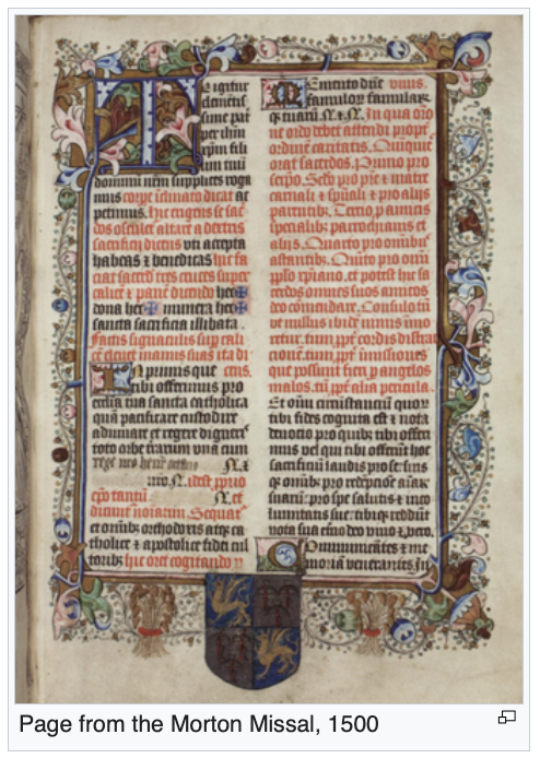
The manuscript tradition strongly influenced the first English types. Early printers did not immediately imitate Italian Renaissance typography; they frequently reproduced the Gothic appearance familiar to English readers. (REFERENCE) The decisive event in English typography was the arrival of William Caxton, (REFERENCE) who established the first printing press in England at Westminster around 1476. His types were primarily Gothic, reflecting the visual expectations of late-medieval readers. Thus, the earliest English typography was more closely related to northern European Gothic typography than to the Renaissance Roman typography developing in Italy. Richard Pynson (Morton Missal) (ILLS), in particular, helped introduce more Continental Renaissance typographic practices into England.
In Tudor England, typography became particularly important during the English Reformation. The printing press was used extensively for Bibles, prayer books, theological works, sermons, royal proclamations, political pamphlets, and controversial religious literature. The Great Bible of 1539 and later English Bibles helped establish important conventions for English book typography.(REFERENCE)
The Elizabethan period produced some of England's most important early printed literature. Important figures included John Day, Richard Field and Thomas Creede. In the seventeenth century, italic became an established companion to Roman type. (REFERENCE) Universities at Oxford and Cambridge developed strong traditions of scholarly book printing. John Fell imported and commissioned a remarkable collection of typefaces and punches, now known as the Fell Types. The Fell Types represented a transitional stage between Renaissance and later English typography. (REFERENCE)
The eighteenth century’s central printing figure was William Caslon. Caslon's types became the quintessential English Old Style typefaces, which were enormously successful in Britain and the American colonies, with the famous phrase, “when in doubt, use Caslon.”(REFERENCE) John Baskerville (REFERENCE) sought greater refinement and precision than Caslon and provided a transitional face between oldstyle and modern typography.
The Industrial Revolution transformed English typography, providing steam-powered presses, mechanized paper production, improved ink, stereotyping, electrotyping, mass newspapers and posters with commercial printing. The nineteenth century produced new typographic categories designed specifically for display with fat faces, Egyptians, and slab serifs (REFERENCE) with Vincent Figgins, Stephen Blake, and Robert Thorne leading the way.(REFERENCE).
With the Victorian Period, type became increasingly expressive rather than merely functional. (REFERENCE) A Victorian poster might combine many different typefaces on a single page. This period produced what might be called a typographic pluralism—almost every historical style could be revived, exaggerated, or recombined. The Arts & Crafts Movement (1860–1910) with William Morris and Lewis F. Day (REFERENCE) was a reaction against industrialized Victorian printing This movement established the foundation for twentieth-century British book typography.
Twentieth Century British Typography
Twentieth century British typography moves from modern signage through Edward Johnston, humanist sans serif faces with Eric Gill, newspaper typography with Stanley Morison and information and signage type with Jock Kinneir and Margaret Calvert. Digital typography was advanced by Neville Brody, David Carson, Matthew Carter, Jonathan Barnbrook, Phil Baines and Jeremy Tankard. Today England remains an important center for type design, lettering, and graphic design.
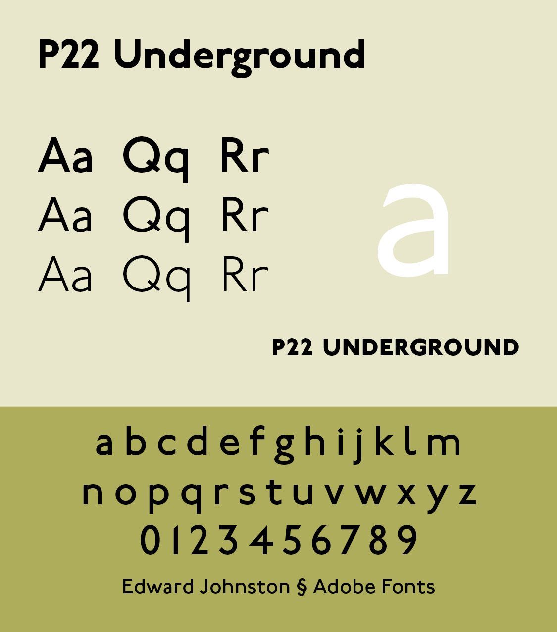
In the early twentieth century, Edward Johnston became a crucial figure in British lettering and typography. Edward Johnston (1872–1944) was a British craftsman who is regarded with Rudolf Koch as the father of modern calligraphy.(REFERENCE) He is best known as the designer of Johnston, a sans-serif typeface used throughout the London underground system until the 1980s. (ILLS) Johnston influenced the typeface designer and sculptor, Eric Gill.
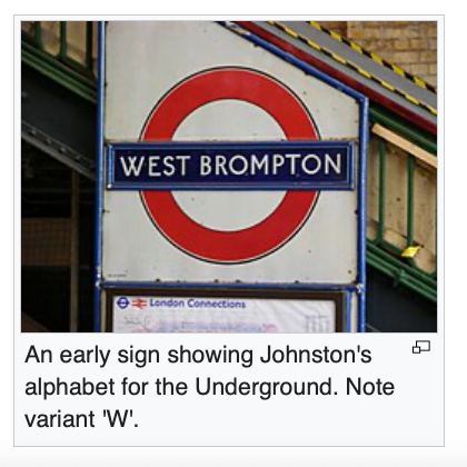
“He accepted a commission from a company which later became part of London Transport, to draw an alphabet for use by photo-litho-transfer on their drawn and lithographed posters. This "Underground Blockletter" of 1916 was for their own use only and was not available elsewhere. It created so much admiration that the Germans produced three block types (Cable, Erbar and Futura) which have had very wide and extensive use. Such is its popularity in America that Cable has perhaps been used more than any other display type ever made. In 1928 Eric Gill's "Gill sans" made a much finer block letter available in general use. It is second only to the "Johnston" from which it is derived, and has become the most widely used display type in Britain.” (p. viii in Writing & Illuminating, & Lettering, with Diagrams and Illustrations by the Author and Noel Rooke, London: Pitman Publishing, 1977)
“Johnston's main work, however, was neither in printing nor in ordinary handwriting, but in formal penmanship, from which the other two had originated. He always maintained the distinction between handwriting and formal penmanship. Formal penmanship remains intrinsically and potentially more important than either of its derivatives and it was through this that Johnston inspired first himself, then others.” (p. viii)
What stood out to this pastor/typographer was the very impressive Christian testimony of his sister, Bridget Johnston, who has “rightly said that the importance of religion in his life can hardly be over-emphasized, but it was not of a usual kind. For him all work was a combination of prayer and praise; it made him feel ill to see work badly done. His active obedience to the two commandments, love of God and love of man, was qualified only when he met contempt for, or subtle disregard of truth. There are, he believed, three main approaches to Truth: Religion, Science and Art, and that creation is the outstanding function of the artist and craftsman, which distinguishes him from the religious or scientific man; that a craftsman's work could be described in the three stages of "embodying, animating and inspiring"; and that the craftsman's creations "inspire the craftsman, embody his idea and give it material life.” (p. ix)
Johnston also devised the simply crafted round calligraphic handwriting style, written with a broad pen, known today as the foundational hand (what Johnston originally called a slanted pen hand, which was developed from Roman and half-uncial forms). Johnston's work demonstrated that typography could function as a coherent visual identity system. His Underground Blockletter has been revived as P22 Underground, available in Adobe fonts.
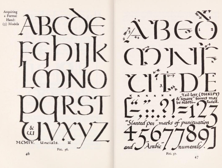
Eric Gill (1882–1940) combined calligraphy, sculpture, engraving, and type design. His typefaces include Gill Sans, Joanna, Perpetua, Golden Cockerel, Collegium, Ditchling, Judaea and others. While hailed as one of the greatest artist-craftsman of the twentieth century, sexual abuse of his daughters and profligate marriages stained his otherwise excellent typographic reputation. He was a student of Johnston and worked for some time for the Golden Cockerell Press in London.
Unlike Johnston, however, his religious interest in Catholicism and the Roman Catholic Church did not quench or lessen his depraved sexual activities. “This charismatic firebrand was a renegade Fabian socialist, a bohemian friend of Augustus John and Bertrand Russell. His adventurous life, as re-created in this beautifully written, absorbing biography, is disturbingly relevant to our time.” (Eric Gill by Fiona McCarthy, Faber and Faber Ltd)
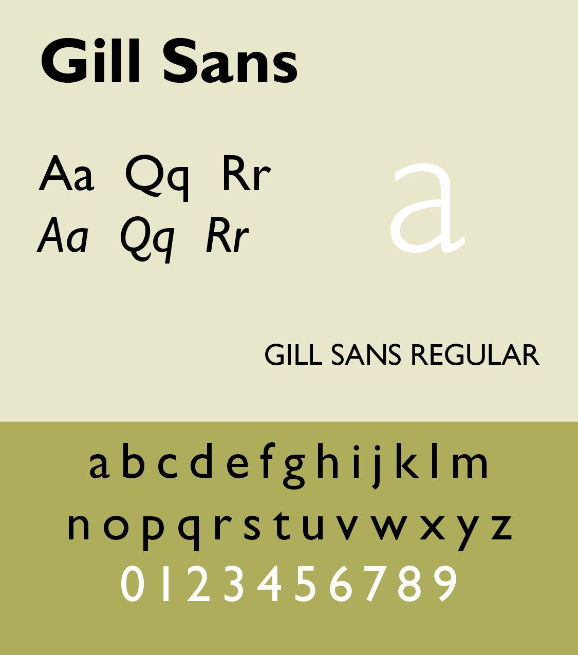
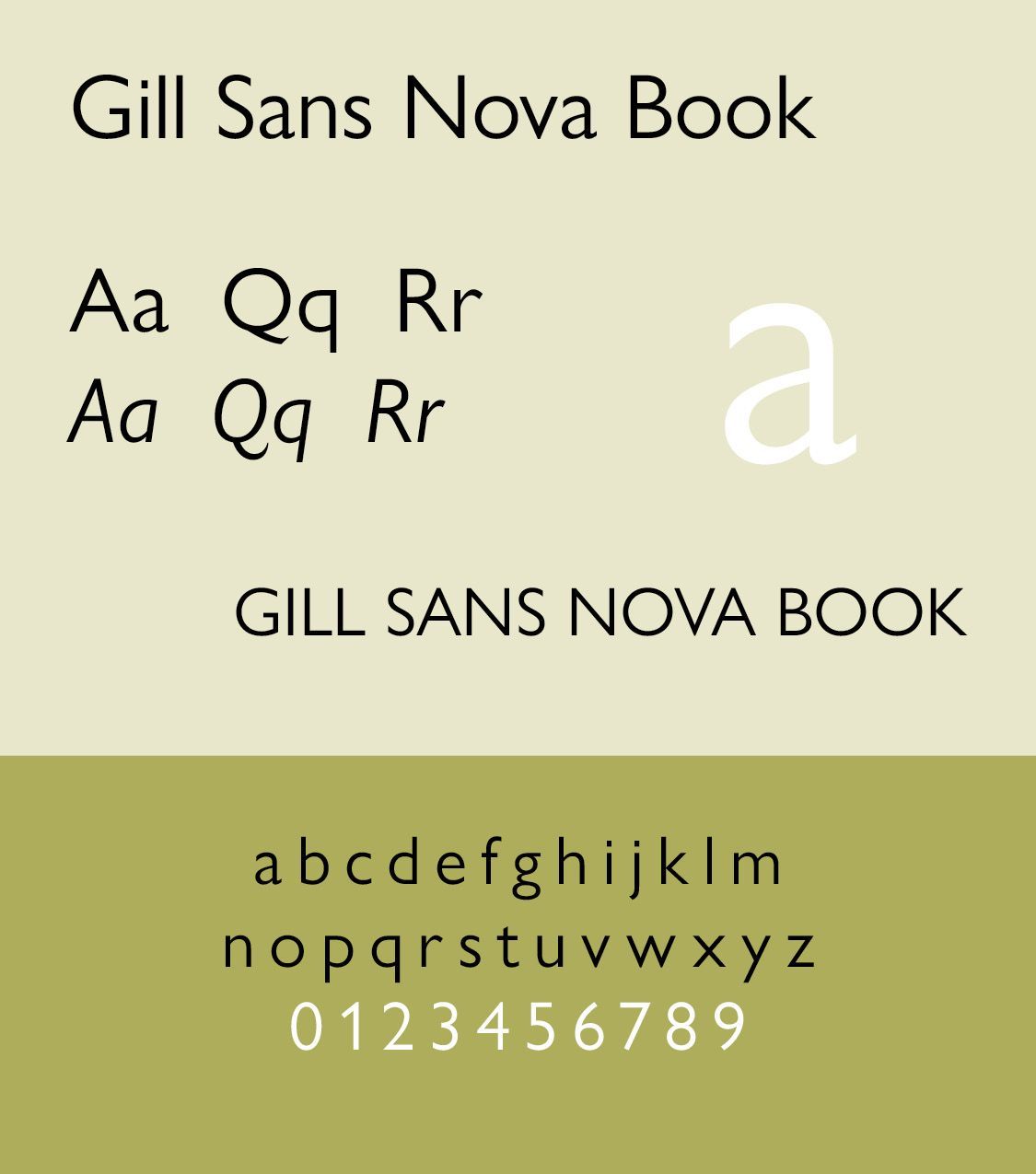
Gill Sans was released in 1927. “Revivals include Bitstream's Humanist 521 and its Cyrillic extensionParatype’s Humanist 521. For a major digital update and revival, see Gill Sans Nova (George Ryan, 2015, Monotype). It extends Gill Sans MT from 18 to 43 fonts. Several new display fonts are available, including a suite of six inline weights, shadowed outline fonts that were never digitized and Gill Sans Nova Deco that was previously withdrawn from the Monotype library. And it covers Greek and Cyrillic.” (https://luc.devroye.org/fonts-26302.html) Gill Sans Nova is available as a font with 43 iterations, from Extra Condensed through Ultra Bold.
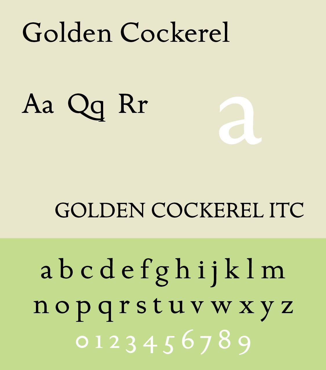
Luc Devroye writes that “Golden Cockerell Roman (1929), is from the Golden Cockerel Press. Berry, Johnson and Jaspert write: Designed by Eric Gill, a rounder form of his Perpetua. It has the modest capitals, horizontal serifs and slight differentiation of colour of Gill's other romans. The M is somewhat splayed. The g has a rather large bowl. The t is very short. The italic, cut only for the 14 point size, is a sloped roman except for the a and with it are used the roman capitals, as in the case of Joanna.” The sample cited here is from fontsgeek.com. (luc.devroye.org)
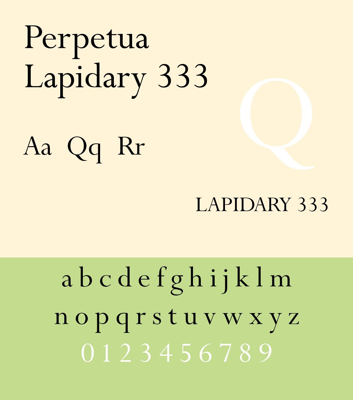
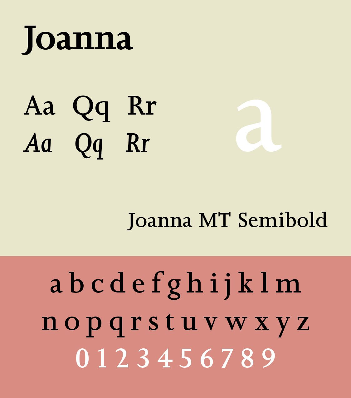
Perpetua was released by Monotype (1928–29), and Joanna (1930) is a slab serif based on work by Granjon. Monotype's metal typeface Joanna dates from 1958. “Berry, Johnson and Jaspert write: Designed by Eric Gill for Hague & Gill in 1930. A light roman with small horizontal serifs and little differentiation of color. The type is remarkable for the smallness of the capitals, which do not reach the height of the ascenders, themselves not tall. The bowl of the g is rather large. The italic is the roman inclined except for a and g. The inclination is very slight. There are no specially cut capitals, but the modest roman capitals are used. This was the practice of Aldus, the first printer to use italic.” (luc.devroye.org)
Gill's work combined humanist proportions, calligraphic influence, geometric simplification, and relatively open forms. It became strongly associated with British modernism and corporate typography.
Stanley Morison and Times New Roman. Stanley Morison (1889–1967) was a British typographer, printing executive and historian of printing. From the 1920s Morison became an influential adviser to the British Monotype Corporation, advising them on type design. His strong aesthetic sense was a force within the company, which starting shortly before his joining became increasingly known for commissioning popular, historically influenced designs that revived some of the best typefaces of the past, with particular attention to the middle period of printing from the Renaissance to the late eighteenth century, and creating and licensing several new type designs that would become popular. Original typefaces commissioned under Morison's involvement included Times New Roman, Gill Sans and Perpetua. (Wikipedia)
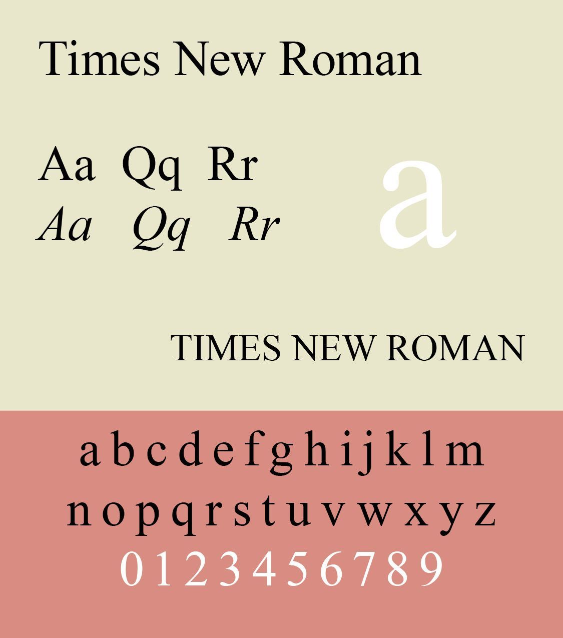
Times New Roman, introduced in 1932, was designed for newspaper economy, readability, compact setting, and relatively small text sizes. It became one of the most used and most popular faces especially in the office world.
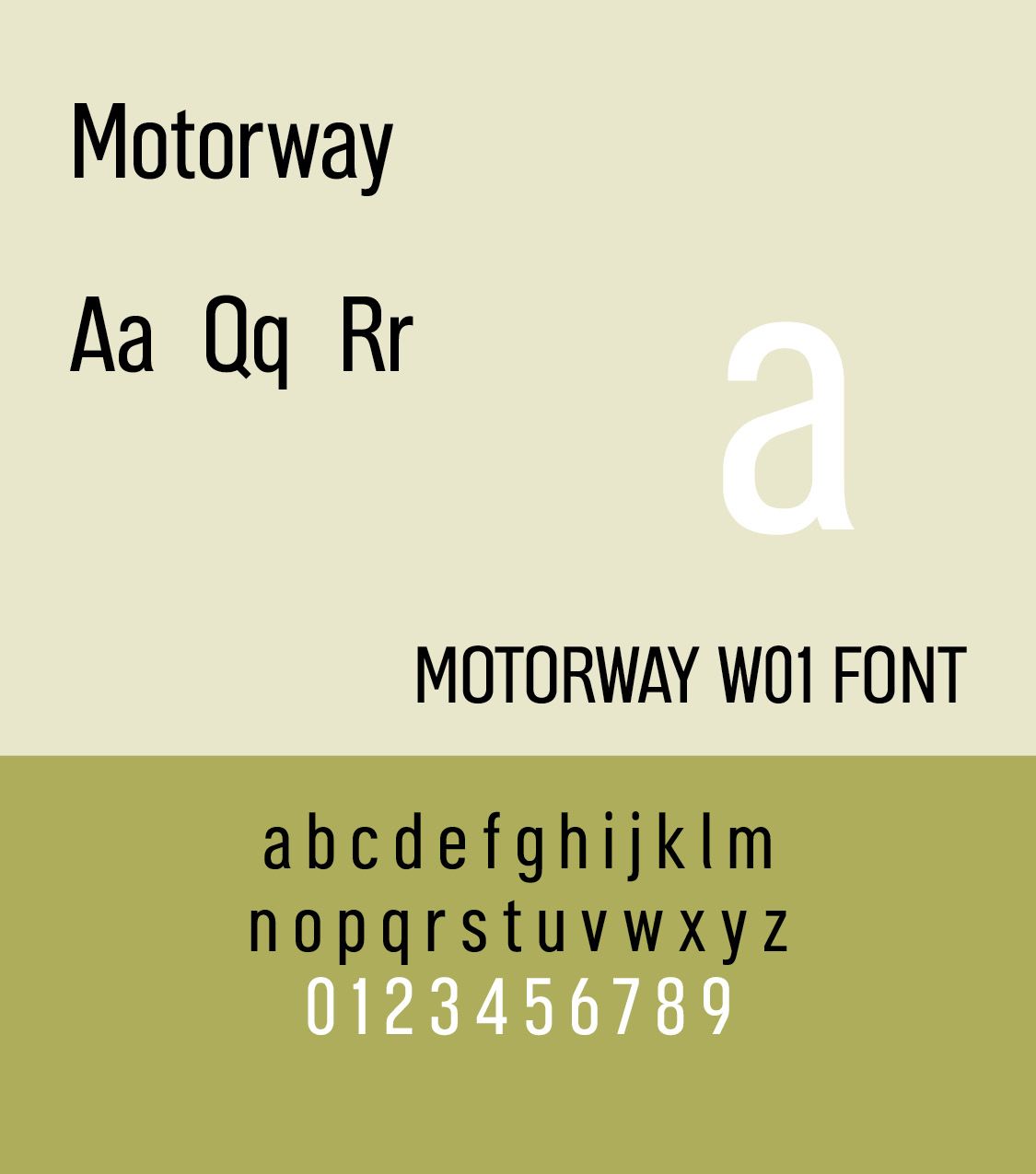
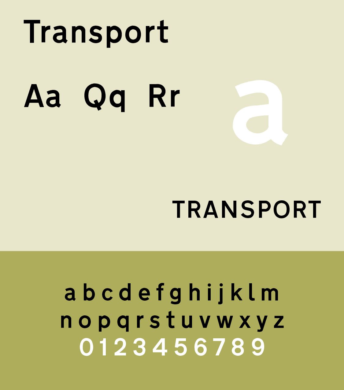
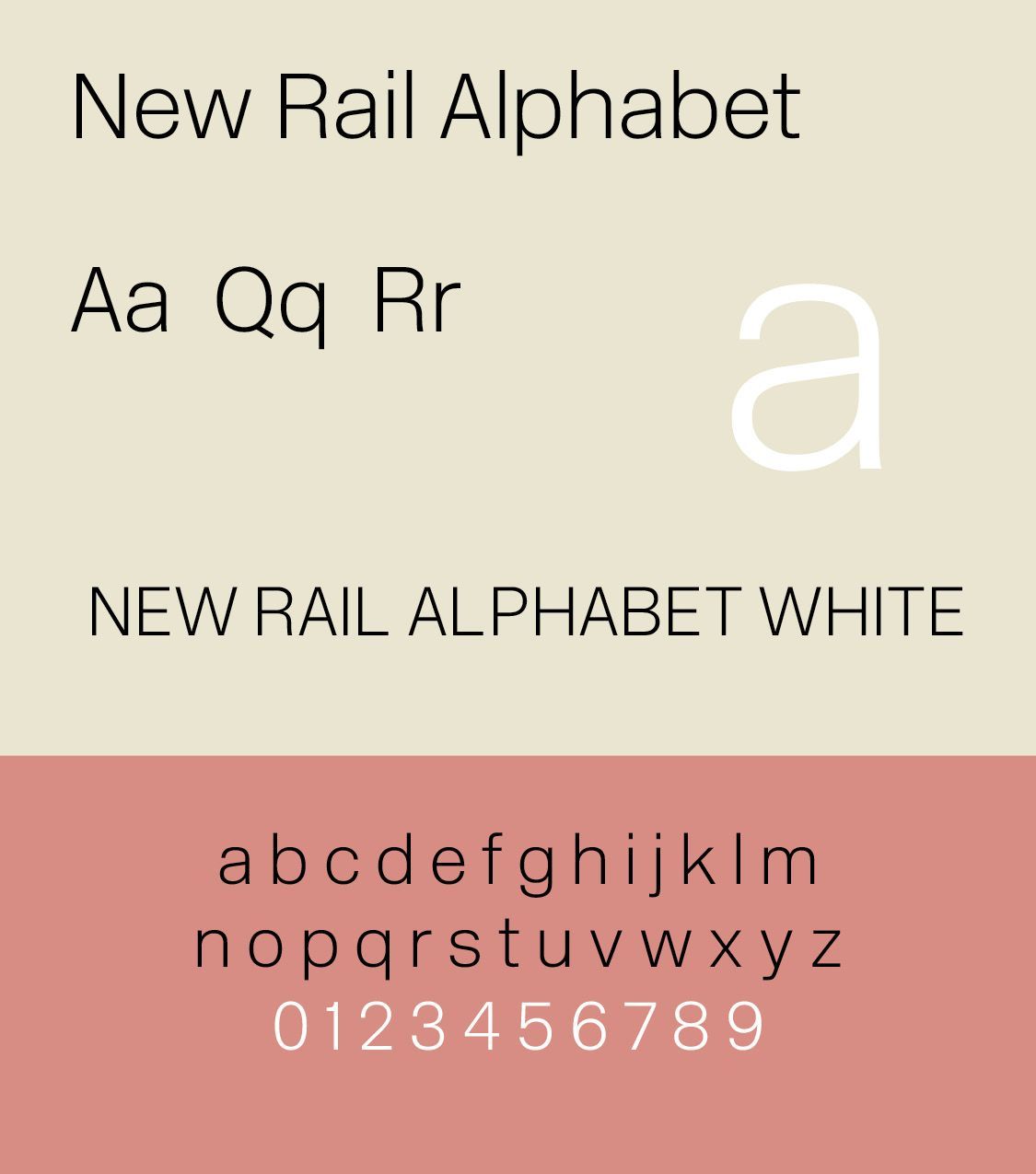
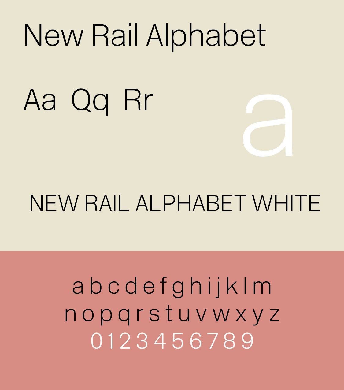
Post WW II Britain saw typography increasingly connected with corporate identity, transportation, publishing, advertising, information design, television, government and public signage. Important designers included David Kindersley, Jock Kinneir and Margaret Calvert. She made TransportD with Jock Kinneir in 1963. Monotype Calvert (1980) is a retail Egyptian typeface that was originally used in Newcastle's Tyne & Wear Metro. In 2009, Margaret Calvert and Henrik Kubel designed New Rail Alphabet, a revival of the 1964 British Rail alphabet of Margaret Calvert and Kinneir Calvert Associates. Jock Kinneir and Margaret Calvert also created Motorway as a companion to Transport. Transport Sample is from fontsgeek.com. Motorway from http://www.onlinewebfonts.com and is licensed by CC BY 4.0. Monotype Calvert courtesy fontsgeek.com. New Rail Alphabet sample from http://www.onlinewebfonts.com and is licensed by CC BY 4.0.
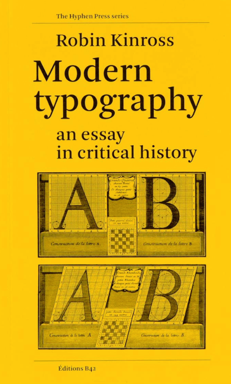
Richard Hollis, a British graphics designer, designed the quarterly journal Modern Poetry in Translation, became the art editor of the weekly magazine New Society and later created John Berger’s Ways of Seeing. He designed the visual identity and marketing material for the Whitechapel Art Gallery in London. Robin Kinross started Hyphen Press, which published books on design and typography from 1980 to 2017. His most significant work, Modern Typography: An Essay in Critical History is a critical history of printing and typography.(ILLS)
Kinross asserts that modernism in typography emerged with the self-awareness of printing and the development of the rationality of its processes and tools. Kinross dates these emerging attitudes to around 1700 and then traces the evolution of modernist typography.
The 1960s – 1980s in Britain were a period of increasing sophistication within graphic design. Important areas included editorial design, corporate identity, record covers, advertising, magazines, signage, and information graphics. British designers helped establish the reputation of London as a major center of international graphic design. The London Underground continued to be one of the world's great examples of systematic typographic identity.
The Digital Revolution (1980s – 2000s)
Like the Industrial Revolution of the eighteenth and nineteenth centuries, the digital revolution took Britain by storm. Digital typesetting fundamentally changed English typography. The tradition printing process of metal type to hot metal composition to phototypesetting gave way to digital type in desktop publishing to digital font development. The Macintosh, PostScript, digital font technologies, and desktop publishing made professional typography accessible to a much larger audience. British designers increasingly worked internationally.
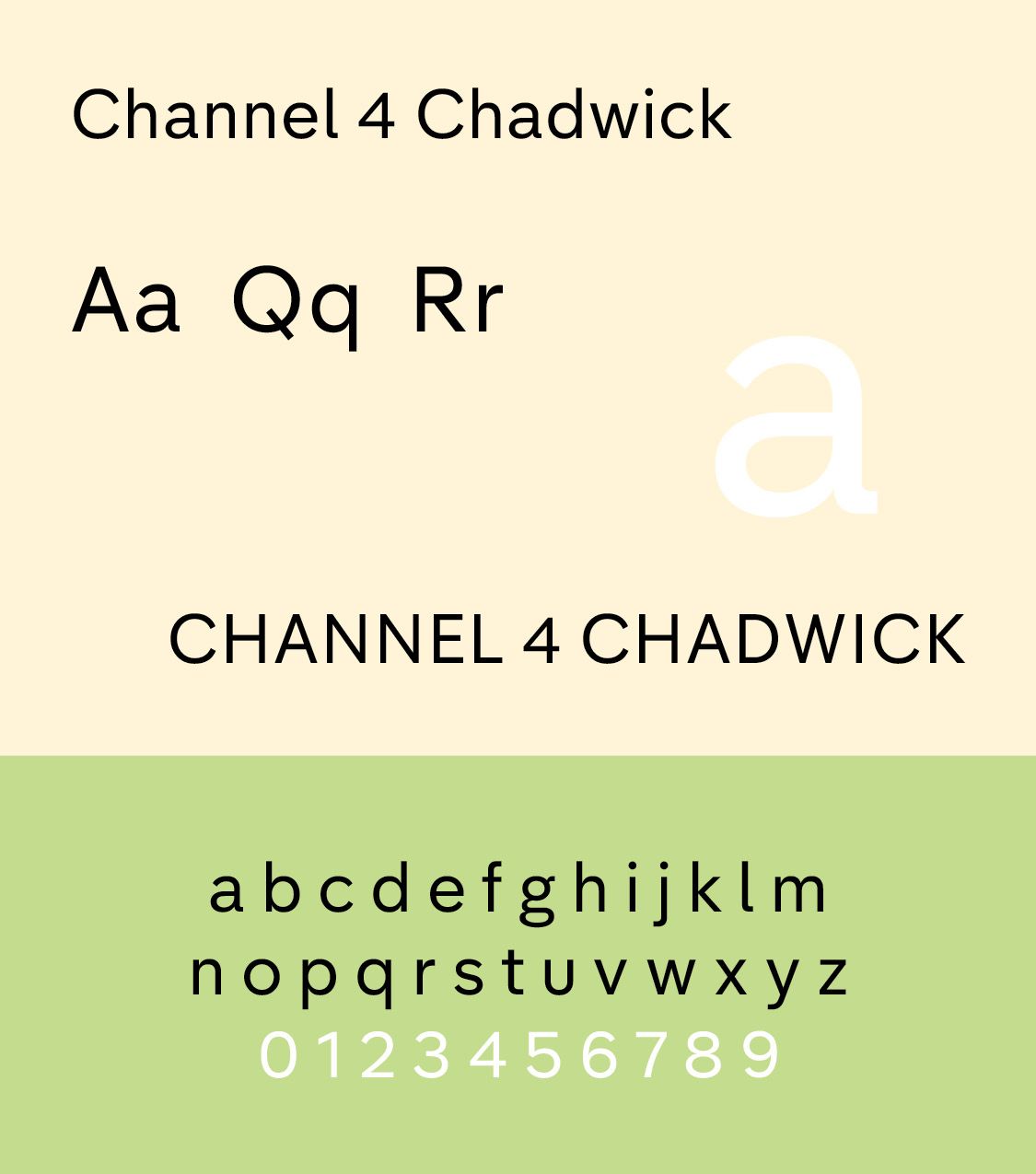
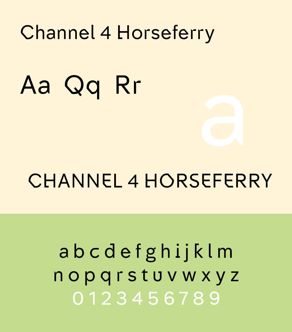
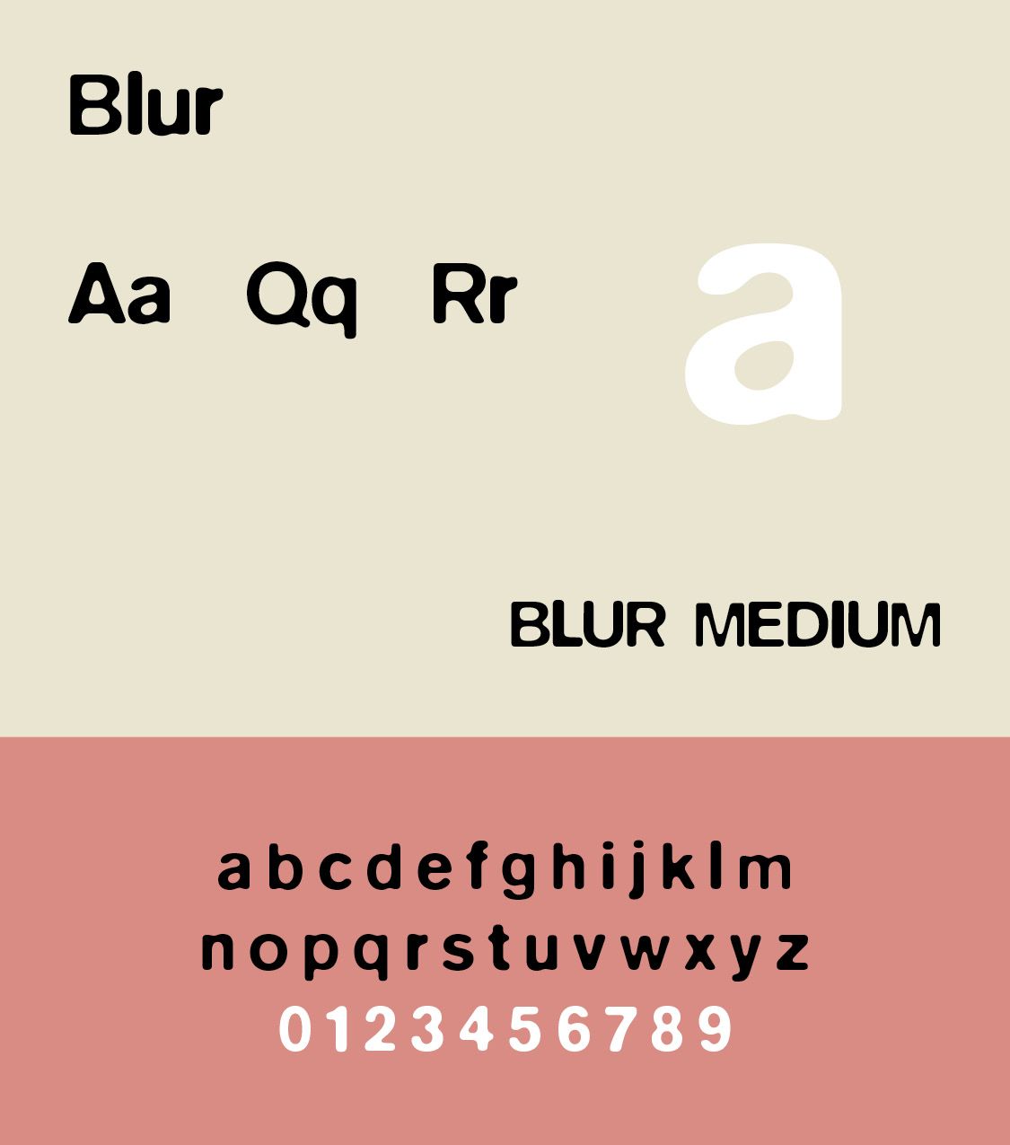
Neville Brody influenced the practice of design in the 1990s, working on record covers and magazine design and was art director for projects for Christian Dior, Nike and the BBC. Brody has been at the forefront of many developments in type culture, from his hand-drawn headlines for The Face magazine and experimental typographic platform FUSE to global fonts for Coca-Cola, Samsung, and Channel 4. his fonts include FF Autotrace (1994), F Cyber Static (1997, letters based on layered sequences of halftone dots), Arcadia (1990), Industria (1990) Insignia (1990), Blur (1991), FF Pop (1991, a rectangular font originally made for a German music TV program), FF Dirty (1994), Gothic (1991), and Harlem (1991). For FIFA's World Cup in 2014, Neville Brody custom-designed Case Brody for England's Nike kit. In 2015, Neville Brody designed Horseferry and Chadwick for the new visual identity for UK broadcaster Channel 4. Our Autotrace and Blur Samples are from fontsgeek.com. Blur Web Light from http://www.onlinewebfonts.com is licensed by CC BY 4.0.
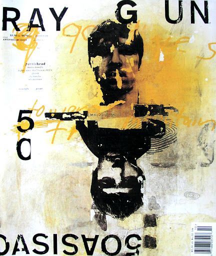
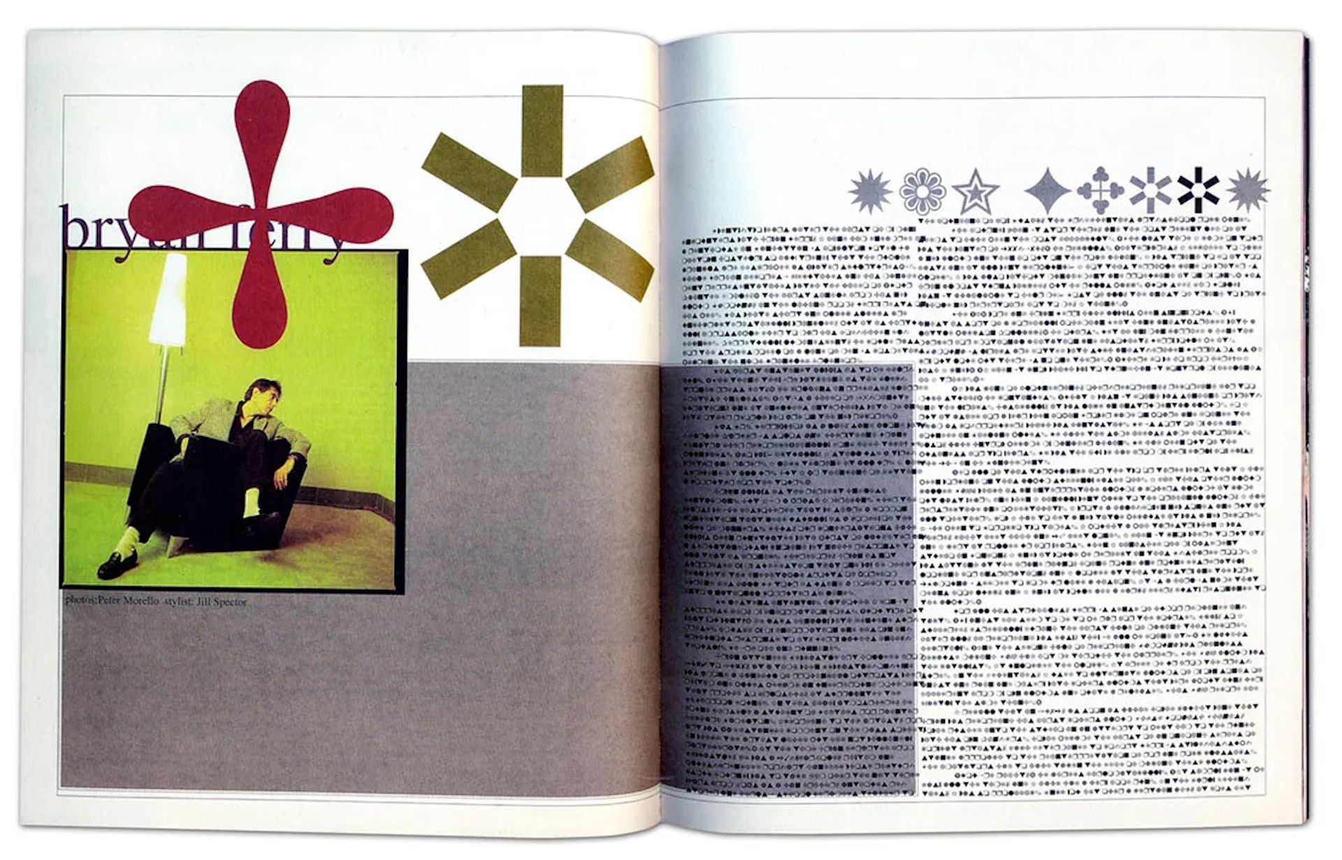
The highly influential American David Carson became art director at the magazine Beach Culture in 1989. Although he produced only six issues before the journal folded, his work there earned him more than 150 design awards. By that time, Carson’s work had caught the eye of Marvin Scott Jarrett, publisher of the alternative-music magazine Ray Gun, and he hired Carson as art director in 1992. David Carson became a leading figure in post-modern graphic design. Trained as a sociologist and a professional surfer, Carson drew inspiration from surf culture, skateboarding, and an understanding of texture and movement in composition. He is most famous for his editorial design for magazines like Ray Gun (1992–1995), (ILLS) where layouts and typesetting challenge traditional magazine grid structures and pure functionality.
Such typography also inspired later subcultures like hardcore, riot grrl, and DIY zine culture. Hardcore subcultural operates with a strong “us against the world” feeling, a lifestyle that abstains from alcohol, drugs and sometimes casual sex, and often aligns with ant-fascism, anti-capitalism, environmentalism and social justice campaigns
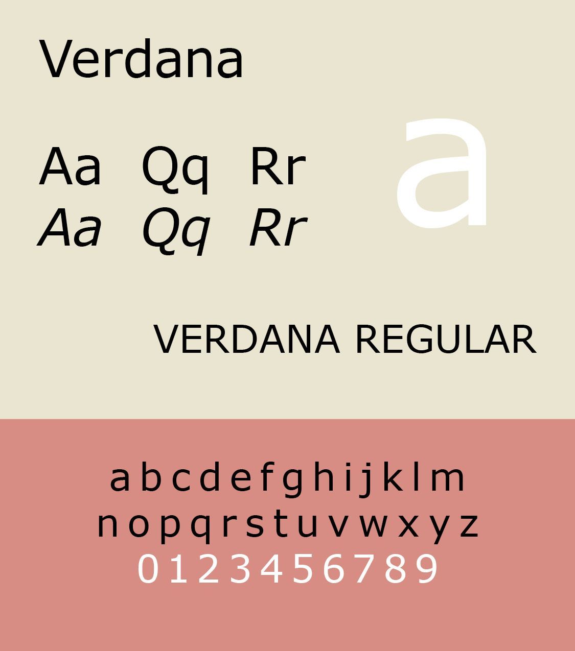
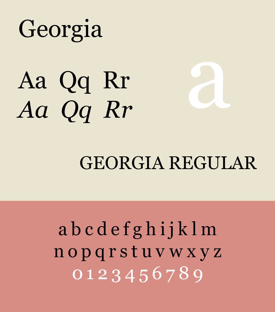
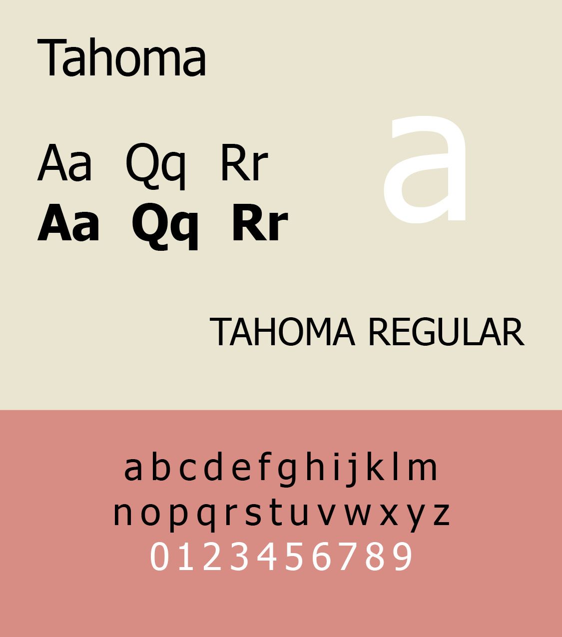
The British typographer, Matthew Carter, provided us with the Verdana and Georgia fonts, along with the Windows interface typeface Tahoma, as well as Bell Centennial, Miller and Galliard. He cofounded Bitstream, a major retailer of digital typefaces.
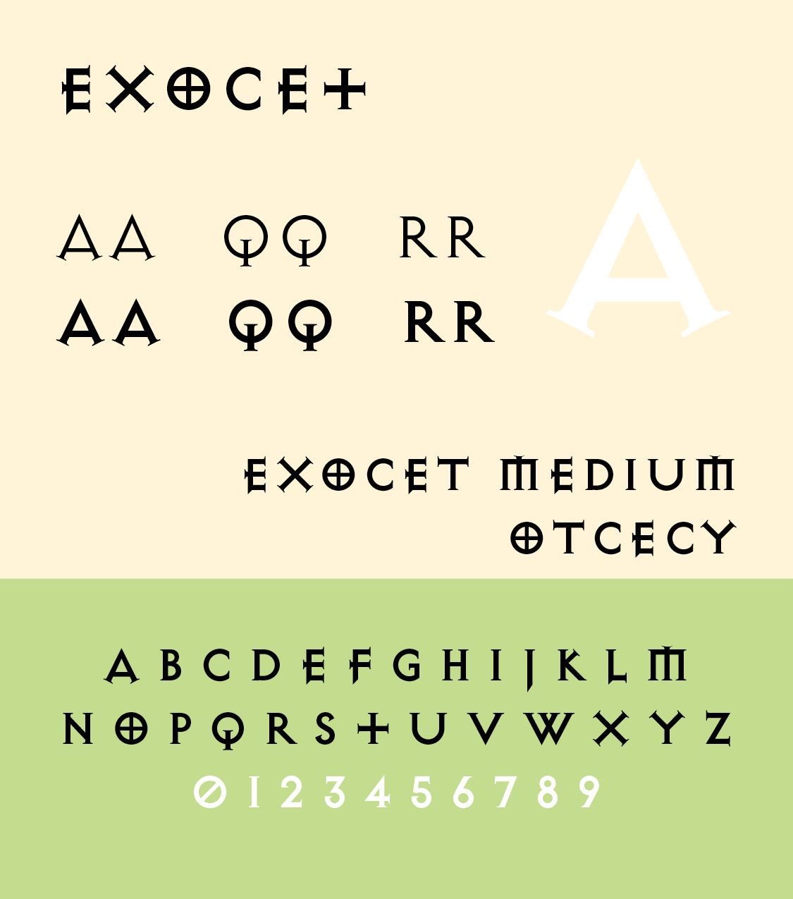
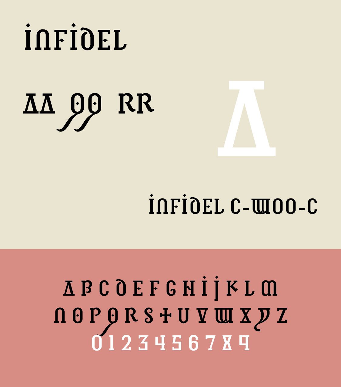
Jonathan Barnbrook, a British graphic designer, film maker, and typographer, designed the cover artwork for David Bowie’s 2002 album Heathen, using his Priori typeface for the first time. Barnbrook is also a type designer and has released typefaces including Bastard (ILLS), Exocet, False Idol, Infidel, Moron, Newspeak, Olympukes, Sarcastic, Shock & Awe. Many have emotive and controversial titles reflecting the style and themes of Barnbrook's work. His typeface Mason, originally released as Manson, is available from Emigre. Our Infidel Sample from http://www.onlinewebfonts.com is licensed by CC BY 4.0.
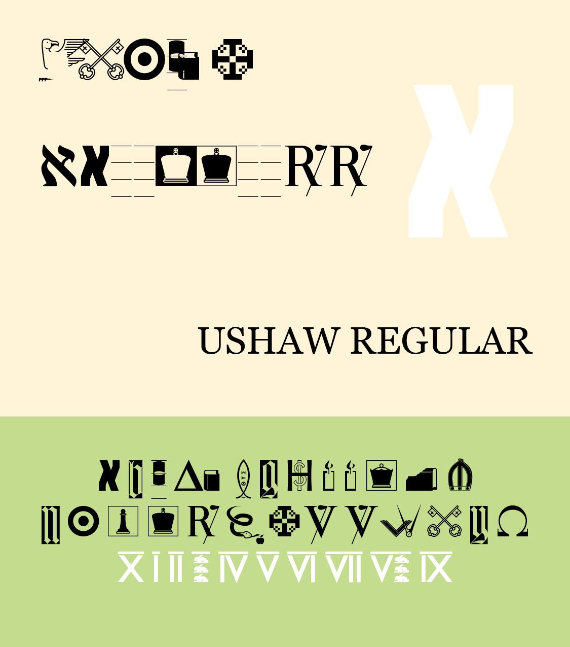
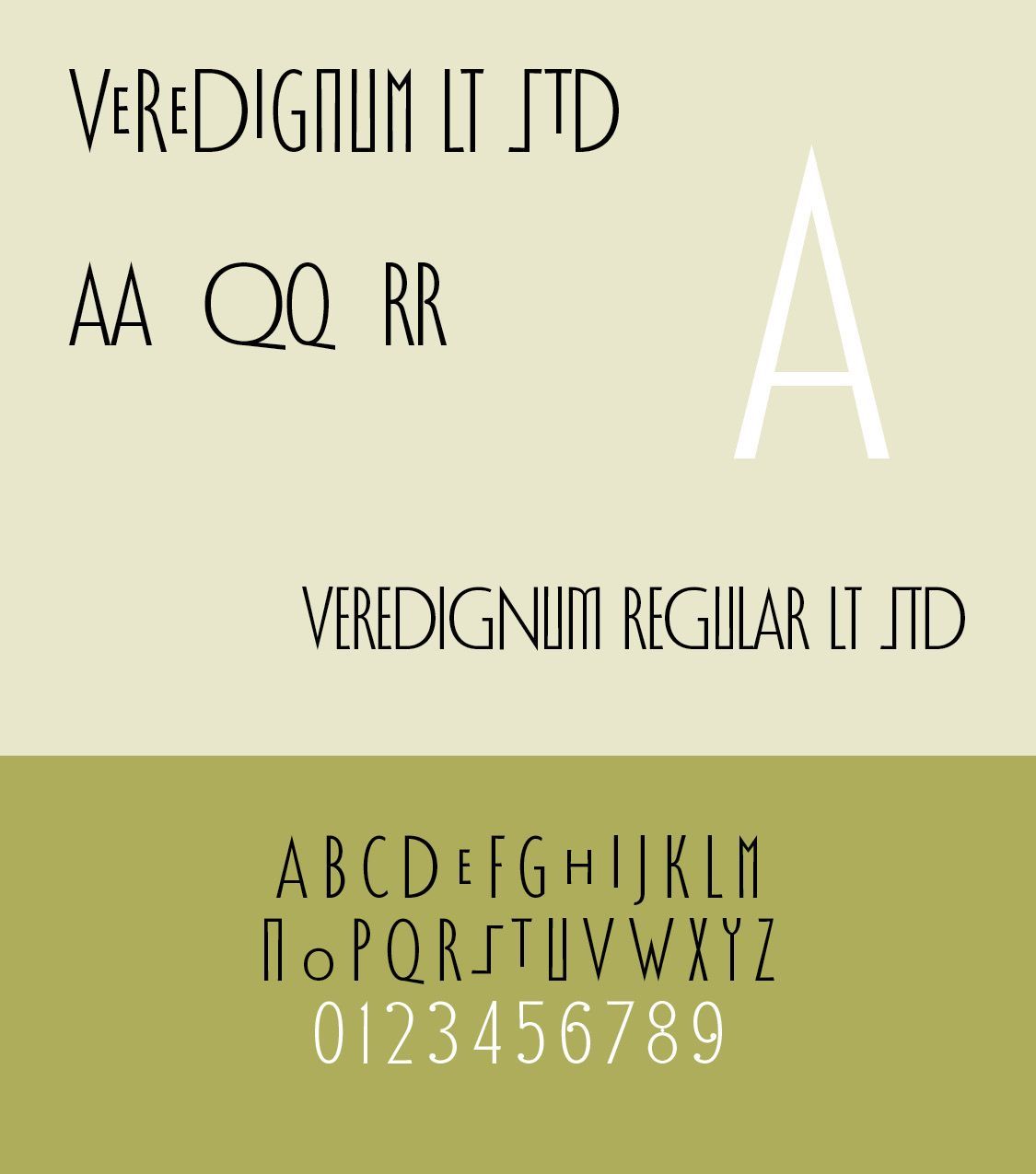
Phil Baines (1958–2024) worked as a freelance graphic designer, was Professor of Typography at Central Saint Martin’s College of Art & Design (now a university) in London (from 1991 until retirement), ran Phil Baines Studio, maintained Public Lettering (about type found in cities), and was Typographic Advisor to the Central Lettering Record CD-Rom project. His typefaces include FUSE Classic 1, Can You (1989), Ushaw (FUSE 8, FontShop, 1993), Toulon (1994), Horncastle (1994), VereDignum LT Std in Alternate, Decorative and Regular weights (2003, Linotype Taketype 5 collection) and Can You Read Me (FUSE 1, 1991). Our Ushaw and VereDignum Samples from fontsgeek.com.
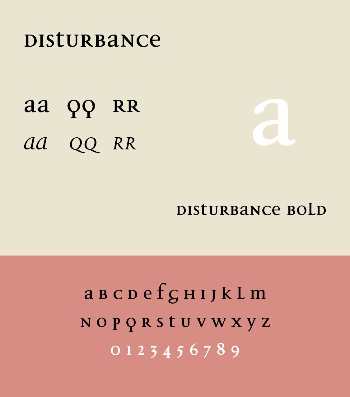
Jeremy Tankard initially worked at Addison Design Consultants and then Wolff Olins, but he left corporate design in order to pursue his interests in type as an independent type designer in 1998. Jeremy has designed type since the early 90s. His first typeface, Disturbance, was released through FontShop International in 1993, followed by Bliss in 1996 as part of the Agfa Creative Alliance and later by typefaces for Adobe and Microsoft. Jeremy continues to design a diverse range of typefaces that aim to provide new visual textures for creative expression. While some designs are bespoke commissions, many are available for licensing through typography.net. Our Disturbance Sample from fontsgeek.com.
Contemporary British typography encompasses revival typefaces, bespoke corporate fonts, variable fonts, web typography, experimental type, kinetic typography, editorial design, signage, branding, and digital interfaces. London in particular remains an international center of type and graphic design.
British Variable Typefaces
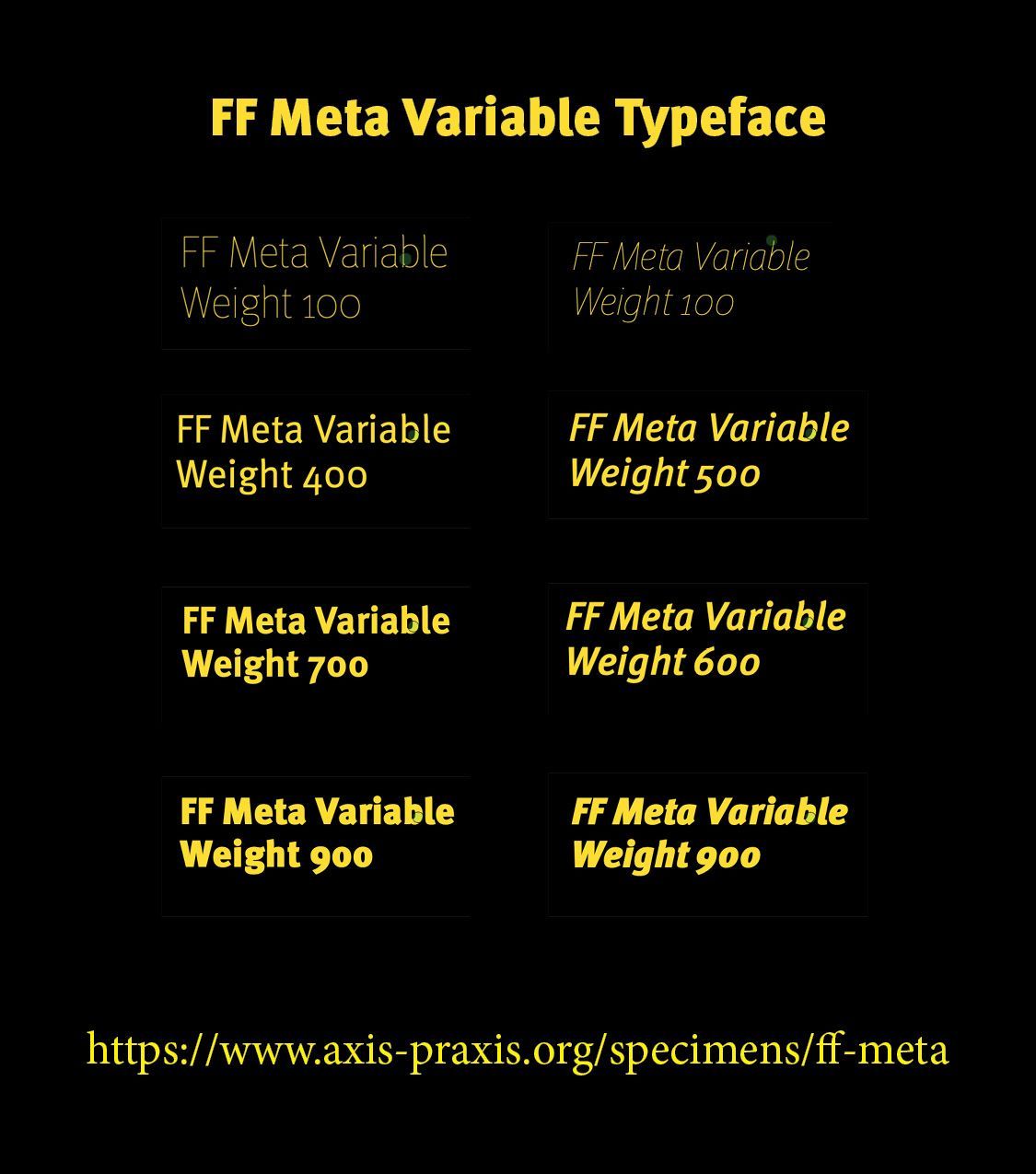
A Variable typeface (REFERENCE) is a font file in which multiple variations—such as weight, width, optical size, or slant—are contained in a single font. Britain has produced several important examples in Roboto Flex, Helvetica Now Variable, Neue Haas Unica Variable, FS Elliot Variable, FS Pimlico Variable, FS Industrie Variable, Monotype Modern Variable, Gill Sans Nova, and Source Sans/Serif Variable. British typography has a particularly strong tradition of variable typefaces and bespoke corporate type, especially because of the influence of British type foundries, graphic-design studios, newspapers, broadcasters, and major institutions.
Fontsmith, founded in London by Jason Smith, is one of the clearest examples of the modern British approach to flexible corporate typography. Its families have been designed with branding, editorial design, digital interfaces, and corporate identity in mind. The significance of these variable families is that a designer can move gradually between characteristics rather than being restricted to a small number of discrete fonts — Light → Regular → Medium → Bold → Black, and, in families with width axes —Condensed → Normal → Expanded. This is particularly valuable for responsive web typography, where the same typeface can adapt to different screen sizes.
British Bespoke Corporate Fonts
Bespoke corporate fonts are different from ordinary commercial typefaces. They are commissioned specifically for an organization or brand, usually to give it a distinctive visual voice. A corporate typeface allows a company to maintain a recognizable typographic personality without relying entirely on a generic commercial font. They include BBC Reith for the BBC, fonts for British Airways, Barclays, and British Railways.
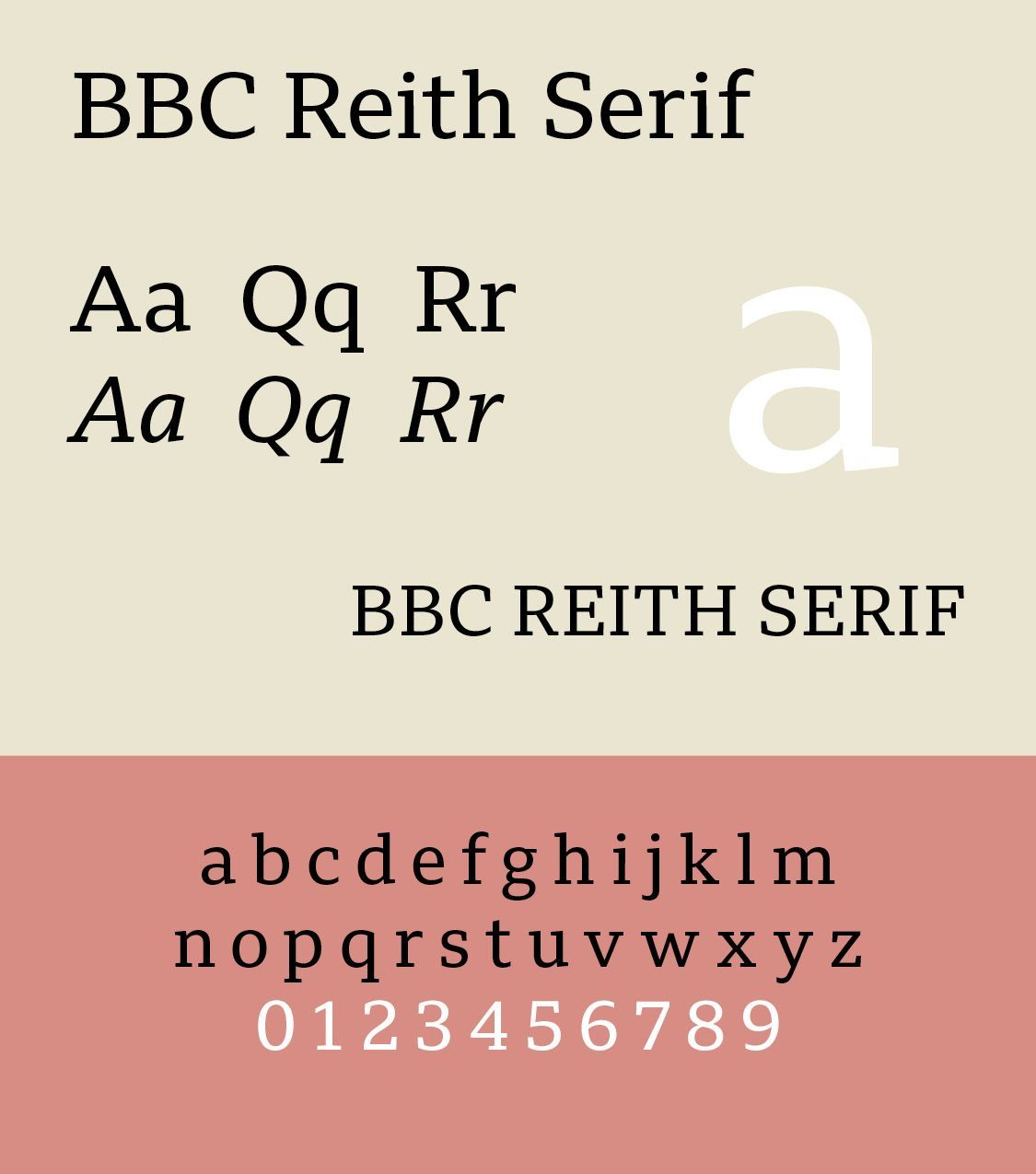
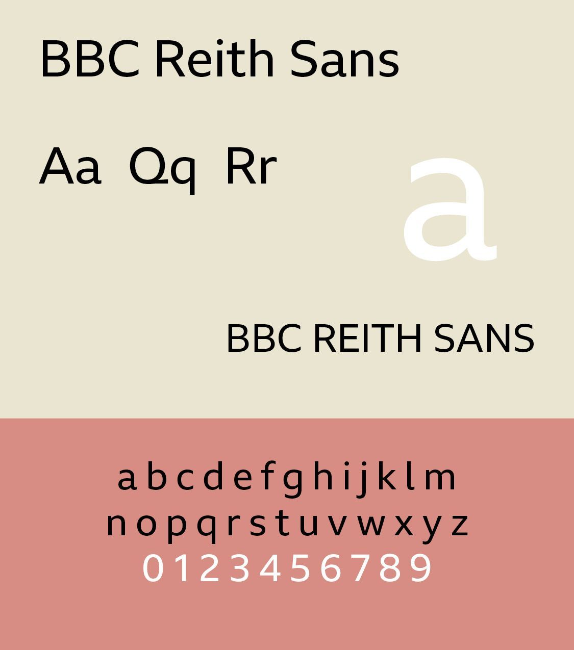
BBC Reith, designed by Dalton Maag in 2017 is perhaps the best-known recent British bespoke corporate typeface. It replaced the BBC's extensive use of Helvetica and Arial and was designed to work across television, websites, mobile applications, print, subtitles, international languages, and corporate communications. Reith has both sans-serif and serif versions. Its purpose was not simply to make the BBC look different. It was intended to create a unified typographic identity across an enormous organization. BBC Reith is a free font available to all.
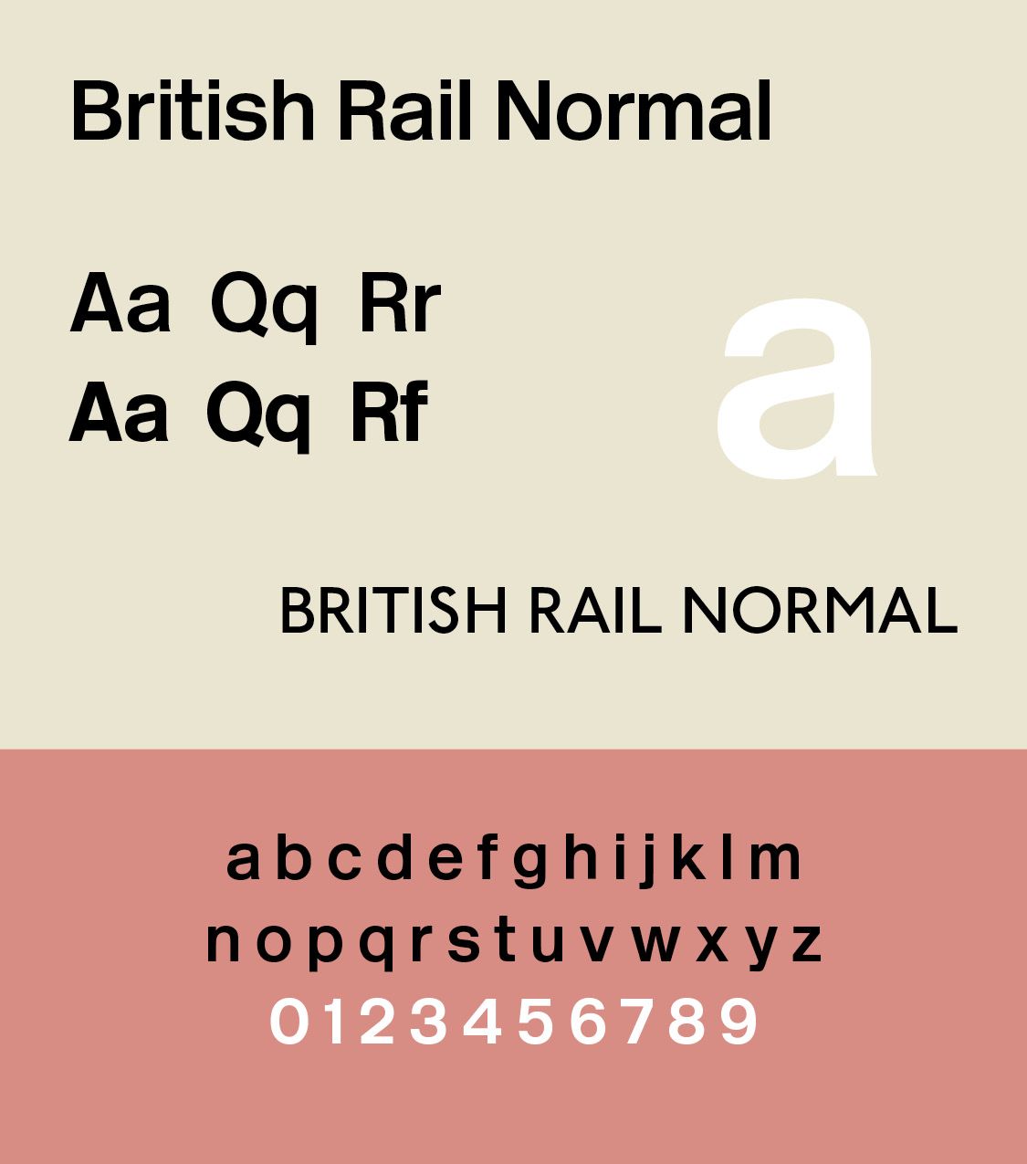
British Railway uses the Rail Alphabet typeface, designed by Jock Kinneir and Margaret Calvert for signage on the British rail network. First used at Liverpool Street Station, it was then adopted by the Deign Research Unit (DRU) as part of their comprehensive 1965 rebranding of the company. It was later used by other public bodies in the United Kingdom. A redesigned version, Rail Alphabet 2, is now used across the Great British Railways.
Rail Alphabet is similar to a bold weight of Helvetica, but with some differences in character shapes, stroke width and x-height to aid legibility. The typeface also has some similarities to Akzidenz-Grotesk, which had earlier provided the same designers the broad inspiration for the Transport typeface used for road signs in the United Kingdom. The typeface was designed specifically for signage and the designers included features to support this such as a bespoke letter-spacing system and two slightly different weight to provide optimum visibility on both light and dark backgrounds.[Wikipedia]
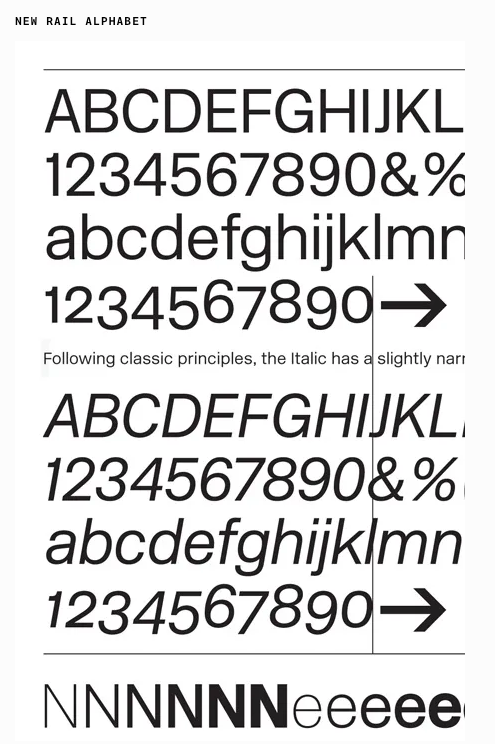
New Rail Alphabet first appeared in the United Kingdom’s National Health hospitals and, subsequently, British Rail and Danish Rail stations, followed by all BAA airports. Now produced in six weights, Off White, White, Light, Medium, Bold and Black, with non-aligning numerals, corresponding italics, and a set of Eastern European characters, by Henrik Kubel of A2/SW/HK, in close collaboration with Margaret Calvert. Our New Rail Alphabet Sample from http://www.onlinewebfonts.com is licensed by CC BY 4.0
Successful Layout & Design