Historical Literary Fonts: The Fell Fonts
Historical Literary Fonts: The Fell Fonts
Rooted in John Fell's legacy at Oxford, these fonts inherit a rich history of learned printing, drawing inspiration from Dutch typefaces with contrasting weights and unique letterforms. The Fell type collection was a gift made to Oxford University by Dr. John Fell (1625–1686), Bishop of Oxford and Vice-Chancellor of the University of Oxford. They were donated to the Oxford University Press (OUP) and became the foundation of its early printing identity — “He bought punches and matrices in Holland and Germany in 1670 and 1672 and entrusted his personal punchcutter, Peter de Walpergen, with the cut of the larger bodies. Igino Marini, revived some Fell types in 2004.”[1]
Why the Fell Types Matter
Fell Types represent pre-Caslon English typography. They form one of the earliest consistent typographic identities of a university press. They show how Dutch type design influenced English printing. Typographically, they were designed for reading, not display. This is important because they departed from the socialistic, anti-industrialization movement of the Arts & Crafts movement led by William Morris (SEE Blog Advances in Typography: A Historical Sketch (Part 2), Nov. 20, 2025).
Much credit for the original fonts goes to Frederick Nelson Phillips and his work at The Arden Press, which became more commercially ambitious and influential. This press produced high-quality editions of classic and scholarly texts, collaborated with academics, editors, and publishers and continued refinement of typographic discipline.
Frederick Nelson Phillips
Frederick Nelson Phillips (c. 1875 – 1938) occupies a crucial transitional role between Arts and Crafts idealism and twentieth-century typographic rationalism, as well as between private press craftsmanship and professional publishing. For historians of printing, he represents a model of how tradition can be revived thoughtfully—without nostalgia, and without surrendering to industrial mediocrity.
Frederick Nelson Phillips was a British printer and typographic entrepreneur best known as the founder of The Florence Press and later The Arden Press. He played a significant role in the early twentieth-century revival of fine printing in Britain, working in the wake of William Morris and the Arts and Crafts movement, yet moving toward a more practical, commercially viable model of quality book production.
Although never as famous as Morris or later modernist typographers, Phillips exerted a quiet but lasting influence. He helped normalize the use of historical typefaces in serious publishing, bridging the gap between private press ideals and commercial book production. Phillips influenced later British typographic standards, particularly in academic publishing. He contributed to the preservation and renewed appreciation of early English type design. His work resonates strongly with later figures interested in typographic scholarship, including those associated with university presses and fine publishing.
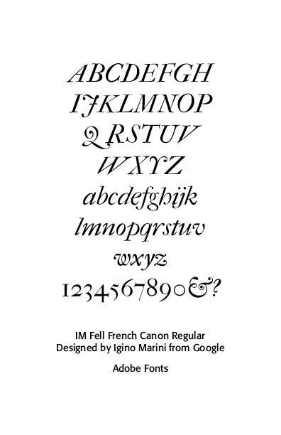
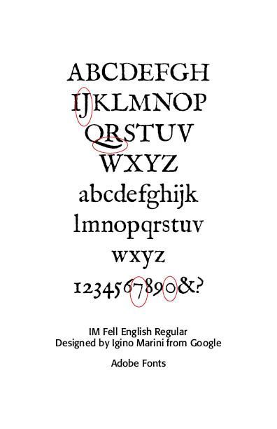
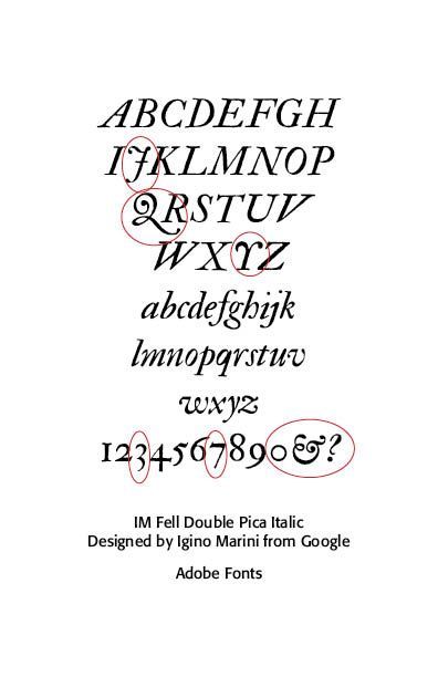
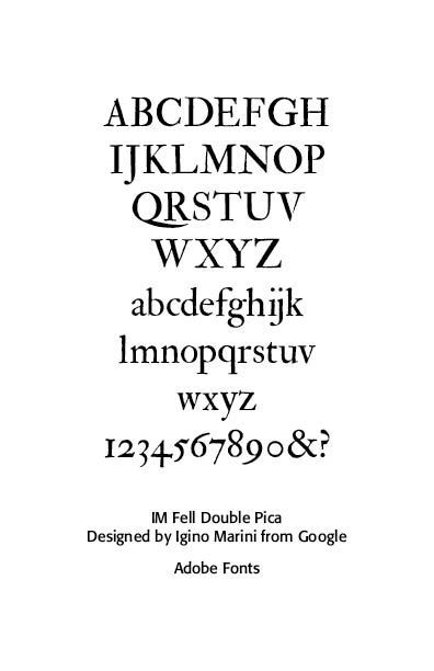
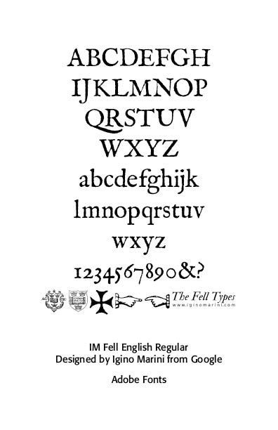
The revived Igino Marini Fell fonts include IM Fell English, IM Fell French Canon, IM Fell Double Pica, and IM Fell Great Primer. These retain the irregularity and color of the originals, making them popular for historical and literary work.
Fell Roman Types, the core of the collection, were used for Latin, English, and scholarly prose. Major Romans included Fell Great Primer Roman, Fell Double Pica Roman, Fell Pica Roman, Fell English Roman, Fell Long Primer Roman, Fell Brevier Roman, and Fell Minion Roman.
Generally, Fell Roman types show broad, sturdy serifs, slightly irregular letterforms, and strong baseline emphasis. Particularly distinctive are capital J, the tail on capital Q, the 7 and the numeral 0. In the italic font note the capital Y, numbers 3, 7, 0 and the fancy ampersand and question mark.
These faces predate Caslon and influenced later British text typography. Fell Italic types were used alongside the Romans, but notably idiosyncratic. These Italics corresponded to the Roman sizes above (Pica, English, Brevier, etc.) They evidence narrow, steeply slanted forms, calligraphic influence, irregular widths, unusual entry strokes and a highly expressive lowercase. The Fell Italics are among the most distinctive and historically revealing of the collection.
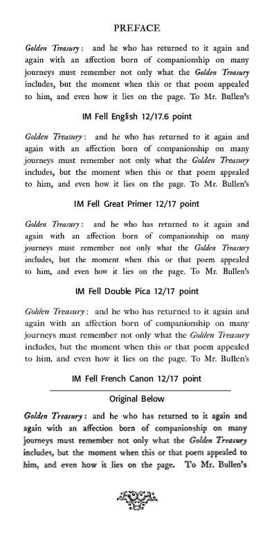
An Example. The Oxford Book of English Verse (Arthur Quiller-Couch, Oxford: The Clarendon Press, 1925) is an excellent example of the Fell typefaces being used in publication.
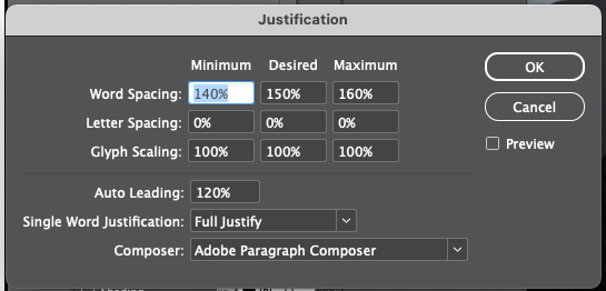
The original paragraph is at the bottom of the sample, with Igino Marini Fell typefaces shown. Which face is closest to the original paragraph from the Oxford Book?
The Fell English face looks close but note the italic "T" on "Treasury." The Great Primer or Double Pica faces are closer to the original. In order to set the letter and word spacing appropriately, I used Adobe InDesign's Justification settings as below.
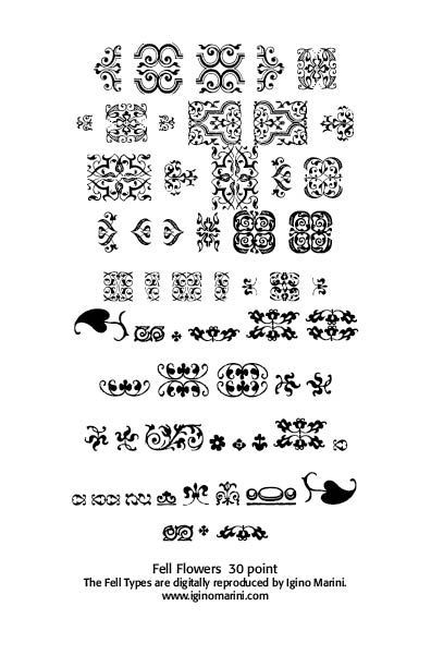
The Fell Flower is not from Igino Marini's Fell Flowers fonts but rather from CARE Typography's rendering of the concluding flower at the end of The Oxford Book.
Fell Language Fonts
Fell Greek Types
One of the most important scholarly assets of the Fell collection were Great Primer Greek, Pica Greek and smaller Greek sizes. The outstanding characteristics were dense, compact forms, extensive ligatures, polytonic diacritics and scholarly rather than literary tone. These Greeks were essential for classical and theological publishing at Oxford.
George Matthiopoulos notes that “in the 18th century, during the era of the cultural Enlightenment and aesthetic innovation in Europe, several University scholars, publishers and printers started increasingly the simplification of the Greek texts and the retiring of the old-style Greek fonts. By the beginning of the nineteenth century, cutting and typesetting the numerous Byzantine ligatures were abandoned altogether and a new stylistic paradigm appeared for the Greek scholarly editions in England, France and Germany.
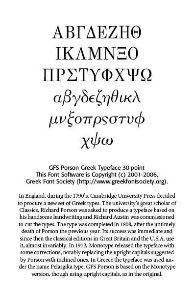
Predictably, it followed the prevailing neoclassical fashion of maximum contrast between thick and thin strokes of their contemporary Latin fonts. Cambridge University Press commissioned a mildly oblique font based on Prof. Richard Porson’s much admired hand-writing, Firmin Didot introduced an upright, round Greek font in Paris and Karl Tauchnitz in Leipzig reprised with his also round, but excessively inclined letterforms; those three distinct styles became the almost exclusive Greek type used in each respective country until the mid-twentieth century for every philological, archeological or theological edition.”[2]

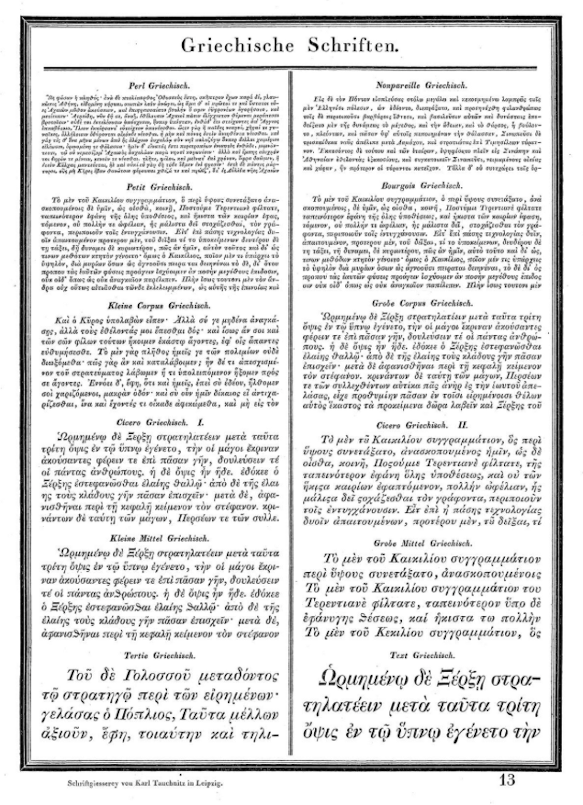
Karl Tauchnitz in Leipzig Sample Greek Texts
Gerry Leonidas notes on the typographical structure of the Porson face that “the design was a radical departure from contemporary styles—the curves are simplified and the structure and alignment of characters more regularized. The modulation of the strokes is more consistent, and there are some new interpretations, like the lunate epsilon, the kappa and the simpler circumflex. The terminals are varied: some taper, some end in drop-like bulbs, and some are sheared. The design is somewhat inconsistent in the balancing of white regions, both in closed counters and around open characters like the lambda. Appropriately for this style, there were no ligatures or contractions. Porson’s design showed the way forward for the next generation of Greek typefaces, re-stating the case for abandoning the grec-du-roi influence and regularizing the strokes of letterforms. It was widely copied (and modified) and still enjoys considerable success, albeit within Greece only for shorter runs of text.” [3] (For more on the development of the Greek font, SEE Blog It’s Greek To Me!, March 18, 2023)
Fell Hebrew Type was designed for biblical and theological scholarship. The letters have compact square forms, clear consonantal structure, and is optimized for learned readers rather than decorative use. Fell Arabic Type was rare and ambitious for its time, an early attempt at Arabic typography in England. It offered limited calligraphic sophistication.
Fell was motivated to “help pass on the knowledge and criticism that lived on the printed page.” Under his direction, the house published many classics of philosophy, philology and literature and the typography used in these early publications became known as the Fell types. Fell hired the best typographers and printers of the day from Holland, Germany and France and declared that “The foundation of all successe must be layd in doing things well, and I am sure that will not be don with English letters” (to Jenkins, 2 Dec. 1672).[4]
“The Fell types are now the pride—or one of the “prides”—of the Clarendon Press. Their revival was of real importance in modern printing. The Oxford Book of English Verse, the volumes in the Tudor and Stuart Library, the Trecentale Bodleianum of 1913, and the Catalogue of the Shakespeare Exhibition held in the Bodleian Library to commemorate the Death of Shakespeare (Oxford, 1916) are familiar examples of their admirable and effective modern use.”[5]
In conclusion, the Fell Types were a typographic archive, not a unified family. They were central to the history of English scholarly printing and offered a bridge between Renaissance type traditions and later British typographic refinement. They reward readers who value texture, rhythm, and historical authenticity over neutrality.
Sources
1. https://luc.devroye.org/fonts-43049.html
2. George D. Matthiopoulos, “Preserving Type Heritage: A Primer of Greek Typography, typeroom.eu, March 12, 2025)
3. Gerry Leonidas, A Primer on Greek Type Design, https://atypi.org/about-atypi/publications/type-journal/a-primer-on-greek-type-design/
4. https://www.sessions.edu/notes-on-design/type-in-history-the-fell-types/
5. https://www.c82.net/printing-types/chapters/21 — Revivals of Caslon and Fell Types, Chapter XXI, From Printing Types by Nicholas Rougeux.
Successful Layout & Design