Advances in Typography (1500–1900): A Historical Sketch (Part 1)
Advances in Typography (1500–1900)
A Historical Sketch (Part 1)
Early Renaissance (1500–1550)
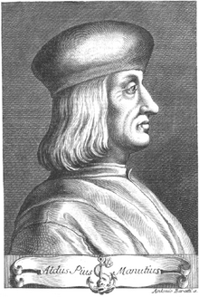
We had noted in the Blog “What Happened After Gutenberg: 1460–1640” (November 8, 2025) that movable type spread across Europe beyond its German roots. Gothic Blackletter type, though still used for religious and legal documents, began to give way to Venetian old style humanist faces. Influenced by humanist handwriting and calligraphy, Aldus Manutius and Francesco Griffo developed italic type for compact books. National printing centers became established in Venice, Italy, Paris and Lyon, France, Basel, Germany and Antwerp in the Netherlands
The transition from Gothic to Italic typefaces was part of the broader evolution of typography that took place during the Renaissance period, driven by shifts in cultural, aesthetic, and technological factors.
The Renaissance, beginning in Italy in the fourteenth century, marked a revival of classical antiquity and a move toward humanism. This brought a renewed interest in the legible, flowing scripts of Roman and Greek antiquity, which were more readable and aesthetically simple compared to Gothic lettering. The development of the printing press (ca. 1440) by Johannes Gutenberg created a need for more versatile and legible typefaces. The emerging humanist values aligned with a preference for typefaces that resembled the clear, round, and graceful writing of ancient Roman scripts.\
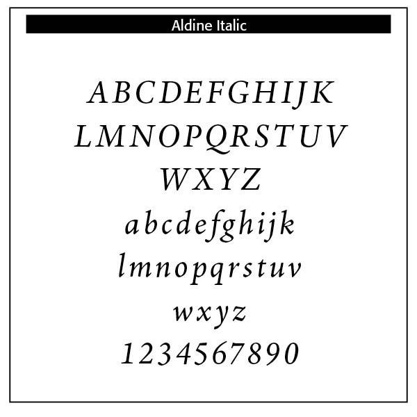
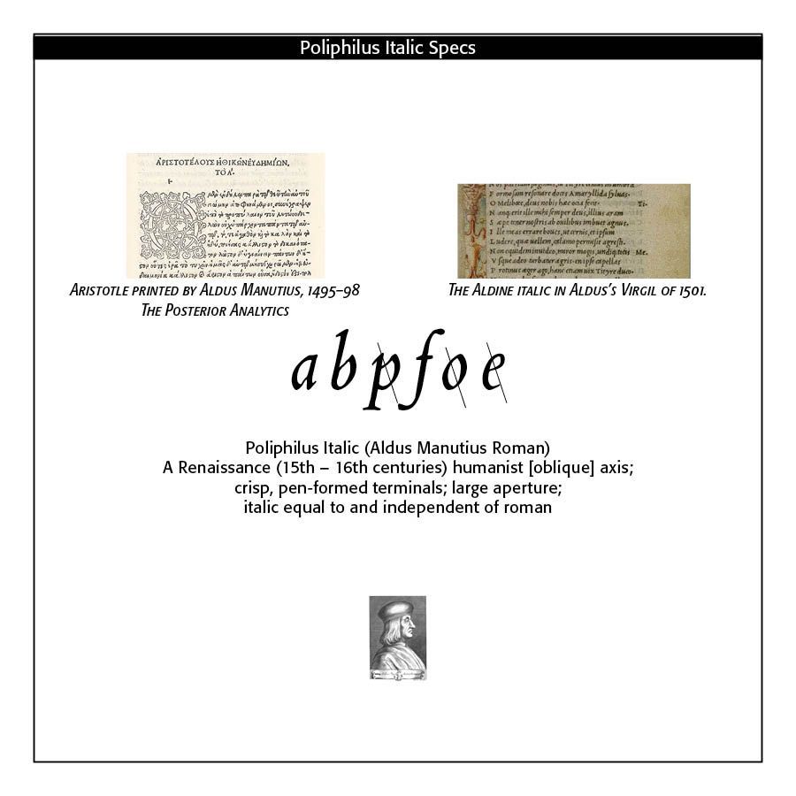
The Italic typeface was introduced by Aldus Manutius in Venice around 1501. Italic type is a cursive font based on a stylized form of calligraphic handwriting. Along with Blackletter (See Blog Jan 16, 2025 Blackletter Type and Universities) and roman type, italic has served as one of the major typefaces in the history of Western typography.
Italics takes notable influences from hand drawn calligraphy, with italic letters normally slanted slightly to the right. Upper case letters may have typographic swashes, flourishes inspired by ornate calligraphy. The name “italic” comes from their Italian use, to replace documents traditionally written in a hand-written style called chancery hand. Notice also the small “end point bowls” on some of the letters, where the ink pen stopped for a second.
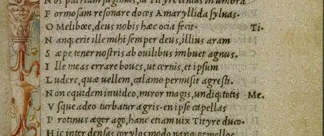
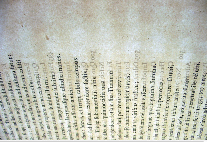
While modern italics are often more condensed than roman types, historian Harry Carter describes Manutius' italic as about the same width as roman type. To replicate handwriting, Griffo cut at least sixty-five tied letters (ligatures) in the Aldine Dante and Virgil of 1501. Italic typefaces of the following century used varying but reduced numbers of ligatures.
Manutius sought to create more compressed elegant typefaces that could fit more text on a page, catering to the rising demand for smaller, portable books. Italic was based on the handwriting of Niccolò de’ Niccoli, a Renaissance scholar and calligrapher. Italic typefaces are defined by their slanted, cursive-like appearance, with letters that have a flowing, dynamic quality. It allowed for more text to be fitted on the page and mimicked the handwriting style of humanist scholars, like the handwriting of Petrarch.
The common italic “slope” was introduced in the sixteenth century — “The first printer known to have used them was Johann or Johannes Singriener in Vienna in 1524, and the practice spread to Germany, France and Belgium. Particularly influential in the switch to sloped capitals as a general practice was Robert Granjon, a prolific and extremely precise French punchcutter particularly renowned for his skill in cutting italics. Vervliet comments that among punchcutters in France "the main name associated with the change is Granjon's.” (Wikipedia on Italic Type)
The insertion of an italic typeface alongside a roman face would wait until later to distinguish portions of a book not properly belonging to the work, such as introductions, prefaces, indexes, and notes; the text itself being in Roman. Later, it was used in the text for quotations ; and finally served the double part of emphasizing certain words. Italic type was not only more elegant than the Gothic but also more efficient in terms of space. It became the preferred choice for printed texts that emphasized classical learning, philosophy, poetry, and humanist literature. Italic was initially used for entire texts but later became more common for emphasis alongside Roman type.
Aldine Italic type does make an appearance in a much larger folio edition of 1500: The Epistole of St. Catherine of Siena, set within a beautiful woodcut illustration (not so the feet) of St. Catherine herself. The italic appears printed across the open book and heart in either hand. Interestingly, the book was commissioned by Margherita Ugelheimer, widow of Peter Ugelheimer, former business partner and close friend to Nicholas Jenson (https://ilovetypography.com/2014/11/25/notes-first-italic/)
Bringhurst notes that “Early italic fonts had only modest slope and were designed to be used with upright roman capitals. There are some beautiful fifteenth-century manuscript italics with no slope whatsoever, and some excellent typographic versions, old and new, that slope as little as 2° or 3°. Yet others slope as much as 20°. . . . Renaissance italics were designed for continuous reading, and modern italics based on similar principles tend to have similar virtues. Baroque and Neoclassical italics were designed to serve as secondary faces only, and are best left in that role. Sloped romans, as a general rule, are even more devotedly subsidiary faces. Their slope makes sense only as a temporary perturbation of the upright roman. (Bringhurst, The Elements of Typographic Style, 54–56)
The characteristics of the Renaissance italic letter can be summarized as follows (Bringhurst, 114)
• stems vertical or of fairly even slope, not exceeding 10 degrees
• bowls generally elliptical
• light, modulated stroke
• humanist axis (slanted axis)
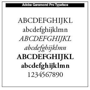
An amazing 111 Garamond typefaces are sold by Linotype alone, including the Stempel, Adobe, EF, #3, IC and BE families Other implementations include Garamont Amsterdam by Scangraphic, and the URW Garamond family (1983).
This period saw the growth of typefounding as an independent trade separate from printing. Garamond’s old style typefaces spread across Europe.
Late Renaissance (1550–1600)
Claude Garamond (1499–1561), whose romans and italics became European standards, a French type designer, publisher and punch-cutter, worked with the typefounder Geoffroy Tory by 1520. His old style roman fonts, cut from 1531 onward, surpassed the existing romans of the period in grace and clarity.
His Greek type set the pattern for Greek printing until the early nineteenth century. His first type is uded in the book, Paraphrasis in Elegantiarum Libros Laurentii Vallae by Erasmus. In 1540, King Francis commissioned Garamond to cut a Greek type. After Garamond’s death in 1561, Christophe Plantin from Antwerp, along with the Le Bé type foundry and the Frankfurt foundry, Egenolff-Bermer, acquire many of Garamond’s original faces.
Early Baroque (1600–1700)
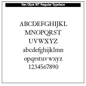
Transitional influences began in typography with increasing standardization in letterforms and punctuation. Dutch typefounders, the Elzevirs and Christoffel van Dijck, create slightly darker, more compact romans which are used widely in scholarly publishing. Greater contrast appears between thick and thin lines with more vertical stress.
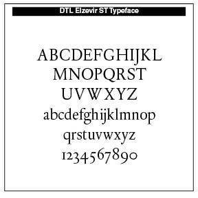
Christoffel van Dijck (died 1669) was a German-born Dutch punchcutter and typefounder. Van Dijck's type was widely used at a time when Amsterdam had become a center for printing. Van Dijck became the most prominent type-founder of his time in the Netherlands, cutting type in roman, italic, blackletter, Armenian, music type and printers’ flowers. Van Dijck worked in a style later described by Fournier as the goût Hollandois or Dutch taste which favored darker type on the page and stronger contrast than earlier types in the Garamond style from the French renaissance. Digital recreations include DTL Elzevir (1992) and Custodia (2002–06). DTL Elzevir (Gerard Daniels) is based on a study of several cuttings from Christoffel Van Dijck. Dutch Type Library mentions that it is mainly based on the Augustijn Romeyn, a cut found on a 1682 type specimen issued by Daniel Elsevier's widow (hence the name DTL Elzevir) showing some typefaces from Van Dijck and others.
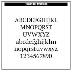
Gerard Unger's Hollander (1983) is based on a study of the typography used in seventeenth century books using typefaces cut by van Dijck and possible Dirck Voskens. OurType's Custodia, designed by Fred Smeijers, is a single-weight roman, with italic and matching small caps, with a seventeenth-century flavor. It was made in 2002 for use in the publications of the Custodia Foundation. Dutch Textura (1681), in versions called Augusteyn Duyts and Mediaen Duyts.
Enlightenment and Transitional Types (1700–1780)
In this period, typography becomes more rational and geometric. Transitional typefaces emerge, like John Baskerville’s high contrast type with sharp serifs and on smooth paper with improved printing ink.
A major typographic contribution in this age came from Romain du Roi (the King’s Roman”). Developed in France in 1692 and commissioned by Louis XIV, this typeface reveals a distinct shift in style, with an increased emphasis on verticality and increased contrast between thick and thin elements, a style that influenced the Transitional typefaces of Pierre Simon Fournier and John Baskerville.
The Romain du Roi was the result of rational, carefully grid-crafted designs. The capital letters were drawn on 8×8 grids, the lowercase letters on rectangular grids. The committee's designs were engraved by Louis Simonneau. Punches for the metal type were cut by Philippe Grandjean, who took some liberty with his type, to moderate the cold geometry of the designs. The type was first used for Médailles sur les principaux événements du règne de Louis le Grand.
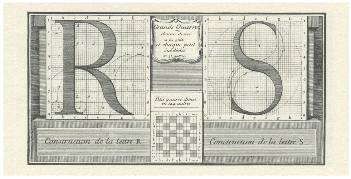
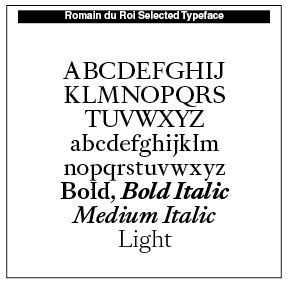
The Romain du Roi had serifs on both left and right sides at the top of ⟨b, d, h, i, k, l⟩. ⟨l⟩ had an extra serif to the left at the mean line to distinguish it from capital ⟨I). It has 108 variations, with Thin, High, Light, Medium, Bold and all the Italics. A sample is noted here. Precision and poetic elegance moves us typographically forward in these faces.
A commission consulted the most beautiful books, the authoritative manuals, as well as many collections and type specimens, identifying the best that has been done since the origins of the printing press. It examined the incunabula of Mainz, Rome, Venice, Paris, the most beautiful printed books of the Angelier, the Estienne, the Wechel, the Elzevier, the theoretical treatises of the géométriciens de la lettre (letter geometricians)— Luca Pacioli, Sigismondo Fanti, Albert Dürer, Geoffroy Tory, Ludovico degli Arrighi, contemporary calligraphic collections, such as those of Louis Senault and Jean-Baptiste Alais, and so forth. The committee was particularly concerned with measuring the proportions between the different sizes of letters, following a numbering system very close to the typographic point. The proportion of the letters in their width is also the subject of precise calculations, apparently referring to the Romans of Jannon4 in large sizes owned by the Imprimerie royale. (https://typofonderie.com/gazette/le-romain-du-roi-the-exclusive-typeface-of-louis-xiv)
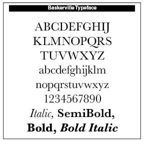
John Baskerville (1706–1775), an English businessman, invented “wove paper,” considerably smoother than “laid paper” and allows for sharper printing results. Such paper is a paper type in which papermakers would weave materials like thin brass wires together to form a mesh. They would then cast the paper pulp onto the woven mesh.
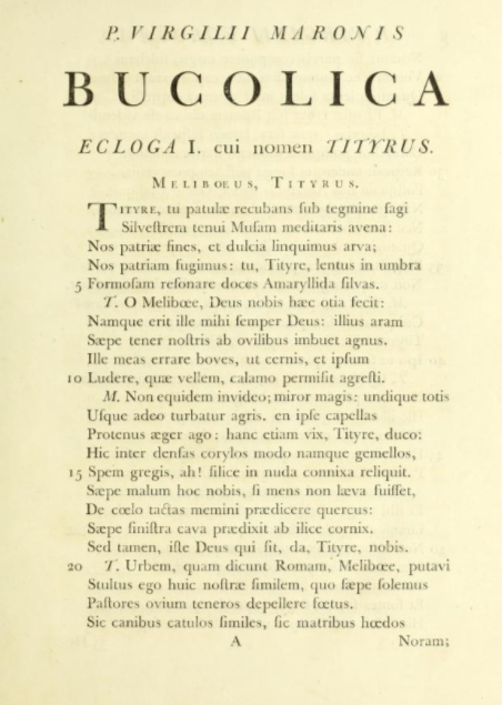
Baskerville took seven years to complete his first book, an edition of Virgil. His typefaces, admired by Benjamin Franklin, added wide margins and leading between lines. He was appointed printer to the University of Cambridge in 1758. Although an avowed atheist, he printed The Book of Common Prayer in 1762 and a folio Bible in 1763.
Virgil, Publii Virgilii Maronis Bucolica, Georgica, et Aeneis (Birminghamiae: Typis Johannis Baskerville, 1757 [i.e. 1771]).From Princeton EDU
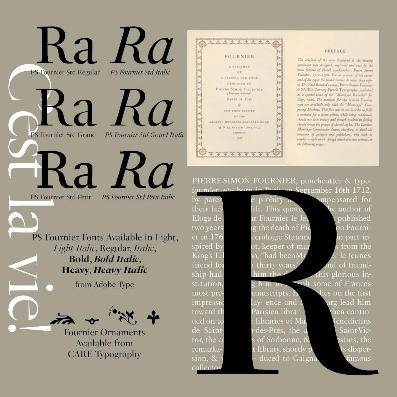
In our history of typography series, Pierre-Simon Fournier (1712–1768) was a French typographer and type designer, renowned for his contributions to the field of typography in the 18th century. He is best known for his work in creating typefaces that reflected the elegance and sophistication of the time.
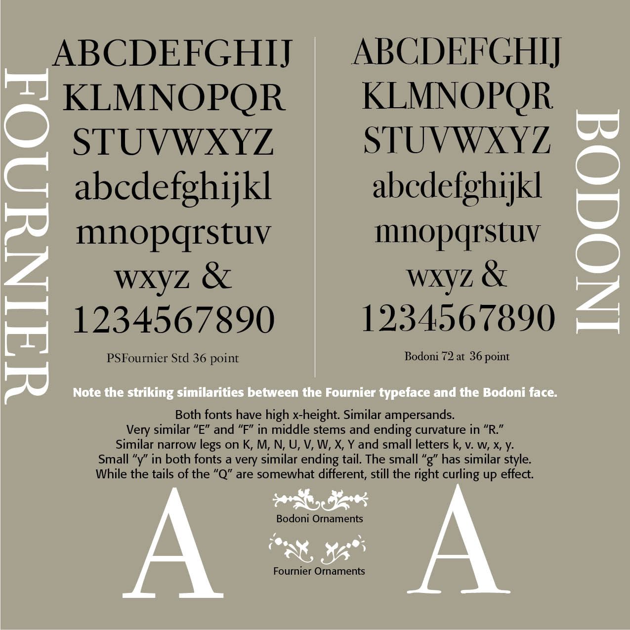
Fournier's work in type design focused on creating typefaces that were both visually appealing and functional. His types were characterized by their clarity, beauty, and legibility. The typeface Fournier is an aristocratic roman typeface. It is transitional, almost modern, in character, with a distinct French flavor, but with more grace and style than traditional French oldstyle designs. This modern character influenced the later work of Bodoni.
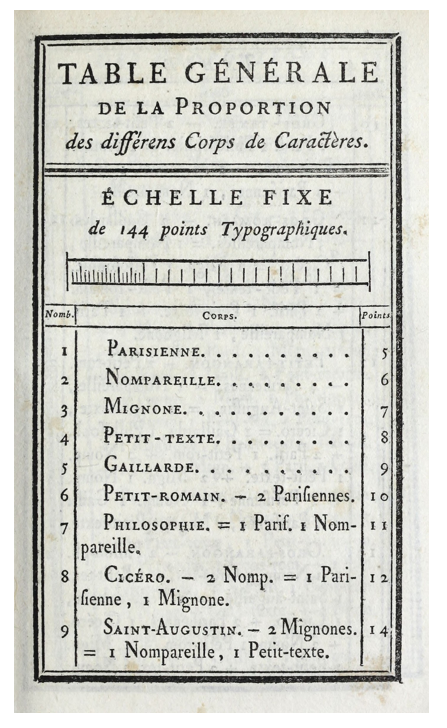
One of Fournier's significant contributions to typography was his establishment of a typographic point system. He invented a system that standardized measurements for type, which provided consistency and made it easier for printers to produce high-quality texts. This innovation helped printers achieve consistency in their work. Fournier published a seminal work in the history of typography titled Manuel de la Typographie (Manual of Typography, two volumes published in 1764 and 1766), which included detailed descriptions of his typefaces along with examples.
The Neoclassical/Modern Era (1780–1850)
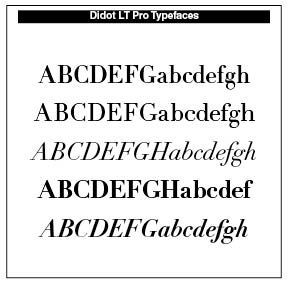
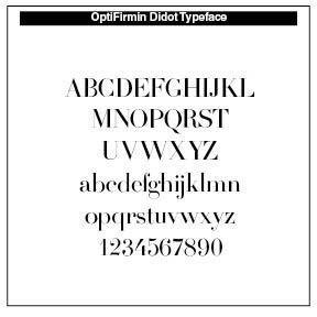
This has been called the Didone era in typography. Type now took on extreme contrast, with flat unbracketed serifs and vertical stress. Key designers of the period were Firmin Didot from France and Giambattista Bodoni from Italy. The style reflected Enlightenment rationalism and early industrial aesthetics. These faces became popular in fine press printing and luxury books.
Firmin Didot (1761–1853) assumed responsibility for his father’s, Francois–Ambroise Didot’s (1730–1804), typefoundry. Francois-Ambroise “altered the standard of type design by allowing greater contrast between thick and thin letters. He improved upon the Fournier standard of measurement for punch cutting and mold making; the Didot point system of 72 points to the French inch became the standard unit of type measurement.” (Britannica)
Firmin designed the Didot typeface. He also invented stereotypes (plates cast from printing surfaces) and was thus able to publish low-priced editions of French, Italian, and English books. Napoleon appointed him director of the imperial foundry, a position he held until his death.
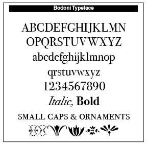
Bodoni printed many important works, the most famous of which were his fine editions of the writings of Horace and Virgil in 1791 and 1793, respectively, and Homer’s Iliad in 1808.
Giambattista Bodoni (1740–1813), the son of a printer, went to Rome, serving an apprenticeship at the press of the Congregation for the Propagation of the Faith, the missionary arm of the Roman Catholic church. “He was gradually won over to the typographical theories of a French printer, Pierre Didot, however, and by 1787 was printing pages almost devoid of decoration and containing modern typefaces of his own design.
The typeface that retained the Bodoni name appeared in 1790. Of the many books that he produced during this period, the best known is his Manuale Tipografico (1788; “Inventory of Types”), a folio collection of 291 roman and italic typefaces, along with samples of Russian, Greek, and other types.” (Britannica)
SOURCES
- Firmin Didot in Britannica
- Roman du Roi in https://typofonderie.com/gazette/le-romain-du-roi-the-exclusive-typeface-of-louis-xiv AND https://en.wikipedia.org/wiki/Romain_du_Roi
- Baskerville in https://en.wikipedia.org/wiki/John_Baskerville AND https://productiontype.com/article/john-baskerville-1706-1775
- Van Dijck in https://en.wikipedia.org/wiki/Christoffel_van_Dijck
- Garamond in https://luc.devroye.org/fonts-26351.html) AND https://en.wikipedia.org/wiki/Claude_Garamond)
- Italics in https://luc.devroye.org/fonts-30540.html AND The Printers’ Handbook of Trade Recipes, Hints & Suggestions Relating to Letterpress and Lithographic Printing, Bookbinding, Stationery, Engraving, Etc., compiled by Charles Thomas Jacobi, London, 1891, AND Talbot Baines Reed, A History of the Old English Letter Foundries (London, 1887) AND Theodore Devinne, The Practice of Typography (New York: The Century Co., 1902) AND Wikipedia on Italics and https://en.wikipedia.org/wiki/Aldus_Manutius AND https://ilovetypography.com/2014/11/25/notes-first-italic/ AND Bringhurst The Elements of Typographic Style 1992 edition, Hartley & Marks, Vancouver B.C.
Successful Layout & Design


