Blog

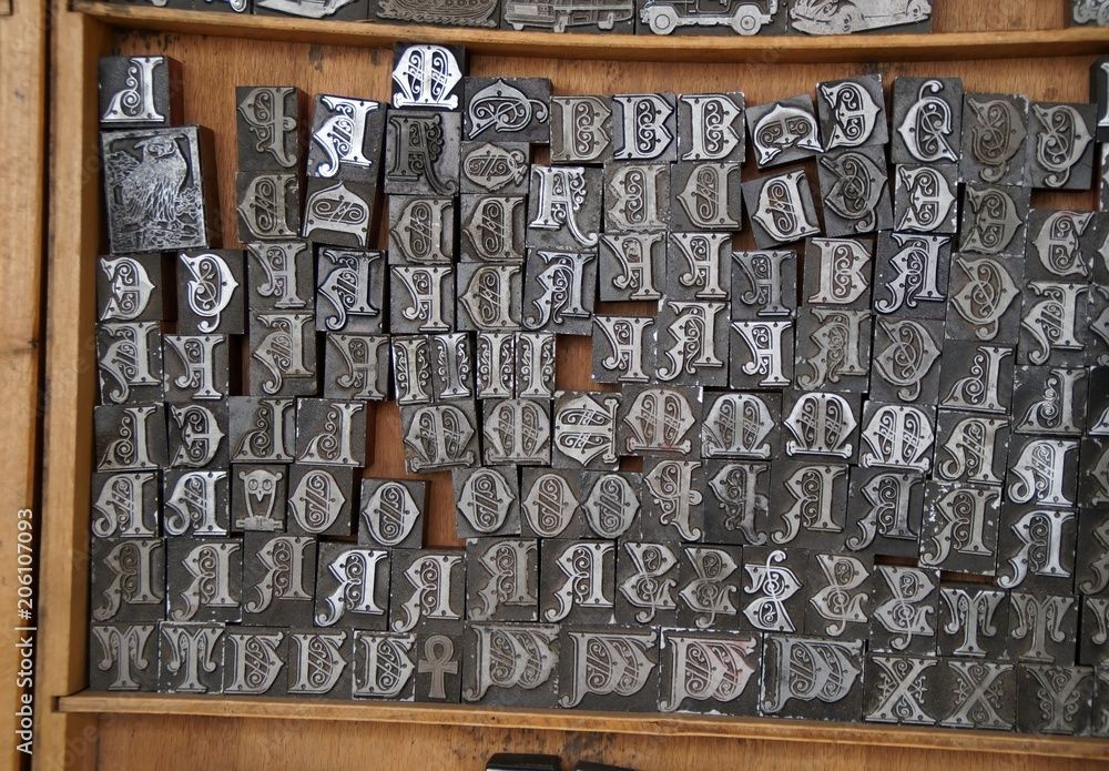
Compositors & Type: Origin and Use of “Uppercase” and “Lowercase” Carl Shank, CARE Typography Most everyone knows what “uppercase” and “lowercase” letters are. They refer, of course, to our “capital” letters and our “regular” small print. But not many know why or how they came to be known by such terminology. The answer is found in the history and development of typography and printing. “Case” here doesn’t refer to “circumstance” or “condition.” It refers to the wooden trays used to store metal letters, the top case for capital letters (“uppercase”) and the lower case for small letters. Each tray was divided into compartments to hold the type. The lower case also held the punctuation marks and other pieces of type, like “spacers.” The type case was a shallow wooden tray divided into compartments of various sizes. There were about thirty styles of type cases, and some of these were made in different sizes.[1] The most common, or standard, size was 32¼ by 16 inches, outside dimensions, and ⅛ inches deep, inside. One of three traditional plans or schemes for such type cases involved (1) all characters in one case; (2) capitals, small capitals and a few other characters in one case; or (3) the small letters, figures, points, spaces and quads in another case. The two latter cases formed a pair and would nearly always be used together.(See Images) Hand compositors (or “swifts”) would take individual letters, spaces and punctuation marks or other characters from the type case and place them in what was called a composing “stick” in such a manner that when the type characters are properly assembled, they form words, sentences and paragraphs. The work of the press room compositor was divided into two fundamental operations — the “setting” of type and the “unsetting” of type. The former was called composition and the latter, distribution. A visual example of such typesetting can be seen in some of the episodes of The Waltons, an American historical dramatelevision series about a family in rural western Virginia in the Appalachian/Blue Ridge mountains chain, during the economic hardships and mass unemployment of the Great Depression in the 1930s and the subsequent United State home front during World War II in the 1940s. The series aired from 1972 to 1981. John-Boy, a leading character of the series, opened a print shop in a shed by the family home with an old-fashioned mechanical printer that required setting cold metal type from a type case. His brother was the compositor while John-Boy ran the printing machine.

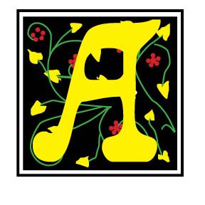
Reading through an old volume of Frederick Nelson Phillips, Inc, Type Faces:With Which We 'Prove It With Proofs' in Typography for Advertisements (New York, 1924), I came across some type that falls outside of the standard typography models, called "vanity type." The term “vanity typography” is not a formal category in typographic history like Old Style, Transitional, Modern, or Sans Serif. Designers typically use the phrase informally to describe typography that draws attention primarily to itself rather than serving the text or reader. Vanity typography occurs when type is used as a display of the designer's skill, fashion, or personal taste rather than to improve communication. Readability is sometimes sacrificed for self-expression and artistic flair. Such type styles use excessive ornamentation, decorative letterforms, overuse of effects like shadows, outlines, gradients and distortions, unusual spacing, and generally typography used to impress rather than inform. Notice in the sample by Phillips, the different "A's," "F's,", "G's," "H's," "L's," "M's," "S's," T's" and "W's." This is not calligraphy lettering, but rather type that could have been used for verses or opening letters to paragraphs or stories.
Puritan Typography Theology Informing Type “Creational realities have not spilled out randomly without purpose; rather, they reflect the wisdom, design, and intention of the good God who made them. It’s our job, then, to observe and learn. . . . And indeed, long before [Jonathan] Edwards began to keep his notebook of earthly pointers to heavenly truths, the seventeenth-century English Puritans were writing lengthy volumes organized around exactly this sort of principle.”[1] “The Puritans were a group of ministers and laypeople within the Church of England who sought to promote Reformed and experiential piety while striving to purify the national church from Roman Catholic influences in doctrine and worship, beginning during the Elizabethan era and continuing as a powerful force until the early eighteenth century. More broadly defined, the Puritan movement included those who were firmly within the Reformed and experiential tradition that flourished not only in sixteenth- and seventeenth-century England, but also well into the eighteenth century north of Hadrian’s Wall (among the Scottish Presbyterians), across the North Sea (among the Dutch Further Reformation divines), and across the Atlantic Ocean (among the New England Puritans and eighteenth-century evangelicals).” [2] Puritan typography flows from Puritan theology. The English Puritans of the sixteenth and seventeenth centuries inherited a typographic world shaped by the late Renaissance, the Reformation, and early modern printing. Their type styles were not merely aesthetic choices. Rather, they reflected theology, scholarship, readability, economy, and cultural identity.
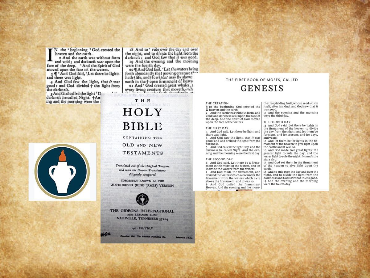
The King James Bible (KJV), commissioned by King James 1 in 1604 and published in 1611, has been a profound Bible translation and masterpiece of beauty through the ages. It has been one of the most influential English translations of the Bible. Its history combines politics, religion, and literary achievement in early modern England. It has an elevated, poetic style that influenced many later writers. It has been prized for its literary beauty, historical continuity and memorability in public reading and worship (ChatGPT).

Responding to AI and Digital Babylon H. Carl Shank April 4, 2026 Austin Gravley, a former Social Media Manager of The Gospel Coalition, and now the Director of Youth Ministry at Redeemer Christian Church in Amarillo, TX, is writing a book on AI and the digital revolution taking place. He compares this Digital Babylon and its captivity and its exiles to Christians living under the overwhelming influence of an active anti-Christian developing AI. Piecing together his comments with those of many others on the advancing scene of AI on our lives, several themes come to mind. First, AI is not God. While there are some in the Silicon Valley who might wish or see AI as a unifying, ontological force that can shape or rule our lives — the Super Machine —others remind us that this is only technology. And as advanced as AI is and becomes, God is still sovereignly in control of it and our lives. Jason Thacker, professor of philosophy and ethics at Southern Seminary and Boyce College, writes — “We must engage these issues, rather than respond after their effects are widely felt. But we don’t have to face today or tomorrow with fear. God is sovereign and his Word is sufficient for every good work, so we are able to walk with confidence as we apply his Word to these challenges with wisdom and guided by his Spirit.” ( The Age of AI: Artificial Intelligence and the Future of Humanity , Zondervan, 2020) A recent storm that darkened my community and scuttled Internet services reminded me of that. Even AI data centers, growing to over 3,000 in 2025 nationwide, are not immune to power disruptions and total blackouts. AI pundits may claim to have control procedures to keep the Internet and AI running cannot promise it to be so. We need to keep this in mind in the Digital Babylon age, as was needed to be kept in mind by Israel in the Babylonian Empire age in biblical times. Babylon went through many iterations, but will be defeated by God at the end of the day, as noted in Revelation. Digital Babylon will experience the same demise. This is not prediction, just Bible truth. We as believers need to hold on to such truth. Second, AI is still technology. Indeed, advanced and advancing technology, but not human. Matthew Schultz in a recent mereorthodoxy.com article notes— “Technology has existed since the Garden and is an integral component of our cultural mandate. We should also remember that one of the core distinctions between the Creator and his creatures is that we never create matter but merely (!) rearrange it. This becomes clear whether we consider an ancient farmer in Mesopotamia irrigating a plot of soil, a medieval peasant in Northumbria weaving a basket from flax, or a young musician in London taking the raw outputs of machine sound, adjusting its pitch, volume, and length, and incorporating it into a DAW loop. While there are all sorts of important distinctions and qualifications between pre- and post-industrial craft, there is no metaphysical distance between the two.” ( Artificial Intelligence Is A Technology , Feb. 26, 2026). AI may be the harbinger of a new Industrial Age, but though changes will be major and sometimes severe, the human side of the equation cannot be discounted or counted out. Part of my retired status as a pastor and theologian is that of a typographer restoring old type faces and doing a deep dive into the history of type. Two historical typographical truths stand out. Although the Renaissance age brought movable type from Gutenberg and others into the machine age, the typographical flair of those ancient scribes with pen-drawn exquisite type remained a stylistic standard. The second note is that with the Industrial Age, while affecting the quantity and speed of type development and printing, master type craftsmen rebelled against machine driven type for more organic typefaces. This was seen, for instance, in the type movement spawned by William Morris (1834–1896). William Morris was an Arts & Crafts designer who founded the Kelmscott Press (1891), reviving hand craftsmanship in printing. His work influenced the twentieth century private press and type revival movements. Lettering became a vehicle for breaking convention. Led by figures such as Morris, there was a decided reaction against industrialization, seeing machine-made goods as dehumanizing and ugly. Handcraftmanship, honesty in materials and utility fused with beauty made up much of what was called the Arts & Crafts Movement. That movement was rooted in medieval guild ideals and morality in design. (For an expanded history of type development, see “Advances in Typography: A Historical Sketch — Three Parts” in the blogs by CARE Typography, www.caretypography.com , Nov. 8, 2025, Nov. 18, 2025 and Nov. 20, 2025) Third, AI affects everyone everywhere. Austin Gravely, a former Social Media Manager of The Gospel Coalition, raises and answers the query — “’So what?’, you may think. ‘I’m not an Internet technician. I’m not a fan of AI. I’m not planning to change how I use the Internet. Why does any of this matter to me?’ To put it bluntly: you are naive if you think these disruptions won’t directly affect you, or indirectly affect you through the effect they will have on others. If the iPhone, social media, and AI have taught us anything, it is that you are impacted by these events regardless of whether you participate in them or not.” ( The State of the Internet: 2026 , mereorthodoxy.com, March 30, 2026) He goes on to say — “A changing Internet will change you. It will change you in ways you can see and in ways you can’t. It will change those you live with, work with, play with, build with, and fight with. It will change what is possible, probable, permissible, and prohibited in your life, your vocation, your church, your neighborhood, and any other physical space the Internet touches.” I recall my 99 year old mother who passed away a couple of years ago in a nursing facility. She was one of those survivors of the Great Depression and World War Two who dismissed the first moon landing and had her flat screen TV removed from her room for fear the government was watching. She lasted for nine years in the same private room in a modern nursing center. She was attended by doctors and nurses and staff who used AI on their computers and other care devices. She even had a modern digital phone removed from her room and refused to learn it. While she personally rebelled against her AI driven machine age, she could not escape those who used such technology for her care. We cannot isolate ourselves from AI and its advancing development, no matter how isolated we try to be. Fourth, AI can be either a blessing or a curse. Again, Matthew Schultz notes — “Our task is not to develop a unique theology of AI but to catechize our members into a people who can wield this technology without becoming captive to its internal logic. Like alcohol, artificial intelligence will become a test of character, a dangerous good that divides the foolish from the wise.” He says “Yet the greatest danger is both more pervasive and less obvious: AI is much more likely to be deployed as a multiplicative layer that allows ever more efficient micro-targeting of digital services and physical products by industries that already profit from compulsive behavior. The advent of hyper-personalized, real-time engagement strategies will require legislative safeguards, especially if AI leads to video advertisements generated in real time for an exhaustively mapped individual profile.” We must seek to “humanize” AI and employ it “humanly.” We must resist the phenomenological bent toward unbelief in AI development and pressures. We must once again learn to think critically and pervasively and biblically about AI. Our young people must be taught prescriptive critical thinking practices, rather than unwittingly and ignorantly giving in to what their phones and computers spit out. Church and ministry pastors must pastor rather than let AI bots plan, prepare and even give their sermons. We must learn to smartly negotiate with the “Magnificent Seven”— Apple, Microsoft, Alphabet, Amazon, Meta, Nvidia and Tesla — rather than blindly following their lead. Convenience and speed must not be allowed to overtake and overcome careful, sustained and critical thinking and acting. “To give language to this change, we must take the best of Christian thinking regarding the social and political imaginary and apply it to the economic imaginary of life under the glowing shores of Digital Babylon, and that kind of work cannot be done with quick hot takes. It will take slow, deep, and thoughtful meditation to apply the riches of Christian thought to making sense of the companies that got us here and where they are taking us.” (Austin Gravley, The State of The Internet: 2026 ) I am both excited and wary of AI. I have learned to be much more cautious about social media and the videos and photos and information they give. Much of it has been and is being AI produced and tweaked. Spammers use AI technology to wrest thousands of dollars from unsuspecting senior citizens. Schools are requiring students to turn off their cell phones or “bag” them until after school hours because of the insidious nature of AI generated stuff. I value more and more of a face-to-face approach in teaching and learning and mentoring others. And we must adopt a state of “believing is seeing” rather than a non-Christian scientifically sanctioned “seeing is believing” approach to truth and justice.
Type Details Matter: Typos & Fractions Carl Shank March 31, 2026 “The practice of typography, if it be followed faithfully, is hard work — full of detail, full of petty restrictions, full of drudgery, and not greatly rewarded as men now count rewards. There are times when we need to bring to it all the history and art and feeling that we can, to make it bearable. But in the light of history, and of art, and of knowledge and of man’s achievement, it is as interesting a work that exists—a broad and humanizing employment which indeed can be followed merely as a trade, but which if perfected into an art or even broadened into a profession, will perpetually open new horizons to our eyes and new opportunities to our hands.” (“Thoughts Upon A Typographic Custom,” Alexander S. Lawson, Electronic Publishing , January 28, 1994) Such detail and “petty restrictions” are to be found in the consideration and history of typographic errors (typos) and the use of fractions. In my March 23, 2023 blog I noted that we need more than a spellchecker. Spell checkers are great. They help us in busy offices doing busy tasks everyday. EXCEPT they cannot correct errors of statement or errors of typography. Grant Weisbrot of New York City has noted that "it is impossible to efficiently proofread without a knowledge of typesetting and printing procedures." ("The Typographic Eye: Proofreading," Electronic Publishing , May 13, 1994) Thus, the note to “raise the register mark and close up the space” in an article is translated by the typographer to “kern the register mark five units and raise it 1¼ points.” He gives some examples of errors of statements — spelling when letters are missing, like "he" for "the;" spelling in a piece published in Britain, like "color" for "colour;" using a correctly spelled word in a wrong way, like 20 carat gold (carat is a diamond weight, karat is an alloy of gold, caret is an insertion mark, and carrot is a vegetable); awkward sentence structure, incorrect or inconsistent capitalization, ungrammatical or awkward sentence structure, failure to apply indents or hangs when suitable, and errors of fact, like the kangaroos of Tibet.
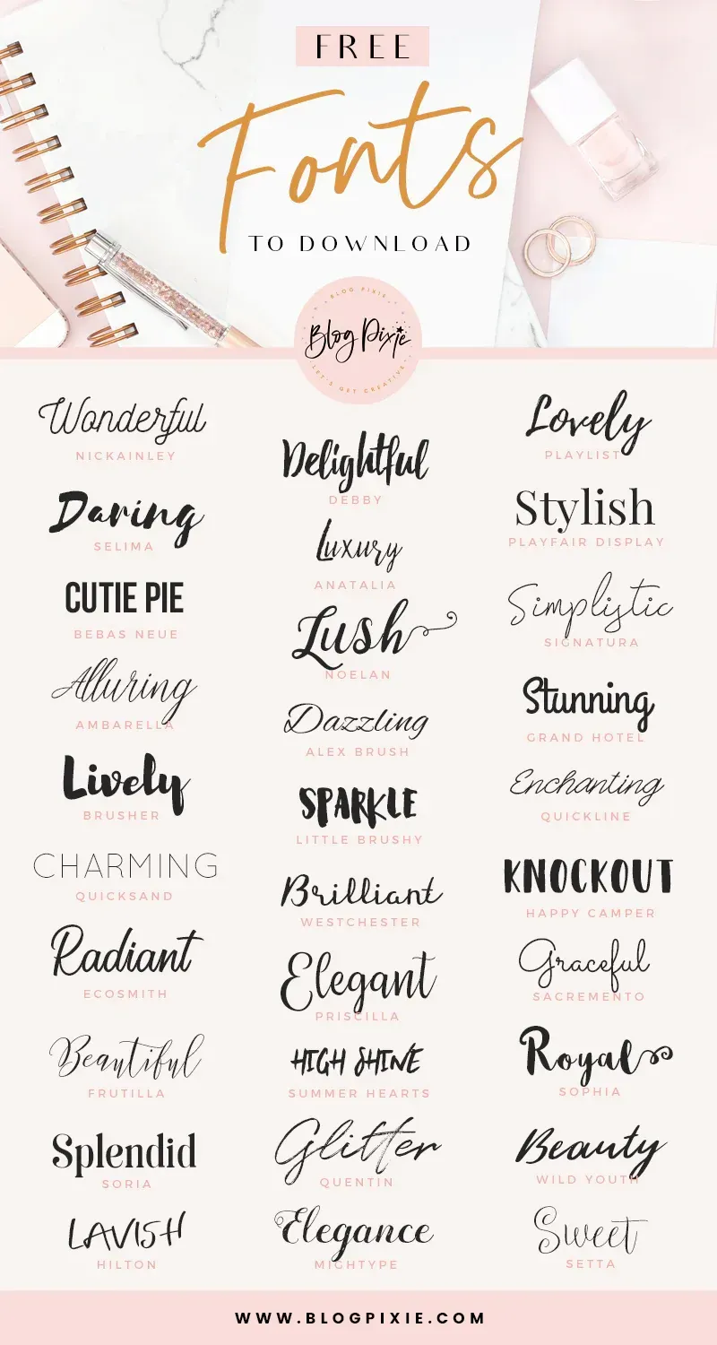
Free Fonts: A Deal or Trouble? The latest Google estimate of available fonts is over 300,000 and counting. Other estimates have catalogued over 550,000 fonts. There are over 36,000 font families, over 4,000 type designers and over 2,700 professional font foundries, not counting smaller font entrepreneurs like CARE Typography, which provides restored fonts from yesteryear. (Quora source https://www.quora.com/How-many-fonts-are-there-in-existence-Does-any-group-attempt-to-keep-a-record-of-all-the-fonts-that-exist ) There are commercial fonts from sources like Adobe and MyFonts (Monotype) which require payment for their use in various platforms. Both provide a subscription service, which usually requires a substantial monthly or yearly fee to download and use their fonts. When I began using Apple Macintoshes in the 1980s, font manufacturers like Adobe and Monotype would “sell” the right to use a number of their fonts for thousands of dollars. And, by the way, you never really “own” the font. You have paid only for the use of the font for a specific purpose or machine. Moreover, the price varies for print use, or web use, or a digital ad use. Even today, the font Trinité Titling by Bram de Does, used in a number of Bibles and biblical studies, costs over $4,000 for the use on a single computer and much more for a number of computer users. Individual users of such fonts are mostly priced out of their budget. Why the seemingly extravagant cost? We had a valve on one of our household plumbing lines go bad. I called the plumber, and he replaced the valve — at a cost of several hundred dollars, while the valve itself cost only a few dollars. Was that fair? Yes, because I was paying for the time and training and effort going into replacing that valve in my house. The same holds true for professional font designers. They spend hundreds, sometimes thousands, of hours in font development. We are paying for their livelihood. Font licenses cover four basic parameters around font usage — “The What: The weight and style of the typeface; The Where: Literally where you’ll use the font – a website, digital ad, or in print; The Who: The number times a font can be installed on a computer (aka the number of people who can use it); The How many: For example, web font licenses describe the number of allotted page views, and app and digital marketing licenses set similar parameters.” (Monotype Report) Companies like Monotype are rarely concerning with an individual using a font for a home, individualized project, but rather an entire design company or printer using that font for commercial gain and advertising dollars. There are fonts available “for personal use only,” prohibiting their use for commercial or money-making projects. There are what have been called “shareware” fonts, fonts with a minimal cost which require attribution of the type designer or provider on projects. Most fonts provide a EULA, or font license, which outlines and determines the legal restrictions and ramifications for their use. What about free fonts? Monotype warns against using unlicensed or what are called “free” fonts for several valid reasons, but, in my opinion, this is an obvious ploy to get the user to buy or subscribe to their font services. One Monotype report cites six issues associated with what are deemed “free” fonts. Free fonts may pop up in similar ads or designs to industry competition, perhaps prompting a lawsuit or cease-and-desist actions. Free fonts often have the inability to scale, add special characters, or even different alphabets. Free fonts have limited creative scope. They may be saddled with malware or software viruses. Poor font design can be a problem with such fonts. A sixth problem with so-called free fonts is that they can be actually “pirated” fonts, copied from legitimately designed fonts. “Aside from branding issues, free fonts also suffer from a whole host of performance issues. Fonts are software files that interact with applications and the operating system on which it’s installed; without the guidance of a skilled font engineer, rendering issues may arise from crashing glyphs, or a lack of proper kerning (the space between glyphs) text in certain scenarios. A free font downloaded from a random website might not support a broad range of languages and or complex scripts (e.g., Japanese or Arabic), or basic diatrics to cover commonly used Latin languages.” (Monotype Report) Monotype maintains that free fonts won’t give a company the individual style it deserves to help it stand out in the marketplace. They also point to the legal ramifications involved with font licensing, not a glamorous subject but one in which company attorneys are hired to examine for possible litigation. Types of Free Fonts There are four sources of free fonts — Open Source fonts with an SIL Open Font License (SEE https://openfontlicense.org ); OS fonts, fonts that come with your operating system and hardware; Subscription add-on fonts that come as an add-on to a subscription service; and, advertised free fonts by independent font designers, such as CARE Typography. Many or most of such free fonts come from freeware, shareware, public domain or demo fonts downloaded or reconstructed from an archive or library, like Internet Archive. Companies such as Website Planet offer free “commercial” fonts, fonts that can be used in business and corporate applications. See https://www.websiteplanet.com/blog/best-free-fonts/. Several cautions, however, are still in order here. First, a font that “looks like” a standard, business font is not the same thing as its “older brother.” An example is Website Planet’s Playfair Display font, both a variable and static font designed by Claus Eggers Sørensen licensed under the SIL Open Font License agreement. Yet, this font looks a lot like the standard Bodoni font, created by Giambattista Bodoni in 1767 and revived by Morris Fuller Benton in 1911 under Linotype’s commercial license.
More on the Greek font. In a previous post ( It's Greek To Me! March 18, 2023) we noted that Cursive Greek type appeared as a chancery script by Francesco Griffo in 1502 and lasted two hundred years. Robert Bringhurst notes that "chancery Greeks were cut by many artists from Garamond to Cason, but Neoclassical and Romantic designers . . . all returned to simpler cursive forms . . . in the English speaking world the cursive Greek most often seen is the one designed in 1806 by Richard Porson." This face has been the "standard Greek face for the Oxford Classical Texts for over a century." ( Robert Bringhurst, The Elements of Typographic Style, Hartley & Marks, Version 3.1, 2005 , pp. 274, 278) In fact, asking Google for the best Greek face to use, it points us to Porson Greek. Porson is a beautiful Unicode Font for Greek. It's not stiff, like many of the cleaner fonts, which are usually san serif. It is bold and easy to read and seems to more closely match the orthography in newer textbooks. (Jan 8, 2004)
CARE Typography is pleased to announce a new typeface — NabelDado — in standard black-and-white font formulation as well as colored SVG formats. Please see samples below. Order from cshanktype@gmail.com. Enjoy!
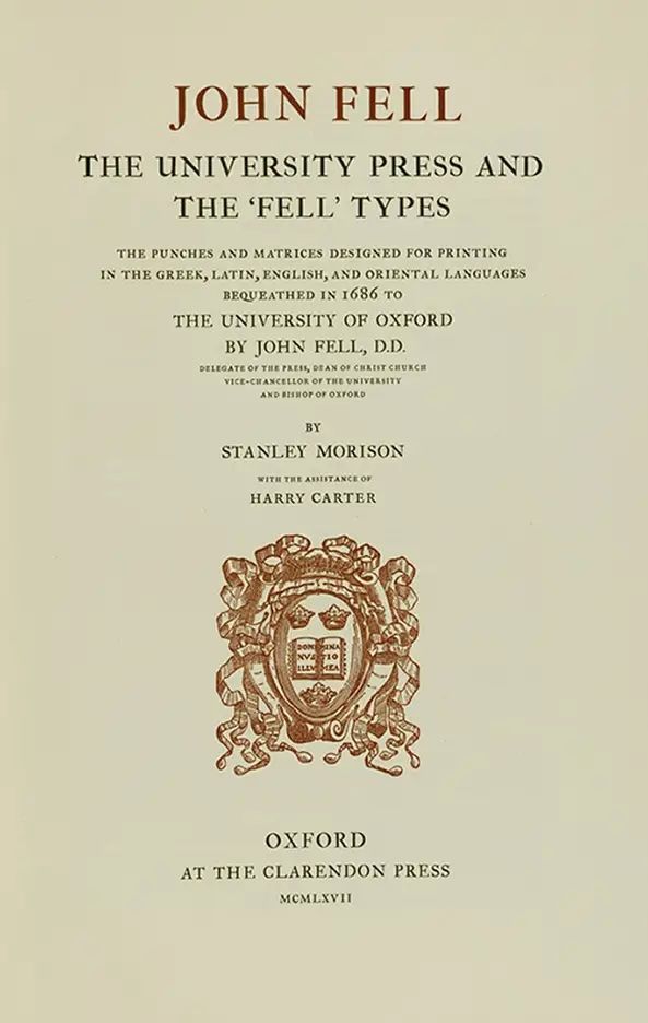
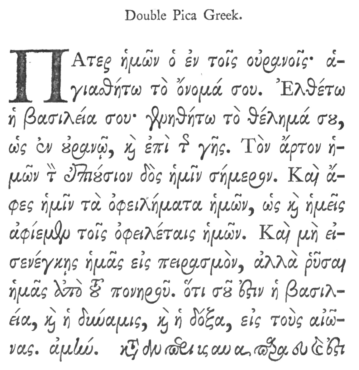
Historical Literary Fonts: The Fell Fonts Rooted in John Fell's legacy at Oxford, these fonts inherit a rich history of learned printing, drawing inspiration from Dutch typefaces with contrasting weights and unique letterforms. The Fell type collection was a gift made to Oxford University by Dr. John Fell (1625–1686), Bishop of Oxford and Vice-Chancellor of the University of Oxford. They were donated to the Oxford University Press (OUP) and became the foundation of its early printing identity — “He bought punches and matrices in Holland and Germany in 1670 and 1672 and entrusted his personal punchcutter, Peter de Walpergen, with the cut of the larger bodies. Igino Marini, revived some Fell types in 2004.”[1] Why the Fell Types Matter Fell Types represent pre-Caslon English typography. They form one of the earliest consistent typographic identities of a university press. They show how Dutch type design influenced English printing. Typographically, they were designed for reading, not display. This is important because they departed from the socialistic, anti-industrialization movement of the Arts & Crafts movement led by William Morris (SEE Blog Advances in Typography: A Historical Sketch (Part 2) , Nov. 20, 2025). Much credit for the original fonts goes to Frederick Nelson Phillips and his work at The Arden Press, which became more commercially ambitious and influential. This press produced high-quality editions of classic and scholarly texts, collaborated with academics, editors, and publishers and continued refinement of typographic discipline. Frederick Nelson Phillips Frederick Nelson Phillips (c. 1875 – 1938) occupies a crucial transitional role between Arts and Crafts idealism and twentieth-century typographic rationalism, as well as between private press craftsmanship and professional publishing. For historians of printing, he represents a model of how tradition can be revived thoughtfully—without nostalgia, and without surrendering to industrial mediocrity. Frederick Nelson Phillips was a British printer and typographic entrepreneur best known as the founder of The Florence Press and later The Arden Press. He played a significant role in the early twentieth-century revival of fine printing in Britain, working in the wake of William Morris and the Arts and Crafts movement, yet moving toward a more practical, commercially viable model of quality book production. Although never as famous as Morris or later modernist typographers, Phillips exerted a quiet but lasting influence. He helped normalize the use of historical typefaces in serious publishing, bridging the gap between private press ideals and commercial book production. Phillips influenced later British typographic standards, particularly in academic publishing. He contributed to the preservation and renewed appreciation of early English type design. His work resonates strongly with later figures interested in typographic scholarship, including those associated with university presses and fine publishing.

