Slab Serif Font History
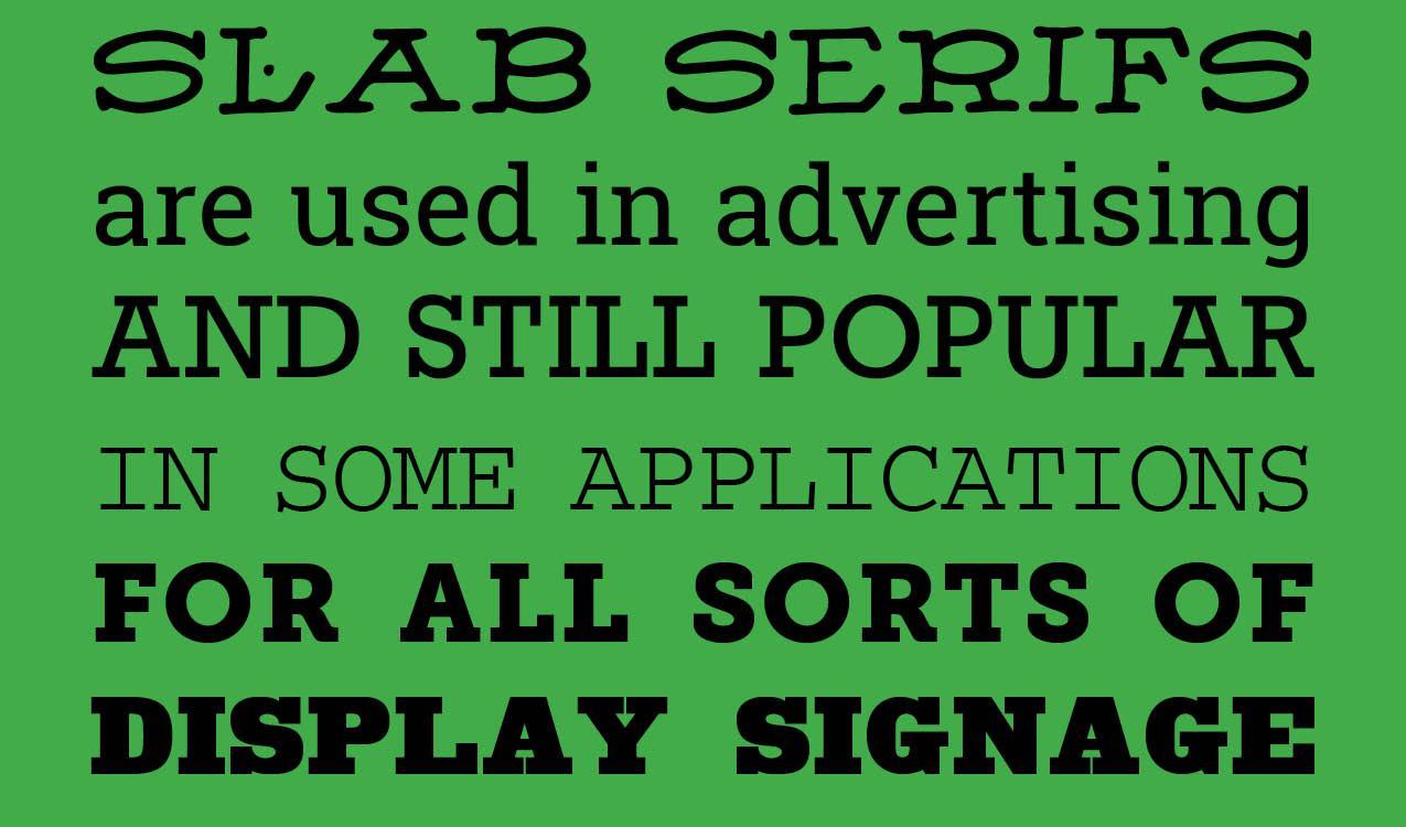
Slab Serifs. Born in Great Britain in the Industrial Revolution of the 1800s, slab fonts, or slab serif fonts, provided a beefy and starkly bold contrast to text fonts that were popular. Found on just about every billboard, poster, pamphlet and advertising vehicle of the day, slabs were designed to stand out from the crowd, a type that shouted, "look at me!" Slab serifs, also called Egyptian, antique, mechanistic or square serif, are characterized by usually thick, block like serifs.
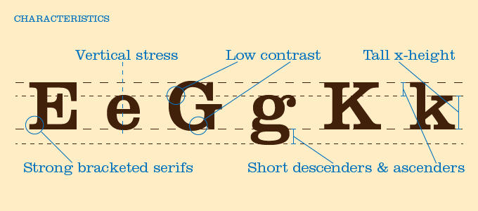
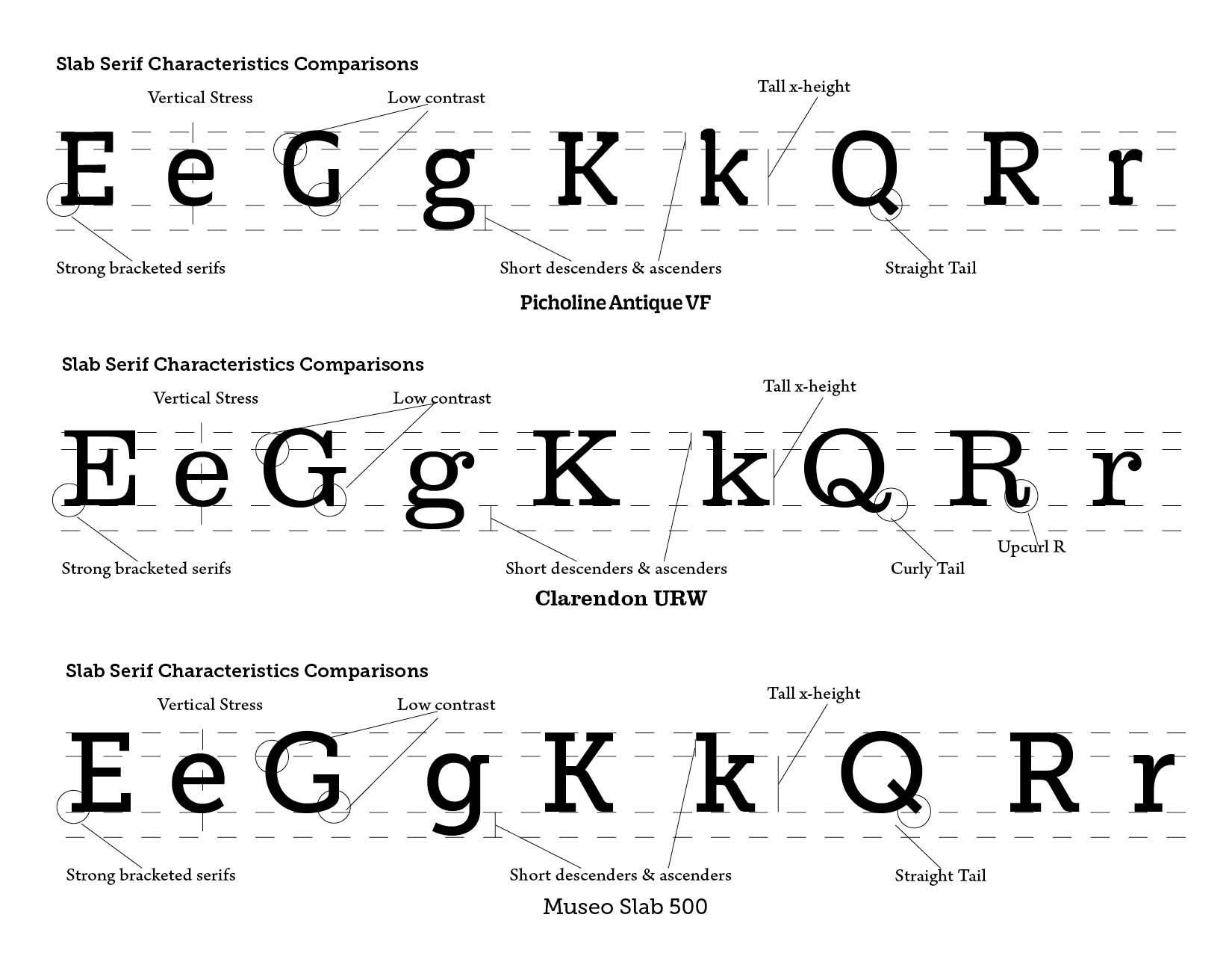
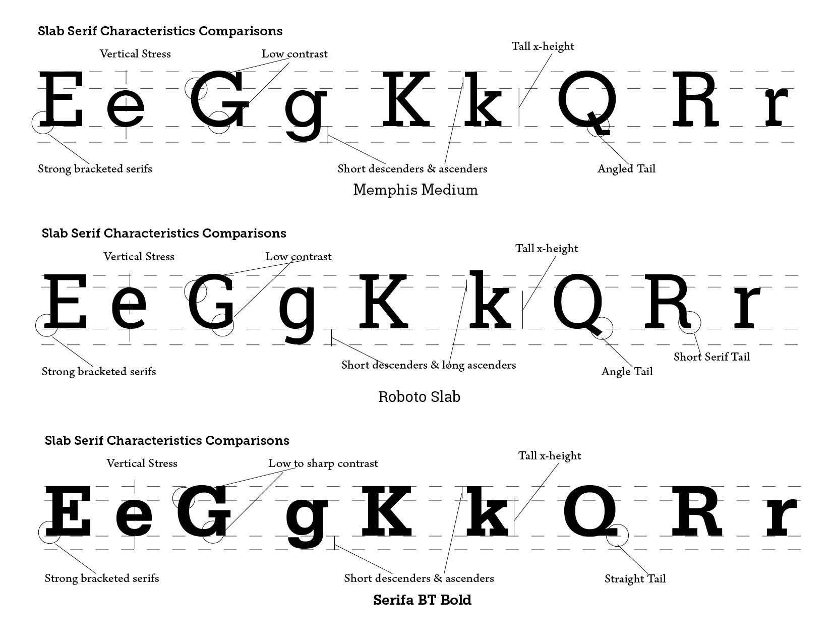
Slab serifs possess thick serifs, which are squared-off or slightly rounded, and almost the same weight as the main strokes. From a typographical standpoint, they have low contrast, with minimal difference between thick and thin strokes. Slab serifs can have a geometric or humanist structure, and can range from mechanical-looking to more organic. They are sturdy and legible, designed for impact and readability even at large sizes. Early examples were Antique and Clarendon.
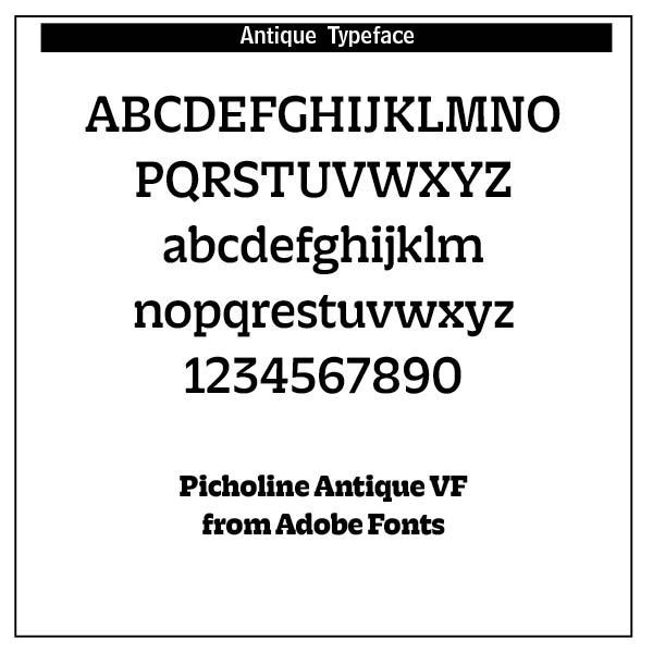
ANTIQUE. The first commercially available slab serif, or Egyptian, typeface—called “Antique”—appeared in 1815 and was designed by Vincent Figgins. They were more attention-grabbing than more traditional serifs. The primary characteristic of slab serif fonts is the lack of curvature on the serifs.
After the first slab serif typeface was released, they quickly grew in popularity early in the 19th century, alongside the rise in printed advertising. Some slab serifs were developed specifically to be used at larger sizes for printed matter like posters. This was a departure from earlier large-scale type designs, which adapted existing forms of book type.
CLARENDON. The first slab serif fonts appeared at the beginning of industrialization in Great Britain in 1820. Clarendon and Ionic became the names for this new development in England, known as English Egyptienne elsewhere in Europe. Clarendon is also the name of a particular font of this style, which, thanks to its clear, objective and timeless forms, never lost its contemporary feel. In small point sizes Clarendon is still a legible font and in larger print, its individual style attracts attention.
Although Clarendon itself was created by Robert Besley in 1845, it is inspired by the typeface Antique, one of the original slab serifs. While Clarendon and Antique share a similar flavor, Clarendon's addition of bracketed serifs, the gentile curves connecting the serif to the body of the letter, gives it the ability to work better inline of a body of text with other serifed fonts as well as giving it its softer and more approachable feel. It quickly became one of the most popular typefaces of its time period and to the point where today we rather quickly associate it with turn of the century England and in the U.S., the old west.
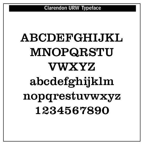
There were a few Clarendons — a thick-faced condensed type with heavy serifs. The original Clarendon is an English slab-serif created in in the 1830s by Robert Besley for Fann and later Thorowgood and Co. type founders. A version was made into a wood typeface and also was reworked in metal by the Monotype Corporation foundry in 1935. Hermann Eidenbenz and Edouard Hoffmann made their own version based on Besley’s original design in 1953. The Craw Clarendon family designed by Freeman Craw was released by American Type Founders in 1955, with light, bold and condensed variants. Fortune or Volta, a very modern version of Clarendon, was designed by Konrad Friedrich Bauer and Walter Baum for the Bauer Type Foundry, in 1955, adding an italic in the medium weight. Aldo Novarese drew the Egizio family, a Clarendon by any other name for the Nebiolo foundry in Turin, Italy in 1958. (From https://www.printmag.com/daily-heller/clarendon/)
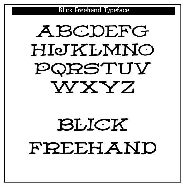
BLICK FREEHAND. Built on innovation and creativity, BLICK is a company of firsts. Dick Blick's first catalog originated in 1911 in the form of a small pamphlet issued by the company's founders, Dick and Grace Blick. Our first product was a lettering pen, the Payzant, which quickly became a bestseller. The Freehand typeface featured in C.A. Faust's 75 New Typefaces in 1912 was penned by Blick using the Payzant. The Blick's first warehouse was their kitchen, and their first shipping department was the Galesburg, Illinois post office where they would send out their daily shipments. See dickblick.com for more information.
Egyptian/Egyptienne — mostly used for slab-serifs generally, although first used by the Caslon Foundry in naming their sans-serif, the first made. Continued to be used as a name for "geometric" slab-serifs appearing in the twentieth century, and so several geometric slab-serifs had Egyptian-themed names, including Memphis, Cairo and Karnak.
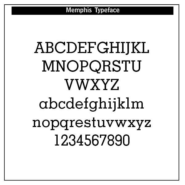
Memphis is a slab-serif typeface designed by Rudolf Wolf and released in 1929 by the Stempel Type Foundry.
Memphis is a "geometric" slab serif, reflecting the style of German geometric sans-serifs (in particular Futura) which had attracted considerable attention, and adapting the design to the slab serif structure. Its structure is strictly monoline, with a "single-storey" 'a' similar to blackletter or handwriting, in an almost-perfect circle. It was released in several weights and with alternative characters such as swashes, which digitisations have mostly not included.
Memphis has an Egyptian name, in reference to the fact that early slab serifs were often called "Egyptians" as an exoticism by nineteenth-century typefounders.
Memphis and other similar designs were popular in printing during the hot metal typesetting period
Ionic — in the nineteenth century used as a name for slab-serifs. In the twentieth century this term became used to mean text faces with some Clarendon-style features, because of an influential body text face of this name from Linotype - this followed from previous faces of the same name only slightly bolder than text proportions from Miller & Richard.
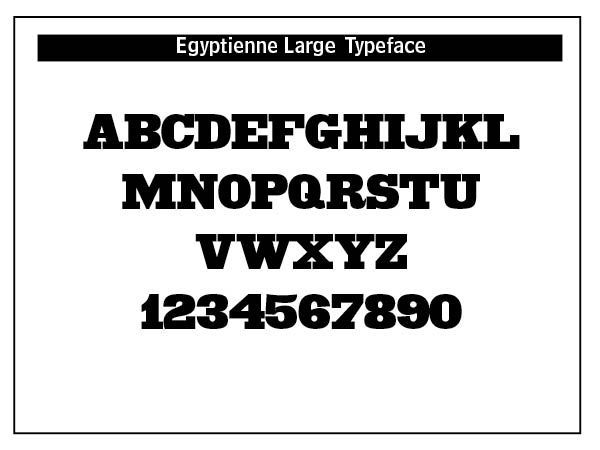
Egyptienne is a slab serif typeface designed by Adrian Frutiger in 1956. The design was influenced by the Clarendon model of slabs that originated in 1845. Egyptienne has a large x-height and, unlike Clarendon, contains italics so it can work well for setting body text. The typeface has been a classic, go-to slab serif for over 50 years but doesn’t seem to be used much on the web, with other humanist slabs such as Adelle being more popular.
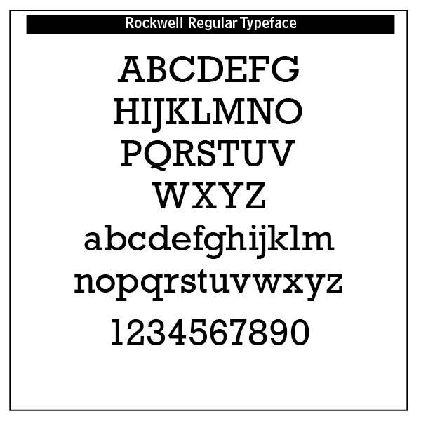
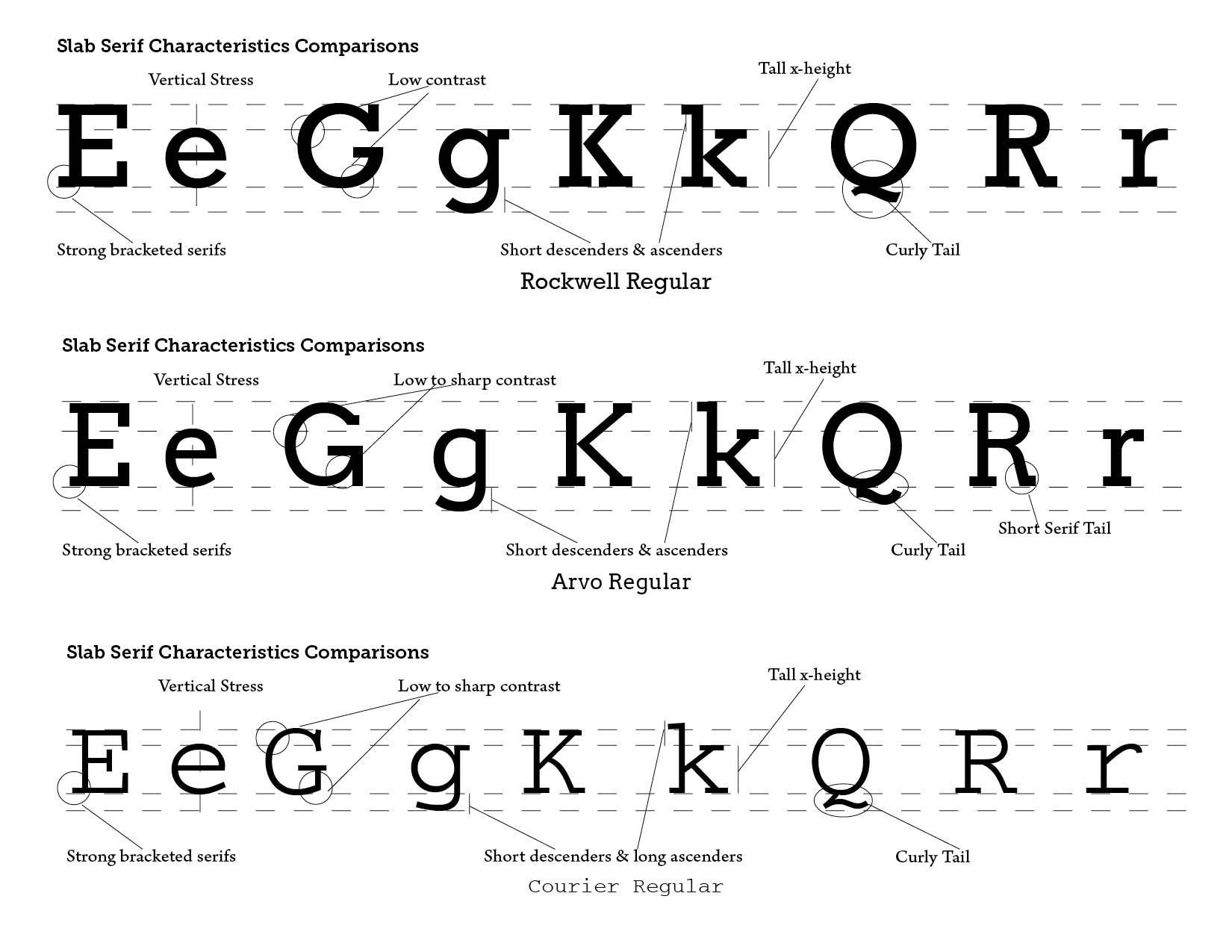
ROCKWELL. The Rockwell family is a fine example of this appealing and eminently usable type style. This is a design that is both robust and adaptable. Marked by the flat top-serifs on the cap A, unusual Q tail and high-legibility two-storied lowercase a, Rockwell has a bit of handmade charm that distinguishes it from the cool, more modern interpretations of the slab serif style. The family is excellent for branding, headlines and other display uses. The simple shapes and hearty serifs also make it a good choice for short blocks of textual content in both print and on-screen environments. The light and bold weights are perfect for setting blocks of text copy, while the extra bold and condensed designs bring authority to display copy. Throw in a little color, and you amp up Rockwell’s messaging power. Rockwell’s large x-height, simple character shapes and open counters, make for an exceptionally legible design. It should not, however, be set so tight that its serifs touch, as this will erode legibility and impair readability. A benefit to Rockwell’s slab serifs, however, is that the design combines beautifully with both sans serif typefaces and a variety of serif designs. (MyFonts.com)
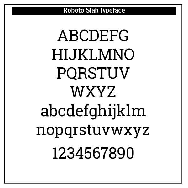
ROBOTO SLAB. Roboto has a dual nature. It has a mechanical skeleton and the forms are largely geometric. At the same time, the font features friendly and open curves. While some grotesks distort their letterforms to force a rigid rhythm, Roboto doesn’t compromise, allowing letters to be settled into their natural width. This makes for a more natural reading rhythm more commonly found in humanist and serif types.
Roboto has a dual nature. It has a mechanical skeleton and the forms are largely geometric. At the same time, the font features friendly and open curves. While some grotesks distort their letterforms to force a rigid rhythm, Roboto doesn't compromise, allowing letters to be settled into their natural width. Roboto Typeface is popular among designers because of its versatility and readability. It is designed to work well on all platforms, including mobile, web, and print. Its open and friendly curves make it easy to read, while its mechanical skeleton gives it a solid structure.
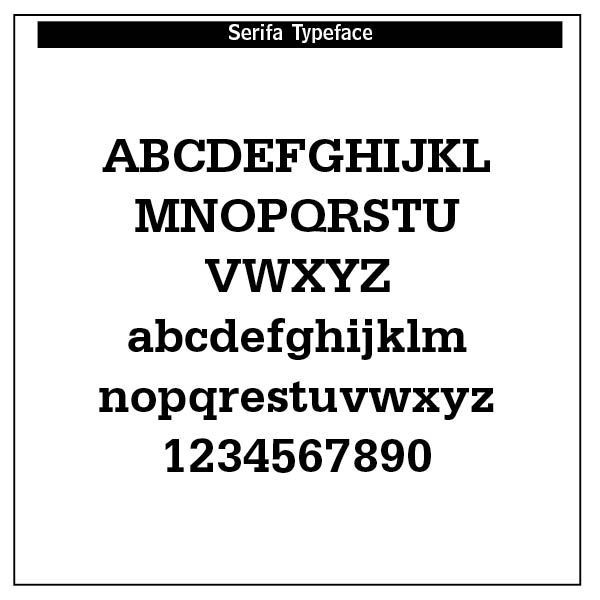
SERIFA. Serifa is a slab serif typeface family created by Adrian Frutiger in 1967. The typeface is based on the Univers family. It was most prominently featured in the logo of Montgomery Ward from 1982 to 1992 and again in the revived online store. It was also used in the campaign ads for Ross Perot's 1992 Presidential campaign and from 1982 to late 1987 on the graphics of various CBS News programming, and for the local news programs at the CBS owned-and-operated television stations (as well as several affiliates). In 2014 Jake Tilson used it in the NT signage to complement the NT logo. Serifa is also used in nearly all of the College Board's communications and exams.
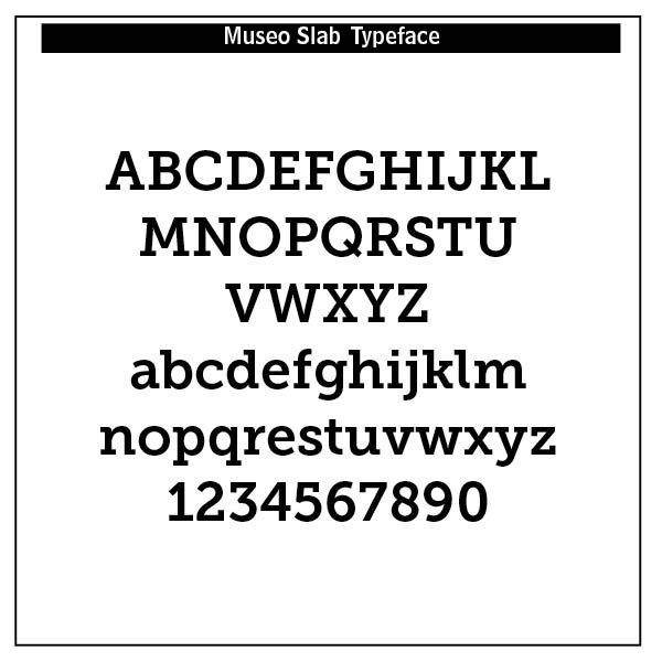
Museo Slab (from Adobe)
Jos Buivenga lives and works in Arnhem. He started designing type in 1994 and started his exljbris Font Foundry ten years later. He is most known for his Museo font family and also for the way he markets his typefaces. This OpenType font family comes in five weights and offers supports CE languages and even esperanto. Besides ligatures, contextual alternatives, stylistic alternates, fractions and proportional/tabular figures MUSEO also has a 'case' feature for case sensative forms. Museo Slab supports a very wide range in languages and is a complete OpenType typeface. Each weight counts 455 glyphs. You can find detailed info in the Museo Slab PDF specimen. Museo Slab is spaced and kerned with Igino Marini's wonderful iKern service.
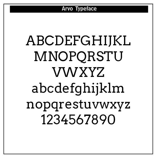
ARVO (Google)
Copyright (c) 2010-2013, Anton Koovit (anton@korkork.com), with Reserved Font Name 'Arvo'
This Font Software is licensed under the SIL Open Font License, Version 1.1 . This license is available as FAQ at https://openfontlicense.org.
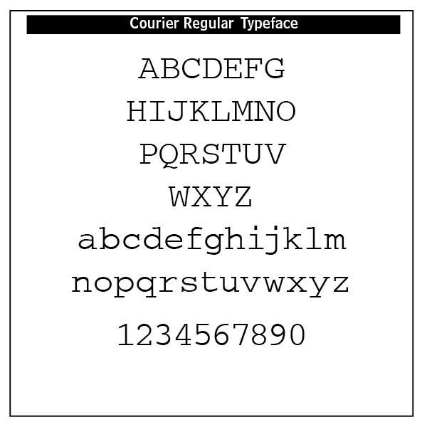
COURIER. Howard G. “Bud” Kettler, worked as a type designer for IBM in the 1950s. He designed corporate logos, special-purpose fonts, like the Bell Gothic, and a number of typewriter fonts. He was tasked with the job of designing a typeface that was “weightier” than the fine lines of Pica and Elite that were being used at the time.
Dirk Stratton, in Aldus Magazine noted that Kettler in the mid-1950s designed the face we call Courier — “He based its geometry on nineteenth century Egyptian typefaces, slab-serifs they are called, and made them work on the typewriter.”¹ IBM never assigned a trademark to the face and it has been in the public domain ever since. Kettler was proud of his work — “A letter can be just an ordinary messenger [that was thought to be the desired name] or it can be the courier which radiates dignity, prestige and stability.”² The Courier typeface was born.
Even the renowned Robert Bringhurst in The Elements of Typographic Style acknowledges Courier’s long standing usefulness — “And on the principle that a good hamburger is better than a bad souffle, even monospace typewriter fonts - such as IBM Courier and Prestige, which are models of their kind - remain well worth considering for routine work on laser printers.” (Robert Bringhurst, Elements of Typographic Style (Hartley & Marks, 1992 edition), 90–91.)
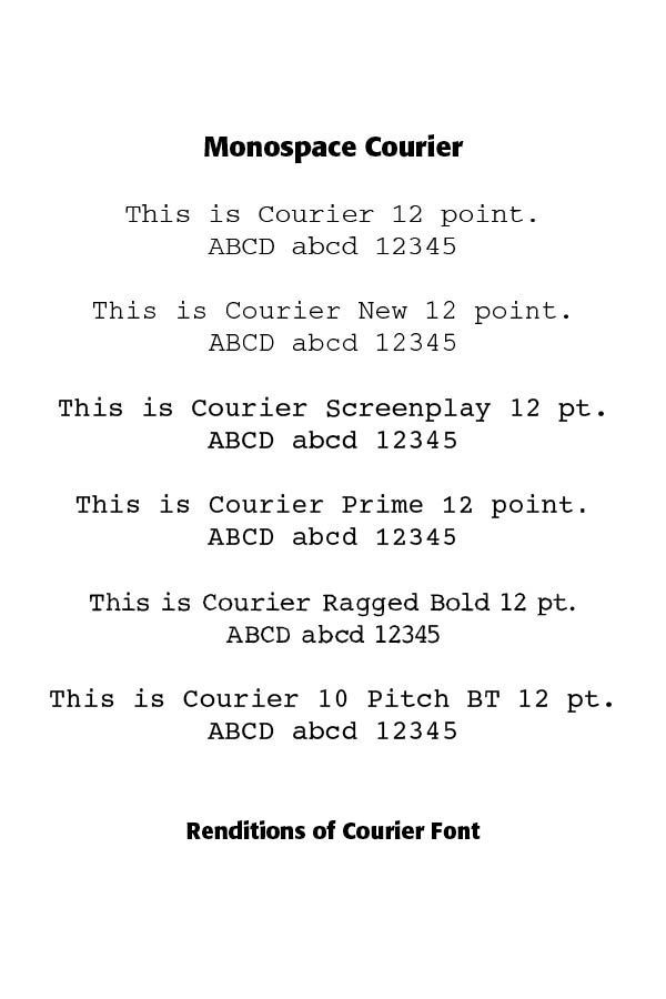
As a monospaced font, Courier found usefulness in computer programming and became the industry standard for screenplays written in 12-point Courier, called Courier Screenplay. The typeface Courier New was used until January 2004 by the federal government, being replaced by 14-point Times New Roman typeface. The iterations and variants of Courier have been many, including Courier New, Courier Screenplay, Courier Prime, Dark Courier, Courier 10 BT, Courier Final Draft and Courier LT Round Font.
Successful Layout & Design


