Puritan Typography
Puritan Typography
Theology Informing Type
“Creational realities have not spilled out randomly without purpose; rather, they reflect the wisdom, design, and intention of the good God who made them. It’s our job, then, to observe and learn. . . . And indeed, long before [Jonathan] Edwards began to keep his notebook of earthly pointers to heavenly truths, the seventeenth-century English Puritans were writing lengthy volumes organized around exactly this sort of principle.”[1]
“The Puritans were a group of ministers and laypeople within the Church of England who sought to promote Reformed and experiential piety while striving to purify the national church from Roman Catholic influences in doctrine and worship, beginning during the Elizabethan era and continuing as a powerful force until the early eighteenth century. More broadly defined, the Puritan movement included those who were firmly within the Reformed and experiential tradition that flourished not only in sixteenth- and seventeenth-century England, but also well into the eighteenth century north of Hadrian’s Wall (among the Scottish Presbyterians), across the North Sea (among the Dutch Further Reformation divines), and across the Atlantic Ocean (among the New England Puritans and eighteenth-century evangelicals).” [2]
Puritan typography flows from Puritan theology. The English Puritans of the sixteenth and seventeenth centuries inherited a typographic world shaped by the late Renaissance, the Reformation, and early modern printing. Their type styles were not merely aesthetic choices. Rather, they reflected theology, scholarship, readability, economy, and cultural identity.
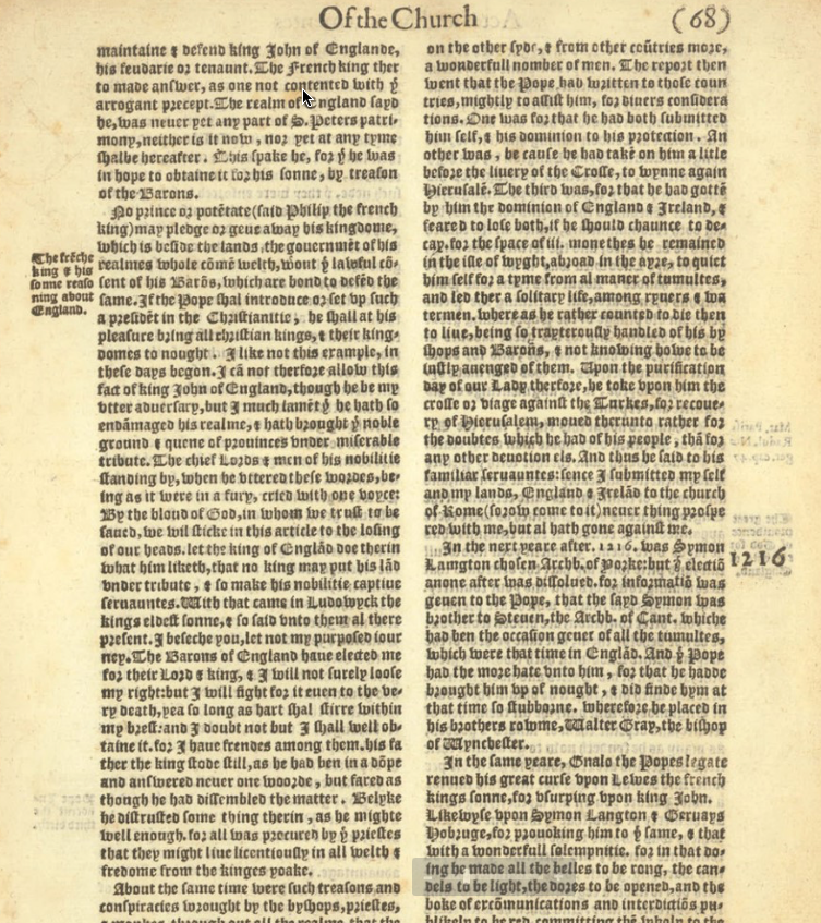
Foxes Book of Martyrs
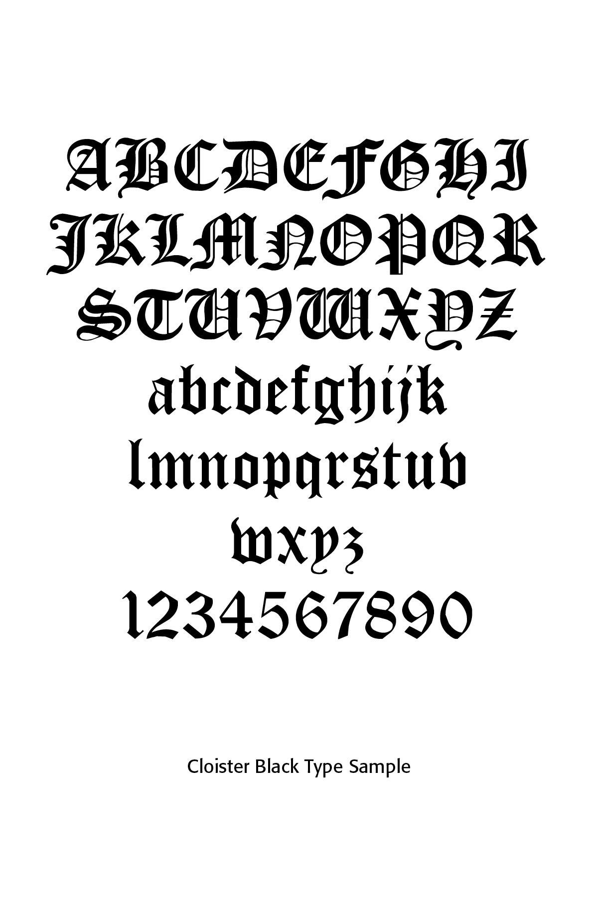
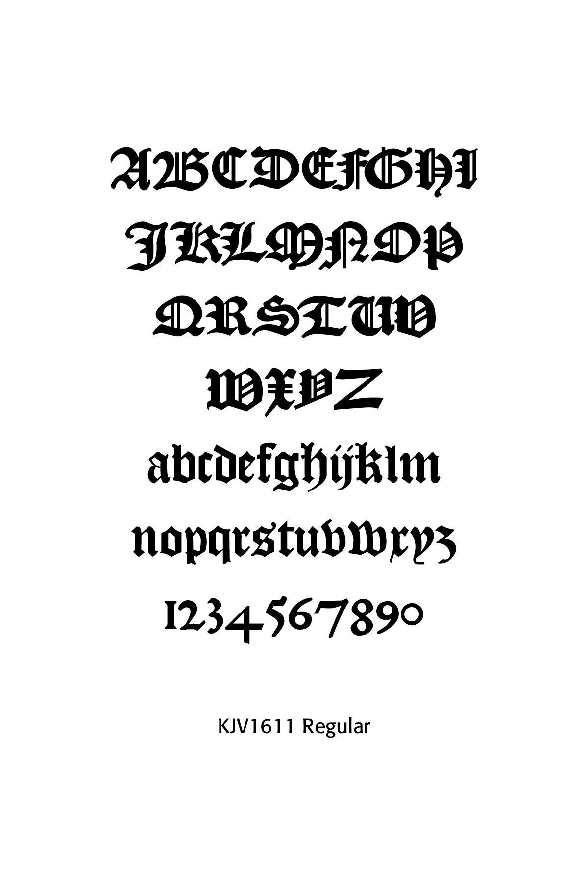
Sample Page in Cloister Black
Various Blackletter Samples
Puritan printing generally avoided excessive ornamentation compared to some Continental Baroque printing traditions. Common features included strong text hierarchy, modest decorative initials, structured pages, wide margins for notes, heavy use of marginal commentary and dense theological text. Their design ideal was sober, rational, disciplined and Scripture-centered, and minimally ornamental. In modern terms, their preferred aesthetic might be described as restrained, text-centered, highly legible and intellectually formal, as noted in especially the texts of John Owen.
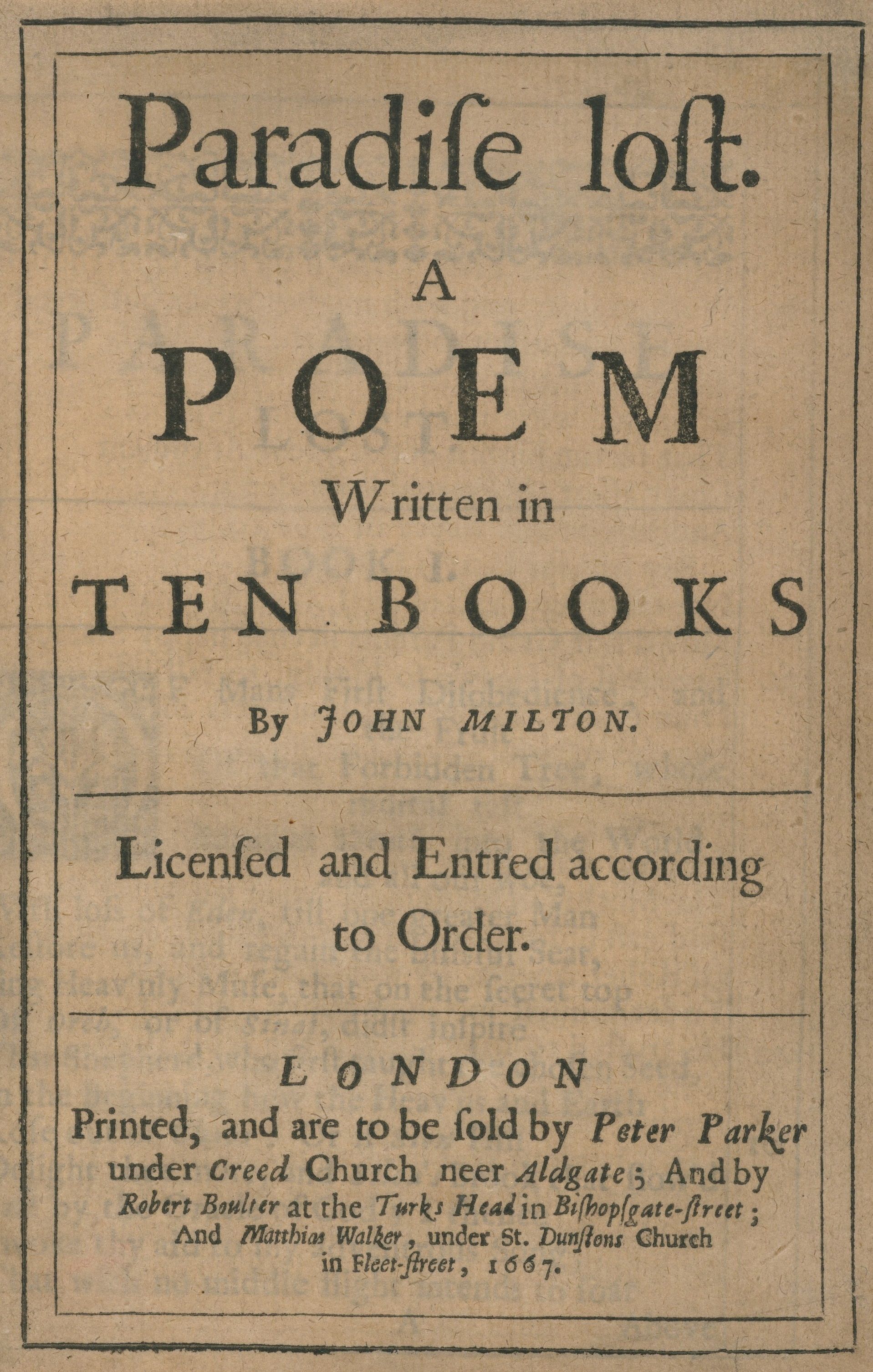
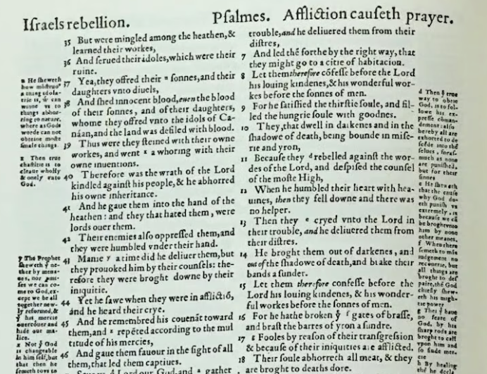
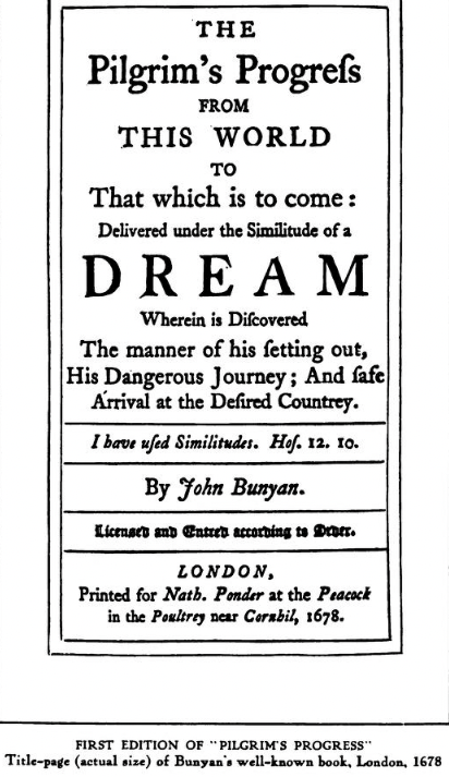
Influential works included The Geneva Bible, the King James Version of 1611, The Pilgrim’s Progress by John Bunyan, The Saints’ Everlasting Rest by Richard Baxter, and Paradise Lost by John Milton. These works helped standardize English religious typography for generations.
Geneva Bible Sample Page
Puritan Type
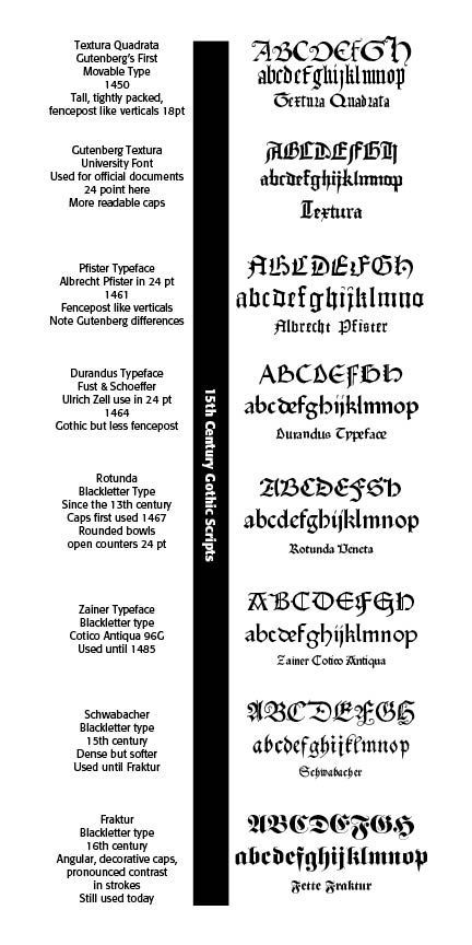
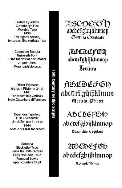
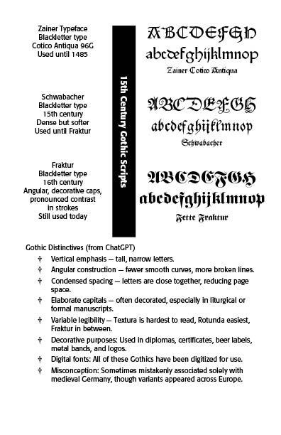
Early Puritan books in the lates 1500s and early 1600s still used forms of blackletter inherited from medieval printing traditions.(SEE Blog Blackletter Type & Universities, January 16, 2025)
Such traditions honored God as Creator Lord of the universe, noted in the Printers Marks. These texts revealed dense, dark texture, angular strokes, strong vertical emphasis and traditional authoritative appearance. Such text was used for printing the Bible after Gutenberg, sermons, legal and religious works and for headings and title pages.
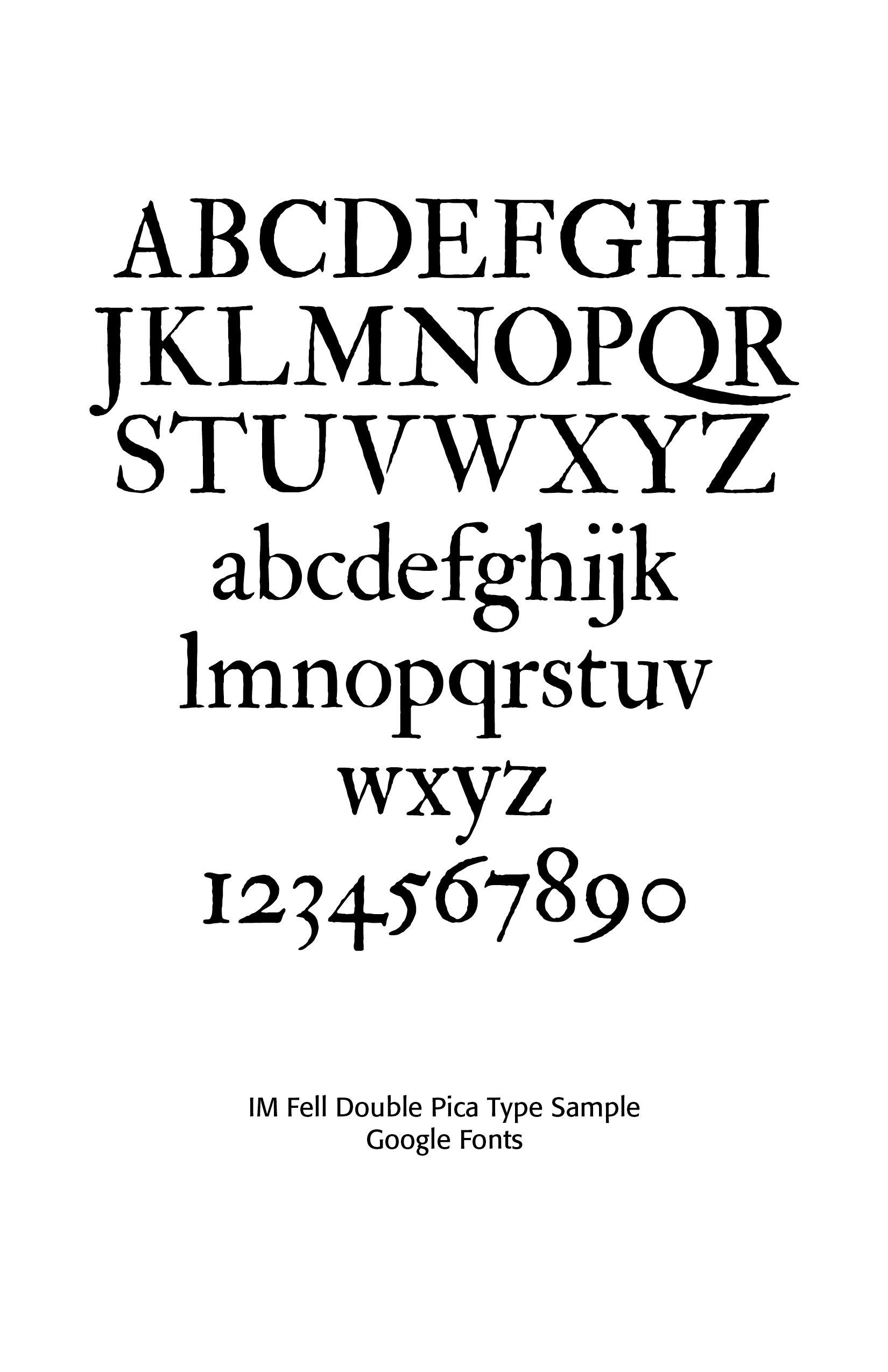
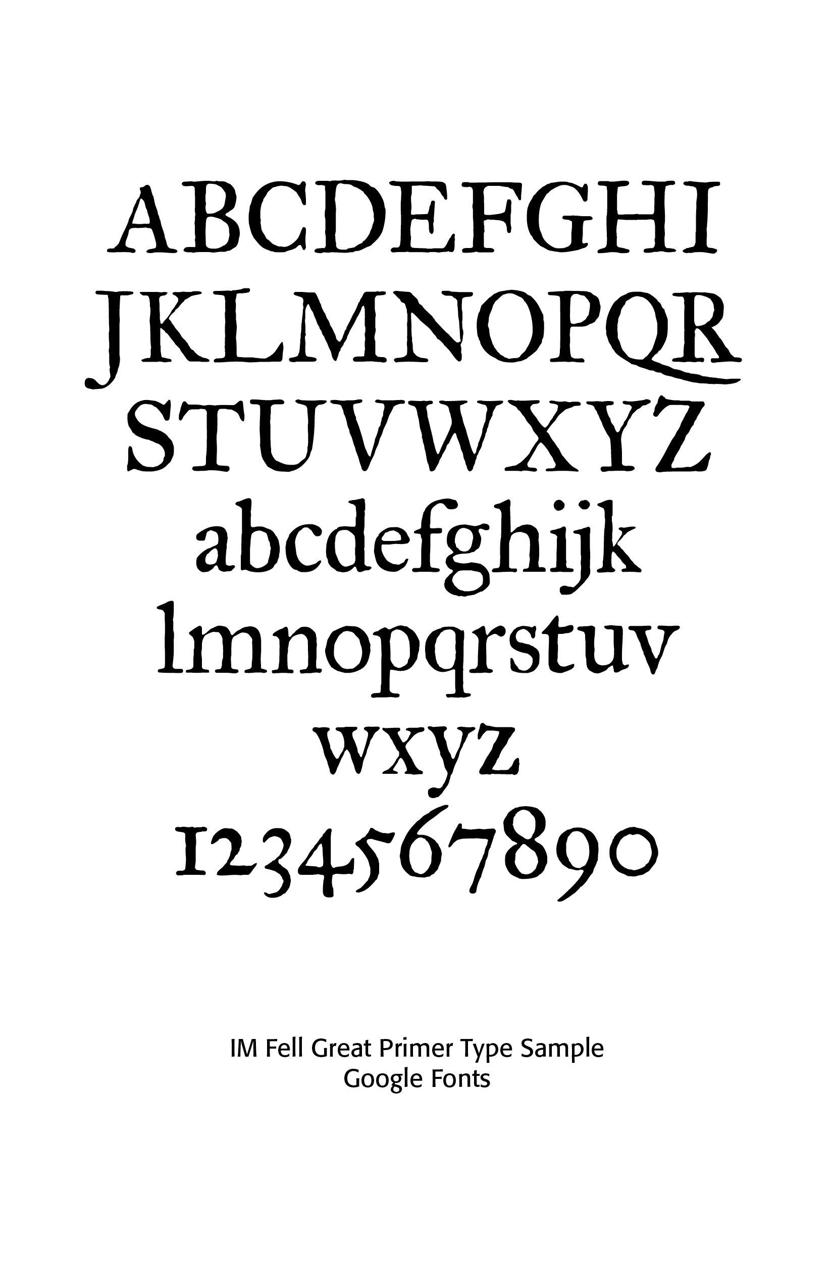
Later Puritans would prefer Roman types for readability and scholarship, becoming the dominant type among educated Puritan printers and scholars by the mid-seventeenth century. Double Pica and Great Primer Italic were abundantly used. Type characteristics here included clearer and more open forms, Renaissance humanism influence, easier for extended reading and better suited for scholarly commentary. The Puritans valued clarity, seriousness, intellectual discipline and Scripture study in their typography. Roman type fit these priorities well.
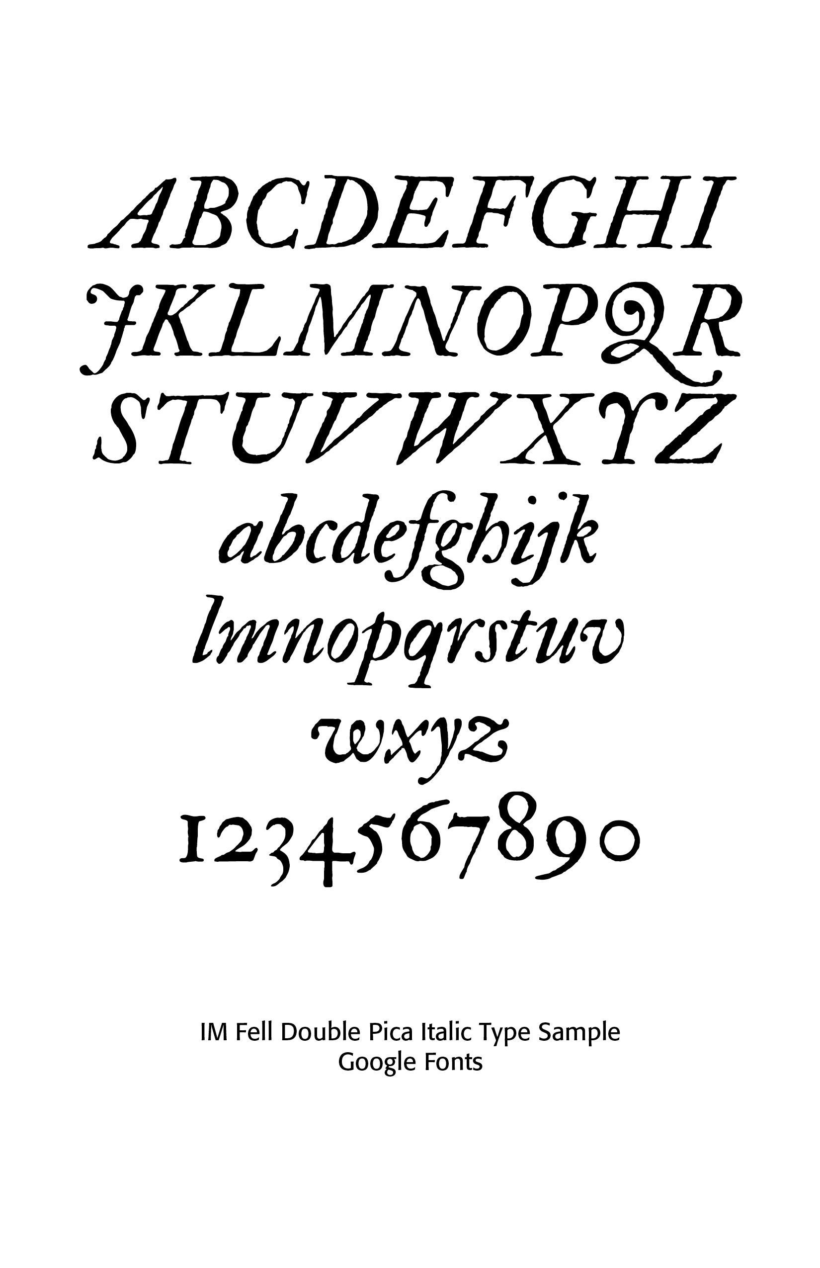
Italic type was widely used, but only sparingly. It was used for emphasis, foreign words, Scripture references, editorial insertions in Bible translation and for marginal notes. The Geneva Bible, for instance, used italics for words supplied by translators, but absent from the original Hebrew or Greek manuscripts. (SEE Blog Italics, February 22, 2025)
Puritan ministers and scholars studied classical rhetoric, Greek and Latin texts, the Hebrew Scriptures and Reformation theological works. Consequently, they encountered Continental type traditions from France, the Dutch, Geneva, Germany and England. Influences included Venetian humanist Roman types, Dutch Baroque serif types, Garalde-style typography, and scholarly Greek and Hebrew fonts. Many learned and studied biblical languages at the Universities of Cambridge and Oxford. (SEE Blog More On The Greek Font, December 23, 2025)
Scholarly typography reflected the Puritan emphasis on precise interpretation, original languages and doctrinal accuracy in the Reformed tradition.
Type Traditions Connected to Puritanism
Although slightly later than the high Puritan era, English type traditions that emerged from this world eventually influenced William Caslon, a leading printer and typographer of the period, Dutch transitional types, Scotch Roman traditions and Colonial American printing, such as that done by Ben Franklin. Many later Protestant publishing traditions—including Bible societies, theological seminaries, and Reformed publishers—continued these ideals well into the nineteenth century.
Dutch transitional typefaces occupy an important place between the old-style Renaissance letterforms of the fifteenth to seventeenth centuries and the more rational, high-contrast modern faces of the late eighteenth century. They developed primarily in the Netherlands during the late seventeenth and early eighteenth centuries and strongly influenced English and later European typography. Dutch typographers needed economical types for dense book setting, durable punches and matrices, readable forms for scholarly and religious works, and styles that balanced elegance with practicality.
Dutch transitional faces emerged partly as refinements of French old-style designs, especially those associated with the royal types of France such as the Romain du Roi, but they retained a warmer and more organic character than later neoclassical typefaces. [SEE Blog Advances in Typography: A Historical Sketch (Part 2), November 20, 2025)
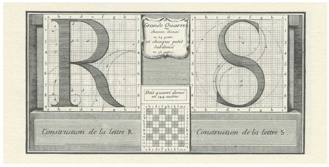
Roman du Roi Type Construct
These Dutch designs became highly influential in England through printers and typefounders such as William Caslon and later John Baskerville. Defining characteristics included moderate stroke contrast, giving them clarity without harshness, and more vertical stress with more upright axis, more regular structure and greater visual precision, larger x-height for more efficient use of page space. Bracketed serifs were connected with curved transitions rather than abrupt joins, with softer than modern faces. Dutch book typography often emphasized economy with narrower characters, tighter spacing and compact text color on the page. Such Dutch faces appear darker, sturdier, highly readable and ideal for long-form reading.
Major Dutch Typographers
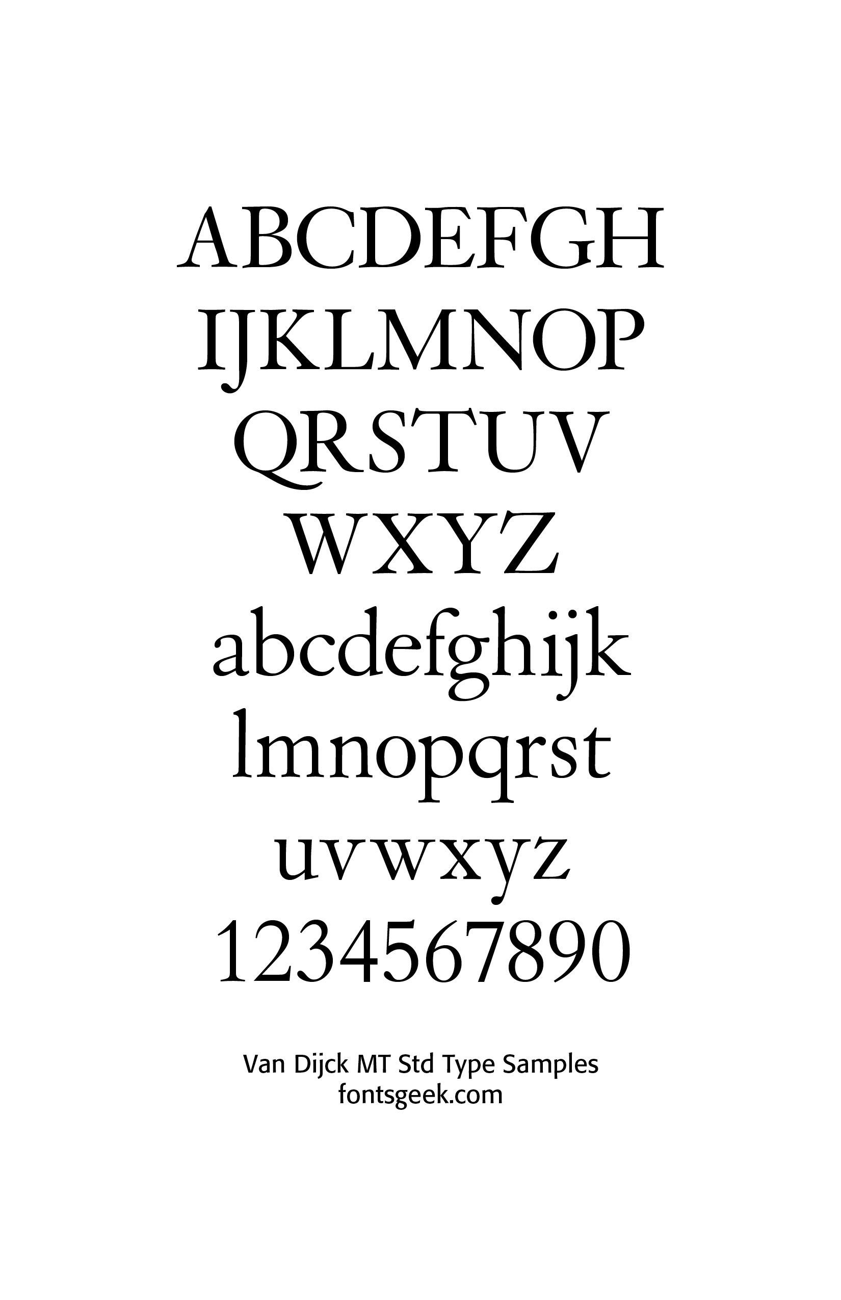
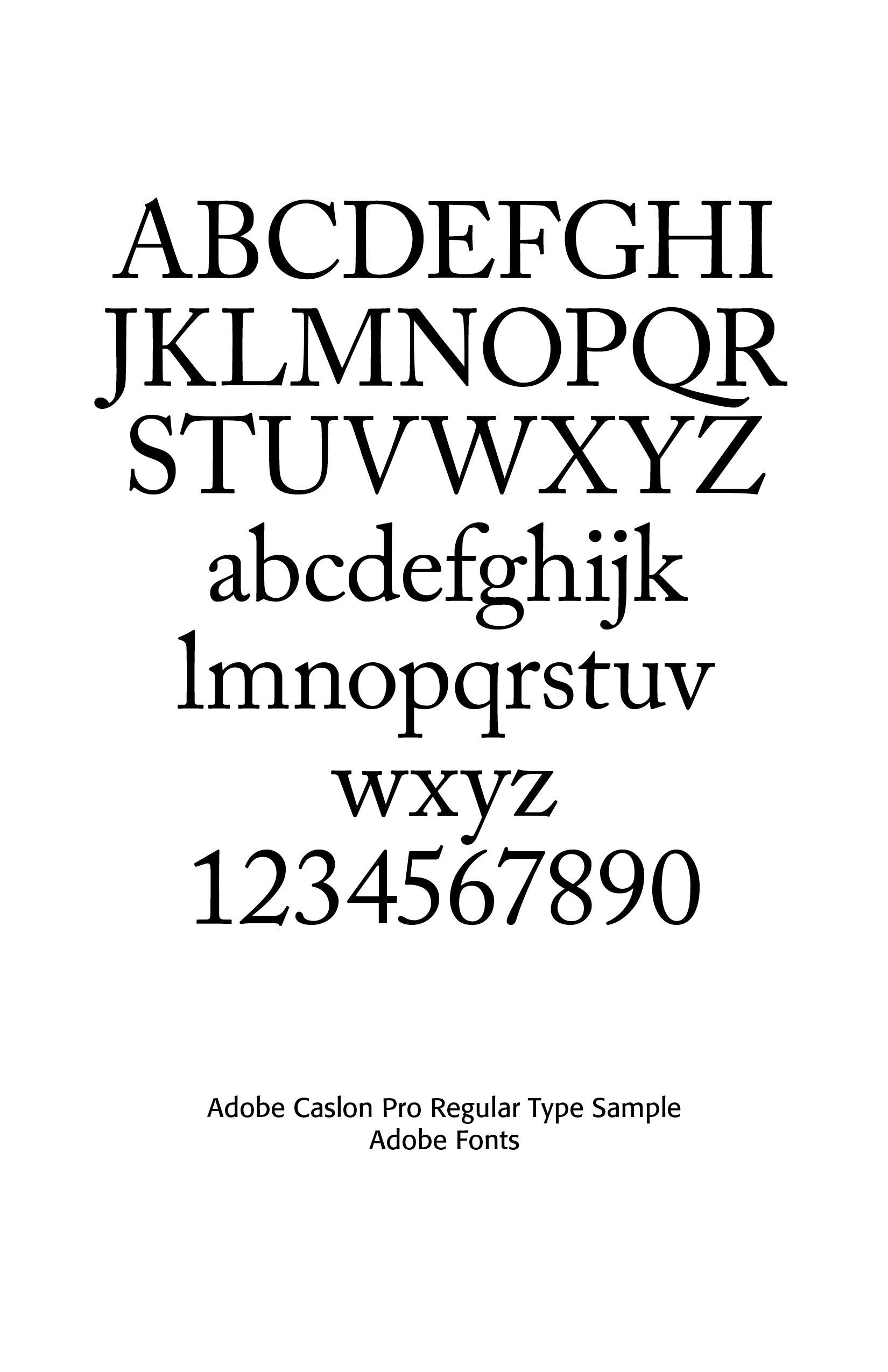
Christoffel Van Dijck (1605-1670 c.) was Elzevir’s main supplier of typefaces. Van Dyck’s designs, along with those of his colleagues Bartholomeaeus and Dirk Voskens, became known as “Dutch types.” He had a type foundry in Amsterdam. In 1675, the Oxford University Printing House purchased a set of Dutch typefaces from various foundrymen, first and foremost Van Dijck. Compared to Garamond, Van Dijck’s types tend to be more refined, with softer strokes, sharper contrasts and lighter, clearly triangular serifs. The axis of the letter is straightened, making it appear almost straight. The typeface, more geometric, benefits from generous counter-forms and moves away from calligraphic sources.
To facilitate reading in small typefaces (a specialty of the Elzevir family, who achieved great feats in small-format books) the lower case is relatively narrow and compact, enabling a greater volume of text to be composed on the page, without loss of legibility. The “Dutch types” still drew heavily on Garamond, but heralded the change that would take place in the following century with the appearance of a new family of typefaces, the “réales”, which would distinguish themselves from their Aldine ancestry.[3]
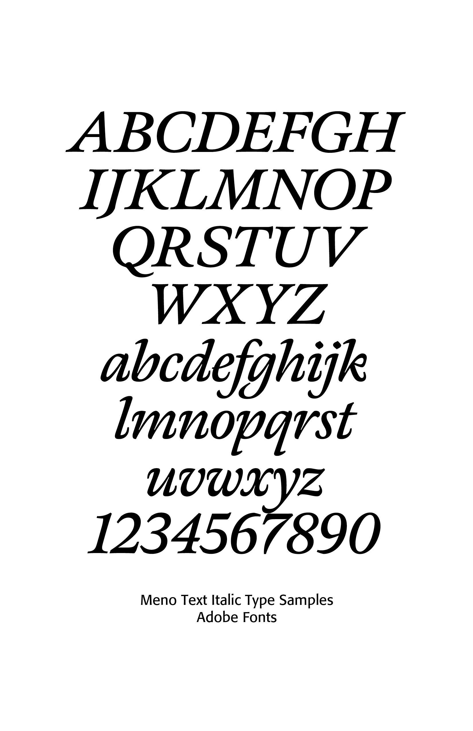
Dirk Voskens was known for refined Baroque-era Dutch typography with transitional tendencies. In 1680, he taught Miklos Kis, who had just moved from Hungary to Amsterdam. Richard Lipton designed the text family Meno FB (1994, Font Bureau) in fifteen styles. He explains: the romans gain their energy from French baroque forms cut late in the sixteenth century by Robert Granjon, the italics from Dirk Voskens' work in seventeenth-century Amsterdam.[4]
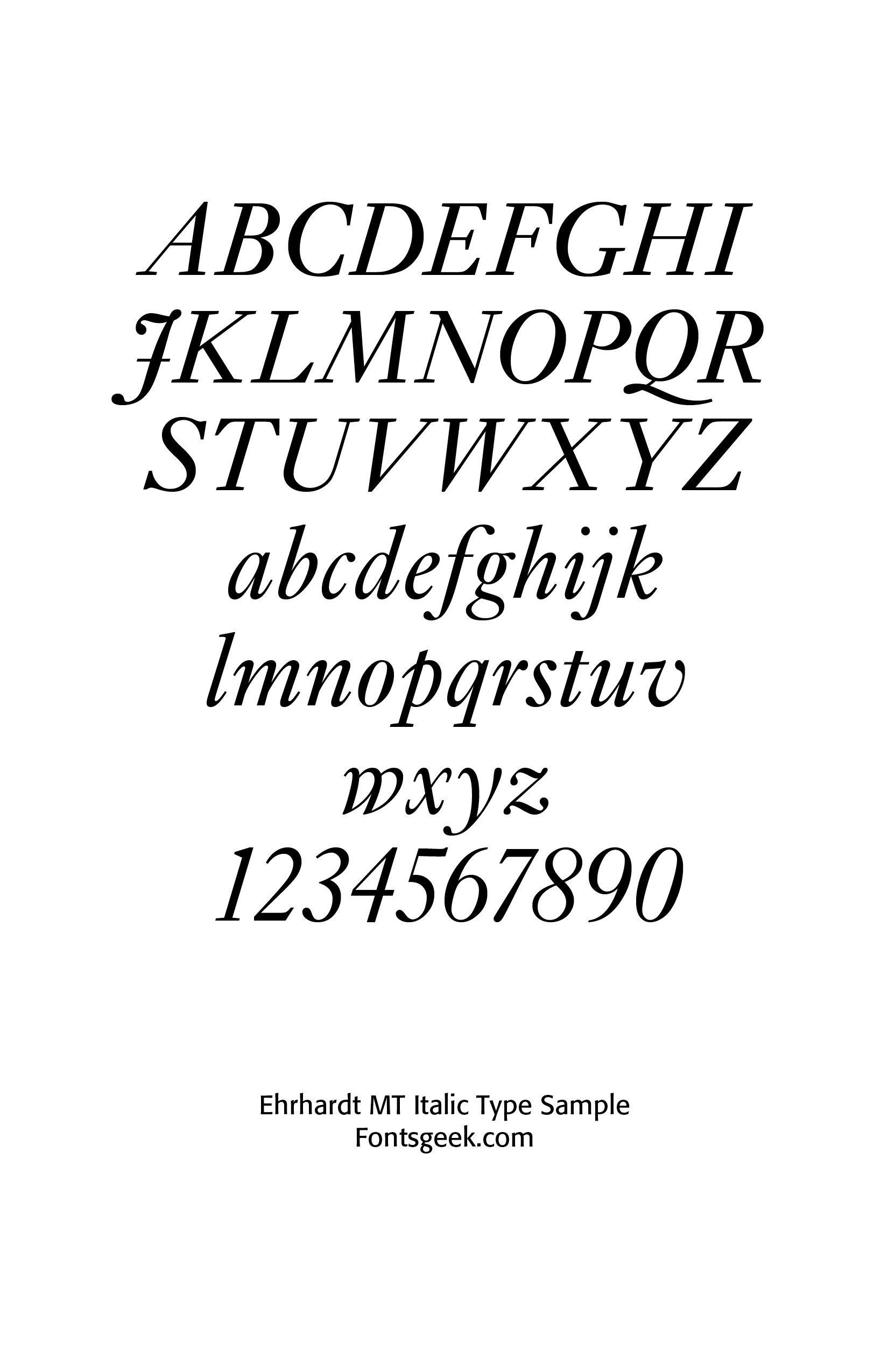
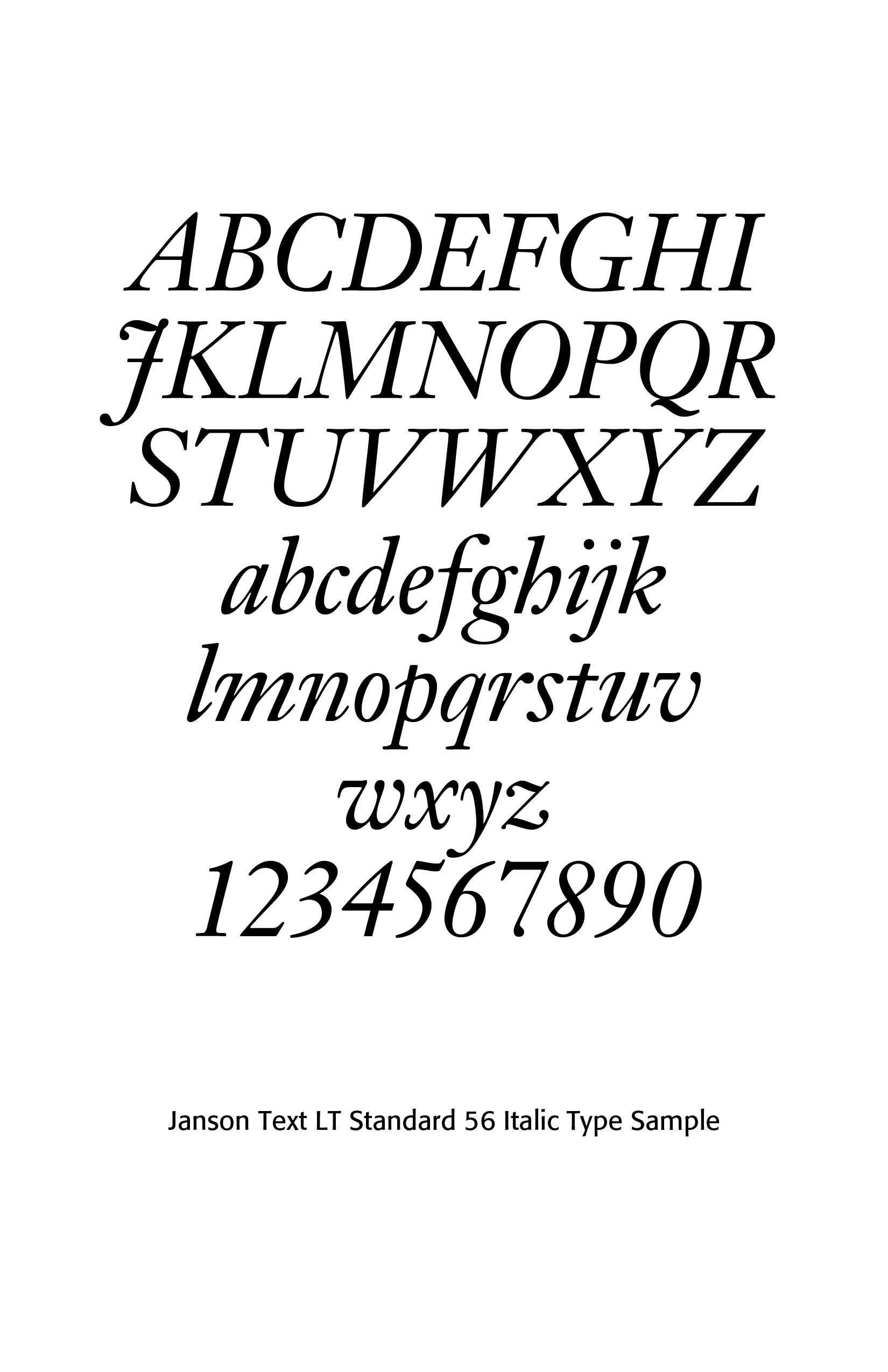
Miklos Kis worked in Amsterdam and produced some of the most admired Dutch-style transitional types. His work later became associated with “Janson” types. The Janson face, cut about 1690, had strong color, compact spacing and excellent book readability. Metal versions of this typeface were cut by Stempel, Mergenthaler Linotype 1937, Linotype (London), Linotype (Frankfurt) and Lanston Monotype. In the upper case the M is an easily remembered letter and in the lower case the g, which has a curved ear. In general the thin strokes are thinner than in earlier types. In the italic the m and n are more squared up. Note also the curves of the v and w. The Linotype version follows the original type was designed under the direction of C.H. Griffith. The Monotype Corporation's Ehrhardt (because the original types were in the Ehrhardt Foundry at Leipzig in the early eighteenth century) is a version of this type.[5]
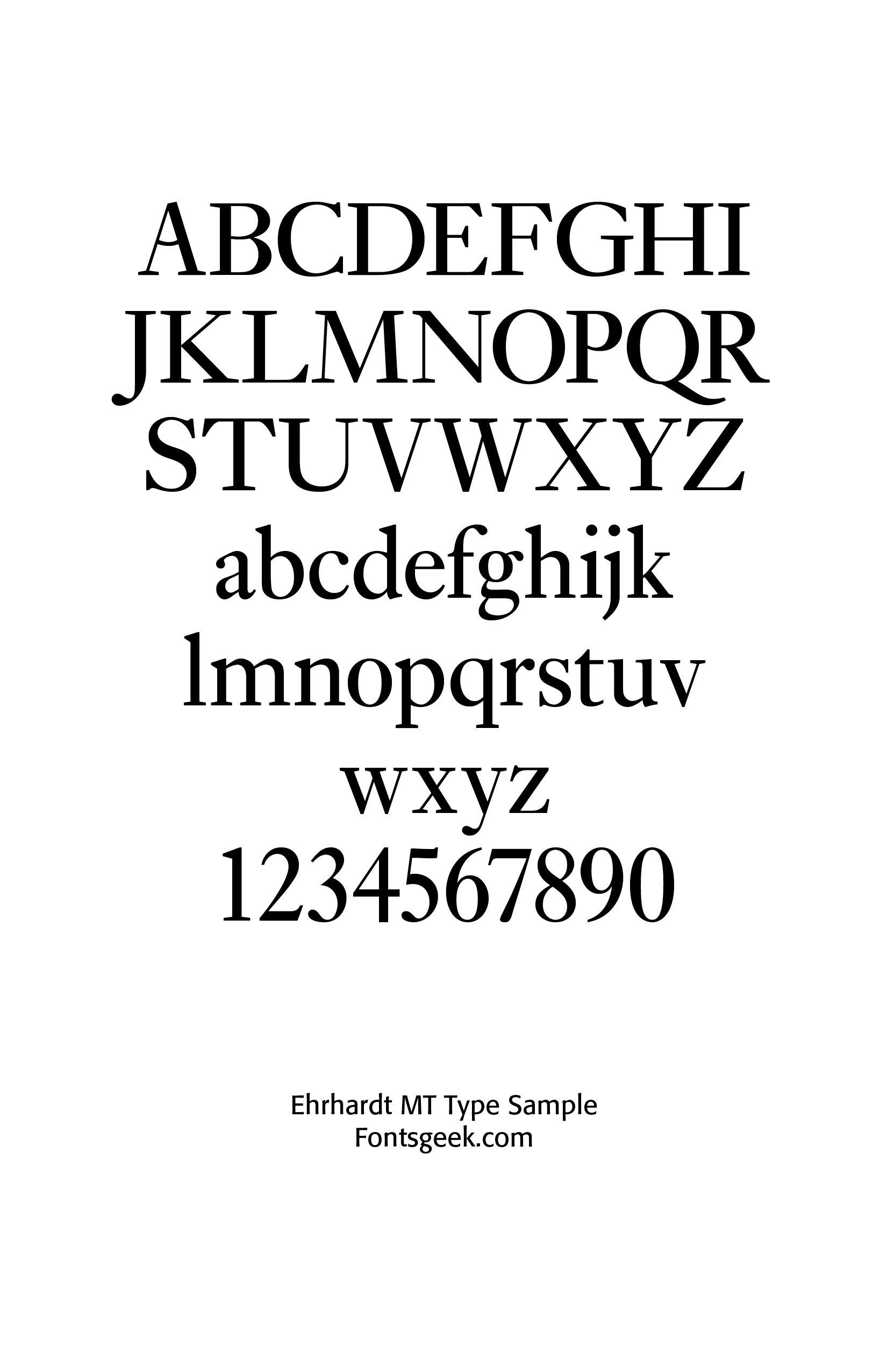
Ehrhardt is an old-style serif released by the British branch of the Monotype Corporation in 1938. It is noted for its economy, narrow width and dark text structure. Ehrhardt is a modern adaptation of printing types “stout Dutch character" from the Dutch Baroque tradition sold by the Ehrhardt foundry in Leipzig. These were cut by Kis while in Amsterdam in the period from 1680 to 1689. From 1937 to 1938, Monotype re-cut the type for modern-day usage, and it has become a popular book typeface. Ehrhardt has a slightly condensed design, giving it a strongly vertical, crisp appearance.
Distinctive features of Ehrhardt include an 'A' with gently curving bar matching the center-link of the 'B', a wide 'T' with spreadeagled serifs on either side and a 'b' with no foot on the left. In italic the 'J' has a crossbar, the 'w' has sharp reverse curves towards the top and left, and the 'v' has a flourish on the left. The face has high stroke contrast (difference between thick and thin strokes) by the standards of most old-style serif fonts. In order to allow compact line spacing, descenders were kept reasonably short. Notable books set in Ehrhardt include the New English Bible.[6]
Monotype has digitized Ehrhardt into the Open Type format, sold in standard and professional releases, with some releases including text figures and small caps. Berry, Johnson and Jaspert date the Monotype version in 1938 and write —"The original types were in the Ehrhardt foundry at Leipzig in the early eighteenth century. The type is another version of Janson. The upper case M is splayed and the g has a curved ear. There is also a semi-bold and italic. Many digital versions exist.”[7]
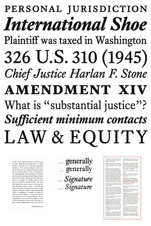
Matthew Butterick created a revival of Ehrhardt called Equity, whose design was inspired by his experiences of office needs from working as a lawyer, Equity has two grades designed to suit different types of paper and printers, known as Equity A and Equity B, the former of which is darker. Each grade has two weights (Regular and Bold), along with their respective italics, totaling four styles each.
Other Puritan Influences
Pierre Simon Fournier’s work with a serif style font reflects transitional developments related to Dutch influence. Son of typefounder Jean-Claude Fournier, he became famous as a type theoretician. He created his own point system in 1737, fourteen years after the French government decreed that types should have standards. In 1739, he created his own foundry. The king of France, Louis XIV, commissioned new types for use during his reign, and turned to Fournier. Reproduction of these types by others was not tolerated. And so, Fournier modèles des caractères were in use throughout Louis XIV's reign. He was known for incorporating ‘decorative typographic ornaments’ into his typefaces. Fournier's main accomplishment is that he ‘created a standardized measuring system that would revolutionize the typography industry forever.’ Fournier's contributions to printing were his creation of initials and ornaments, his design of letters, and his standardization of type sizes.[8] (SEE Blog at More Fournier, August 20, 2025)
William Caslon
The rise of William Caslon, the greatest of English letter-founders, stopped the importation of Dutch types. This changed the history of English type-cutting. After his appearance the types used in England were most of them cut by Caslon himself, or else fonts modelled on the style which he made popular. “Caslon's pica ... was based very closely indeed on a pica roman and italic that appears on the specimen sheet of the widow of the Amsterdam printer Dirck Voskens, c.1695, and which Bowyer had used for some years. Caslon's pica replaces it in his printing from 1725…Caslon's Great Primer roman, first used in 1728, a type that was much admired in the twentieth century, is clearly related to the Text Romeyn of Voskens.”[9]
While not used extensively in Europe, Caslon types were distributed throughout the British Empire, including British North America, where they were used on the printing of the U.S. Declaration of Independence. After William Caslon I's death, the use of his types diminished, but had a revival between 1840 and 1880 as a part of the British Arts and Crafts movement.
“There are other letters more elegant, since the Caslon characters do not compare in that respect with the letters of Garamond or Grandjean. But in their defects and qualities they are the result of a taste typically Anglo-Saxon, and represent to us the flowering of a sturdy English tradition in typography. Lacking a “national” form of letter, we in America (who are mainly governed by English printing traditions) have nothing better. Caslon types are, too, so beautiful in mass, and above all so legible and “common-sense,” that they can never be disregarded, and I doubt if they will ever be displaced.”[10]
American Printing
The first press set up in the Colonies was established at Cambridge, Massachusetts. Its activities extended from 1638 to 1692. Its equipment consisted of a printing-press and type, and with these three pressmen and a printer arrived in the summer of 1638. This proto-typographer of British North America was Stephen Daye, traditionally connected with the famous London printer, John Day.[11]
To make life beautiful was not the motive which led to the settlement of New England, and the promoters of the Cambridge Press merely desired that spiritual truth should be made more clear through its publications. The typography of its books was as unattractive and crabbed as the matter which it (perhaps fittingly) enshrined.[12]
The earliest types in such offices as that of Bradford, the first New York printer, were probably Dutch and English. Later types were English, and chiefly those of Caslon—although after 1775 (roughly speaking), type was made in North America. Primers and books, newspapers and broadsides, were mostly printed in Caslon old style types in the mid-eighteenth century and up to the Revolution. It was the face commonly in use until about 1800. Franklin admired and recommended Caslon’s types, and his own office was equipped with them. The style of composition of most Colonial work was like a provincial copy of London printing—and was, as a good rule, a good many years behind current London fashions.
John Day “left the most distinct mark on early sixteenth century English typography. He was born in 1522, and began work on his own account in 1546. Taking refuge abroad during the Marian persecutions of Protestants, he returned and began printing again in 1557, and on the accession of Elizabeth (who merely persecuted Catholics), worked on a larger scale. Day, by the way, was printer of the English edition in black-letter of that very famous Protestant martyrologium, Foxe’s Book of Martyrs in 1563; and in 1569 he produced A Book of Christian Prayers, commonly called “Queen Elizabeth’s Prayer Book,”a rough, tasteless black-letter volume, clumsily modelled on French Horæ, but which had great popularity. He also cut a fine Greek letter and some attractive musical characters, and mathematical signs, etc., not before cast in type.”[13]
The material that a well-known eighteenth century printer possessed is shown in the specimen of Isaiah Thomas (1749–1831) of Worcester, Massachusetts. Franklin called Thomas the “American Baskerville,” but his printing was not remarkable except in view of the period in which he worked, and the difficulties which lack of good paper, good ink, and good workmen placed in this way. Thomas’s chief work was his folio Bible, published in 1791—the first folio Bible printed in America—for which Franklin, to whom Thomas presented a copy, expressed great admiration.[14]
Sources
1. Matthew C. Bingham, A Heart Aflame for God: A Reformed Approach to Spiritual Formation (Wheaton, IL: Crossway Books, 2025), 240 & 242. Kindle Edition.
2. Joel R. Beeke, Meet the Puritans (Reformation Heritage Books, 2006 & 2025).
3. https://en.wikipedia.org/wiki/Christoffel_van_Dijck
4. https://luc.devroye.org/fonts-32658.html
5. https://luc.devroye.org/fonts-104413.html
6. https://en.wikipedia.org/wiki/Ehrhardt_(typeface)
7. Ibid.
8. https://luc.devroye.org/fonts-37262.html
9. https://en.wikipedia.org/wiki/Caslon
10. https://www.c82.net/printing-types/chapters/17#fig-262)
11. https://www.c82.net/printing-types/chapters/18)
12. Ibid.
13. https://bibles-online.net/flippingbook/1563/91/
14. https://www.c82.net/printing-types/chapters/18
Successful Layout & Design


