Ornamental Gothics

Carl Shank • August 30, 2025

Gothics History. Gothic typefaces are a broad group of styles rooted in medieval calligraphy and evolved into distinct print types during and after the invention of movable type via Gutenberg in the 15th century. They are sometimes confusingly named. In Europe “Gothic” usually refers to blackletter (medieval scripts), while in the U.S. “Gothic” often refers to sans-serif typefaces since the 1830s.


Gothic script is a broad term for the entire family of medieval European scripts that developed from Carolingian minuscule around the twelfth century. “Minuscules” are lower case letters as distinct from capital letters, or uncials. Type developed in the sixth through tenth centuries with modern lettering evolving from Carolingian scripts. The Emperor Charlemagne used these letters as an educational standard.


These densely packed scripts featured tall, narrow letterforms, strong vertical emphasis, sharp, angular connections, a dramatic thick/thin contrast and minimal spacing between letters. Gothic-inspired fonts create immediate medieval impact and work beautifully for titles, logos, and short display text. They are used today in Fantasy Gaming, Historical Projects, Themed Entertainment (like the Renaissance Fair), Book Design, Certificates, Breweries and Distilleries. Jack Nolan, a professional graphics designer, has provided a fetching display of such faces in his "33 Medieval Fonts Perfect for ‘Ye Olde’ Designs in 2025."(1)


Substyles
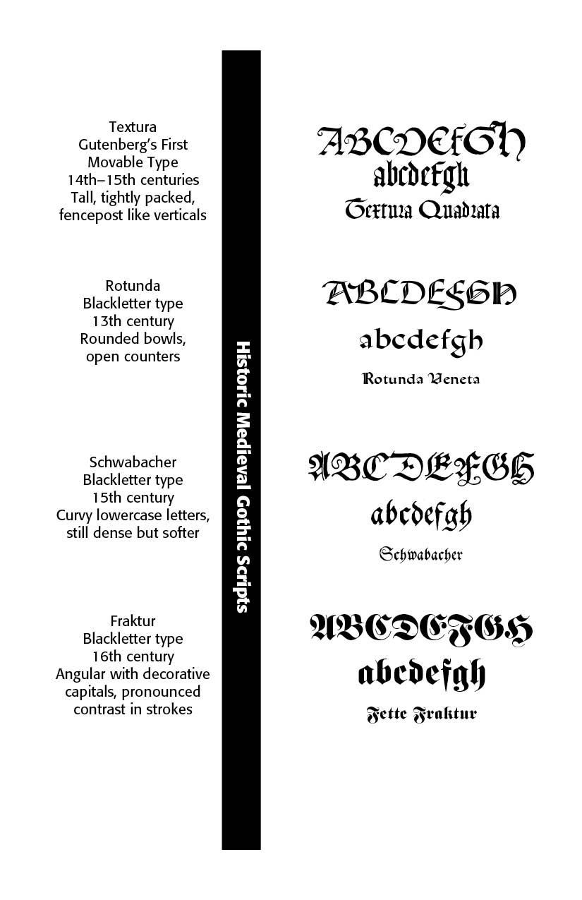
Substyles of Gothic script developed in several major typefaces — Textura, Rotunda, Schwabacher, and Fraktur. Textura (Textualis) has very dense, upright, tall little-spaced letters with sharp, angular strokes and minimal curves. The vertical emphasis offers almost no slant and there are diamond-shaped serifs at stroke ends.


Textura was used in the Gutenberg Bible along with other formal and liturgical documents. Old English Text has heavily borrowed from Textura Quadrata. (I have traced some of this history in two books I wrote — Bible Typography: A History of Bible Printing and Versions, and Typographical Beauty Through the Ages: A Christian Perspective, both available from Lulu Press [lulu.com]or on Amazon.)


Rotunda, with its rounded bowls and more open counters, is rounder and more open than Textura, thus, easier to read. It has softer curves and fewer broken strokes, more spacing between letters and blends elements of Carolingian minuscule with Gothic verticality. Rotunda was mostly used in southern Europe and Italy.


Schwabacher was a transitional form between Textura and Fraktur, with moderate curves. It has round lowercase letters, more flowing that Textura but denser than Rotunda. Distinctive shapes are “g” and “s.” This face was popular in German books in the late fifteenth – sixteenth centuries.


Fraktur, the most famous German blackletter type, was widely used from the 16th to early 20th century. It has broken yet ornate strokes with both sharp and curved elements. Tall ascenders and elaborate capitals made it the official German type in publications and newspapers until World War II. Its Nazi associations and use with German nationalism due to its use in Nazi propaganda makes it suspect in politically sensitive contexts.


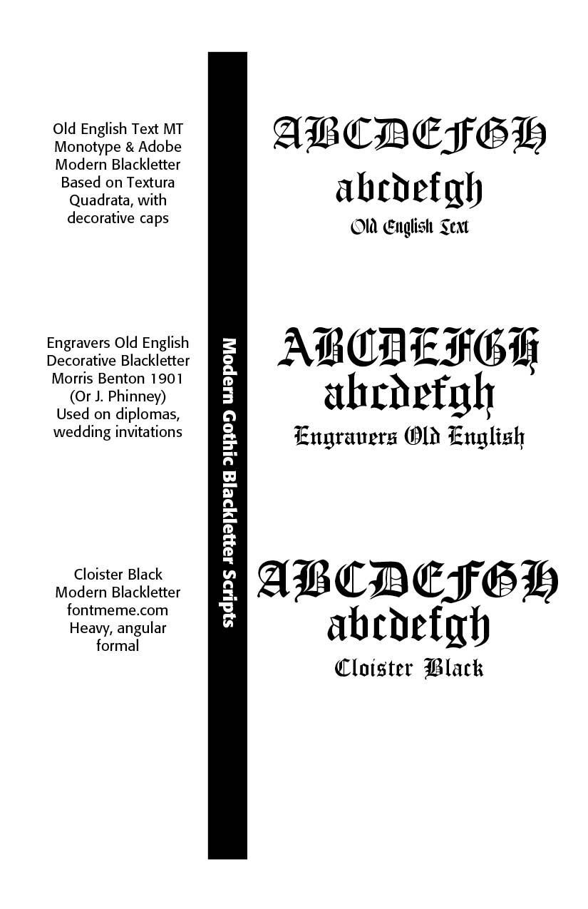
Modern revivals have seen these historic Gothic faces used in diplomas, certificates, beer labels, metal bands, and logos. Old English Text (see Below), Engravers Old English and Cloister Black are favorite faces. These Gothics were gradually replaced by Roman typefaces for readability. Nazi Germany’s later ban on Fraktur in 1941 ended its official use.


Gothics & Old English Typefaces. There is often confusion between Gothic Blackletter faces and what we call Old English type. What we can say is that All “Old English” fonts are Gothic, but not all Gothic fonts are “Old English.” The true Old English language was never written in what we call “Old English font” today—that name is a modern typographic misnomer.


The term “Old English” in typography usually refers to blackletter styles, particularly Textura Quadrata. However, this is somewhat misleading as the actual Old English language (Anglo-Saxon, used from the fifth through eleventh centuries) was typically written in Insular scripts, which look quite different from the later blackletter styles many associate with “Old English” typography. “Old English” was actually the language of the Anglo-Saxons until the mid 1100s and they had nothing to do with Blackletter. Centuries after Blackletter’s initial emergence, “Old English Text” was the name of a font by Monotype that mimicked eleventh century Textura.


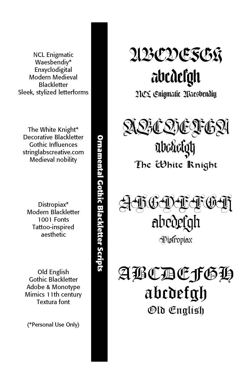
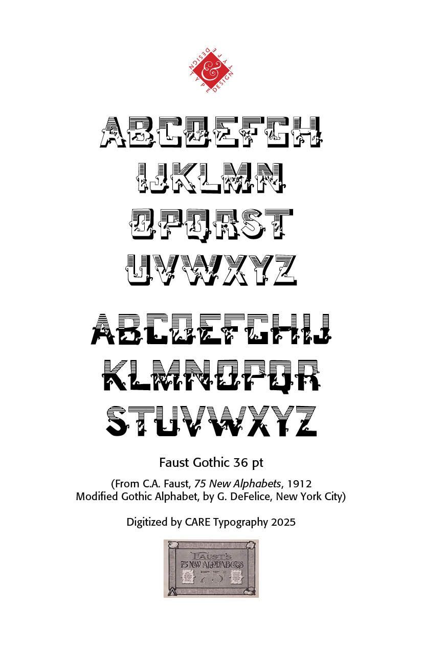
Modern Old English fonts include Old English Text MT, which is based on Textura Quadrata, often with decorative capitals, Cloister Black,  Engravers Old English, used on diplomas and wedding invitations, and a number of  Ornamental variations with type foundries sometimes adding swashes, outline versions, or engraved shading to classic blackletter faces, such as those in the Faust Gothic typeface.


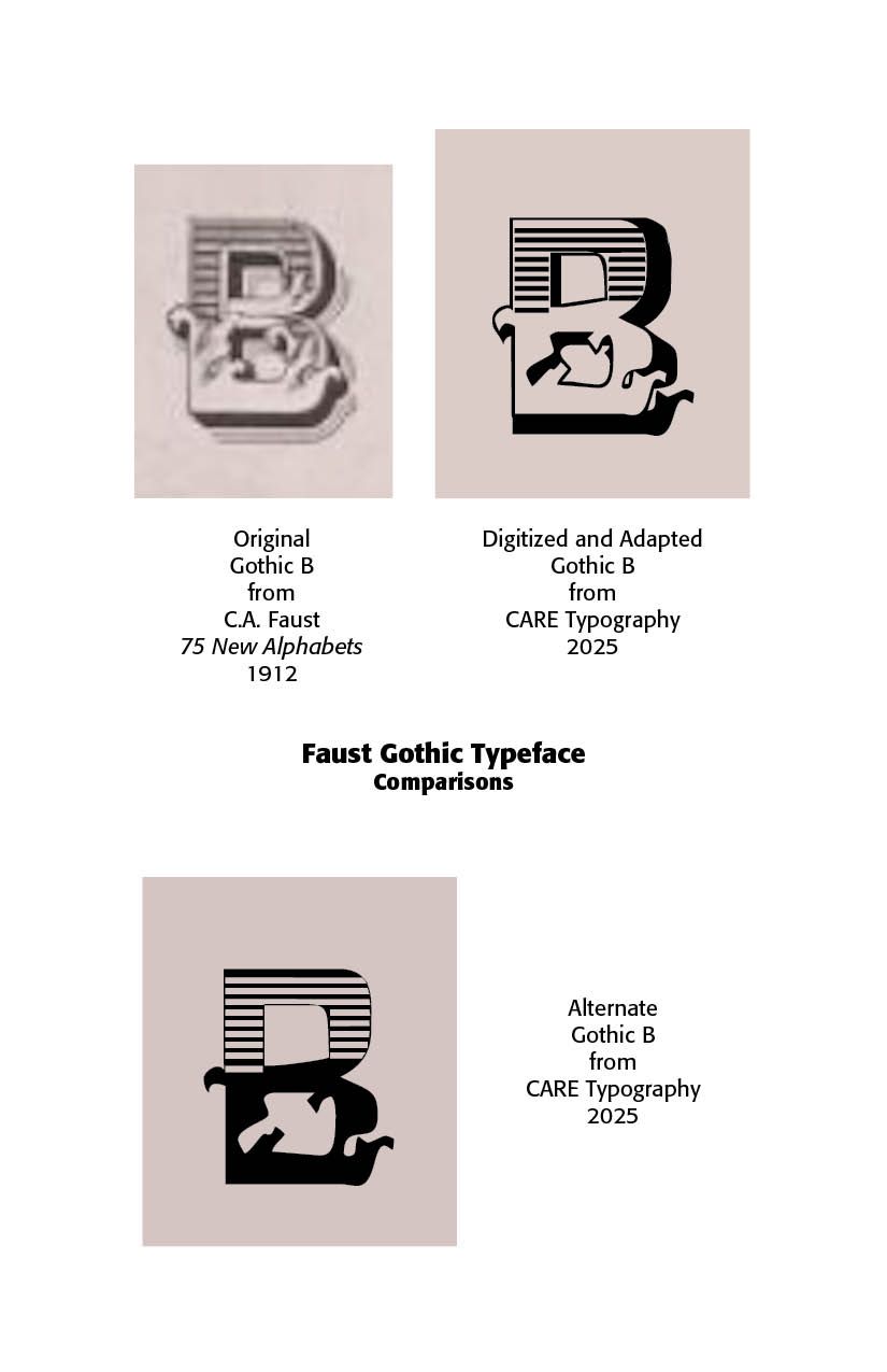
Ornamental Gothic Fonts. Ornamental Gothic fonts possess elaborate capitals, initial letters that are often highly decorated, with swirls, flourishes, or foliage (sometimes called “Lombardic capitals” when round). These capitals may contain internal ornamentation such as hatching, shading, or miniature drawings. A fine example is the font found in C.A. Faust’s 75 New Alphabets in showcasing a Modified Gothic Alphabet, by G. DeFelice, New York City. This font has been digitally recreated and adapted for use by CARE Typography. It is available for purchase and use.


Such ornamental fonts have intricate strokes, with stems and crossbars that may include spur-like extensions, curls, or diamond finials. Pen strokes often show “broken” or “fractured” angles that create a textured look. Thick verticals and thin connecting lines give a dramatic texture. Many ornamental Gothic faces accentuate this contrast with embellished serifs or small spikes. Some of these fonts have decorative ligatures, letters are frequently joined in ornate ligatures (e.g., “ct,” “st,” “Th”). These ligatures may have extra curves or swoops that fill the space between letters.


Ornamental caps may use color and gold in original manuscripts. Historically, ornamental Gothic scripts in illuminated manuscripts often included red, blue, or gold initials, with pen-drawn filigree or “trailing vines” (called flourishing or “rinceaux”).


Modern American Gothics. “Gothic typefaces” in American usage historically refer not to medieval blackletter scripts (as in Europe), but to sans-serif typefaces, especially from the late nineteenth to mid-twentieth century. American printers and foundries used the term “Gothic” for what we’d now simply call sans-serifs.


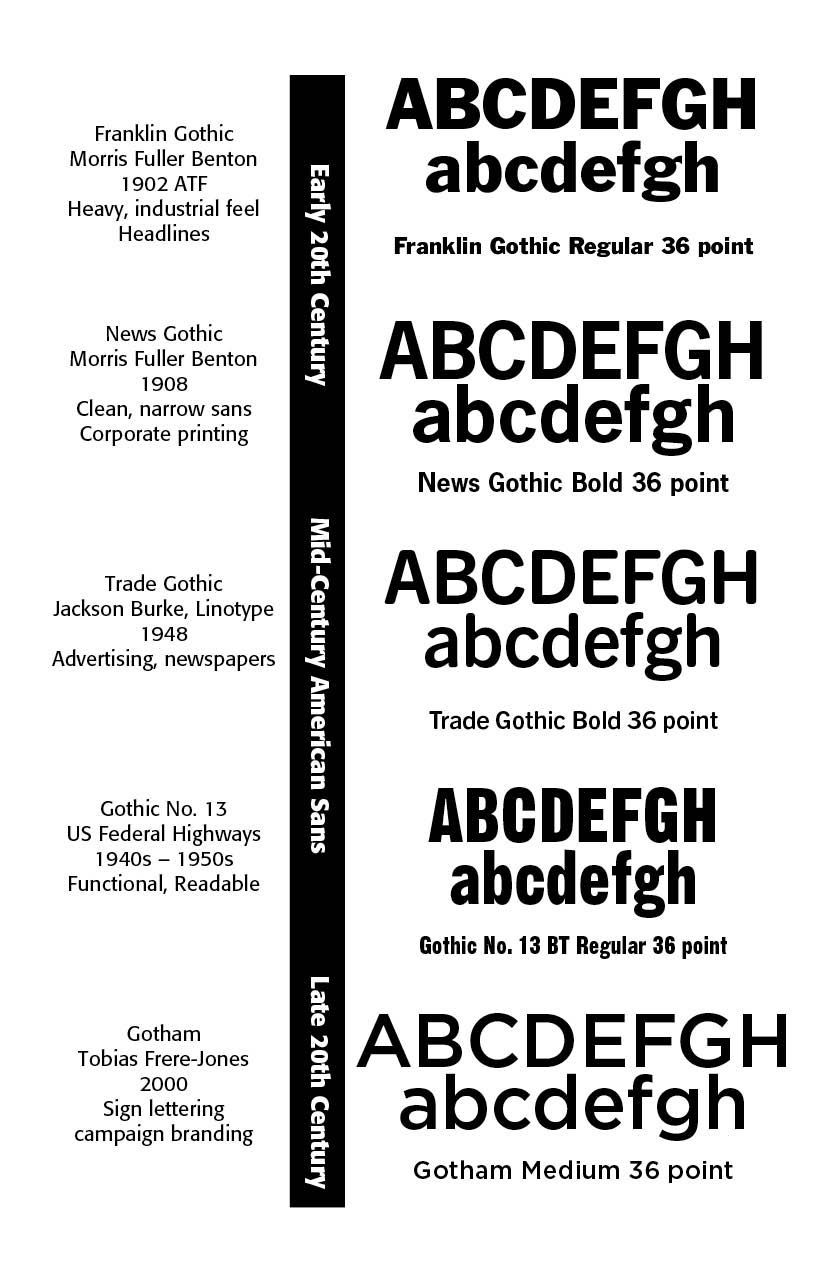
As early as the 1830s, “Gothic” became the standard name for sans-serif display faces. They were mostly used for advertising, posters, and signage rather than book typography. Key features included condensed proportions, simple strokes, minimal contrast, and sometimes quirky letterforms. Boston Gothic (c. 1837) was one of the earliest American sans-serifs. Franklin Gothic (1902, Morris Fuller Benton, ATF) with its heavy, industrial feel, became a dominant American sans-serif for headlines. News Gothic (1908, Benton, ATF) was lighter and more neutral than Franklin Gothic, ideal for newspaper text and display.


Trade Gothic (1948, Jackson Burke, Linotype) is a workhorse sans used heavily in advertising and newspaper headlines. It is more irregular and “lively” than the geometric European faces (like Futura). Gothic No. 13 / Highway Gothic (FHWA Series, 1940s–50s) was designed by the U.S. Federal Highway Administration for road signage. It is functional and legible at distance and speed rather than stylish.


Gotham, an example of late twentieth century Neo-Gothics (2000, Hoefler & Frere-Jones), is based on mid-20th century American sign lettering and architectural sans-serifs. It gained fame in Barack Obama’s 2008 campaign branding. Gotham’s designer notes that “Gotham celebrates the attractive and unassuming lettering of the city. New York is teeming with such letters, handmade sans serifs that share a common underlying structure, an engineer’s idea of “basic lettering” that transcends both the characteristics of their materials and the mannerisms of their makers. These are the cast bronze numbers that give office doorways their authority, and the markings on cornerstones whose neutral and equable style defies the passage of time. They’re the matter-of-fact neon signs that emblazon liquor stores and pharmacies, and the names of proprietors plainly painted on delivery trucks. These letters are straightforward and non-negotiable, yet possessed of great personality, and often expertly made. And although designers have lived with them for more than half a century, they remarkably went unrevived until 2000, when we introduced Gotham.”


SOURCES

(1). 33 Medieval Fonts Perfect for ‘Ye Olde’ Designs in 2025

Jack Nolan Updated Jul 23, 2025

https://designworklife.com/medieval-fonts-fantasy-or-renaissance-flair/

He highlights Silvermoon, Goldiwak, The Quironax, Synthetic Stone, Dragonhelm, Inkwell Scribe, Dragonit, Cikond, Hortens, Black Kinger, Black Baron Typeface, NCL Jurgen Farbache, Basefigh, Raven Hell Round, Iron Steel, Odd Times, Enigmatic Waesbendly (Modern Blackletter), Falcone, Enchant, Marcus, Windshire, Fenrir Gothic, Ambrosia, Heraldic Shadows, The Hero King Typeface, Raven Hell Regular, Wicked Knight, Lordish Blackletter, The White Knight (my second choice), Distropiax (3rd choice), King Castle, Moleta, Othelie.


Successful Layout & Design

By Carl Shank April 7, 2026
The King James Bible (KJV), commissioned by King James 1 in 1604 and published in 1611, has been a profound Bible translation and masterpiece of beauty through the ages. It has been one of the most influential English translations of the Bible. Its history combines politics, religion, and literary achievement in early modern England. It has an elevated, poetic style that influenced many later writers. It has been prized for its literary beauty, historical continuity and memorability in public reading and worship (ChatGPT).
By Carl Shank April 6, 2026
Responding to AI and Digital Babylon H. Carl Shank April 4, 2026 Austin Gravley, a former Social Media Manager of The Gospel Coalition, and now the Director of Youth Ministry at Redeemer Christian Church in Amarillo, TX, is writing a book on AI and the digital revolution taking place. He compares this Digital Babylon and its captivity and its exiles to Christians living under the overwhelming influence of an active anti-Christian developing AI. Piecing together his comments with those of many others on the advancing scene of AI on our lives, several themes come to mind. First, AI is not God. While there are some in the Silicon Valley who might wish or see AI as a unifying, ontological force that can shape or rule our lives — the Super Machine —others remind us that this is only technology. And as advanced as AI is and becomes, God is still sovereignly in control of it and our lives. Jason Thacker, professor of philosophy and ethics at Southern Seminary and Boyce College, writes — “We must engage these issues, rather than respond after their effects are widely felt. But we don’t have to face today or tomorrow with fear. God is sovereign and his Word is sufficient for every good work, so we are able to walk with confidence as we apply his Word to these challenges with wisdom and guided by his Spirit.” ( The Age of AI: Artificial Intelligence and the Future of Humanity , Zondervan, 2020) A recent storm that darkened my community and scuttled Internet services reminded me of that. Even AI data centers, growing to over 3,000 in 2025 nationwide, are not immune to power disruptions and total blackouts. AI pundits may claim to have control procedures to keep the Internet and AI running cannot promise it to be so. We need to keep this in mind in the Digital Babylon age, as was needed to be kept in mind by Israel in the Babylonian Empire age in biblical times. Babylon went through many iterations, but will be defeated by God at the end of the day, as noted in Revelation. Digital Babylon will experience the same demise. This is not prediction, just Bible truth. We as believers need to hold on to such truth. Second, AI is still technology. Indeed, advanced and advancing technology, but not human. Matthew Schultz in a recent mereorthodoxy.com article notes— “Technology has existed since the Garden and is an integral component of our cultural mandate. We should also remember that one of the core distinctions between the Creator and his creatures is that we never create matter but merely (!) rearrange it. This becomes clear whether we consider an ancient farmer in Mesopotamia irrigating a plot of soil, a medieval peasant in Northumbria weaving a basket from flax, or a young musician in London taking the raw outputs of machine sound, adjusting its pitch, volume, and length, and incorporating it into a DAW loop. While there are all sorts of important distinctions and qualifications between pre- and post-industrial craft, there is no metaphysical distance between the two.” ( Artificial Intelligence Is A Technology , Feb. 26, 2026). AI may be the harbinger of a new Industrial Age, but though changes will be major and sometimes severe, the human side of the equation cannot be discounted or counted out. Part of my retired status as a pastor and theologian is that of a typographer restoring old type faces and doing a deep dive into the history of type. Two historical typographical truths stand out. Although the Renaissance age brought movable type from Gutenberg and others into the machine age, the typographical flair of those ancient scribes with pen-drawn exquisite type remained a stylistic standard. The second note is that with the Industrial Age, while affecting the quantity and speed of type development and printing, master type craftsmen rebelled against machine driven type for more organic typefaces. This was seen, for instance, in the type movement spawned by William Morris (1834–1896). William Morris was an Arts & Crafts designer who founded the Kelmscott Press (1891), reviving hand craftsmanship in printing. His work influenced the twentieth century private press and type revival movements. Lettering became a vehicle for breaking convention. Led by figures such as Morris, there was a decided reaction against industrialization, seeing machine-made goods as dehumanizing and ugly. Handcraftmanship, honesty in materials and utility fused with beauty made up much of what was called the Arts & Crafts Movement. That movement was rooted in medieval guild ideals and morality in design. (For an expanded history of type development, see “Advances in Typography: A Historical Sketch — Three Parts” in the blogs by CARE Typography, www.caretypography.com , Nov. 8, 2025, Nov. 18, 2025 and Nov. 20, 2025) Third, AI affects everyone everywhere. Austin Gravely, a former Social Media Manager of The Gospel Coalition, raises and answers the query — “’So what?’, you may think. ‘I’m not an Internet technician. I’m not a fan of AI. I’m not planning to change how I use the Internet. Why does any of this matter to me?’ To put it bluntly: you are naive if you think these disruptions won’t directly affect you, or indirectly affect you through the effect they will have on others. If the iPhone, social media, and AI have taught us anything, it is that you are impacted by these events regardless of whether you participate in them or not.” ( The State of the Internet: 2026 , mereorthodoxy.com, March 30, 2026) He goes on to say — “A changing Internet will change you. It will change you in ways you can see and in ways you can’t. It will change those you live with, work with, play with, build with, and fight with. It will change what is possible, probable, permissible, and prohibited in your life, your vocation, your church, your neighborhood, and any other physical space the Internet touches.” I recall my 99 year old mother who passed away a couple of years ago in a nursing facility. She was one of those survivors of the Great Depression and World War Two who dismissed the first moon landing and had her flat screen TV removed from her room for fear the government was watching. She lasted for nine years in the same private room in a modern nursing center. She was attended by doctors and nurses and staff who used AI on their computers and other care devices. She even had a modern digital phone removed from her room and refused to learn it. While she personally rebelled against her AI driven machine age, she could not escape those who used such technology for her care. We cannot isolate ourselves from AI and its advancing development, no matter how isolated we try to be. Fourth, AI can be either a blessing or a curse. Again, Matthew Schultz notes — “Our task is not to develop a unique theology of AI but to catechize our members into a people who can wield this technology without becoming captive to its internal logic. Like alcohol, artificial intelligence will become a test of character, a dangerous good that divides the foolish from the wise.” He says “Yet the greatest danger is both more pervasive and less obvious: AI is much more likely to be deployed as a multiplicative layer that allows ever more efficient micro-targeting of digital services and physical products by industries that already profit from compulsive behavior. The advent of hyper-personalized, real-time engagement strategies will require legislative safeguards, especially if AI leads to video advertisements generated in real time for an exhaustively mapped individual profile.” We must seek to “humanize” AI and employ it “humanly.” We must resist the phenomenological bent toward unbelief in AI development and pressures. We must once again learn to think critically and pervasively and biblically about AI. Our young people must be taught prescriptive critical thinking practices, rather than unwittingly and ignorantly giving in to what their phones and computers spit out. Church and ministry pastors must pastor rather than let AI bots plan, prepare and even give their sermons. We must learn to smartly negotiate with the “Magnificent Seven”— Apple, Microsoft, Alphabet, Amazon, Meta, Nvidia and Tesla — rather than blindly following their lead. Convenience and speed must not be allowed to overtake and overcome careful, sustained and critical thinking and acting. “To give language to this change, we must take the best of Christian thinking regarding the social and political imaginary and apply it to the economic imaginary of life under the glowing shores of Digital Babylon, and that kind of work cannot be done with quick hot takes. It will take slow, deep, and thoughtful meditation to apply the riches of Christian thought to making sense of the companies that got us here and where they are taking us.” (Austin Gravley, The State of The Internet: 2026 ) I am both excited and wary of AI. I have learned to be much more cautious about social media and the videos and photos and information they give. Much of it has been and is being AI produced and tweaked. Spammers use AI technology to wrest thousands of dollars from unsuspecting senior citizens. Schools are requiring students to turn off their cell phones or “bag” them until after school hours because of the insidious nature of AI generated stuff. I value more and more of a face-to-face approach in teaching and learning and mentoring others. And we must adopt a state of “believing is seeing” rather than a non-Christian scientifically sanctioned “seeing is believing” approach to truth and justice.
Show More