Early Printing & Typography: An Extended Early History
Early Printing and Typography —
An Extended Early History
In previous Blogs I investigated the history and development of the alphabet (Ancient Alphabets, Oct 28, 2023), along with a pictorial history of type (Typography: Pictorial History, May 15, 2024), a pictorial history of the development of printing machines (Typography: A History of Machines, March 12, 2023), printers marks (About Printers Marks: Highlighting Crosses, March 15, 2024) and old Bible typographic versals (Old Bible Typography Versals, April 19, 2024). The history of typography and printing is rich and extensive —and interesting. The following summary of early printing and typography gives a picture of the long, and sometimes tedious, history of such printing.
Most people somewhat familiar with the history and development of printing believe, with substantial reason, that printing and the development of typography began with Johannes Gutenberg and his invention of the printing press in or around 1440. Indeed, a sculpture of Gutenberg was made by David Angers in 1839, celebrating the “light that was made.” Alexander Lawson maintains that rather than Gutenberg inventing printing, he merely mechanized it — "In fact, he should be credited with the origination of interchangeable parts with his concept of single type letters." (Typographic Journey—Craft to Computer, Typeworld, July 1, 1992). Gutenberg studiously followed his scribal predecessors in printing the Bible for popular use.
But like other historical events, and especially typography history, there is much more to the story that needs to be told. The question is not whether presses of different kinds were already known before Gutenberg. Indeed, long before printing in Europe, the general mode of printing in China had always been from wooden blocks, yet separable letters, known to them as early as the eleventh century.
In the Chinese King-Li period (1041–1048), a blacksmith named Pi-ching invented a manner of printing with “ho-pan,” or tablets formed of moveable types. On a fine and glutinous earth, formed into plates, Pi-ching engraved the characters most in use. Each character formed a type. He burnt these in the fire to harden them. In printing, he took a frame of iron, divided interiorly and perpendicularly by strips of the same metal. He laid this on a table of sheet iron coated with a fusible gum of resin, wax and lime. He inserted the types, placing them one against the other. Each filled frame formed a tablet. Brought near to the fire, the gum melted, after which a level piece of wood was pressed forcibly on the surface of the types. The tablets were then printed from in the usual manner.
Twenty-five hundred years before the Christian era, Egyptians wrote on papyrus. The inner portion of the plant was stripped, the strips laid across each other, pressed and dried. These squares were then joined together to form a long strip, which was rolled around a rod. One of the oldest books on record, The Book of the Dead, came from such a procedure. Many other books on religion, law, medicine were written. The Hindus used skins and palm leaves, and writings in sanscrit were most likely done in temples by Brahmin priests. The Vedas, sacred writings as old as 2000 BC, formed a large part of the literature. Hebrews wrote on stones and animal skins, preserving much of the Old Testament of the Bible. Scribes in the Middle Ages copied manuscripts, preserving Christianity in those dark times.
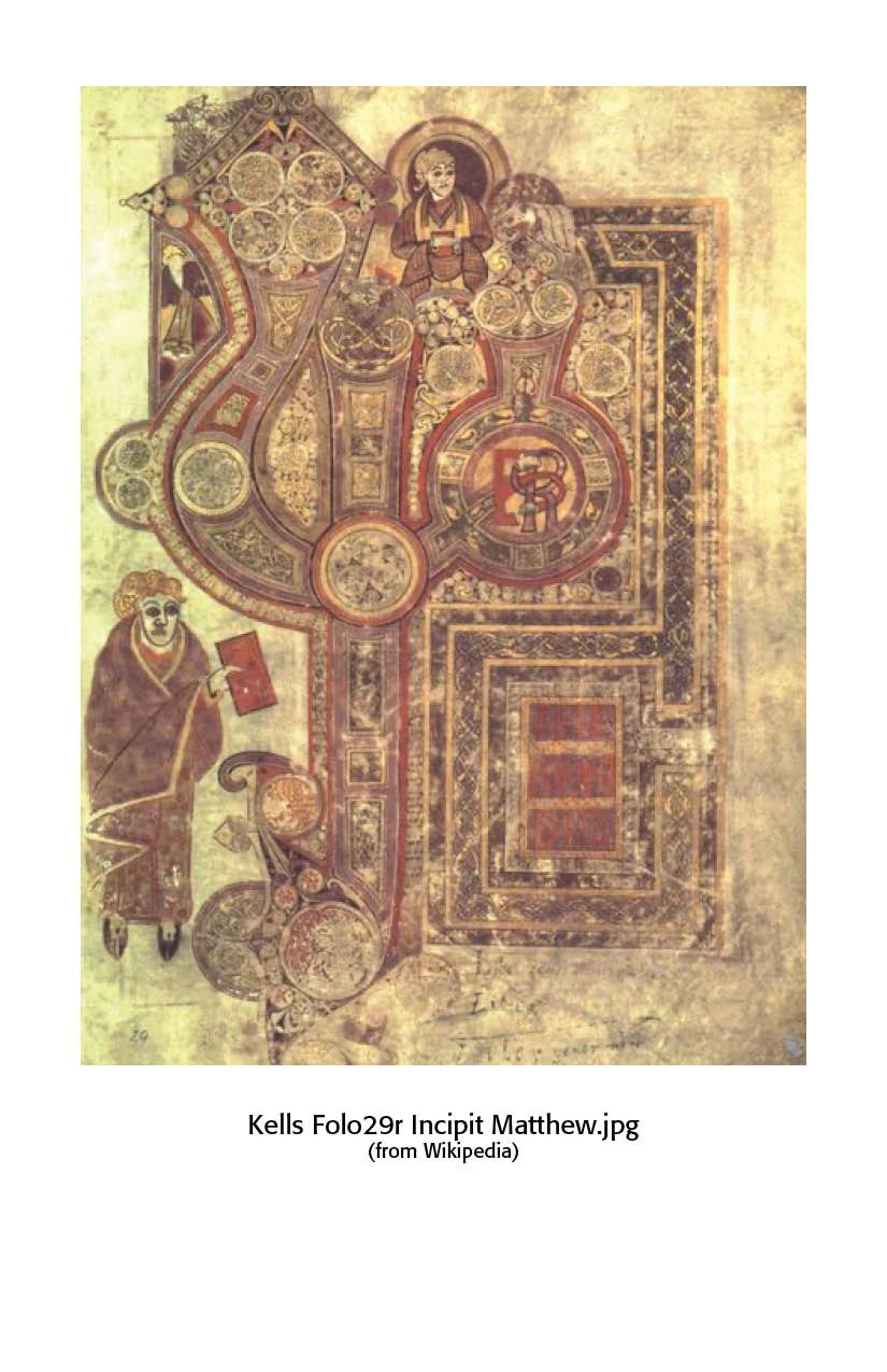
Scribal art can be seen in the famous Book of Kells, a copy of the Gospels written in the seventeenth century. It is notable because of the excellence of its decoration, the endless variety of initial letters, and the careful lettering. This was probably produced in the monastery of Kells, founded by St. Colombo. In such manuscripts, what is notable is the gold, red and blue lettering. (See Sample on Right)
Typographers in Europe and the western world used frames, or coffins, made of planks of wood, in which rectangular hollows were cut the size of the pages to be printed, and these types, after having been string together, were placed in horizontal lines. Before this, printing of block books was done by placing the paper on an inked surface and rubbing the back. Simply constructed presses, prototypes of the modern hand press, were used for printing playing cards and image prints. They were then colored by means of stencils. A French made printing card, dated 1423, is 8 x 11 inches in size and is the oldest dated specimen of such printing. Such means gave us the word “printing.” The Biblia Pauperum (Bible of the Poor) was another block book prior to the invention of typography.
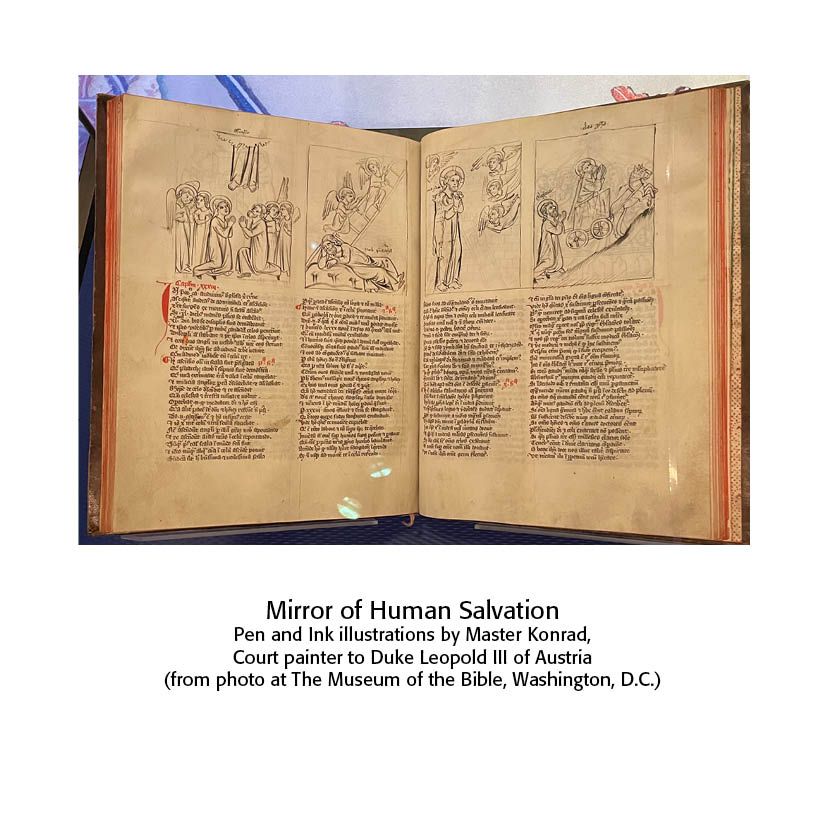
The Speculum Humanse Salvationis (Mirror of Human Salvation) represents the transition from block books to type printed books. Of the sixty-three pages, twenty are printed from wood blocks and forty-three from separate types. It consists of rhymed Latin couplets that show how events in the Old Testament prefigured events in the New Testament. The image on the left is from Austria, about 1370.
Then comes Gutenberg and his grand invention or use of the printing press and the art of typography. But there has been a lot of historical discussion as to whether Gutenberg was the first printer. Indeed, some scholars have given the credit to another person in another country prior to 1450. The claims of Holland were presented about 1566 by Hadrian Junius, or Adrian the Younger, dubbed by others as the “Coster Legend.” The claim is that a Dutch edition of the Mirror of Salvation was printed with separate types cut from wood. Four editions, two in Latin and two in Dutch, are known to exist, all printed from types except twenty pages of the second edition, which are printed from engraved blocks.
Gerard Meerman in 1765 published Origines Typographical, concluding that typography was invented by Laurens Coster, a sheriff at various times between 1422 and 1434, who used separate wood types about 1428 or 1430 and was robbed by Johann Gensfleisch, elder brother of Gutenberg, who carried the art to Mainz. For a number of years, Coster was given equal honors with Gutenberg as the inventor of typography. However, a study by Anton Van der Linde in the 1800s argued that Coster’s cause had been misrepresented by Koning and others. While there may be some truth to the Coster story, the proofs are weak and the identity of Coster was never settled. Gutenberg, on the other hand, is shown by innumerable records to be the probable inventor of separate mental types and the inventor of typography, most likely in Strasburg rather than Mainz
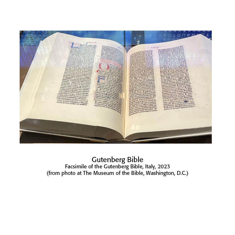
Johann Gutenberg. Born in Mainz, Germany about 1399, Gutenberg moved with his family to Strasburg around 1420 because of civil strife in Mainz. In 1450 Gutenberg went to Johann Fust, a citizen of Mainz, and borrowed needed money for his printing operation. Gutenberg reneged on the loan and was brought before the town court, and Fust secured the printing presses and books from the house of Gutenberg. The records indicate that Gutenberg printed with separate metal types at Mainz, during the years 1450–1455. Of course, his greatest achievement was the famous Forty-Two Line Bible, consisting of thirteen hundred pages, about twelve by sixteen inches, two columns to the page, with the columns containing forty-two lines. The typeface is in today’s sizes 20-point book Gothic lettering. Gutenberg died in 1468. Along with Johann Fust, Gutenberg’s printing associate, Peter Schaeffer, became a partner in the business. They produced a Psalter, the first book with a printed date of August 14, 1457.
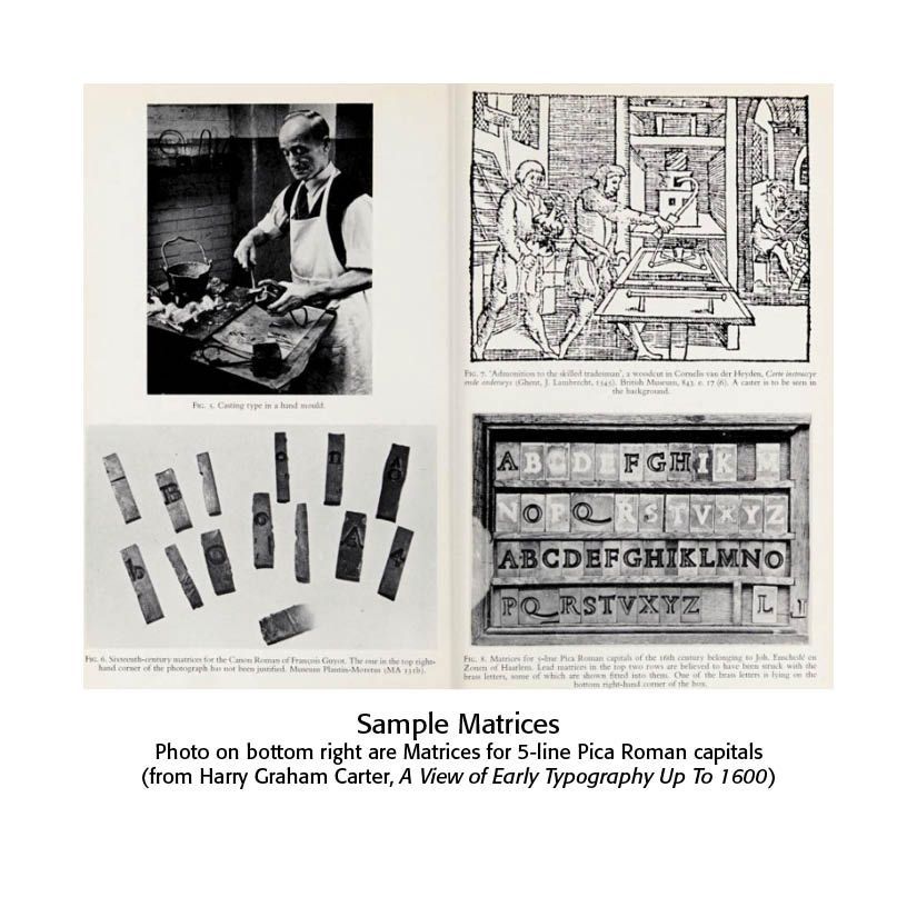
So, how were the letters made? Gutenberg found a way of stamping the shapes of every letter of the Latin alphabet in what they called “matrices.” From these matrices they cast their letters in copper or tin, hard enough to be printed on. The matrices consisted of a number of small troughs of uniform length, each one the size, in regard to depth and thickness, of the shape of a letter. These shapes were stamped into a prepared mold of clay or plaster. The fused metal was poured into these matrices.
A testimony to Gutenberg’s printing developments and tenacity was recorded by Wimpheling, a German educator and theologian (1450–1528) — “His sense of duty to his convictions was manifested in his boundless faith in the ultimate success of his inventions ; his courage was dauntless; no difficulties could deter him from following the path he was resolved upon pursuing ; his diligence was unwearied; his perseverance indomitable. In spite of numerous failures, or what seemed such to men less hopeful than himself, he constantly attracted new friends and supporters, as old ones fell away. Losses, lawsuits and ingratitude dogged each step of his career; but he triumphed over every difficulty; saw the Art he had invented become the means of bringing fortunes to men who had at different times been his associates and opponents; and died esteemed and honored by the sovereign of his native city. Well did he realize the truth of the inspired proverb of the Royal Hebrew sage, — ‘Seest thou a man diligent in his business, he shall stand before kings ; he shall not stand before mean men.’" (Skeen, Early Typography, 196–7)
Sir Edward Creasy of Ceylon wrote — “The circulation of printed books created hosts of readers, who otherwise would have remained ignorant of any kind of literature, ancient or modern. It gave an immeasurable increase to the weight of public opinion. It stimulated discovery. It promoted discussion. of opinion difficult, and generally impossible. It shook to the very base every institution that was founded on fraud, or upheld by unjust force. It gave also weapons to those who seek violent changes merely from the love of innovation and violence. Among the numerous causes which co-operated in giving European history the altered character which we discover in it during and after the close of the fifteenth century, none have been more operative than the invention of moveable types.” (Skeen, 199–200)
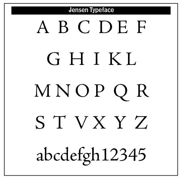
Post-Gutenberg. Nicolas Jenson (1420–1480) developed the roman style typeface and studied printing under Gutenberg. The printed roman lowercase face took on the proportions, shapes, and arrangements that marked a transition from an imitation of handwriting to the style that has remained in use throughout subsequent centuries of printing. Jenson also designed Greek-style type and black-letter type.(Britannica). A colophon, the forerunner of the modern title-page, was set by Jenson entirely in capitals with the lines opened up by liberal space. Interestingly, the books of Jenson do not contain the letters J, U and W — “His types were perfect, the print clear and sharp, paper carefully selected, and margins nicely proportioned.”(The Art & Practice of Typography, Gress and Rogers, 1917) (The image on the right is Adobe Jensen Pro typeface)
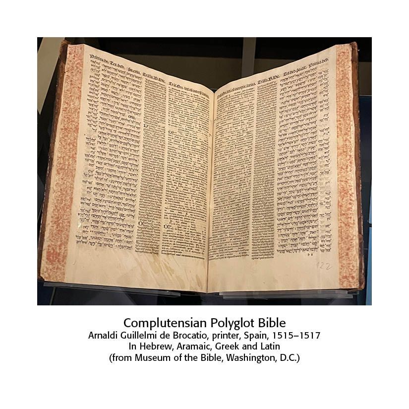
Aldus Manutius introduced the slanting style of type known as italic, fashioned after the handwriting of Petrarch, an Italian poet. Aldus also reduced the size of books from the large folio, on which the Gutenberg Bible was printed with page size 12 x 17.5 inches, to a more convenient octavo. Aldus was the first to suggest the printing of a polyglot Bible, a Bible with multiple versions. However, the first polyglot work ever printed was a Psalter, the literary work of Augustin Justinian, a Corsican bishop, of eight columns, each a different translation in Genoa, Italy in 1516.
The Frenchman, Christopher Plantin, began to print at Antwerp in 1555. Wikipedia notes — “By 1549, he headed one of the most well-respected publishing houses in Europe. He was responsible for printing a wide range of titles, from Cicero to religious hymnals. While delivering a prestigious commission, he was mistakenly attacked and received an arm wound that prevented him from labouring as a bookbinder and led him to concentrate on typography and printing. By 1555, he had his own print shop and was an accomplished printer. The first book he is known to have printed was La Institutione di una fanciulla nata nobilmente, by Giovanni Michele Bruto, with a French translation. This was soon followed by many other works in French and Latin, which in point of execution rivalled the best printing of his time.” (https://en.wikipedia.org/wiki/Christophe_Plantin)
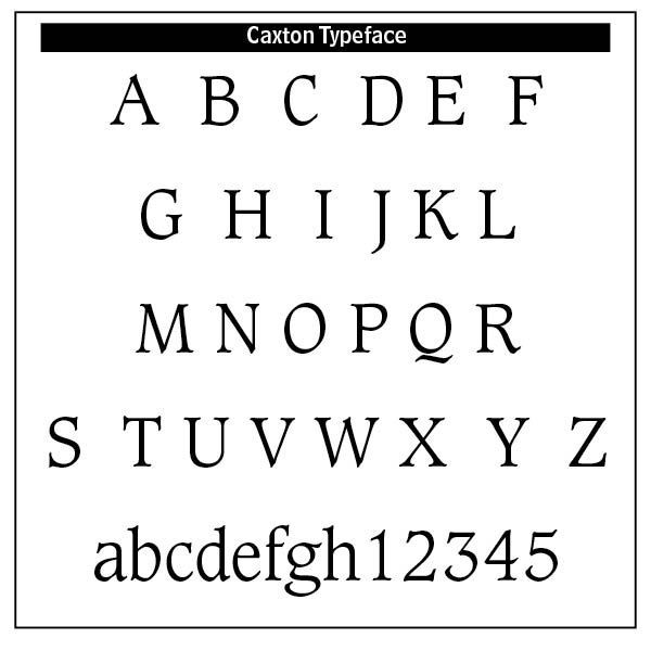
In England, William Caxton was the first to set type in that country in 1477. Caxton set up a press near Westminster Abbey, on the outskirts of London. His first dated book is The Dictes and Sayinges of the Philosophers, 1477. His typefaces copied those of Mansion, who in turn copied Dutch copyists. There are six types associated with Caxton. His Type No. 2, with which he established his press at Westminster, was brought over by him from Bruges, where Colard Mansion worked. The Bitstream Company today has produced a typeface based on Caxton’s letters. While the Puritan Cromwell ruled against all sorts of sculpture and painting, he encouraged printing and literature. John Milton, author of Paradise Lost, 1667, was Latin secretary to Cromwell. In 1657 the sixth and last volume of the London Polyglot Bible, compiled by Brian Walton and printed by Thomas Rovcroft, was produced. An extensive survey of British typesetting and type foundry history can be found in Talbot Reed’s A History of the Old English Letter Foundries with Notes (1887).
Early American typography and printing. Ministers are important to the history of printing and typography. Reverend Jesse Glover, a Puritan minister, was chiefly responsible for a print shop erected at Cambridge in 1638, with printer Stephen Daye as its first printer. The first work produced was The Freeman’s Oath, and the first book was The Book of Psalmes, or the Bay Psalm Book (1640). Pennsylvania became the second English colony where typography was practiced. In 1687 William Bradford printed an almanac at his print shop near Philadelphia. This was a sheet containing the calendar of twelve months, starting with March and ending with February. Bradford was a friend of the Quaker, George Fox, and among the first to emigrate to Pennsylvania in 1682.
James Franklin in 1721 began to print a newspaper, The New England Courant. At that time there was no type foundry or press manufacturing plant in the United States. Promises of financial assistance from England evaporated, and Franklin left England to work as a foreman for Samuel Keimer. Samuel Keimer (1689–1742), originally an English printer and emigrant who came to America, was the original founder of The Pennsylvania Gazette. James Franklin, with a partner, Hugh Meredith, opened a printing office.
One of the first jobs done by the new firm of Franklin and Meredith was forty sheets of the history of the Quakers, set in English pica and long primer. The English pica, now the standard measurement of type in English typography, “owes its name to its use in printing the ordinal of the services of the early Church. It was a table showing the course of the service in the Church in the times of darkness. It was called the “pie” because it was written in letters of black and red. (Reed, A History of the Old English Letter Founderies, 38) The “long primer” was another of the old English type bodies used in liturgical works. Primers in this size of type were printed either in long lines instead of double columns “or that the length of the page was disproportionate to the width, or that they contained the service at full length, or without contraction.” (Reed) France named this typeface after Claude Garamond.
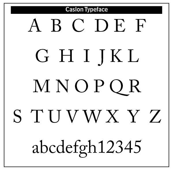
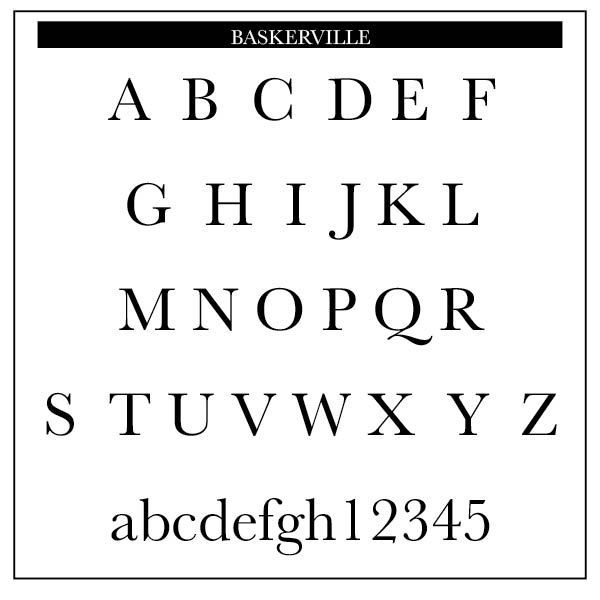
In 1732, Franklin published Poor Richard’s Almanack. For twenty-five years he continued printing the Almanack with nearly ten thousand copies being sold annually. (Gress and Rogers, The Art & Practice of Typography, 71) Caslon typefaces and ornaments were extensively used by Colonial printers. The Roman face cut by Caslon bears a similarity in its capitals to the typefaces used by Thomas Newcomb on the title page of the “Compleat Ambassador.” Caslon’s letters entered a career of honor. He reproduced his type from the French Elzevir types, also known as French Old Style types, which started in 1846 with Louis Perrin's cut of the Lyons capitals, a roman titling font. Caslon’s Roman became the fashionable type for nearly eighty years. Indeed, Baskerville’s letters were inspired by those of Caslon.
Benjamin Franklin was the most successful printer in British America, owning or controlling most of the newspapers in the colonies by 1753. One purchase on October 2, 1729, was The Pennsylvania Gazette from Samuel Keimer.Benjamin got his first taste of the printing business in 1718 at the age of twelve while working at The New England Courant in Boston under his brother James. Young Benjamin was in charge of setting the letters for the printer and selling newspapers door to door, but what he really wanted to do was to write. Later, in January 1748, at age 42, and weeks from the midpoint of his long life, Benjamin Franklin did something highly unusual. He retired. Retirement allowed Franklin to turn his attention to public service and science, serving from 1776 to 1778 on a commission to France to gain French support for American independence. This is how we usually remember Ben Franklin, but printing was his main business for a large part of his life.
Resources
William Skeen,
Early Typography (Colombo: Ceylon, 1872) Reprinted by The Project Gutenberg, July 2018.
Harry Graham Carter,
A View of Early Typography Up To About 1600 (Oxford: Clarendon Press, 1969)
Francis Vaux, In The Praise of Typography, 1658.
Theodore Low De Vinne,
A Treatise on Title Pages, New York, 1902
Edmund G. Gress and Bruce Rogers,
The Art & Practice of Typography: A Manual of American Printing, including a brief history up to the twentieth century, with reproductions of the work of early masters of the craft, and a practical discussion and an extensive demonstration of the modern use of typefaces and methods of arrangement (New York: Oswald Publishing, 1917)
Talbot Baines Reed, A History of the Old English Letter Foundries With Notes (London: Elliot Stock, 1887)
Successful Layout & Design


