French Typography History (Part 1)
Parisian Typography History
Parisian typography refers broadly to the traditions of type design, printing, lettering, bookmaking, and graphic design that developed in Paris, particularly from the early days of European printing through the modern era. Paris became one of Europe's most important centers of typographic culture, alongside Venice, Rome, Antwerp, Amsterdam, London, and later Berlin.
What makes Paris especially significant is that French typography repeatedly combined technical innovation with an unusually strong concern for aesthetics and cultural identity. The French Renaissance established some of the foundations of Western book typography, The Romain du Roi introduced a rationalized approach to letterform construction. Didot transformed the Roman into a highly elegant Modern style, while Parisian poster, fashion, and advertising design subsequently made typography an essential component of visual culture.
For a study of European typography, Paris is therefore best viewed not simply as another printing center, but as one of the places where the craft of type, the art of the book, state patronage, intellectual culture, fashion, and graphic design repeatedly converged.
Parisian typography in perspective
The history of Parisian typography can therefore be understood as a progression through several major phases — Gothic manuscript tradition, to Renaissance humanism, to French Old Style Romans, to Royal/Rational typography, to Romain du Roi, to Didot Modern Roman, and to Industrial display typography.
Another way to organize this history would be to note several recurring characteristics of French typography. French typographical elegance can be seen in the developing of refined proportions and carefully controlled letterforms. There was a strong early connection to Roman inscriptions and Renaissance typography. Mathematical order was especially evident in the Romain du Roi typography. Didot established high contrast in lettering and there was strong emphasis on readable, beautiful text typography. Ornamentation became particularly important in the Art Nouveau period. Display typography defined much of posters and advertising typography. Type was often treated as part of French intellectual culture, and Paris repeatedly absorbed international design movements.
The beginnings. Paris and the first printers
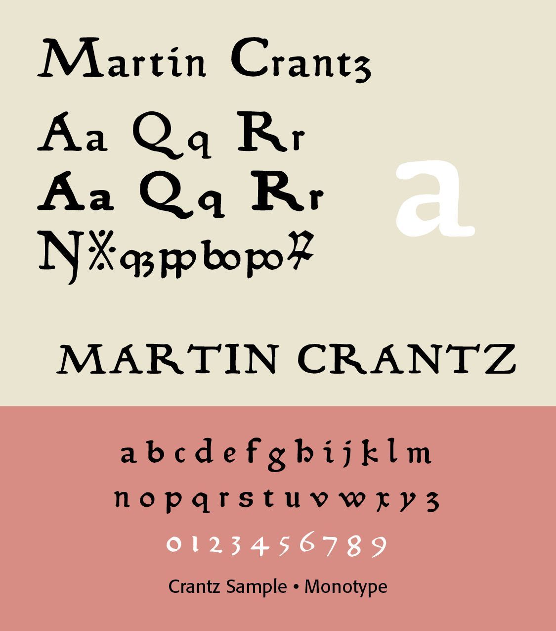
Printing arrived in Paris relatively early. The first printing press in Paris was established around 1470, associated with three German printers, Ulrich Gering, Michael Friburger, and Martin Crantz. Gering together with Michael Friburger and Martin Crantz set up a printing press within the Sorbonne to produce texts selected and edited by his patrons.
The press produced 22 works between 1470 and 1472. Martin Crantz was likely the fellow who had the technical know how to cast the type itself, hence the name of this new face that is based on his work. This font has been expanded to meet the demands of modern day use, but it also contains a number of specialized glyphs that allow for the recreation of text in the manner of his day with such characters as the -rum abbreviation and other handy Renaissance oddities. Since this face was designed prior to 1501 there is no italic variant in keeping with the spirit of historical accuracy. Crantz typeface purchased from Monotype. (ILLS)
Although strongly influence by German printers, French printing quickly developed its own French character. Printers produced theological works, classical literature, university texts, legal works, liturgical books, and humanist scholarship. Early type was primarily Gothic, reflecting manuscript traditions still dominant in France.
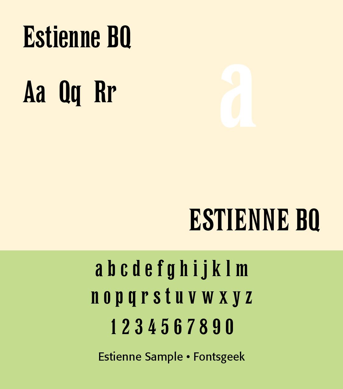
Robert Estienne was a book printer, born in Paris in 1503. He died in Geneva in 1559. He cut an italic alphabet after an Aldine design, and used it in his edition of Cicero's Opera. (ILLS of Opera)
The Renaissance —Paris becomes a typographic center. During the sixteenth century, Paris became an important center of Renaissance humanism. The transition from Gothic type toward Roman and italic type was particularly significant. French printers increasingly looked to Italy for typographic inspiration, especially to the work of Venetian printers such as Aldus Manutius.
Parisian printers developed increasingly refined Roman types characterized by moderate contrast, elegant proportions, relatively small x-heights, graceful capitals, refined bracketed serifs, and sophisticated italics.
Important Parisian printers included Simon de Colines, Geoffroy Tory, Claude Garamond, Robert Estienne, and Robert Granjon. Geoffroy Tory was particularly important because he regarded typography as an intellectual and artistic discipline.
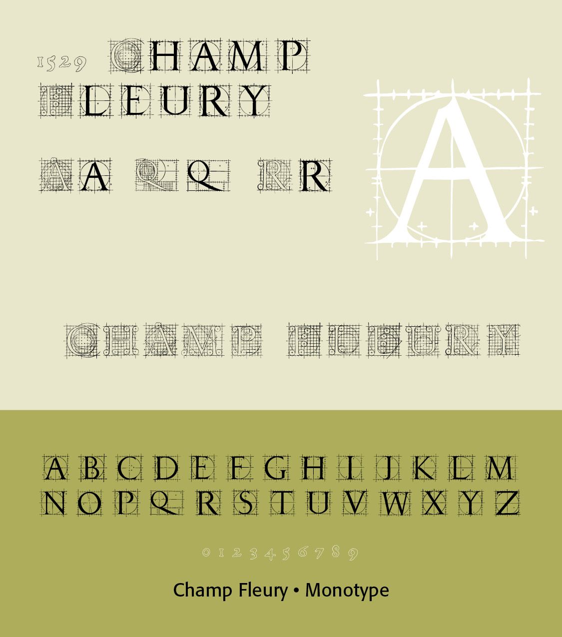
His Champ Fleury (1529) connected French typography, letterform construction, geometry, language, and aesthetics. Tory's work helped establish the idea that the design of letters could embody cultural and philosophical ideals. Geoffroy Tory compared the proportions in letters to proportions in the human body.
There have been rather few attempts at making a typeface based on Tory's drawings from Champ Fleury. Gilles Le Corre (GLC) created 1529 Champ Fleury (2010). Christian Kusters designed AF Champ Fleury (1996) and Michael Jacoby based his Vitruvia Titling (2016) on the Champ Fleury typeface. Our 1529 Champ Fleury Initials contains two complete alphabets, with a very great effort to be as close as possible to the original pictures. (ILLS)
Robert Granjon (1513–1590), a French type designer and printer, worked for various printers in Paris, Lyon, Frankfurt, Antwerp, and Rome. He is best known for having introduced the typeface Civilité and for his italic type form, the design of which in modern days is used in Garamond Italic. Granjon’s italic had a dazzling appearance that made it difficult to read. It was nevertheless the primary influence for italic type design until the Arrighi model was revived in 1920.
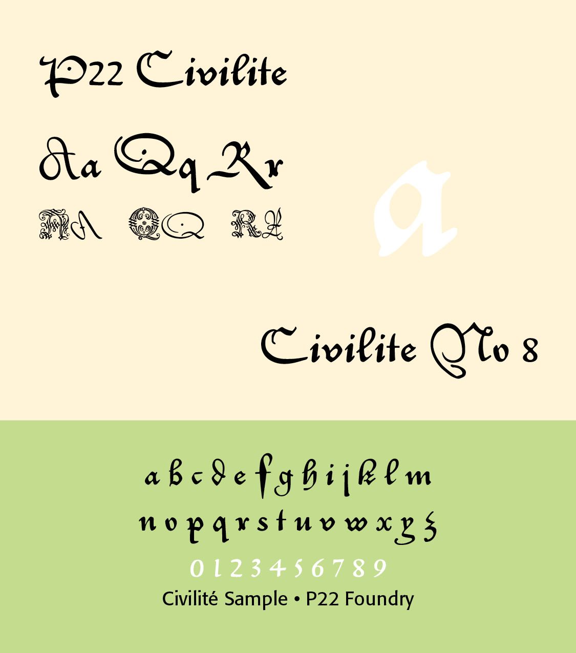
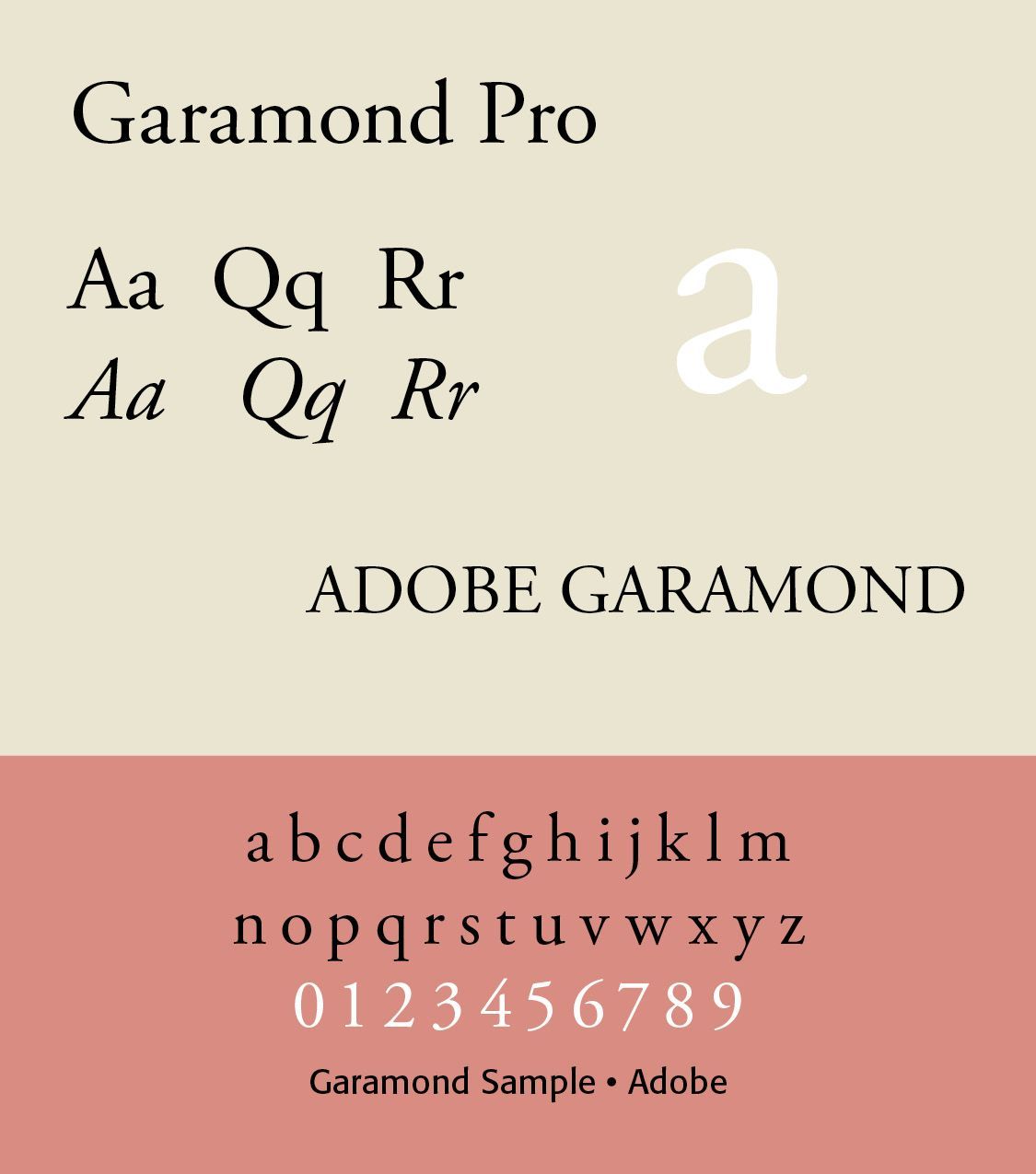
Claude Garamond became one of the defining figures of Renaissance French typography. His Roman types were highly influential and eventually became models for numerous revivals, including modern Garamond typefaces.(ILLS of Font)
The French monarchy eventually became an important patron of typography. A particularly important development occurred under Louis XIV with the creation of the Imprimerie Royale (Royal Printing Office) in 1640. This represented an increasing connection between the state, scholarship, printing, and typography. French typography became associated with order, rationality, refinement, and royal authority.
Romain du Roi
One of the most important developments in French typography was the creation of the Romain du Roi ("King's Roman").(REFERENCE) Commissioned under Louis XIV, the typeface was developed during the late seventeenth and early eighteenth centuries by a team working under the direction of the mathematician Sébastien Truchet and punchcutter Philippe Grandjean. This typeface reveals a distinct shift in style, with an increased emphasis on verticality and increased contrast between thick and thin elements, a style that influenced the Transitional typefaces of Pierre Simon Fournier and John Baskerville.
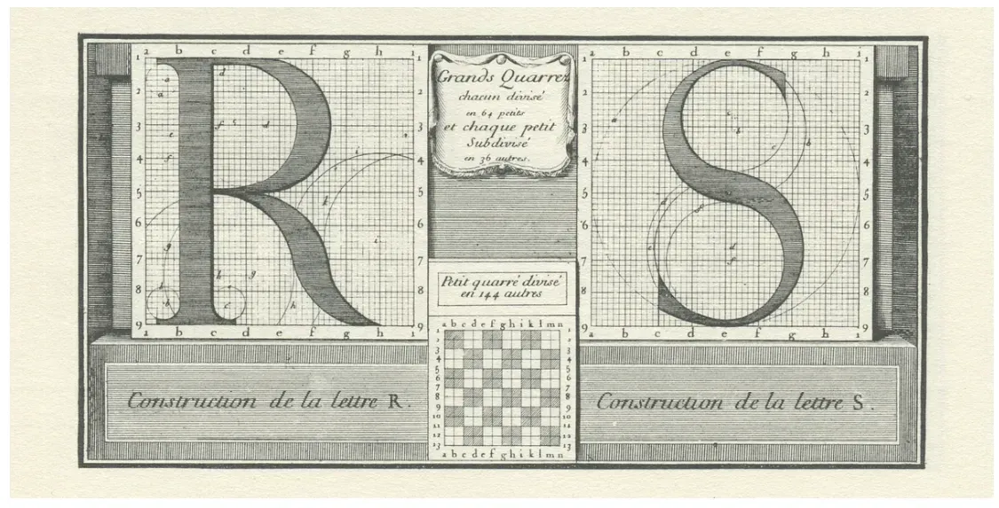
Unlike Renaissance type, which evolved largely from handwriting, Romain du Roi was deliberately constructed using geometric and mathematical principles.(PICTURE) Its characteristics included stronger vertical emphasis, greater contrast, more rationalized letterforms, geometric construction, elegant, controlled curves, and sharper serifs. It represented a significant shift toward the transitional Roman. The Romain du Roi was the result of rational, carefully grid-crafted designs. The capital letters were drawn on 8×8 grids, the lowercase letters on rectangular grids. The committee's designs were engraved by Louis Simonneau. Punches for the metal type were cut by Philippe Grandjean, who took some liberty with his type, to moderate the cold geometry of the designs. The type was first used for Médailles sur les principaux événements du règne de Louis le Grand.
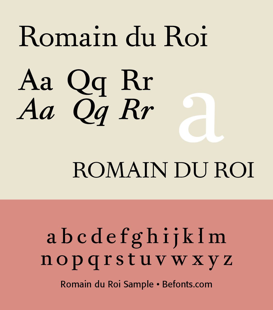
The Romain du Roi had serifs on both left and right sides at the top of ⟨b, d, h, i, k, l⟩. ⟨l⟩ had an extra serif to the left at the mean line to distinguish it from capital ⟨I). It has 108 variations, with Thin, High, Light, Medium, Bold and all the Italics. A sample is noted here. Precision and poetic elegance moves us typographically forward in these faces.(ILLS of font))
Pierre-Simon Fournier (1712–1768) (REFERENCE) was a French typographer and type designer, renowned for his contributions to the field of typography in the 18th century. He is best known for his work in creating typefaces that reflected the elegance and sophistication of the time.
Fournier's work in type design focused on creating typefaces that were both visually appealing and functional. His types were characterized by their clarity, beauty, and legibility. The typeface Fournier is an aristocratic roman typeface. It is transitional, almost modern, in character, with a distinct French flavor, but with more grace and style than traditional French oldstyle designs. This modern character influenced the later work of Bodoni.(ILLS of font)
One of Fournier's significant contributions to typography was his establishment of a typographic point system. He invented a system that standardized measurements for type, which provided consistency and made it easier for printers to produce high-quality texts. This innovation helped printers achieve consistency in their work.
Fournier published a seminal work in the history of typography titled Manuel de la Typographie (Manual of Typography, two volumes published in 1764 and 1766), which included detailed descriptions of his typefaces along with examples. This work served as a reference for printers and typographers. The Introduction gives an overview of the principles of typography. In his Classification of typefaces, Fournier emphasizes the distinction between different styles, such as Roman, Italic, and Gothic types. The manual includes practical tips for setting type, including spacing, alignment, and layout, aimed at improving the quality of printed materials. Fournier includes numerous type specimens, showcasing his designs and providing examples of how different types can be used effectively in printing. Throughout the text, Fournier discusses the historical development of typography and its evolution, reflecting on the influence of various cultures and periods on the art of type.
Other contemporaries elsewhere, such as J.M. Fleischman and J. Enschedé, started imitating Fournier's style. In the 1750s, his career was at its peak. He advised royalty in Sweden and Sardinia on types, and set up a printing shop for Madame de Pompadour. He developed musical types in cooperation with J.G.I. Breitkopf in 1756. Fournier's designs influenced future generations of typographers and established a foundation for modern type design. His methods and styles contributed to the evolution of typography, leading to the development of various typefaces we see today.
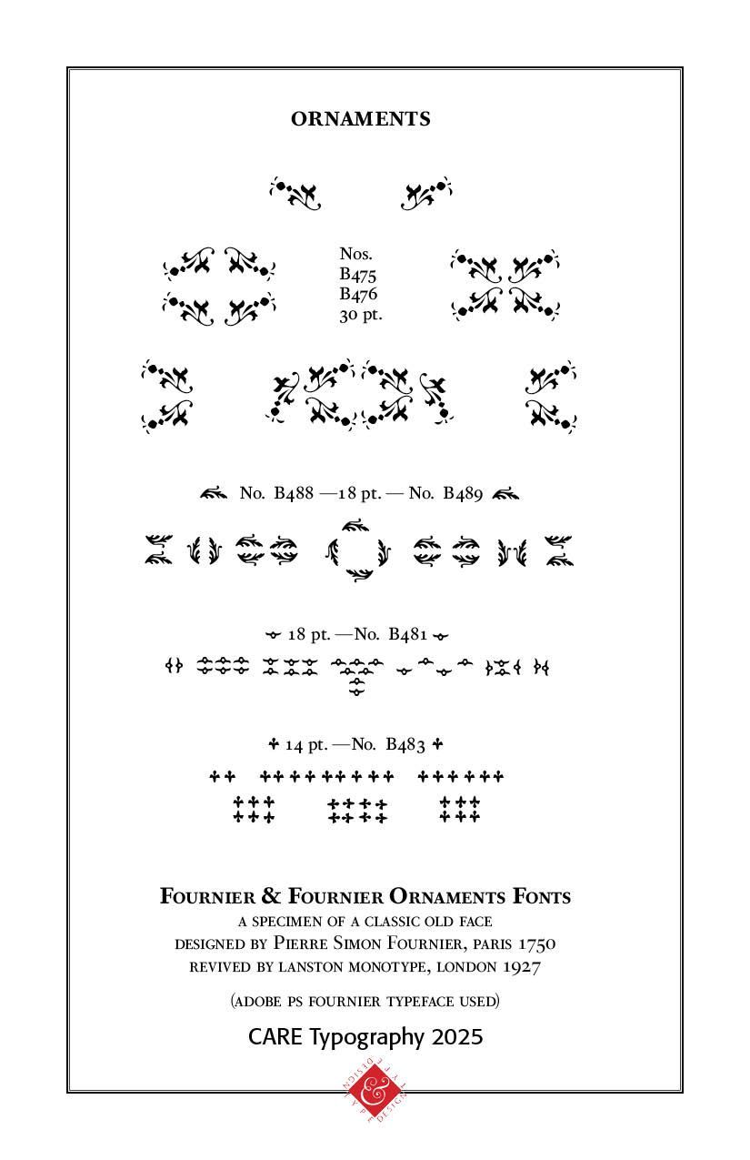
The ORNAMENTS display is a careful digitized reproduction by CARE Typography of Fournier's original ad as seen in the "Fournier Specimen Book" by Lanston Monotype, 1927, in London. (ILLS Picture)
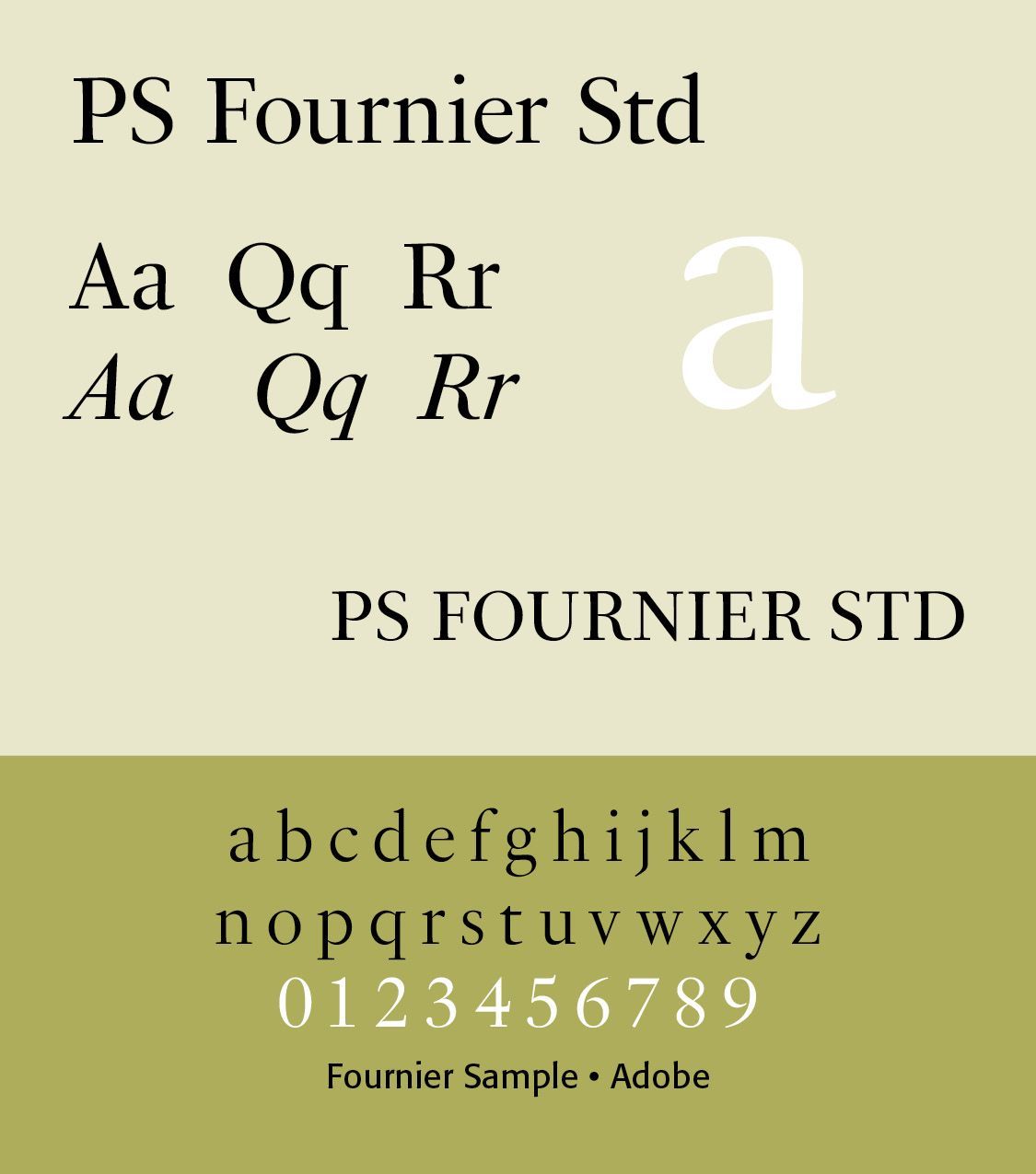
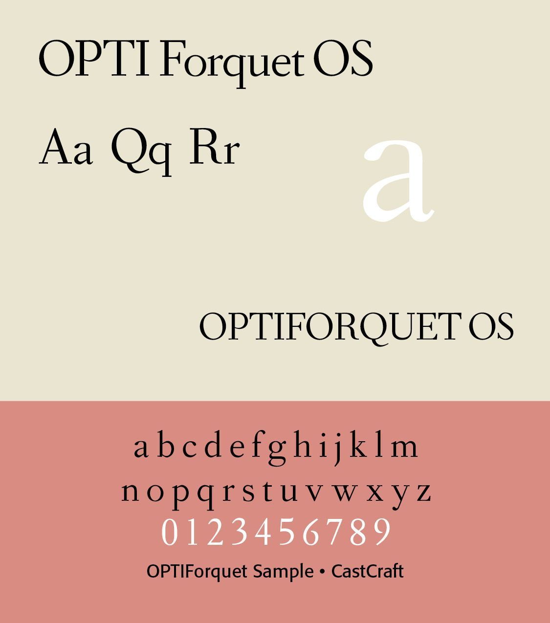
The Castcraft version of Fournier is called OPTI Fourquet. (ILLS of font) Joshua Darden's Corundum Text (2006) and typeface Griesshammer's free font Source Serif (2014, Adobe) are also based on Fournier. The ambitious PS Fournier (2016, Stéphane Elbaz) is perhaps one of the best digital revivals. At B&P Swiss Typefaces, François Rappo published New Fournier (2011) based on the typography of Pierre-Simon Fournier. It comes in 24 styles.
Overall, Pierre-Simon Fournier's impact on typography is significant, as he helped to shape the standards of type design and usage in the 18th century, leaving a lasting mark on the field. (ChatGPT and https://luc.devroye.org/fonts-37262.html)
The Didot dynasty
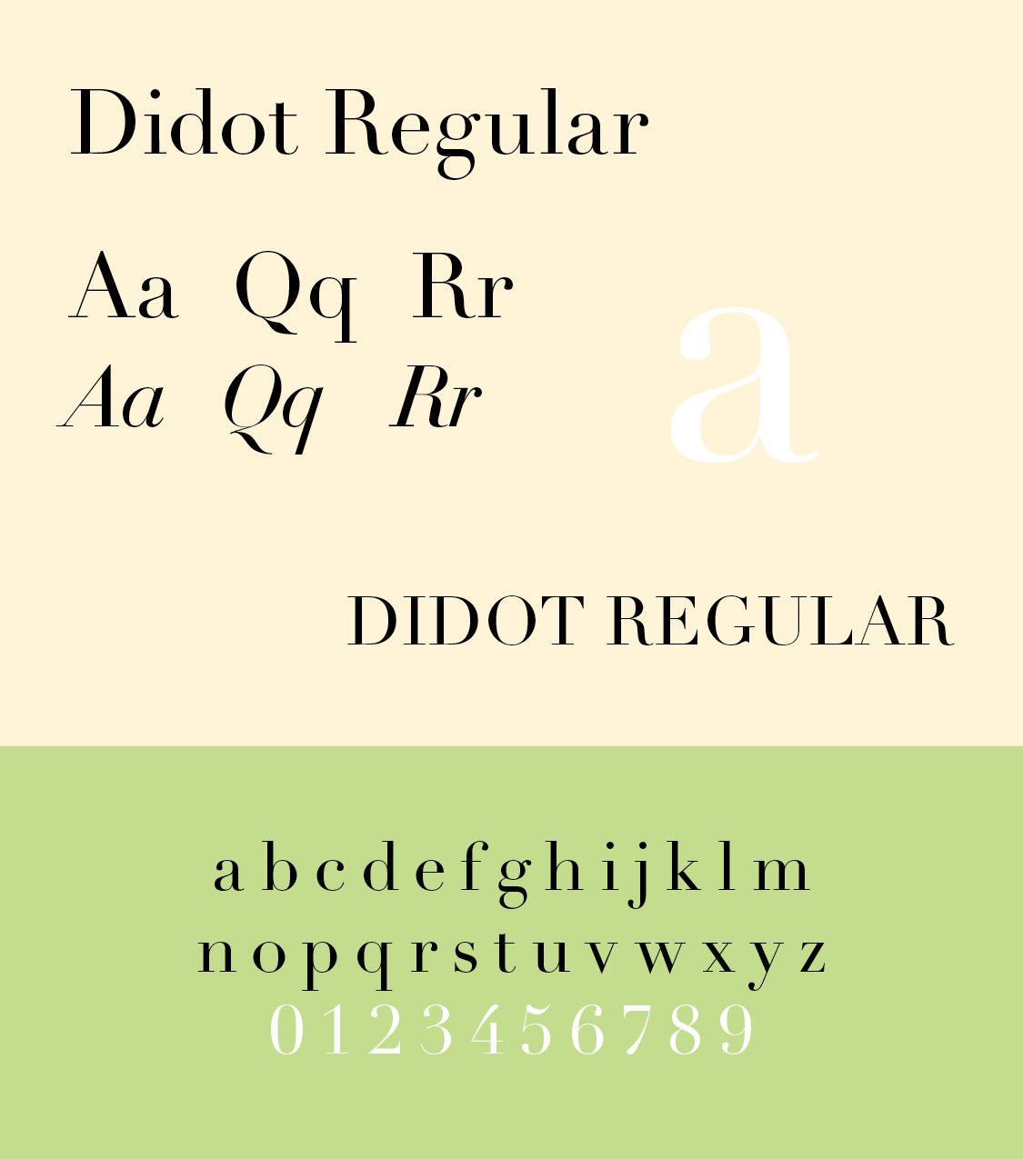
Perhaps the most famous contribution of Parisian typography came from the Didot family. The Didots were a remarkable dynasty of printers, publishers, typefounders, booksellers, and type designers The most important typographic figure was Firmin Didot (1764–1836). He developed a highly refined Modern Roman type characterized by extreme thick/thin contrast, unbracketed hairline serifs, vertical stress, very thin horizontal strokes, geometric precision, and elegant proportions. This became known as Didot. Didot's influence extended far beyond France. His style became one of the defining typographic expressions of the late eighteenth and early nineteenth centuries.
Especially associated with luxury, fashion, elegance, neoclassicism, French publishing,
And high-end advertising, Didot typefaces stand out. Developed in 1783–1811, Firmin Didot cut the letters and cast them as type in Paris. His brother, Pierre Didot, used the types in printing. His edition of La Henriade by Voltaire in 1818 is considered his masterwork.
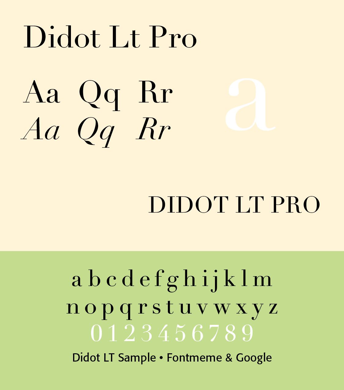
Didot is described as neoclassical and evocative of the Age of Enlightenment. As the movement grew during the eighteenth century of France, Didot became a signature typeface in the region due to its calculated construction and thin, shaven appearance appealing to the refined tastes of the neoclassical community. The Didot family were among the first to set up a printing press in Greece. Typefaces in the style of Didot have remained popular in Greek ever since. (Wikipedia) Firmin Didot font by Font Meme And GFS Didot by Google
The family's work coincided with a major transformation in European typography. The older calligraphic traditions of Renaissance and Baroque typography were increasingly replaced by typography emphasizing mathematical proportion, high contrast, symmetry, and classical forms.
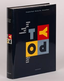
Why the Didots matter. The importance of the Didot dynasty can be summarized in five areas. In type design, Firmin Didot helped establish the Modern Roman as one of the great historical styles of typography. In type measurement, The Didot point system provided an important standard for European typography. Didot is associated with the development of the Didot typographic point system, which became one of the principal systems of type measurement in continental Europe. The system was based on the French pouce and established a standardized relationship between type sizes. The Didot point eventually became 1 Didot point ≈ 0.376 mm, or 1/72 of a French ligne. This should not be confused with the Anglo-American point system, which is approximately 0.3528 mm.
In printing, the family contributed to improvements in printing technology and production. In publishing, the Didots produced some of the finest French books of their era. Among the most notable projects, they offered lavish editions of Racine, La Fontaine, Virgil, Horace and Jean-Jacques Rousseau. In aesthetic influence, their typography helped establish the visual language of French Neoclassicism. Their typography reflected the ideals of Neoclassicism in their order, symmetry, rationality, restraint, classical architecture, Roman antiquity, and intellectual clarity. The page became less dependent upon the organic calligraphic movement characteristic of Renaissance typography. Instead, it became increasingly architectural.
The Didot family also contributed to advances beyond typeface design. François-Ambroise Didot and later members of the family were involved with improvements in printing technology and stereotyping. Stereotyping allowed printers to create a durable plate from composed type, making it possible to reproduce an edition without maintaining the original type composition. This was especially valuable for dictionaries, reference works, Bibles, classical texts, and large editions.
Thus, the Didots were part of the broader technological transformation of printing from hand composition toward more industrial production. In the larger history of Roman type, the Didots occupy a critical position in the development of Roman typography. Jenson birthed Aldine Romans, which gave us Garamond, to Baskerville, to Fournier to Didot/Bodoni and modern typography. The Didots therefore represent the culmination of a centuries-long movement toward increasingly precise and contrasting Roman type. Modern versions of Didot remain particularly prominent in fashion magazines and luxury branding.
Parisian typography and the French Revolution (1789–1799)
The French Revolution transformed printing and graphic communication. Paris experienced an enormous expansion of newspapers, pamphlets, political posters, revolutionary publications, caricatures, and political announcements. Typography became an instrument of mass political communication. Large display lettering became increasingly important because posters and proclamations had to communicate quickly to people in public spaces.
Display typography of the nineteenth century
During the Industrial Revolution, Paris developed an increasingly sophisticated display typography. Typography and printing were forever transformed by the Industrial Revolution. Britannica notes that “the Industrial Revolution changed the course of printing and typography not only by mechanizing a handicraft but also by greatly increasing the market for its wares. Inventors in the nineteenth century, in order to produce enough reading matter for a constantly growing and ever more literate population, had to solve a series of problems in paper production, composition, printing, and binding.”
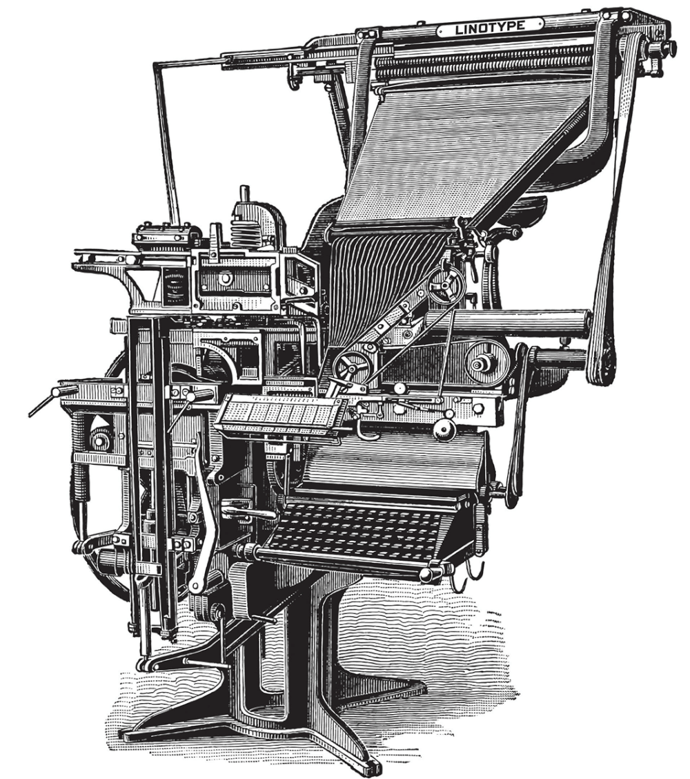
Ottmar Mergenthaler’s Linotype machine (SHOWN), patented in 1884, and Tolbert Lanston’s Monotype machine (1885), speeded up the process of setting type and gave great flexibility in respect to line widths, type fonts and type sizes. “The Industrial Revolution was all about communicating with the masses. Through signs, posters, newspapers,, periodicals and advertisements, typefaces became larger and catchier, with bolder lettering and shading introducing experimental serif and sans serif faces. Ornamental typography was also another major highlight in this era.” Printing became mass industrial, shifting from craft to mechanized production.
Art Nouveau migrated to Art Deco and then to modernist graphic design and contemporary fashion and communication design. New printing technologies permitted larger and more elaborate types. Popular styles included what are called “fat faces,” heavy versions of Roman type used for advertisements and posters.
Fat faces are a category of very heavy display typefaces characterized by extremely thick strokes, strong contrast, and a dramatic visual presence. They emerged primarily in the early nineteenth century, particularly in Britain, as printers sought type that could attract attention in advertisements, posters, handbills, and other forms of commercial printing. A fat face is essentially an exaggerated form of the Didone or modern Roman. Its principal characteristics include extremely heavy main strokes — the vertical strokes can be extraordinarily thick—Strong thick/thin contrast — thin hairlines remain very fine in comparison with the massive stems—Unbracketed or lightly bracketed serifs — reflecting the influence of modern Roman types — large x-height in some designs — particularly in later display faces.
They also have compact letterforms, allowing large amounts of visual weight within a relatively small space. This is display-oriented design, intended primarily for headlines rather than continuous reading. Such type is dramatic, attention-getting appearance — the type can almost function as graphic ornament. The effect is sometimes described as "boldness pushed to the extreme."
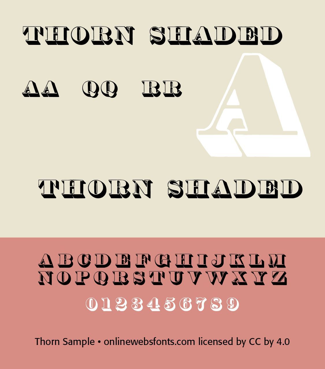
The rise of fat faces coincided with the growth of commercial advertising. Printers needed type that could compete visually for attention on posters, theater bills, circus advertisement, broadsides, trade cards, newspaper advertisements, auction notices, product advertisements, shop signs, and political announcements. Typography consequently became more competitive and expressive. Type was no longer merely a vehicle for reading. It increasingly became a means of attracting the eye. Fat faces are therefore an important step in the transition from traditional book typography toward modern display typography and graphic design. Some historically important fat faces include Thorne Shaded and Thorne Display Faces and Thorowgood Fat Face.
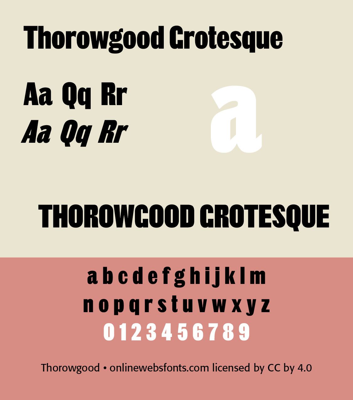
Robert Thorne (1754–1820) became a leading figure in this industrial-era type. He created the first Fat Faces types, which were enlarged, bold Didone fonts used for advertising purposes, Thorowgood (1809), Thorne Shaded (1820), recut by Stephenson & Blake’s Karl Gomer in 1938–1940. Thorowgood’s Seven-line Grotesque, cut c. 1834 (its first appearance in a specimen is that year, and it does not appear in the specimen dated 1830), was one of the first condensed sans serif typefaces, and one of the first known with a lowercase. This is also the first recorded use of the term Grotesque, which would become a popular name for sans typefaces in the UK and in Germany. The type was copied and Thorowgood’s Grotesque and Egyptians appeared in specimens by 1835 in Prague, in what is now the Czech Republic. (ILLS Font)
Many of these letters seem typical of later condensed forms; for example, the flat-sided capital O and the typically flat-sided vertical tail of the R. The capital G with its lack of crossbar is also typical of the time. The lowercase has a large x-height; the external shapes are gently rounded, but the internal counters are completely flat. The c and e have greater variation in weight than normal, and the a with its large bowl, unusual counter, and a tail with a simple straight form (like the lowercase t) is not at all what we expect.
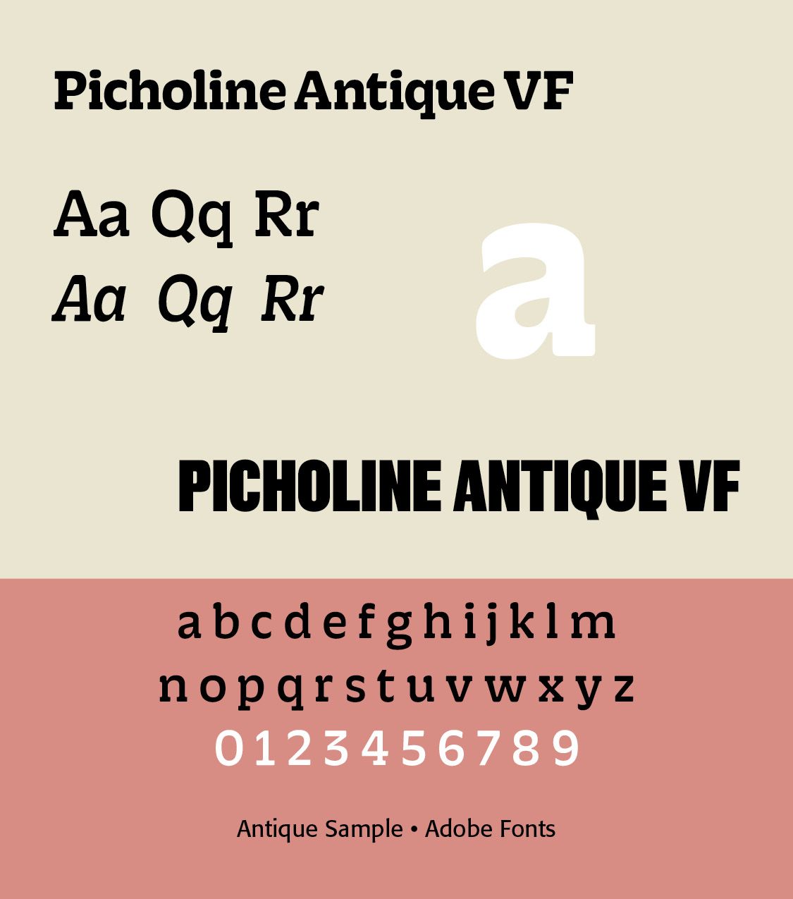
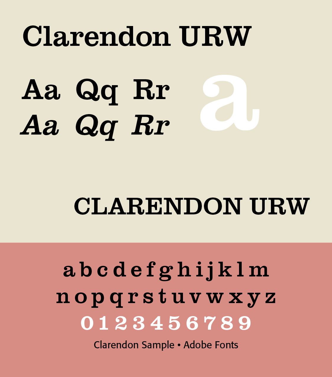
Slab serifs (REFERENCE). Slab serifs are strong, rectangular serifs associated with commercial printing. Slab serifs possess thick serifs, which are squared-off or slightly rounded, and almost the same weight as the main strokes. From a typographical standpoint, they have low contrast, with minimal difference between thick and thin strokes. Slab serifs can have a geometric or humanist structure, and can range from mechanical-looking to more organic. They are sturdy and legible, designed for impact and readability even at large sizes. Early examples were Antique and Clarendon.
There was an explosion in the range of new typefaces and letterforms to adapt to commercial use. Like the canals of Britain, much of the early typefaces, though honored, were overcome by the growth of display typefaces introduced by Lund Humphries and his printing house. It was not until 1815 when Vincent Figgins used Antique, a slab serif face, for commercial use.
Antique is characterized by the presence of slab serifs, which are nearly equal in width to the major strokes of the letter A. (ILLS) The serifs are unbracketed which means that the serifs attach to the strokes with an abrupt right angle transition (without any triangular or curved fillets in the corners). This typeface first appeared in metal type in 1815 in Figgins’ Type Foundry in England. Wood-type Antique was first produced in 1828 in the U.S. by Darius Wells when he began mass-producing wood-type. As the industry matured two parallel developments occurred. Several variations in Antique type style were created such as italics, tilting, outline, shaded, light face, condensed, and expanded type to various degrees. In addition, several derivative typefaces of Antique came to be created, including Clarendon, Antique Tuscan, Grecian, Latin, French Clarendon, Egyptian, Aldine, Columbia, and Ionic.
Sans serifs. (REFERENCE) Initially relatively rare but increasingly important toward the end of the century. Sans-serif lettering in block capitals had been developing in popularity, initially due to interest in classical antiquity in which inscriptions often had minimal or no serifs, and came to be used by architect John Sloan and copied by others, particularly in signpainting. Historian James Mosley, the leading expert on early sans-serifs, has suggested in his book The Nymph and The Grot, that Sloan's influence was crucial in spreading the idea of sans-serif letterforms around the end of the eighteenth century. However, it was some decades before a printing typeface would be released in this style, now commonly used. The name "Egyptian" had become commonly used in England by 1816 to describe this style of lettering. The name "Egyptian" may have originated from the image of sans-serifs being historical in style, the Egyptomania of the period and the "blocky" nature of ancient Egyptian architecture.
END PART 1
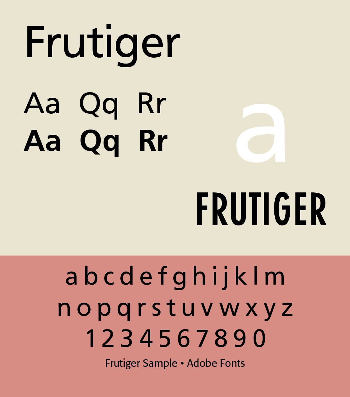
Frutiger, designed by Adrian Frutiger in 1975 and issued by Mergenthaler, gave airport visitors clear signage at the Charles DeGalle Airport in France. It works well with his text typeface, Méridien. Note its balance and openness — Frutiger decided instead to make a new sans serif typeface that would be suitable for the specific legibility requirements of airport signage: easy recognition from the distances and angles of driving and walking. The resulting font was in accord with the modern architecture of the airport. In 1976, he expanded and completed the family for D. Stempel AG in conjunction with Linotype.” (myfonts.com)
Successful Layout & Design