Variable Fonts: An Introduction
Variable Fonts: An Introduction
History & Use
“Variable fonts are a single font file that behaves like multiple fonts.” (John Hudson) The technology behind variable fonts has been around for a while. Starting in the 1990s, interpolation and extrapolation have been used to create different masters, and weights in typefaces. For example, by designing a regular and bold weight a semibold could be interpolated from the two masters.
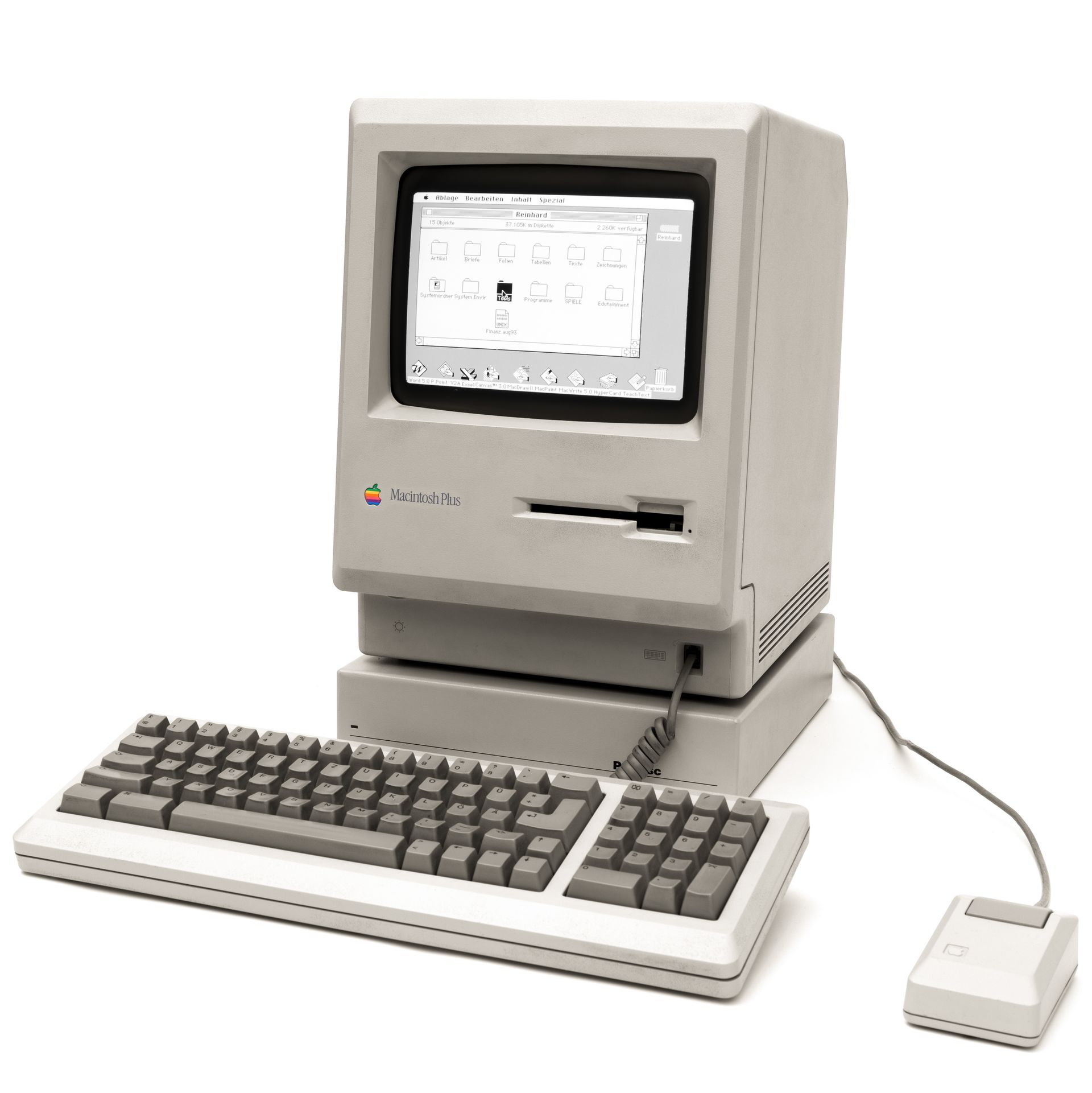
Apple Computer, in its development of the Macintosh computer in the early 80’s, also introduced the Apple LaserWriter™ and the LaserWriter Plus. Using a new technology
called “Postscript,” licensed from Adobe Systems, a built-in font description language in the Laser-Writer’s ROM (read-only memory) converted screen fonts on the computer screen, through a mathematical process, to 300 dpi (dots-per-inch) output. (Exciting at the time!)
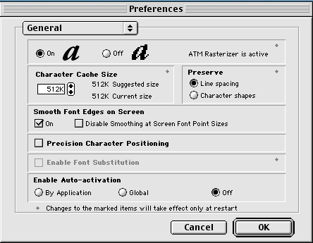
Users wanted, and soon got, true WYSIWYG (pronounced wizzywig— what-you-see-is-what-you get) operating environments. With the advent of Adobe’s ATM (Adobe
Type Manager™), and Apple’s TrueType fonts, the on screen font “jaggies” were replaced by the outline representation of the font, so that the screen faithfully represented the final printed output. Fonts could be “downloaded” per job to the Postscript printer, even if the printer did not have the specified fonts inherent in its ROM files.
QuickDraw
“QuickDraw” gave the added advantage of producing laser-like output even from a nonPostscript printer. With QuickDraw, the font outlines are processed by the computer and sent to the printer for output. Software packages now skew, bend, shrink, condense, expand, rotate and manipulate typeforms. Apple’s System 7.x and Windows 3.1x included several TrueType fonts that were installed with the system software.
Basic QuickDraw was designed for the earliest Mac models with their built-in black-and-white screens and was seen on systems such as the Macintosh Classic and Powerbook 100 computers. Color QuickDraw was introduced with the first Macintosh II systems, supporting up to 256 colors. 32-Bit Color QuickDraw was part of Mac System 7 and supported up to millions of colors.
QuickDrawGX added various curve-drawing commands and introduced TrueType as its basic font system. “The ability to do kerning, tracking, and justification, as well as ligatures and ornamental forms of various characters, is provided by the line layout routines, supported by the QuickDraw GX smart font format. The line layout routines work with the typographic information contained in the TrueType GX and Type 1 GX fonts to give you a ton of control over how text is placed on a page. Because QuickDraw GX typography is fully integrated with graphics, you can rotate, skew, and change the perspective of typographic shapes the same way you can geometric shapes. You can use the text shape to draw a line of text with one style. The glyph shape enables you to draw text in several styles and graphically manipulate each glyph.” (Getting Started With Quickdraw, Sep 1993)
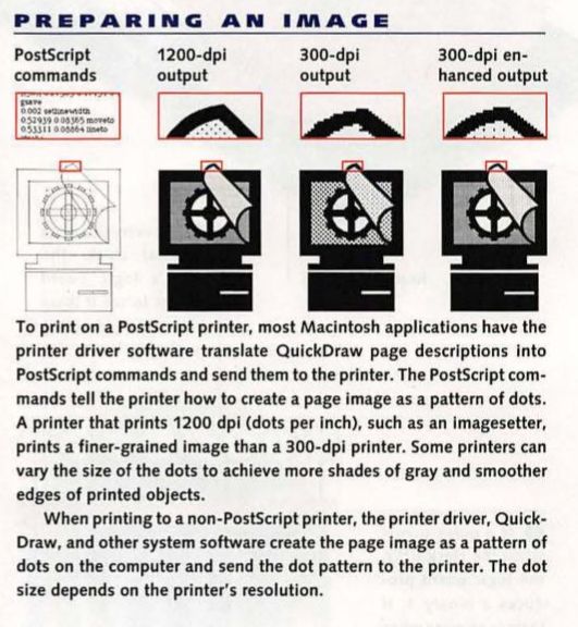
When you click OK in a Print Dialogue box on your computer, the application for text specifies font, size, style and so forth. For graphic objects, the application specifies the shape, size, line weight, fill pattern, and other attributes. QuickDraw prepares a script of actions necessary to draw the whole page and is generic enough to work with any type of printer. For the LaserWriter, the driver translates the QuickDraw script into a Postscript program and sends that to the printer.
While many of its component features live on in the current Macintosh environment as OpenType Variable Fonts, GX itself was formally “killed” with the purchase of the NeXT system and the adoption of the Quartz imaging model in Mac OS X. GX proved too large, with its API (Application Programming Interface) demanding several books, and required speeds not available on the classic Mac 68000-based platforms, like the Mac Plus.
Multiple Masters Fonts
Multiple master fonts (or MM fonts) are an extension to Adobe Systems Type 1 PostScript fonts. Multiple master fonts contain two or more “masters,” that is, original font styles, and allow a user to interpolate between these masters along a range of continuous “axes.” Custom styles can then be generated from a single font file programmatically.
Most MM fonts support one or two (sometimes three) of the following variables — Weight (wt), Width (wd), Optical size (op) and sometimes Style. Width allows the character width to be extended or compressed. While other software allows for shrinking or widening type, the results from a multiple master font are superior. Vertical strokes in enlarging or reducing characters tend to be proportionally thicker or slimmer, giving an uneven appearance. MM fonts with a width axis are designed to scale appropriately.
Weight allows the character weight to be modified, typically from light or thin, through regular, to extra bold. Optical size allows the character shape to be modified based on how large it will appear to the reader. At small sizes, small details such as serifs and thin lines such as stems are typically bolder. The "x-height" (the height of a lower case "x") is also a larger proportion of the total font height, and the characters may be extended slightly. These changes are designed to make small type easier to read.
Style, the least used of the multiple master axes, allows any other font property to be continuously modified. One such example is changing the serif style from wedge (triangular) to slab (rectangular).
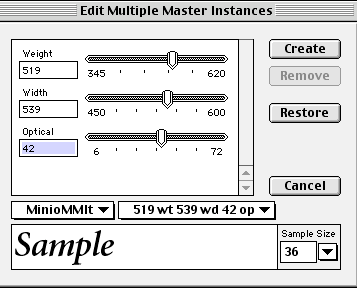
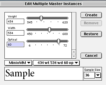
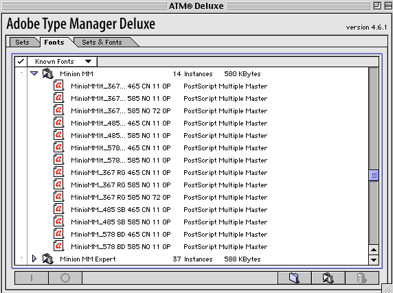
This technology failed for at least two reasons. First, users were forced to generate “instances” for each font variation, littering their hard drives with font bearing names, like MinioMMIt_519 wt 539 wd 42 op. This code was for the Minion Italic font with a weight of 519, a width of 539 and an optical size of 42.
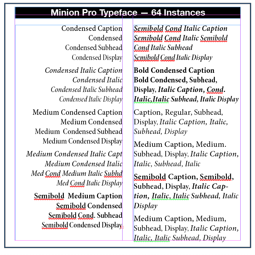
The second reason for the MM discontinuance is that most font designers have generally preferred to release fonts in specific, individually fine-tuned weights and styles. Thus, the current Open Type Minion Pro font has 64 variations carefully crafted to suit most any typographic need and context.
Current application support for MM fonts is sparse. However, font design tools such as FontLab and FontForge can edit MM fonts, and can export them into other font formats as needed. Adobe Type Manager (ATM) is required for MM support on Windows and the "Classic" Mac OS (9 and below).
A technical note concerns a key question on which sizes to interpolate to. “In the Thesis typeface developed by Lucas de Groot (See BLOG Post Advances in Typography: Late Twentieth to Twenty-First Centuries A Historical Sketch (Part 3) December 1, 2025), de Groot's choice of weights to release was developed using an "interpolation theory". The optical interpolation b, in the three stems a (thinnest), b (interpolation) and c (thickest), is set to the geometric mean of a and c, i.e. b² = ac (as opposed to the linear arithmetic mean).” (Wikipedia) Popular MM Fonts — ITC Garamond MM, Minion MM, Myriad MM, Adobe Jenson MM.
Open Type Variable Fonts
Open Type Variable fonts build directly on the technology introduced to TrueType by Apple in the QuickDraw GX graphics environment. Of similar vintage, Adobe’s multiple master format approached similar concepts in a different way. How do we know that Variable Fonts don’t also have a declining future? The need for more compact dynamic webfonts is part of the answer. “Variable fonts also have the potential to enable new kinds of typography for electronic documents, responsive to things like device orientation or even viewing distance. Compact and faster fonts also provide significant advantages for embedding fonts in devices, especially for East Asian (CJK) and other fonts with very large glyph sets and character coverage. The smaller device and disc footprint of variable fonts has been a major factor in encouraging support for the technology in software companies.” (https://medium.com/variable-fonts)
An Open Type Variable font contains one or more axes that each provide particular variation between different extremes of a typeface design. The format also allows for the possibility of intermediate designs, for the whole glyph set or for individual glyphs, to provide finer control over the design as it changes across the variations design space.
Unlike MM fonts, an Open Type Variable font contains only a single set of glyph outlines “and the other extremes or intermediate shapes are defined as deltas from those outlines. So, for example, a font may contain a set of glyph outlines that correspond to the regular weight and width of a typeface, and the lighter, heavier, narrower, and extended designs will be expressed in the font data as movements of outline nodes relative to that outline.” (Medium.com) Any position within the design space can be a named instance.
This is a sample of using a Variable Font in Adobe InDesign. Note the Width and Weight axes. (For Demo purposes only)
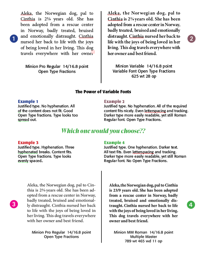
An Example. A client wants you to professionally typeset the following paragraph — "Aleka, the Norwegian dog, pal to Cinthia, is 2 3/9 years old. She has been adopted from a rescue center in Norway, badly treated, bruised and emotionally distraught. Cinthia nursed her back to life with the joys of being loved in her living. This dog travels everywhere with her owner." Her requirements are as follows — Use justified Minion type in a block 18 picas wide by 11 picas deep and in 14 point on automatic leading at 16.8 point. She wants you to use real fractions. The block must be easy to read and pleasing to the eye.
The draft below gives some options a professional typographer or printer might use. Notice in Example 1 all of the text required does not fit and the spacing between words is too extended. The fraction is okay using Minion Open Type Pro. Example 2 uses Minion Variable font. Note the darker type, thus easier to read, and the word spacing is pleasing to the eye. Example 3 goes back to Minion Pro but this time uses hyphenation. The problem is too many hyphens in this short block. Example 4 uses a Minion MM font with only one hyphen, but again the text is pleasing to the eye. Which one would you choose?
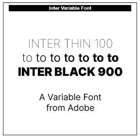
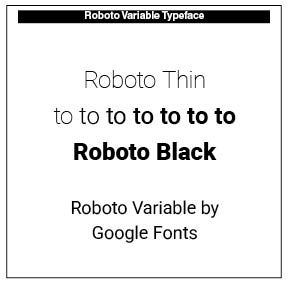
Two Variable Fonts highlighted in this piece are Roboto and Inter. A good place to see and experiment with variable fonts is AxisPraxis at https://www.axis-praxis.org/specimens/. Note the insert on the FFMeta Demo Variable Font.
Creating a Variable Open Font, using Glyph software, can be found at https://glyphsapp.com/learn/creating-a-variable-font
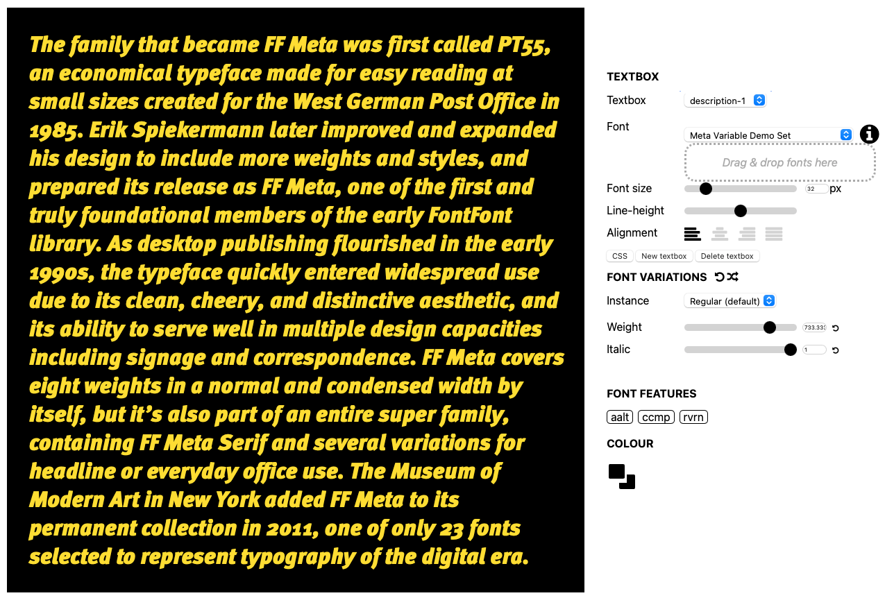
This is a sample Variable font, FF Meta Variable, noted in axis-praxis.org. Note the axes on the right of the paragraph.
Successful Layout & Design


