Advances in Typography: A Historical Sketch (Part 2)
Industrial Revolution and Display Typography (1800–1870)
I have recently viewed the broadcasts of Great Canal Journeys, a narrated insight into Britain’s canals and waterways by two married and retired actors. They have been responsible for the restoration of a number of Britain’s canal systems. They noted that the Industrial Revolution in that country brought about the almost demise of the canals for moving products across the continent. The railroads took over much of the movement of goods from one place to another.
In much the same way, typography and printing were forever transformed by the Industrial Revolution. Britannica notes that “the Industrial Revolution changed the course of printing and typography not only by mechanizing a handicraft but also by greatly increasing the market for its wares. Inventors in the nineteenth century, in order to produce enough reading matter for a constantly growing and ever more literate population, had to solve a series of problems in paper production, composition, printing, and binding.”
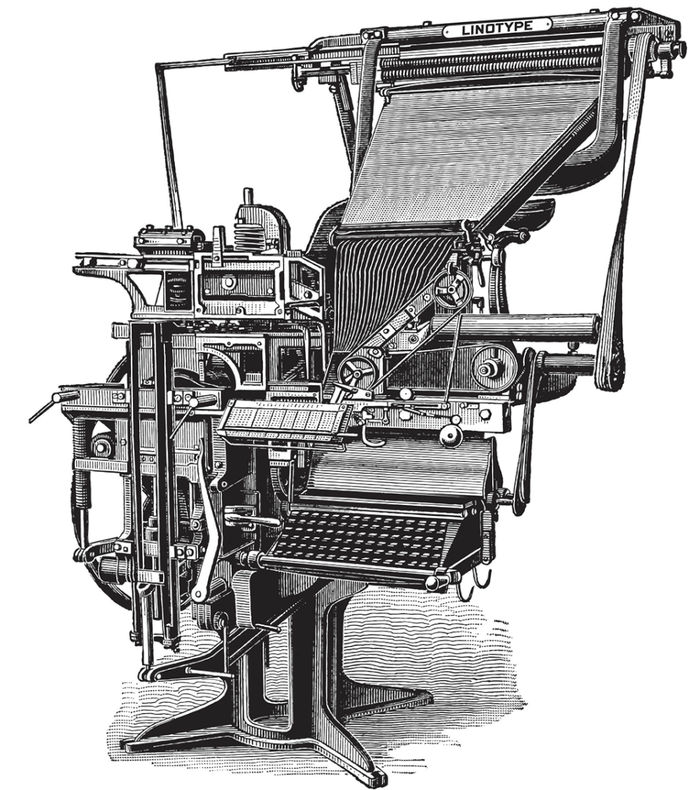
Ottmar Mergenthaler’s Linotype machine (SHOWN), patented in 1884, and Tolbert Lanston’s Monotype machine (1885), speeded up the process of setting type and gave great flexibility in respect to line widths, type fonts and type sizes. “The Industrial Revolution was all about communicating with the masses. Through signs, posters, newspapers,, periodicals and advertisements, typefaces became larger and catchier, with bolder lettering and shading introducing experimental serif and sans serif faces. Ornamental typography was also another major highlight in this era.”[1] Printing became mass industrial, shifting from craft to mechanized production.
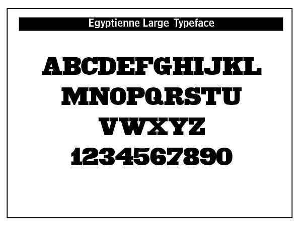
Fat faces by Robert Thorne and Slab Serifs (also called Egyptians) provided a starkly bold contrast to the popular text fonts of the period. Found on just about every billboard, poster, pamphlet and advertising vehicle of the day, slabs were designed to stand out from the crowd, a type that shouted, "look at me!" Slab serifs, also called Egyptian, antique, mechanistic or square serif, are characterized by usually thick, block like serifs.
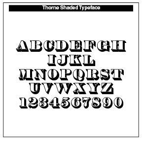
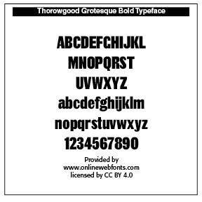
Robert Thorne (1754–1820) became a leading figure in this industrial-era type. He created the first Fat Faces types, which were enlarged, bold Didone fonts used for advertising purposes, Thorowgood (1809), Thorne Shaded (1820), recut by Stephenson & Blake’s Karl Gomer in 1938–1940. INSERTs
Thorowgood’s Seven-line Grotesque, cut c. 1834 (its first appearance in a specimen is that year, and it does not appear in the specimen dated 1830), was one of the first condensed sans serif typefaces, and one of the first known with a lowercase. This is also the first recorded use of the term Grotesque, which would become a popular name for sans typefaces in the UK and in Germany. The type was copied and Thorowgood’s Grotesque and Egyptians appeared in specimens by 1835 in Prague, in what is now the Czech Republic.
Many of these letters seem typical of later condensed forms; for example, the flat-sided capital O and the typically flat-sided vertical tail of the R. The capital G with its lack of crossbar is also typical of the time. The lowercase has a large x-height; the external shapes are gently rounded, but the internal counters are completely flat. The c and e have greater variation in weight than normal, and the a with its large bowl, unusual counter, and a tail with a simple straight form (like the lowercase t) is not at all what we expect. [2]
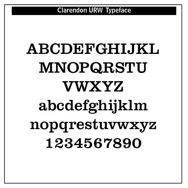
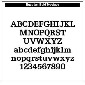
Slab serifs (See my Blog “Slab Serif Font History” July 21, 2025) possess thick serifs, which are squared-off or slightly rounded, and almost the same weight as the main strokes. From a typographical standpoint, they have low contrast, with minimal difference between thick and thin strokes. Slab serifs can have a geometric or humanist structure, and can range from mechanical-looking to more organic. They are sturdy and legible, designed for impact and readability even at large sizes. Early examples were Antique and Clarendon.
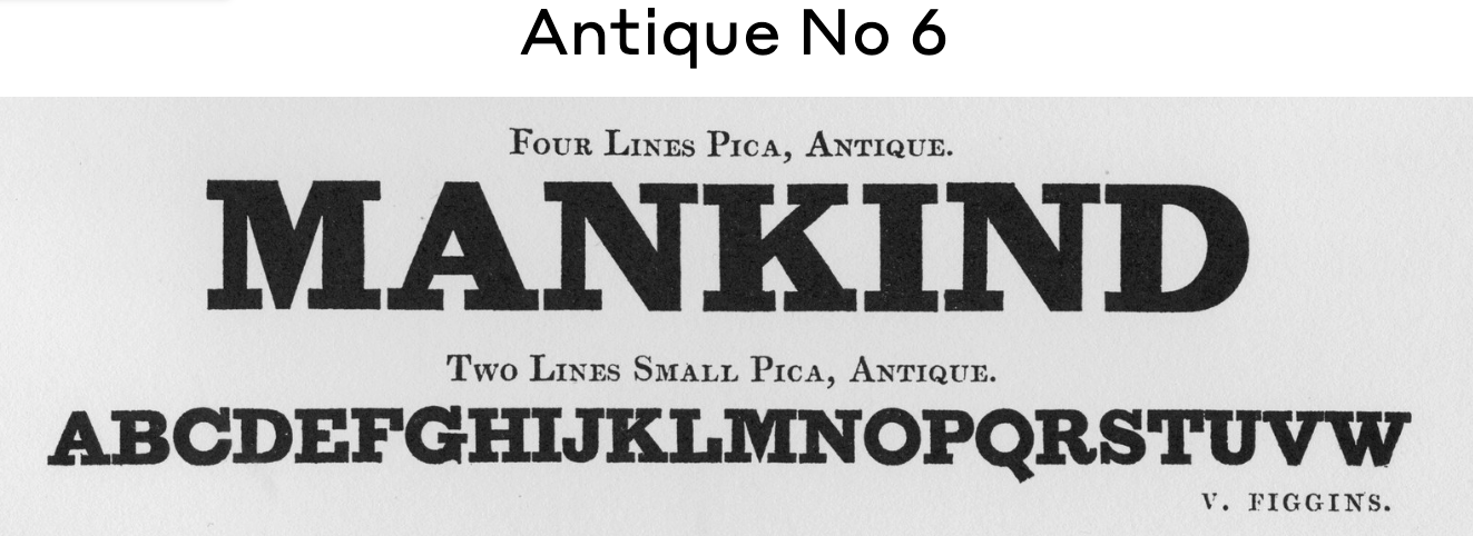
There was an explosion in the range of new typefaces and letterforms to adapt to commercial use. Like the canals of Britain, much of the early typefaces, though honored, were overcome by the growth of display typefaces introduced by Lund Humphries and his printing house. It was not until 1815 when Vincent Figgins used Antique, a slab serif face, for commercial use.
Antique is characterized by the presence of slab serifs, which are nearly equal in width to the major strokes of the letter A. The serifs are unbracketed which means that the serifs attach to the strokes with an abrupt right angle transition (without any triangular or curved fillets in the corners). This typeface first appeared in metal type in 1815 in Figgins’ Type Foundry in England. Wood-type Antique was first produced in 1828 in the U.S. by Darius Wells when he began mass-producing wood-type. As the industry matured two parallel developments occurred. Several variations in Antique type style were created such as italics, tilting, outline, shaded, light face, condensed, and expanded type to various degrees. In addition, several derivative typefaces of Antique came to be created, including Clarendon, Antique Tuscan, Grecian, Latin, French Clarendon, Egyptian, Aldine, Columbia, and Ionic. [3]
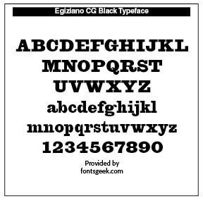
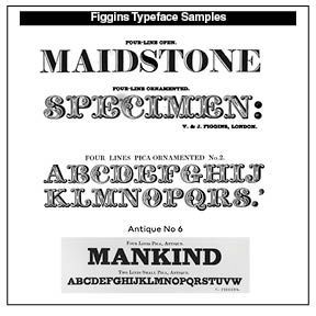
Vincent Figgins, an English typefounder (1766–1844), was a key figure in commercial and poster typography of the nineteenth century. He published several books of type specimens, and designed Gresham (1792), Old English (1815), Figgins Shaded (1816), Figgins Tuscan (1817, digitized by HiH (2005)), Egiziano Black (1815) and Egyptian (1817). His slab serifs such as Egiziano served as a model for Ale Navarro's LC Merken (2019). The typeface Later Figgins resurfaces as Intertype and Intertype Bold around 1916. Figgins’ work inspired Matthew Carter’s Elephant (1992) [4]
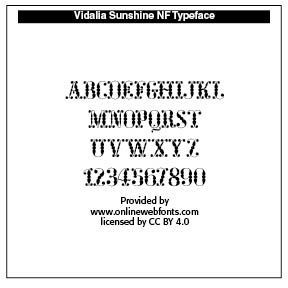
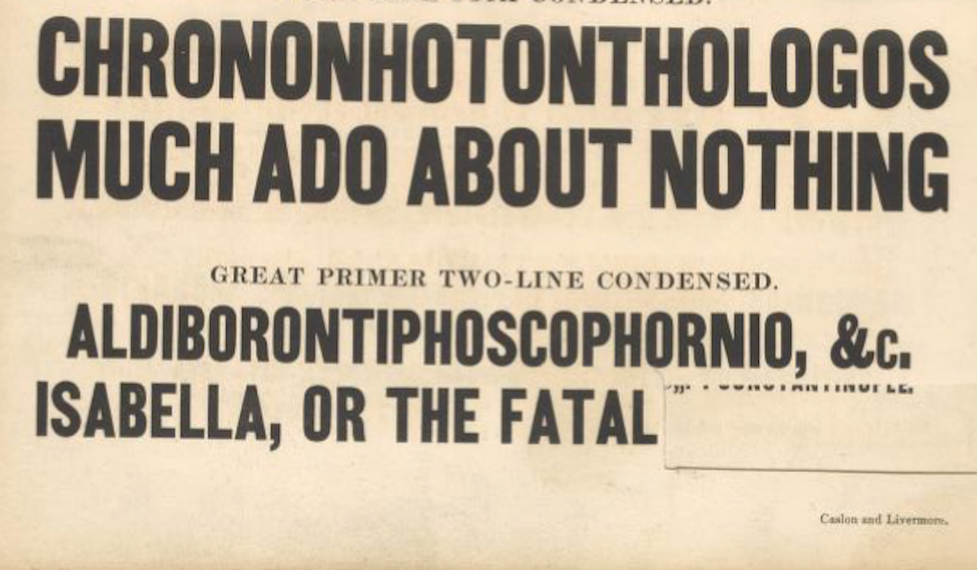
Figgins Tuscan was released by the Figgins foundry around 1846. “By 1848 it already crossed the Atlantic and appeared in George Bruce’s catalogue. Until the late 1800s several American foundries, amongst them MacKellar, Smiths & Jordan [as Two-Line Great Primer Ornamented No. 5, 1885] offered this design before it fell into disregard at the turn of the century.”(The Pyte Foundry) Digital interpretations include Vidalia Sundshine NF (Nick’s Fonts, 2007) and Polymer.
Figgins Tuscan typeface opened the door to Tuscan styled typefaces. Fancy Tuscan letters quickly became so popular, they eventually came to represent the cluttered extremes of Victorian design. Foundries competed with each other to produce most extravagantly decorated letterforms. What is often overlooked is the long history of the Tuscan style. Early examples have been traced back to ancient Rome. Indeed, the characteristic bifurcation may have represented a fishtail to the early Christians, thus sharing in the roll of symbolic identification played by the simple drawing of a fish as a whole. Later trifurcation was developed as an alternate termination, followed by loops, full fishtails, curls, hooks and other fancy variations.
William Caslon IV (1780–1869) was an English typefounder who published the first sans serif type called “Egyptian” in 1816, initially little-used, but laid the foundation for later sans serif developments. Actually, Caslon printed the phrase “W CASLON JNR LETTERFOUNDER,” and from those letters a sans serif was developed. The typeface was cataloged under the name Two Lines English Egyptian – "Two Lines English" referring to its size (around 28 modern points) and "Egyptian" was the common name given to sans-serif lettering at the time. Considering its historical importance, the specimen is rather inconspicuously sandwiched between larger, more ornate, serifed titling capitals suggesting the foundry didn’t consider the design to be of any great significance or worthy of more prominence.
Sans-serif lettering in block capitals had been developing in popularity, initially due to interest in classical antiquity in which inscriptions often had minimal or no serifs, and came to be used by architect John Sloan and copied by others, particularly in signpainting. Historian James Mosley, the leading expert on early sans-serifs, has suggested in his book The Nymph and The Grot, that Soane's influence was crucial in spreading the idea of sans-serif letterforms around the end of the eighteenth century. However, it was some decades before a printing typeface would be released in this style, now commonly used. The name "Egyptian" had become commonly used in England by 1816 to describe this style of lettering. The name "Egyptian" may have originated from the image of sans-serifs being historical in style, the Egyptomania of the period and the "blocky" nature of ancient Egyptian architecture.
Several digital revivals of Caslon's Egyptian have been made, for commercial use by Miko McGinty, Cyrus Highsmith and Christian Schwartz of Font Bureau (adding a lower case invented by Schwartz) and for private use by Justin Howes and by James Mosley, both with a modified G. Howes' revival is used for signage at Dulwich Picture Gallery, designed by Soane. In 1987 metal was cast by Oxford University Press from the original matrices to print a special edition of reprinted type from the early nineteenth century crafted by Ian Mortimer. [5]
Mid to Late Nineteenth Century (1870–1900): Revival, Reform, and Modern Systems
William Morris (1834 –1896) was an Arts & Crafts designer who founded the Kelmscott Press (1891), reviving hand craftsmanship in printing. His work influenced the twentieth century private press and type revival movements. Lettering became a vehicle for breaking convention. Led by figures such as Morris, there was a decided reaction against industrialization, seeing machine-made goods as dehumanizing and ugly. Handcraftmanship, honesty in materials and utility fused with beauty made up much of what was called the Arts & Crafts Movement. That movement was rooted in medieval guild ideals and morality in design.
Morris in his essay on "Printing" emphasized these new points. He says that "It is discouraging to note that the improvement of the last fifty years is almost wholly confined to Great Britain. Here and there a book is printed in France or Germany with some pretension to good taste, but the general revival of the old forms has made no way in those countries. Italy is contentedly stagnant. America has produced a good many showy books, the typography, paper, and illustrations of which are, however, all wrong, oddity rather than rational beauty & meaning being apparently the thing sought for both in the letters and the illustrations."
On Typography he notes that "it is obvious that legibility is the first thing to be aimed at in the forms of the letters; this is best furthered by the avoidance of irrational swellings & spiky projections, and by the using of careful purity of line. Even the Caslon type when enlarged shows great short- comings in this respect: the ends of many of the letters such as the t and e are hooked up in a vulgar and meaningless way."
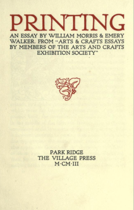
"Therefore, granted well-designed type, due spacing of the lines and words, and proper position of the page on the paper, all books might be at least comely and well looking : and if to these good qualities were added really beautiful ornament & pictures, printed books might once again illustrate to the full the position of our Society that a work of utility might be also a work of art, if we cared to make it so."
Devoting himself to the socialist cause, he regularly lectured at meetings across Britain, hoping to gain more converts, although was regularly criticized for doing so by the mainstream press. Politically, Morris was a staunch revolutionary socialist and anti-imperialist, and although raised a Christian, he came to be an atheist.
The Movement stressed simple, functional, and durable forms. with inspiration from nature but rendered in stylized, often geometric patterns (floral or foliate motifs). Heavy emphasis was placed on natural materials—wood, stone, textiles. Earthy colors and solid craftsmanship were key characteristics. Morris's ethos was that one should "have nothing in your houses that you do not know to be useful or believe to be beautiful.”
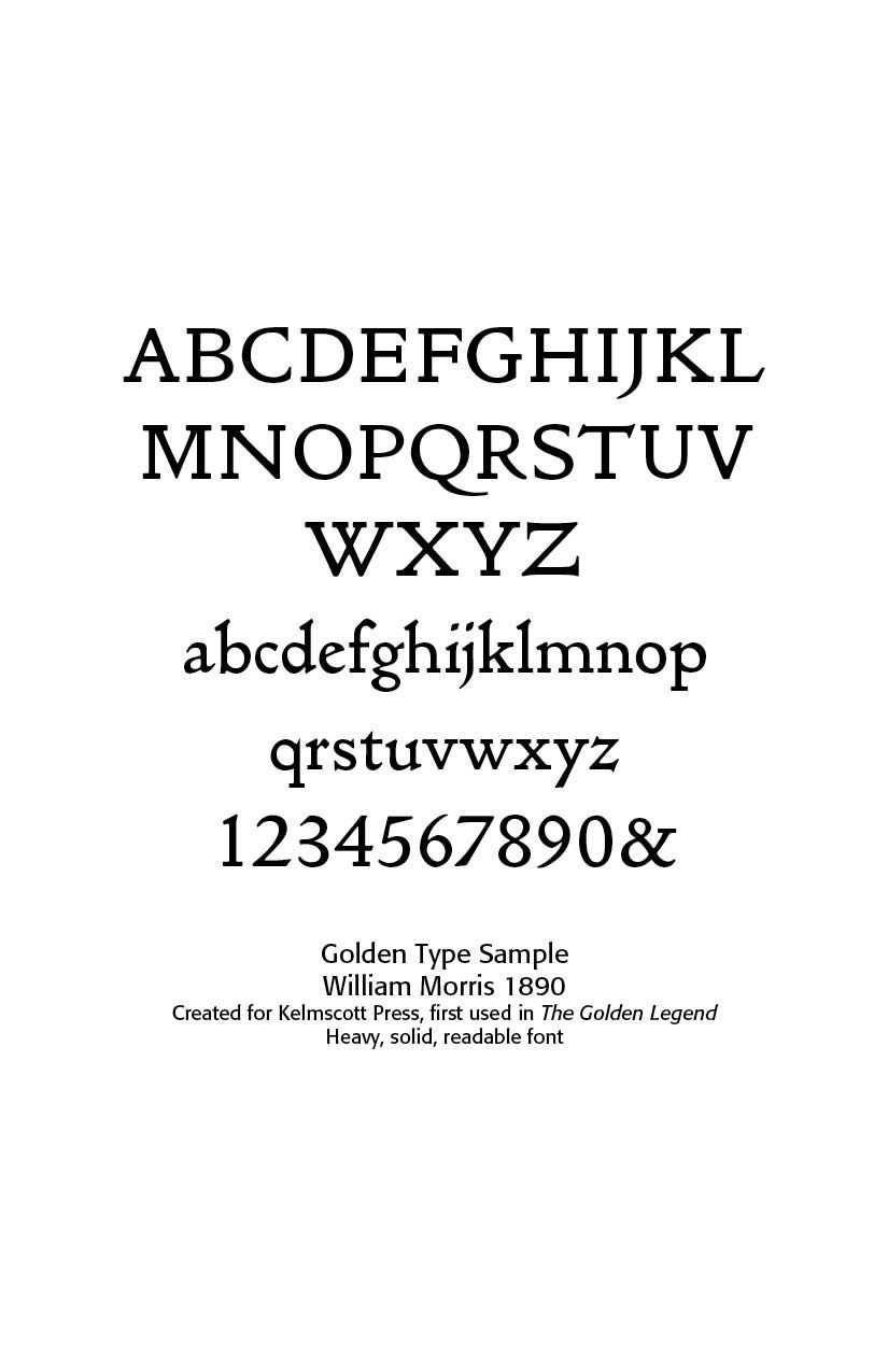
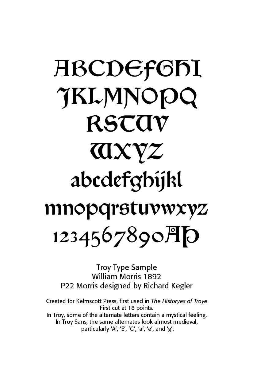
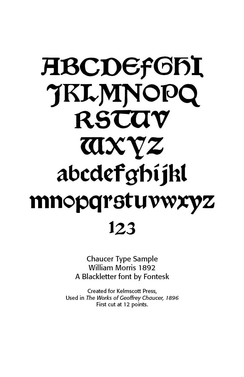
Morris created three main typefaces for the Kelmscott Press —Golden Type (roman), Troy Type (blackletter), and Chaucer Type (smaller blackletter). These remain his lasting contributions to typography. [6]
In Germany Morris’ closest counterpart was Rudolf Koch, (SEE the Blogs “Early German Typography, Parts 1 and 2,” Sep 22, 2025) who gathered around himself at Offenbach, where he taught at the Arts and Crafts School and designed types for the Klingspor foundry, a community of craftsmen who painted, worked in metal, wood, and stone, printed, and wrote. Above all a skilled penman, Koch made the written word the basis of his designs in any medium, whether tapestry or woodcut. A devout Christian, Koch, like the medieval craftsmen he admired, saw the Gothic style as a supreme manifestation of religious spirit; he was no mere imitator but an artist who freely reinterpreted in his types and books the traditional Fraktur type of Germany. Koch also created a number of modern types, among them sans serifs and romans.
The Didot point system was adopted in Europe and later in the United States. The ATF (American Type Founders) formed in 1892 consolidated numerous foundries. Early Garamond, Jenson and other Renaissance models inspired new designs.
Transition to Modern Typography (by 1900)
Early twentieth century type movements included Art Nouveau (SEE Blog “Art Nouveau Typography, Sep 6, 2025) featuring organic, decorative forms expressed in the archaic type styles of Grasset in France, Will Bradley in the United States, and Henry van de Velde in Belgium and Germany.
This signaled the end of metal type’s dominance with the beginning of machine typesetting in the Monotype and Linotype machines. However, in 1946, Louis Marius Moyroud and René Higonnet decided metal and wood type were so “last century” and introduced phototypesetting—a game-changer in typography. Instead of casting chunky metal or wood letters, this process used a photographic process, allowing text to be composed on film or paper.
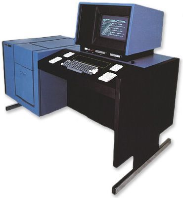
I experienced some of this transition from typewriters and the cherished IBM Selectric to the IBM Executive typewriter, using special fonts and implementing true proportional spacing long before Adobe’s Postscript came about. The flying-ball Selectric used interchangeable balls, preparing the way for the IBM Composer, which allowed for proportional spacing and justified text. Then, the Macintosh came about with the massively large LaserWriter and the ImageWriter for home use. We all thought we died and went to printing heaven with a 300 dpi LaserWriter and Times and Helvetica fonts. Then came Postscript and the phototypesetting Itek and the rest is history.
Designers could now manipulate type with greater precision, and experiment with size, style, and spacing in ways that were previously impossible. The flexibility of phototypesetting allowed designers to integrate text and images more seamlessly, paving the way for more dynamic and complex layouts. This era expanded the creative possibilities of typography, bridging the gap between traditional methods and digital innovations.
Between 1500 and 1900 typography evolved from Renaissance humanist forms to industrial mass production and artistic revival. Old style typefaces (like Garamond) moved to Transitional faces (like Baskerville) to Modern/Didone faces (like Didot and Bodoni) to Industrial display types (fat faces, slab serifs, sans serifs) to the Arts & Crafts revivals. These developments shape nearly everything in modern type designs.
SOURCES
- https://www.printmag.com/design-culture/evolution-typography-history/
- https://commercialtype.com/about/collections/thorowgood_grotesque)
- https://www.printmuseum.org/wood-type-antique
- https://luc.devroye.org/fonts-32567.html
- https://en.wikipedia.org/wiki/Caslon_Egyptian
- From https://www.caretypography.com/art-nouveau-typography
Successful Layout & Design


