Yellow Pages Typography
“Let Your Fingers Do the Walking!” The Yellow Pages developed from the ordinary telephone directory and became one of the most important forms of commercial advertising and business information in the twentieth century. For much of the century, the Yellow Pages were essentially the printed marketplace of a community—a place where people could find plumbers, doctors, restaurants, retailers, manufacturers, churches, and virtually every other kind of business.
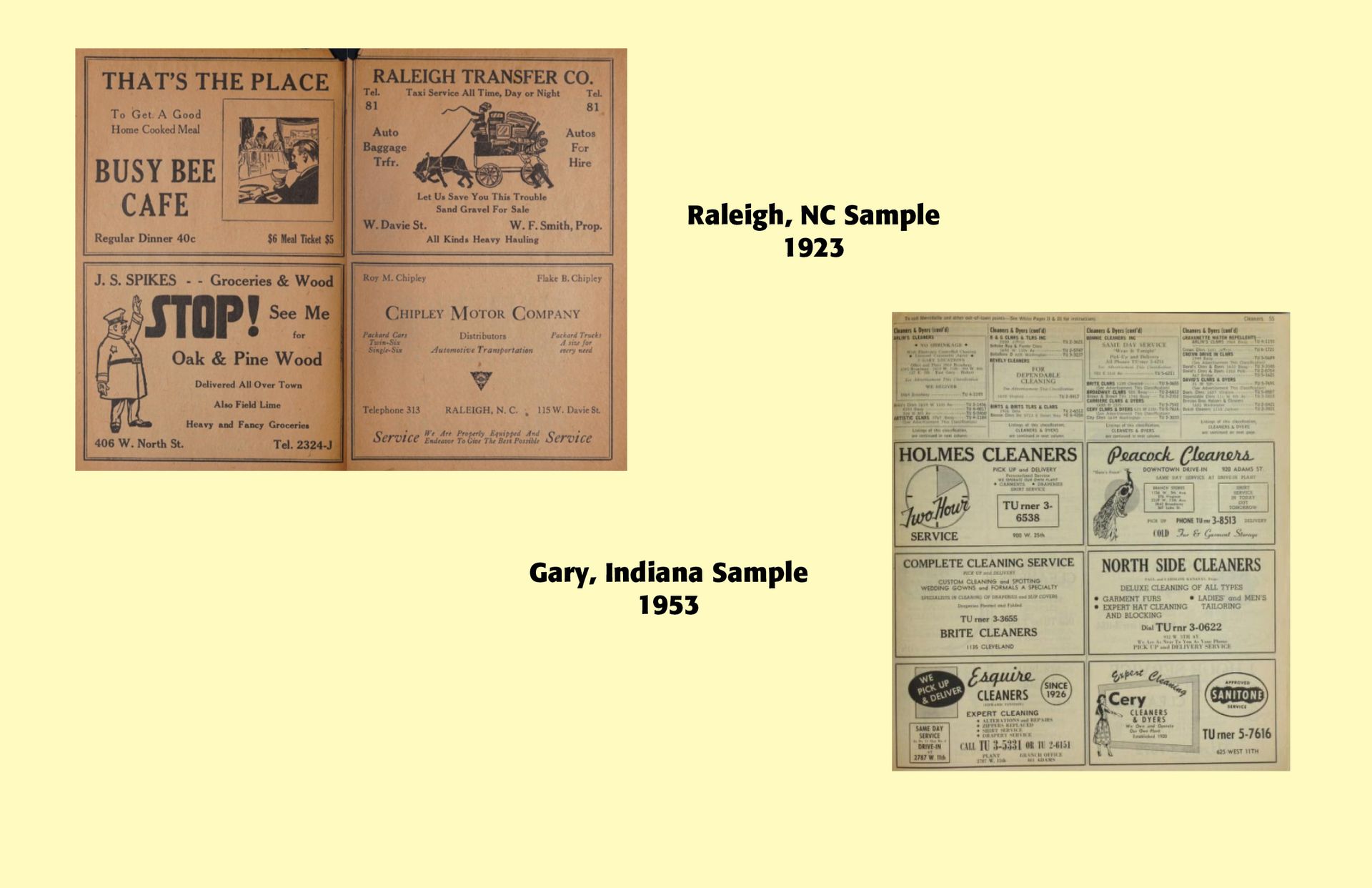
For typography and graphic design, they are especially significant because they demonstrate the transition from simple alphabetical lists to highly organized visual information systems. In that respect, the Yellow Pages can be studied not merely as a form of advertising, but as an important chapter in the history of information design, commercial typography, and visual navigation. (ChatGPT)
Early directories were alphabetical lists of subscribers, rather than commercial guides. Growing businesses increasingly wanted their telephone numbers to be easily found by potential customers. “White” pages listed residential and business subscribers, while “yellow” pages listed businesses and services by category. The telephone book became a commercial reference book, an early “search engine” in print.
As the Bell Telephone system grew, by the early twentieth century virtually every substantial American community had some form of classified business directory associated with its telephone service. Businesses could purchase larger type, bold listings, display advertisements, illustrations, borders, logos, multiple-column advertisements, and full or partial-page advertisements. The Yellow Pages allowed a customer to search by need, rather than by brand. The phrase, “Let your fingers do the walking,” was introduced in the 1960s and became one of the most recognizable advertising campaigns in American ad history.
Yellow Page customers eventually moved their advertising to websites and search engines, like Google, with a number of major advantages over the printed model. They could be updated continuously, were searchable, could include photographs and provide maps. They could link directly to websites, include customer reviews, provide directions, and were not restricted to a particular geographic edition. The printed Yellow Pages could not compete with that flexibility.
From a typographical standpoint, the Yellow Pages had to accommodate enormous amounts of information in a limited volume which was easy to navigate. Typical design characteristics included small type, bold headings, multiple column layouts, with larger advertisers offered headlines, illustrations, logos, decorative borders, photographs, reversed type, rules, boxes and multiple typefaces. This often made such ads clunky, machine-driven, display poor, and not inviting to the eye of the beholder. Larger cities demanded larger Yellow Pages with alphabetical categories, bold section headings, indexes, cross-references, tabbed sections, repeated advertisements and geographical subdivisions. The Yellow Pages required the user to understand the classification system, whereas modern internet search engines attempt to interpret natural language inquiries, which increasingly through AI have become a form of language learning models. The samples below show the clunky nature of a typical Yellow Page ad and suggested makeovers by professional typographers.
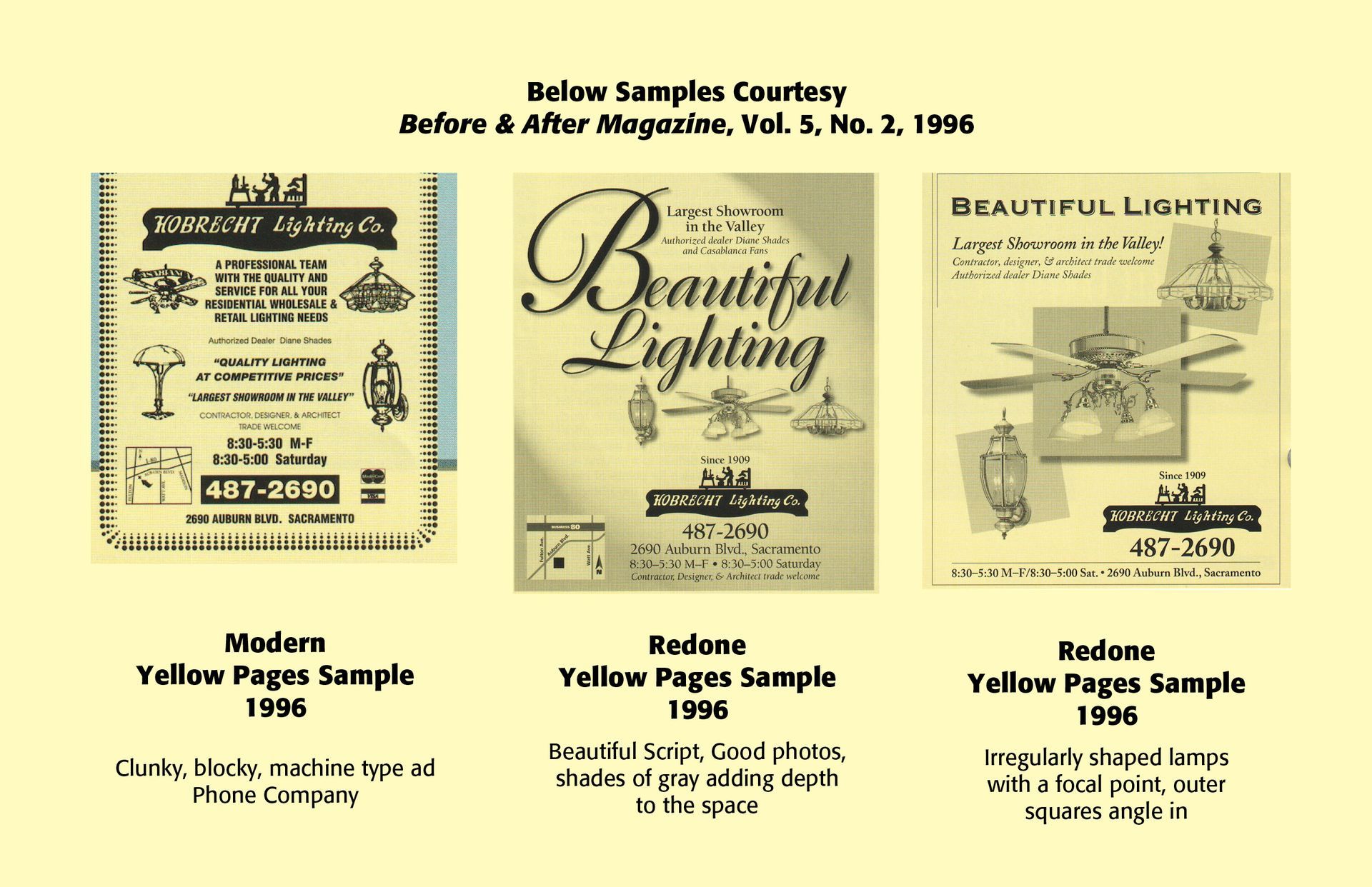
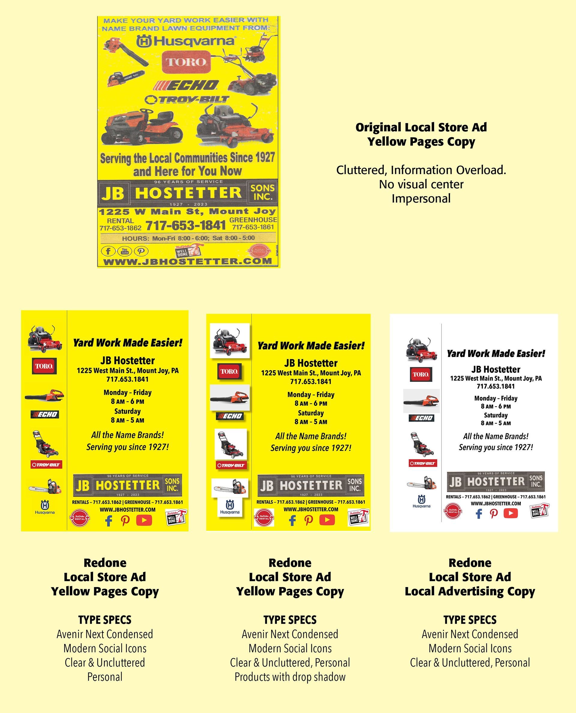
The Chart below traces the evolving history of the Yellow Pages.
1876
Bell's telephone patents and rapid development of telephone service
1878
First known telephone directory, New Haven, Connecticut
1880s
Early classified telephone/business directories develop
Late 1800s
Commercial listings increasingly separated from subscriber listings
Early 1900s
Yellow Pages-style classified business sections expand
1920s–1940s
Telephone directories become major local advertising media
1950s
Display advertising becomes increasingly sophisticated
1960s
"Let your fingers do the walking" campaign becomes famous
1970s–1980s
Yellow Pages become an essential advertising medium for local businesses
1990s
Internet directories begin challenging printed directories
2000s
Online search rapidly replaces much of the printed directory's function
2010s–2020s
Printed Yellow Pages decline substantially; digital local search dominates
Successful Layout & Design