Typeface Characteristics: Which Type Where?
Typeface characteristics are the visual and structural features that distinguish one typeface from another. They determine a typeface’s historical appearance, readability, personality, and appropriate use.
Useful Ways to Analyze Any Typeface. When examining an unfamiliar typeface, ask these questions in order (provided by ChatGPT) —
- Does it have serifs?
- What kind of serifs?
- How much thick/thin contrast is present?
- What is the stress angle?
- What is the x-height?
- How wide or narrow are the letters?
- How are the counters constructed?
- What do the terminals look like?
- What are distinctive letters such as a, g, e, R, and Q doing?
- How does the typeface behave in a paragraph—open, dark, dense, airy, mechanical, or calligraphic?
- What historical or technological process does its construction suggest?
- What personality does the combination of these characteristics produce?
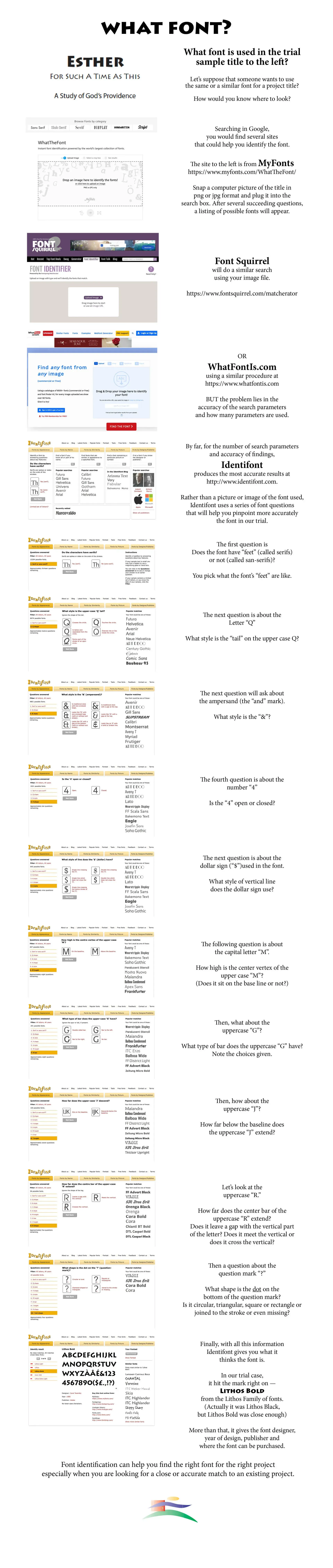
There are a number of online sources to help identify typefaces (See Feb. 6, 2022 Blog for more explanation and use.) Sources include —
MyFonts (www.myfonts.com/WhatTheFont),
FontSquirrel (www.fontsquirrel.com/matcherator)
WhtFontIs (www.whatfontis.com)
Identifont (www.identifont.com) is one of the best. Here are the questions it will ask you —
- Does it have feet (serifs) or not (sans-serifs)?
- What style is the tail on uppercase Q?
- What style is the ampersand (the &)?
- Is the numeral “4” open or closed?
- What style of vertical line does the Dollar sign ($) have?
- How high is the center vertex of the uppercase M? Sit on the line or not?
- What type of bar does the uppercase G have?
- How far below the baseline does the uppercase J extend?
- What about the uppercase R? How far does the center bar extend? Is there a gap with the vertical part of the letter? Does it meet or cross the vertical?
- What about the question mark (?) What shape is the dot at the bottom? Is it circular, square, triangular, rectangular or even missing?
The important point is that a typeface should not be identified by a single characteristic. Its identity comes from the interaction of serifs, contrast, stress, proportions, counters, terminals, spacing, and letterform construction.
Overall Personality. All these characteristics combine to give a typeface its voice. Old Style serifs are generally humanistic, historical, and literary. Transitional serifs are more refined, rational, balanced. Didone (Modern) serifs are elegant, fashionable, high-contrast. Slab serifs are sturdy, industrial, authoritative.
Humanist sans are found to be friendly, readable, contemporary. Geometric sans are precise, modern, architectural. Grotesque sans are utilitarian, direct, functional.
Script is personal, expressive, formal, or informal depending on construction.
Typeface Classifications
There happen to be a number of ways to classify fonts. Some of them make more sense to me than others. Robert Bringhurst in his masterful book, The Elements of Typographic Style, Hartley & Marks, 1992 edition, chooses categories consequent with historical periods of fine art, thus, Scribal or Carolingian, Renaissance, Mannerist, Baroque, Rococo, Neoclassical, Romantic, Realist, Geometric Modernism, Expressionist, Elegiac Post-Modernism, Geometric Post-Modernism.
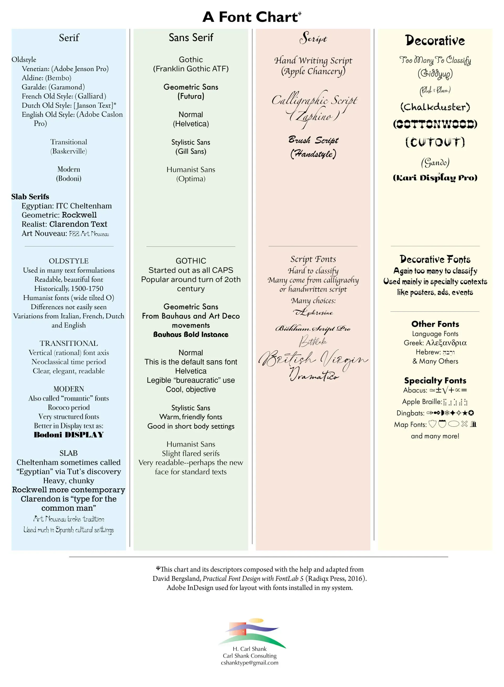
Thomas Phinney’s classifications taught in most design schools include — Old Style, Transitional, Modern, Slab Serif (or Egyptian), fat faces, wood type, Art Nouveau, Art Deco, synthesis, and grunge. David Bergsland, from which I adapted the following chart and its descriptors, reduces the families to — Serif, Sans-Serif, Script and Decorative. (David Bergsland, Practical Font Design With FontLab 5, Radiqx Press, p. 217).
Erik Spiekermann in his masterful 4th edition of Stop Stealing Sheep: Find Out How Type Works offers an unhistoric, yet modern classification, namely that provided by Adobe. Again, that is not all there is to the many fonts out there, but it is a good start.
The chart below gives a graphic representation of Bergsland’s system of classification, along with some of my additional notes. (CHART)
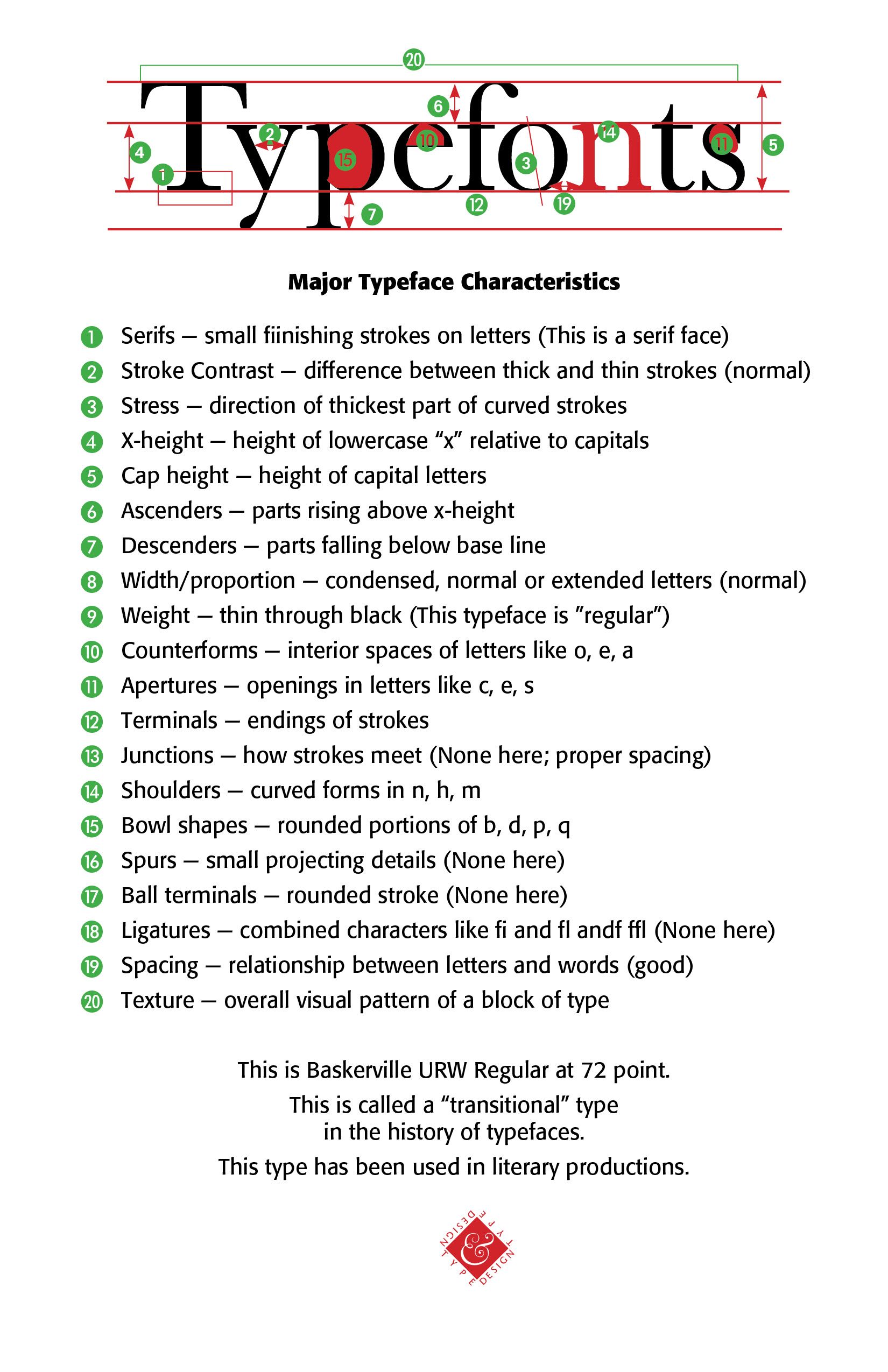
Major Typeface Characteristics (At least 21) (See Accompanying Samples)
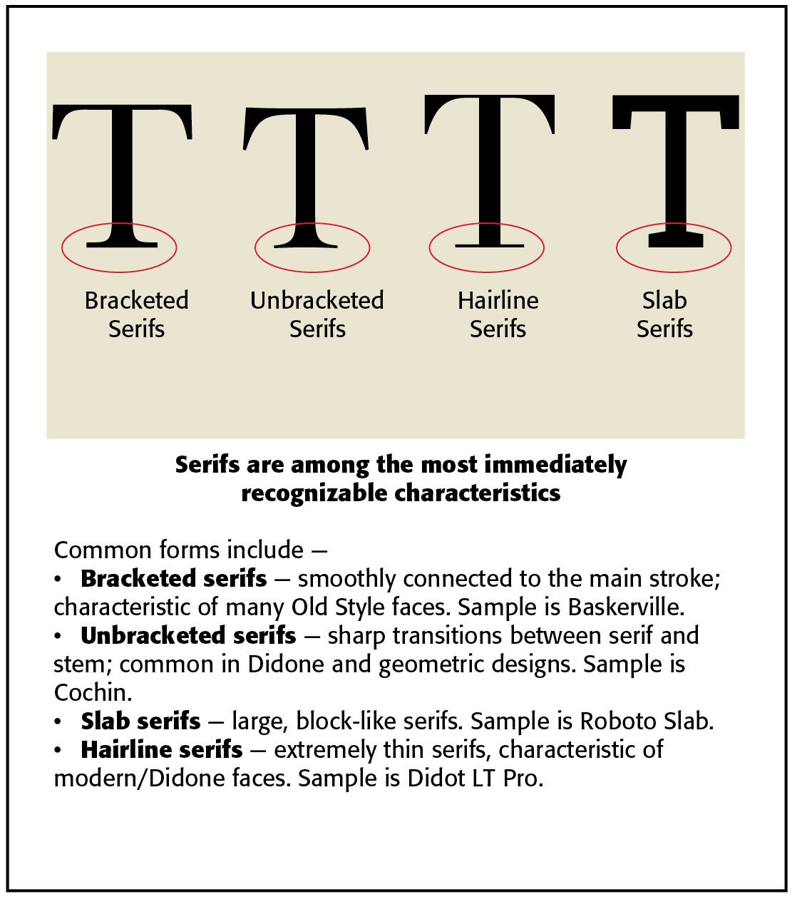
Serifs. Small finishing strokes on letters. Indicate traditional, literary or formal. They are among the most easily identifiable characteristic of a typeface. There are bracketed serifs, which are smoothly connected to the main stroke and characteristic of many Oldstyle faces. A sample would be Baskerville.
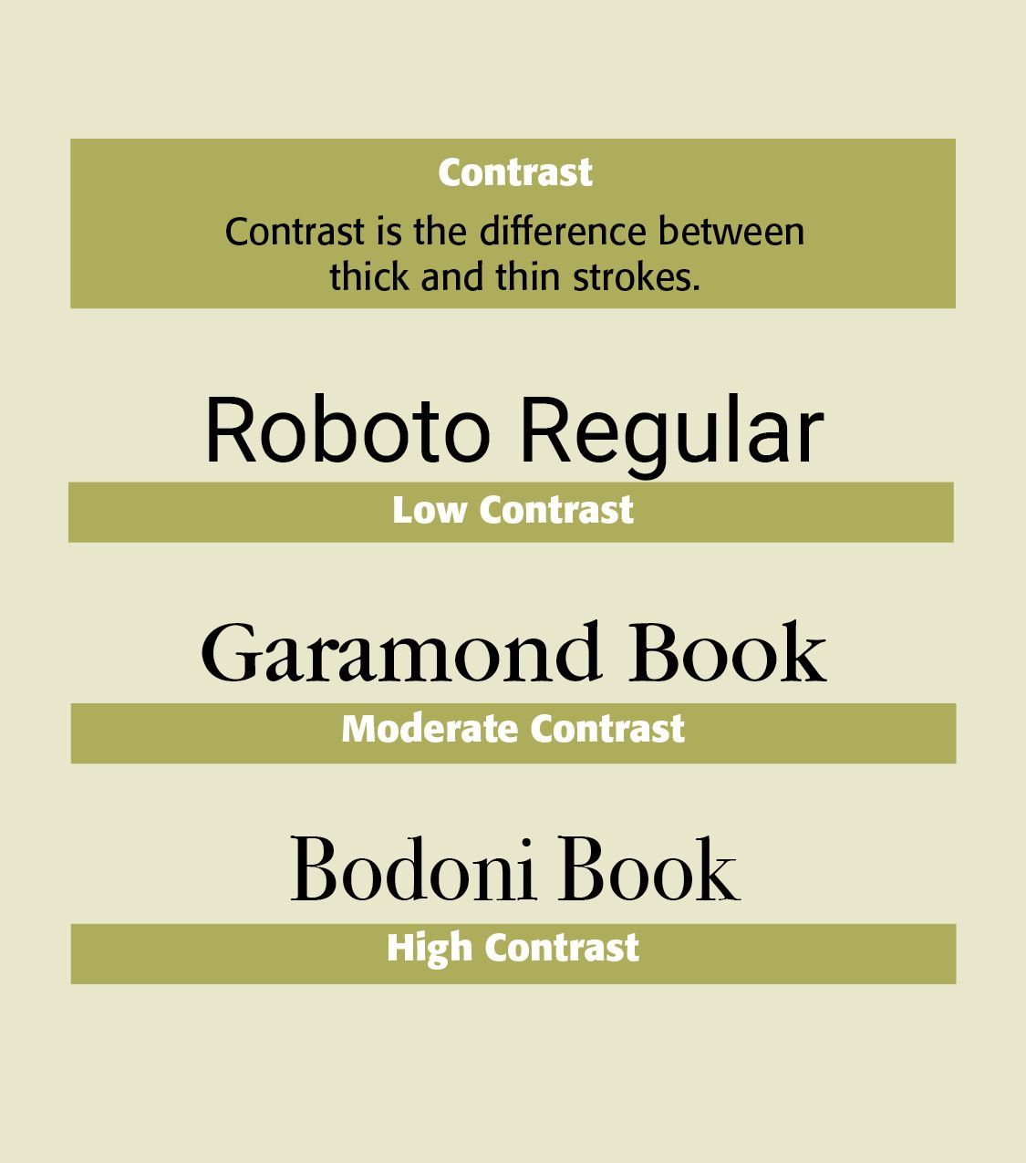
Stroke contrast. Difference between thick and thin strokes. Can range from low to dramatic. Low contrast letterforms strokes are consistently similar. Samples would include Roboto, Helvetica, and Univers. Moderate contrasting letterforms have some variation between thick and thinner strokes, faces like Garamond and Baskerville fit here. High contrast strokes are evident in modern typefaces, like Bodoni and Didot.
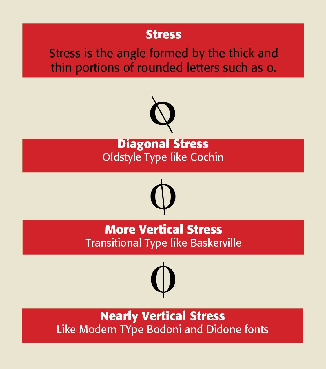
Stress. Direction of the thickest part of curved strokes. Helps reveal historical classification — oldstyle, transitional, modern. Stress is the angle formed by the thick and thin portions of rounded letters such as o. Diagonal stress is apparent in some oldstyle faces like Cochin. More vertical stress occurs in many transitional faces, like Baskerville. Nearly vertical stress takes place in modern faces like Bodoni and Didone fonts.
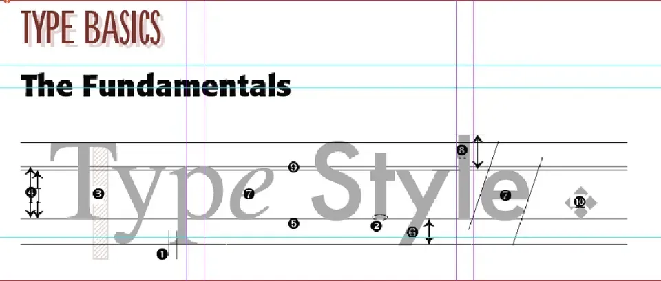
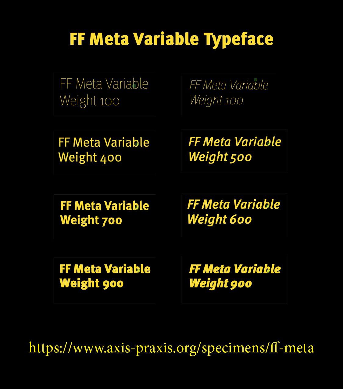
x-height. The height of lowercase “x” relative to capitals. A larger x-height at smaller font sizes increases readability. In our variable font sample, note that the smaller the point size, the greater is the x-height. The larger the point size the relatively smaller the x-height.
Cap Height. The height of capital letters. Affects visual scale and presence.
Ascenders. Parts of letters rising above x-height. Affects rhythm and texture.
Descenders. Parts of letters falling below baseline. Affects rhythm and line spacing. Greater line space for large descenders.
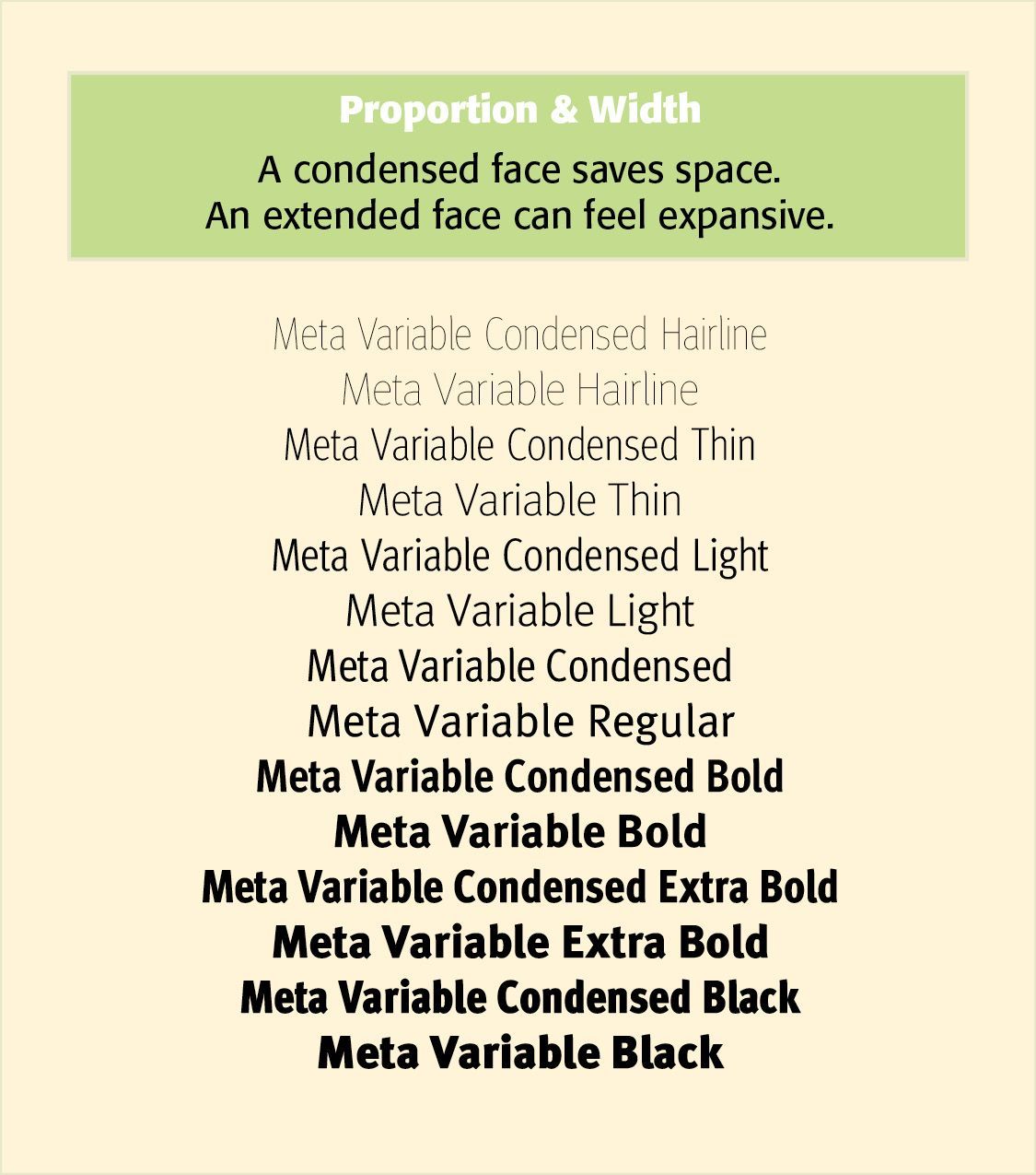
Width/Proportion. Condensed, normal or extended letterforms. Controls density and space. Typefaces may be Ultra-condensed, Condensed, Normal, Extended. Ultra-extended. A condensed face saves space and creates a tall, energetic appearance. An extended face can feel expansive and monumental.
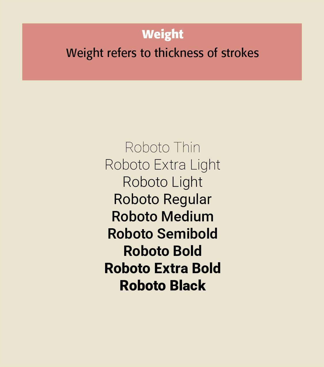
Weight. Thin through black. Determines emphasis and visual strength. Weight refers to the thickness of strokes, moving from Thin to ExtraLight to Light to Regular to Medium to Semibold to Bold to Black to Heavy. Weight is both a functional and expressive characteristic. A book face usually requires moderate weight, while posters and headlines may employ Bold or Black weights.
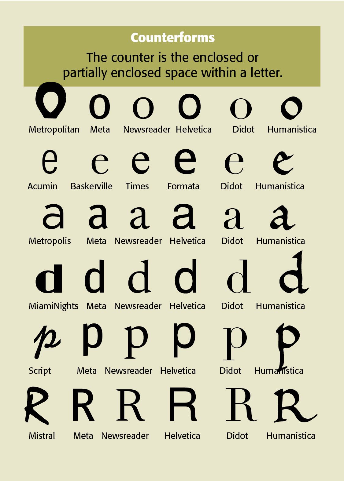
Counterforms. The interior spaces of letters such as o, e and a. Strongly affects readability. The counter is the enclosed or partially enclosed space within a letter. Examples include the letters o, e, a, d, p and R. Counterforms are extremely important because typography is defined as much by its spaces as by its strokes. Apertures. Openings in letters such as c, e, s. Important for clarity
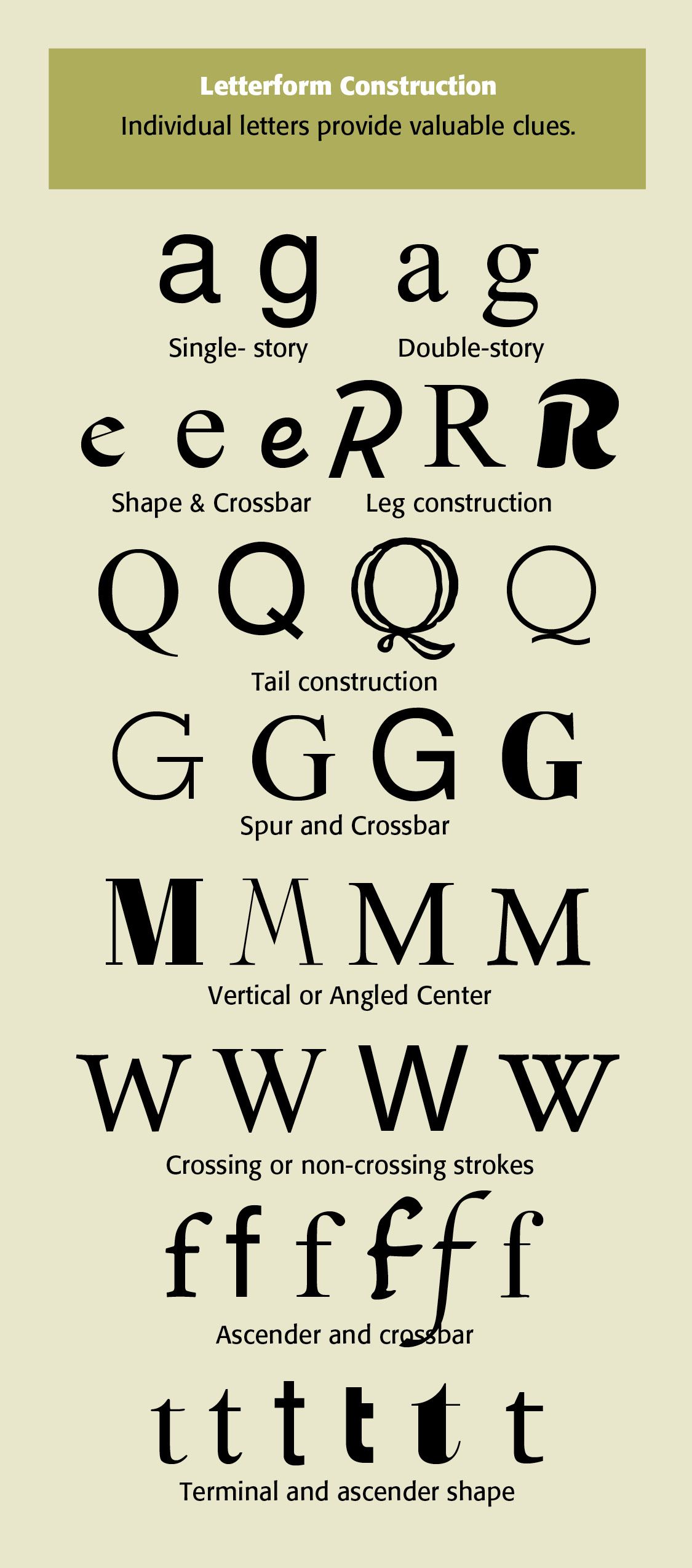
Letterform Construction. Individual letters provide valuable clues to a typeface's design. Particularly diagnostic letters include a — single-story or double-story. Lowercase single-story is a simple oval or circle with straight vertical stem on the right; “g” open tail loop that does not close back up into the main body, like Helvetica. Double-story two enclosed interior spaces — lowercase a has a closed oval body topped with a curved roof or ear and a tail; lowercase “g” has a closed loop (bowl) connected to a lower hanging loop, like Times Roman. In the letter e, note its shape and crossbar, with R, the leg construction, with Q the tail construction. Note with G the spur and crossbar, M the vertical or angled center, the W crossing or non-crossing strokes. In the letter f see the ascender and crossbar, and in the letter t, the terminal and ascender shape.
Other important characteristics include —
Junctions. How letter strokes meet. Contributes to personality and construction.
Shoulders. Curved forms in n, m, h. Affects rhythm and texture.
Bowl Shapes. Rounded portions of b, d, p, q. A major stylistic identifier.
Spurs. Small projecting details on letterforms. Can give a typeface a distinctive form.
Ligatures. Combined characters such as fi and fl and ffi. Improves spacing and adds typographic character.
Spacing. Relationship between letters and words. Affects color, rhythm, and readability.
Texture. Overall visual pattern of a block of type. Determines whether text feels light, dark, open, or dense.
While such typeface characteristics may seem tedious and mundane, seemingly unimportant, they always define or describe how well or how poorly we read or see some printed or digital composition.
Successful Layout & Design