German Typography History
German Typography History
German typography has a particularly distinctive history because Germany was central to the invention of European movable-type printing, the development of Gothic/Blackletter typography, the rise of Fraktur, and later the modernist rejection of traditional German type. The story therefore moves dramatically from manuscript Gothic forms to highly ornate Fraktur, then to Bauhaus modernism and finally to contemporary digital typography.
The history can be understood as a series of major transformations, as noted in ChatGPT, Gothic manuscript → Gutenberg → Schwabacher → Fraktur → Roman/Gothic duality → nineteenth-century industrial typography → Bauhaus modernism → New Typography → postwar modernism → digital pluralism.
What makes German typography particularly fascinating is that the political and cultural meaning of type was unusually strong. Fraktur was not simply a letterform; over time it became associated with German language and identity, while the twentieth-century modernists deliberately sought to replace that historical visual language with an international, functional one.
If you're studying European typography comparatively, German typography makes an especially useful contrast with Italian, French, Dutch, and English typography, because Germany's long attachment to Gothic type produced a very different trajectory from the Roman-type tradition that developed in Italy and subsequently dominated much of Western Europe.
A number of Blogs I have written gives one an insight as to German historical typography and its central typographic characters, including typefaces and notes about Johannes Gutenberg, Marin Luther in Gothic type, Fraktur type and its extensive use in Germany, Rudolph Koch, the Bauhaus period with Herbert Bayer and Paul Renner, Futura, Jan Tschichold and Die Neue Typographie, and the influence of the Akzidenz-Grotesk font and its relationship to Helvetica, Univers, Neue Haas Grotesk, and Arial. Blogs that inform —
Advance in Typography: Twentieth Century (Part 1)
Type After Gutenberg: A Historical Sketch
Theology of Type (2): Gutenberg to Early 1900s
Early German Typography (Part 1)
Early German Typography (Part 2)
Blackletter Type & Universities
Typography: A History of Machines
Contemporary German Typography. Contemporary Germany has become one of Europe's major centers of type design. Important contemporary designers and foundries include Erik Spiekermann. Erik Spiekermann (born1947)( is a German art historian, typographer, designer, information architect and writer. He divides his time between Berlin, London and San Francisco. He runs Hacking Gutenberg, an experimental letterpress printing workshop in Berlin. He wrote Stop Stealing Sheep & Find Out How Type Works, a book on typography first published in 1993, revised 4th edition 2023.
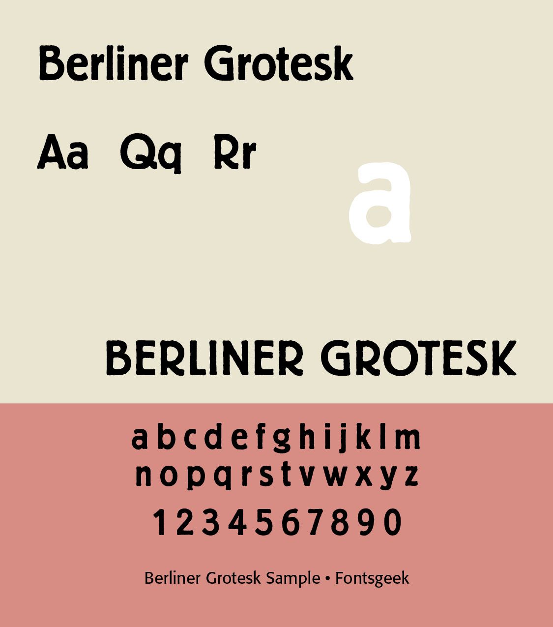
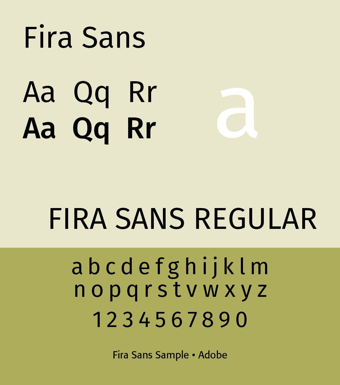
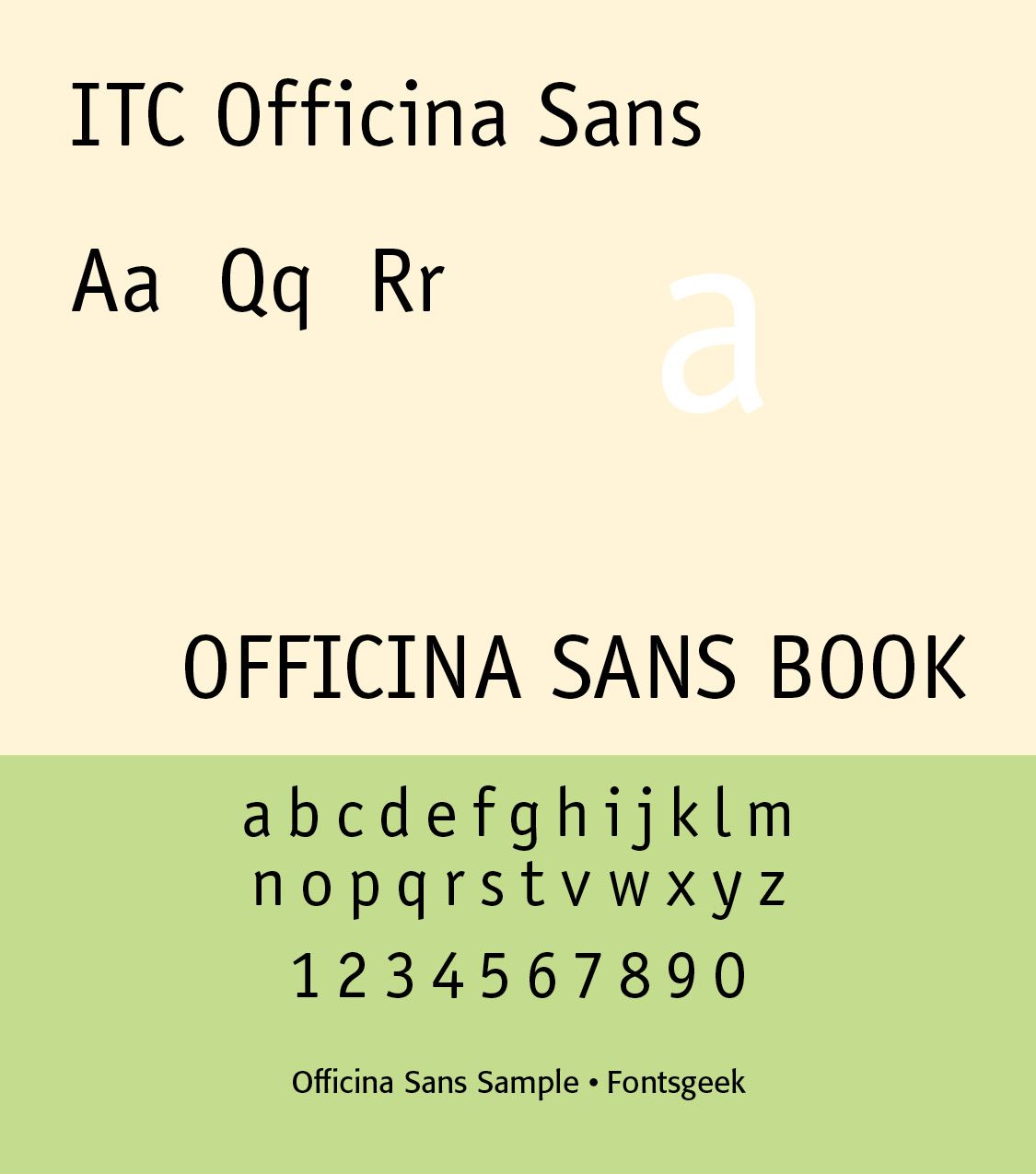
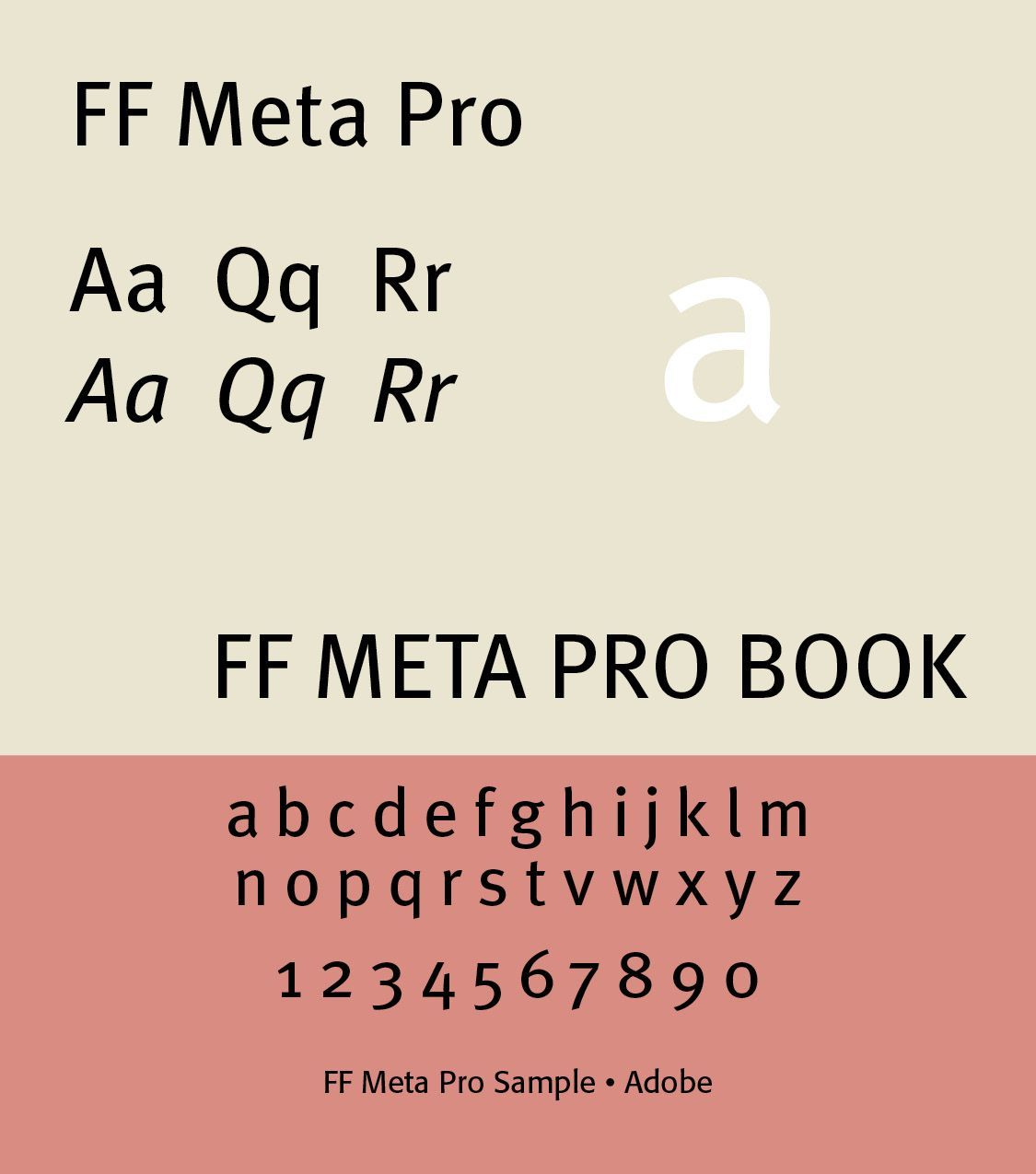
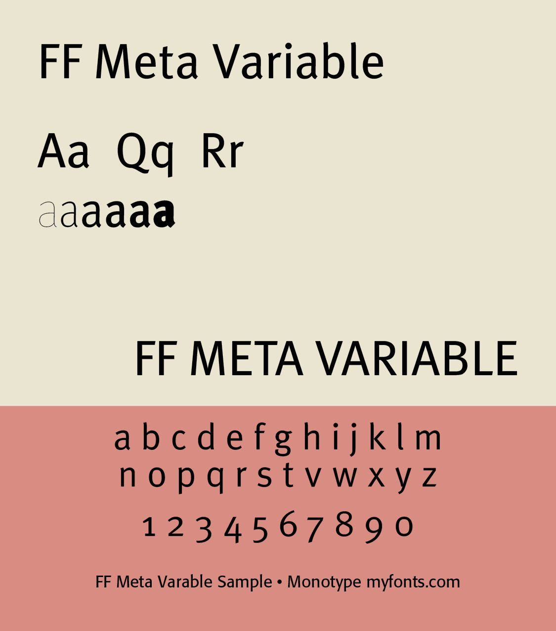
Spiekermann has designed numerous typefaces, both for sale and as part of corporate design programs. His typefaces include Berliner Grotesk (original is from 1913, digitization is from c. 1978), Fira Sans (designed in collaboration with Ralph du Carrois) for Firefox OS, released in 2013 under the SIL Open Font License), ITC Officina Sans and Serif fonts (1990), and FF Meta. FF Meta is especially interesting, as one of the fonts illustrated by axis-praxis for variable font use. It has 28 Instances offered through Adobe, from Condensed through Black, and a Variable font from Monotype.
Spiekermann’s work emphasizes information clarity, signage, corporate identity, wayfinding, and digital typography. In German typography, wayfinding refers to the use of typography, symbols, color, spatial organization, and signs to help people navigate a physical environment. It is closely associated with Germany’s strong tradition of functionalist and systematic graphic design.
Modern German typography is characterized by pluralism rather than a single national style. Contemporary designers freely use sans serifs, serif typefaces, variable fonts, neo-grotesques, geometric sans serifs, humanist sans serifs, contemporary revivals of Fraktur, experimental lettering, and digital display fonts.
Fraktur remains visible in specialized contexts such as traditional breweries, historic businesses, newspapers and publications with historical associations, certificates, Blackletter music and cultural graphics, and Gothic/medieval-themed design, However, it is no longer the default German text type.
Successful Layout & Design