Typography: A History of Machines
Typography: A History of Machines. Several years ago, Alexander Lawson wrote a series of articles on the history of typographic machines and typography, Typographic Journey—Craft to Computer (Typeworld, July 1, 1992 – September 2, 1992). He did a masterful job of outlining the major eras of typographic printing equipment. I was inspired to draft a pictorial history from those articles, noted in the graphic below.
Rather than merely a look back at the machinery and utility of typography, Lawson as well as many other typographers, and printers, for that matter, look upon typography and printing as a "fine art" — "Is it any wonder . . . if the printer, or lover of printing, who is sensitively alert to all this multi-form variability of the apparently inelastic and static medium, should wax enthusiastic over it, and claim for it a place among the fine arts?" (Will Bradley, "Is Printing A Fine Art?") Starting with Johann Gutenberg and working his way through the centuries and developments of printing and printers, Lawson with a taste for the art as well as the science of printing and typography, traces the major hallmarks of the machines that actually produced the printed page.
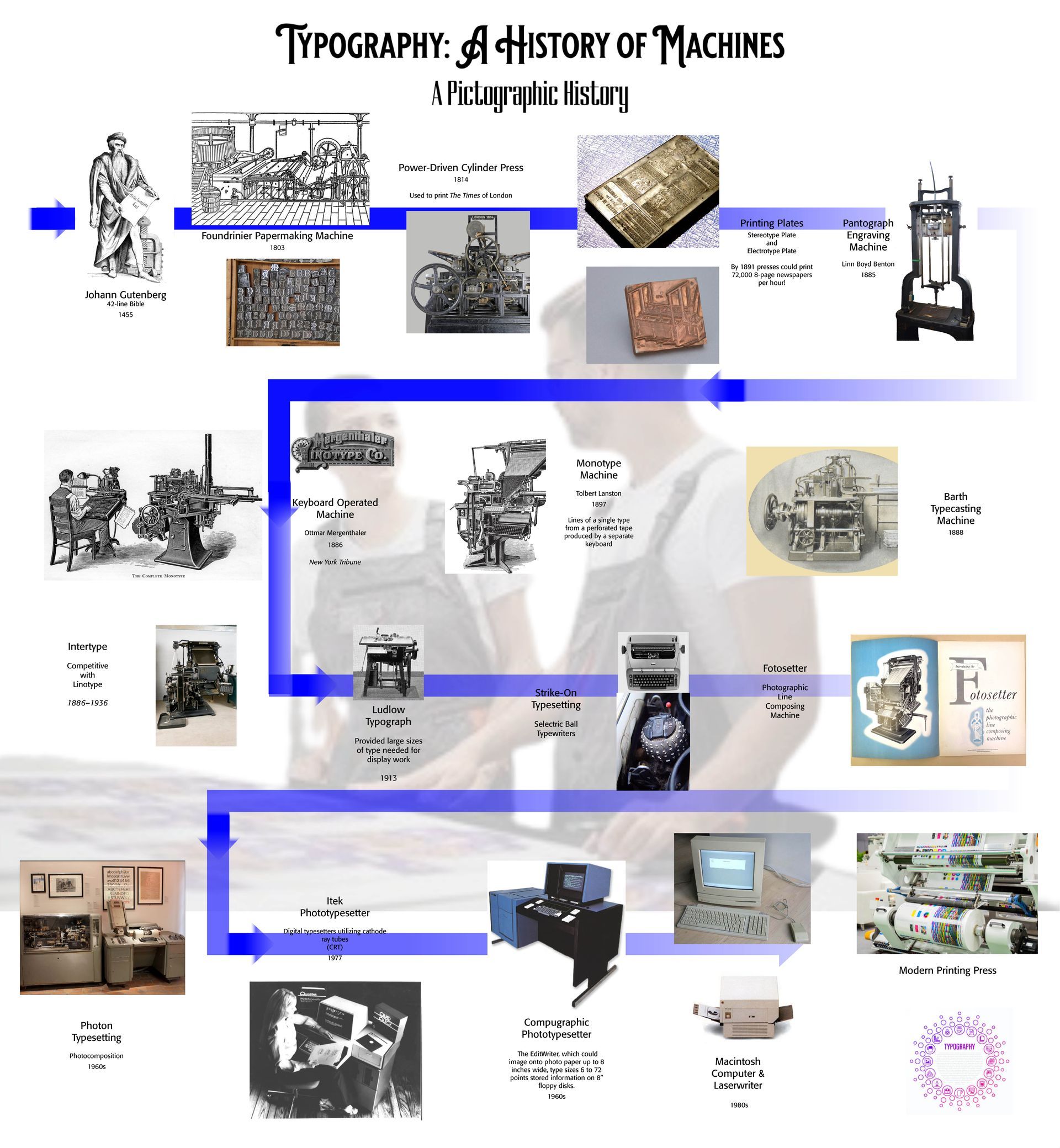
Printing for the masses actually began with Gutenberg in 1455 with his 42-line Bible. The sketch used in the graphical representation below comes from the free stock hosted by Dreamstime — "This sculpture of Johannes Gutenberg was made by David Angers in 1839 and was unveiled June 24, 1840. It can be seen in Strasbourg, where Gutenberg lived between 1434 and 1444, after being exiled from Mainz. At this time, he had already begun to work on his printing press, although trying to keep his projects secret as much as was possible. The inscription on the page he is holding reads: And light was made. (92145700 © CCOimages | Dreamstime.com)" Lawson notes that rather than Gutenberg inventing printing, he merely mechanized it — "In fact, he should be credited with the origination of interchangeable parts with his concept of single type letters." (Lawson, July 1, 1992) Gutenberg studiously followed his scribal predecessors in printing the Bible for popular use.
With the Foundrinier paper making machine in 1803 came the taste for and development of typographic machines, printing presses, capable of printing newspapers, like The Times of London in 1814. Printing plates followed allowing printers to mass produce thousands of copies in the lates 1800s. The Mergenthaler (called the "Merg") was a keyboard operated input machine and Linotype began their historic operation.
Interestingly, in the history of typesetting and printing, I came into the scene when the IBM Electric Ball strike-on typesetting was the rage. I worked for a small printing outfit in the Sterling, VA area that had a couple of these strike-on machines clacking away on a daily, and sometimes a 24/7 basis. We did ads and posters and especially Christian-based books, all typeset on the IBM. However, the larger display print had in the early days to be hand-set from scratch on letters that took many hours of careful labor.
We moved to the Itek Phototypesetting machine which produced display type that the printer could then make a camera-ready layout for the press. We never quite moved beyond the IBM machines and the Itek since the business went under at that time. However, I learned a lot about fast turnaround typesetting and printing. I got my hands dirty, literally, as I learned the ropes.
My next typesetting stint occurred in Schenectady, NY where in 1984 I bought an Apple Laserwriter that could take computer generated type and print at a then amazing 300 dpi (dots per inch). My Apple computers ranged from the entry level Macintosh 128K to the SE to the Classic to the PowerMac to the iMac to the Mac Cube to the Mac Mini (various iterations) to the present day Mac Studio M1. Originally designed for personal and home use, the creation of PageMaker layout program allowed people like myself to start layout and typesetting businesses that rivaled our IBM business computers. Apple computers just got faster, better, and software programming developed so that Mac-made software was also made for the IBM PC.
To see the development of typesetting machines is a rush for me. I hope you can join me in my love for the "fine art" of typography and its machines.
Successful Layout & Design


