Italian Typography History (2)
Italian Typography and Futurism. One of Italy's most important contributions to twentieth-century graphic design came from Futurism. Beginning around 1909, Italian Futurists challenged conventional typography. The most important figure was Filippo Tommaso Marinetti. His Zang Tumb Tumb and related works used typography dynamically rather than simply as a vehicle for continuous reading.
Zang Tumb Tumb is a sound and concrete poem appearing in journals between 1912 and 1914, when it was published as an artist’s book in Milan. It is an account of the Battle of Adrianople. The poem uses Parole in libertà (words in freedom; creative typography) and other poetic impressions of the events of the battle, including the sounds of gunfire and explosions. The work is now seen as a seminal work of modernist art, and an enormous influence on the emerging culture of European avant-garde print. (Wikipedia)
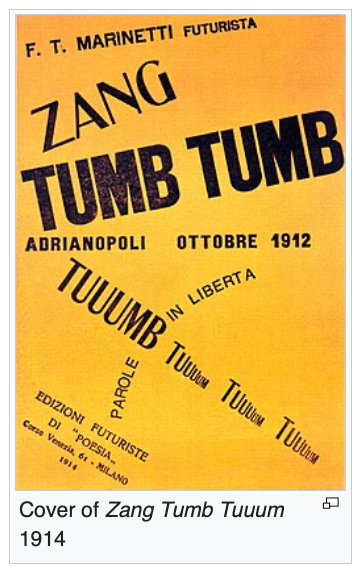
Marinetti wrote — “I call for a typographic revolution directed against the idiotic and nauseating concepts of the outdated and conventional book, with its handmade paper and seventeenth century ornamentation of garlands and goddesses, huge initials and mythological vegetation, its missal ribbons and epigraphs and roman numerals. The book must be the Futurist expression of our futurist ideasm . . . even more: My revolution is directed against what is known as the typographic harmony of the page, which is contrary to the flux and movement of style. (Marinetti, Typographic Revolution, 1913 (Wikipedia)
Futurist typography experimented with different type sizes, multiple typefaces, diagonal composition, vertical text, irregular spacing, sound symbolism, visual movement, and typographic fragmentation. Typography became an image and expressive medium. This anticipated many later developments in avant-garde graphic design, advertising, editorial design, concrete poetry, experimental typography, and digital typography.
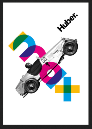
Italian Modernism. After World War II, Italian graphic design became internationally important. Italy developed a distinctive modernist tradition characterized by a combination of modernism + craftsmanship + visual sophistication + historical awareness.(ChatGPT) Important designers included Albe Steiner, Max Huber, Bruno Munari, and Giovanni Pintori. Others included Giovanni Pintori, Armando Testa, Franco Grignani, and Aldo Novarese.(Huber Poster)
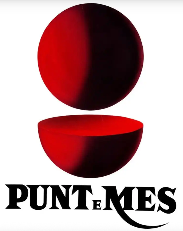
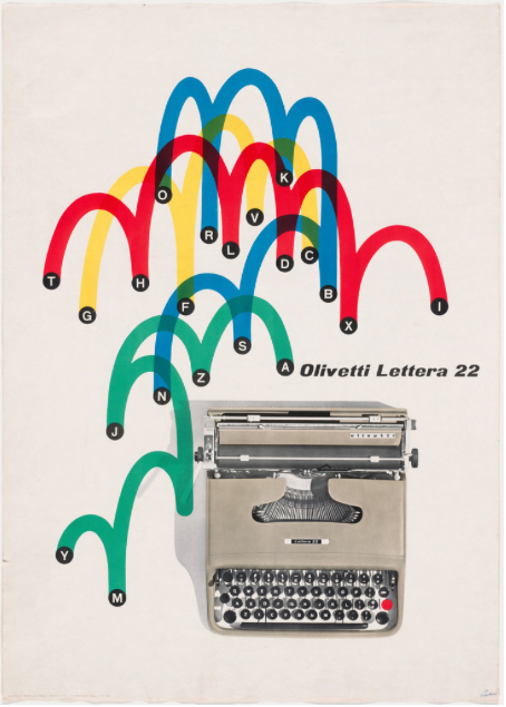
Giovanni Pintori (1912 – 1999), for example, was known mostly for his advertising work with Olivetti. He is known for his use of geometric shapes and minimalist style in his advertising posters, specifically his posters for the Lettera 22 and the Olivetti logo. Armando Testa (1917 – 1992) was an Italian graphic designer, cartoonist, animator and painter. Among Testa's most renowned creations is the iconic "Punt e Mes" advertisement, which features a half-sphere and a whole sphere to visually communicate the brand's name, translating literally as "point and a half." Nonetheless, also his striking Pirelli advertisements, characterized by clean visuals and elegant simplicity, demonstrates Testa's mastery of minimalism to maximize brand impact. (Wikipedia) (Olivetti Ad) (Punt e Mes Picture)
Franco Grignani (1908 – 1999) was an Italian architect, graphic designer and artist. He is best known for black and white graphics, particularly the Woolmark logo, which was voted 'Best Logo of all Time' by Creative Review Magazine in 2011. He played a part in Italy's second Futurist and Constructivist movements. Subsequently, his work was more closely associated with Kinetic Art and Op Art. Based on theories of perception, particularly the psychology of form, using his knowledge of architecture, he created more than 14000 experimental works. He remains a powerful influence in the world of graphic design. In Italy, he is considered a master of optical graphic design. (Wikipedia)

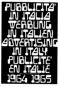
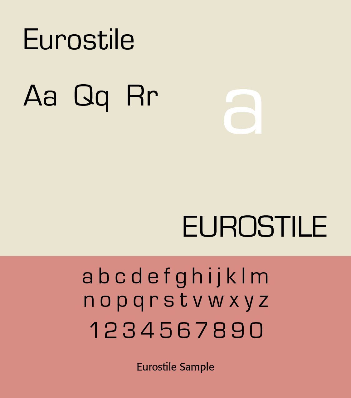
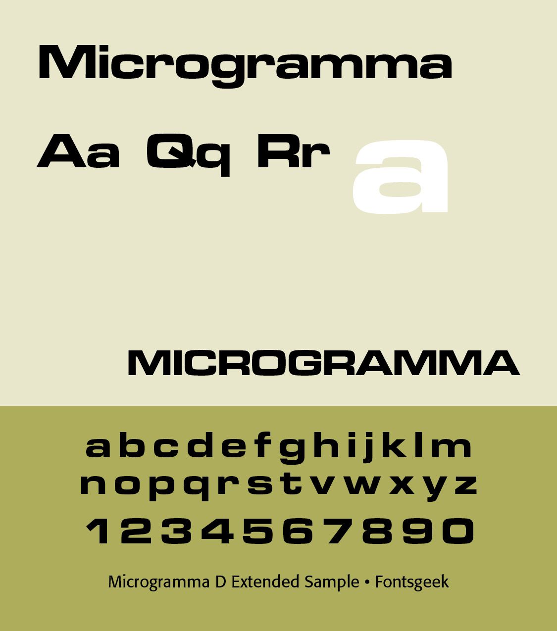
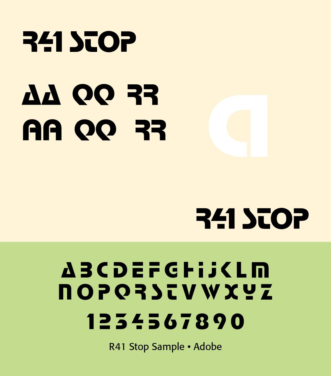
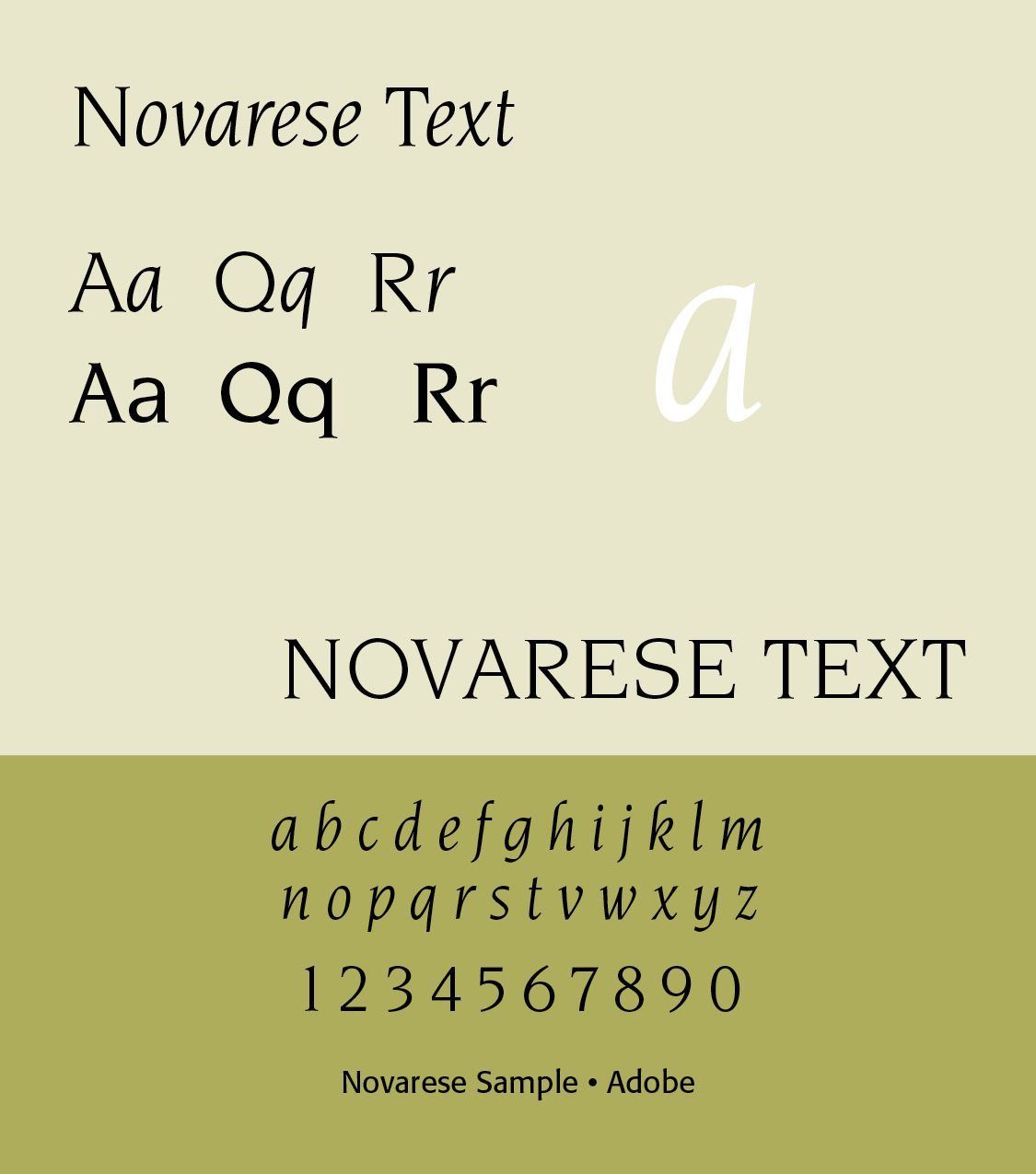
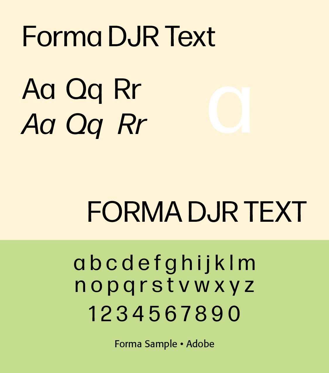
Aldo Novarese (1920 –1995) lived and worked mostly in Turin. He composed over a hundred typefaces. One of his most famous designs is probably Eurostile, a geometric sans-serif design. It utilized shapes based on subtly curved rectangles with rounded corners, reflecting the modern designs that were gaining popularity at the time, influenced by the subtly curved shape of a cathode-ray tube screen or airplane windows. It became very popular as a typeface that evokes technology (it can be seen on the speedometers on many cars and vehicles, particularly older models). He worked extensively with the Nebiolo type foundry in Turin. We highlight here Eurostile, Microgramma, Stop, Novarese, and Forma.
Italian Type Foundries. Italian typography cannot be understood without its type foundries. One of the most important was Nebiolo. It produced numerous important typefaces and worked with designers such as Aldo Novarese, Alessandro Butti, and others associated with Italian industrial typography. Nebiolo helped make Italian type design internationally visible during the 20th century.
Since the 1980s and especially the digital revolution, Italian type design has become increasingly international. Italian designers work across type foundries, branding, editorial design, signage, web typography, variable fonts, corporate identity, and experimental typography. Contemporary Italian typography draws upon several historical traditions simultaneously.
Successful Layout & Design