Early German Typography (Part 1)

Carl Shank • September 22, 2025

EARLY GERMAN TYPOGRAPHY

A Historical Sketch (Part 1)


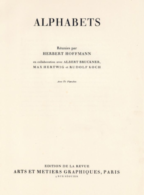
Herbert Hoffmann, Albert Bruckner, Max Hertwig, and Rudolf Koch collaborated on a typographic “atlas” or specimen book titled Hoffmanns Schriftatlas: Das Schriftschaffen der Gegenwart in Alphabeten und Anwendungen (1930) (Hoffmann’s Type Atlas: Contemporary Type Creation in Alphabets and Applications) Also distributed in France under the title Alphabets by Herbert Hoffman and other collaborators by Arts et Métiers Graphiques magazine, it is a specimen of alphabets, initials, monograms, logos and other typographic forms from early German typography. The atlas captures typographic modernism in Germany around that time, including influences of the Bauhaus and the modernist movement. It is considered a rich visual record of type and lettering design in that period, showing both experimental and traditional forms. For collectors and historians, it helps map relationships among type designers, graphic artists, and typographic culture in the interwar years. Alphabets features works by key typographers of early Germany in the 1920s and 1930s including Rudolf Koch, Margarete Leins, Anna Simons, Louis Oppenheim, E.R. Weiss, Ludwig Mayer, Lucian Bernhard and others. 


CARE Typography has investigated and revived some of the alphabets in this book, giving alphabetic examples of typefaces long since forgotten or discarded along the way. This blog highlights some of those typefaces along with their creators and later digitizers.


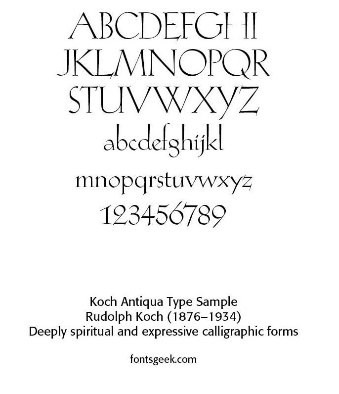
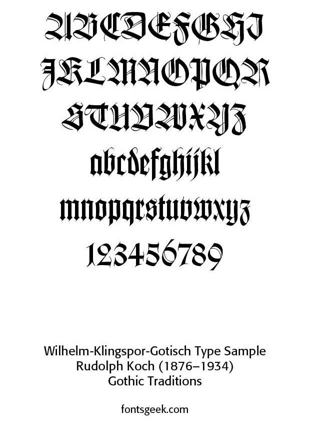
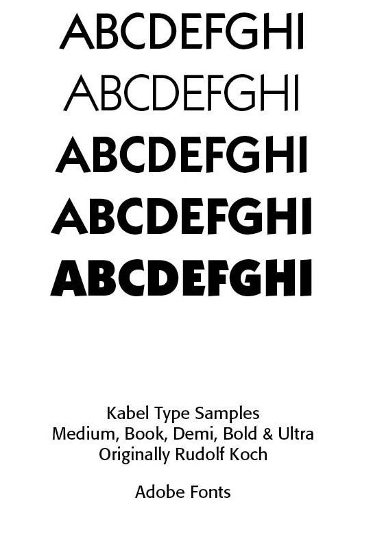
Rudolf Koch (1876–1934). As one of the featured type designers, Koch’s work gives weight and prestige to the anthology. He was a calligrapher, type designer and teacher at the Offenbach School of Design. Renowned for his deeply spiritual and expressive approach to lettering, he blended Gothic traditions with modern, expressive calligraphic forms. His notable typefaces included Kabel, Koch Antiqua and Wilhelm-Klingspor-Schrift as the displays show.


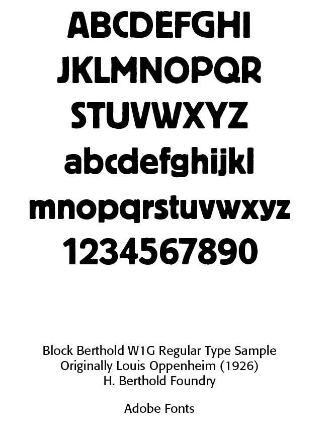
Louis Oppenheim (1879–1936). Oppenheim produced Berthold Block (1926), a heavy, geometric sans serif used widely in advertising pieces. He was strongly associated with early modernist German design, especially display typography. He was a pioneer of expressive and bold typographic forms in commercial graphics. Berthold Block has a chunky design suitable for headings, with short descenders allowing tight line spacing. Typographer Stephen Coles describes it as a “soft but substantial display face with compact dimensions and an organic appearance.”


 The original metal design was intentionally “distressed,” matching the effect of worn type. Berthold Block was released in 1908, with Berthold later adding additional weights and styles, along with phototypesetting versions. It was often used by Praktiker and the Whitechapel Art Gallery for branding in the 1970s and 80s. In the late 1970s, Berthold re-released three lighter-weight fonts derived from the Block design as a mini-family named "Berliner Grotesk" for phototypesetting, with the font redraw carried out by Erik Spiekermann.


A variety of digitizations of Block exist, including by Berthold and successor companies and by Bitstream (the condensed weight only). Paratype of Moscow released an expansion with Cyrillic characters in 1997. Matthew Butterick’s Hermes, first released by Font Bureau, and later self-released, is a loose adaptation also inspired by other German grotesque typefaces of the period, adding lighter weights and unicase features. (From Wikipedia) The sample provided is from Adobe Systems 1992 named Block Berthold Regular 400. Block Berthold is a registered trademark of H. Berthold AG.


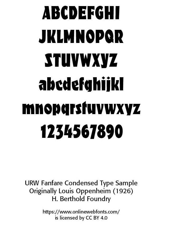
The Fanfare typeface was also designed by Oppenheim and published by the URW Type Foundry and released on MyFonts in 2001. This face also appeared in the Alphabets book.


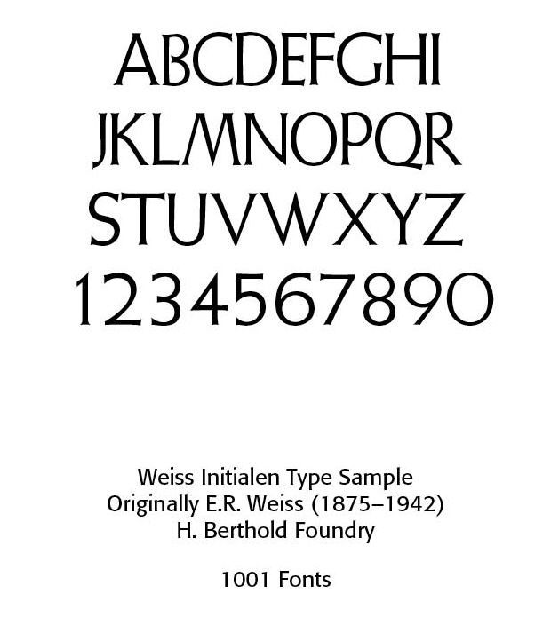
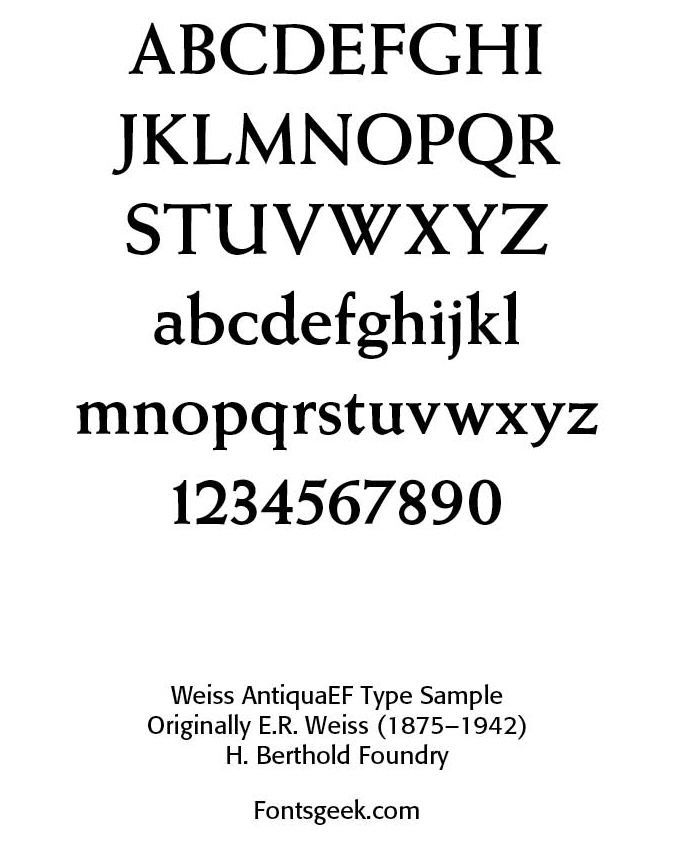
Ernst Rudolf Weiss (1875–1942). Weiss was a type designer, artist and book designer. He blended humanist serif forms with classical calligraphic qualities, creating elegant book typefaces. He was known for his refined and readable type. Weiss Antiqua and Weiss Initialen display how readable and exacting his faces were. Ludwig Mayer (1879–1972) established Ludwig & Mayer type foundry in Frankfurt, which published work by many significant type designers, including E.R. Weiss

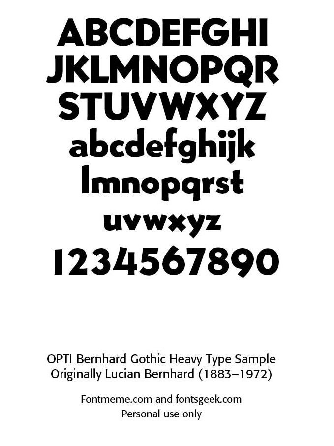
Lucian Bernhard (1883–1972). Bernhard was a graphic and type designer and art director who produced Bernhard Antiqua, Bernhard Gothic and Bernhard Modern. Bernhard Gothic is a family of geometric sans serif faces designed in 1929 for ATF (American Type Founders), with five variations produced in over two years. Bernhard Gothic is more organic and less regular than other geometric typefaces, including Futura and Kabel. The sample shown is OPTIBernhard Gothic Heavy, available from fontmeme.com and fontsgeek.com. OPTI is a label used by Castcraft for digital fonts produced around the early 1990s. Technically, many were likely based on the copies Castcraft had made for phototype. Luc Devroye notes that the company is long defunct with ethical issues having produced fonts of subpar quality (https://luc.devroye.org/fonts-27506.html).


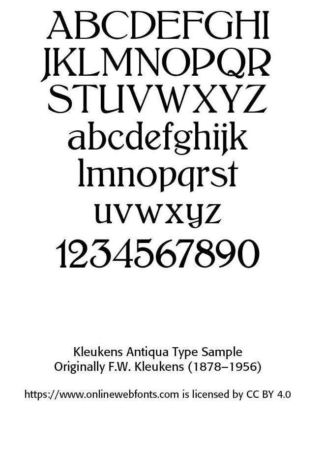
Friedrich Wilhelm Kleukens (1878–1956). Kleukens was a calligrapher and type designer known for elegant type and lettering rooted in tradition but with a modern sensibility. He created Rudina and F.W. Kleukens-Antiqua. He worked closely with Koch and contributed to the German book and type design renaissance in the early 1900s.


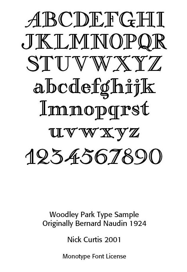
Bernard Naudin (Bernard Étienne Hubert Naudin) (1876–1946). Naudin was a French artist, known mostly for his work as a painter, draftsman, engraver and caricaturist, but he also made contributions to type design. In 1910, Georges Peignot of the Peignot/Deberny & Peignot foundry, asked Naudin to design a new typeface. Working from his own handwriting, Naudin designed and engraved Naudin Roman and Italic as well as Naudin Champlevé.

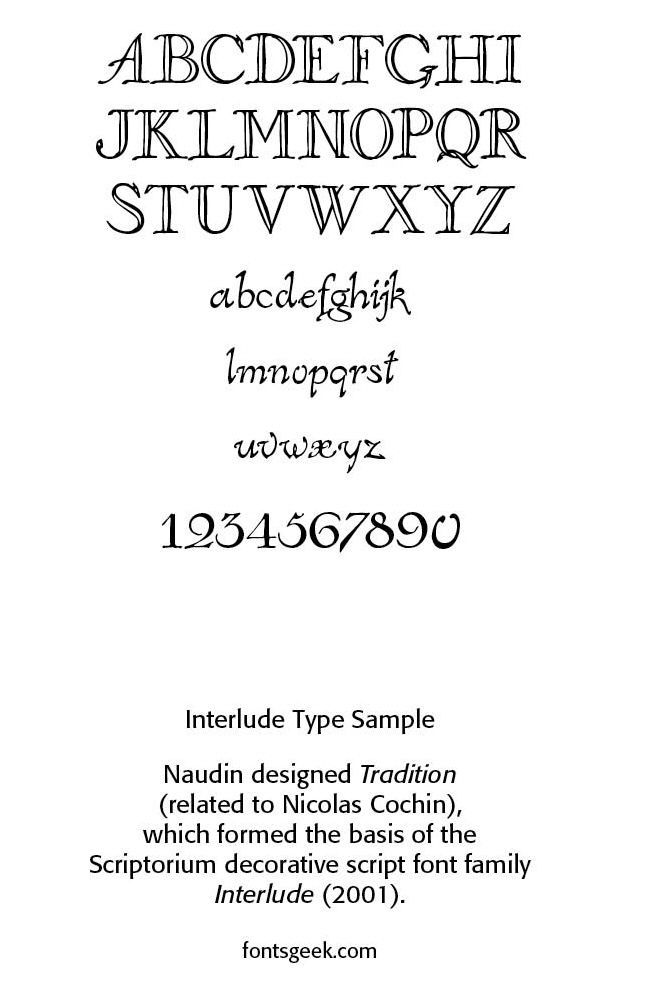
Naudin also designed Tradition, which formed the basis of the Scriptorium decorative script font family Interlude (2001). Champlevé was revived in 2006 by Ari Rafaeli. Woodley Park designed by Nick Curtis in 2001 is also based on Naudin Champlevé. Naudin’s typefaces did not enjoy great success at the time, but other designers have drawn inspiration from his decorative style. His merging of engraving, ornamentation, and artistic illustration into type design gives him an interesting hybrid status of part fine-arts engraver with part typographer.

END PART ONE. In the next installment we shall consider the early German works of  Ernst Deutsch, Friedrich Heinrichsen, Benjamin Krebs Nachf, and the three women typographers, Maria Ballé , Anna Simons and Margarete Leins. We shall also note the Ecole des Arts et Metiers de Stuttgart.

Successful Layout & Design

By Carl Shank April 6, 2026
Responding to AI and Digital Babylon H. Carl Shank April 4, 2026 Austin Gravley, a former Social Media Manager of The Gospel Coalition, and now the Director of Youth Ministry at Redeemer Christian Church in Amarillo, TX, is writing a book on AI and the digital revolution taking place. He compares this Digital Babylon and its captivity and its exiles to Christians living under the overwhelming influence of an active anti-Christian developing AI. Piecing together his comments with those of many others on the advancing scene of AI on our lives, several themes come to mind. First, AI is not God. While there are some in the Silicon Valley who might wish or see AI as a unifying, ontological force that can shape or rule our lives — the Super Machine —others remind us that this is only technology. And as advanced as AI is and becomes, God is still sovereignly in control of it and our lives. Jason Thacker, professor of philosophy and ethics at Southern Seminary and Boyce College, writes — “We must engage these issues, rather than respond after their effects are widely felt. But we don’t have to face today or tomorrow with fear. God is sovereign and his Word is sufficient for every good work, so we are able to walk with confidence as we apply his Word to these challenges with wisdom and guided by his Spirit.” ( The Age of AI: Artificial Intelligence and the Future of Humanity , Zondervan, 2020) A recent storm that darkened my community and scuttled Internet services reminded me of that. Even AI data centers, growing to over 3,000 in 2025 nationwide, are not immune to power disruptions and total blackouts. AI pundits may claim to have control procedures to keep the Internet and AI running cannot promise it to be so. We need to keep this in mind in the Digital Babylon age, as was needed to be kept in mind by Israel in the Babylonian Empire age in biblical times. Babylon went through many iterations, but will be defeated by God at the end of the day, as noted in Revelation. Digital Babylon will experience the same demise. This is not prediction, just Bible truth. We as believers need to hold on to such truth. Second, AI is still technology. Indeed, advanced and advancing technology, but not human. Matthew Schultz in a recent mereorthodoxy.com article notes— “Technology has existed since the Garden and is an integral component of our cultural mandate. We should also remember that one of the core distinctions between the Creator and his creatures is that we never create matter but merely (!) rearrange it. This becomes clear whether we consider an ancient farmer in Mesopotamia irrigating a plot of soil, a medieval peasant in Northumbria weaving a basket from flax, or a young musician in London taking the raw outputs of machine sound, adjusting its pitch, volume, and length, and incorporating it into a DAW loop. While there are all sorts of important distinctions and qualifications between pre- and post-industrial craft, there is no metaphysical distance between the two.” ( Artificial Intelligence Is A Technology , Feb. 26, 2026). AI may be the harbinger of a new Industrial Age, but though changes will be major and sometimes severe, the human side of the equation cannot be discounted or counted out. Part of my retired status as a pastor and theologian is that of a typographer restoring old type faces and doing a deep dive into the history of type. Two historical typographical truths stand out. Although the Renaissance age brought movable type from Gutenberg and others into the machine age, the typographical flair of those ancient scribes with pen-drawn exquisite type remained a stylistic standard. The second note is that with the Industrial Age, while affecting the quantity and speed of type development and printing, master type craftsmen rebelled against machine driven type for more organic typefaces. This was seen, for instance, in the type movement spawned by William Morris (1834–1896). William Morris was an Arts & Crafts designer who founded the Kelmscott Press (1891), reviving hand craftsmanship in printing. His work influenced the twentieth century private press and type revival movements. Lettering became a vehicle for breaking convention. Led by figures such as Morris, there was a decided reaction against industrialization, seeing machine-made goods as dehumanizing and ugly. Handcraftmanship, honesty in materials and utility fused with beauty made up much of what was called the Arts & Crafts Movement. That movement was rooted in medieval guild ideals and morality in design. (For an expanded history of type development, see “Advances in Typography: A Historical Sketch — Three Parts” in the blogs by CARE Typography, www.caretypography.com , Nov. 8, 2025, Nov. 18, 2025 and Nov. 20, 2025) Third, AI affects everyone everywhere. Austin Gravely, a former Social Media Manager of The Gospel Coalition, raises and answers the query — “’So what?’, you may think. ‘I’m not an Internet technician. I’m not a fan of AI. I’m not planning to change how I use the Internet. Why does any of this matter to me?’ To put it bluntly: you are naive if you think these disruptions won’t directly affect you, or indirectly affect you through the effect they will have on others. If the iPhone, social media, and AI have taught us anything, it is that you are impacted by these events regardless of whether you participate in them or not.” ( The State of the Internet: 2026 , mereorthodoxy.com, March 30, 2026) He goes on to say — “A changing Internet will change you. It will change you in ways you can see and in ways you can’t. It will change those you live with, work with, play with, build with, and fight with. It will change what is possible, probable, permissible, and prohibited in your life, your vocation, your church, your neighborhood, and any other physical space the Internet touches.” I recall my 99 year old mother who passed away a couple of years ago in a nursing facility. She was one of those survivors of the Great Depression and World War Two who dismissed the first moon landing and had her flat screen TV removed from her room for fear the government was watching. She lasted for nine years in the same private room in a modern nursing center. She was attended by doctors and nurses and staff who used AI on their computers and other care devices. She even had a modern digital phone removed from her room and refused to learn it. While she personally rebelled against her AI driven machine age, she could not escape those who used such technology for her care. We cannot isolate ourselves from AI and its advancing development, no matter how isolated we try to be. Fourth, AI can be either a blessing or a curse. Again, Matthew Schultz notes — “Our task is not to develop a unique theology of AI but to catechize our members into a people who can wield this technology without becoming captive to its internal logic. Like alcohol, artificial intelligence will become a test of character, a dangerous good that divides the foolish from the wise.” He says “Yet the greatest danger is both more pervasive and less obvious: AI is much more likely to be deployed as a multiplicative layer that allows ever more efficient micro-targeting of digital services and physical products by industries that already profit from compulsive behavior. The advent of hyper-personalized, real-time engagement strategies will require legislative safeguards, especially if AI leads to video advertisements generated in real time for an exhaustively mapped individual profile.” We must seek to “humanize” AI and employ it “humanly.” We must resist the phenomenological bent toward unbelief in AI development and pressures. We must once again learn to think critically and pervasively and biblically about AI. Our young people must be taught prescriptive critical thinking practices, rather than unwittingly and ignorantly giving in to what their phones and computers spit out. Church and ministry pastors must pastor rather than let AI bots plan, prepare and even give their sermons. We must learn to smartly negotiate with the “Magnificent Seven”— Apple, Microsoft, Alphabet, Amazon, Meta, Nvidia and Tesla — rather than blindly following their lead. Convenience and speed must not be allowed to overtake and overcome careful, sustained and critical thinking and acting. “To give language to this change, we must take the best of Christian thinking regarding the social and political imaginary and apply it to the economic imaginary of life under the glowing shores of Digital Babylon, and that kind of work cannot be done with quick hot takes. It will take slow, deep, and thoughtful meditation to apply the riches of Christian thought to making sense of the companies that got us here and where they are taking us.” (Austin Gravley, The State of The Internet: 2026 ) I am both excited and wary of AI. I have learned to be much more cautious about social media and the videos and photos and information they give. Much of it has been and is being AI produced and tweaked. Spammers use AI technology to wrest thousands of dollars from unsuspecting senior citizens. Schools are requiring students to turn off their cell phones or “bag” them until after school hours because of the insidious nature of AI generated stuff. I value more and more of a face-to-face approach in teaching and learning and mentoring others. And we must adopt a state of “believing is seeing” rather than a non-Christian scientifically sanctioned “seeing is believing” approach to truth and justice.
By Carl Shank March 31, 2026
Type Details Matter: Typos & Fractions Carl Shank March 31, 2026 “The practice of typography, if it be followed faithfully, is hard work — full of detail, full of petty restrictions, full of drudgery, and not greatly rewarded as men now count rewards. There are times when we need to bring to it all the history and art and feeling that we can, to make it bearable. But in the light of history, and of art, and of knowledge and of man’s achievement, it is as interesting a work that exists—a broad and humanizing employment which indeed can be followed merely as a trade, but which if perfected into an art or even broadened into a profession, will perpetually open new horizons to our eyes and new opportunities to our hands.” (“Thoughts Upon A Typographic Custom,” Alexander S. Lawson, Electronic Publishing , January 28, 1994) Such detail and “petty restrictions” are to be found in the consideration and history of typographic errors (typos) and the use of fractions. In my March 23, 2023 blog I noted that we need more than a spellchecker. Spell checkers are great. They help us in busy offices doing busy tasks everyday. EXCEPT they cannot correct errors of statement or errors of typography. Grant Weisbrot of New York City has noted that "it is impossible to efficiently proofread without a knowledge of typesetting and printing procedures." ("The Typographic Eye: Proofreading," Electronic Publishing , May 13, 1994) Thus, the note to “raise the register mark and close up the space” in an article is translated by the typographer to “kern the register mark five units and raise it 1¼ points.”  He gives some examples of errors of statements — spelling when letters are missing, like "he" for "the;" spelling in a piece published in Britain, like "color" for "colour;" using a correctly spelled word in a wrong way, like 20 carat gold (carat is a diamond weight, karat is an alloy of gold, caret is an insertion mark, and carrot is a vegetable); awkward sentence structure, incorrect or inconsistent capitalization, ungrammatical or awkward sentence structure, failure to apply indents or hangs when suitable, and errors of fact, like the kangaroos of Tibet.
Show More