Early German Typography (Part 2)

Carl Shank • September 22, 2025

Herbert Hoffmann, Albert Bruckner, Max Hertwig, and Rudolf Koch collaborated on a typographic “atlas” or specimen book titled Hoffmanns Schriftatlas: Das Schriftschaffen der Gegenwart in Alphabeten und Anwendungen (1930) (Hoffmann’s Type Atlas: Contemporary Type Creation in Alphabets and Applications) Also distributed in France under the title Alphabets by Herbert Hoffman and other collaborators by Arts et Métiers Graphiques magazine, it is a specimen of alphabets, initials, monograms, logos and other typographic forms from early German typography. The atlas captures typographic modernism in Germany around that time, including influences of the Bauhaus and the modernist movement. It is considered a rich visual record of type and lettering design in that period, showing both experimental and traditional forms. 


In Part One of this series, we investigated the typography of early Germany through the lens of Rudolf Koch, Louis Oppenheim, E.R. Weiss, Lucian Bernhard, Friedrich Wilhelm Kleukens, and Bernard Naudin. In this Part Two we revisit the typography of Ernst Deutsch, Friedrich Heinrichsen, Benjamin Krebs Nachfolger, Maria Ballé, Margarete Leins, Anna Simons and take a brief visit to the Ecole des Arts et Metiers in Stuttgart.

Ernst Deutsch (1887–1938). Born in Vienna, Austria, Ernst Deutsch first worked as a costume designer and studied under Gustav Klimt. In Paris, he worked he worked on costumes for Coco Chanel, before moving to the United States in 1929, where he changed his name to Ernst Dryden and was employed from 1933 onwards as a costume designer for Universal, Columbia and Selznick in Hollywood. He died in Los Angeles in 1938


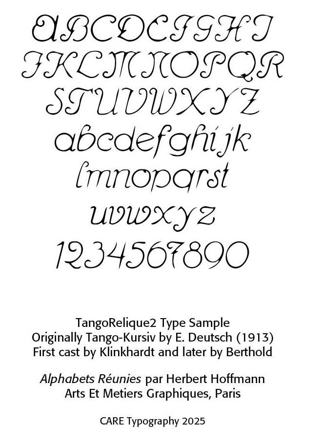
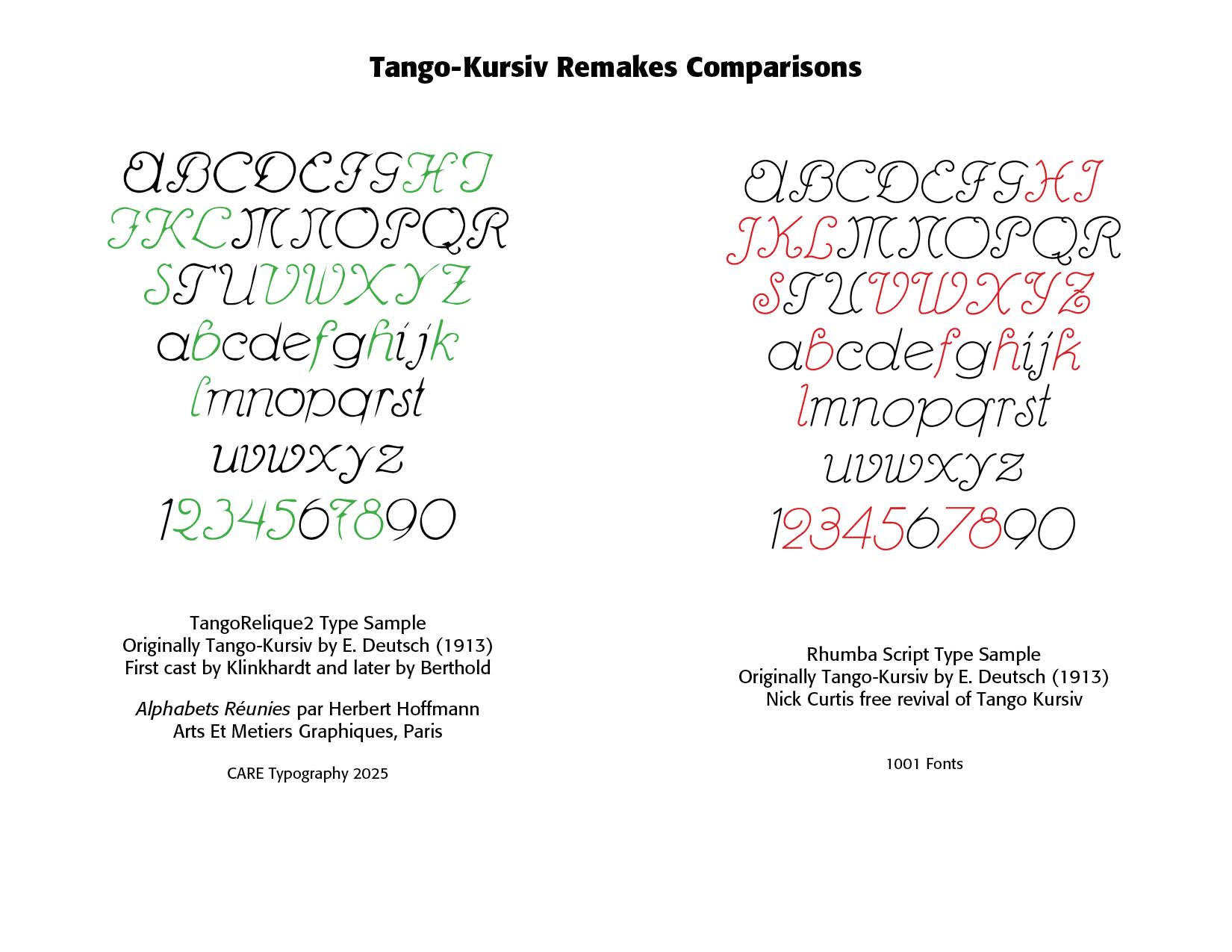
In typography, Deutsch designed Tango Kursiv (1913), Tango Antiqua and Tango Antiqua Halbfelt (1916). He was known for designing display lettering and poster typography, especially in the pre-World War One period. Digital revivals have been offered by Nick Curtis in his Rhumba Script NF, a free revival of Tango Kursiv, and Oliver Weiss in his WF Paletti in 2016–2017. Deutsch fonts have strong display orientation, with elegant, somewhat decorative, but still relatively clean visual style. We also see the influence of early twentieth-century graphic design movements in Europe in the Art Nouveau/Jugenstil, poster arts, and his exposure to Paris-based design sensibilities

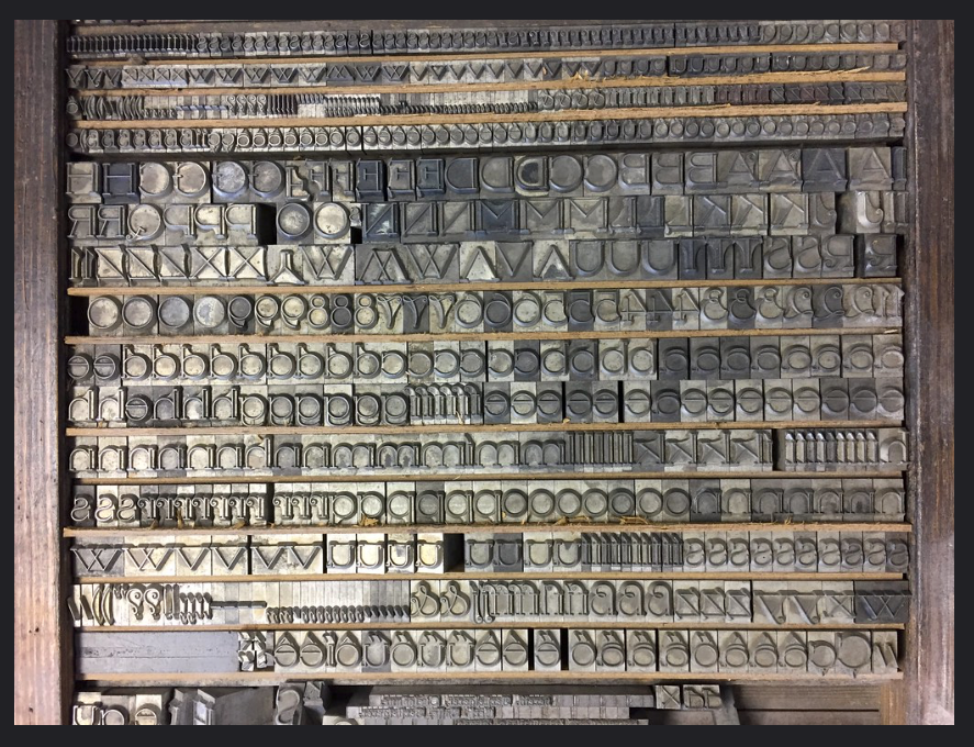
This is a photograph of the typecase for Tango-Antiqua. It was captured by  Albert-Jan Pool in Wetzig's Handbuch Der Schriftarten from 1926 in visiting Katharina Jesdinsky's print workshop in Kiel in 2017.

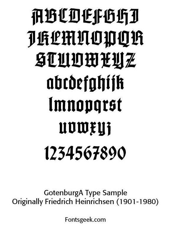
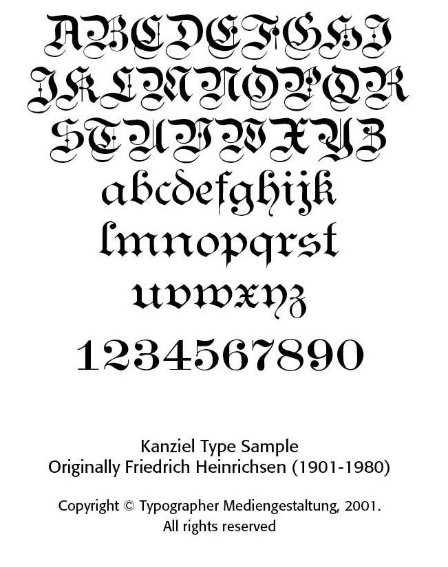
Friedrich Heinrichsen (1901–1980). Heinrichsen worked as a typographer and graphic artist. Part of his training came under Rudolf Koch, becoming his assistant in Offenbach in 1924. After World War Two he taught typography, was involved in rebuilding efforts and worked on industrial, advertising and church commissions.


His best known typeface is Gotenburg. Gotenburg is a “broken grotesque” style font, referencing old blackletter or fractured styles and sans/grotesque styles for letter forms. Gotenburg comes in Gotenburg Bold and decorative variants in Gotenburg A and B. He also designed the Heinrichsen-Kanzlei face. As part of the Offenbach School, he emphasized craftsmanship, calligraphic roots and the integration of letter-forms with ornamentation and strong design sensibilities.


Benjamin Krebs Nachfolger (or just Krebs Nachf) founded one of the significant German foundries in the later nineteenth and early twentieth centuries. It produced many typeface designs, especially what is referred to as blackletter (“Fraktur”) and early sans-serif (Grotesks) as well as display and decorative type. Blackletter faces included Normale Fraktur, Neue Fraktur, Kunstler Gottisch, Psalter Gottisch and Kaiser Gottisch. A history of Krebs Nachf was written by Gustav Mori in 1916. The firm was taken over by Ludwig & Mayer, and then Klingspor and finally by Stempel in 1933.


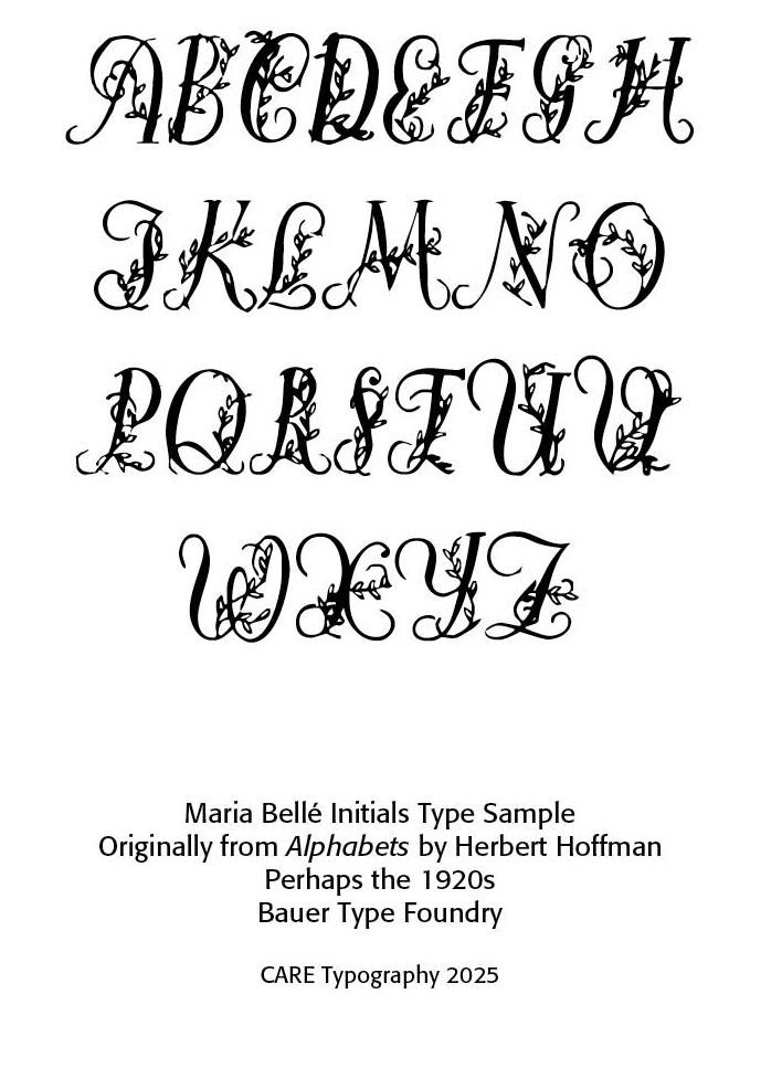
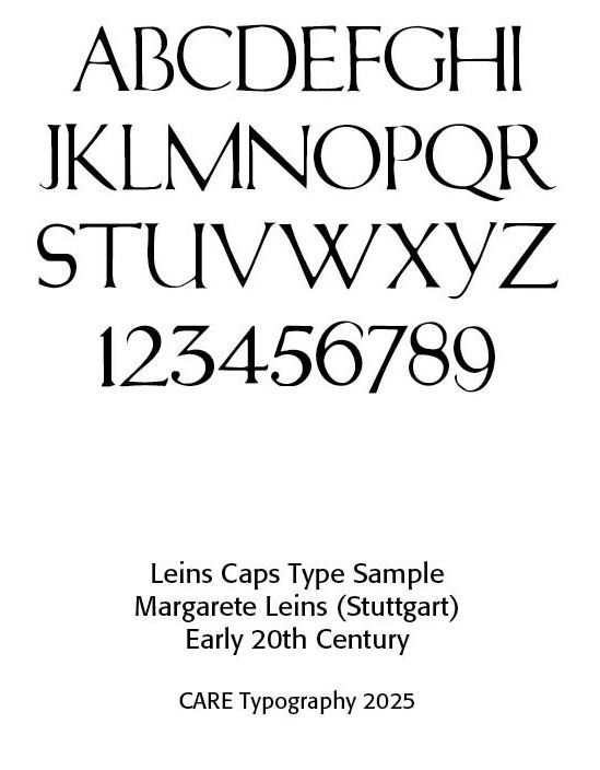
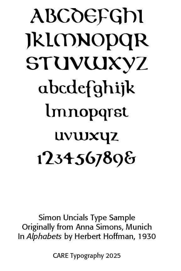
Maria Ballé was one of the first female type designers. While the exact date of her work is not clearly known, references suggest it wa during the 1920s. She created the face called Ballé Initials for the Bauer Type Foundry. She along with Margarete Leins (Stuttgart) and Anna Simons (Munich) were some of the few women typographers of the period. Leins contributed to calligraphy and decorative lettering, participating in the resurgence of handcraft in typography influenced by Jugendstil and the Arts & Crafts movement. Simons translations of Johnston’s work and her teaching helped establish a modern German calligraphic tradition. She influenced Rudolph Koch and others in early twentieth century calligraphic renaissance.


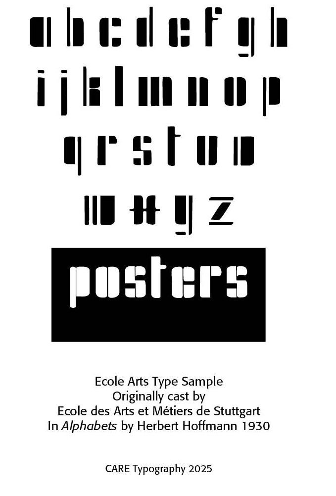
Ecole des Arts et Metiers de Stuttgart (State Academy of Fine Arts in Stuttgart). A public fine art university in Stuttgart, Germany, founded in 1761. By 1950 you could study painting, glass painting, sculpture, free and applied graphics, interior and furniture design (″Innenarchitektur und Möbelbau"), textiles, ceramics, metal and art teaching, and professors included Trude Barth, Otto Baum, Willi Baumeister, Walter Brudi, Rudolf Daudert, Hans Fegers, Eugen Funk, Gerhard Gollwitzer, Peter Otto Heim, Manfred Henninger, Karl Hils, Eberhard Krauß, Hans Meid, Hugo Peters, Karl Rössing, Harmi Ruland, Hermann Sohn, Karl Hans Walter, Hans Warnecke, Kurt Wehlte, Hans Wentzel, Karl Wiehl and Rudolf Yelin. A sample of an early twentieth century art/typography piece highlighting the alphabet is included in Alphabets. (Wikipedia)


Successful Layout & Design

By Carl Shank December 22, 2025
Historical Literary Fonts: The Fell Fonts Rooted in John Fell's legacy at Oxford, these fonts inherit a rich history of learned printing, drawing inspiration from Dutch typefaces with contrasting weights and unique letterforms. The Fell type collection was a gift made to Oxford University by Dr. John Fell (1625–1686), Bishop of Oxford and Vice-Chancellor of the University of Oxford. They were donated to the Oxford University Press (OUP) and became the foundation of its early printing identity — “He bought punches and matrices in Holland and Germany in 1670 and 1672 and entrusted his personal punchcutter, Peter de Walpergen, with the cut of the larger bodies. Igino Marini, revived some Fell types in 2004.”[1] Why the Fell Types Matter Fell Types represent pre-Caslon English typography. They form one of the earliest consistent typographic identities of a university press. They show how Dutch type design influenced English printing. Typographically, they were designed for reading, not display. This is important because they departed from the socialistic, anti-industrialization movement of the Arts & Crafts movement led by William Morris (SEE Blog Advances in Typography: A Historical Sketch (Part 2) , Nov. 20, 2025). Much credit for the original fonts goes to Frederick Nelson Phillips and his work at The Arden Press, which became more commercially ambitious and influential. This press produced high-quality editions of classic and scholarly texts, collaborated with academics, editors, and publishers and continued refinement of typographic discipline. Frederick Nelson Phillips Frederick Nelson Phillips (c. 1875 – 1938) occupies a crucial transitional role between Arts and Crafts idealism and twentieth-century typographic rationalism, as well as between private press craftsmanship and professional publishing. For historians of printing, he represents a model of how tradition can be revived thoughtfully—without nostalgia, and without surrendering to industrial mediocrity. Frederick Nelson Phillips was a British printer and typographic entrepreneur best known as the founder of The Florence Press and later The Arden Press. He played a significant role in the early twentieth-century revival of fine printing in Britain, working in the wake of William Morris and the Arts and Crafts movement, yet moving toward a more practical, commercially viable model of quality book production. Although never as famous as Morris or later modernist typographers, Phillips exerted a quiet but lasting influence. He helped normalize the use of historical typefaces in serious publishing, bridging the gap between private press ideals and commercial book production. Phillips influenced later British typographic standards, particularly in academic publishing. He contributed to the preservation and renewed appreciation of early English type design. His work resonates strongly with later figures interested in typographic scholarship, including those associated with university presses and fine publishing.
By Carl Shank December 17, 2025
Nothing New Under The Sun: A Look at Current Typographic Trends As a typographic historian of sorts, and owner of CARE Typography, a small design studio focusing on reviving historic and often missed typefaces, I read a number of type reports and books. Of special interest is the newsletter from the Monotype corporation highlighting trends and faces for today. (See https://bit.ly/3Y1R1BV ) A couple of statements in their latest reports by Phil Garnham, Creative Type Director, at Monotype got me thinking about culturally laced typographic styles and faces that have graced our historic type landscapes. He notes a “new universal style emerging: flat design in modern online brands, almost reverting to the minimalist style of five years past. Many companies are going for clean geometric style with type.” This is hardly a new concept or trend. A deeper dive into the history of type design over the centuries helps us understand what may be happening. In the history of typography, on which I have written (See H. Carl Shank, Typographical Beauty Through the Ages: A Christian Perspective, Lulu.com, 2025), the visual dissonance of the Dadaist movement in type was replaced by the order of Constructivism and its functional accessible design principles. Art Deco gave way to Swiss type beauty with its readability and visual harmony in the faces of Helvetica and Univers. Grunge and Psychedelic type by Wes Wilson gave way to the sans serifs used universally today. Hippie children of the 60s grew up to be corporate CEOs of the 80s and 90s, shedding their anti-establishment and even destructive behaviors for the boardroom and nice houses with ordered yards and gardens. This has been the story of all cultural movements, including typographic movements. They reflected their cultural morés of the times, but the bold, audacious, violent, raucous types always gave way to what we internally want and desire — a return to simplicity, functionality and order and type viability. From a theological viewpoint, the thought provoking words of the writer of Ecclesiastes of the Bible apply here — “What has been is what will be, and what has been done is what will be done, and there is nothing new under the sun. Is there a thing of which it is said, “See, this is new”? It has been already in the ages before us.” (Ecclesiastes 1:9, 10) “Customers are seeking affinity with brands that seek justice in our world, and that goes beyond a brand’s mission. People want to see brands actively involved in solving societal problems.” The issues of climate change, diversity movements, equity and inclusion initiatives are seemingly new but typographically rehearse type’s movements from Gutenberg to today. Calligraphers and typographers have been dealing with cultural changes and shifts for ages. I applaud what Monotype and others are seeking to do with variable fonts and digital type, but I would historically caution us in the business not to place too much excitement and hubris after cultural trends. Carl Shank CARE Typography December 2025
Show More