Type After Gutenberg: A Historical Sketch
What Happened to Type After Gutenberg?
A Brief Historical Sketch from 1460-1640
At the end of the 15th century, German printing was at the forefront of a revolutionary transformation in Europe, driven by the invention of the movable-type printing press by Johannes Gutenberg in the mid-15th century. This development had a profound impact on culture, education, and the dissemination of knowledge. By the end of the century, Germany had become one of the key centers of printing in Europe, particularly in cities like Mainz, Nuremberg, and Augsburg.
Books printed before 1501 are referred to as incunabula. German printers produced a significant portion of the incunabula, with many focusing on religious texts such as the Bible, liturgical works, and theological treatises. Secular works, including classical texts, legal documents, and scientific works, also gained prominence towards the end of the century.
Incunabular typography can be said to have two major sources of inspiration —fifteenth century scribes and German typecutters, the second group of which drew largely on (and sometimes coincided with) the first. Fifteenth-century typography was characterized by both continuity and innovation. Typecutters like Nicolas Jenson and Johan Veldener found themselves highly influential in their regions, designing typefaces for many printers, but scribes also contributed their weight to the design of typography.
German printers played a key role in developing early typefaces. However, they were not the only typeface creators and users. There were altogether in the Netherlands twenty-two towns where books were issued before 1500. When printing had once been introduced it spread rapidly, all but three towns starting within the first ten years. Jacob Gibbons notes that types “changed hands” and were sold or rented across Europe, Germany to Italy and France, France and the Rhine valley to England, the Netherlands to England and France to the Netherlands. Type founding and paper making were international businesses. Typography became a vehicle of cultural exchange in late medieval and early modern Europe. Thus typography was as mobile as the printing press itself in fifteenth century Europe, and perhaps a more subtle carrier of cultural, regional, national, and even personal identity.
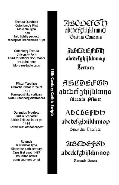
One of the most popular typeface was Blackletter (also called Gothic script or Fraktur), which dominated printed works in Germany during this period. The dense and elaborate script was particularly suited to religious and formal texts. However, that Gothic Blackletter script was developed with nuances across Europe. Gutenberg’s textura quadrata face, used in printing his famous Bible, became Gutenberg textura used in university and legal settings. Albrecht Pfister produced his own typeface, somewhat distinct from Gutenberg, though possibly derived from it.
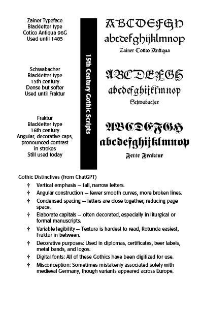
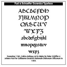
Ulrich Zell used Fust and Schoeffer’s Durandus typeface. Rotunda type became a readable alternative to Gutenberg’s. Zainer’s Cotico Antiqua was used until 1485. The Schwabacher type was a dense but softer face, paving the way until the Fraktur face in the sixteenth century and beyond.
By 1500, there were over 1,000 printers operating in various German cities, making Germany a leading hub for the printing industry. Notable printing centers included: Mainz—The birthplace of Gutenberg’s press; Nuremberg — An important center for both printing and intellectual activity; and, Augsburg—A commercial and printing hub.
What is often lost in typographical history in the years closely following Gutenberg are the important printers and typographers in Germany, Italy, Switzerland, France, the Netherlands, Spain, England, Austria, Sweden, Holland, Denmark, Scotland, Mexico, Ireland and the United States who furthered the cause of typography and printed works. This Blog serves as a historical sketch of a number of these important people.
John Mentel
Timeline: 1460
Johannes Mentelin (1410–1478) was a pioneering German printer and bookseller. In 1466 he printed and published the first German language Bible in Strasbourg. Among the predominantly theological and philosophical works in Latin, he offered the Latin edition of the Bible in 1460 and 1463, works of Augustine, Aquinas, Aristotle, John Chrysostom, Jerome and Albertus Magnus. Although Mentelin cannot be cited as the inventor of the art of printing books, he was nevertheless one of the most skillful of the early typographers.
H. Eggesteyn was a partner for some time with the printer Mentel at Strasbourg. Both were thus contemporaries of Gutenburg (1400-1468) the inventor of metal types, and, therefore, must have derived their knowledge of the new art and mystery clandestinely, or otherwise, from him or from his partners, Fust and Schoeffer.
Mentel’s type is conspicuous by being a simplified Gothic round hand. Some original features occur in the capital letters, giving both flourishing Gothic and simple Roman lapidary style.
Albrecht Pfister
Timeline: 1461
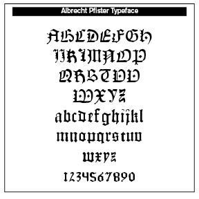
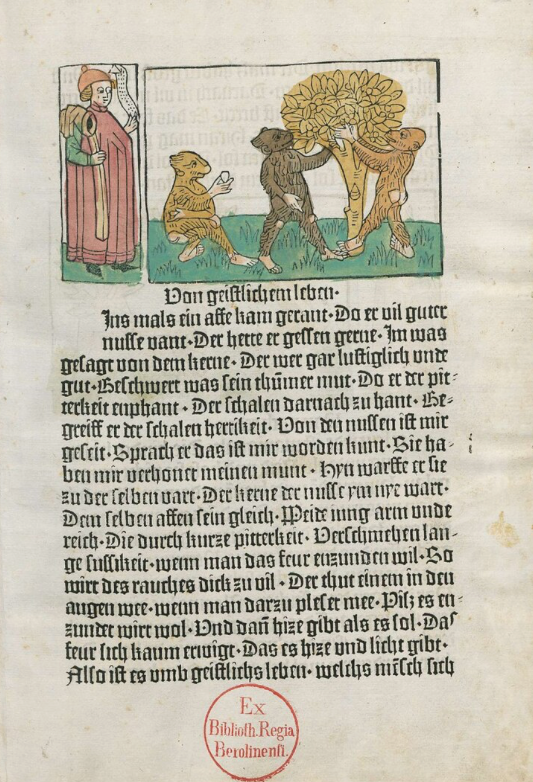
Albrecht Pfister (1420–1466) was one of the first European printers to use moveable type, printing books in the German language and notably the first to use woodcuts in 1461 to illustrate German language books. He obtained the necessary printing types from Gutenberg’s workshop. These types were used in Bamberg in the late 1450s for a new edition of the Latin Bible, the second after Gutenberg’s own edition. He published and signed his works (unlike Gutenberg) which included two editions of the religious work, Der Ackermann aus Bohmen, in German, two editions of Ulrich Boner’s Der Edelstein in German, two editions of Biblia pauperum in German, a History of Joseph, Daniel, Judith and Esther in German and an edition of the Belial of Jacobus de Teramo in German.
He was heavily influenced by Gutenberg’s typefaces, but there are noticeable and subtle differences between the two. Note the Pfister type sample. “Incidentally, Pfister was among the first to print in the vernacular. Of the three editions of an illustrated Bible, Biblia pauperum, or Paupers’ Bible, that he published between 1462 and 1463, two were in German, one in Latin. Prior to its typographic appearance, the Biblia pauperum had already proven incredibly popular as a xylographic or blockbook.”[https://ilovetypography.com/2015/11/10/the-first-illustrated-books/)]
Ulrich Zell
Timeline: 1464
Zell learned printing from the establishment of Johann Fust and Peter Schoffer and was printing at Cologne as early as 1463. His printing works can be traced to 1502. About 120 of his publications are known. Most of his books were textbooks in quarto form for the university, along with an undated edition of the Latin Bible in two volumes. In 1489 he published St. Augustine, On The Trinity and the City of God in folio edition.
His type was similar to the Durandus and Clements types of Fust and Schoffer. What is historically important about Zell is his claim preserved in the Chronicle of Cologne in 1499 that 1450 was the very beginning of machine printing, that Gutenberg was the inventor, and that the first book printed was the Vulgate, or the Latin Bible.
Schweinheim & Pannartz
Timeline: 1465
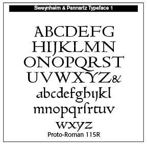
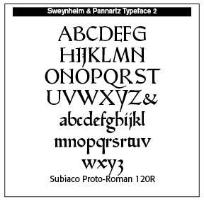
Conrad Schweinheim (or Schwanheim or Sweynheim, died 1477) and Arnold Pannartz were ecclesiastics and the first printers of Italy. A printing press for books was established at the Abbey of Subiaco in 1464, moved to Rome in 1467. At Subiaco they published three books, Cicero’s De Oratore, the Opera of Lactantius and Augustine’s
De Civitate Dei — The City of God. During 1464–72 they produced over 12,000 copies of thirty–seven works, mostly the classics and the Church fathers. Sweynheim was the typesetter of the outfit. In spite of their skill and printing volume, they needed and received papal monetary assistance. The two dissolved their partnership in 1472, with Sweynheim working until he died as engraver on the maps of the Cosmography of Ptolemy. He was the first to apply copper engraving to the maps. Sweynheim was in close connection with Mainz until his death.
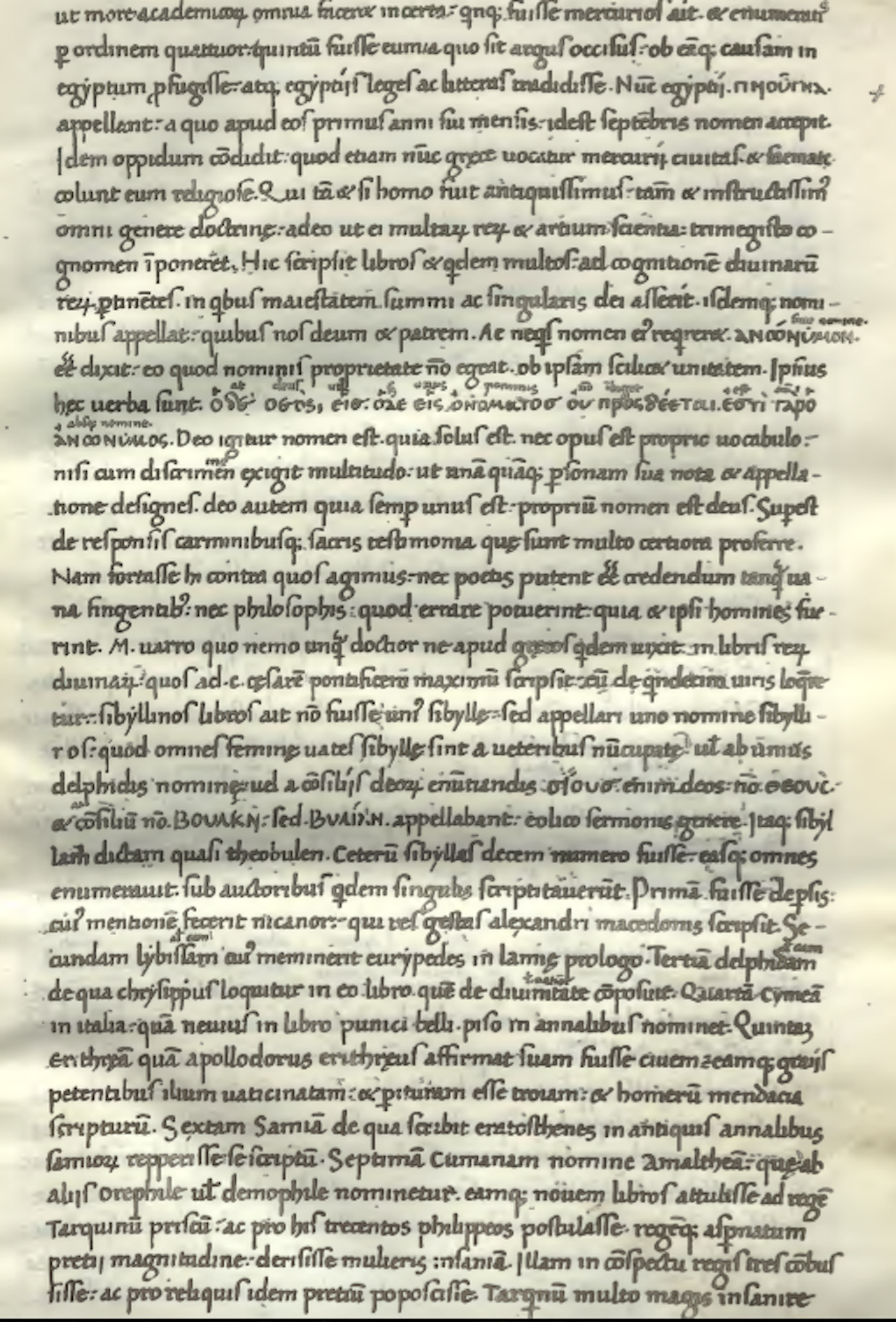
The dies cut by Sweynheim embody the preliminary steps of the present type for Latin characters. His capitals are the first to show the forms used in Roman inscriptions on stone. His smaller letters repeat the characters used in manuscripts of the ninth to tenth centuries. He cast the first Greek type, found in his third book, that of Lactantius. Note the sample page with the use of Greek type from Divinarum institutionum libri septem printed in 1430.
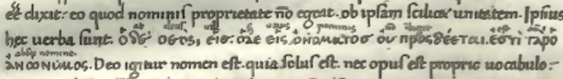
The seven books of the Diuinae institutiones, are the most important work by Lactantius, Christian author and advisor to Roman emperor, Constantine the Great.
They are an apologetic treatise that includes a defense of Christianity and a criticism of pagan religion, philosophy and morals. Greek Interlinear used.
Günther Zainer
Timeline: 1468
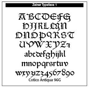
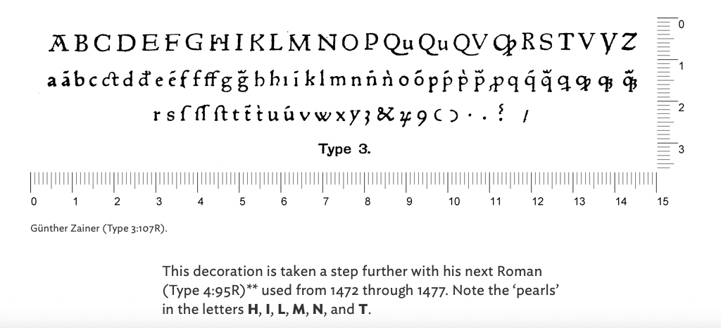
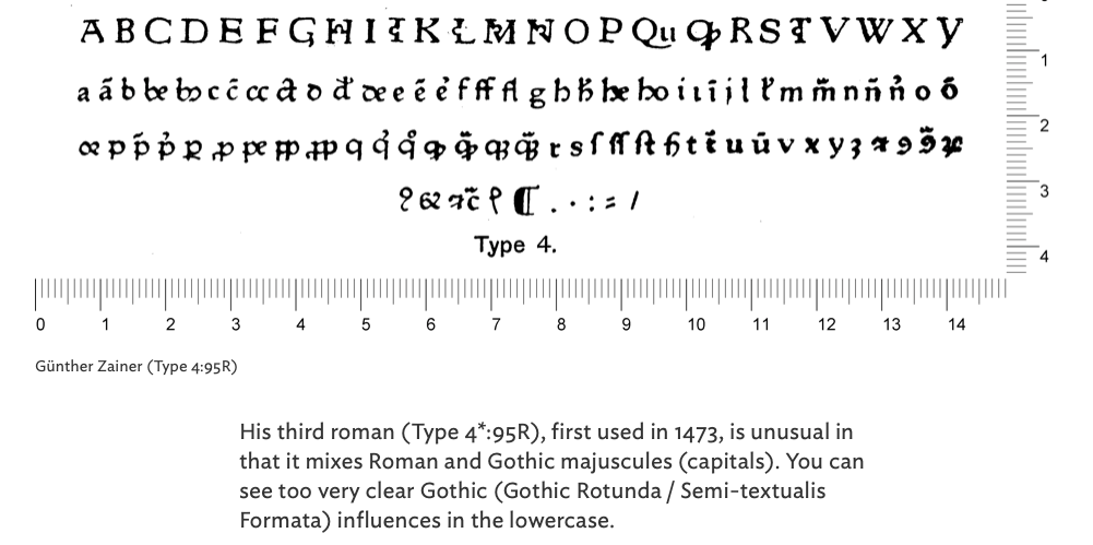
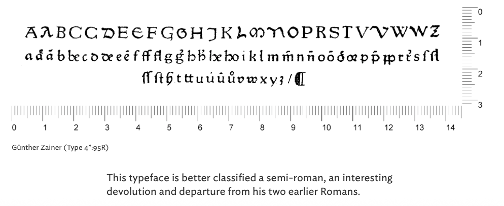
Gunther Zainer (died 1478) introduced printing to Augsburg, Germany in 1468. He produced about 80 books, including two German editions of the Bible and the first printed calendar. He also printed the first large illustrated book, Jacobus de Voragine’s Legenda aurea with 131 woodcuts.
Zainer used two Gothic types and three Romans. His Roman types are striking, with his first Roman of 1472 leaving behind the Gothic influences of early Roman typography. Note the “H” with the “pearl” in the crossbar.
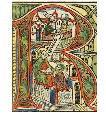
Initial from the German Bible, printed by Zainer in Augsburg in 1477.
Zainer Type Samples below.
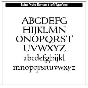
John de Spira
Timeline: 1469
Along with his brother, Wendelin, John or Johann von Speyer (also de Spira) were German printers in Venice from 1468 to 1477. Early in 1460–61 Johann appears as a “goldsmith” and in September 1469 he was granted the first “monopoly” of printing in Venice by the Venetian Senate. He issued Cicero’s Epistolae ad familiars in 1469 and also the first edition of Pliny’s Historia naturalis. Johann died during the printing of Augustine’s De Civitae Dei with his brother completing it. In 1477 he published Mirror of the Virgin in Blackletter type.
As to the type, Spira 110R Proto-Roman was first used by Johann for Cicero’s work. See the sample offered with an Open Type license.
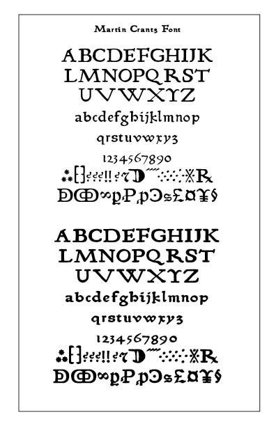
Ulrich Gering
Martin Crantz
Michael Friburger
Timeline: 1470
These three partners established the first printing press in France. Invited to Paris in 1469 by the Rector of the Sorbonne, Johann Heynlin, and his colleague Guillaume Fichet, Gering together with Michael Friburger and Martin Crantz set up a printing press within the Sorbonne to produce texts selected and edited by his patrons. The press produced twenty-two works between 1470 and 1472. Gering is thought to have made the first typeface in France in the 1470s.
The Martin Crantz font has been expanded to meet the demands of modern day use but it also contains a number of specialized glyphs that allow for the recreation of text in the manner of his day with such characters as the -rum abbreviation and other handy Renaissance oddities. Since this face was designed prior to 1501 there is no italic variant in keeping with the spirit of historical accuracy.
Bernado Cennini
Timeline: 1471
Bernardo Cennini (1414/15 – 1498) was an Italian goldsmith, sculptor and early printer of Florence, Italy. He produced the first book printed at Florence. Seeing some printed books, Cennini thought out the procedure for himself, cast his own type font, and working with others produced the first of the incunabula printed at Florence in 1471. The book was the Commentary of Virgil by Maurus Servius Honoratus. Rather than the predominant religious works of the period, early Florentine printing focused on classical texts, grammars and other humanistic works.
Nicolas Ketelaer
Gerard de Leempt
Timeline: 1473
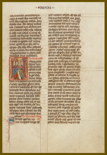
The names of Nicolaus Ketelaer and Gerard de Leempt have been linked up with the early stages of the printed book in the Netherlands. Indeed, they are recorded in the colophon of the oldest dated book printed in the Northern Netherlands: the Historia Scholastica by Petrus Comestor. (SEE INSERT) In the copy which must have been acquired by the Canons Regular of St. Augustine in Utrecht shortly after its appearance, the colophon reads — Explicit secunda pars hystorie scholastice: que est de novo testamento. Impressain traiecto inferiori: per magistros Nycholaum ketelaer et Gherardum de Leempt M°cccc°lxxiii.
The work was written around 1170 by the theologian Peter Comestor. Originally composed in Latin but quickly translated into French and other vernacular languages, the text paraphrases and comments on Christian stories mostly taken from the Bible. It tells a universalizing history of humankind from a Christian perspective, encompassing episodes from the creation of the world to Christ’s ascension.
No fewer than 33 other books came out of this printer’s workshop, including Eusebius’s Historia ecclesiastica, printed in 1474. During the fifteenth century printing was introduced into twenty-one towns in the Netherlands, the presses of Antwerp and Louvain being the most important, while those of Deventer were very prolific. Among individual printers John of Westphalia, who worked for over twenty years at Louvain, and Gerard Leeu, who worked for seven years at Gouda. The Utrecht Psalter is the most famous medieval manuscript in the Netherlands—in 2015 it was included in UNESCO’s Memory of the World RegisterNew Paragraph
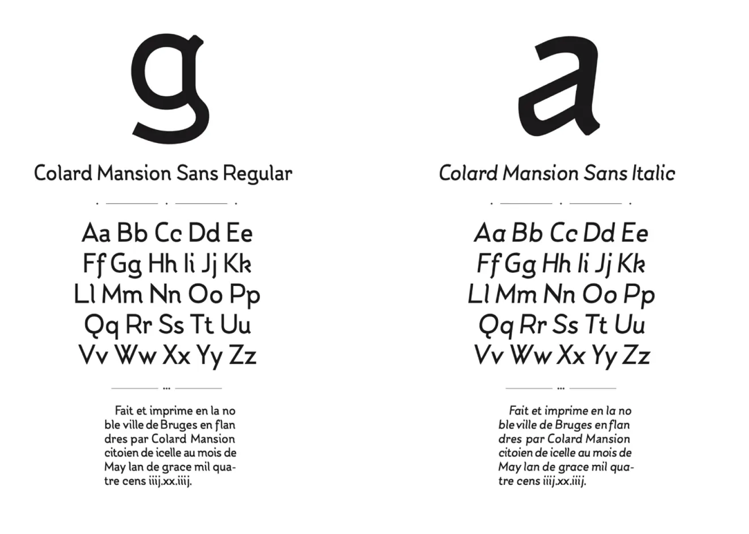
Colard Mansion
Timeline: 1474
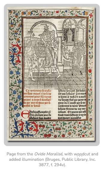
Working in Bruges from 1457 to 1484, Colard Mansion produced many books and manuscripts, the most famous being De consolatione philosophiae (Consolation of Philosophy). The Cambridge copy is decorated beautifully by hand with illustrations based on those in a later edition printed by Arend de Keysere in Ghent in 1485 in Dutch. Scholars suggest that copies of de Keysere’s edition and this copy were probably decorated in the same workshop by a team of miniaturists. Mansion began printing in around 1475–6, collaborating with the English composer, William Caxton.
He had two fonts and produced two formats of printed books, the medium-sized quarto and the large and luxurious folio. Twenty-three full texts survive his work.
William Caxton
Timeline: 1477
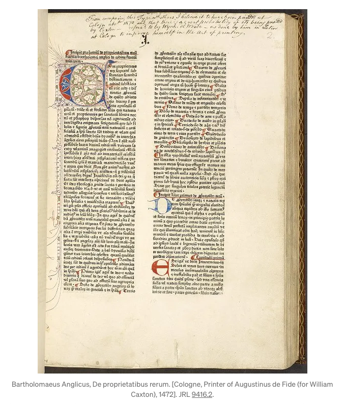
Caxton’s career actually began as a textile merchant in Bruges, becoming acting governor of the Merchant Adventurers in the Low Countries. His first translation was that of a popular French romance. He set up a printing press in Bruges and published his translation of The Recuyell, the first printed book in the English language. His printing of The Game and Play of Chess Moralised was the first printed book in English to make use of woodcuts. Returning to England in 1476, he set up a printing shop at Westminster and published a number of boks including The Canterbury Tales. Over the course of fourteen years, he printed more than 70 books.
In 1477 Dictes and Wise Sayings of the Philosophers was printed. The Pilgrimage of the Soul was printed in 1483 and served as one of the prototypes of Bunyan’s Pilgrim’s Progress. Caxton printed the Statutes of Henry VII in 1492, the first collection of English laws ever printed. They comprise the enactments of the first three Parliaments of Henry VII.
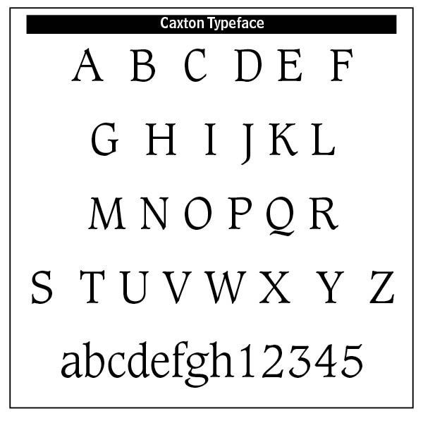
The typefaces used by Caxton were all varieties of blackletter or gothic type. His earlier works were set in an early form of French lettre bâtarde. By 1490, he had acquired a more round and open typeface, a textura originally used by the Parisian printer Antoine Verard and later favored by Caxton's successor, Wynkyn de Worde. Fonts named after Caxton were the Caxton Initials by Frederick Goudy in 1905 and the ITC Caxton Roman family.
Nicolas Spindeler
Timeline: 1478
Nicolaus Spindeler was a German printer born in Zwickau (Saxony, Germany) and settled in Spain in the third quarter of the 15th century. In 1475 he may have been working in Zaragoza with Mateo Flandro, in the company of Pedro Brun, although some historians doubt this. After the dissolution of this brief partnership, he moved to Tortosa with Pedro Brun, where in 1477 he printed Nicolai Perotti's book Rudimenta grammaticae, using the Gothic typefaces inherited from the partnership the three printers had established.
Theoderic Rood
Timeline: 1478
Johann Snell
Timeline: 1483
Rood was a printer of incunabula at Oxford, England between the years of 1481–1484. Johann Snell, a German printer, served his apprenticeship with the Brotherhood of St. Michael and was an independent printer and bookbinder in the 1480s. Bishop Karl Ronnov had him print a short prayer book, Breviarium Ottoniense, and he also printed De obsidione et bello Rhodiano, about the Turkish siege of the island of Rhodes. These are the first books printed in Denmark.
John Winterburger
Timeline: 1482
Johannes Winterburger played a major role in establishing Vienna as a center of scholarly printing, particularly connected to the newly founded University of Vienna’s humanist community. He is first documented in 1492, just as the city’s intellectual and theological life was gaining academic momentum. By the early 1500s, Winterburger was the principal printer of the University of Vienna.
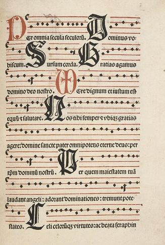
His press specialized in theological works, humanist scholarship highlighting Conrad Celtis, Johann Cuspinian and other Viennese humanists, liturgical books and legal and official texts for Austria and nearby territories. His books are characterized by high-quality Gothic typefaces, later supplemented with more refined Roman types as humanism influenced Viennese scholarship, the use of woodcut illustrations and decorated initials, often produced by local artists and large-format liturgical printing, requiring technical precision to align musical notation and chant text (a difficult task in early printing).
ChatGPT notes that Winterburger is sometimes compared to Anton Koberger in Nuremberg for scale and professional standards.
Missa de requiem, Johannes Winterburger, 1499 in
Luna Library, Manchester, England
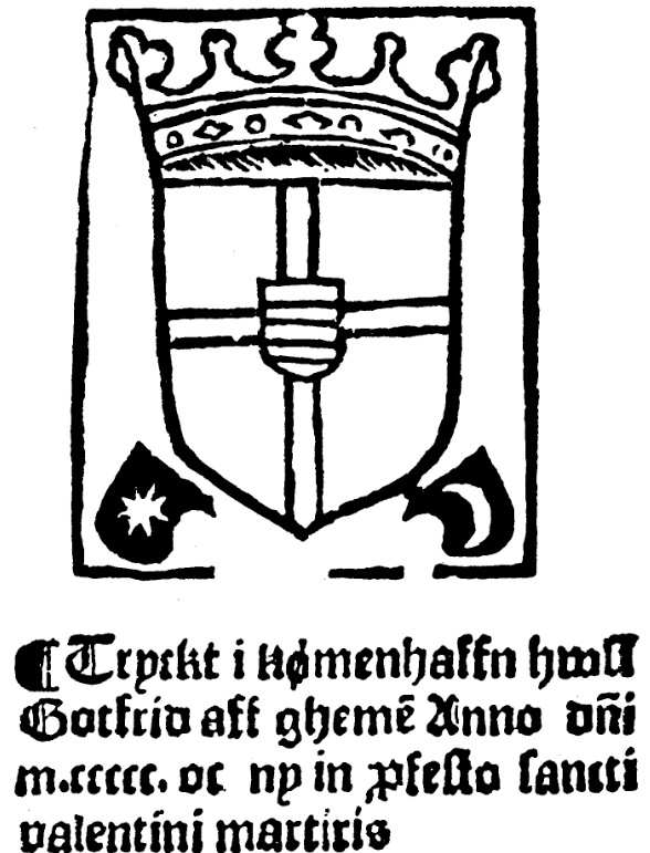
Gothofridus de Ghemen
Timeline: 1493
Gothofridus (Gotfred of Ghemen) was the first known printer to settle in Copenhagen, active at the turn of the 16th century. Sources place his press in Copenhagen in the 1490s–1509/1510 period. He produced mainly religious and devotional works for the Danish market (examples in surviving catalogues include prayer books and other devotional prints). A Copenhagen imprint from 1509 is documented. De Ghemen is usually credited as the first printer established in Denmark, introducing movable-type printing to Copenhagen and helping bring printed liturgical and devotional literature to Danish readers. His press marks and a handful of surviving imprints are the primary evidence for his activity.
Androw Myllar
Timeline: 1507
Myllar was the first Scottish printer in the early 1500s. Myllar together with Walter Chepman were granted a patent by James IV to establish a printing press in Scotland. The first book known to have been printed in Scotland was The Complaint of the Black Knight.
Juan Cromberger
Timeline: 1540
The home of the first printing press and shop was at the corner of Moneda and Licenciado Primo Verdad streets in Mexico City in 1539. The Seville-based publisher, Juan Cromberger with an Italian printer Juan Pablos printed vice regal and Church related documents. At least thirty-five books came out of this shop between 1539 and 1560.
Humphrey Powell
Timeline: 1551
Printing was introduced to Ireland when the London printer Humphrey Powell as give twenty pounds by the King’s Privy Council in Westminster in 1571. The first book was his Boke of the common praier in 1551.
“Powell's Boke of the common praier was printed in English using Roman type. Twenty years later, Queen Elizabeth I, then monarch of England and Ireland, paid for a set of Irish type to be cut under the direction of John Kearney, the Treasurer of St Patrick's Cathedral. This type was used to print the first book printed in the Irish language, the Aibidil gaoidheilge, & caiticiosma, an Irish alphabet and catechism. Elizabeth I's purpose in supporting this venture was to promote the evangelization of the many Irish speakers among the island's population.”
Stephen Daye (1594–1668)
Timeline: 1639
Daye emigrated from England to the English colony of Massachusetts Bay, becoming with his son the first printer of colonial America. His press printed the Bay Psalm Book in 1640, the first book printed in the present day United States. More than a century after Daye's death, his legacy found renewed fame in Vermont, when his printing press came into the possession of printers Judah Spooner and Timothy Green, who used it to publish the state's first newspaper in Westminster, Vermont, The Vermont Gazette, or Green Mountain Post-Boy, on February 12, 1781. In 1932 the Stephen Daye Press was instituted, publishing local poets and writers notable to Vermont history, including Elliott Merrick, Mark Whalon and Walter Hard. The press closed in December 1942.
SOURCES
- Incunabula at https://expositions.nlr.ru/ve/RA5466/swiss-incunabula
- New Advent on Mentel at www.newadvent.com
- Pfister at (https://ilovetypography.com/2015/11/10/the-first-illustrated-books/) and
- https://www.staatsbibliothek-bamberg.de/en/article/albrecht-pfister-and-the-earliest-printed-books-in-german-from-bamberg/ and https://en.wikipedia.org/wiki/Albrecht_Pfister
- Zell at (https://en.wikipedia.org/wiki/Ulrich_Zell)
- Sweynheim at https://www.newadvent.org/cathen/11444b.htm and https://luc.devroye.org/fonts-36767.html
- Sample Lactantius https://digitalarchive.rds.ie/items/show/4046
- Zainer at https://ilovetypography.com/2014/02/08/unusual-fifteenth-century-fonts/#:~:text=Günther%20Zainer%20used%20two%20Gothic,produced%20during%20the%20fifteenth%20century.
- Spira at https://www.historyofinformation.com/detail.php?id=309) and (https://www.newadvent.org/cathen/14215a.htm and https://github.com/anrt-type/GoticoAntiqua
- Crantz at https://ilovetypography.com/2016/04/18/the-first-roman-fonts/
- Nicolas Ketelaer & Gerard de Leempt at The Invention of Printing / A Collection of Facts and Opinions, Descriptive of Early Prints and Playing Cards, the Block-Books of the Fifteenth Century, the Legend of Lourens Janszoon Coster, of Haarlem, and the Work of John Gutenberg and His Associates, Theodore Low De Vinne. Also Article by GISELA GERRITSEN-GEYWITZ, Koninklijke Brill NV, Leiden, 2001. Also https://www.musinskyrarebooks.com/images/upload/e-list-13.pdf. Also Early Printed Books By E. Gordon Duff, London: Kegan Paul, Trench, Trübner & Co., Ltd. MDCCCXCIII. Also Movable Type, Movable Printers: Printers and Typography as Agents of Cultural Exchange in Fifteenth-Century Europe by Jacob A. Gibbons, 2014, Book and Digital Media Studies MA Thesis. Also David McKitterick, Print, Manuscript and the Search for Order 1450-‐1830 (Cambridge: Cambridge University Press, 2003)
- Mansion at https://cudl.lib.cam.ac.uk/view/PR-INC-00001-F-00003-00001-03304/1
- Rood at https://en.wikipedia.org/wiki/Theoderic_Rood
- Snell at https://en.wikipedia.org/wiki/Johann_Snell
- Myllar at https://en.wikipedia.org/wiki/Androw_Myllar
- Cromberger at https://en.wikipedia.org/wiki/House_of_the_First_Print_Shop_in_the_Americas
- Powell at https://www.tcd.ie/library/exhibitions/directors-choice/first-book-in-irish/
- Daye at Wikipedia
Successful Layout & Design


