About Sans Serif Fonts
About Sans Serif Fonts. Whether we realize it or not, our alphabet began as sans serif characters. “Sans-serif” is a French term meaning “without feet.” Most type you read is what is called “serif” text, or text with feet. The “feet” are the little stems at the end of characters that make up a large part of textual materials. They make the reading legible, easy to digest, and allow the least eye strain for longer reading periods.
Sans Serif fonts can be seen on Sumerian Clay tablets (3000–2076 BC) and later on Greek stone tablets and headstones. “The first sans serif Roman letters were gold jewelry engravings that date from 700 BC, when the city of Rome was nothing but straw and mud huts.” (Steve Kennedy, “Facts-o-Type,” Typeworld, September 15, 1991)
Nicolette Gray in A History of Lettering (David Godine Publishers, 1986 and in the U.K. by Phaidon Press Limited) says that “the idea does not seem to have been pursued until the end of the eighteenth century, when it was taken up as part of the revival of Greek architecture . . . in the next century it was used in a very different context and as a different conception.” (173) By the turn of the century, a whole collection of sans serif types, called “grotesques had been generally accepted for use in advertising and promotional printing.” (Kennedy) In Victorian England, sans serif faces were used as an architectural lettering, on pubs and shops. Bringhurst points out that the first unserifed (sans serif) type was cut by William Caslon in London, in 1816, consisting of capitals only. Such faces were first cut in Germany in the 1830s.
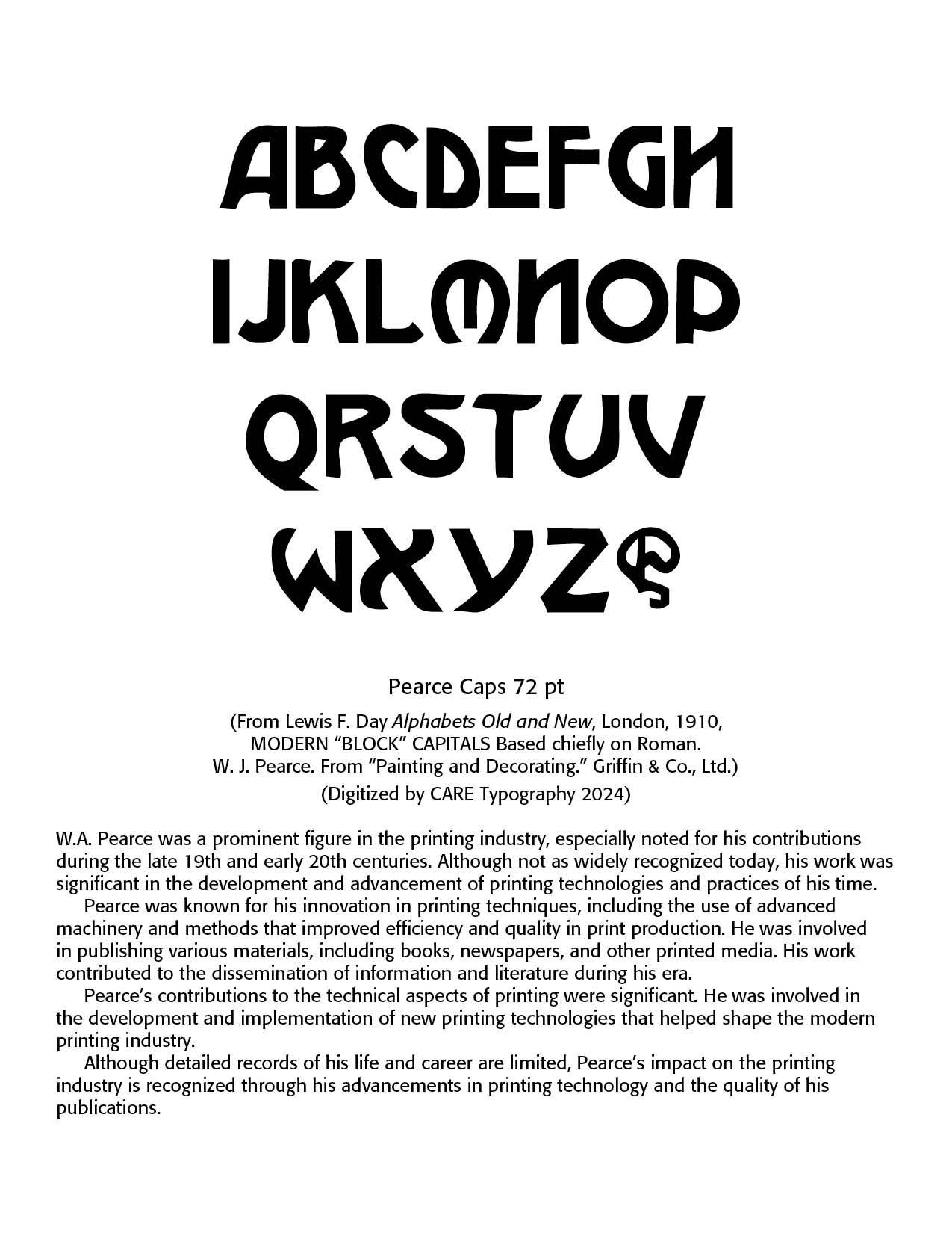
Block capitals in typography refer to uppercase letters that are often used in a clear, straightforward style. They're typically characterized by their uniform height and consistent stroke width, which makes them highly legible. This style is often used for headings, titles, and signs where readability is crucial.
In more technical terms, block capitals might be contrasted with other letter forms like italics or script fonts, which have more variation in stroke width and slant. Block capitals are often used in contexts where a clean, no-nonsense appearance is desired, such as in legal documents, certain types of signage, or any place where clarity is paramount. Note the example below by W.A. Pearce, a prominent figure in the printing industry, especially noted for his contributions during the late 19th and early 20th centuries. Although not as widely recognized today, his work was significant in the development and advancement of printing technologies and practices of his time.
These typefaces were generally disdained by book publishers and looked upon as beneath the types used for printing. Most of these faces were dark, coarse and tightly closed and illegible in smaller point sizes. Original Helvetica and Franklin Gothic are instances, “cultural souvenirs of the bleakest days of the Industrial Revolution.” (Bringhurst, The Elements of Typographic Style, 188–189) Sans serif fonts were seen only as “utility” fonts — “The introduction of some modification of line width is almost always required to give it any subtlety of design. We have seen that some experiments were made in the fifteenth century . . . but the idea does not seem to have been pursued until this century [twentieth], when it has been used in type designs such as Optima.” (Gray, 173)
The Bauhaus School for Architecture and the Applied Arts was opened in 1919 by Walter Gropius and emphasized the primary role of function in design, thus excluding the serifs. A number of typographers allied themselves with the Bauhaus school, and the resulting controversy between serifs and sans serifs simply amplified type design.
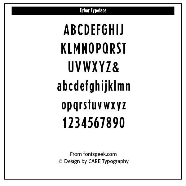
The typeface, Erbar, designed by Josef Erbar in 1913, was the first of the new German gothic types to disturb conservative printing traditionalists — “Erbar along with Koch’s Kabel and Renner’s Futura became the model for the European and American typefounders flood of sans serifs which were to follow.” (Kennedy) Note the Erbar font on the right. It is a well-proportioned font, with the capital M straight sided with a middle V. Caps E, F, L, T are narrow. The ascender of the lower case t is angled, providing an impetus for other sans serif gothics that followed to do the same.
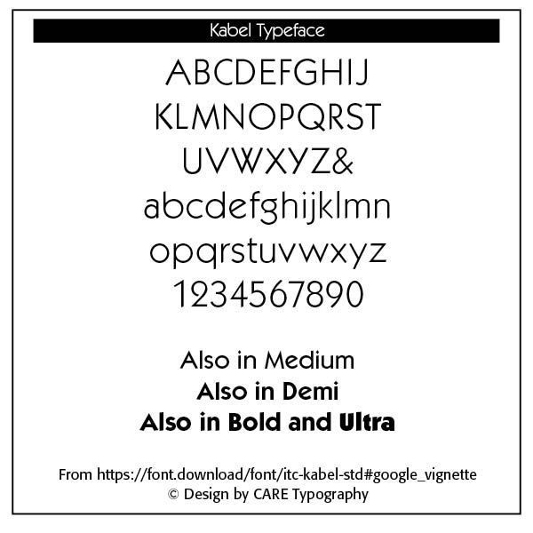
Kabel was designed by Rudolf Koch (1927–30) in Offenbach, Germany. The lighter weights have a small x-height, with the eye in the original black weight too large. The International Typeface Corporation (ITC) redesigned Kabel in the 1980s to make the font more uniform throughout, functioning better at smaller sizes and with text. The font was named to commemorate the first transatlantic telegraph cable. Note the splayed M with a sharp apex, the lower case g with an open bowl and the ear extending to the right. Ascenders are tall and terminals are cut at an angle. The ampersand is sized to fit the intermediate figure height. Kabel became a popular geometric sans serif face. It served as an inspiration for many more sans serifs that followed. Indeed, the study of the light strokes of archaic Greek inscriptions, with their large aperture, geometric typographic meditation on the circle and the line, and the study of Renaissance calligraphy and humanistic form helped propel sans serifs to greater subtlety and usability.
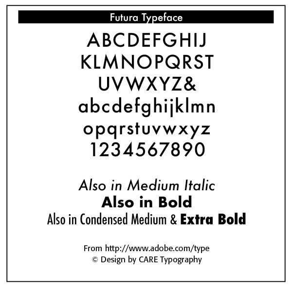
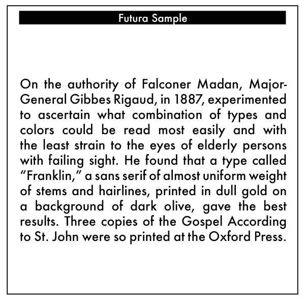
Futura, designed by Paul Renner in 1924–26 in Frankfurt, is a geometric sans serif font. The stroke is carefully shaped to give it optical balance. Futura’s popularity was unprecedented. Monotype even released alternate characters to make Gill Sans more Futura-like — “The European cloning of Futura was joined when a French typefounder released an electroplated copy of Futura, which they named Europe.” (Kennedy) Note the capital M is splayed and the mid strokes extend to the baseline. The tail of the Q is straight. The lower case a is one-storied; the tail of the g is open, and the lower case u has the same design as its capital.
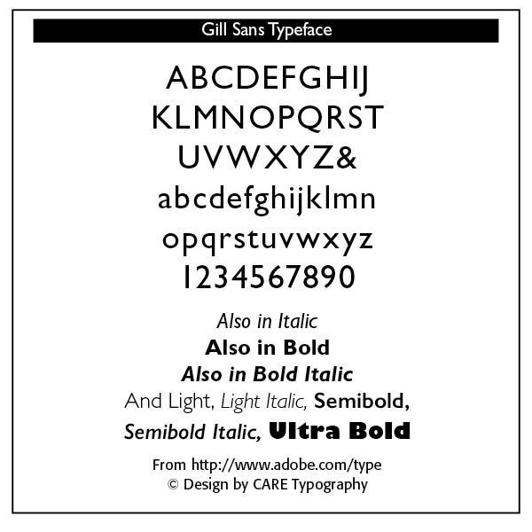
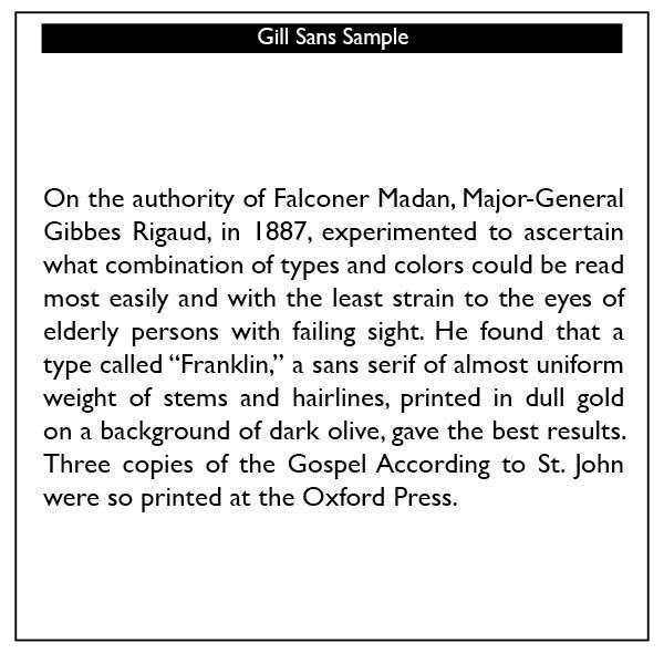
Gill Sans, designed by Eric Gill, was the British answer to the large amount of sans serifs inspired by Renner’s Futura. “Gill based his type on Edward Johnson’s sans serif which was designed as signage for the London Underground in 1916.” (Kennedy) The Gill Sans font is more readable and legible of all modern sans serif fonts. Kennedy says that “a close inspection of Gill Sans reveals that its legibility comes from its austerity, and Gill’s experience as a stone cutter.” Note that the inside white space in the capital G gives this character its form. The aperture is large. The lower case g’s ear protrudes horizontally. The cap M is straight sided, with a short V’d and based on classic roman letterforms. Books have been set with Gill Sans.
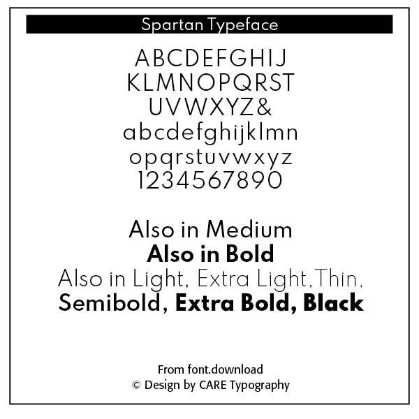
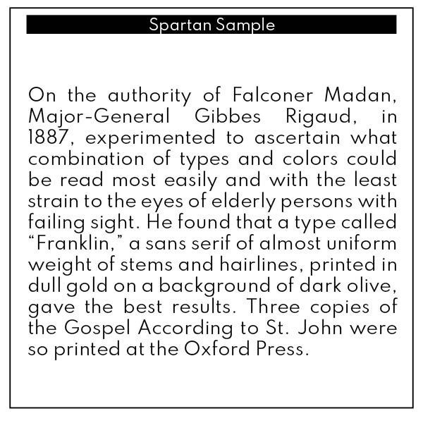
Spartan is Mergenthaler Linotype’s unlicensed version of Futura, copied weight by weight from Bauer. It was produced in 1939 when the sans serif typeface Metro failed to gain a significant share of the market, and was later adopted by American Type Foundries (ATF). The small sizes of Book and Heavy cut for classified are original. American type foundries wanted sans serif typefaces to compete with popular European faces that were being imported to this country. To say that Spartan is similar to Renner’s Futura is understating the case. Copying of fonts by competitors happened all the time.
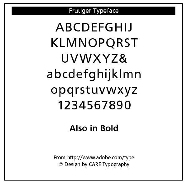
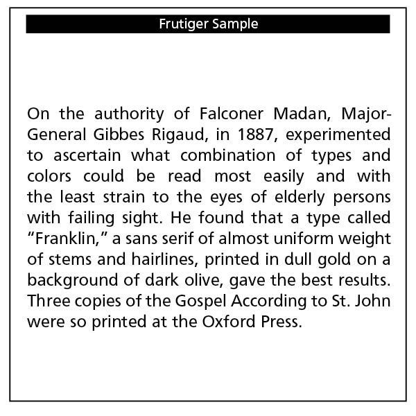
Frutiger, designed by Adrian Frutiger in 1975 and issued by Mergenthaler, gave airport visitors clear signage at the Charles DeGalle Airport in France. It works well with his text typeface, Méridien. Note its balance and openness — Frutiger decided instead to make a new sans serif typeface that would be suitable for the specific legibility requirements of airport signage: easy recognition from the distances and angles of driving and walking. The resulting font was in accord with the modern architecture of the airport. In 1976, he expanded and completed the family for D. Stempel AG in conjunction with Linotype.” (myfonts.com)
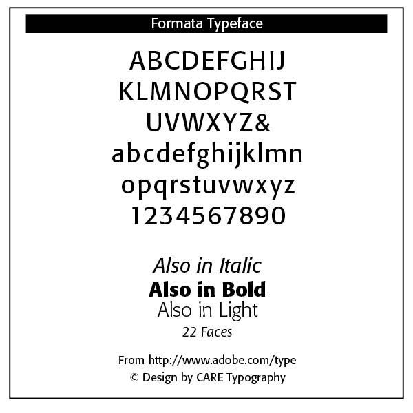
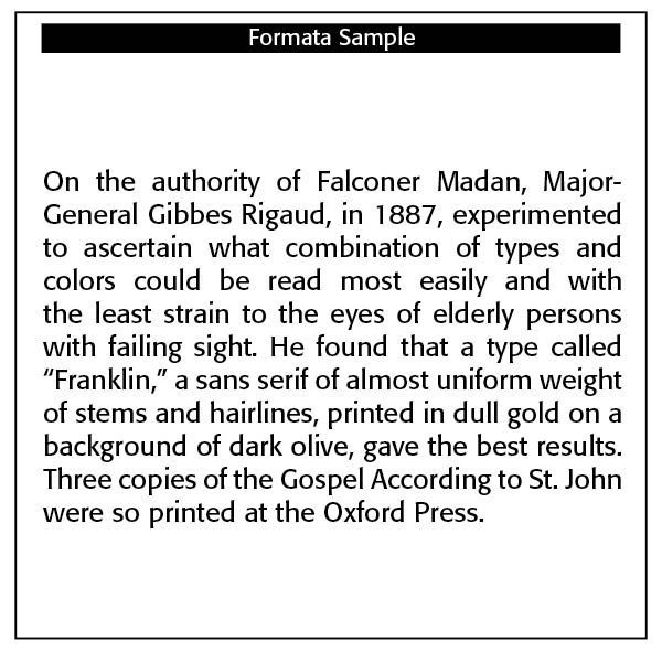
Formata, designed by Bernd Mollenstadt and issued by Berthold in 1984, presents a very readable and pleasing font. I like this font very much, with its subtle and asymmetrical taper — “Instead of linear severity common to many sans serifs, Formata offers curved strokes and interesting details that are subtle in smaller sizes but distinguishable in larger sizes, thus, appropriate for both text and display. The family has an extensive weight range complimented by small caps, old style figures, fractions and the Euro symbol for both the normal and condensed versions.” (myfonts.com)
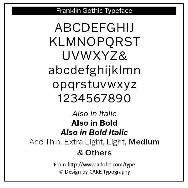
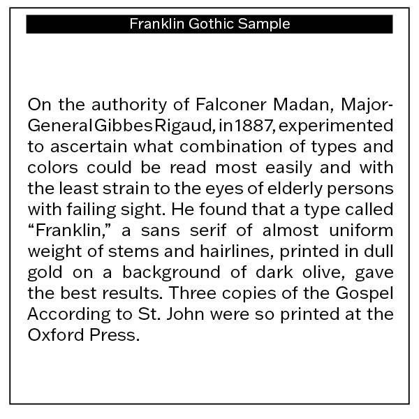
Franklin Gothic is a nineteenth century font, a “quintessential American sans for more than a century. Designed by Morris Fuller Benton and released in 1905 by American Type Founders, Franklin Gothic quickly stood out in the crowded field of sans-serif types, gaining an enduring popularity. Benton’s original design was a display face in a single weight. It had a bold, direct solidity, yet conveyed plenty of character. A modern typeface in the tradition of 19th-century grotesques, Franklin Gothic was drawn with a distinctive contrast in stroke weight, giving it a unique personality among the more mono-linear appearance of later geometric and neo-grotesque sans-serif types.” (myfonts.com)
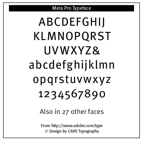
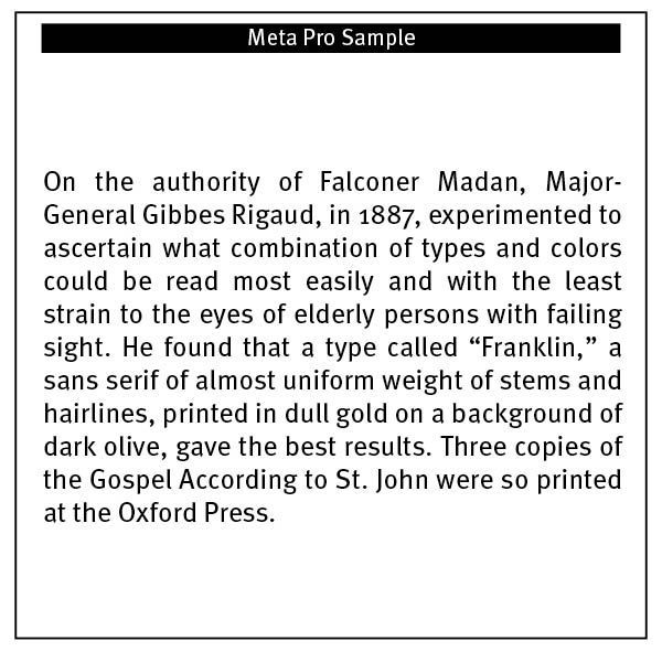
Meta Pro, designed by Erik Spiekermann and issued by FontShop in1991, gives us compact and erect forms, with the “stroke subtly modulated, and the ends of the stems slightly bent and cropped at an angle, giving a faint reminiscence of serifs.” (Bringhurst, 191) The family’s weights range from Light to Black in Compressed, Condensed, and Normal and is ideally suited for book text, editorial and publishing as well as poster and billboards. (myfonts.com) Note the sample text below and its readability.
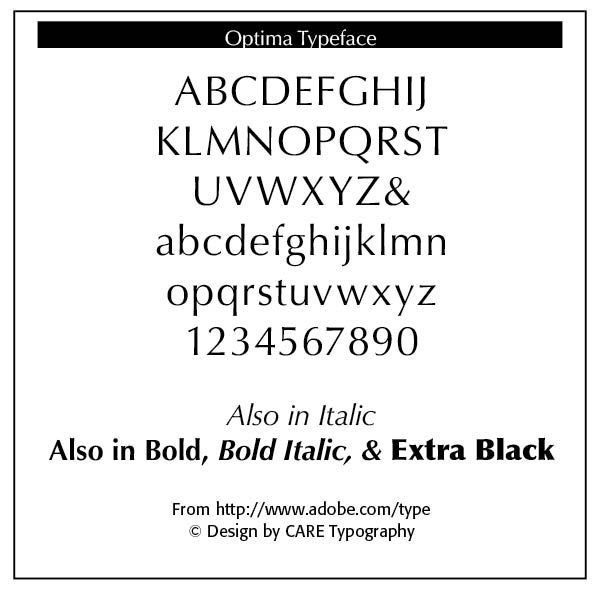
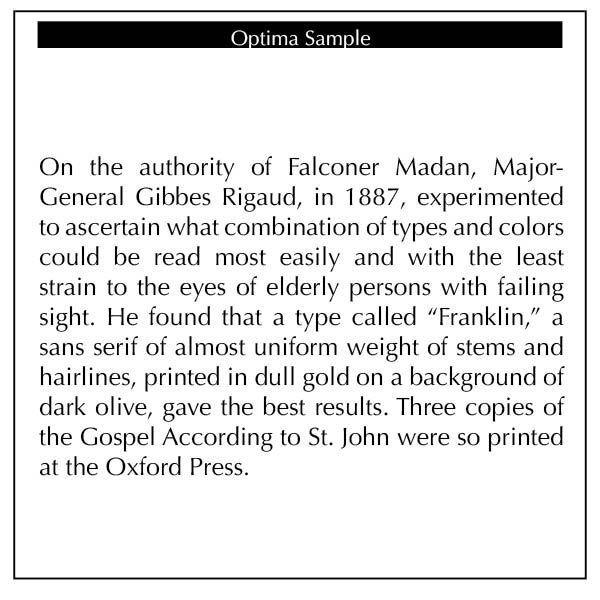
Optima, designed by Hermann Zapf in 1952–55 and issued by both Stempel and Linotype, is a true sans serif font with Neoclassical influences — “Although Optima is almost always grouped with sans serif typefaces, it should be considered a serifless roman. True to its Roman heritage, Optima has wide, full-bodied characters – especially in the capitals. Only the E, F and L deviate with narrow forms. Consistent with other Zapf designs, the cap S in Optima appears slightly top-heavy with a slight tilt to the right. The M is splayed, and the N, like a serif design, has light vertical strokes. The lowercase a and g in Optima are high-legibility two-storied designs.” There is a matching Greek text font that was issued in 1971.
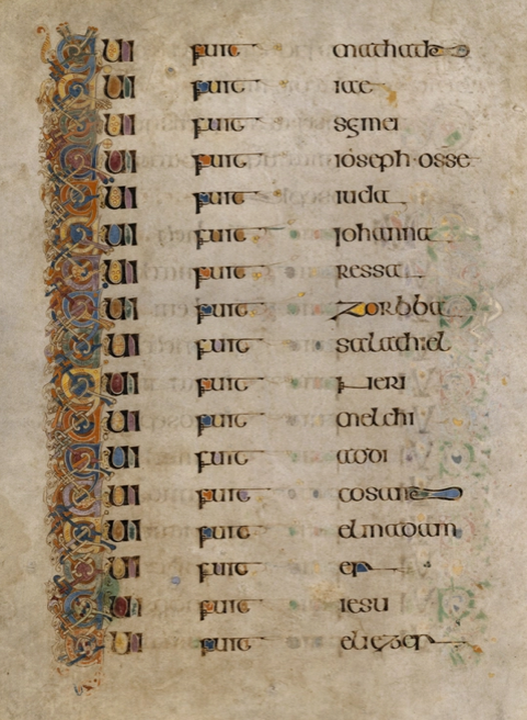
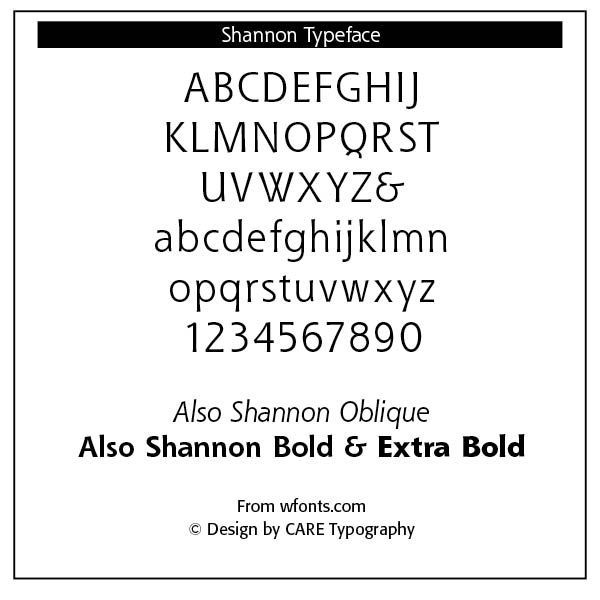
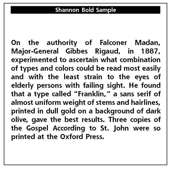
Shannon was designed by Kris Holmes and Janice Prescott Fishman and presented by Compugraphic in 1981. In typographer’s terms, Shannon has a humanist axis and large aperture. It draws its shapes from the letterforms in the Book of Kells (See Below), a handwritten Irish text which dates back to the 8th century.
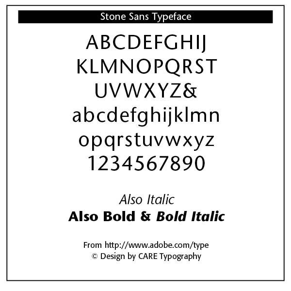
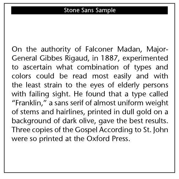
Stone Sans, designed by Sumner Stone and issued by Adobe in 1987 and by ITC in 1989, is a “sans serif of variable axis, large aperture, large x-height and subtle modulation of the stroke.” (Bringhurst, 192) It is part of a wide ranging family of typefaces, including serifed, unserifed, informal and phonetic faces, giving it expensive typographic and printing capabilities. Stone worked together with Bob Ishi (“Ishi” in Japanese means “stone”) of Adobe to create the Stone family fonts. Stone sans is very legible and can be used widely.
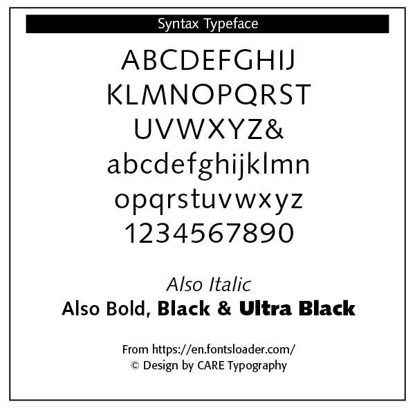
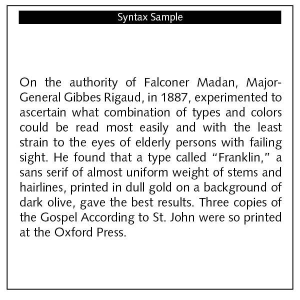
Syntax, a Linotype font, was “developed by Hans Eduard Meier in 1968 and presented by the font foundry D. Stempel AG. Its figures are based on Old Face characters but have a distinctive, modern design.” (myfonts.com) It is a true neohumanist sans serif, giving us Renaissance forms. The 11 degree sloping of the italic and the half degree slope of the roman face lends the font a dynamic feel. Bringhurst notes that “an extended Syntax character set, intended specifically for setting Native American languages, was designed in 1981 by Charles Bigelow and Kris Holmes.” (192)
This brief survey of sans serif faces allows us to trace their history while appreciating their usability in various forms of print. A number of these faces can be used in textual matter, even long texts, without losing readability or legibility. Frederick Goudy notes in his Typologia that “I firmly believe that the best types for our use must be newer letter forms based on the shapes fixed by tradition, fresh expressions into which new life and vigor have been infused, creating new types which are characterized by severe restraint and which exhibit the poise and reposeful quality that are always pleasing.” (42) The best sans serif typefaces honor such an observation.
Resources
Robert Bringhurst,
The Elements of Typographic Style (Hartley & Marks, 1992 edition)
Alex Brown, “Type Renaissance: A Primer on Digital Type,” in
Macworld, July 1991.
Frederick Goudy,
Typologia: Studies in Type Design & Type Making With Comments on the Invention of Typography • The First Types Legibility and Fine Printing (Berkeley, CA: Univ of California Press, 1977 edition)
Nicolete Gray,
A History of Lettering: Creative Experiment and Letter Identity (Boston: David Godine Pub., 1986 USA Edition)
Steve Kennedy, “Facts-o-Type,” in
Typeworld, September 15, 1991.
https://www.myfonts.com
Successful Layout & Design


