Advances in Typography: Twentieth Century (Part 1)
Advances in Typography: Twentieth Century
A Historical Sketch (Part 1)
Early Twentieth Century: Form Follows Function
Bauhaus Precursor
The Deutscher Werkbund (German Work Foundation, est. 1907, Munich) was a pivotal German association of artists, architects, designers, and industrialists that advanced rational, industrial design and laid the foundation for modernist sans-serifs. The Werkbund emphasized functionalism, simplicity, honest use of materials, and alignment with industrial production, rejecting unnecessary ornamentation and anticipating the principle “form follows function.” Its purpose was to elevate German industrial products by integrating artistic excellence, technical innovation, and industrial manufacturing, summarized by the motto: “From work to form”—good design as a cultural and economic asset. Key founders included Hermann Muthesius, Peter Behrens, Fritz Schumacher, and Karl Schmidt.
Their goals were to enhance everyday objects through quality design, foster a unified visual culture in Germany, partner artists with industrial manufacturers, promote standardization and modern production techniques, and compete internationally in design excellence.
The Werkbund is recognized as a precursor to the Bauhaus and modern industrial design. Notable members included Walter Gropius, Ludwig Mies van der Rohe, and Peter Behrens. The organization established principles of functional, simplified forms, standardized mass production, and the concept of design as a cultural force. They hosted influential exhibitions, notably the 1914 Cologne Exhibition, as well as publishing journals and defining standards for high-quality design.
Futura & Geometric Modernism (1920s–1930s)
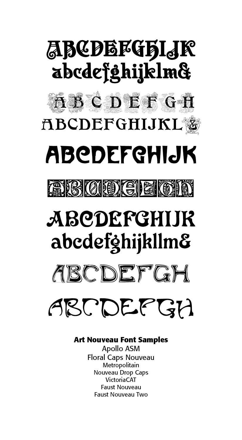
As we saw in my last post, between 1500 and 1900 typography evolved from Renaissance humanist forms to industrial mass production and artistic revival. Old style typefaces (like Garamond) moved to Transitional faces (like Baskerville) to Modern/Didone faces (like Didot and Bodoni) to Industrial display types (fat faces, slab serifs, sans serifs) to the Arts & Crafts revivals. Art Nouveau was a reaction against the academicism, eclecticism and historicism of nineteenth century architecture and decorative art. The new art movement had its roots in Britain, in the floral designs of William Morris, and in the Arts and Crafts movement founded by the pupils of Morris.
Under Art Nouveau, typography wasn’t just functional but rather integrated into the overall artistic composition of posters, magazines and books. Much of the art and even typefaces were hand-drawn, borrowing from calligraphy and even medieval scripts, adding a romantic quality to the resulting art.
Other characteristics of Art Nouveau were a sense of dynamism and movement, often given by asymmetry or whiplash lines, and the use of modern materials, particularly iron, glass, ceramics and later concrete, to create unusual forms and larger open spaces. SEE SAMPLES and (SEE Blog “Art Nouveau Typography,” September 6, 2025)
Peter Behrens, a founder and organizer of Deutscher Werkbund (German Work Foundation), unfortunately associated with the German Nazi party, was one of the most influential architects and designers of the early twentieth century, widely recognized as the pioneer of modern industrial design. Behrens designed trademarks that exist today, such as the iconic “Dem deutschen Volke” (To The German People) above the portal of the Reichstag building in Berlin. (See Photo)
In 1902 he created a new German type which served, for example, as the official German type for the world expositions in 1904 and 1910. He notes that for this type “he took the technical principle of the Gothic script, the stroke of the quill feather. The proportions of height and width and the boldness of the strokes of the Gothic letters were also decisive for me in producing a German character. A cohesive character could be hoped for by avoiding all non-necessities and by strictly carrying out the design principle of holding the quill at an angle.”[1] Behrens bridged Art Nouveau with modern graphic design in the Arts and Crafts Movement
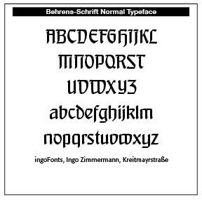

Behrens Schrift (1901-1902, Jugendstil font at the Rudhardsche foundry in Offenbach. This typeface served, for example, as the official German type for the world expositions in 1904 and 1910. This is a digitized sample.
Then came World War 1 (1914–1918) and with it a devasting blow to societal hopes and standards. The utopianism of pre-war gave way to the skepticism of post war and the rise of German totalitarianism under Hitler. Culture here again invaded typography and typographic designs. World War 2 would further affect typographic design with the modernist move toward individualism and anti-Christian historic thought and standards.
This break with historic type formulations can be seen in the Dadaism movement. Disdain for convention marks the Dada period of typography, if we can rightly call it typography. Dadaists were influenced by Futurist typography, which celebrated energy and disorder. Whereas Futurists glorified progress, Dada questioned meaning itself.
This avant-garde movement rejected order and logic, which it regarded as having failed to prevent the catastrophic First World War. This frightfully horrific war trashed former utopian dreams of a wonderful, orderly and helpful society. Dada was nihilistic and used dynamic, non-linear text to express anger and emotion. The term “Dada” has no actual meaning. It is a childlike word used to describe lack of reason or logic in artwork and typography. (SEE my BLOG “Theology of Type (2): Gutenberg to the Early 1900s,” November 1, 2025 for more Dada samples).
Herbert Bayer (1900–1985) and Bauhaus
THE BAUHAUS was one of the most influential design schools of the twentieth century. Founded by Walter Gropius in Weimar, Germany in 1919, many of Europe’s leading artists and designers were on its faculty — Anni Albers, Josef Albers, Herbert Bayer, Max Bill, Marcel Breuer, Johannes Itten, Wassily Kandinsky, Paul Klee, Lazlo Moholy-Nagy, and Piet Mondrian to name a few. When the Nazis came to power in Germany, many of the staff emigrated to the United States to found the new Bauhaus in Chicago in 1937.
Sans-serif typefaces became the hallmark of Bauhaus typography. The clean, legible, geometric forms were modern, efficient and aligned with machine aesthetics. A leading typographer and organizer of Bauhaus was Herbert Bayer.
Herbert Bayer was an Austrian-American designer. After completing an apprenticeship in arts and crafts in Linz, Bayer enrolled at the Weimar Bauhaus from 1921 to 1924. Heavily influenced by Constructivism, as well as the painter Wassily Kandinsky, Bayer became the director of the Department of Typography and Advertising when the Bauhaus relocated to Dessau in 1925.
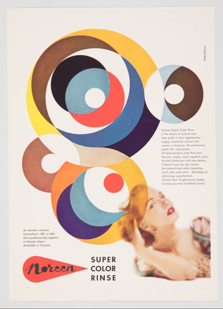
Dissatisfied with teaching, he moved to Berlin in 1928 where he set up a design studio. There, he created cutting-edge advertisements that were featured in popular magazines such as Vogue and covers for the monthly periodical Die neue Linie. Bayer immigrated to the United States in 1938 and became one of the most influential designers of the twentieth century at the Aspen Institute for Humanistic Studies. While at Aspen, Robert Anderson, founder and president of the Atlantic Richfield Company (ARCO) hired Bayer as a design consultant for his company. His work involved everything from designing buildings, interiors, corporate graphics, furnishings, and tapestries for various headquarters. [2]
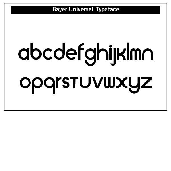
The Universal Typeface, 1925, was a geometric alphabet based on a bar and circle designed by Bayer. In rejecting the archaic and complicated gothic alphabet, Bayer abolished upper and lower case alphabets and replaced them with a single case. He renounced all suggestions of calligraphy.
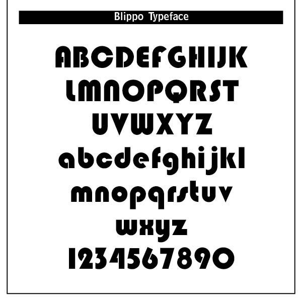
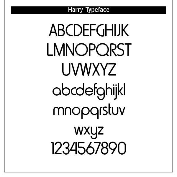
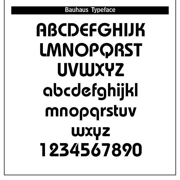
Other Bauhaus inspired type mostly from the late 1960s and early 1970s were typefaces like Harry (Mary Goldstein, 1960), Burko (David Burke, 1967), Blippo (Joe Tayor, 1969), Pump (Bob Newman, 1970), and Bauhaus (Ed Benguiat, 1969). The latter became ITC Bauhaus offered through Adobe type.
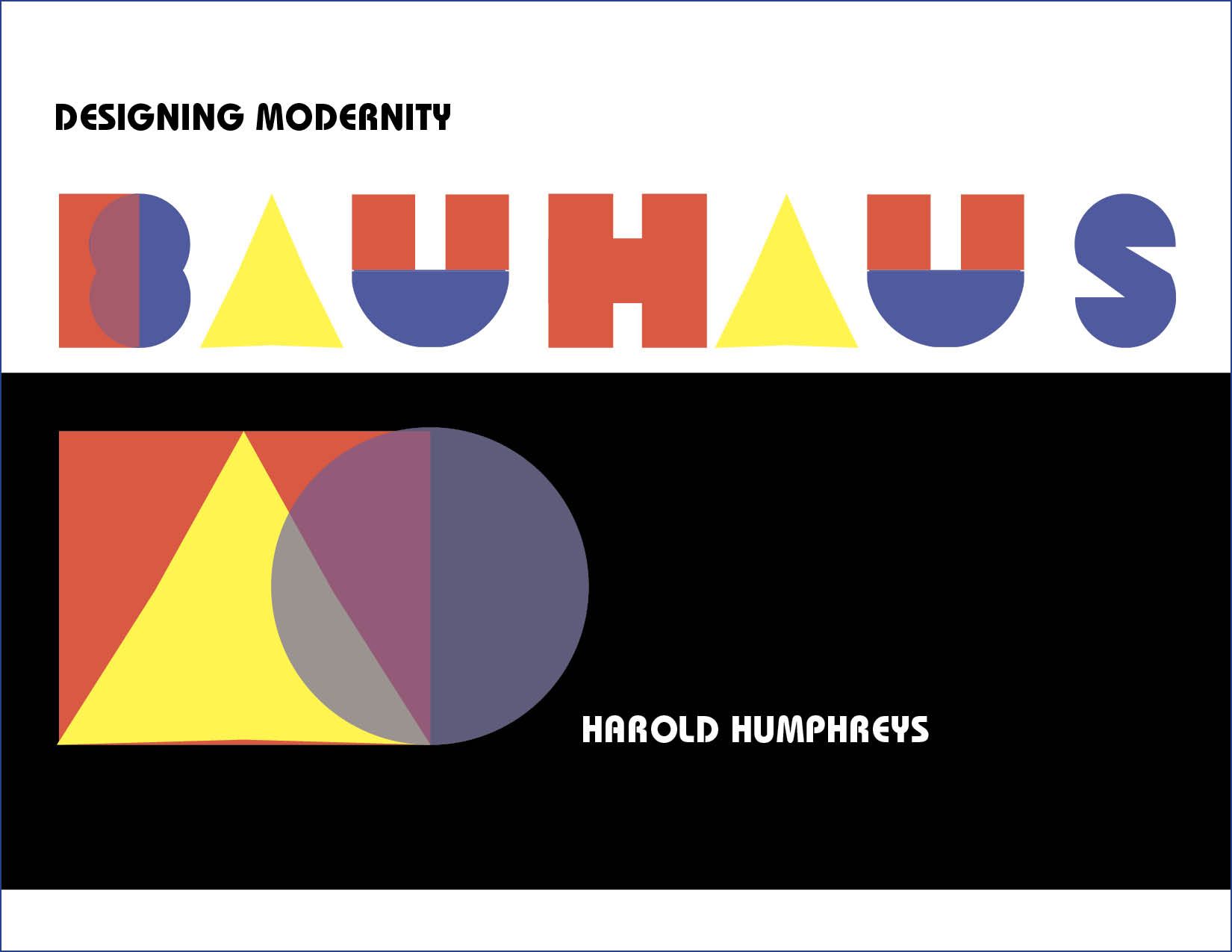
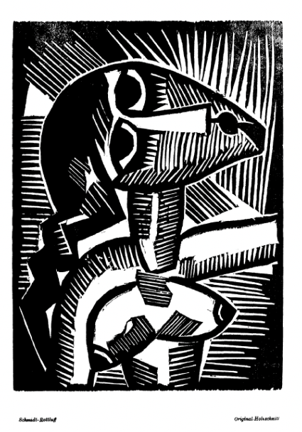
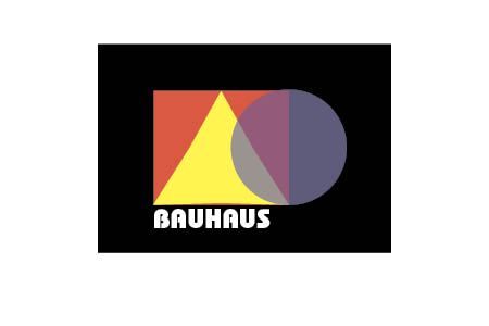
This Bauhaus Poster was offered as a practice sample by French & D'Andrade in their Type Project Book The sample above was designed in Adobe InDesign.
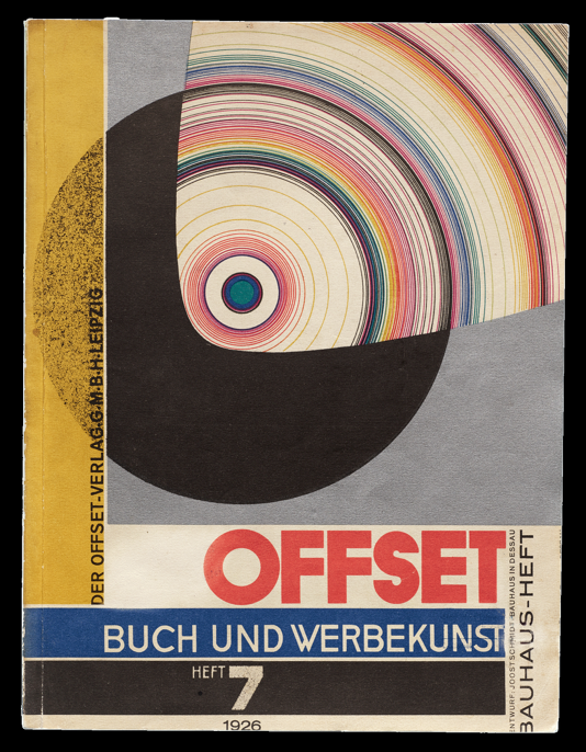
Bauhaus, of course, is not limited to Bauhaus typography but includes craft, technology and design thinking. Bauhaus posters often featured bold, sans-serif type, strong diagonal lines and clear visual hierarchy. They communicated modernity, efficiency and social progress. The Bauhaus vision was also applied to industrial design of logos, packaging, branding and products.
Wassily Kandinsky, one of the school’s founders, assigned the colors red, blue and yellow to the square, circle and triangle. A theoretical study of such colors and shapes was a major part of the curriculum. The “S” was particularly challenging in my Adobe InDesign program, as it is also in Adobe Illustrator, the suggested program to use. [3]
The Bauhaus typographic principles laid the foundation for the International Typographical Style (Swiss Style) and much of modern graphic design. The designer Josef Muller-Brockmann (1914–1996) was a pioneer of the International Typographic Style, with his simple designs and clean use of typography inspiring many graphic designers in the twenty-first century.[4] Bauhaus type aesthetics still influence UI/UX design and minimalist information design today.
Herbert Bayer stands as one of modernism’s most influential designers, synthesizing typography, graphic design, photography, architecture, and environmental design into a unified vision. His Universal typeface and Bauhaus typographic system remain central to design history curricula and continue to shape contemporary visual culture.
Jan Tschichold (1902–1974). German-Swiss typographer, calligrapher, teacher, and book designer Jan Tschichold wasborn in Leipzig to a sign-painter, He was trained in calligraphy and lettering at the Leipzig Academy. His seminal experience was attending the 1923 Bauhaus Exhibition, which redirected his career from classical calligraphy toward radical modernism. By the mid-1920s he became the leading spokesman for the avant-garde in typography.
His 1928 book
Die Neue Typographie (The New Typography)
became the manifesto of functionalist design. Its core principles were asymmetry instead of symmetry, sans-serif typefaces for modern communication, standardized paper sizes, hierarchy through weight, size and placement, photography favored over illustration and typography as functional, not decorative. This book codified European Modernist typography.
He designed numerous posters and layouts with dynamic diagonals, experimental sans-serifs with Akzidenz-Grotesk and Futura, using photomontages and mathematical grid structures.
Paul Renner (1878 – 1956) was born in Wernigerode, Germany, and initially trained as a painter and graphic artist before focusing on typography and design. Though influenced by early twentieth-century German design movements, especially Bauhaus philosophy, Renner was not formally affiliated with the Bauhaus school.
Renner worked as a graphic designer, educator, and type designer, actively promoting clarity, functionality, and simplicity in design. He taught at the Frankfurt School of Applied Arts (Städelschule), shaping future generations of designers and typographers.
During the Nazi regime, Renner’s modernist and progressive views conflicted with official aesthetics, presenting professional challenges. Nevertheless, he continued to contribute to typography and design theory throughout his career.
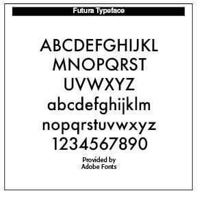
Futura (1927)— Renner’s most renowned typeface, Futura, is a geometric sans-serif defined by clean lines and shapes inspired by circles, triangles, and squares. It became a hallmark of modernist typography, widely used in advertising, publishing, and corporate identity, and reflects Bauhaus principles of functionality and efficiency. Beyond Futura, Renner designed additional typefaces and contributed to type standards and education in Germany, helping to establish the foundations of modern typography.
Renner authored influential works such as Typography: Form and Communication, emphasizing legibility, readability, and the role of type in visual communication. He advocated for a rational, structured approach to design that balanced practical and aesthetic considerations.
Futura remains one of the most widely used typefaces globally, influencing subsequent geometric sans-serifs. Renner is recognized for both his design work and his intellectual contributions to typography, bridging modernist design and effective typographic communication.
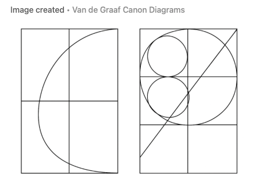
However, after fleeing Nazi Germany in 1933 and ultimately settling in Switzerland, Tschichold renounced strict modernism and turned toward classical, humane typography inspired by Renaissance book design. He embraced Garamond, Bembo and traditional serif types with balanced proportions, gentle hierarchy and classical page canons, such as the Van de Graaf Canon and the Golden Section (SEE my BLOG “Grids, Type and the Golden Ratio,” April 28, 2022)
The Van de Graaf Canon is a geometric method for constructing ideal proportions for a book page and its text block. The “circles” refer to one of the visual/analytic diagrams used to illustrate the proportional relationships. Originating from the 15th-century book designs, it creates harmonious margins and places the text block within a page using geometric diagonals, not numerical measurements.
Drawn out, the method produces overlapping diagonals and arcs—often represented with circles to show proportional relationships and to highlight how the text block relates to the page’s center. Such design results in classic proportions—typically wide outer and bottom margins, with the text block placed slightly above center—echoing Renaissance book design.
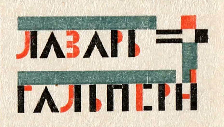
Poster in https://mcbcollection.com/jan-tschichold-designer-theorist-collector
From 1947–1949 he worked for Penguin Books, transforming the entire design system based on clarity, consistency, and typographic rigor.
Humanist Revival: Eric Gill (1882–1940)
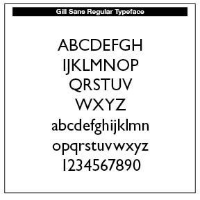
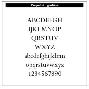
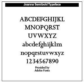
Known for his typefaces Gill Sans, Perpetua and Joanna, Eric Gill blended modern simplicity with classical proportions. Gill was a stone carver, letterer and type designer and print maker whose work deeply shaped modern British typography and design.
His typefaces became some of the most recognizable and widely used type families of the 20th century. Gill moved to Ditchling, Sussex, where he joined with like-minded Catholic craftsmen to form a community centered on work, faith, and simplicity, later formalized as The Guild of St Joseph and St Dominic (1920). His conversion to Roman Catholicism in 1913 deeply influenced his artistic philosophy. At the same time, Gill’s reputation has been radically reevaluated due to the disturbing revelations in his private diaries, published decades after his death, documenting sexual abuse and other serious misconduct.
Notes
1. In 1902, Peter Behrens (1869—1940), architect, designer and typographer, created a new ”German“ type which became very successful very quickly for the Rudhard’sche Gießerei (foundry which later became Gebr. Klingspor AG) in Offenbach am Main. It served, for example, as the official German type for the world expositions in 1904 and 1910. Behrens himself writes about the development of this type. https://www.dafont.com/behrensschrift.fontcom. Also, see Peter Behrens and Symbolisms of Industrial Design: The Case of AEG, https://pikark.com/en/listing/peter-behrens-industrial-design/
2. This summary taken from both https://thebayercenter.org/about-herbert-bayer/ and the Wikipedia article on Herbert Bayer.
3. Nigel French & Hugh D’Andrade, The Type Project Book: Typographic Projects to Sharpen Your Creative Skills & Diversify Your Portfolio (Pearson Education, Inc., 2021), 18–21.
4. From https://en.wikipedia.org/wiki/Josef_Müller-Brockmann.
END PART 1
Successful Layout & Design
