Theology of Type (2): Gutenberg to Early 1900s
Theology of Type (2): Gutenberg to Early 1900s
William Skeen in his 1872 Early Typography celebrated what he called “The Art Sublime” referring to typography and its use for divine illumination —
I seek, Disciple of the Art;
That to the famed Teutonic three
Just meeds of praise may given be;
That all aright the men may know
To whom Typography we owe;
The men whose names immortal ring,
Whose gifts transcendent blessings bring,
Whose monuments in every land
By wisdom rear’d, heart-honor’d stand,
Inscribed in tongues of every clime —
“Inventors of the Art Sublime!”[1]
Skeen pontificates that “to this Art, as it was invented and perfected in Europe in the Fifteenth century, the epithets Divine and Noble have not untruly been applied.”[2] "It is Divine, inasmuch as it is one of the grand instruments in the hands of Providence for the regeneration of fallen humanity. By it the mightiest movement the world has ever seen since the days when the Apostolic Twelve went about “turning it upside down,” — the Great Reformation of the Sixteenth century, — was mainly effected. Without it the Word of God could not have been diffused, as it has been, is being, and will continue to be, to every nation and tribe and people and tongue throughout the world.”[3]
We are made by our Creator to be “sensory-rich,” and our typographic history unfolds this in stunning and diverse ways. As one writer has so eloquently said "Holy Scripture calls us to inhabit an ordered world of creation and providence that is sensory rich, but we suffer what we may regard as spiritual sensory deprivation. And the more we discover the depth, scope and lush richness of the divinely ordered real world, the more we discover the impoverishment of the modern condition."[4]
Even the briefest of surveys and historical typographic study will reveal the theology of type. The depth, scope and richness of typography through the centuries displays either the beauty God has given this world, or the resistance to such beauty.
The Protestant Reformation of the sixteenth century was deeply tied to advancements in typography and printing, which played a crucial role in spreading reformist ideas. Some major typographical advances during this period include the use of the printing press of Johann Gutenberg around 1440 which had revolutionized printing. Printers improved the efficiency of moveable type, making it faster and easier to print large numbers of religious pamphlets, tracts and Bibles.
Instead of obscure Latin, reformers like Martin Luther advocated for scripture and religious texts in local, common languages. The Blackletter face Fraktur was a Gothic script used in German-speaking areas. The more humanist Roman type gained traditional use in parts of Europe.
Woodcut illustrations like those of Lucas Cranach the Elder, who supported Martin Luther, complemented printed texts, making complex religious ideas and theological concepts more accessible to a largely illiterate population. There were greater efforts in standardizing spelling and grammar studies and books. Printing advancements enabled the production of smaller, more affordable Bibles.
These typographical innovations, combined with the theological upheaval of the Reformation, transformed the way people accessed and engaged with religious texts, ultimately shaping modern literacy and communication.
GUTENBERG ERA TYPOGRAPHY (1450 +)
Scribes in pre-Gutenberg times labored for years creating wonderful typographic art, such as in the Landsifarne Gospels. Typography in Gutenberg’s pre-Victorian days spoke of craftsmanship, classical ideals and typographic innovation. From Printers Marks, as we saw in Part 1 of this study, to blackletter fonts to humanist typefaces, typography became more refined, rational, and mathematically structured.
The term “University” in relation to blackletter fonts typically refers to the use of these fonts in academic and religious contexts during the Middle Ages, and later in formal academic environments where tradition, authority, and history are emphasized. The most notable “University” blackletter fonts are linked to the old European universities and have been used in documents, manuscripts, and crests. Three traditionally common faces were Textura, Fraktur and Rotunda.
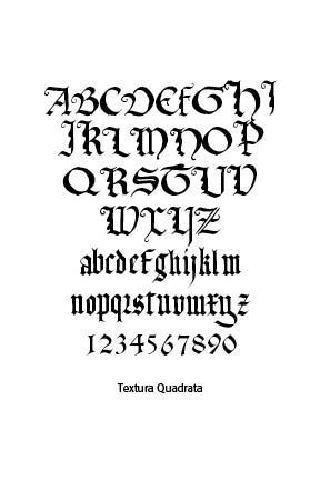
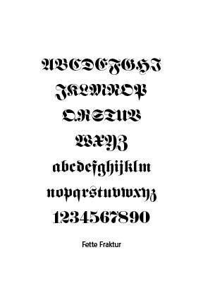
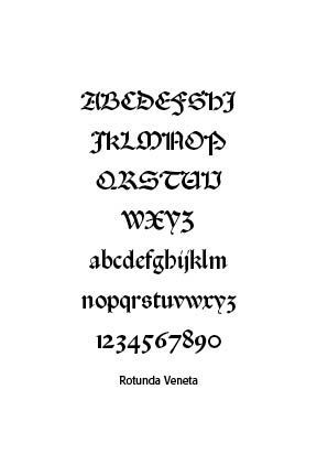
Blackletter type is gratuitous in that it makes the Triune God available to the masses of the times. Instead of God’s revelation locked up in monasteries and for only the favored few, everyone could now read the Bible in their own language, not merely ancient Latin.
Blackletter objectifies God in the sense that we have written revelation, not obscure mystical teachings. Blackletter, however, fails at typological differences, making it hard to read and decipher at times for moderns. Blackletter was desirable in the period in which it was used. Blackletter type certainly crossed geographical and language backgrounds in Europe and England and beyond. It was a boundary-crossing typeface. Lastly, blackletter was “fitting” for the times. It would be, of course, succeeded by more legible and elegant typefaces.
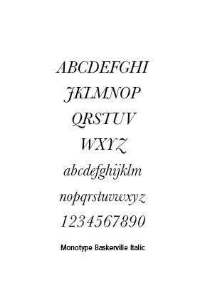
One of the most beautiful italic typefaces is Baskerville. Designed in 1757 by John Baskerville in Birmingham, England, Baskerville Italic demonstrates the outstanding qualities of harmony, precision and readability. “At a time when books in England were generally printed to a low standard, using typefaces of conservative design, Baskerville sought to offer books created to higher-quality methods of printing than any before, using carefully made, level presses, a high quality of ink and very smooth paper pressed after printing to a glazed, gleaming finish.”[5]
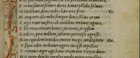
Along with Blackletter and roman type, italics has served as one of the major typefaces in the history of Western typography. Italic takes notable influences from hand drawn calligraphy, with italic letters normally slanted slightly to the right. Upper case letters may have typographic swashes, flourishes inspired by ornate calligraphy. The name “italic” comes from their Italian use, to replace documents traditionally written in a hand-written style called chancery hand. Italic typefaces are defined by their slanted, cursive-like appearance, with letters that have a flowing, dynamic quality. It allowed for more text to be fitted on the page and mimicked the handwriting style of humanist scholars, like the handwriting of Petrarch.
Italic typefaces were originally used separate from the roman face. In fact, Aldus Manutius wedded the italic face with small roman capitals in his Virgil of 1501. Aldus was the first to suggest the printing of a polyglot Bible, a Bible with multiple versions. However, the first polyglot work ever printed was a Psalter, the literary work of Augustin Justinian, a Corsican bishop, of eight columns, each a different translation in Genoa, Italy in 1516.
VICTORIAN BEAUTY (1837–1901)
The heavy ornamentation of the Victorian period gave us decorative and fancy type, with a trend toward expressiveness over readability in display typography. Printers would mix multiple typefaces on a single page or poster to catch the eye. The Industrial Revolution facilitated the mass production of such printing. Type was used to create hierarchy and drama with little concern for typographic minimalism.
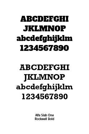
Type styles that emerged in the Victorian period included Egyptian slab serif, like this Alfa Slab One font and Rockwell.
Would we consider Victorian type beautiful? The lack of white space and forced, bold, and audacious design ideas and posters might challenge the quality of proportion, unity, variety, symmetry, harmony, intricacy, delicacy, simplicity and suggestiveness — the description of “fittingness.” Its desirability had limited appeal historically. Yet, this era above all was strongly rooted in the objective in its demands to be noticed and speaking loudly to us of the rule of God in life and thought. It was “really there” boldly and powerfully there. So, in many senses, for at least a period of time, Victorian type was theologically beautiful and eventful.
ART NOUVEAU (1890–1910)
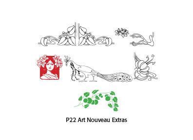
Art Nouveau typography was more art than rigid form with curvilinear, elegant, and stylized lettering forms, sometimes with asymmetrical or unconventional shapes. Typefaces mimicked natural shapes, like vines, tendrils and flowers, as in the P22 Art Nouveau Extras glyphs featured.
Typography wasn’t just functional but rather integrated into the overall artistic composition of posters, magazines and books. Much of the art and even typefaces were hand-drawn, borrowing from calligraphy and even medieval scripts, adding a romantic quality to the resulting art.
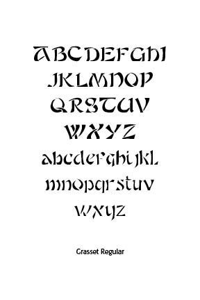
Art Nouveau was a reaction against the academicism, eclecticism and historicism of nineteenth century architecture and decorative art. The new art movement had its roots in Britain, in the floral designs of William Morris, and in the Arts and Crafts movement founded by the pupils of Morris. The Grasset Typeface from Lewis F. Day’s Alphabets Old and New, London, 1910, shows that art nouveau flair for which these men were famous. The font has been digitized by CARE Typography.
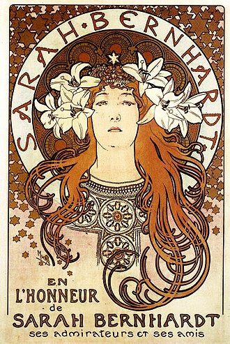
Famous examples include the works of Alphonse Mucha (1860–1939), a Czech painter, illustrator and graphic artist. He was known for his decorative theatrical posters, especially those of Sarah Bernhardt, a French stage actress of the late nineteenth and early twentieth centuries. Wikipedia notes that he became devoutly religious — “For me, the notions of painting, going to church, and music are so closely knit that often I cannot decide whether I like church for its music, or music for its place in the mystery which it accompanies.”[6] At the Paris Universal Exposition of 1900 he depicted a future society in the Balkans where Catholic and Orthodox Christians and Muslims lived in harmony together. Mucha was a devoted Catholic mystic — “I had not found any real satisfaction in my old kind of work. I saw that my way was to be found elsewhere, little bit higher. I sought a way to spread the light which reached further into even the darkest corners. I didn’t have to look for very long. The Pater Noster (Lord’s Prayer): why not give the words a pictorial expression?[7]
Is Art Nouveau theologically beautiful? I start with the subjective opening quote from Nigel French and Hugh D’Andrade in The Type Project Book: Typographic Projects To Sharpen Your Creative Skills & Diversify Your Portfolio (Pearson Education, 2021) that you either love it or hate it. And many people love the organic, flowing flowers and stems and fancy type that adorns Art Nouveau posters and advertisements. However, looking more deeply at our starting description of God honoring beauty, we can make several observations.
A few of the Art Nouveau designers did attempt to bring glory to God and reflect his creation as a gift. Others not so much, especially Behrens. Art Nouveau certainly illustrated the principle of harmony or unity of expression as well as diversity. Art Nouveau crossed geographical and social boundaries well. Some of it was “fitting” in terms of beauty and objectifiably outstanding, like the Behrens designs. Art Nouveau served as a graphical and artistic bridge to later graphic arts.
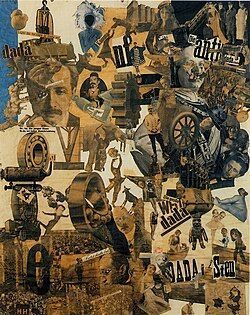
Cut with the Kitchen Knife Dada through the Beer Belly of the Weimar Republic,
Hannah Höch, 1919
Hugo Ball’s famous Karawane (1916), composed of invented words, emphasized performance and phonetics over readability —
Karawane
jolifanto bambla o falli bambla
großiga m’pfa habla horem
egiga goramen
higo bloiko russula huju
hollaka hollala
anlogo bung
blago bung blago bung
bosso fataka
ü üü ü
schampa wulla wussa olobo
hej tatta gorem
eschige zunbada
wulubu ssubudu uluwu ssubudu
tumba ba-umf
kusa gauma
ba - umf
DADAISM (1916-1918)
The avant-garde movement of Dadaism used type to express anti-establishment sentiment. This avant-garde movement rejected order and logic, which it regarded as having failed to prevent the catastrophic First World War. This frightfully horrific war trashed former utopian dreams of a wonderful, orderly and helpful society. Dada was nihilistic and used dynamic, non-linear text to express anger and emotion. The term “Dada” has no actual meaning. It is a childlike word used to describe lack of reason or logic in artwork and typography.
Dada undermined the rules and distinctions between reading and viewing. Meaning was derived from form, not syntax. Dada artists used type in manifestos that were typographically explosive and politically provocative. Logic and coherence were readily attacked. Type danced, shouted and clashed. Type disrupted, questioned and awakened. Dada’s typographic innovations laid the groundwork for later movements like Surrealism, Situationism, Fluxus and Punk graphic design.
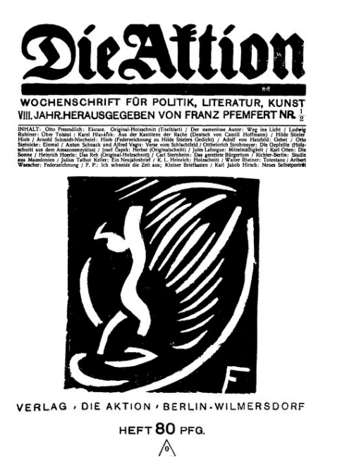
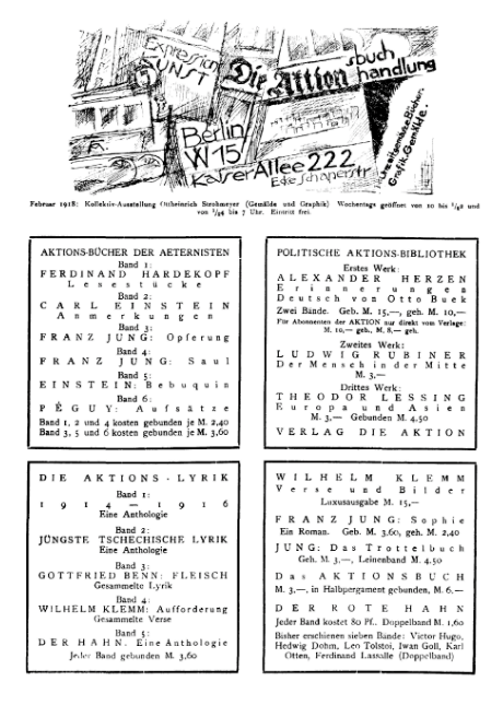
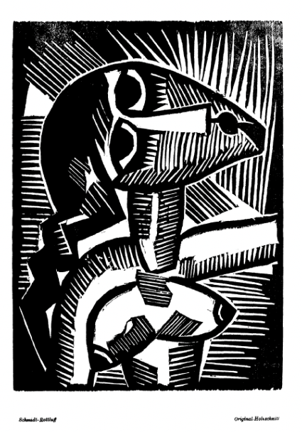
A leading Dada magazine of the period, Die Aktion (“The Action”), emphasized literary Expressionism and was published between 1911 and 1932 in Berlin. It stood for socialistic left-wing politics.
Later Situationists resistance to society is called in the French détournement, the tactic of taking something that exists and changing it to give a different message to that which was originally intended. Dada typography and adherents were Situationists in typography.
In the Dadaists rejection of order and logic in typography, using as many different fonts they wanted, and liberating typography from the grid of letter press, printing horizontally, vertically and diagonally on the same page, their rejectionist typography inspired the visual arts, literature, and theater. That influence is still being felt today.
Difference and distance typographically in Dadaism could under God be made to reflect the unity and diversity of God. God providentially has used Dadaist typography to challenge, to awaken, to express the disorder in this sin-fallen world. Typography was no longer passive, but performative, disruptive and deeply expressive. Type can speak, in other words, in ways that grab our attention about the disorder of this world and even point us to the God who rules over such disorder.
Perhaps Dadaism’s ultimate function was to force us away from our neatly contrived autonomy and consider what makes us who we are. Type and typography would never be the same after Dadaism. In modern graphic design, especially Swiss typography, echoes of Dada’s experimentation live on, though often more refined. This type-based rebellion lasts!
SOURCES
(Note that much of this info from the author’s Typographical Beauty Through the Ages: A Christian Perspective, Lulu Press, 2025)
1. William Skeen, Early Typography (Colombo: Ceylon, 1872), opening poem.
2. Skeen, 11–12.
3. Skeen, 12–13.)
4. Mark A. Garcia, “The World of the Word of God,” Westminster Magazine (Vol. 2, Issue 2, Spring 2025), 11.
5. https://en.wikipedia.org/wiki/Baskerville
6. https://en.wikipedia.org/wiki/Alphonse_Mucha.
7. Ibid.
Successful Layout & Design


