More On Variable Fonts
More On Variable Fonts
Open Type Variable Fonts (REFERENCE)
(Some of this Blog from previous Blog on Dec 9. 2025. See REFERENCE above)
Open Type Variable fonts build directly on the technology introduced to TrueType by Apple in the QuickDraw GX graphics environment. Of similar vintage, Adobe’s multiple master format approached similar concepts in a different way. How do we know that Variable Fonts don’t also have a declining future? The need for more compact dynamic webfonts is part of the answer. “Variable fonts also have the potential to enable new kinds of typography for electronic documents, responsive to things like device orientation or even viewing distance. Compact and faster fonts also provide significant advantages for embedding fonts in devices, especially for East Asian (CJK) and other fonts with very large glyph sets and character coverage. The smaller device and disc footprint of variable fonts has been a major factor in encouraging support for the technology in software companies.” (https://medium.com/variable-fonts)
An Open Type Variable font contains one or more axes that each provide particular variation between different extremes of a typeface design. The format also allows for the possibility of intermediate designs, for the whole glyph set or for individual glyphs, to provide finer control over the design as it changes across the variations design space. Unlike MM fonts, an Open Type Variable font contains only a single set of glyph outlines “and the other extremes or intermediate shapes are defined as deltas from those outlines. So, for example, a font may contain a set of glyph outlines that correspond to the regular weight and width of a typeface, and the lighter, heavier, narrower, and extended designs will be expressed in the font data as movements of outline nodes relative to that outline.” (Medium.com) Any position within the design space can be a named instance. Variable fonts allow a continuous design space containing potentially thousands or millions of possible instances. For typography, this means greater control over hierarchy, responsive design, spacing, readability, branding, and visual expression, while often requiring fewer font files.
Why variable fonts? The overriding reason for variable fonts is their use and size for digital typography. For example, Roboto Static fonts consume 8.9 MB of space, while Roboto Variable takes only 492 KB. Roboto Italic Variable uses only 532 KB. While not every software application uses variable font technology, it is apparent that such technology will be used in more and more applications requiring typefaces that “fit” a certain style but use only minimal space.
Variable fonts allow a single font file to contain a continuous range of typographic variations rather than requiring separate files for each style. These variations are controlled by font axes. The weight axis goes from 100–900 and determines the lightness to heaviness of strokes. The width axis ranges from about 50–200 and describes condensed to expanded proportions. The slant axis is often -10 degrees to 0 degrees and specifies angle of an otherwise upright design. The italic axis from 0–1 switches between Roman and true italic. The optical size axis adjusts the design for different point sizes, and the grade axis changes stroke weight while preserving character width.
Instead of discrete styles such as regular, medium and bold, the weight axis goes from Thin to Extra Light to Light to Regular to Medium to Semibold to Bold to Extra bold to Black. The width axis moves a typeface from condensed to normal to expanded. A condensed variable font can therefore fit more text into a narrow column while retaining appropriate typographic proportions. The Optical axis allows the typeface to redesign itself according to its intended size.
Display size would offer finer details, tighter spacing, greater contrast, sharper serifs and more delicate forms. Text size would offer sturdier strokes, larger counters, more generous spacing, stronger details and improved readability at small sizes. (ILLS) The Grade axis is useful in editorial and interface typography, allowing a designer to make the text appear heavier without significantly changing line breaks, word lengths, column width and page composition.
There are also custom axes, like casual, softness, distorted forms, informality, extended character proportions, lowercase height and uppercase height. In his masterfully illustrated and written Stop Stealing Sheep: Find Out How Type Works by Erick Spiekermann, he highlights the “softness” axis in Express Fraunces. This is “a stylish and contemporary Old Style with a "Softness" axis to control the 'wetness' or 'inkiness' of the typeface. Although it is drawn entirely with rounded serifs, it achieves crispness in the "Sharp" area of the design space with extremely high contrast. See more at fraunces.undercase.xyz.”(p. 183)(BOOK ILLS)
A good place to see and experiment with variable fonts is AxisPraxis at https://www.axis-praxis.org/specimens/.
Creating a Variable Open Font, using Glyph software, can be found at https://glyphsapp.com/learn/creating-a-variable-font
More Variable Fonts with History
Google’s variable font selection includes IBM Plex Sans, Inter, Newsreader, Open Sans, Playfair Display, Express Fraunces and Roboto. FF Meta Variable is now a licensed font from Monotype (myFonts.com). Formata Variable is a demonstration only font from CARE Typography. We consider four Google Variable typefaces here — Newsreader, Roboto, Playfair Display, and Express Fraunces.
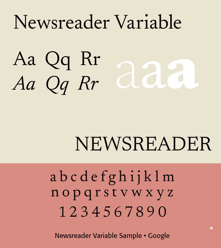
Newsreader
Newsreader is a contemporary, variable serif typeface designed for extended editorial reading. Its historical-looking forms, generous readability, optical sizing, and variable weights make it particularly appropriate for newspapers, magazines, books, essays, and long-form digital publishing.
Newsreader can be placed in the category of twenty-first-century digital editorial typefaces that reinterpret traditional book typography, alongside typefaces such as Source Serif, Literata, and Merriweather, while noting that Newsreader's variable optical-size capability makes it especially representative of contemporary variable-font design.
Newsreader belongs broadly to the tradition of transitional/old-style serif typefaces, but it is not a revival of one particular historical typeface. Its design combines characteristics associated with traditional book typography with proportions and details intended to perform well on modern screens.
Its overall personality is literary and editorial, quiet rather than decorative, classical but contemporary, highly readable, slightly humanistic, and particularly effective in long passages of text. It can therefore occupy a middle ground between traditional book type and contemporary digital typography. The typeface was conceived for situations in which people read substantial amounts of text rather than simply encountering headlines or short labels.
Its distinctive appearance can be attributed to serifs which are relatively restrained and integrated into the letterforms rather than being strongly ornamental, contrast which gives the typeface a traditional literary appearance, comfortable proportions, large x-heigh making it suitable for computer screens, and with subtle calligraphic influences.
Variable Newsreader
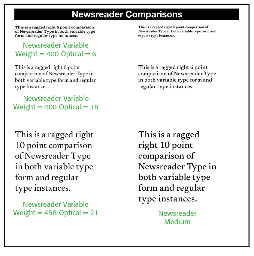
One of Newsreader's particularly important contemporary features is that it is a variable typeface. Its variable-font design allows the user to move along several axes, most importantly, Weight — from relatively light to bold, and Optical size — allowing the design to adapt to different sizes of text. This is significant because a typeface intended for reading needs to behave differently at 10–12 pt text than at 60 pt display size. Newsreader's optical-size capability allows its details to change as the type gets larger or smaller rather than simply scaling the same outlines.
Newsreader can be compared to more traditional typefaces, like Georgia, which is relatively sturdy and informal, serving well in early computer displays. Newsreader belongs to the later era of high-resolution screens and variable fonts. It can therefore pursue a more nuanced typographic vocabulary while still maintaining excellent reading performance.
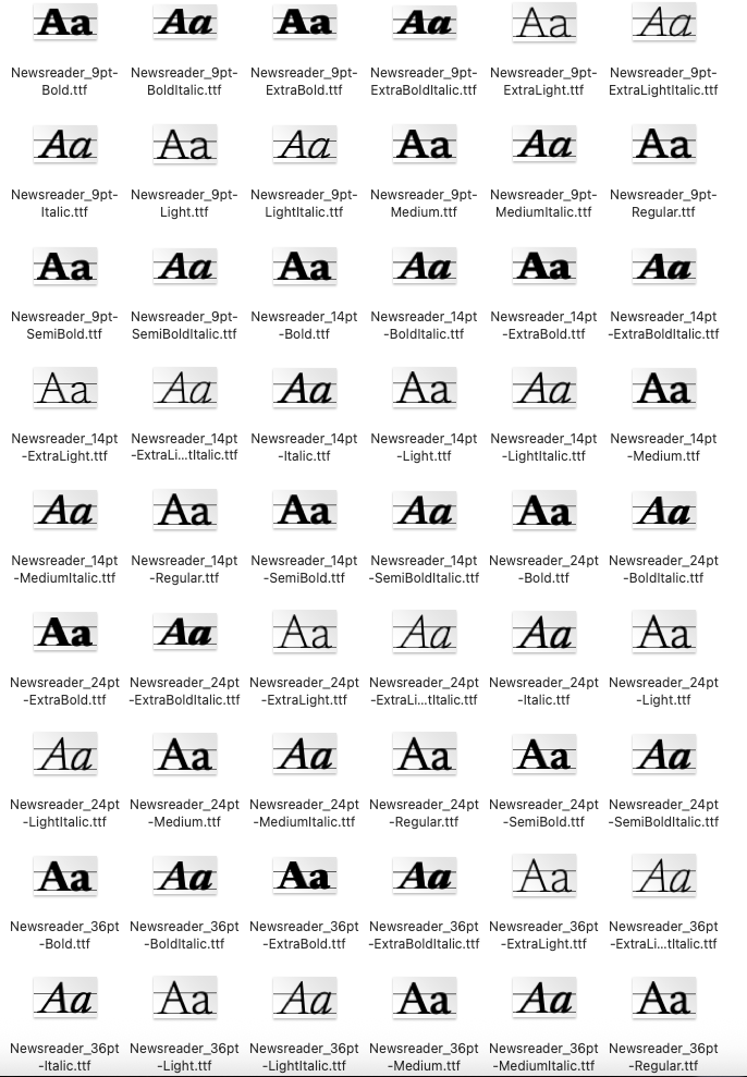
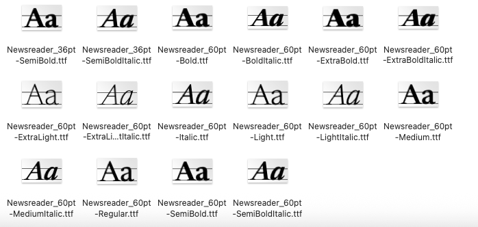
Newsreader 70 Static fonts range from Newsreader 9, 14, 24, 36, and 60 point bold to bold italic, to semibold and semibold italic, to extra bold and extra bold italic, to extra light and italic, to light and light italic, to medium and medium italic, to the standard regular and italic.(ILLS)
Good applications of Newsreader typefaces include newspaper articles, magazine articles, news websites, opinion pieces, publishing, books, essays, literary journals, cultural publications, digital websites, blogs, and institutional writings for museums, universities, cultural organizations, and historical publications.
Newsreader was recently used for Amodei’s Machines of Loving Grace about powerful AI and its possible future benefits, and CARE Typography’s A Typographer’s Pocket Guide for Users, Printers, Clients (Lulu, 2026).
Newsreader is a good example of the transition from traditional typeface design to responsive digital typography. It brings together historical serif conventions, contemporary type design, digital readability, variable-font technology, optical sizing, and editorial typography. In that sense, Newsreader is not simply “a new serif.” It represents a broader movement toward typefaces that can adapt to the circumstances in which they are read.
Roboto
Roboto is one of the most influential sans-serif typefaces of the digital era. Designed by Christian Robertson, it was developed by Google for the Android operating system and introduced in 2011. It subsequently became a major part of Google's Material Design system and one of the world's most widely used digital typefaces.
Roboto is a highly versatile contemporary sans serif designed by Christian Robertson for Google's Android platform. Its combination of neutrality, humanistic details, extensive weights, screen-oriented construction, and integration into Material Design made it one of the defining typefaces of early 21st-century digital typography.
It can be placed under Digital/System Typography, 2010s–present, alongside typefaces such as Open Sans, Source Sans, Inter, and San Francisco, with Roboto particularly notable as an example of a typeface becoming a global typographic system through an operating system and digital platform.
Roboto is a neo-grotesque/humanist-influenced sans serif. Its design attempts to combine the efficiency and neutrality of modern sans-serif typography with subtle humanistic qualities that make extended digital reading more comfortable.
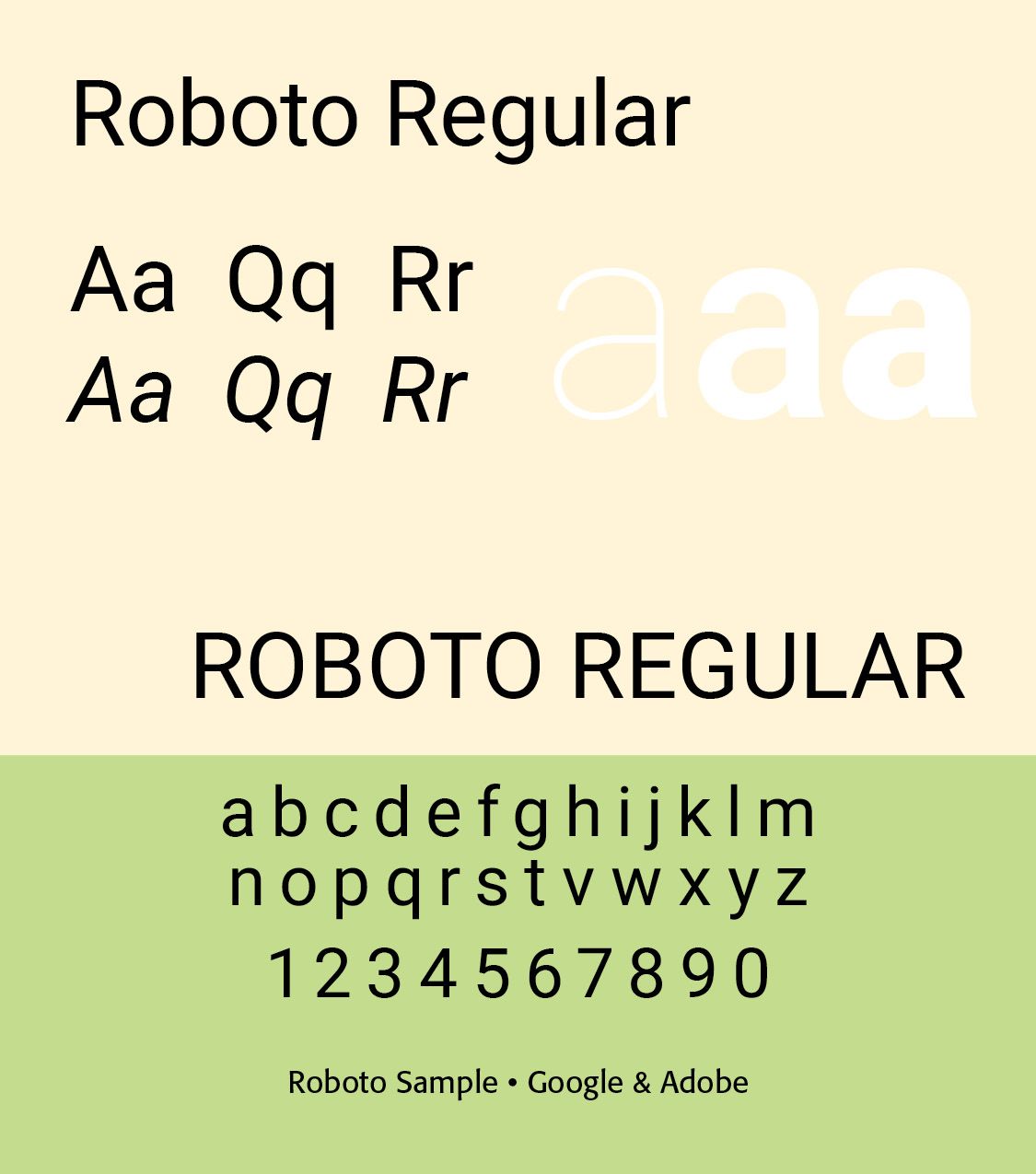
Its personality can be described as clean, neutral, modern, functional, approachable, highly legible, and technological without being futuristic. It was deliberately designed not to draw attention to itself. In many applications, Roboto functions as an infrastructure typeface—a typeface that allows information and interface design to take priority. Roboto was designed from the beginning for a world of smartphones, apps, interfaces, notifications, menus, digital screens, and responsive layouts. Roboto is the default typeface for Android. Roboto attempts to balance the purely geometric with the purely humanist.
Letterform characteristics include double-story lowercase “a,” open, readable counters, relatively open forms, distinctive curves, and numerals. Compared with Helvetica, the 1957 Helvetica is from the Swiss typographic style while Roboto is from the digital, interface typographic style. Helvetica has print-oriented origins, while Roboto has scree/interface origins. Helvetica is strongly neo-grotesque while Roboto is neo-grotesque with humanistic influences. Helvetica is corporate neutral while Roboto is digital/system neutral. Original Helvetica was designed for static type, while Roboto was designed for digital flexibility. (Note, however, the newer variable forms of Helvetica at myfonts.com)
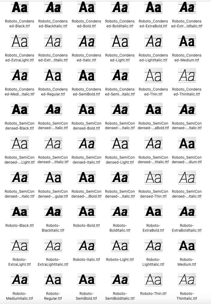
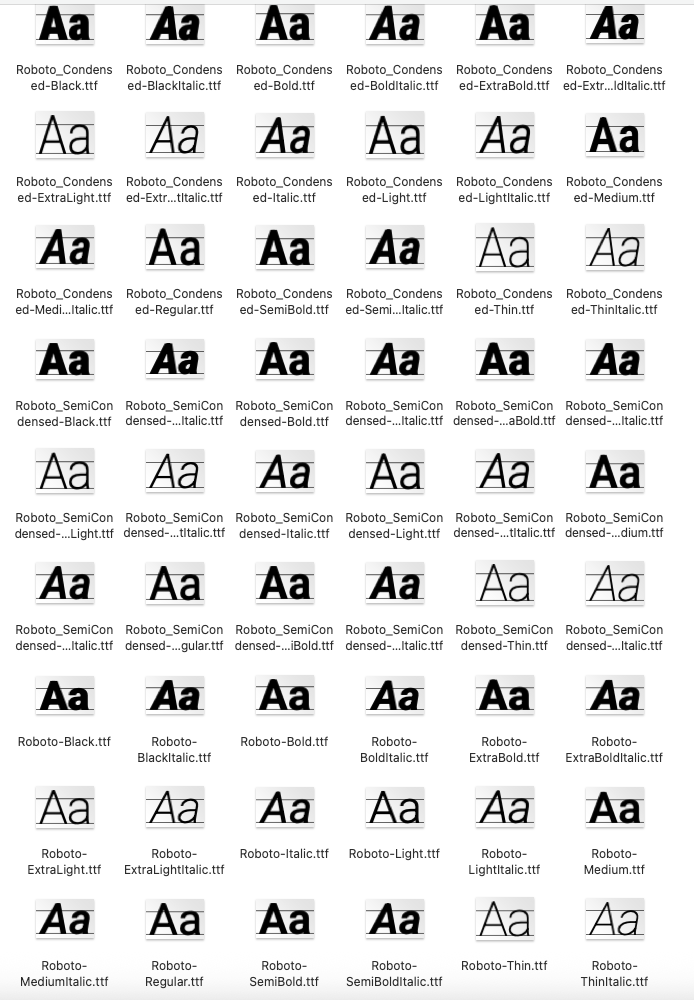
Roboto’s 48 Static Type Instances range from Roboto Condensed, Black, Black Italic, Bold, Bold Italic, Extra Bold, Extra Bold Italic, Extra Light, Extra Light Italic, Condensed Light, Italic, Medium, Medium Italic, Regular, Semibold, Semibold Italic, Condensed Thin and Thin Italic, Semi Condensed Black, Italic, Bold, Bold Italic, Light, Light Italic, Medium and Medium Italic, Regular, Bold, Italic, Thin, Black, Bold, Extra Bold, Extra Light, Light, Medium, Regular, Semi Bold, Thin and their Italics.
Variable Roboto
Roboto is a variable typeface with two axes — weight and width.
Instead of selecting only Regular, Bold or Black, a designer can potentially choose intermediate values appropriate to a particular screen, size, or design situation. Roboto is particularly effective for mobile apps, websites, operating systems, dashboard, software interfaces, charts, tables, signage-like digital displays and data-heavy layouts.
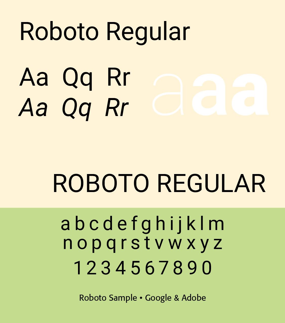
Its neutrality makes it extremely adaptable. However, its neutrality may make it feel generic, over-familiar, technological, corporate, or visually anonymous. If the purpose of a design is to communicate a strong historical, literary, luxurious, eccentric, or highly distinctive personality, a more expressive typeface may be preferable.(ILLS)
Where Helvetica became emblematic of twentieth-century corporate modernism, Roboto is arguably emblematic of twenty-first-century digital interface modernism.
Roboto is licensed under the SIL Open Font License, Version 1.1.
END PART 1
Successful Layout & Design