Advances in Typography: Twentieth Century A Historical Sketch (Part 2)
Mid-Century Modernism & Corporate Typography (1945–1980)
Designers like Jan Tschichold were foundational to many of the Swiss design principles. This style evolved from Constructivist, De Stijl and Bauhaus design principles, particularly the ideas of grid systems, sans-serif type and minimalism. Emerging in Switzerland during the 1940s and 1950s, this typography, also known as the International Typographic Style, directly responded to the type chaos of Dada and the stylization of Art Deco. The International Typographic Style (or the Swiss Style) in the 1950s and 1960s focused on grid systems, objective communication and sans-serifs. Key figures were Josef Muller-Brockmann, Emil Ruder and Armin Hofmann.
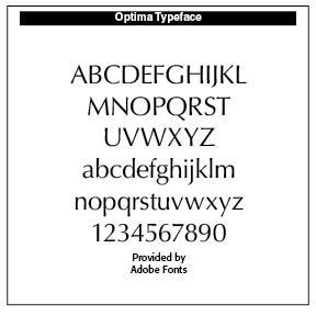
The Swiss style emphasized readability, visual harmony and universality. Clarity, objectivity and functionality were key components. Contributors included Max Miedinger, creator of the Helvetica typeface (1957 by Miedinger & Eduard Hoffmann), and Adrian Frutiger, creator of the Univers typeface in 1957, and Hermann Zapf, creator of Optima in 1958. Swiss style became the dominant graphic language of postwar corporate identity.
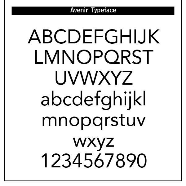
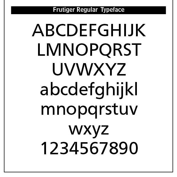
Other Blogs I have written noted the development of Helvetica (“Helvetica’s Journey” July 13, 2024). Adrian Frutiger (1928–2015) was a Swiss typeface designer whose career spanned hot metal, phototypesetting and digital typesetting eras. Frutiger’s most famous designs, Univers, Frutiger and Avenir, are landmark sans-serif families spanning the three main genres of sans-serif typefaces —neogrotesque, humanist and geometric.
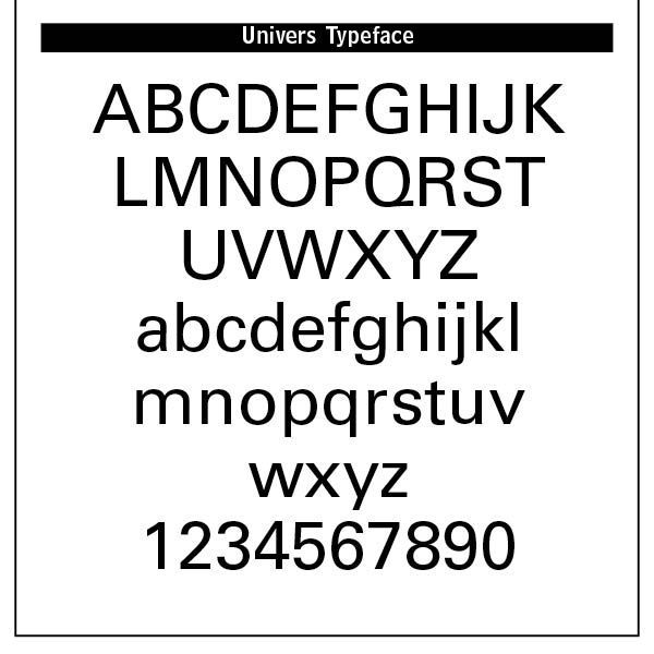
Univers is a clear, objective form suitable for typesetting of longer texts in the sans-serif style. Starting from old sketches from his student days at the School for the Applied Arts in Zurich, he created the Univers type family. Folded into the Linotype collection in the 1980s, Univers has been updated to Univers Next, available with 59 weights. This lasting legible font is suitable for almost any typographic need. It combines well with Old Style fonts like Janson, Meridien, and Sabon, Slab Serif fonts like Egyptienne F, Script and Brush fonts like Brush Script, Blackletter fonts like Duc De Berry, Grace, San Marco and even some fun fonts. Univers is not a “free” font and must be purchased from Linotype.
Other faces by Frutiger are Frutiger and Avenir. These fonts were designed to be legible, versatile and anonymous, avoiding stylistic “noise” to focus on clear communication. Swiss type used a systematized approach to typography, enabling consistent spacing, alignment and hierarchy, crucial for multilingual and complex layouts. Typography was seen as part of a harmonious, modern composition. Generous white space facilitated clarity and focus.
Swiss type used a systematized approach to typography, enabling consistent spacing, alignment and hierarchy, crucial for multilingual and complex layouts. Typography was seen as part of a harmonious, modern composition. Generous white space facilitated clarity and focus.
Hermann Zapf (1918–2015), a master of calligraphy and type design, produced enduring serif and sans-serif classics. His elegant letterforms influenced generations of designers. Zapf also pioneered early digital typography and computerized typesetting systems. Born in Nuremberg, Germany, his interest in lettering was sparked by a 1935 exhibition on Rudolf Koch, one of Germany’s great calligraphers. Zapf began self-teaching calligraphy using inexpensive pens and paper.
In 1938 he secured work as a retoucher at the Karl Ulrich & Co. printing firm in Frankfurt. Military service during WWII interrupted his career. After the war, Zapf resumed work as a calligrapher and book designer. Zapf was an early advocate for integrating computing into type design. He worked with Donald Knuth on the Metafontand TeX programs, and with computer scientists at Rochester Institute of Technology to develop digital typesetting systems. His work helped define the aesthetics and engineering of early digital fonts.
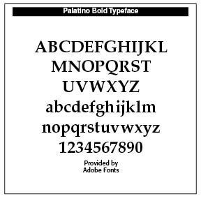
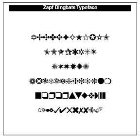
In 1947 Zapf joined the D. Stempel AG type foundry in Frankfurt. His exceptional skill in calligraphy and lettering led to a series of successful designs, including Palatino (1948–1950), a humanist serif influenced by Renaissance calligraphy, which became one of the most popular book typefaces of the twentieth century. Optima (1952–1955) is a serif-less Roman, somewhere between serif and sans-serif, inspired by stone-carved capitals in Florence, is widely used in corporate and monumental typography. Zapf Dingbats (1978) is a symbol and ornament set for ITC that became ubiquitous in early desktop publishing.
Mid-Twentieth Century: Phototype to Digital
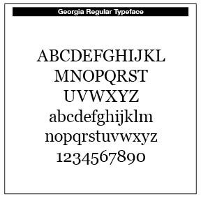
Matthew Carter (b. 1937). Matthew Carter was one of the most important type designers bridging metal, phototype, and digital eras. Verdana and Georgia (1996) were engineered for screen legibility in early computing. His serif Miller and Galliard are widely used in publishing. He also crafted the Charter typeface.
Born in London to a printing historian father, Carter was exposed to typography early. He trained briefly at Oxford University, then apprenticed as a punchcutter at Enschedé in the Netherlands under P. H. Rädisch—one of the last traditional punchcutting masters. This grounding in physical type making shaped his sense of proportion and detail. He designed for ITC and co-founded Bitstream in 1981, the first digital type foundry. He produced screen-legible fonts for Microsoft in the 1990s. He was awarded a MacArthur “Genius Grant” in 2010.
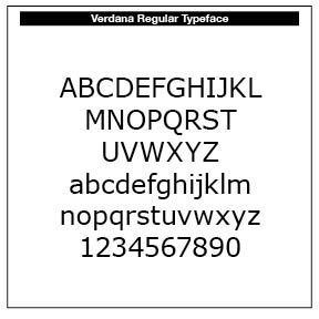
Verdana has large x-height and open forms. In the mid-1990s, most existing typefaces were designed for print, not screens. As part of its Core Fonts for the Web project, Microsoft commissioned fonts that would be highly legible even at small sizes, work well on low-DPI monitors (typically around 72–96 DPI), and improve the appearance of text in browsers, apps, and interfaces. Verdana was Matthew Carter’s solution to these design challenges in 1996, alongside Georgia (a serif companion font). SAMPLE
Georgia is a serif companion face, highly legible at small digital sizes. “Georgia is a serif typeface designed in 1993 by Matthew Carter and hinted by Thomas Rickner for Microsoft. It was intended as a serif typeface that would appear elegant but legible when printed small or on low-resolution screens. The typeface is inspired by Scotch Roman designs of the nineteenth century and was based on designs for a print typeface on which Carter was working when contacted by Microsoft; this would be released under the name Miller the following year. The typeface's name referred to a tabloid headline — "Alien heads found in Georgia." (Wikipedia) SAMPLE
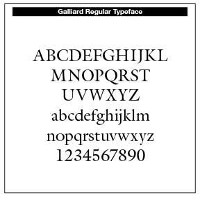
Galliard is based on the sixteenth-century type of Roger Granjon. According to Alexander Lawson, "The name Galliard stems from Granjon's own term for an 8-point font he cut about 1570. It undoubtedly refers to the style of the face, for the “galliard”was a lively dance of the period,” explaining what drew him to Granjon's work, Carter wrote on some of his more characteristic letterforms: "looking at them, adjectives like 'spirited, 'tense' and 'vigorous' come to mind...it is easy to admire Granjon's work." (Wikipedia) (SAMPLE)
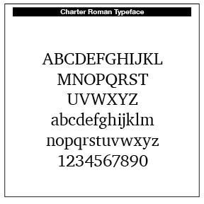
“Bitstream Charter is a serif typeface designed by Matthew Carter in 1987 for Bitstream. Charter is based on Pierre-Simon Fournier’s characters (SEE my Blog “More Fournier,” August 2025), originating from the 18th century. Classified by Bitstream as a transitional-serif typeface (Bitstream Transitional 801), it also has features of a slab-serif face and is often classified as such. Charter was originally optimized for printing on the low-resolution 300 dpi laser printers of the 1980s, and remains suitable for printing on both modern high-resolution laser printers and inexpensive lower resolution inkjet printers due to its strong, legible design.” (Wikipedia)
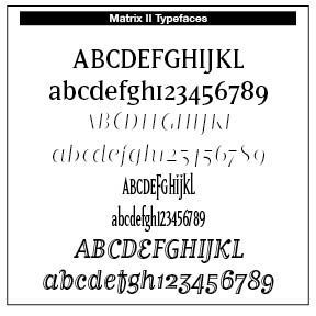
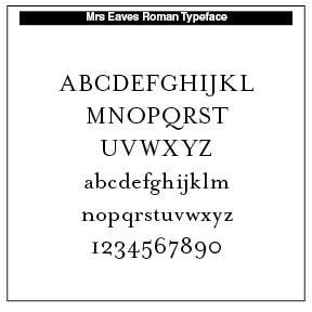
Zuzana Licko (b. 1961) is a Slovak-American co-founder of Émigré Fonts, and a pioneer of early digital type. Initially creating low-resolution bitmap faces, she later explored revivals and experimental forms. Her Mrs Eaves (based on Baskerville) became a major design trend in the 1990s–2000s. She studied at UC Berkeley, majoring in graphic design. She gained early access to personal computers (including the Apple Macintosh) and began experimenting with bitmap type.
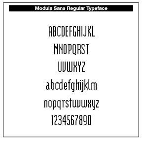
Major Typefaces include Matrix (1986), a hybrid serif designed on low-res Macintosh screens, Modula (1985), a geometric and modular face, Mrs. Eaves (1996), a humanist revival of Baskerville’s forms, and Filsofia (1996), a contemporary interpretation of Bodoni.
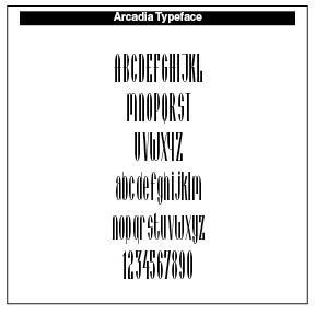
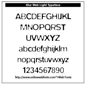
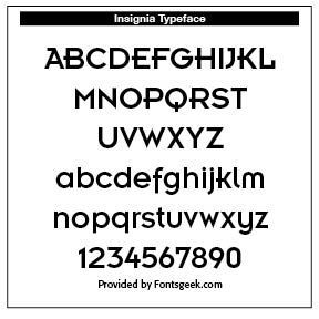
Neville Brody (b. 1957) is a British leading postmodern designer whose work on The Face magazine and various type families helped define the graphic look of the 1980s–1990s. He co-founded FontFont (1990) and pushed expressive digital typography into the mainstream. Brody studied at the London College of Printing (now London College of Communication). His early work was influenced by punk, Dada, and postmodern experimentalism. His layouts broke traditional grid systems, used expressive typography, and incorporated distressed and unconventional letterforms. He is known for Arcadia, FF Blur, Insignia and Typeface for Arena, The Face, and other magazines. Brody bridged expressive typography and global branding.
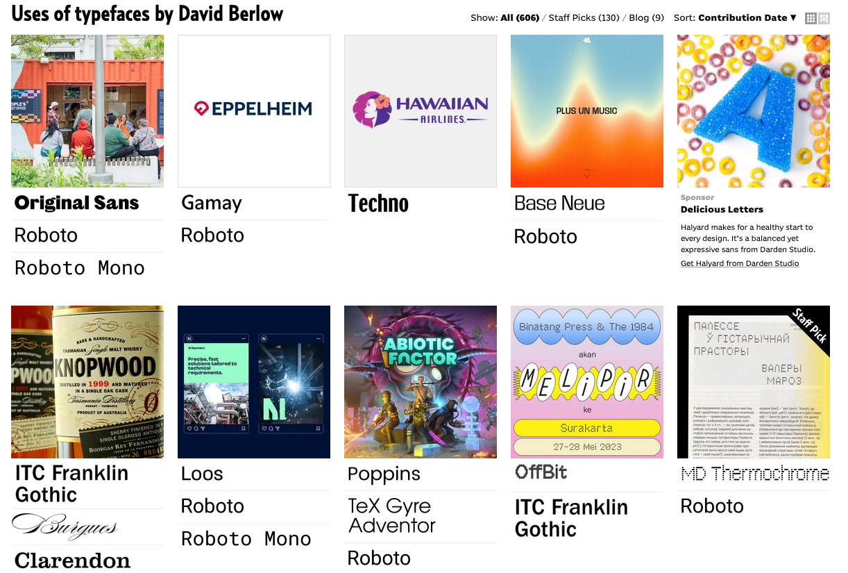
David Berlow (b. 1955) began his career at Mergenthaler Linotype in the late 1970s, working on digital type development. He later worked for the International Typeface Corporation (ITC). Berlow co-founded The Font Bureau (1989) with editorial designer Roger Black. Font Bureau became central to the typographic modernization of American newspapers, magazines, and media companies. Font Bureau has developed more than 300 new and revised type designs for The Chicago Tribune, The Wall Street Journal, Entertainment Weekly, Newsweek, Esquire, Rolling Stone, Hewlett Packard and others, with OEM work for Apple Computer Inc. and Microsoft Corporation. Berlow played a major role in digital type engineering, developing large, flexible font families, Digital Type Leadership, and is regarded as one of the most technically adept type designers of the digital era.
END PART 2
Successful Layout & Design


