More On The Greek Font
More on the Greek font. In a previous post (It's Greek To Me! March 18, 2023) we noted that Cursive Greek type appeared as a chancery script by Francesco Griffo in 1502 and lasted two hundred years. Robert Bringhurst notes that "chancery Greeks were cut by many artists from Garamond to Cason, but Neoclassical and Romantic designers . . . all returned to simpler cursive forms . . . in the English speaking world the cursive Greek most often seen is the one designed in 1806 by Richard Porson." This face has been the "standard Greek face for the Oxford Classical Texts for over a century." ( Robert Bringhurst, The Elements of Typographic Style, Hartley & Marks, Version 3.1, 2005, pp. 274, 278)
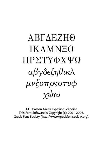
In fact, asking Google for the best Greek face to use, it points us to Porson Greek. Porson is a beautiful Unicode Font for Greek. It's not stiff, like many of the cleaner fonts, which are usually san serif. It is bold and easy to read and seems to more closely match the orthography in newer textbooks. (Jan 8, 2004)
In England, during the 1790’s, Cambridge University Press decided to procure a new set of Greek types. The university’s great scholar of Classics, Richard Porson was asked to produce a typeface based on his handsome handwriting and Richard Austin was commissioned to cut the types. The type was completed in 1808, after the untimely death of Porson the previous year. Its success was immediate and since then the classical editions in Great Britain and the U.S.A. use it, almost invariably. In 1913, Monotype released the typeface with some corrections, notably replacing the upright capitals suggested by Porson with inclined ones. In Greece the typeface was used under the name Pelasgika type. GFS Porson is based on the Monotype version, though using upright capitals, as in the original.
As we noted in our post on Fell Types, Oxford University Press used Porson's Greek typeface regularly and exclusively. In the Preface to The Oxford Book of English Verse, 1250–1900, by Arthur Quiller-Couch, a Greek quote is used. That quote is set in Porson Greek type.
What has interested me are the salient differences between the Porson type and succeeding Greek typefaces in the digital world. Note the insert from The Oxford Book of English Verse in different Greek faces.
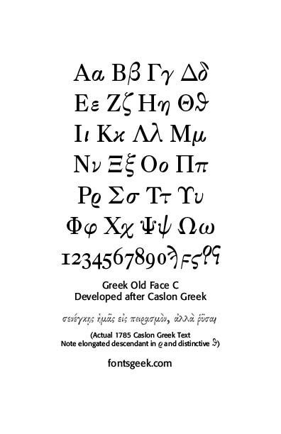
The Englishman William Caslon punchcut many roman, italic, and non-Latin typefaces from 1720 until his death in 1766. At that time most types were being imported to England from Dutch sources, so Caslon was influenced by the characteristics of Dutch types. He did, however, achieve a level of craft that enabled his recognition as the first great English punchcutter. Caslon's roman became so popular that it was known as the script of kings, although on the other side of the political spectrum (and the ocean), the Americans used it for their Declaration of Independence in 1776. (myFonts.com)
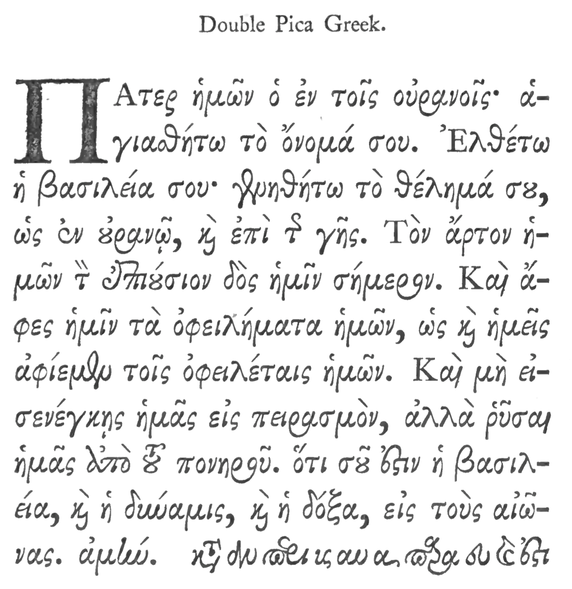
Caslon's Double Pica Greek Sample. Note the flowing cursive style and the Greek's rho elongated descenders.
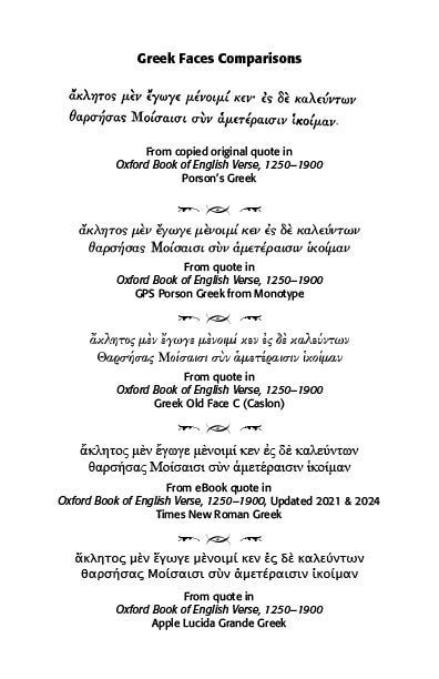
Lucida Grande's Greek can be found in all Macintosh X systems. It looks like Lucida sans, but has more glyphs.It covers Roman, Cyrillic, Hebrew, Arabic, Thai and Greek. Many of its 2800+ glyphs were added by Michael Everson to the original collection.
Many use the standard Times New Roman Greek lettering, as in the eBook version of The Oxford Book of English Verse. Older Macs, with the original LaserWriter, provided Symbol as a Greek font. "Symbol (often written as Σψμβολ in typeface) is one of the four standard fonts available on all PostScript-based printers, starting with Apple's original LaserWriter (1985). It contains a complete unaccented Greek alphabet (upper and lower case) and a selection of commonly used mathematical symbols. Insofar as it fits into any standard classification, it is a serif font designed in the style of Times New Roman. Due to its non-standard character set, lack of diacritical characters, and type design inappropriate for continuous text, Symbol cannot easily be used for setting Greek language text, though it has been used for that purpose in the absence of proper Greek fonts. Its primary purpose is to typeset mathematical expressions."(Wikipedia,https://en.wikipedia.org /wiki/Symbol_(typeface))
Successful Layout & Design


