Free Fonts: A Deal or Trouble?
Free Fonts: A Deal or Trouble?
The latest Google estimate of available fonts is over 300,000 and counting. Other estimates have catalogued over 550,000 fonts. There are over 36,000 font families, over 4,000 type designers and over 2,700 professional font foundries, not counting smaller font entrepreneurs like CARE Typography, which provides restored fonts from yesteryear. (Quora source https://www.quora.com/How-many-fonts-are-there-in-existence-Does-any-group-attempt-to-keep-a-record-of-all-the-fonts-that-exist)
There are commercial fonts from sources like Adobe and MyFonts (Monotype) which require payment for their use in various platforms. Both provide a subscription service, which usually requires a substantial monthly or yearly fee to download and use their fonts. When I began using Apple Macintoshes in the 1980s, font manufacturers like Adobe and Monotype would “sell” the right to use a number of their fonts for thousands of dollars. And, by the way, you never really “own” the font. You have paid only for the use of the font for a specific purpose or machine. Moreover, the price varies for print use, or web use, or a digital ad use. Even today, the font Trinité Titling by Bram de Does, used in a number of Bibles and biblical studies, costs over $4,000 for the use on a single computer and much more for a number of computer users. Individual users of such fonts are mostly priced out of their budget.
Why the seemingly extravagant cost? We had a valve on one of our household plumbing lines go bad. I called the plumber, and he replaced the valve — at a cost of several hundred dollars, while the valve itself cost only a few dollars. Was that fair? Yes, because I was paying for the time and training and effort going into replacing that valve in my house. The same holds true for professional font designers. They spend hundreds, sometimes thousands, of hours in font development. We are paying for their livelihood.
Font licenses cover four basic parameters around font usage — “The What: The weight and style of the typeface; The Where: Literally where you’ll use the font – a website, digital ad, or in print; The Who: The number times a font can be installed on a computer (aka the number of people who can use it); The How many: For example, web font licenses describe the number of allotted page views, and app and digital marketing licenses set similar parameters.” (Monotype Report) Companies like Monotype are rarely concerning with an individual using a font for a home, individualized project, but rather an entire design company or printer using that font for commercial gain and advertising dollars.
There are fonts available “for personal use only,” prohibiting their use for commercial or money-making projects. There are what have been called “shareware” fonts, fonts with a minimal cost which require attribution of the type designer or provider on projects. Most fonts provide a EULA, or font license, which outlines and determines the legal restrictions and ramifications for their use.
What about free fonts?
Monotype warns against using unlicensed or what are called “free” fonts for several valid reasons, but, in my opinion, this is an obvious ploy to get the user to buy or subscribe to their font services. One Monotype report cites six issues associated with what are deemed “free” fonts. Free fonts may pop up in similar ads or designs to industry competition, perhaps prompting a lawsuit or cease-and-desist actions. Free fonts often have the inability to scale, add special characters, or even different alphabets. Free fonts have limited creative scope. They may be saddled with malware or software viruses. Poor font design can be a problem with such fonts. A sixth problem with so-called free fonts is that they can be actually “pirated” fonts, copied from legitimately designed fonts.
“Aside from branding issues, free fonts also suffer from a whole host of performance issues. Fonts are software files that interact with applications and the operating system on which it’s installed; without the guidance of a skilled font engineer, rendering issues may arise from crashing glyphs, or a lack of proper kerning (the space between glyphs) text in certain scenarios. A free font downloaded from a random website might not support a broad range of languages and or complex scripts (e.g., Japanese or Arabic), or basic diatrics to cover commonly used Latin languages.” (Monotype Report)
Monotype maintains that free fonts won’t give a company the individual style it deserves to help it stand out in the marketplace. They also point to the legal ramifications involved with font licensing, not a glamorous subject but one in which company attorneys are hired to examine for possible litigation.
Erik Spiekermann, an acclaimed typographer from Germany, notes this in his book Stop Stealing Sheep: Find Out How Type Works, Grafiche Antiga, Crocetta del Montello, Italy, 2022 (available in PDF format) — "Some sites offering free fonts are run by people who do have enough spare time to "make" their own fonts and give them away, and those may actually resemble the originals that inspired them. But don't expect those fonts to be produced to professional standards. They will often lack a full character set, the outlines are usually badly drawn, hinting is automatic at best and there is no guarantee that the fonts will show up in all browsers or print properly. You get what you pay for. Or don't, as it were." (p. 97)
Types of Free Fonts
There are four sources of free fonts — Open Source fonts with an SIL Open Font License (SEE https://openfontlicense.org); OS fonts, fonts that come with your operating system and hardware; Subscription add-on fonts that come as an add-on to a subscription service; and, advertised free fonts by independent font designers, such as CARE Typography. Many or most of such free fonts come from freeware, shareware, public domain or demo fonts downloaded or reconstructed from an archive or library, like Internet Archive.
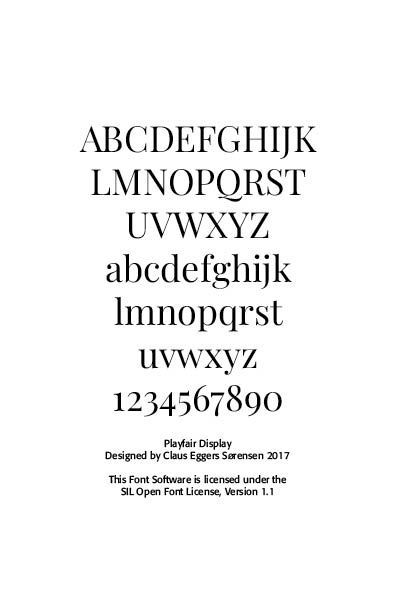
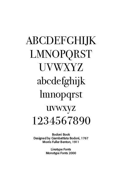
Companies such as Website Planet offer free “commercial” fonts, fonts that can be used in business and corporate applications. See https://www.websiteplanet.com/blog/best-free-fonts/. Several cautions, however, are still in order here. First, a font that “looks like” a standard, business font is not the same thing as its “older brother.” An example is Website Planet’s Playfair Display font, both a variable and static font designed by Claus Eggers Sørensen licensed under the SIL Open Font License agreement. Yet, this font looks a lot like the standard Bodoni font, created by Giambattista Bodoni in 1767 and revived by Morris Fuller Benton in 1911 under Linotype’s commercial license.
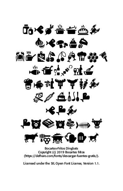
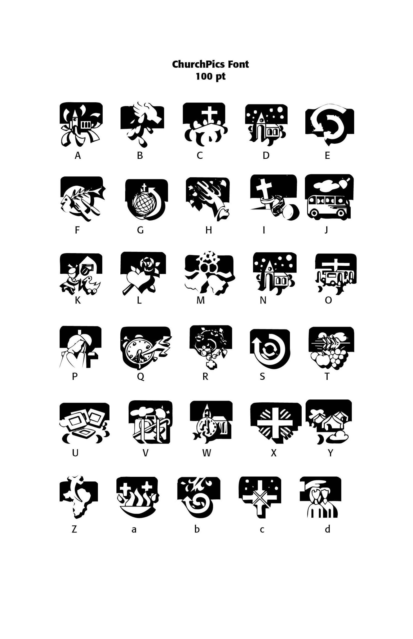
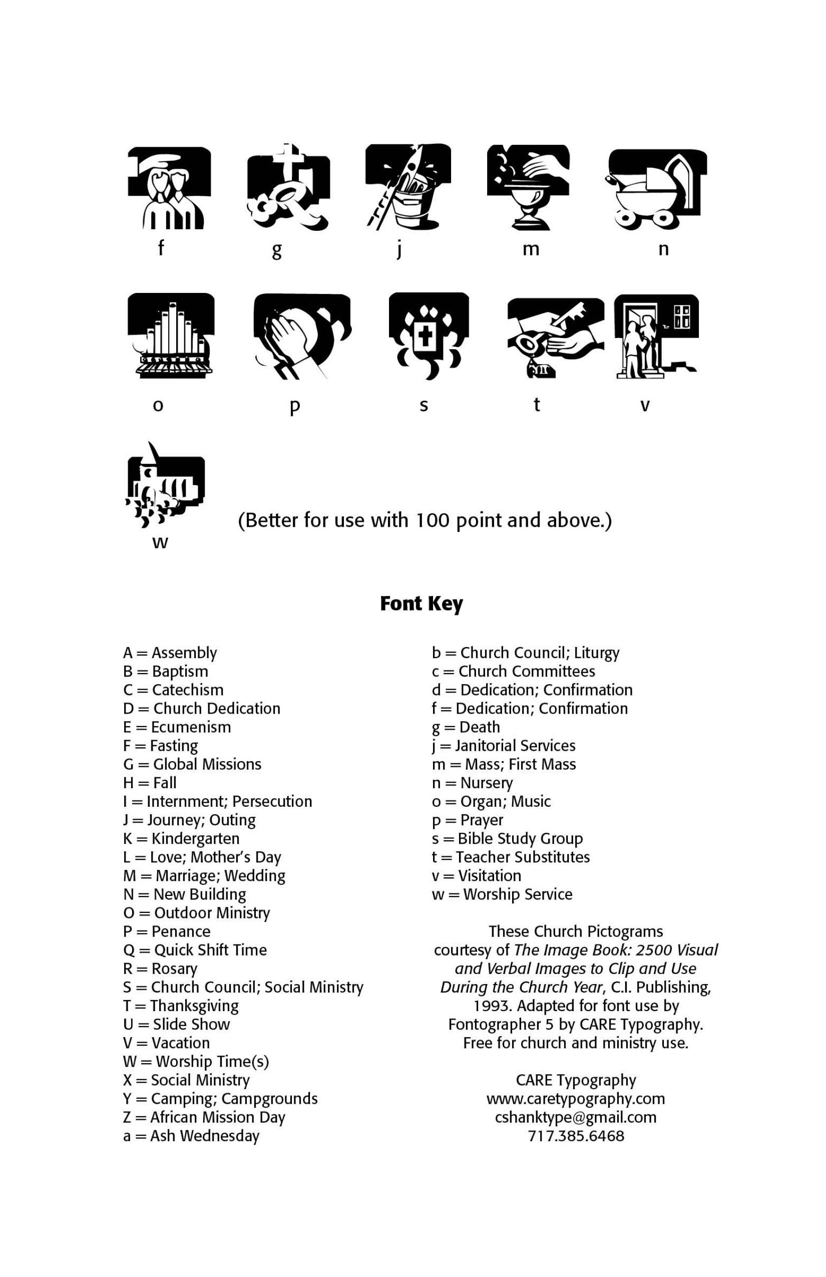
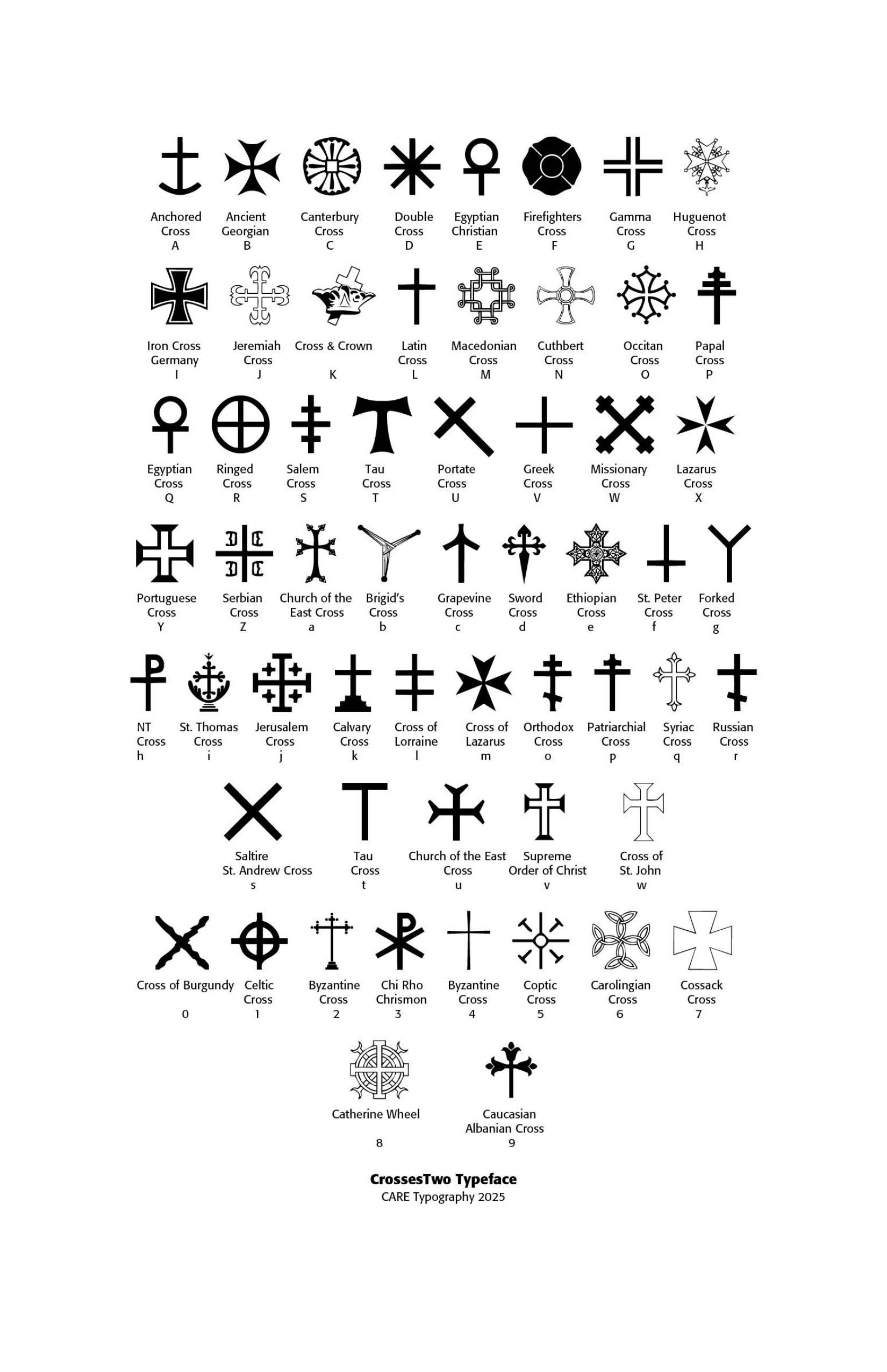
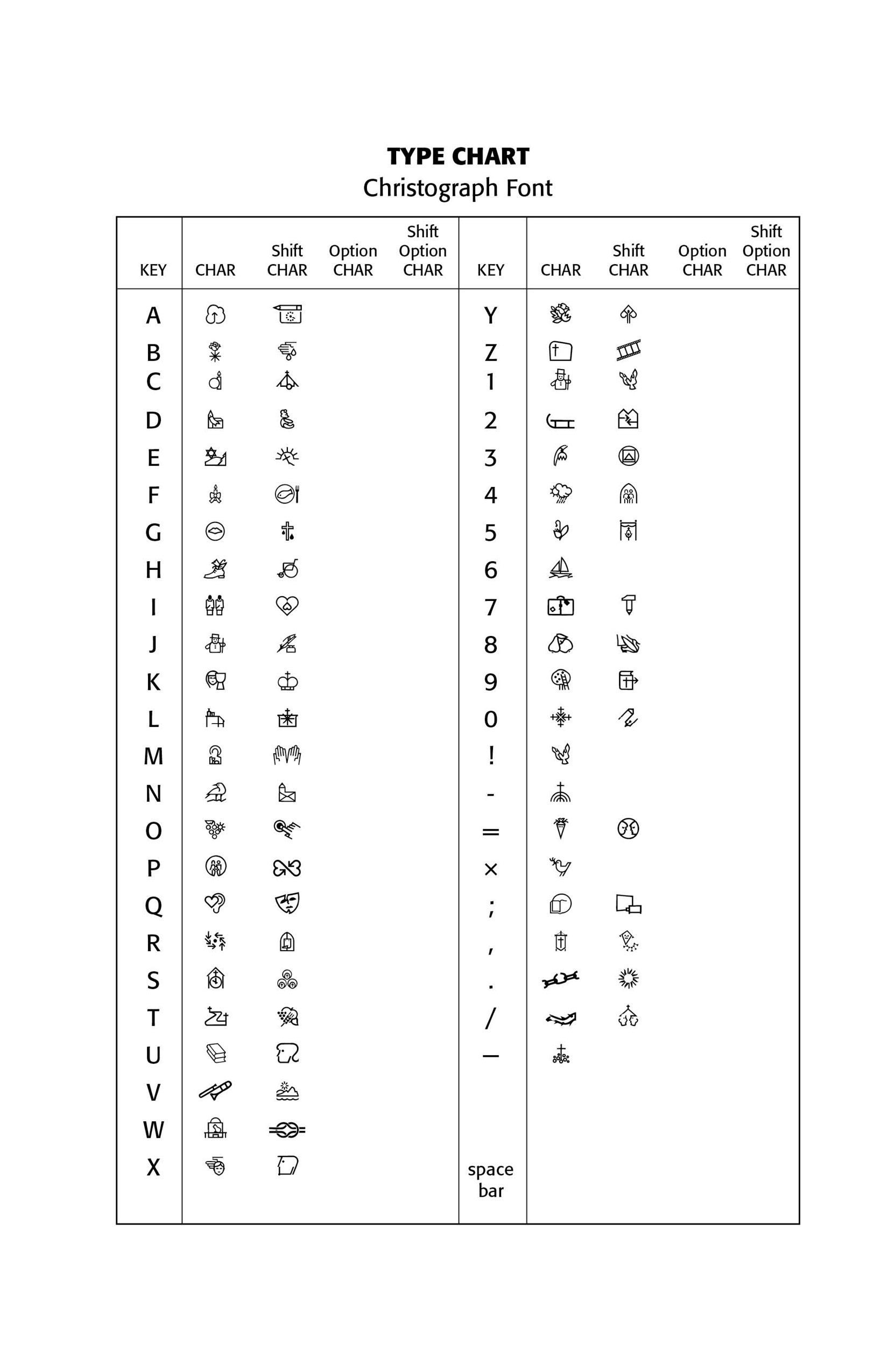
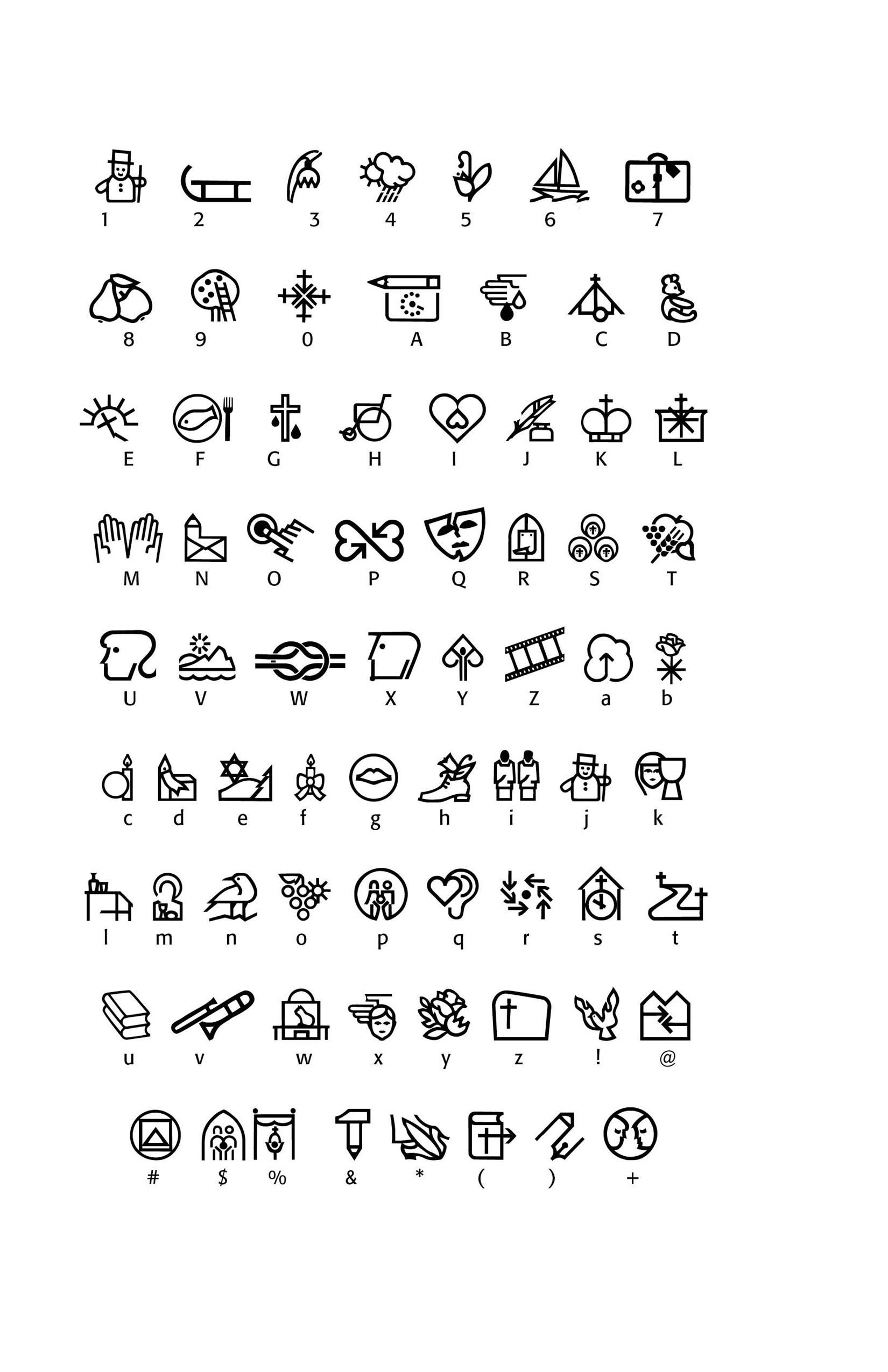
The problematics of free fonts can also be seen in what are called Dingbat fonts, which are picture fonts, or symbol fonts, like Website Planet’s Bocartes-Fritos Dingbats font, a playful, symbol rich dingbats font. Using this font for illustrative purposes in planning picnics or announcing fun and games may seem commercially useful. However, the symbols themselves may be under copyright by someone else.
Free fonts are limited in use and application, mostly for personal, individual projects or single use applications such as test environments, utility fonts for billing statements, invoices, official letters or in-house labeling. Other uses include wedding and event invitations, announcements, church and non-profit bulletins and so forth.
Monotype and other foundries argue against using free fonts as “branding” for consumer-packaged goods. They maintain that fonts are an integral and important part of building trust and recognition. They also argue that free fonts make it easy for phishing attacks on the general public. No doubt, Monotype wants type users to subscribe to their vast array of fonts and buy their use for different applications. Such fees can amount to a lot of money for a single use product or application. Of course, they would contend that such purchasing guarantees ethical licensing and use of fonts. It may also protect a small company against legal liabilities.
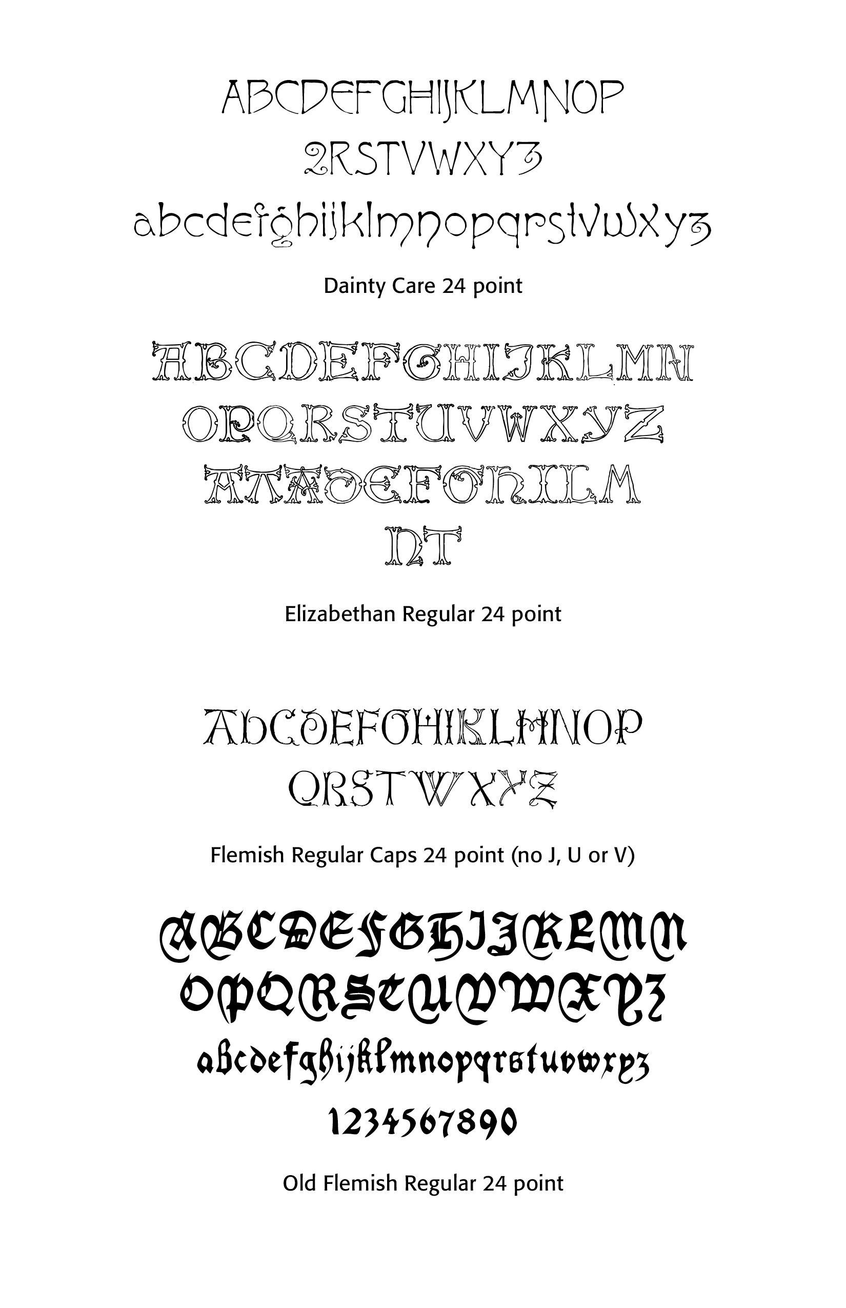
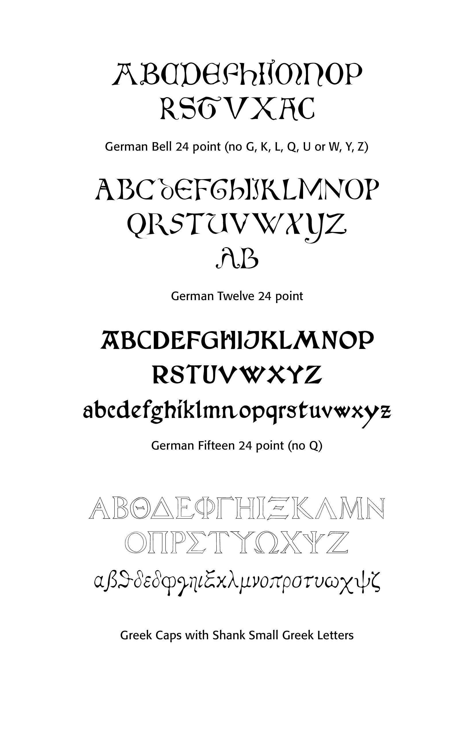
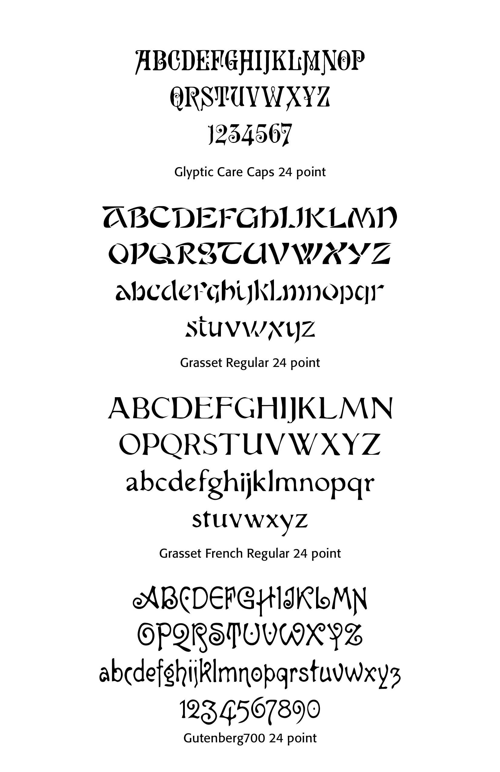
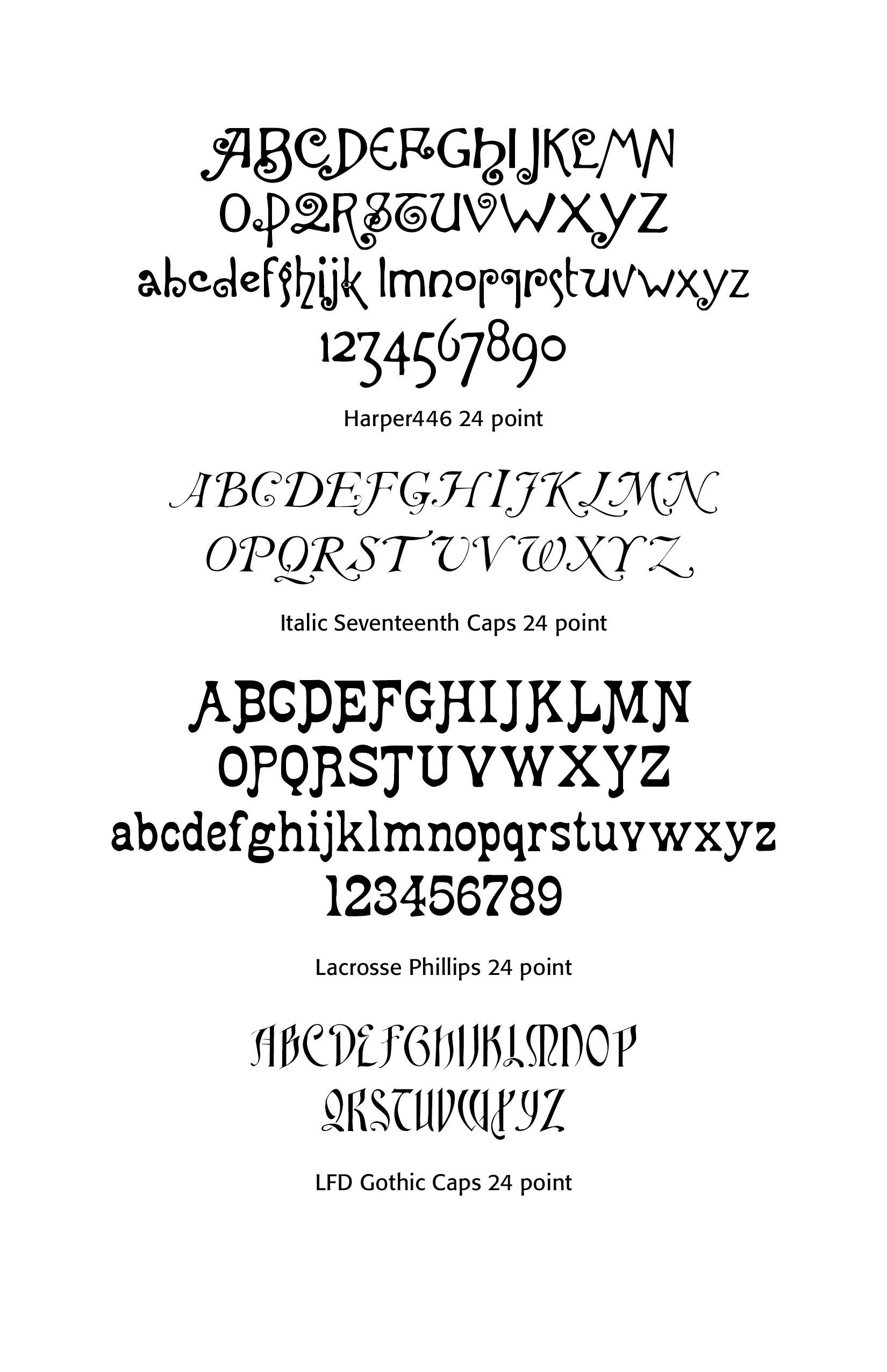
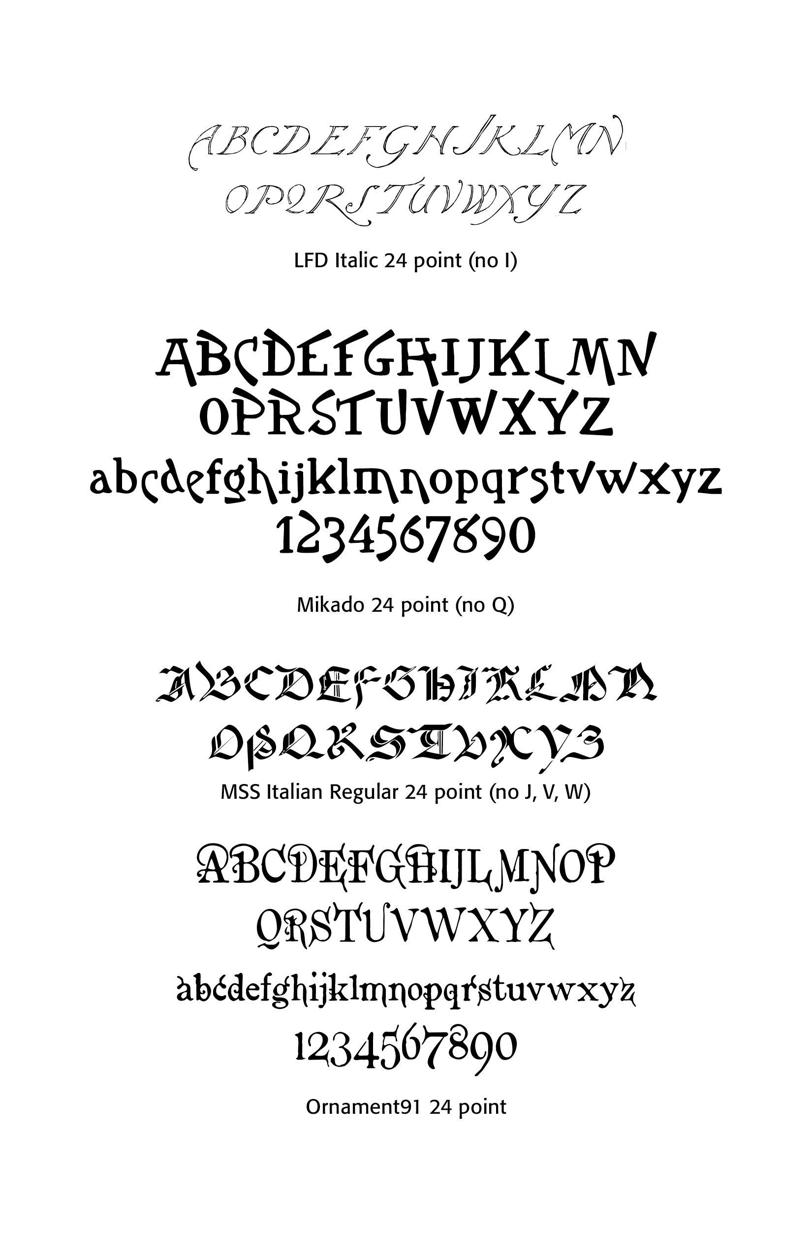
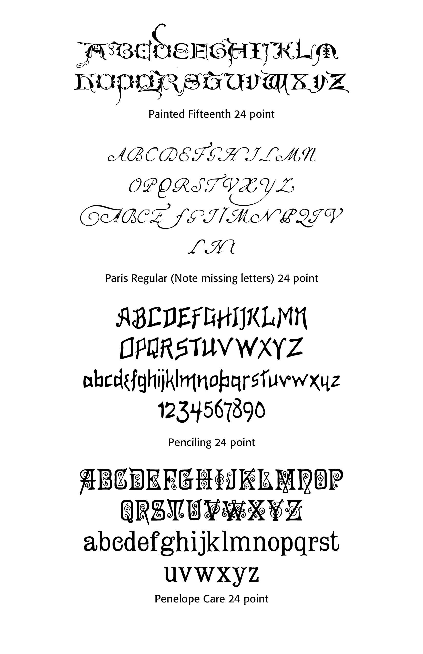
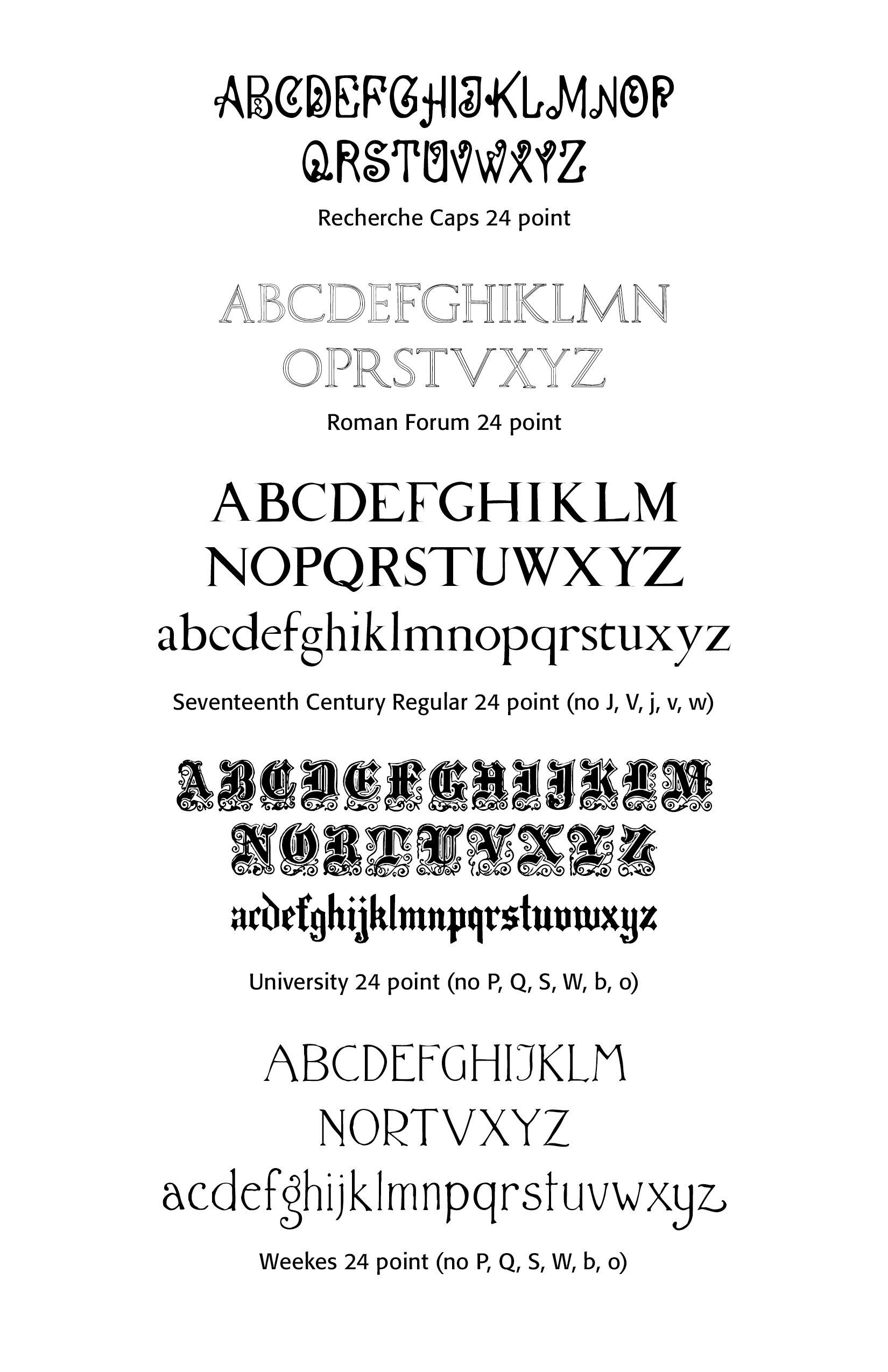
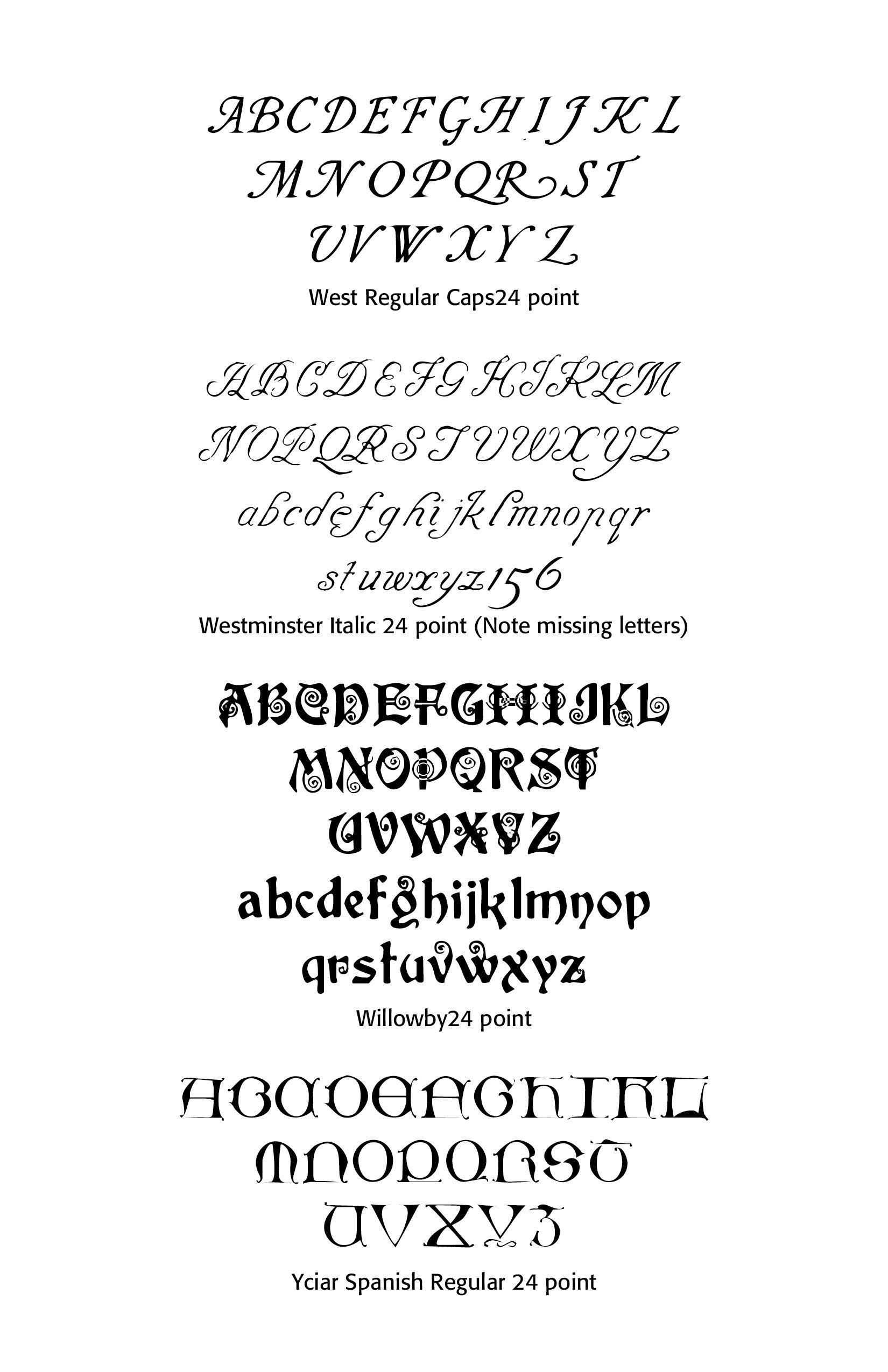
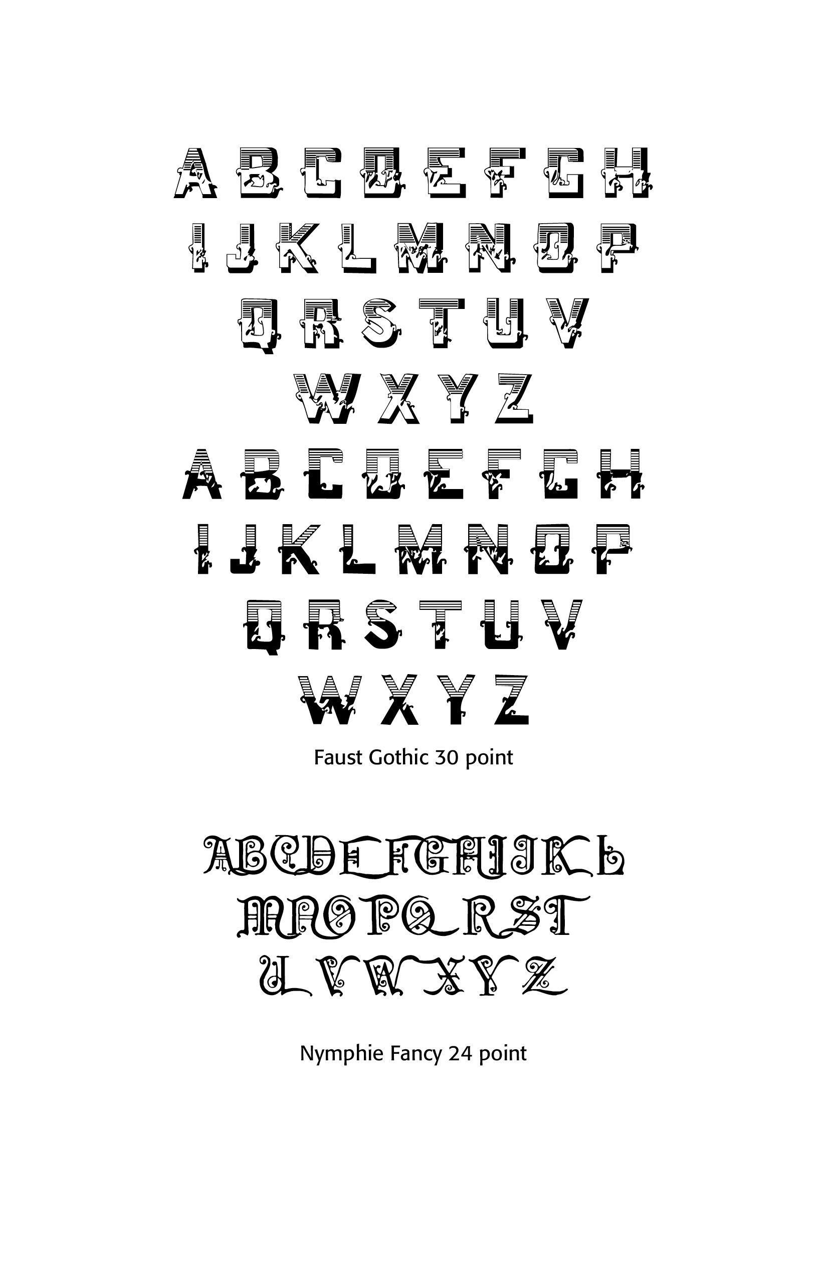
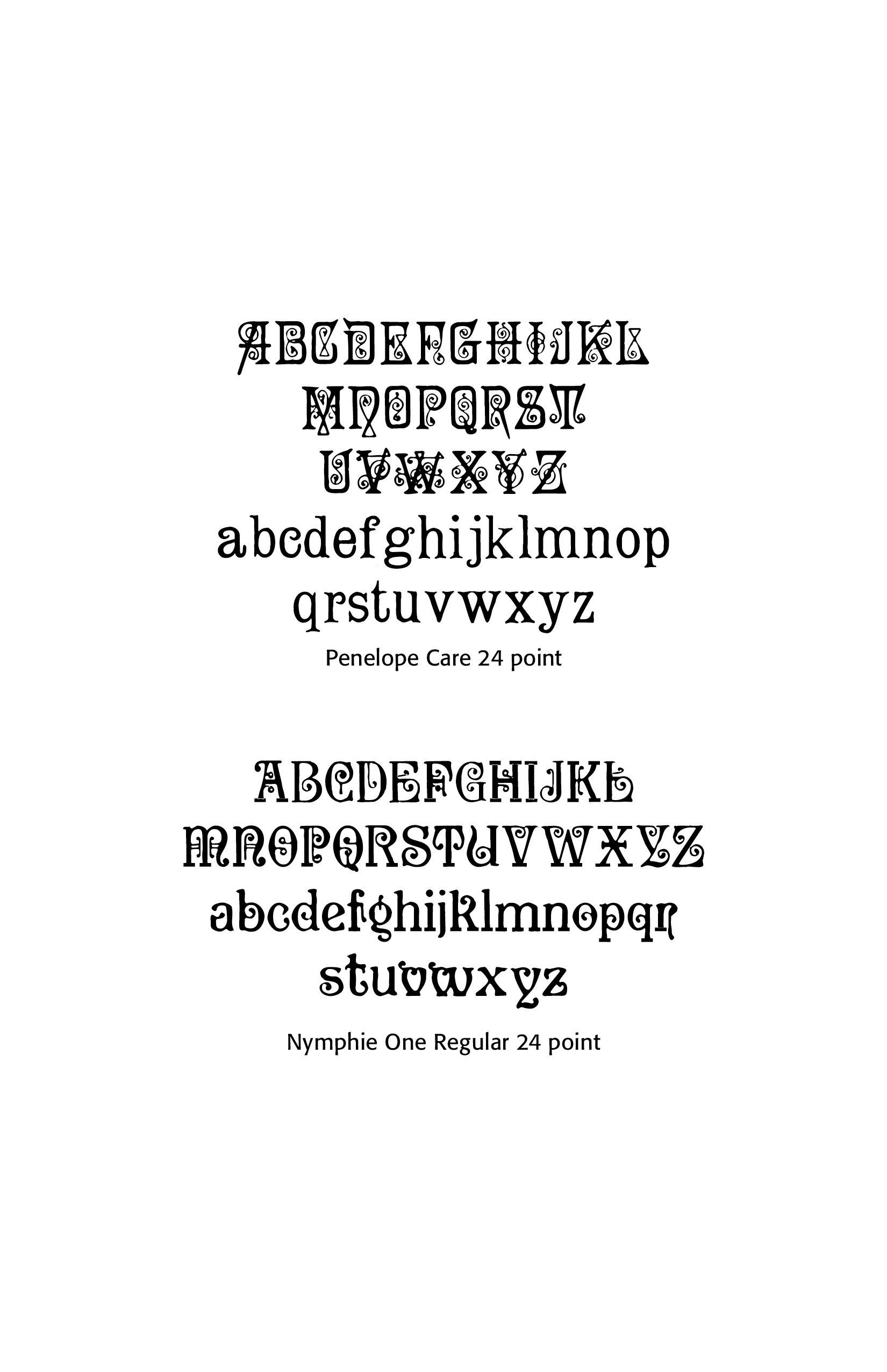
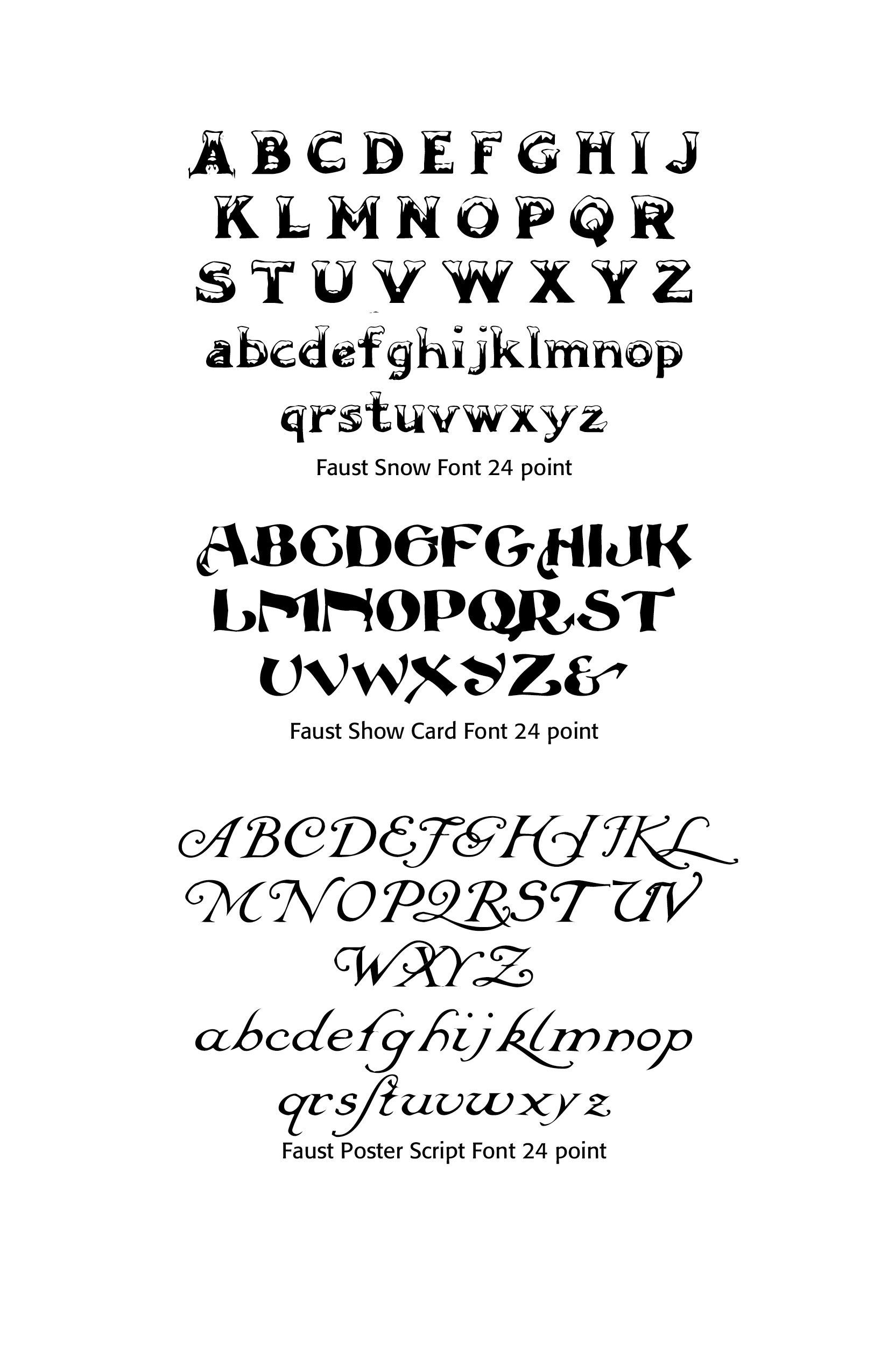
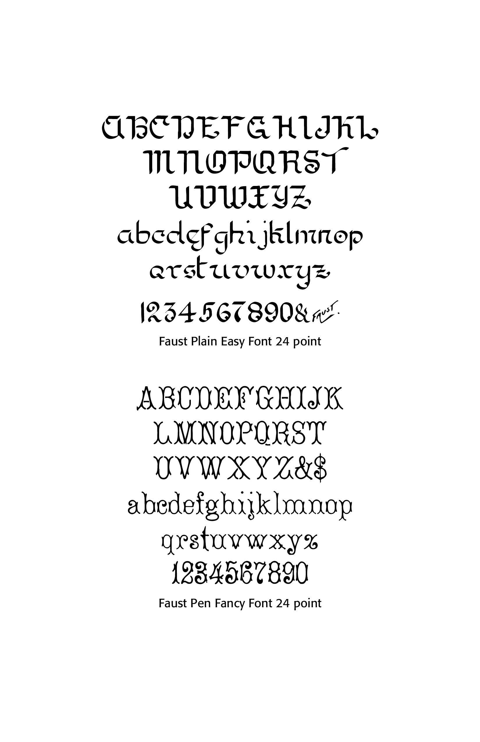
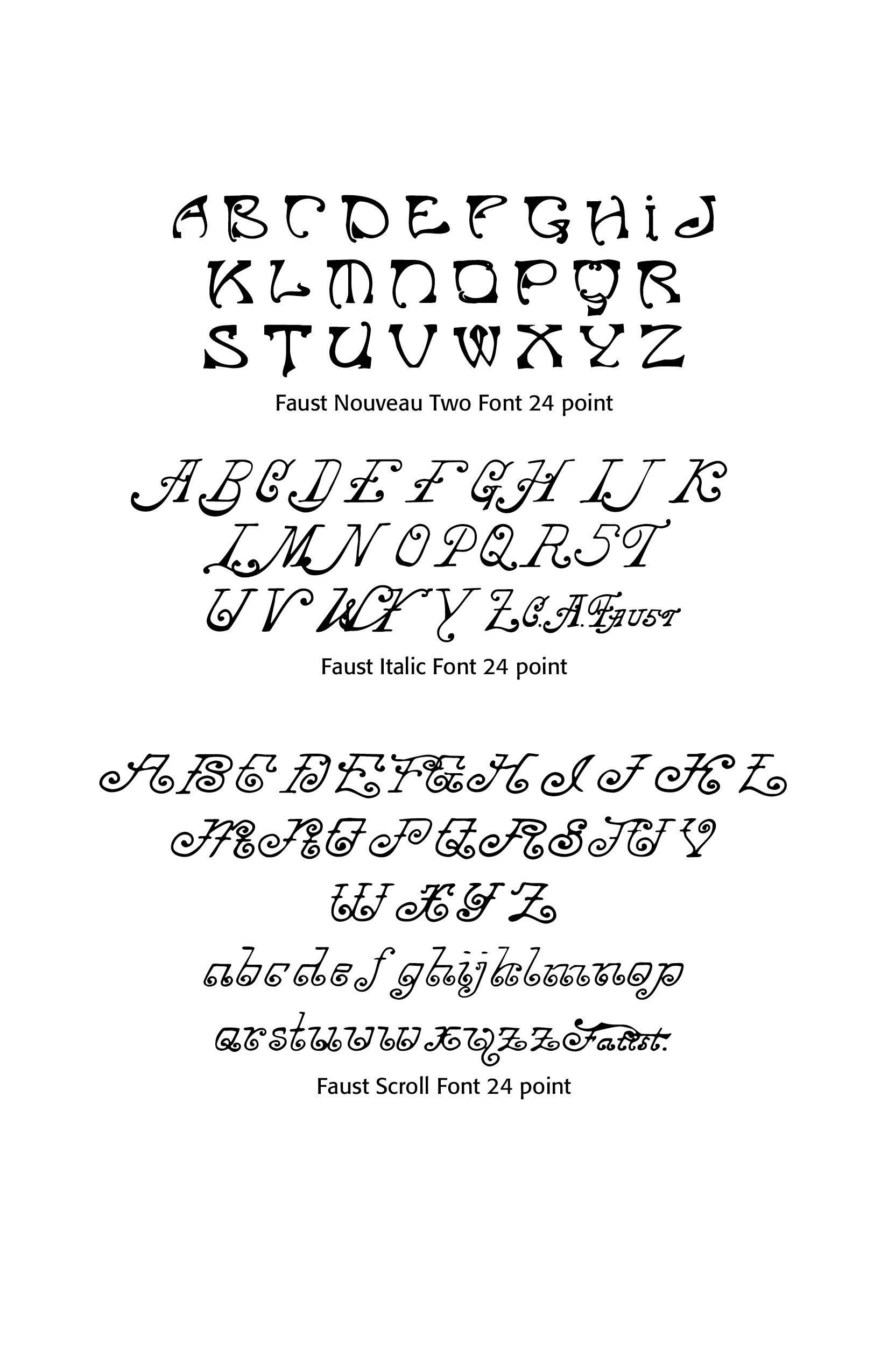
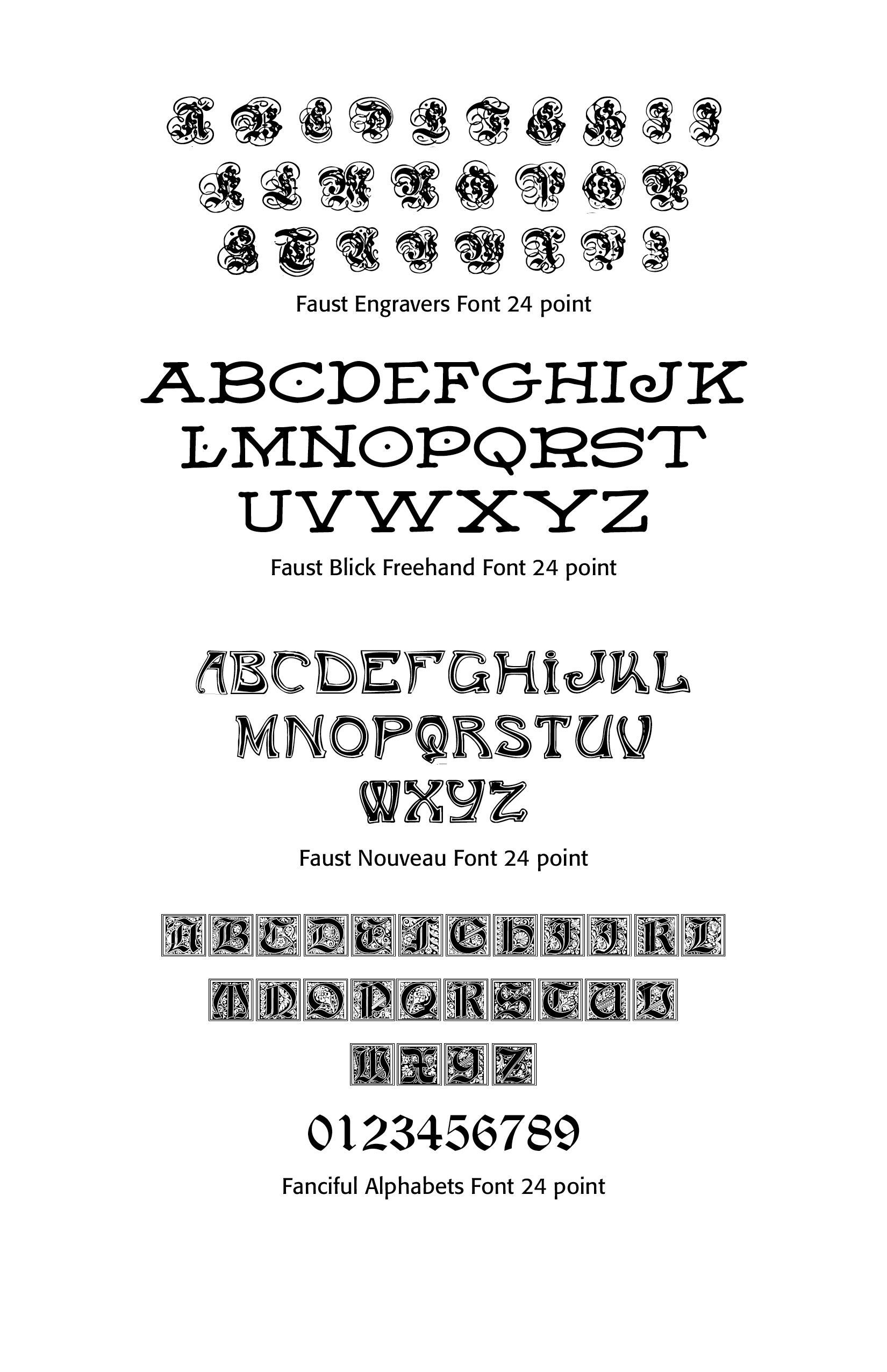
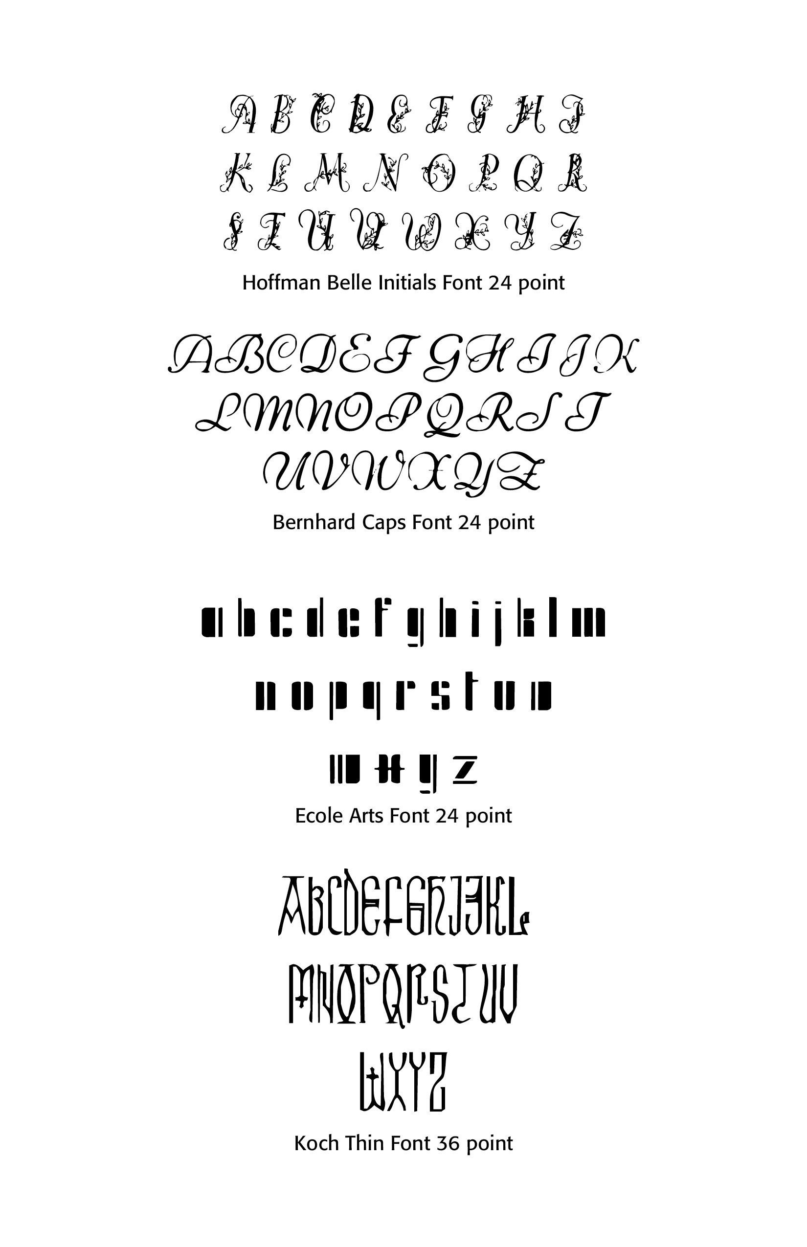
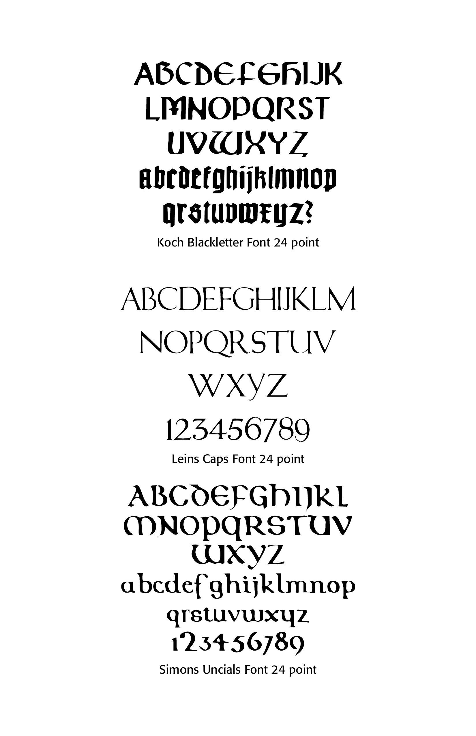
Using CARE Typography fonts. Many of the fonts advertised by CARE Typography are free to the user. Some of the fonts have a small handling fee. While I respect Monotype's cautions and warnings cited above about free fonts, a couple of clarifying notes are in order about CARE fonts.
Most are not for normal text use. Many of these restored fonts come from old pen-drawn fonts now long outdated in the regular marketplace. Some of them have missing letters, not due to our carelessness but what was available to digitize. Use trusted (even Monotype's) textual fonts for readability, proper kerning and licensed for use.
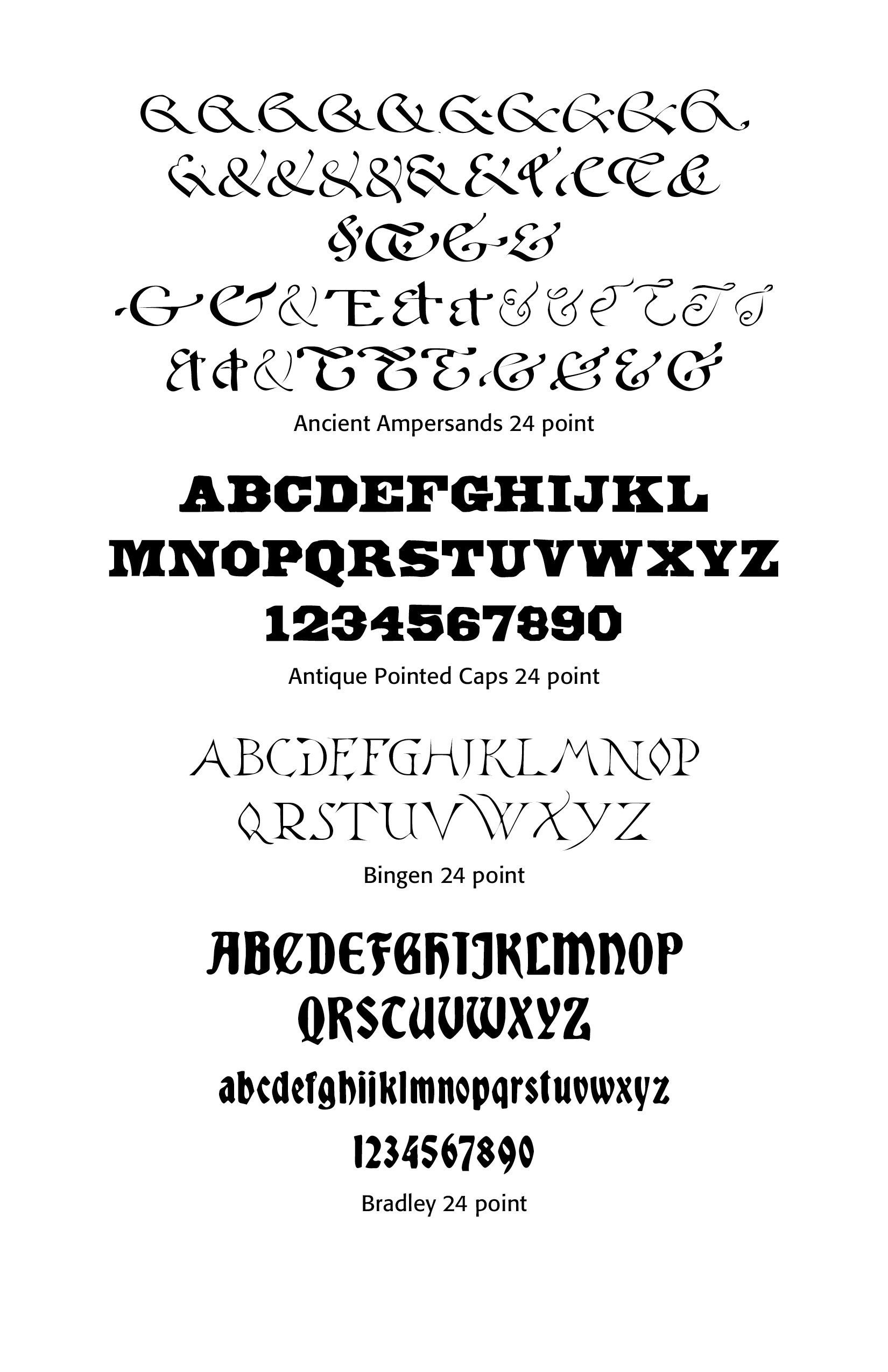
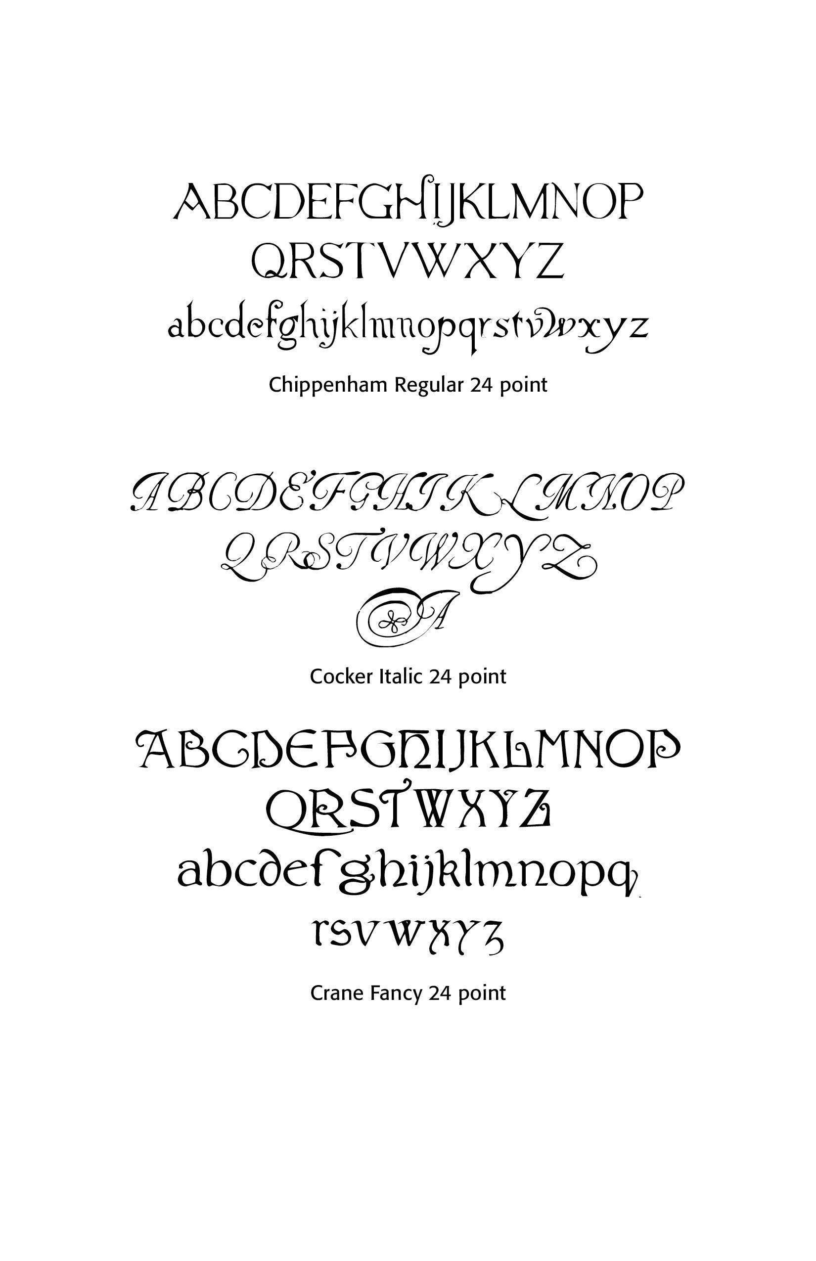
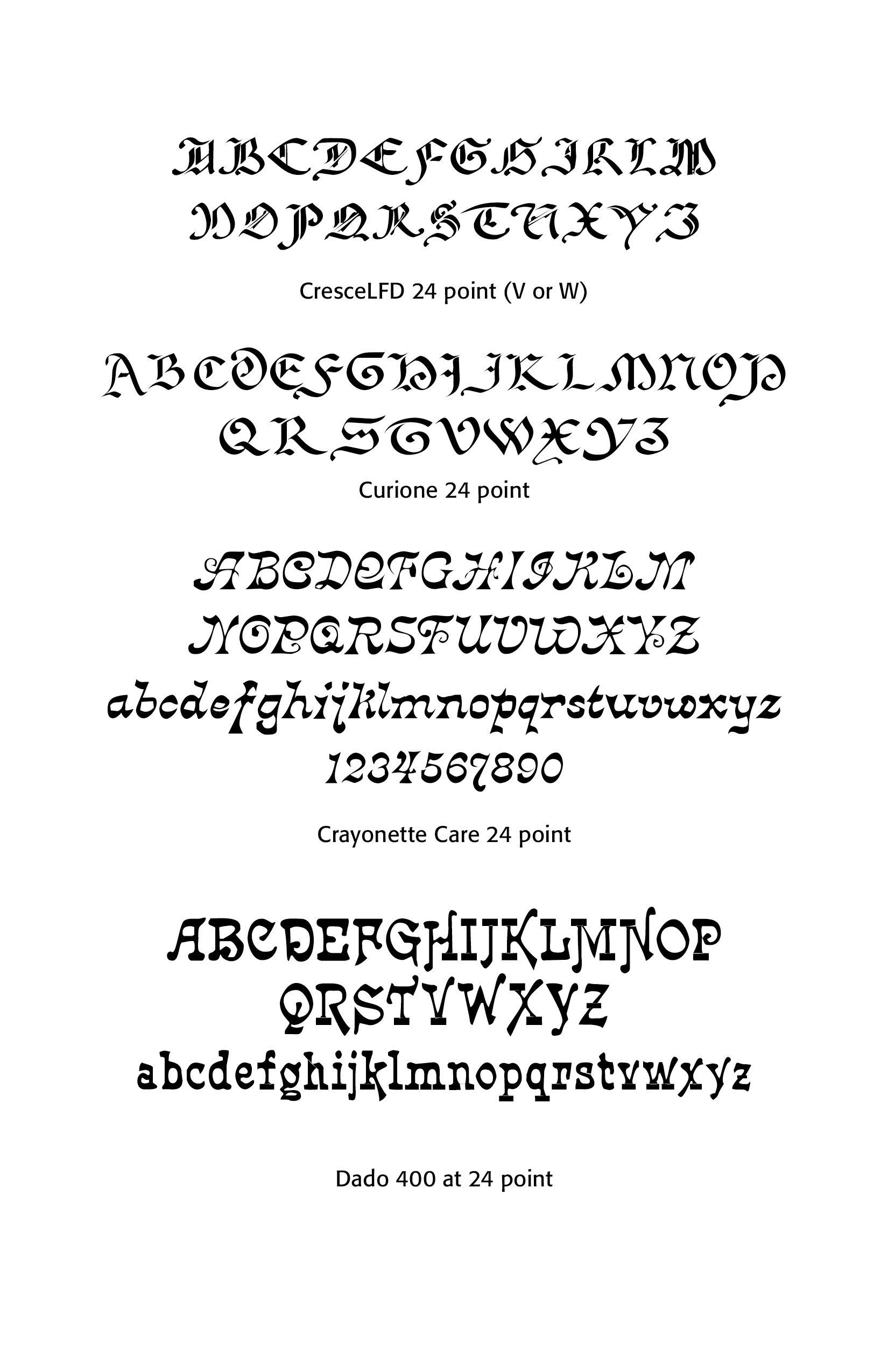
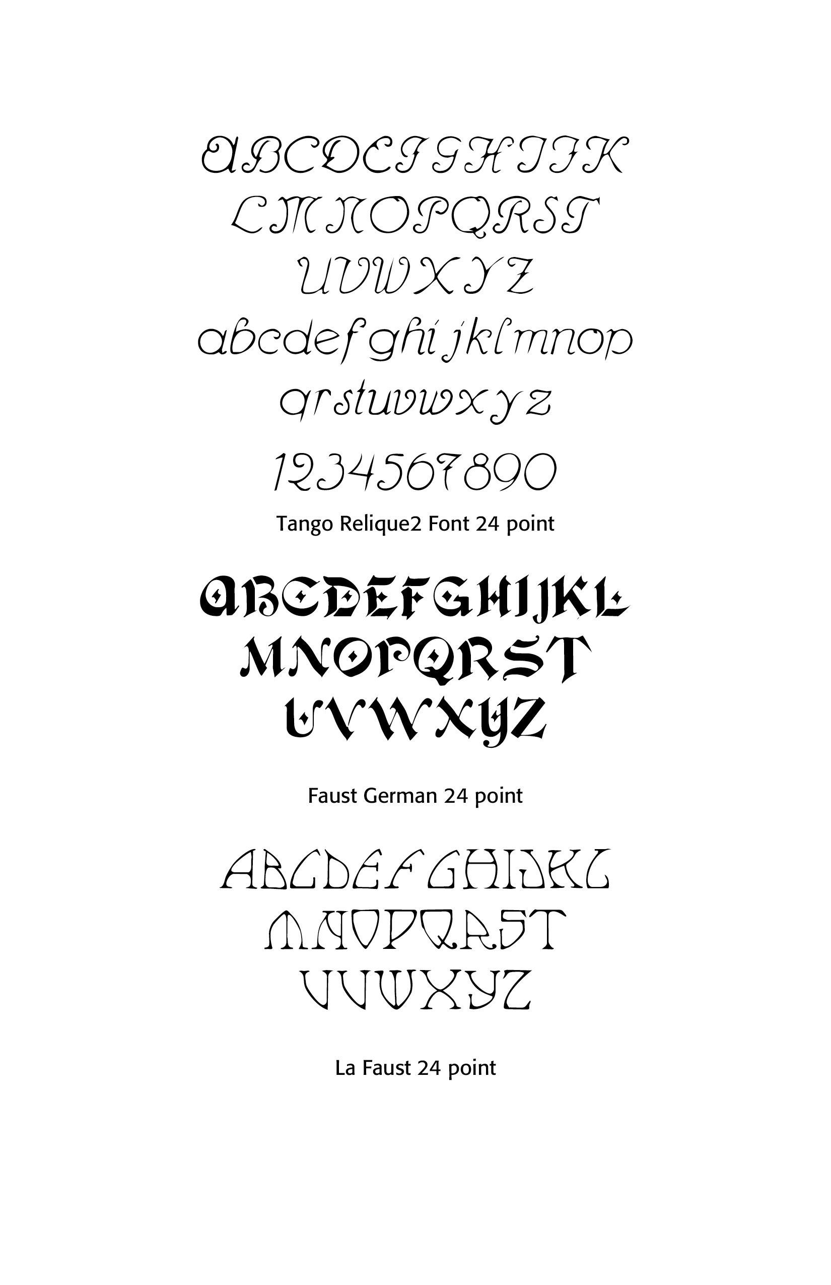
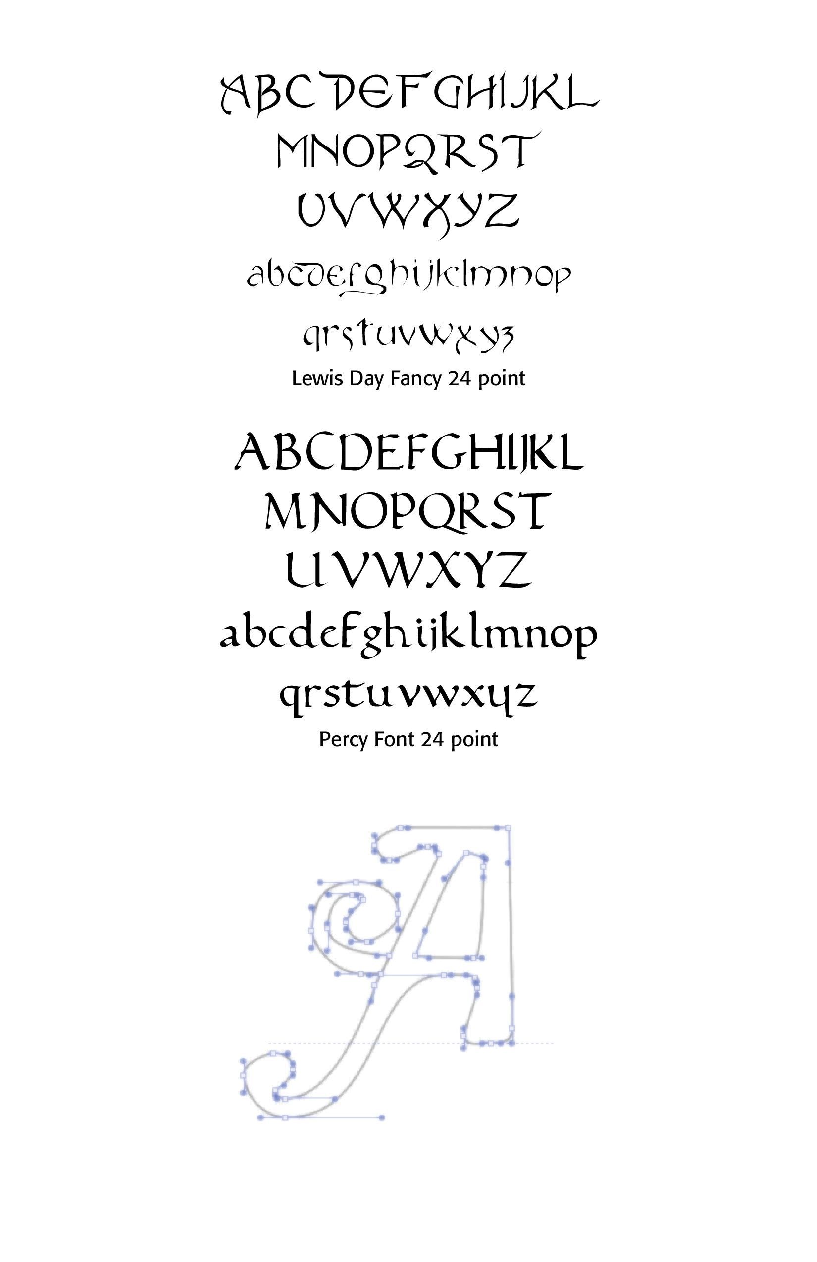
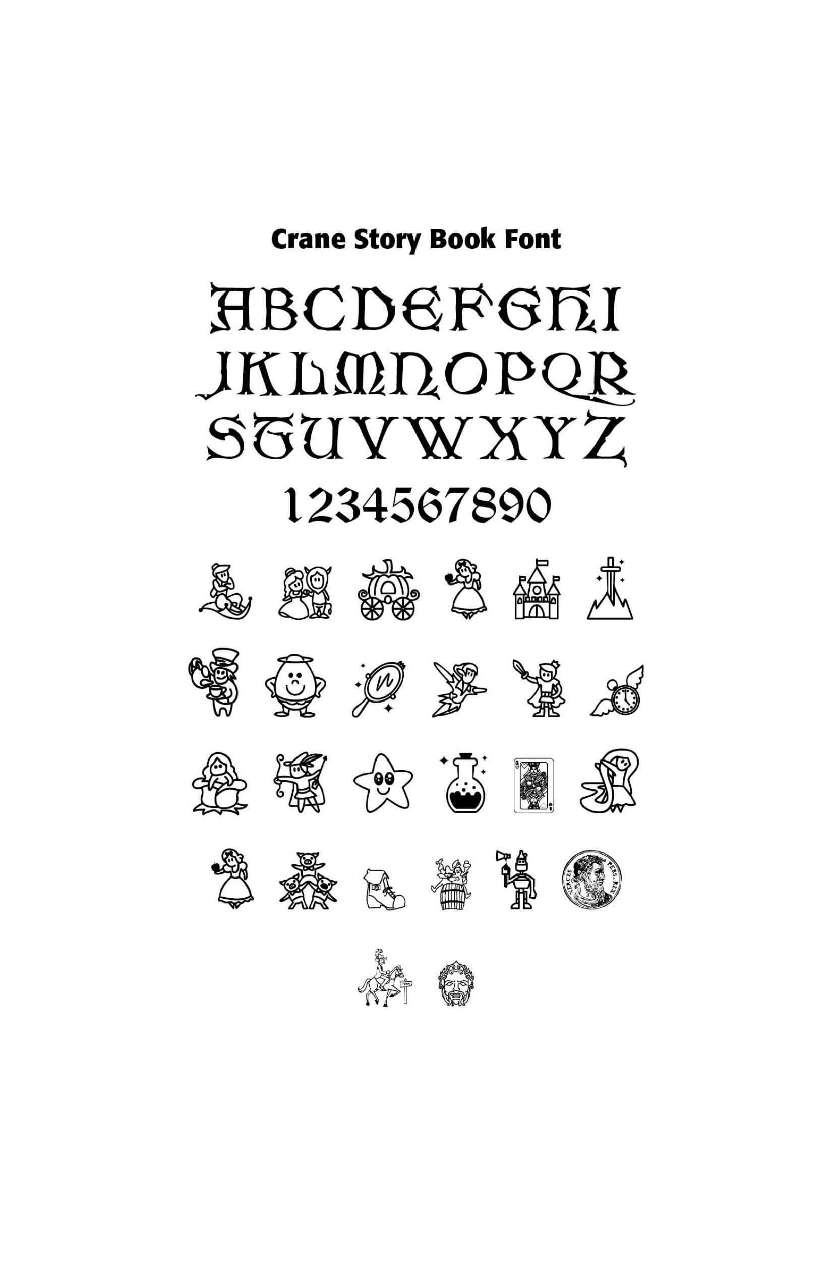
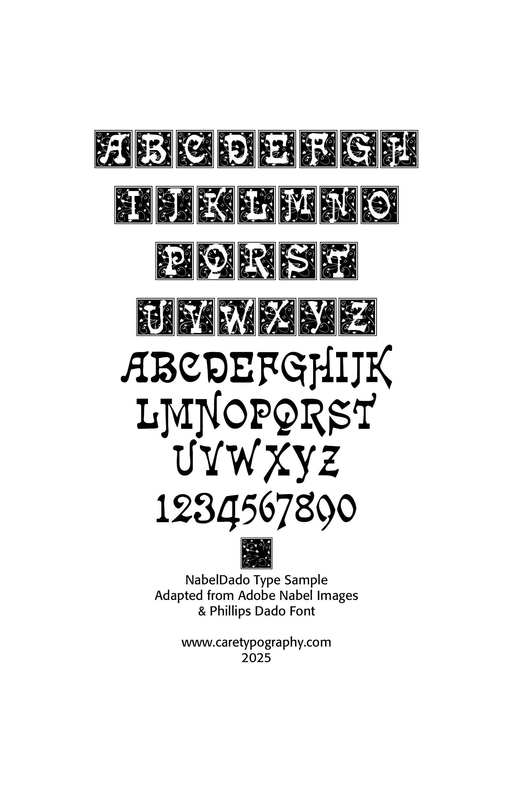
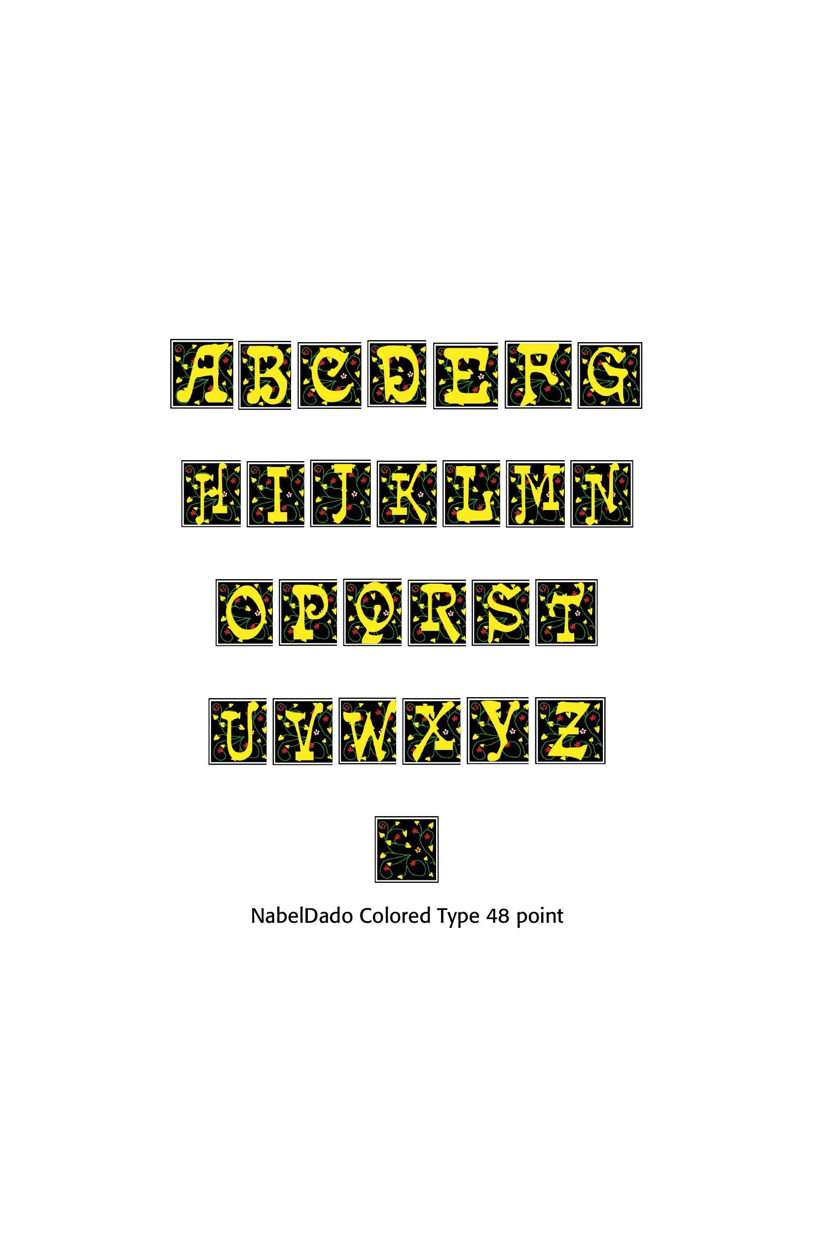
Use CARE digitized fonts for display purposes. Many of these older fonts are perfect for versals (opening letters) or fancy invitations, parties, retro looks and so forth. Many of these fonts have no small letters and are all capitals. They are meant for design purposes.
CARE fonts are licensed. Some with CARE's own licensing and others from trusted free licensing sources. We have made every attempt to provide trusted older fonts which are in the public domain in the copyright world. Some of the fonts we have are limited in their use for churches and other non-profits. When you order a font or a number of them, we will provide that information.
Successful Layout & Design