Advances in Typography: Late Twentieth to Twenty-First Centuries A Historical Sketch (Part 3)
Advances in Typography: Late Twentieth to Twenty-First Centuries
A Historical Sketch (Part 3)
Late Twentieth to Early Twenty-First Century: Corporate and Contemporary Digital
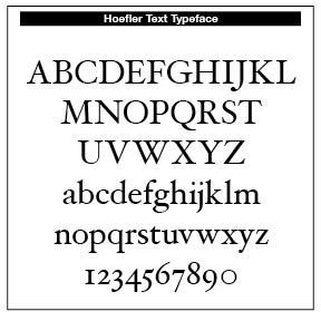
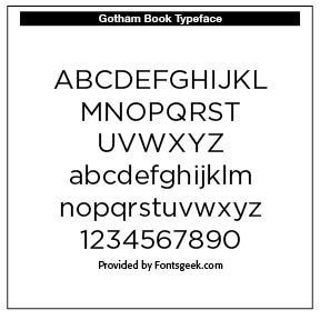
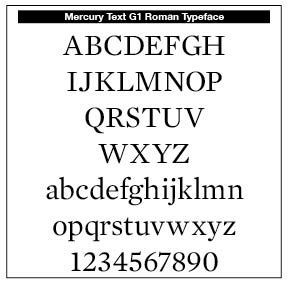
Jonathan Hoefler (b. 1970) is an American type designer known for influential typefaces such as Hoefler Text, Gotham, Knockout, and Mercury. Gotham, co-designed with Tobias Frere-Jones, gained international fame through its use in Barack Obama’s 2008 campaign and has since become a staple in corporate and editorial branding.
Born in New York City, Hoefler’s early fascination with everyday typography led him to a self-taught career in type design. In 1989, he founded the Hoefler Type Foundry, quickly earning recognition with Champion Gothic for Sports Illustrated. His partnership with Roger Black and later Tobias Frere-Jones resulted in dozens of widely used typefaces.
Hoefler’s work is characterized by a blend of historical research and modern engineering, shaping digital typography standards. His typefaces are used by major publications, cultural institutions, and corporations worldwide. In 2021, Monotype acquired his company, marking a significant moment in the evolution of digital type design.
Hoefler’s approach has redefined contemporary type design, bridging historical revivals and modern usability. His influence extends across print and digital media, setting new standards for clarity, versatility, and typographic excellence.
Tobias Frere-Jones (b. 1970). Tobias Frere-Jones is a renowned American type designer whose work has profoundly shaped contemporary typography. Born on August 28, 1970, in New York City, Frere-Jones grew up in Brooklyn and pursued graphic design, earning a BFA from the Rhode Island School of Design (RISD) in 1992.
After graduating from RISD, Frere-Jones joined the Font Bureau in Boston, where he quickly became a senior designer. During his tenure, he developed several successful typefaces that contributed to the foundry’s respected catalogue.
In 1996, Frere-Jones began teaching at the Yale School of Art, helping to develop the typeface-design program. His commitment to education has influenced a new generation of designers.
A pivotal moment in his career came in 1999 when he started collaborating with Jonathan Hoefler. Their partnership, formalized as “Hoefler & Frere-Jones” around 2005, resulted in the creation of typefaces for major clients, including magazines, cultural institutions, and corporations.
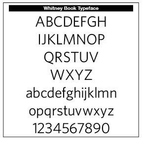
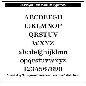
Some of Frere-Jones's most recognized typefaces include Gotham, a widely used and instantly recognizable face, a staple in corporate and civic design, Interstate, rooted in American vernacular lettering, and is favored for its clarity and versatility. Other faces include Whitney, Surveyor, Tungsten, which further showcase his meticulous approach and design strength.
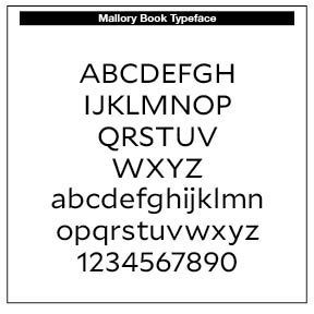
After parting ways with Hoefler in 2014, Frere-Jones established his own foundry, Frere-Jones Type. The first retail family released under this label was Mallory in 2015, continuing his legacy of innovative and functional type design. Credit for Mallory Book is from https://www.onlinewebfonts.com/icon and is licensed by CC BY 4.0.
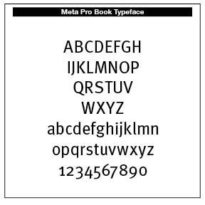
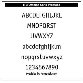
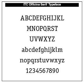
Eric Spiekermann (b. 1947) is a German designer, typographer, and educator who championed humanist sans-serifs for modern communication. Co-founder of FontShop and FontFont, he helped build the digital type distribution ecosystem. In 1989 he founded FontShop — one of the first digital font distributors. Over the years he has designed many influential typefaces (or font families / systems) — among them FF Meta, ITC Officina, FF Unit, and corporate or public-system typefaces (signage, wayfinding, corporate identity) for clients like companies, transit authorities, airports. Spiekermann is also an author of influential books and articles on typography, including the widely read Stop Stealing Sheep & find out how type works (original German edition 1982, first English edition 1987).
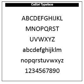
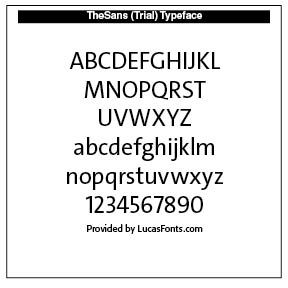
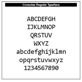
Lucas de Groot (b. 1963), a Dutch typographer, studied at the Royal Academy of Fine Arts, the Hague, moved to Berline, working under Erik Spiekermann for a time and left to establish his own firm, FontFabrik, which became LucasFonts. He is especially known for his superfamily Thesis, TheSans, TheSerif, TheMix, TheAntiqua, plus others which is a comprehensive type system. He developed for Microsoft the Calibri and Consolas fonts. He also developed theoretical work on “interpolation” for font design, a method to generate multiple font weights/styles from master designs in a way that preserves optical balance and consistency.
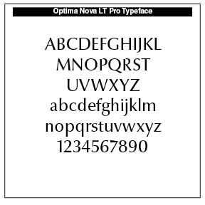
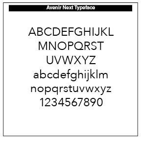
Akira Kobayashi (b. 1960) is a Japanese typographer known for Avenir Next (with Frutiger), Optima Nova and other Linotype revivals. A central figure at Linotype, Kobayashi has directed many modern reinterpretations of classic typefaces and developed original work widely used in publishing and branding
The Twenty-First Century: Web, UI & Variable Font Era
UI stands for “digital user interface.” A good UI font is known for its legibility, readability and usability. Legibility refers to how well one individual letter or character can be distinguished from another in a typeface.
Legibility is everything, and choosing the right font will significantly impact the overall user experience of your mobile apps. If someone cannot discern between an 0 and an O, or if they’re squinting trying to read a line of text, then it’s a clear sign of incorrect typography. Readability refers to how words and blocks of text are arranged in a design. It’s all about spacing words and sentences to allow the user to easily interpret and understand content in a way that makes sense.
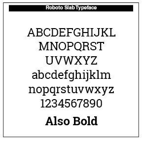
Christian Robertson (b. 1973). Christian completed the BFA program in Graphic Design at Brigham Young University in Provo, UT, and was a partner at Mansfield Design Company in American Fork, UT. He joined Google where he presently works. He is especially known for the Roboto font (2011) and Roboto Slab. He is Google’s flagship system typeface designer.
Roboto was the first typeface was created as the system font for its Android operating system, and released in 2011. The entire font family has been licensed under the Apache License. In 2014, Roboto was redesigned for Android 5.0. Most variants of Roboto have been licensed or re-licensed under Open Font License —Roboto including the default sans-seriffont), Roboto Condensed, Roboto Flex, Roboto Mono, and Roboto Serif.
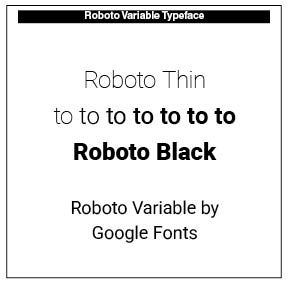
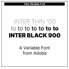
Note that Roboto and Inter are what we call "variable fonts." A variable typeface (or variable font) is a single font file that behaves like many fonts in one. Instead of separate files for Regular, Bold, Condensed, Wide, Light, Black, etc., a variable typeface contains continuous ranges called axes that allow the designer or user to adjust typography with fine precision. A variable font uses the OpenType Font Variations technology (introduced in 2016). It includes multiple “masters” inside one file and lets you interpolate smoothly between them.
Instead of dozens of static fonts, one variable file reduces page load weight, simplifies family organization, and ensures consistent interpolation across styles. Common axes include weight (wght), from Thin to Black, width (wdth), Condensed to Expanded, optical size (opsz), optimized for small or large text, slant (slnt), italic switching (ital) and grad, indicating stroke contrast or thickness. Some typefaces include custom axes, like serif size, roundness, contrast or ascender length.
Designers use variable typefaces in print materials, fine-tuning weight for better type color on the page, adjusting width for line length control and optical sizing for headings versus captions. In Web formations and UI work, variable type is used for responsive text, accessibility (increasing stroke weight for legibility) and reducing the number of font files loaded. Branding uses include adaptable typographic systems and animated identities.
Rasmus Andersson (b. 1980s) is a Swedish type designer known for the typeface Inter (2017–2020). This face was designed as one of the most popular open-source UI typefaces for contemporary web and app design. Inter is engineered for readability at small sizes on screens.
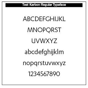
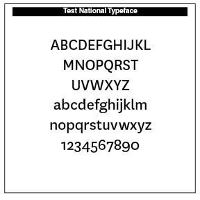
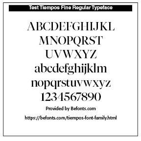
Kris Sowersby (b. 1981) is a New Zealander and founder of Klim Type Foundry and one of the most respected designers working today. His work is known for typographic rigor and excellent text faces for editorial environments. He is known for the typefaces Karbon, National, Sohne and Tiempos
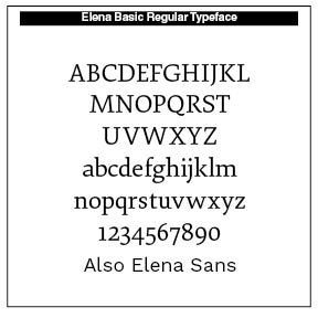
Nicole Dotin (b. 1980s) is a partner at Process Type Foundry. She is known for the typefaces Elena, Elena Sans and research-drive faces. Her work is praised for balance, clarity, and nuanced typographic color. Elena is a crisp, modern serif typeface. Designed for extended reading and medium-sized display copy, it avoids the stuffiness of historical text faces and doesn't overreach when it comes to contemporary detailing. It's a balanced, low-contrast typeface with economic proportions and works well in print or on screen.
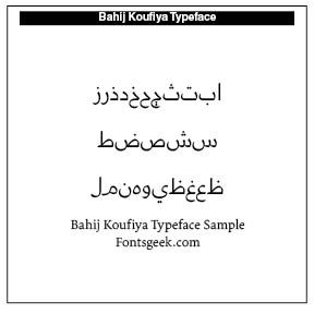
Nadine Chahine (b. 1978) is a Lebanese type designer of Arabic type and multiscript typography. Formerly at Linotype; currently at I Love Typography. A major voice in global type design and readability research. She is known for the typefaces Koufiya, Arabic versions of Frutiger, Helvetica and Univers.
Successful Layout & Design


