Advanced Practical Typography: A Review of Walter B. Gress’s Contribution (1)
Walter B. Gress was associated with the American printing trade during the era when letterpress printing, hot-metal composition, and mechanized presses dominated commercial printing. Rather than introducing new typefaces or typographic theories, Gress focused on practical craftsmanship, emphasizing accuracy, efficiency, and standardized production methods.
Gress’s lasting contribution lies in documenting the craft knowledge of the traditional printing office. His work bridges the nineteenth-century tradition of manual typography and the increasingly mechanized printing industry of the twentieth century, preserving techniques and standards that shaped generations of American printers. His most famous work was The American Handbook of Printing (1913). This book covered nearly every aspect of an early American commercial printing office. It addressed such topics as typography and composition hand typesetting, proof correction, imposition, lock-up and presswork, paper selection, inks, estimating jobs, printing-office management and printing terminology.
Gress was most interested in the professional ideals of American commercial printing in the early twentieth century, consisting of legibility over ornament, consistency in composition, careful spacing and alignment, correct use of type families, high standards of proofreading, and the efficient workflow in the composing room. His work and teaching occurred during a transitional period in printing history, where hand composition still existed alongside mechanical typesetting. Linotype and Monotype systems were becoming standard. Commercial printing was expanding rapidly. Trade schools increasingly required instructional texts.
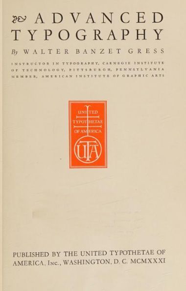
Our overview will consider topics from his practical textbook, Advanced Typography, Instructor in Typography, Carnegie Institute of Technology, Pittsburgh, Pennsylvania, Member, American Institute of Graphic Arts (United Typothetae of America, Washington, D.C., 1931). He was most interested in type choices, harmony of type, balance in typographic composition, tone and contrast, legibility and proportionality. Display type should be applied sparingly. Plain rule borders are preferred over fanciful ones. His main concern is that print is clearly legible, especially to the reader who may be a child or student in school. “In protracted reading, the 10-point short-descender or 12-point long-descender type is considered sufficiently legible for general use by both child and adult readers.” (48)
He notes that “while there is an aesthetic consideration involved in maintaining uniform tones in typography, the utility factor is of far greater importance, since legibility should always be the prime consideration in any piece of printing.” He cites concerns about eye strain producing fatigue and fatigue creating a lack of interest. He is quite conservative in his typographical advice, noting that “borders, like rules, are sometimes used in combination with type to secure a pleasing and decorative effect.
But it is dangerous to use them for attracting attention, nor do they make type easier to read. They really do not.”
Italic faces were considered “effeminate” — Since the italic letter is classed as an effeminate typeface, it is particularly appropriate for use in printing advertising girls’ schools, florists’ shops, women's wear. perfumery, or anything pertaining to femineity.“ “[Italics] due to its lack of legibility in the sloping lines is not a satisfactory practice to use very much in general publicity printing. It is well to remember that, after all, the prime essential in all printing is legibility.”(42)
“The most important fundamental in typography is legibility. Upon this factor depends to a considerable extent the success of the printed message, for notwithstanding the eloquence of the copy appeal, the suitability of illustration, and the appropriateness of ornament used, if an unwise choice of a typeface has been made, or if any of the fundamentals of legibility have been violated, the inevitable result will be only partial success, or possibly complete failure.” (44)
Type Selections
Here Gress is famously conservative to a fault. He introduces the book with this note — “Among the wide variety of type-faces available for the printer's use today, there are comparatively few that are really suitable for the production of good typography. With the exception of this limited number of good faces, changing typestyles have resulted in the accumulation in many composing rooms of almost endless varieties of typefaces which, after serving an all too short period of usefulness, are ushered into that printers’ oblivion, the ‘hell-box.’”
“Almost without exception, harmony demands that you use only one style of type in any job. And as mentioned before, the safest plan for the inexperienced compositor is to learn to think in terms of one type series.” (90) In his early twentieth century days, while aware of a growing number of typefaces, his choices reflect pre-computerized typefaces. Even Robert Bringhurst will later scathingly criticize fanciful type choices as frivolity — “In short, the typography should be richly and superbly ordinary, so that attention is drawn to the quality of the composition, not to the individual letterforms. Only a face that warrants close scrutiny should be set in a form that invites it.” (Robert Bringhurst, The Elements of Typographic Style (Hartley & Marks, 1992 edition, 92)
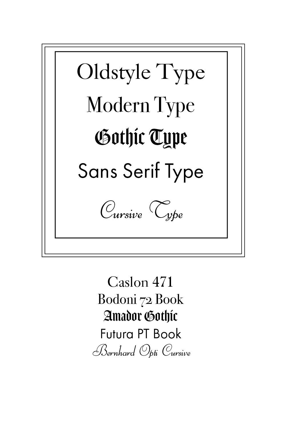
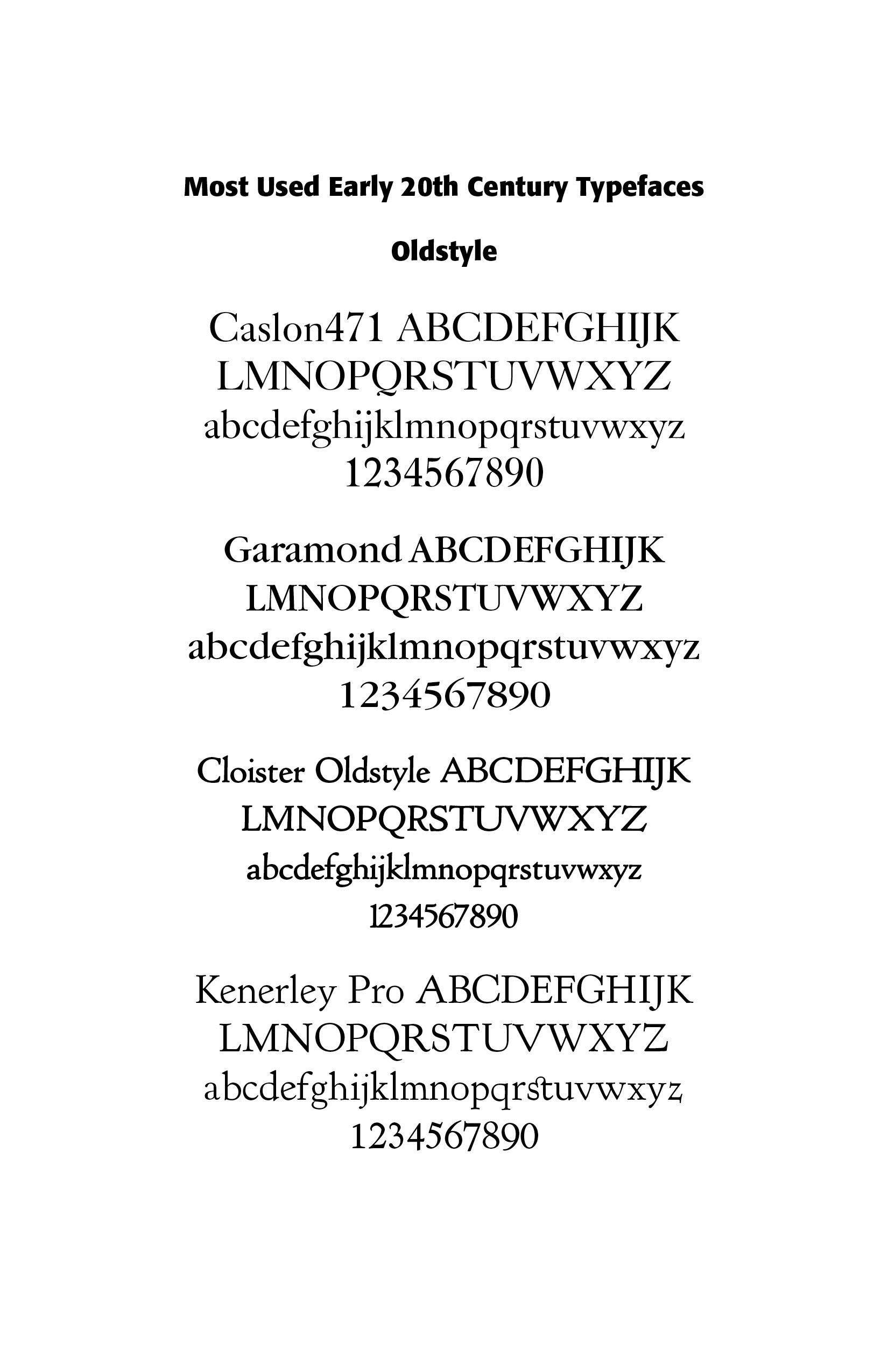
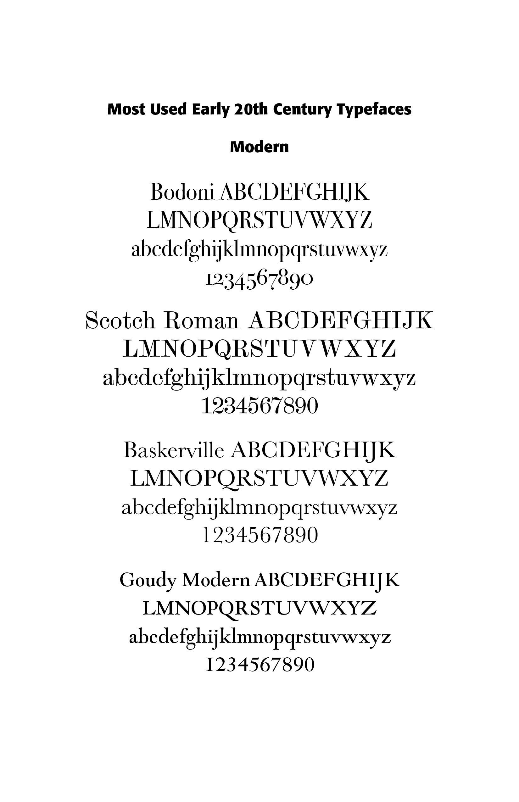
He selects five most used type classifications for good typography — Oldstyle type, Modern type, Gothic type, Sans-serif type, and Cursive type. I have discussed these five classifications in detail in different blogs.† He notes that a complete series contains roman and italic capitals, from six to twelve point, figures and punctuation marks, with small caps in a limited number of typefaces. He is against using type without historically proven type families. His own survey of printers and typographers then showed that the top oldstyle faces used were, in order of preference, Caslon 471, Garamond, Cloister Oldstyle, and Kenerley. Most used modern faces included Bodoni, Scotch Roman, Baskerville, and Goudy Modern. Even then, “of the entire seventeen styles of Cheltenham designed, the original Cheltenham Oldstyle is really the only suitable face from the viewpoint of legibility.” (35) Cursives in his treatment are limited to Bernhard Cursives (ILLS).
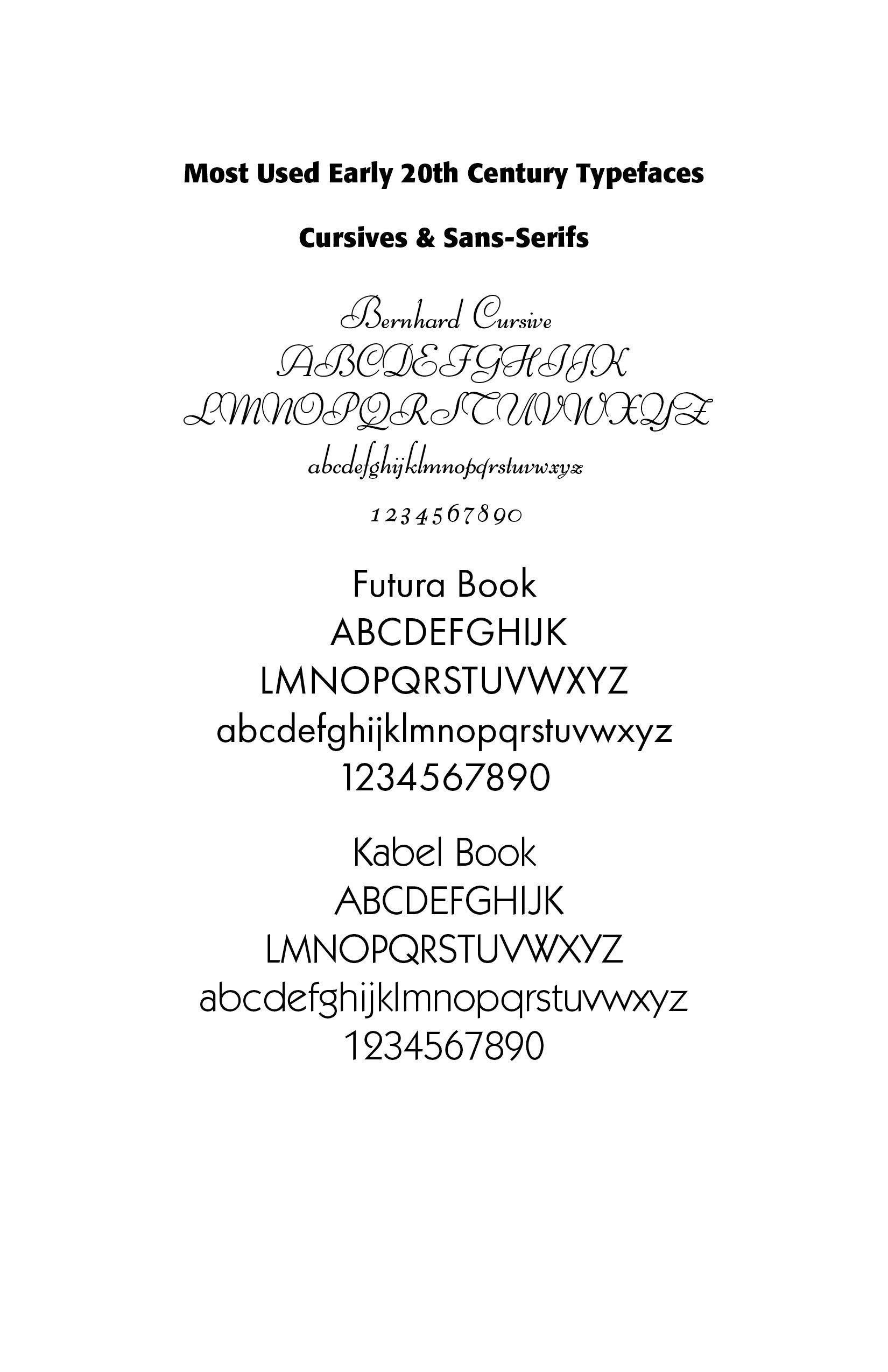
Sans-serif typefaces were just coming into popular use in his days —" Sanserif Types as its name implies, this style of letter is based on a design in which there are no serifs on the stems of the letters, and the strokes are all of a uniform thickness. These types are rapidly coming into general use among typographers who are following the 'new trend.’ as is evidenced by the Typographic Scoreboards shown periodically in a well-known printing trade paper, which are based on advertising pages appearing in the leading national magazines.” Most used were Futura and Kabel.
I find Gress’s comments on typography in “church programs” to be extremely archaic and parochial — “Church Programs require a typographic treatment peculiarly their own, due to the ecclesiastical nature of the service for which they are intended. The use of Gothic, or what is commonly known among most printers as "text" type, for the title page and for headings is appropriate for programs of this nature. Decorative spots based on a Gothic style, as well as maltese crosses, are available at the different typefoundries, all of which are acceptable for this style of composition. . . The church program may be set effectively in Roman type also.”(179) This speaks of too much formality and too little cultural freedom. However, in the early twentieth century, such formality was expected and cultivated.
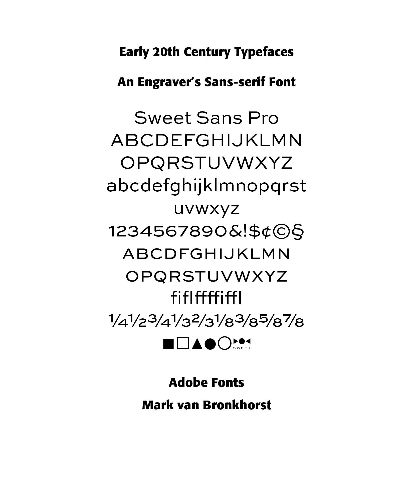
A face not mentioned by Gress but available in the early 1900s was the engraver’s sans-serif, mastered by Mark van Bronkhorst in his Sweet Sans typeface. The family is based on antique engraver’s lettering templates called “masterplates.” Professional stationers use a pantograph to manually transfer letters from these masterplates to a piece of copper or steel that is then etched to serve as a plate or die. This demanding technique is rare today given that most engravers now use a photographic process to make plates, where just about any font will do. But the lettering styles engravers popularized during the first half of the twentieth century—especially the engraver’s sans—are still quite familiar and appealing. (from Adobe Description)
Display type should be lowercase letters with regular capitals or small caps, “making sure the size is large enough to stand out with sufficient prominence from the straight reading matter.” Moreover, “proper names and important words on which it is desired to place emphasis should be capitalized, but in display headings capitals should be used with considerable restraint.” (42)
Gress makes the important point, picked up by later typographers, that “the good typographer first analyzes the copy to discover the purpose for which it is intended, and to be successful in this task he should assume the viewpoint of the ultimate reader and forget that he is a typographer. Many printed efforts have failed in effectiveness because the objective of the printer has been to make a ‘pretty’ piece of typography instead of an effective one . . . The printer, like the expert physician, should be able to diagnose the requirements of his clients, and through an intelligent direction of his efforts should become indispensable to the success of his customers.”(17)
NOTES
†Oldstyle and Modern Romans in “All About Romans” in https://www.caretypography.com/all-about-romans.
Gothic in “Ornamental Gothics” in
https://www.caretypography.com/ornamental-gothics and “Type After Gutenberg” in https://www.caretypography.com/type-after-gutenberg-a-historical-sketch.
Sans-serif type in “About Sans Serif Fonts” in https://www.caretypography.com/about-sans-serif-fonts.
Cursive in “Scripts and Cursives (1 & 2) in
https://www.caretypography.com/scripts-cursives
Successful Layout & Design