All About Romans
All About Romans. No, not the Roman Empire, or the Caesars, or Christ, but the typographic distinction between Old Style Roman and Modern Roman typography. Roman typefaces are among the most influential developments in the history of typography. Although all Roman types descend from the humanist writing of the Italian Renaissance, they evolved into distinct stylistic categories over several centuries. Two of the most important are Old Style (Old Face) and Modern (Didone) Roman typefaces. They differ not only in appearance but also in their historical origins, methods of production, readability, and aesthetic philosophy.
Old Style and Modern Roman typefaces represent two major stages in the evolution of Western typography. Old Style typefaces preserve the humanist ideals of Renaissance calligraphy, emphasizing warmth, balance, and readability. Modern (Didone) typefaces embody the Enlightenment pursuit of precision and refinement, using strong contrast, vertical stress, and delicate serifs to create a dramatic, sophisticated appearance.
Together, they established the foundation for later serif classifications—including Transitional, Slab Serif, and Contemporary designs—and continue to influence typography in publishing, branding, and digital media today.
Old Style Romans developed during the Renaissance, when printers sought to imitate the elegant handwriting of Italian humanist scholars. Early printers such as Nicolas Jenson and later Claude Garamond transformed handwritten letterforms into metal type.
Nicholas Jenson (c. 1420–1480) was a French engraver, pioneer, printer and type designer who carried out most of his work in Venice, Italy. Nicholas Jenson has been something of an iconic figure among students of early printing since the nineteenth century when the artist William Morris praised the beauty and perfection of his roman font. Jenson is an important figure in the early history of printing and a pivotal force in the emergence of Venice as one of the first great centers of the printing press.
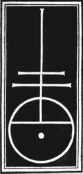
Jenson's Trademark
Jenson's fame as one of history's greatest typeface designers and punch cutters rests on the types first used in his edition of Eusebius’ Praeparatio Evangelica , which presents the full flowering of the roman type design. a work of Christian apologetics written by Eusebius in the early part of the fourth century AD. It was begun about the year 313 and attempts to prove the excellence of Christianity over pagan religions and philosophies. (Wikipedia)
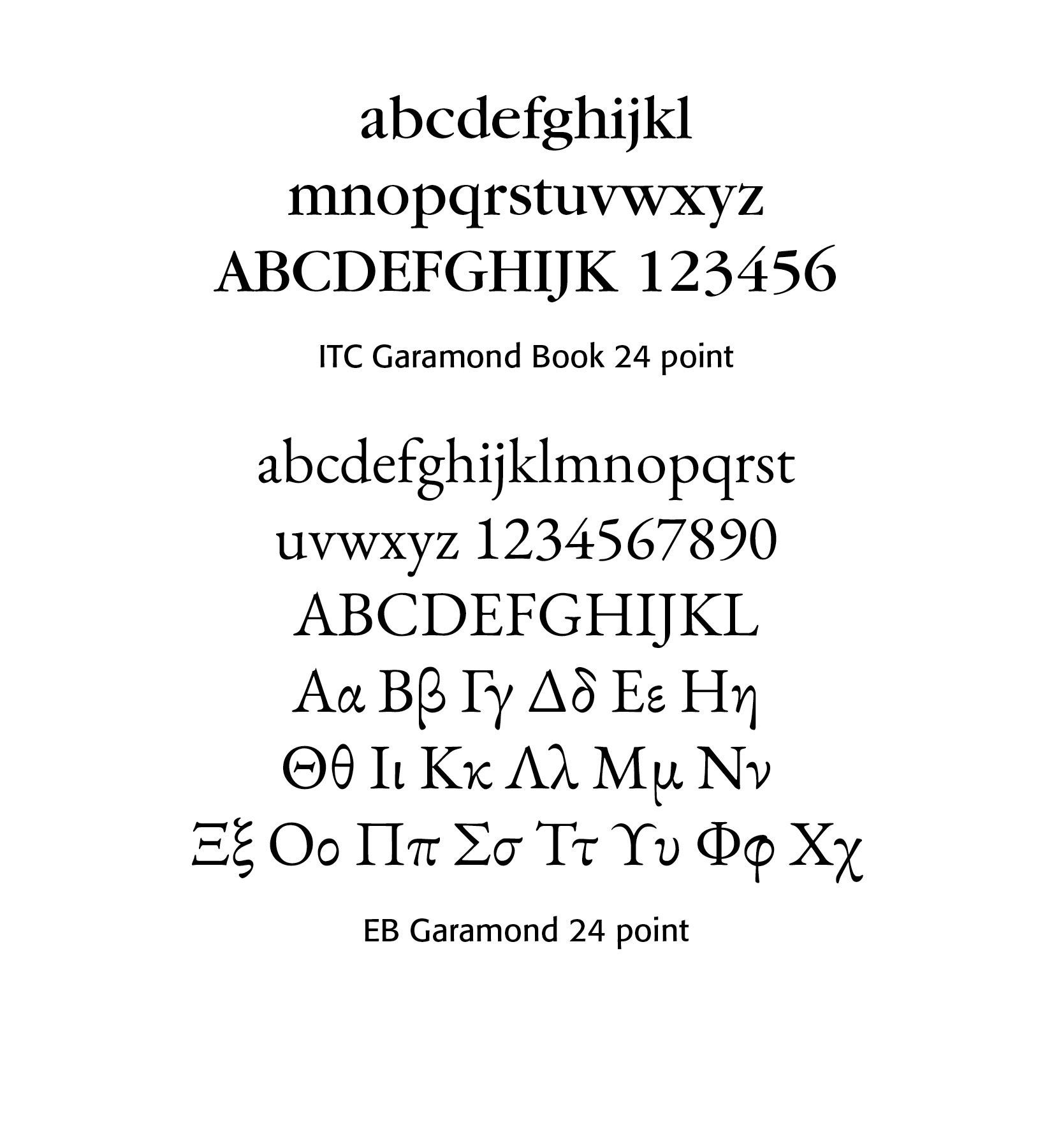
Claude Garamond, was a French type designer, publisher and punch-cutter based in Paris, France. Garamond worked as an engraver of punches, the masters used to stamp matrices, the moulds used to cast metal type. He worked in the tradition now called old-style serif design, which produced letters with a relatively organic structure resembling handwriting with a pen but with a slightly more structured and upright design.
Garamond came to prominence around 1540, when three of his Greek typefaces (now called the Grecs du roi (1541) were requested for a royally-ordered book series by Robert Estienne. Garamond based these types on the handwriting of Angelo Vergecio, the King's Librarian at Fontainebleau. The result is an immensely complicated set of type, including a vast variety of alternate letters and ligatures to simulate the flexibility of handwriting.
The period from 1520 to around 1560, encompassing Garamond's career as an artisan, was an extremely busy period for typeface creation, with a wide range of fonts created, some apparently for exclusive use by a specific printer, with others sold or traded between them. (Wikipedia)
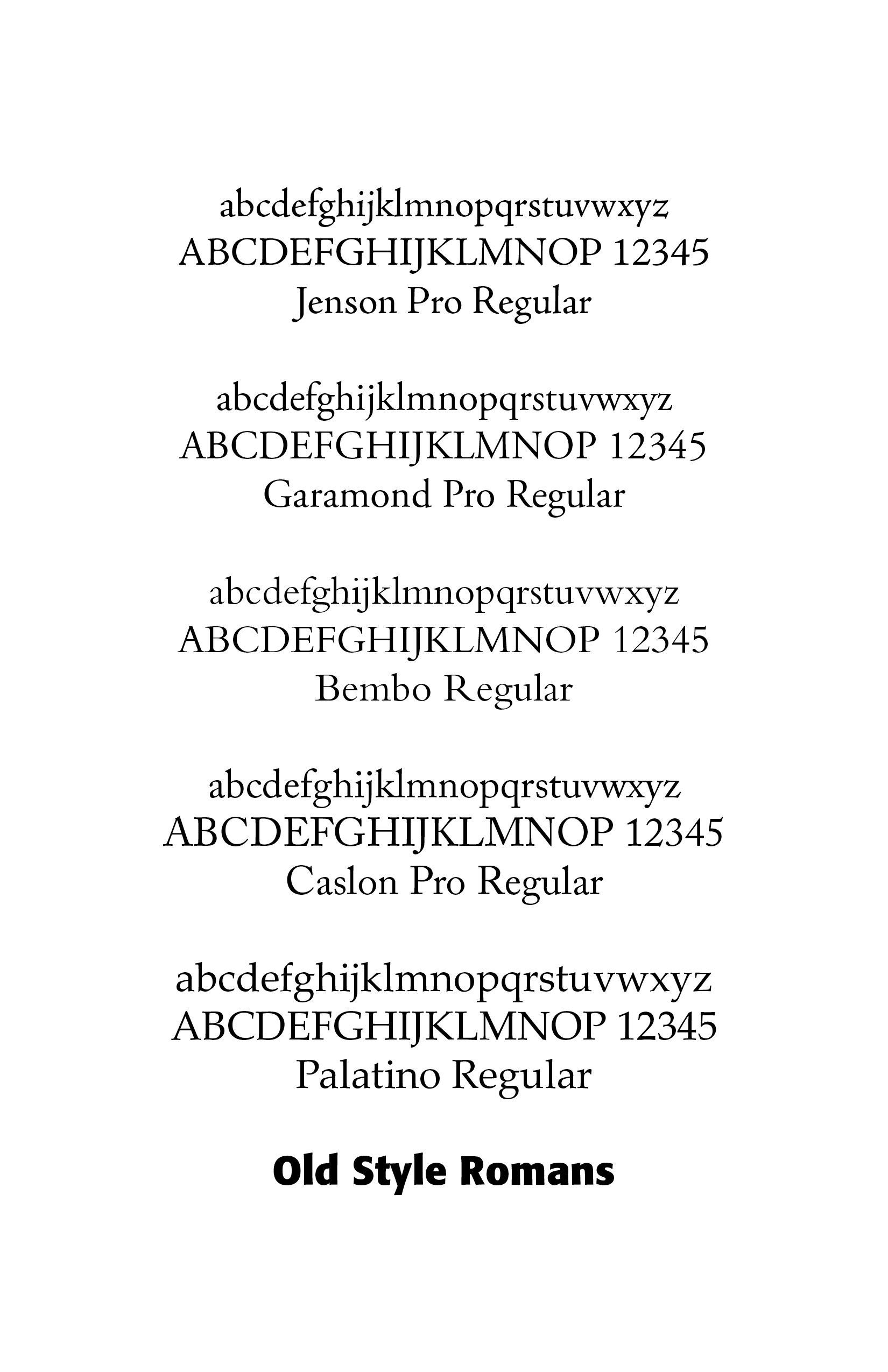
Old Style Romans were influenced by a revival of handwriting from classical Greek and Roman learning, an emphasis on proportion and harmony, handcrafted punch-cutting and the habit of reading primarily from books rather than newspapers. Representative type faces included Jenson, Garamond, Bembo, Caslon and Palatino
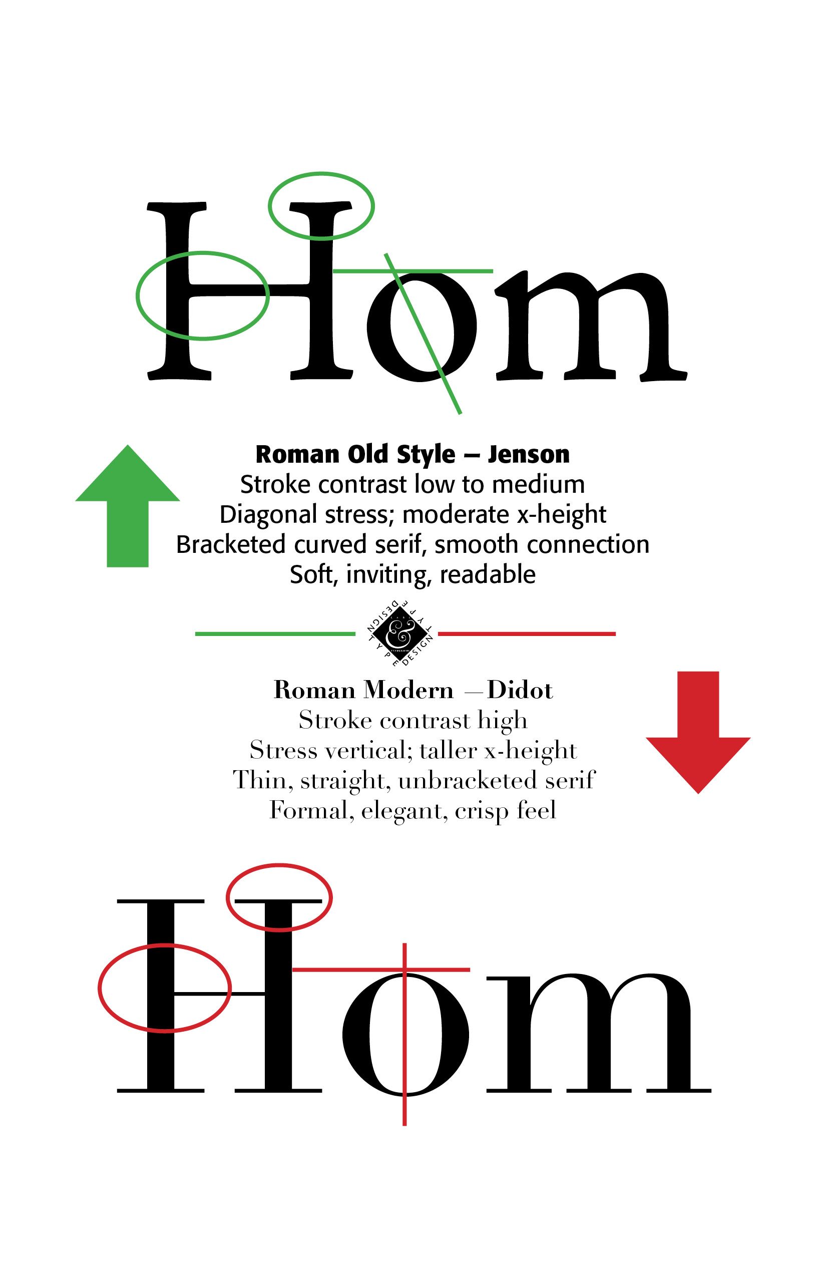
In terms of typefaces, the stroke contrast was low to moderate, with diagonal stress, bracketed serifs and a warm, readable, organic feel to the text. Old Style Romans are excellent for long reading. Old Style serifs are curved, gently bracketed and smoothy connected to the stem of the letter. They have moderate x-height, generous counters, rounded forms and moderate ascenders and descenders. Old Style type was originally produced by hand-cut punches and printed on handmade paper with uneven ink and wooden presses.
Goals for Old Style Romans were readability, beauty, harmony, natural proportion, with the letters appearing almost alive and warm. They were comfortable for long books, provided less eye fatigue, had balanced spacing and were forgiving on lower-quality paper. You will find Old Style Romans in books, academic publishing, Bibles, journals, literary works and educational materials.
Modern Roman typefaces emerged during the Enlightenment and Industrial Revolution (1780–1830). Improvements in paper manufacturing, ink quality, and punch-cutting allowed type designers to create much finer details than were previously possible. The two names most associated with Modern Roman are Giambattista Bodoni and Firmin Didot.
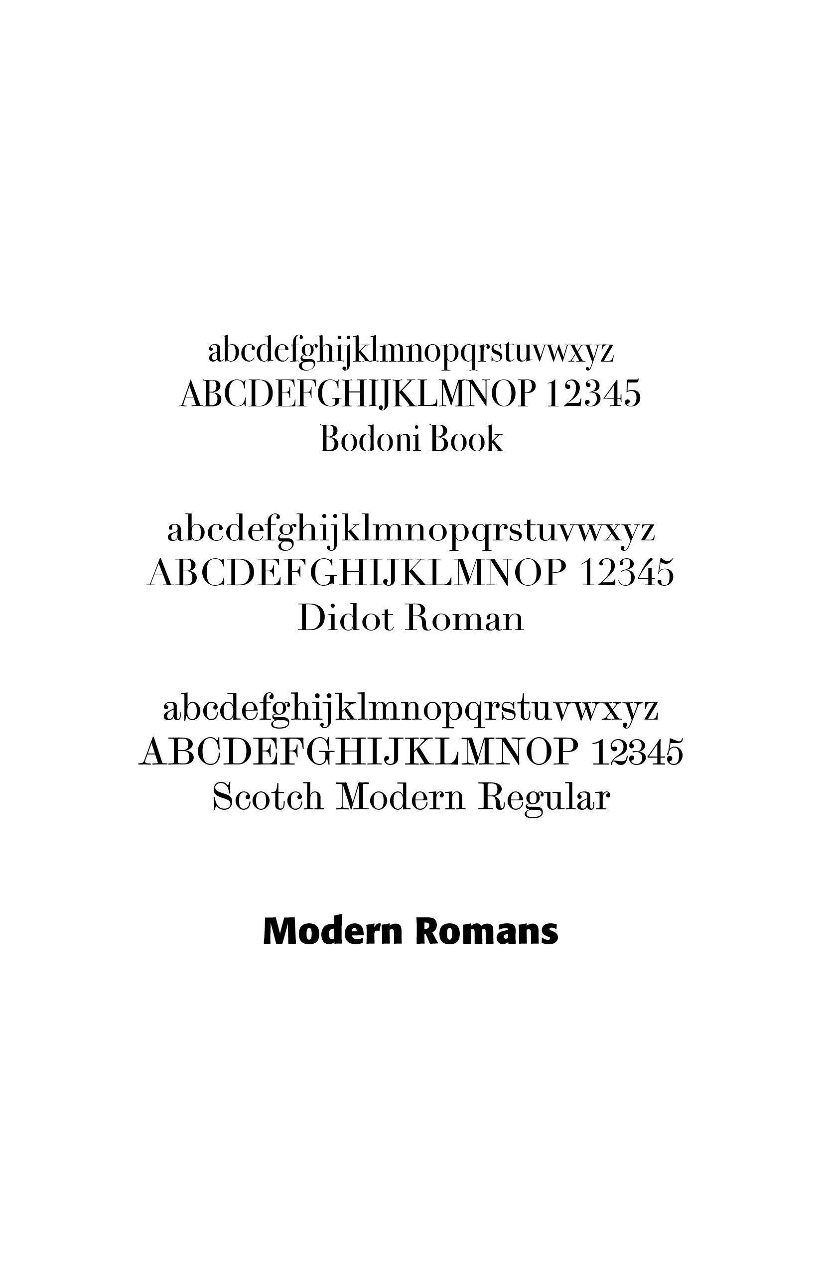
Giambattista Bodoni (1740–1813)) was an Italian typographer, type-designer, compositor, printer, and publisher in Parma, Italy.
He first took the type-designs of Pierre Simon Fournier as his exemplars, but afterwards became an admirer of the more modelled types of John Baskerville. He and and Firmin Didot evolved a style of type called “Modern,” in which the letters are cut in such a way as to produce a strong contrast between the thick and thin parts of their body. Bodoni achieved an unprecedented level of technical refinement, allowing him to faithfully reproduce letterforms with very thin “hairlines,” standing in sharp contrast to the thicker lines constituting the main stems of the characters. (Wikipedia)
Firmin Didot (1764 – 1836) was a French printer, engraver and type founder. Didot invented the word “stereotype” which in printing refers to the metal printing plate created for the actual printing of pages (as opposed to printing pages directly with movable type ), and used the process extensively, revolutionizing the book trade by his cheap editions. His manufactory was a place of pilgrimage for the printers of the world. Firmin Didot is credited with establishing the use of the Didone or "Modern" style of serif typefaces. The types that Didot used are characterized by extreme contrast in thick strokes and thin strokes, by the use of hairline serifs and by the vertical stress of the letters. Many fonts today are available based on Firmin Didot's typefaces, and are often called Didot as a result. (Wikipedia)
Modern Romans emphasize precision, geometry, elegance and rational design rather than the organic appearance of handwritten letters. Their stroke contrast is very high, with vertical stress, thin, unbracketed serifs, all of which give an elegant, formal and “crisp” feel. They are excellent for display work. They reflect mechanical precision rather than handwriting. Modern Roman serifs are extremely thin, flat, almost hairline and unbracketed. Letters feature a taller x-height, sharper terminals, compressed curves and very fine details.
Advances in printing technology allowed for harder steel punches, smoother paper, better presses and improved inks. Modern Romans emphasize precision, order, symmetry, rationality, perfection, all Enlightenment ideals. They give a dramatic appearance to a project, providing striking headlines and are excellent for fashion and jewelry advertisements. Their disadvantages include thin strokes, which may disappear at small sizes and require high-quality printing or high-resolution screens. You will find Modern Romans in fashion magazine, luxury branding, cosmetics, invitations, certificates, and logos.
Successful Layout & Design