Advanced Practical Typography: A Review of Walter B. Gress’s Contribution (2)
Harmony, Balance, Tone & Contrast
As mentioned in Part 1 of this series, Walter B. Gress was associated with the American printing trade during the era when letterpress printing, hot-metal composition, and mechanized presses dominated commercial printing. Rather than introducing new typefaces or typographic theories, Gress focused on practical craftsmanship, emphasizing accuracy, efficiency, and standardized production methods.
Gress was most interested in the professional ideals of American commercial printing in the early twentieth century, consisting of legibility over ornament, consistency in composition, careful spacing and alignment, correct use of type families, high standards of proofreading, and the efficient workflow in the composing room. His work and teaching occurred during a transitional period in printing history, where hand composition still existed alongside mechanical typesetting. Linotype and Monotype systems were becoming standard. Commercial printing was expanding rapidly. Trade schools increasingly required instructional texts.
Our overview will consider topics from his practical textbook, Advanced Typography, Instructor in Typography, Carnegie Institute of Technology, Pittsburgh, Pennsylvania, Member, American Institute of Graphic Arts (United Typothetae of America, Washington, D.C., 1931). He was most interested in type choices, harmony of type, balance in typographic composition, tone and contrast, legibility and proportionality. Display type should be applied sparingly. His advice covered detailed book composition, and in display work, everything from business cards, envelopes, letterheads, billheads and statements, receipts, banking forms, rule forms, tags and labels, tickets, blotters, announcements, and handbills, to window cards and posters.
Gress worked during the age of metal type, hand composition and offset presses. His advice is somewhat dated, but highly advisable for do-it-yourself-printing and desktop publishing.
Harmony of Type
“Harmony means the adaptation and the combination into a pleasing composition of things that are similar or related in certain respects. A picture of a horse and a teaspoon would almost certainly be ridiculous. A picture of a horse and a cart might conceivably have real artistic merit. A picture of a teaspoon, combined with a teacup, sugarbowl, and pitcher, might be a work of art.”(86)
Gress broke harmony of type into four categories — harmony of typographic treatment and subject matter, harmony of the different types, harmony of types and decorative material, and harmony of types and illustrations. Harmony refers to the application of typographic style that is most appropriate to the spirit and intent of the text matter. “Herein lies the only possibility of making the reading matter and the appearance of the printed page work together to produce one effect. If this kind of harmony is lacking, the best copy and the best typography will pull in opposite directions and neutralize what might otherwise be a strong, definite effect.” (87)
Gress was insistent that only one style of type be used in any job. So, combining oldstyle type with modern type means losing any unified feeling of daintiness and delicacy. Different iterations of a type family, of course, can and should be used for proper emphasis and legibility. “Initial letter treatments, depth of paragraph indentions, and many other minor features that are so important to the finished effect of the job must be different with each style of type.”
Parfum 1
Parfum 2
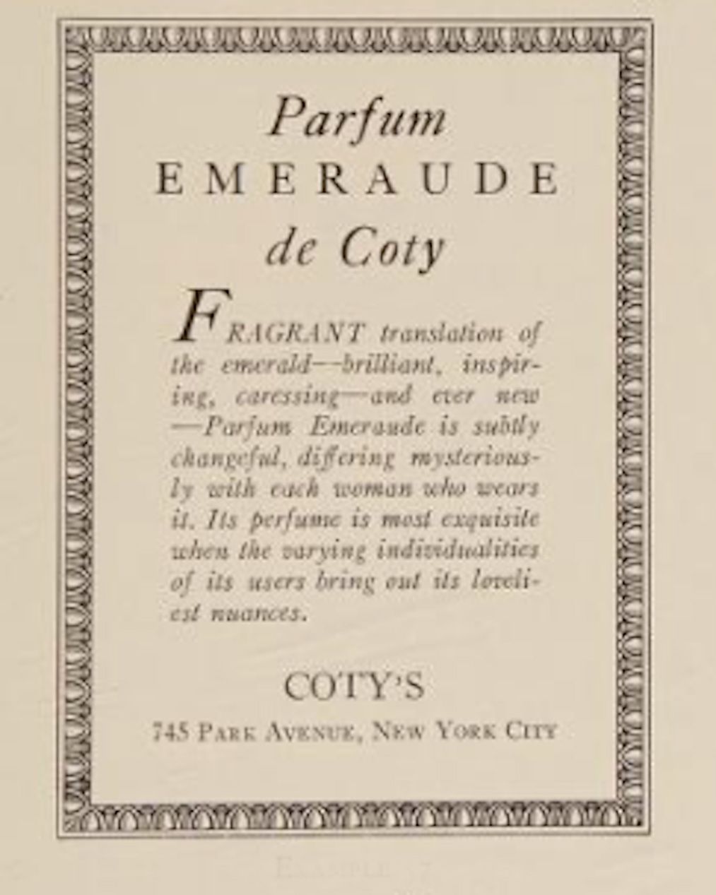
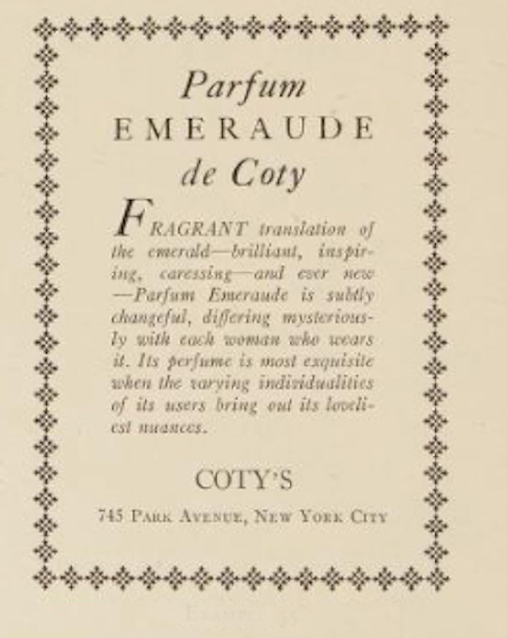
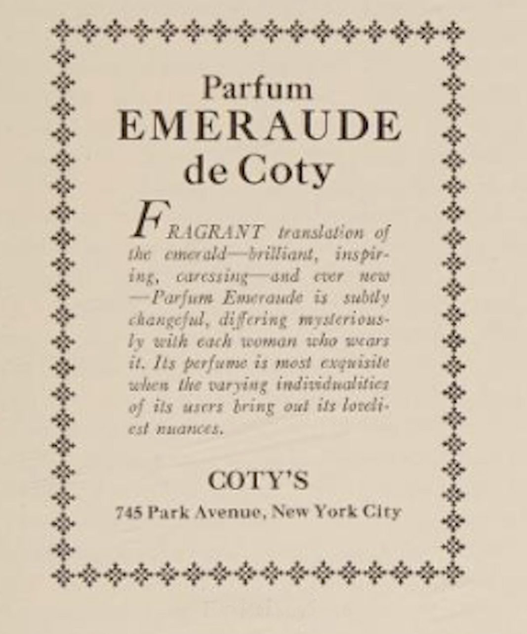
Suppose you were to typeset an advertisement for perfume — “brilliant, inspiring, caressing, ever new with the “varying individualities of its users bringing out its loveliest nuances.” Gress gives several bad examples, what he calls inharmonious relationships and one good harmonious example. Which one would you choose for type harmony? (ILLS)
If you chose Parfume 1, Gress would note that the border used and the type is good, but the classic traditions behind the border used makes it inharmonious — “But the classic traditions behind this border as well as its significance make it really inappropriate to the kind of copy which it surrounds. Copy such as this demands a border that is purely decorative. An ornamental border of formalized flowers would probably be appropriate.”
Parfume 4 displays regularity, formality and good looks, but misses the spirit and style of the perfume. Parfume 3 uses inharmonious type, with oldstyle Caslon and modern Bodoni together. He believes Parfume 2 expresses the spirit of the client’s intentions. In today’s advertising world, even in print advertising, we might say “Really?!!”
Parfum 3
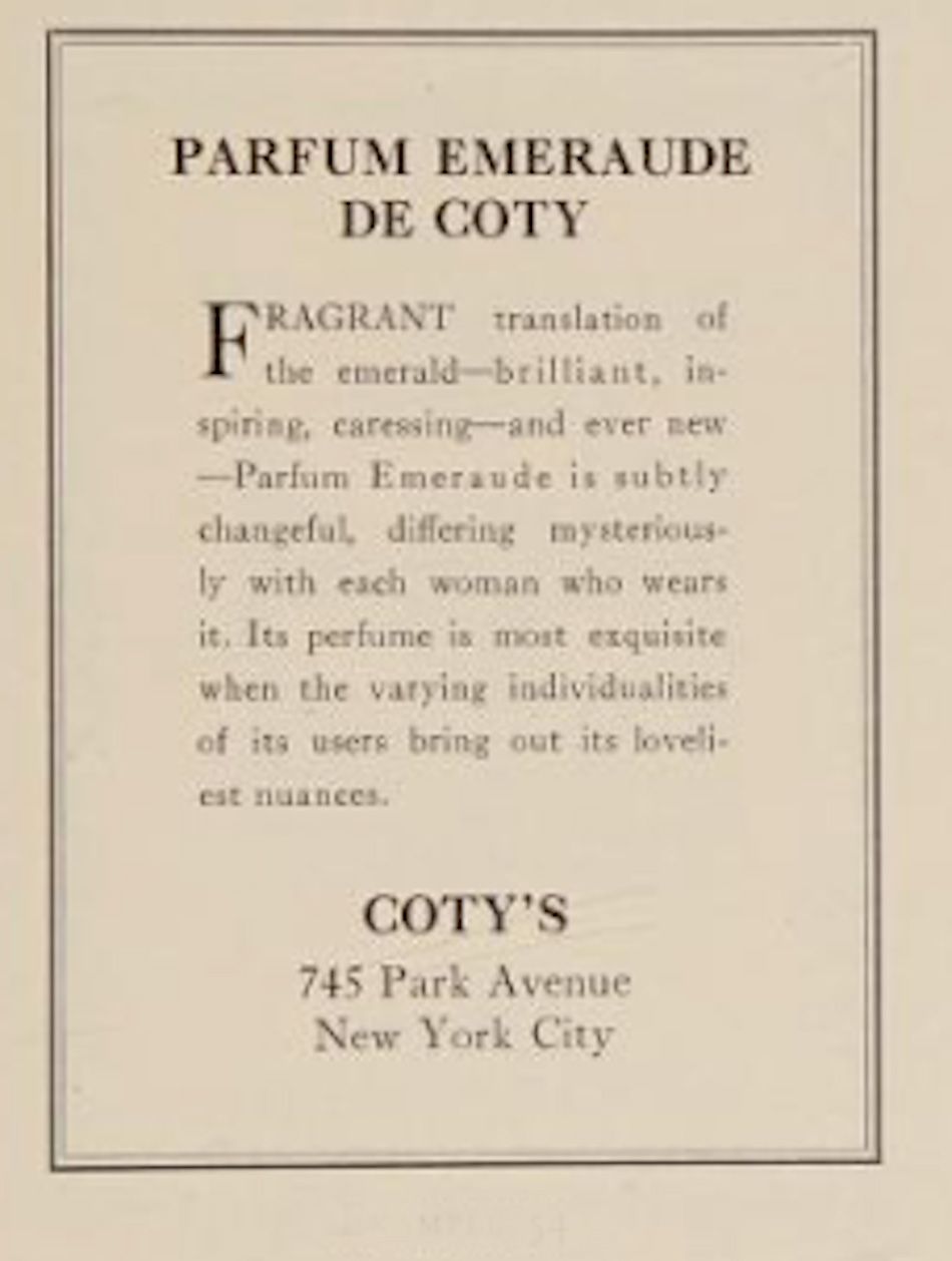
Parfum 4
Later typographers, including John McWade and other graphic designers and typographers, highlighted in his now out-of-print Before & After Magazine (1990s), will also talk about harmony, composition, proportion, tone and contrast and legibility, only updated for computer typesetting and digital reproduction. One designer, Laura Lamar, provides some design theory based on Gestalt theory, which attempts to explain human behavior in terms of pattern seeking. Such theory explains how the eye organizes visual experiences and how the brain interprets them. Lamar says that “knowing the visual principles of Gestalt will give you a valuable design toolbox.” (Before & After Magazine, Vol. 3, No. 6, 1993, 3)
Gress’s harmony idea in typography uses the Gestalt principle of equilibrium, which addresses the stability we seek in everything we see. The grouping of elements on a common axis in Gress’s advertisements is an example of good equilibrium. However, the principle of similarity, where we use one font for body copy and another for headings which is dissimilar to the body copy, such as bold sans-serif headers, often used to highlight this principle, is beyond Gress’s practical typographic advice. The printing principle he advises is for one type family per job and the lack of sans-serif headers, which are beyond his time, results in a bland advertisement, which only early twentieth century people might read. Even the ornamentation borders he suggests would fail to sell perfume today.
Isomorphic correspondence means humans respond to meaning, that we interpret visual objects based on our own experiences and memories. The most effective graphic images are those to which we can relate in real life. Advertisers rely on isomorphic correspondence to pull our emotional triggers, even to sell perfume! McWade would strongly suggest an ad “makeover” for perfume here. What is missing in Gress’s ads is not so much harmonious relationships as Gestalt meaning theories applied to type. Take a look at a few modern perfume ads, designed by CARE Typography with the help of Adobe’s Express.
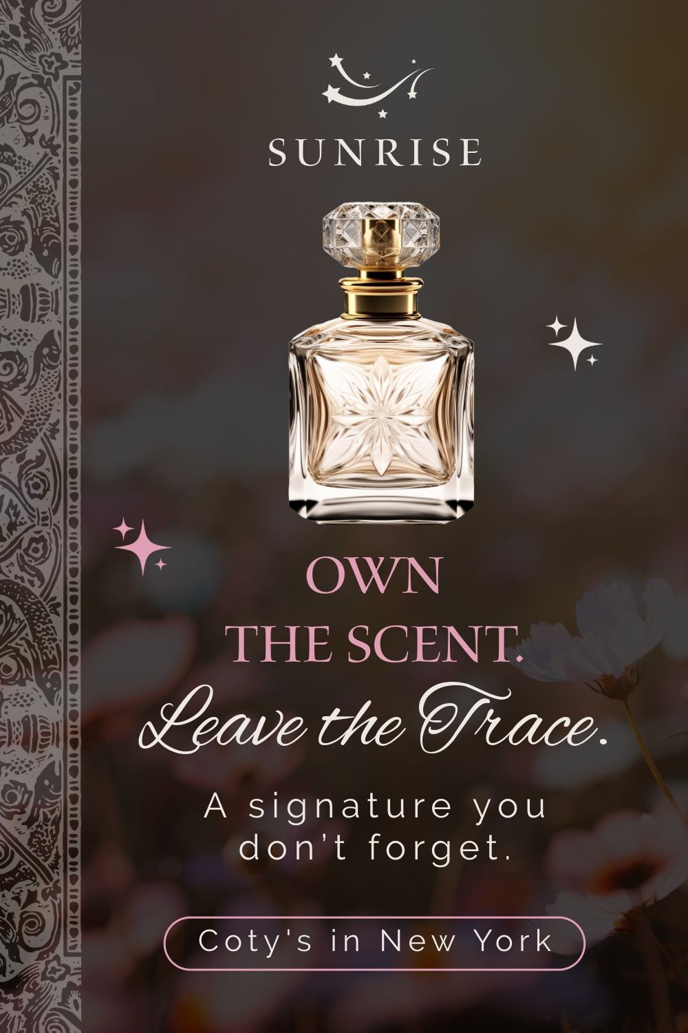
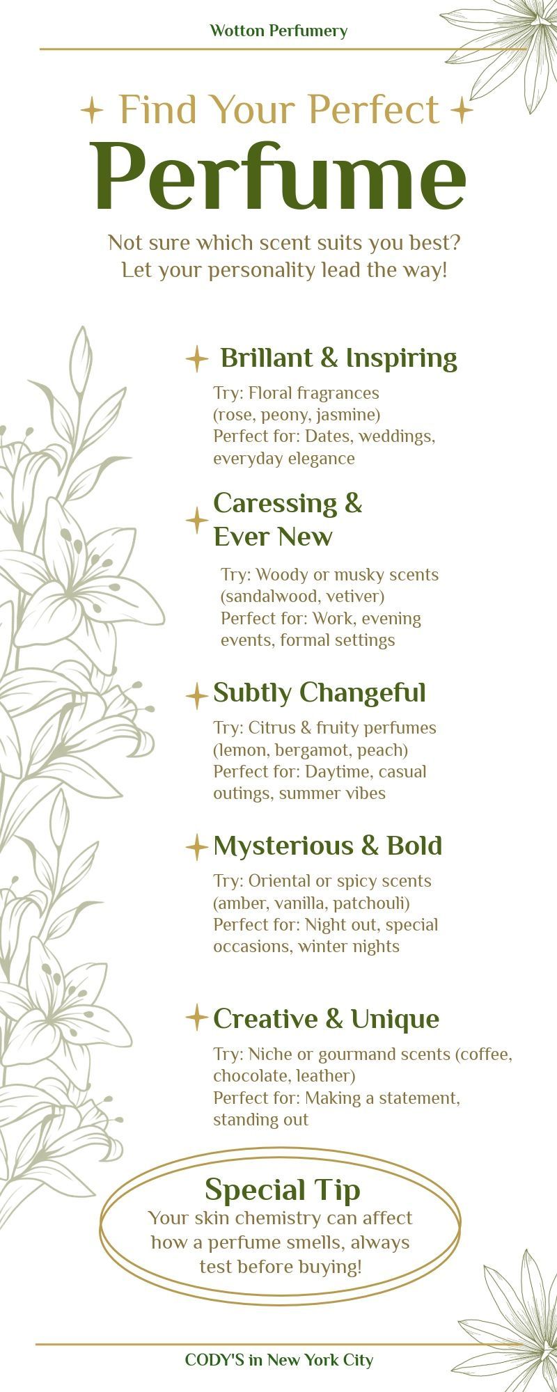
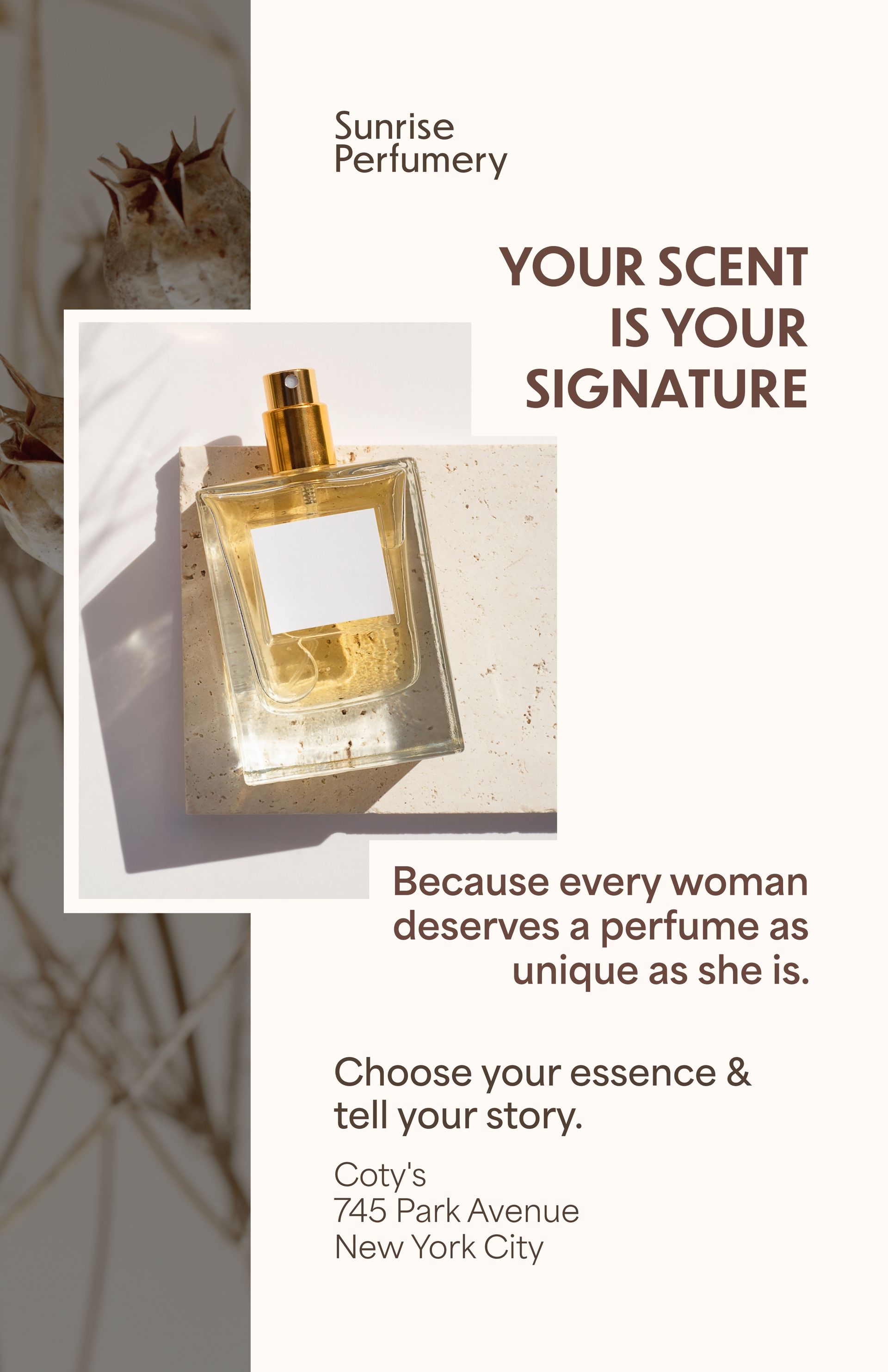
Balance
Like a balanced teeter-totter board, balance is essential to the printed page. The printed page must have “stability and repose in order to please the eye and make reading easy. If a page is out of balance the heaviest part continually attracts the eye, and the whole thing looks as though it were about to skid off into space.”(100) The Gestalt design theory here is called “continuation,” the eye’s instinctive tendency to follow a path, which can be literal or imagined.
Gress notes that balance is secured “by the correct placing of all parts according to their weight and size. In this connection it should be definitely understood that white space has weight value as well as type.” Typesetting needs both horizontal and vertical or perpendicular balance. Easy horizontal balance occurs when all lines of type and illustrations are centered on the width of the type page. Perpendicular balance is not so easy to obtain. Gress would rely on a planned system of type and white space on a page.
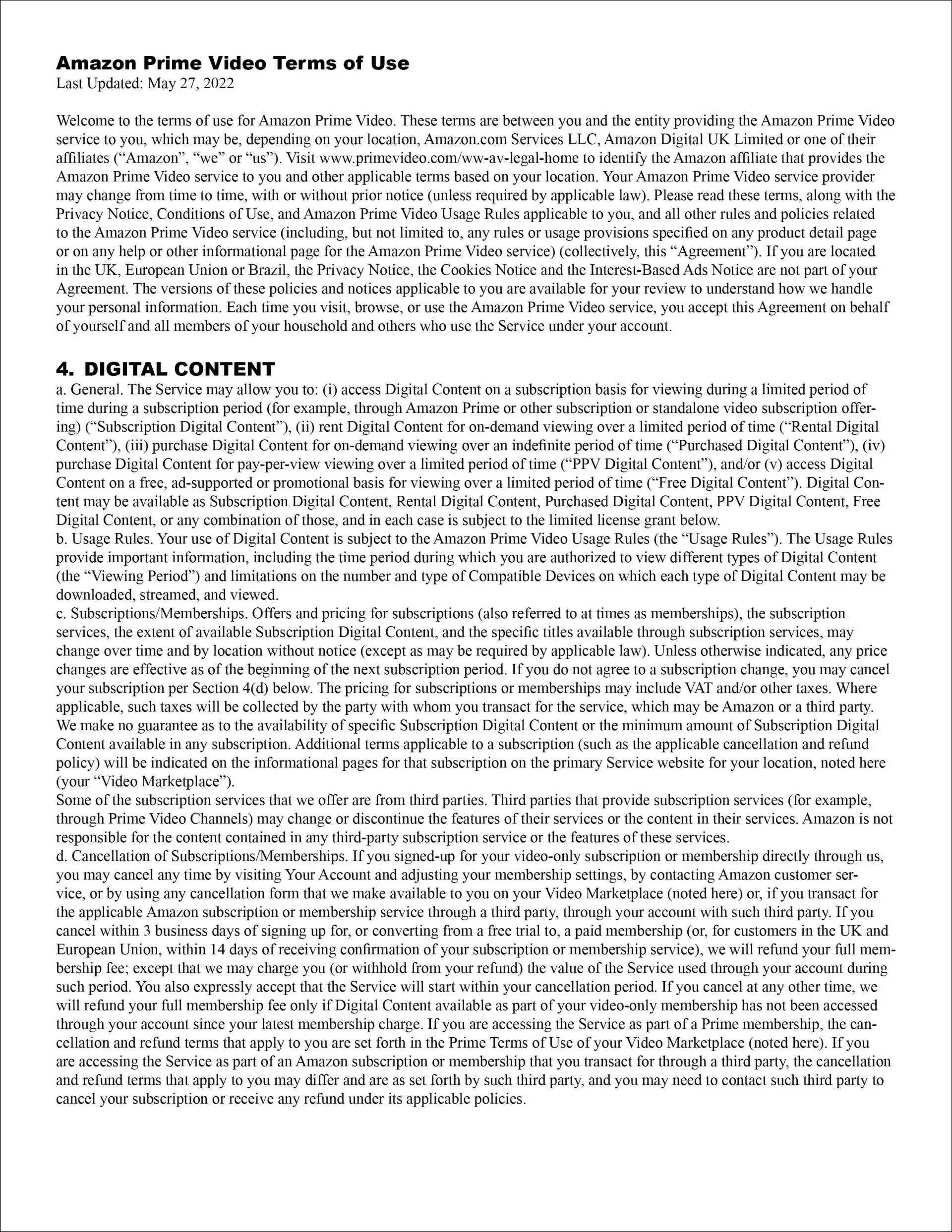
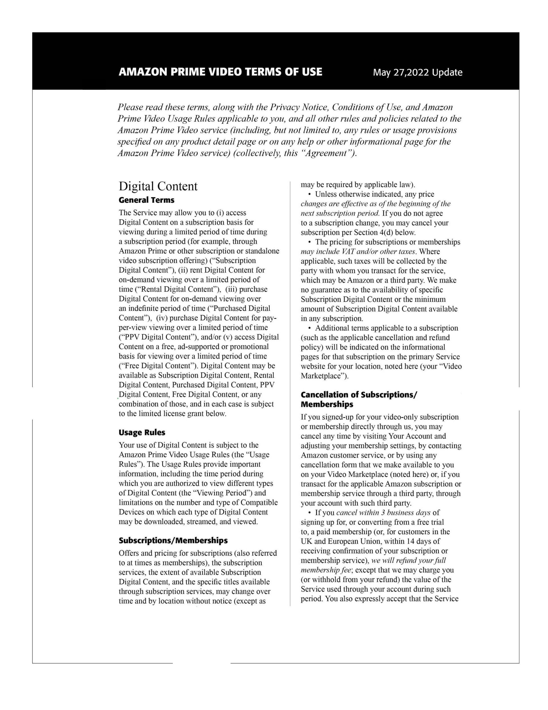
However, in the illustration “Prime Video Terms 1” below, Gress would say that this format is “balanced.” But it is terribly boring and mostly unread by the public. The suggested makeover in “Prime Video Terms 2” not merely shows creativity but a more inviting balance of type and design, using white space admirably.
Tone & Contrast
Gress says “while there is an aesthetic consideration involved in maintaining uniform tones in typography, the utility factor is of far greater importance, since legibility should always be the prime consideration in any piece of printing.” He says that “inharmonious tones exert a disturbing influence, and cause additional eye readjustments in which there is a material increase of mental fatigue in the mind of the reader. Unnecessary eye-strain induces early fatigue, and fatigue creates a lack of interest, which inevitably results in little or no retention of the printed message.
Since the primary object of any printed thing is to be read, and in the case of advertising messages particularly, is intended to attract attention, create interest. develop desire, and tonally to induce action, important to realize the need of harmonious tones in typography.”
Consequently, “Bold-face types should not be combined too freely with light-face types.
Neither should heavy ornament be used with types of a lighter tone, although the printer sometimes obtains uniformity of tone between type and ornament by printing heavy spots of decoration in a lighter color.” We have moved far beyond Gress in today’s typography and printing. We most always use bold face type, like my favorite, Formata Bold, or Helvetica Bold or another well designed bold, to highlight and set off regular reading text in an ad, a business card, an announcement or a book.
While Gress admits that the “law of contrast is a fundamental law on which the entire universe is based,” “a slight touch of contrast is sufficient to give the printed job a necessary amount of interest to attract the reader.” His early twentieth century conservatism is badly showing through his comments. Laura Lamar says that contrast is a designer’s most powerful communication tool — “It can attract the eye, create visual priorities, establish landmarks, control movement, lead, label, emphasize and define. I’ll go so far as to call it the design secret of the universe!” (Before & After Magazine, Vol. 2, No. 4, 1992, 12ff)
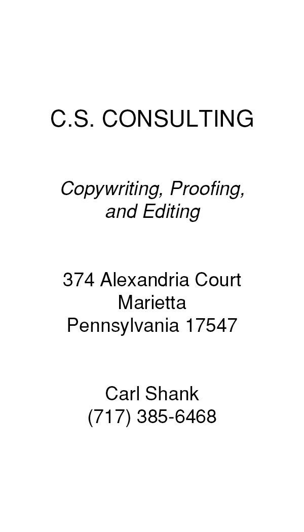
In the business cards below, we have more than a “slight touch of contrast” to make these cards stand out among the plain and uninviting cards Gress would recommend. “We use the tools of contrast to emphasize the meaning of the design, to change the tone and personality of the words from quiet and subtle to bold and confident, from formal and businesslike to casual and friendly.” (Lamar, 13) Different kinds of contrast make different relative impact. While legibility would be the name of the game to Gress, impact and what the reader needs to see first would be today’s name of the game.
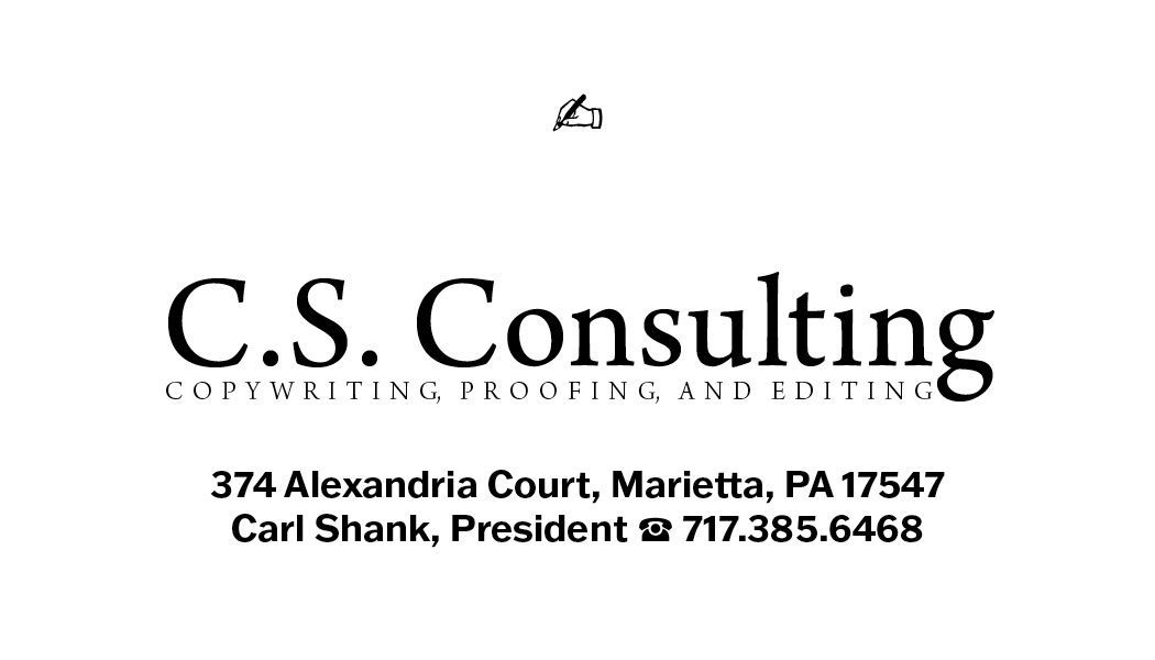
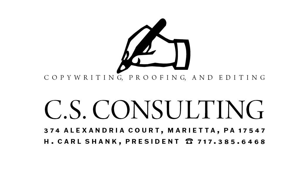
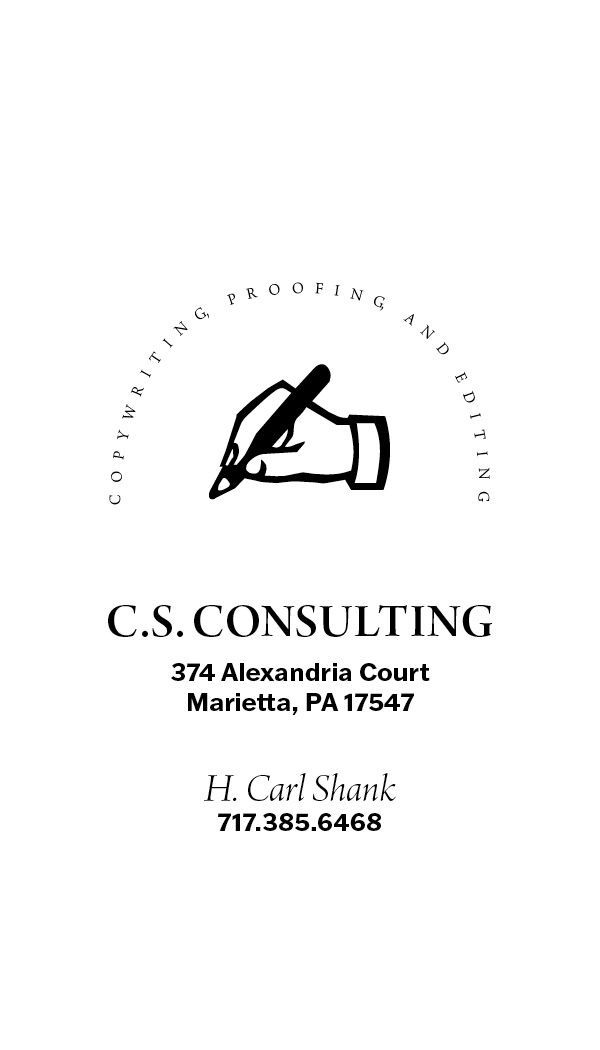
Diagnostic tools of contrast include value, contrasting light and dark, negative and positive, solid and tint, colors with black and white, weight, contrasting bold with light, mass with line, thick with thin, form, contrasting caps and lowercase, roman and italic type, elaborate with simple and square/round. Placement contrasts high and low, centered versus left or right, together or apart. Gress gets this in his practical typography advice.
Quantity contrasts many with few, single elements with groupings, often with seldom. Texture contrasts tight with loose, airy with dense, smooth with rough, shiny with matte finish. Scale contrasts large with small, tall with short and broad with narrow. (Lamar, 12)
What we gain from Walter Gress is an appreciation for typography that has stood the test of time for ages. His legibility advice, though dated, shows his understanding of what the typed page is all about for the reader. Gress helped summarize the typographic past and prepared typographers, designers and printers for a refined and balanced typographic future.
Successful Layout & Design