Small Caps
small capitals (often called small caps) are specially designed uppercase letterforms that have the proportions and stroke weight of lowercase letters while retaining the shapes of capitals. They are not simply reduced full capitals; true small capitals are drawn specifically for the typeface.
Small capitals originated during the Renaissance as printers sought a harmonious way to incorporate the dignity of Roman capitals into continuous lowercase text. Over five centuries, they became a hallmark of fine typography, especially in books, Bibles, scholarly editions, legal documents, and reference works. When properly designed as true small capitals rather than scaled-down capitals, they provide elegant emphasis, improve textual hierarchy, and contribute to the refined appearance that has characterized high-quality typography since the sixteenth century.
Understanding Small Caps. True small caps are not just reduced versions of typical capitals. When arabic numerals became part of the normal roman alphabet, they were given both lowercase and uppercase forms. Robert Bringhurst notes that "typographers call the former text figures, hanging figures or old-style figures, and make a point of using them whenever the surrounding text is set in lowercase letters or small caps. The alternative forms are called titling figures, ranging figures or lining figures, because they range or align with one another and with the upper case." (The Elements of Typographic Style, Hartley & Marks, 1992 edition, 44).
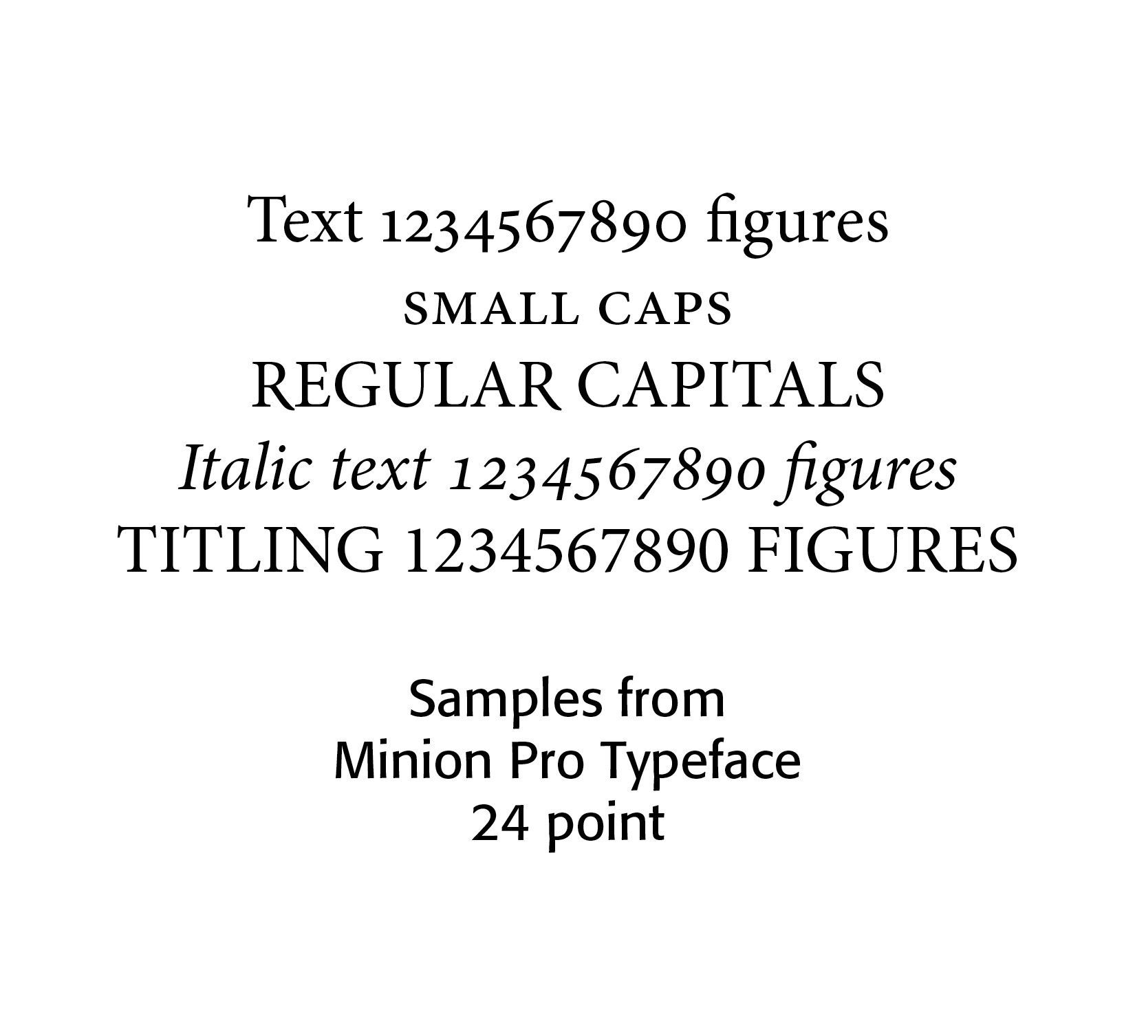
Around the late fifteenth and early sixteenth centuries, printers began cutting reduced capitals for use within text. These became the earliest true small capitals. Reasons for their creation and use included visual refinement,
hierarchy, classical appearance, and an easier reading than all capitals.
In the seventeenth century, small caps became increasingly standardized. Printers used them for chapter openings, running heads, author names, biblical references, legal texts, and scholarly works. They became associated with learned and classical printing.
Book typography of the eighteenth century used small caps for first words of chapters
names, indexes, headings, and references, Fine book printers of the nineteenth century continued their use, and in the twentieth century, typographers such as Stanley Morrison, Jan Tschichold, and Bruce Rogers encouraged their careful use.
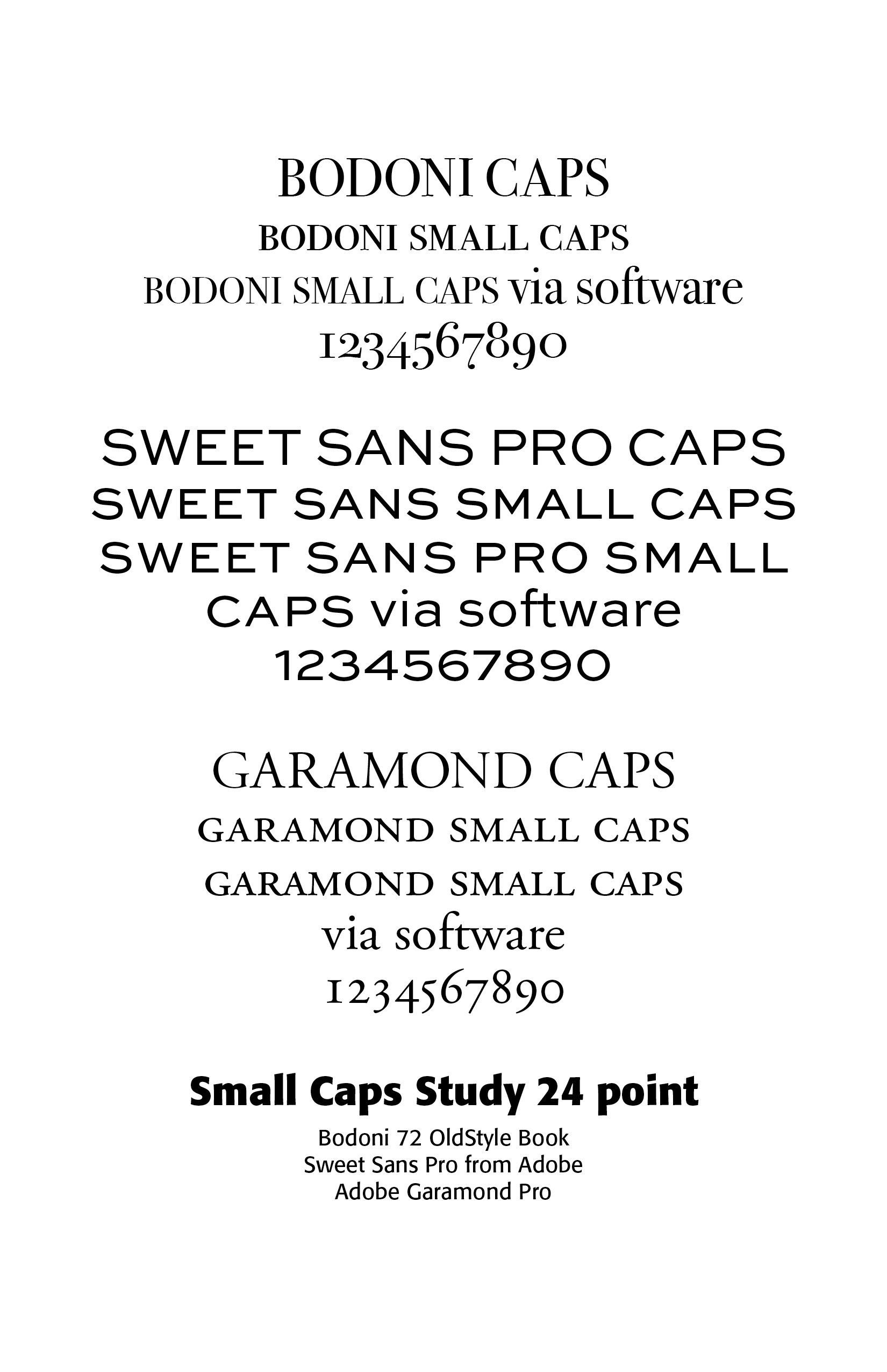
Modern OpenType fonts often include professionally designed small capitals. Examples include
Adobe Garamond, Minion, Bembo, Sabon and Garamond Premier. Small caps are often used in the opening words of chapters, in biblical references, like lord, indicating that the Hebrew divine name (YHWH) lies behind the English translation "LORD," indexes, abbreviations, academic typography in critical editions, classical texts, legal works, dictionaries, linguistic studies, and historical monographs. Genealogical publications often print surnames in small capitals. Scientific journals use small capitals for species authorities, specialized abbreviations, and editorial conventions.
Small capitals improve hierarchy, reduce visual shouting compared with full capitals, blend harmoniously with lowercase text, create elegant emphasis, preserve readability, and give pages a traditional, scholarly appearance. The Chicago Manual of Style uses them for abbreviations, publishing conventions, and certain scholarly apparatus. The Oxford Style Manual employs them in indexes, references, and specialized editorial contexts. Academic publishers frequently use them for author names in bibliographies, manuscript sigla, and editorial notes. Bible publishers maintain the long-standing convention of setting LORD and similar divine-name renderings in small capitals.
Professional typography strongly favors true small capitals because they preserve the intended visual balance of the typeface.
"The practice of setting extensive pieces of copy in the smaller sizes of capitals and small capitals is not advisable, for the use of two sizes of capitals in a paragraph of copy causes a material decrease in legibility which reduces the reading interest. If capitals are desired for such copy, it is better to use small capitals alone and, if possible, to letter-space them." (W. B. Gress, Advanced Typography, 1931)
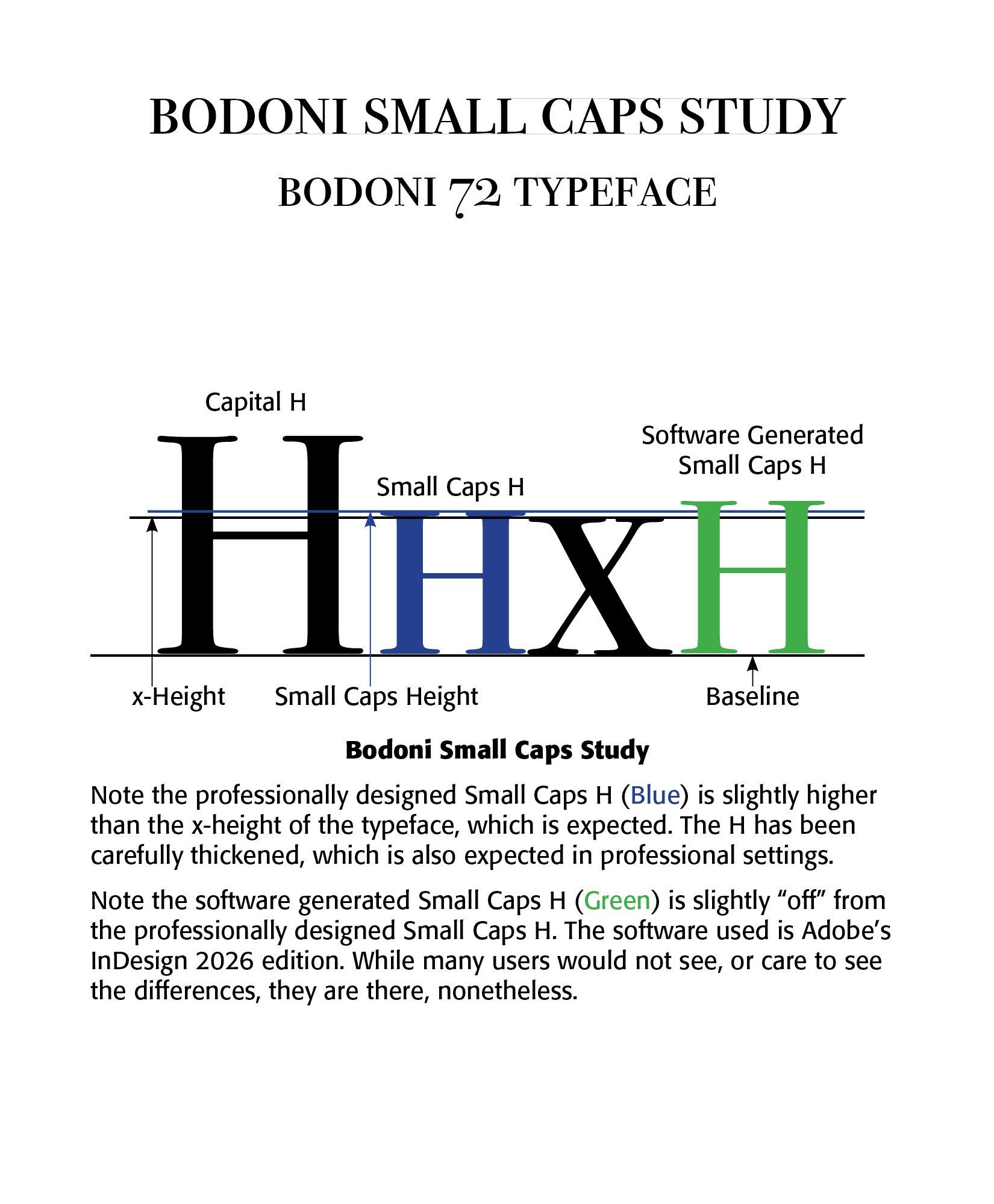
Small caps are not shrunken normal large capitals. While digital typography allows such transformations, using programs like FontLab's Fontographer, such renderings end up distorted and not true to the original font. Professionally designed small caps are built from the ground up. They are slightly larger than the font's x-height and exhibit stronger stems for clarity, as in the diagram.
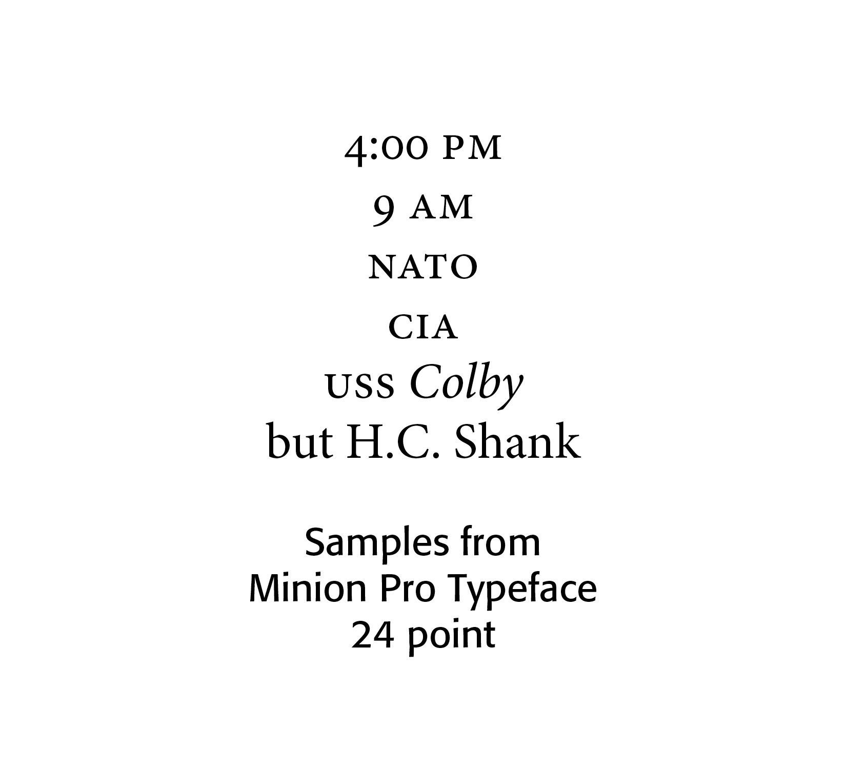
For abbreviations and acronyms in the midst of normal text, use small caps. Notice the following examples (using the Minion Pro font here). The space between the small cap letters is 10% of the size of the font. Note no small caps are used for initials of names.
Successful Layout & Design