Scripts & Cursives (1)
Scripts & Cursives. In typography and calligraphy, the terms script and cursive are related but not synonymous. They are often used interchangeably in popular usage, but type historians and calligraphers generally distinguish them by purpose, construction, and historical origin. While all cursive-inspired fonts are script typefaces, not all script faces are cursives. Thus, a calligraphic font with disconnected capitals and lowercase letters is a script font, but not truly cursive.
Background. Two previous posts are a good place to start this discussion — See "Calligraphy & Typography" at https://www.caretypography.com/calligraphy-typography. Also, see "Pen-Lettering History" at https://www.caretypography.com/pen-lettering-history. In typographic terminology, script refers to a class of typefaces designed to emulate handwriting or calligraphy, regardless of whether letters are connected. Cursive, by contrast, refers to a style of handwriting characterized by connected, flowing letterforms developed for efficient writing. Consequently, cursive writing is one important source of script typefaces, but script typography also includes many designs that are not truly cursive.
Robert Bringhurst in The Elements of Typographic Style (Vancouver: Hartley & Marks, 2012) classifies script as a category of typefaces derived from handwriting and distinguishes formal and informal script traditions. He notes that "there are thousands of typefaces that stand outside the conservative and tradition-bound world of text type, and that look as if they might have been handwritten rather than drawn, carved or inscribed. Some are formal, some informal, some connected and some made of separate letters. Typographers often lump them together unscientifically as script types." (p. 193, 1992 Edition).
Bringhurst says that "in general, scripts are also more closely tied to particular moods, places and times than text types are, and types that pass quickly in and out of fashion are extraneous to the subject of this book." (p. 193) He notes that scripts are important only as "setting off" a single word or line of normal text copy. He then discusses the typefaces Beowolf, Carolina, Legende, Ondine, Present and Salto.
Highlighting Scripts. There are "formal" scripts, "casual" scripts, "brush" scripts, "calligraphic" scripts, "Copperplate-inspired" scripts, and "Spencerian-inspired" scripts.
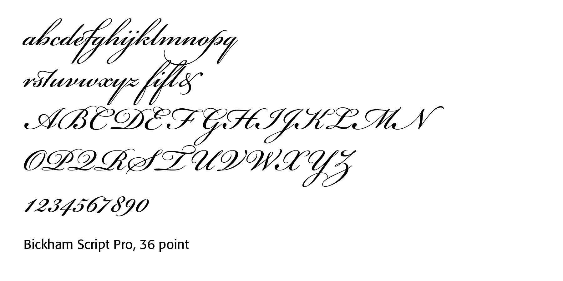
Formal scripts exhibit a high contrast between thick and thin strokes, long, graceful swashes, connected letters, and formal rhythm and symmetry. Samples include Bickham Script Pro, Edwardian script and Palace script. Such scripts showcase fine handwriting and extravagant flair.
Together, Edward Cocker, John Ayres, Thomas More William Smith, Thomas Seddon and Charles Snell preserved and refined England's major script traditions through engraved copybooks. They standardized handwriting used in commerce, education, and government. They created engraved letterforms that served as prototypes for script typefaces, Bridging the worlds of calligraphy, engraving, and typography during a period before script could be easily reproduced with movable type. They laid the aesthetic foundation for many eighteenth- and nineteenth-century script fonts, especially those based on Round Hand and Copperplate traditions.
More on Bickham script can be found at the post "English Penman Calligraphic Fonts" at https://www.caretypography.com/english-penman-calligraphic-fonts.
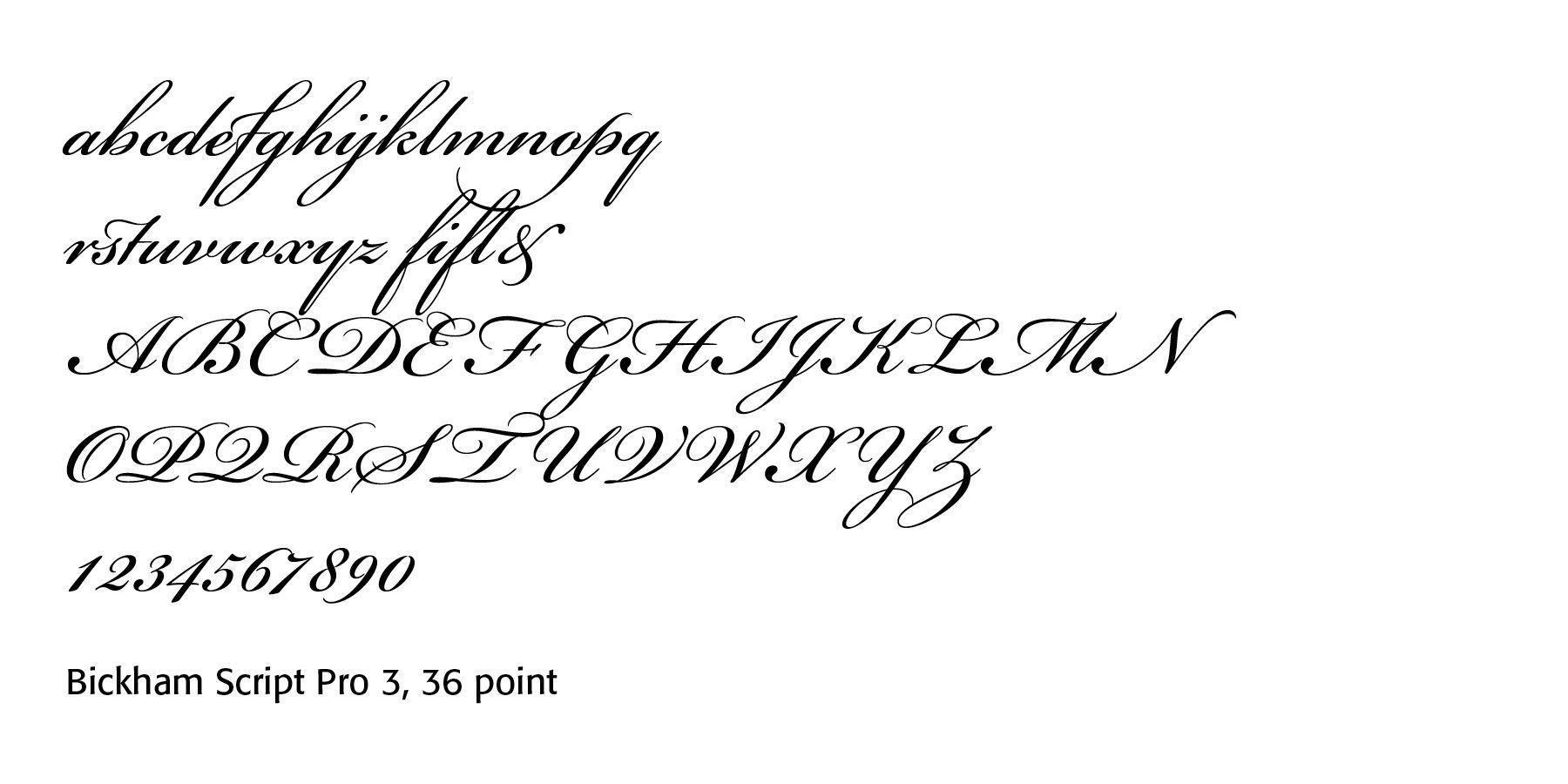
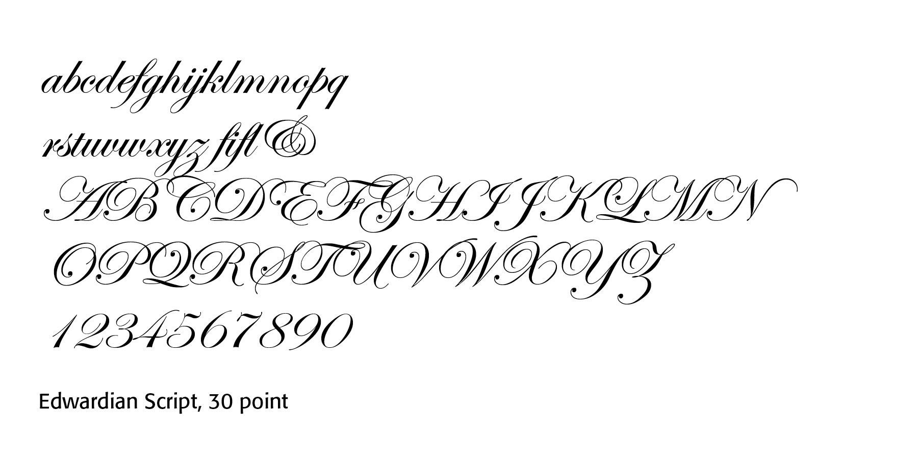
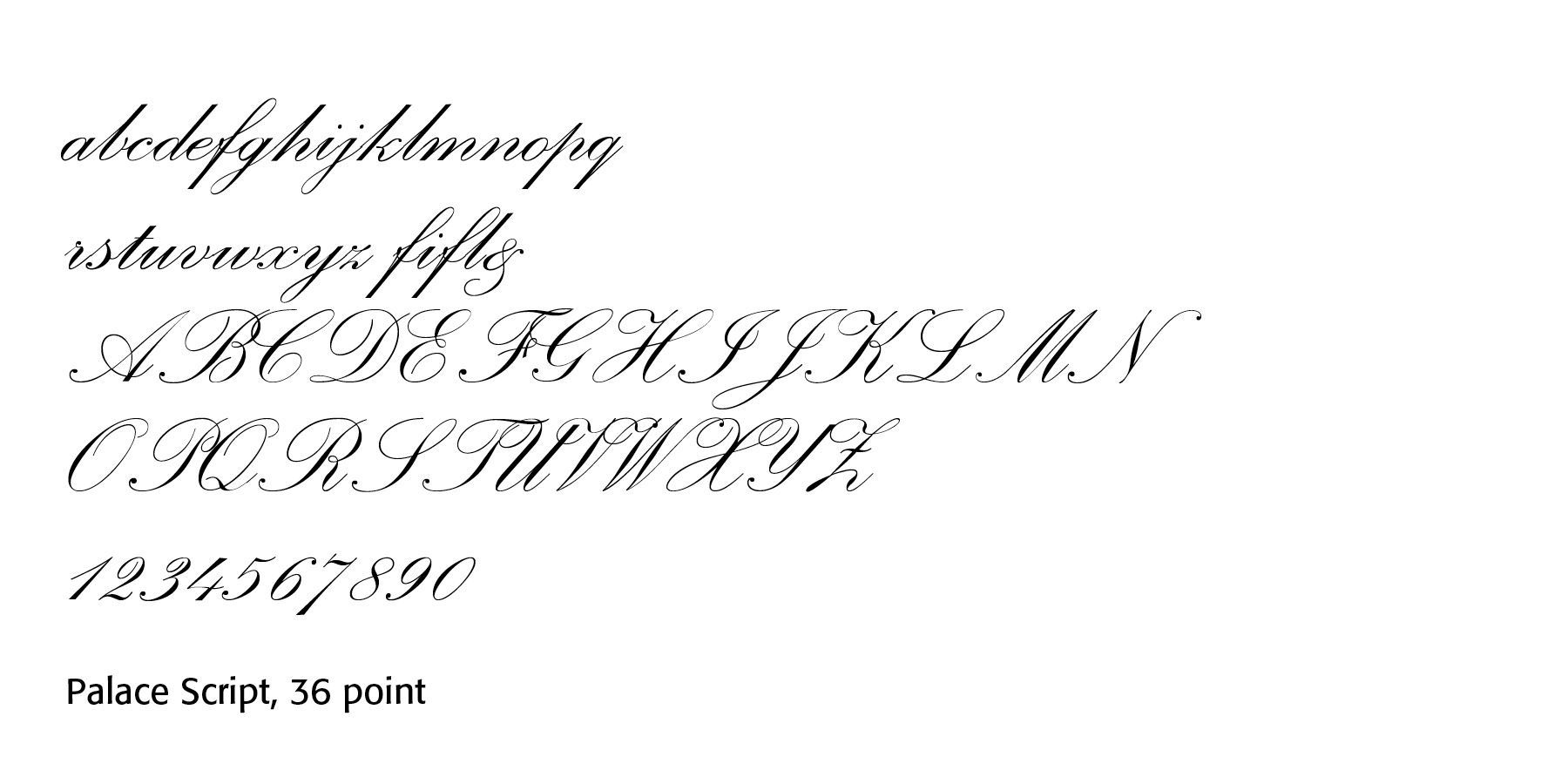
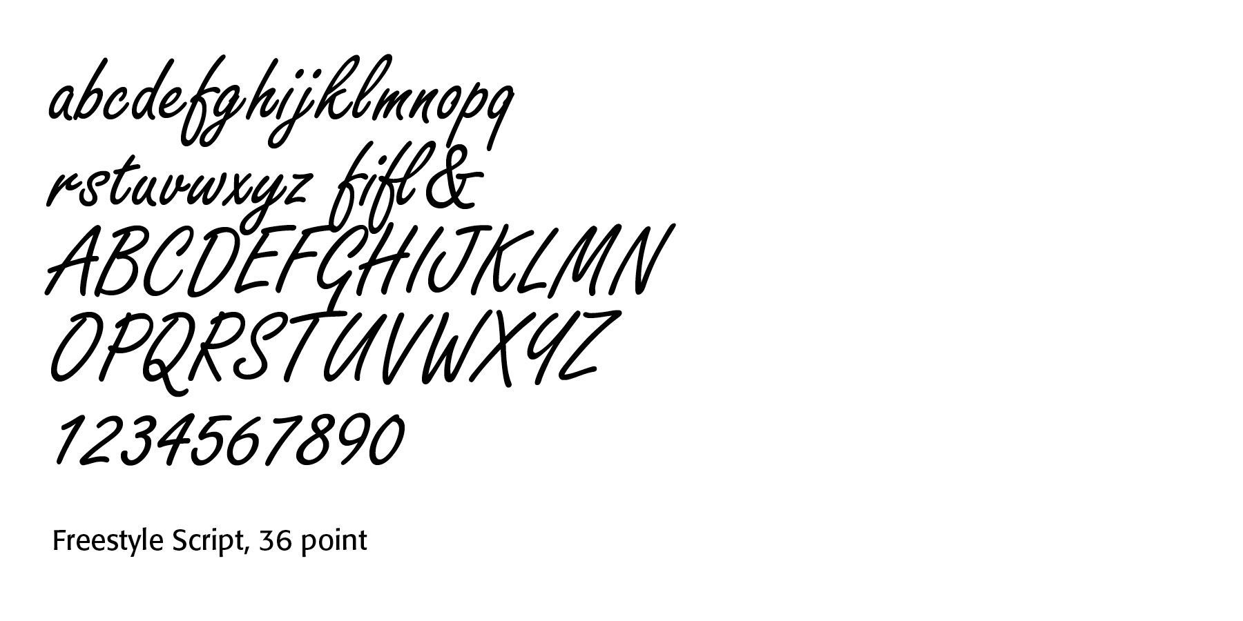
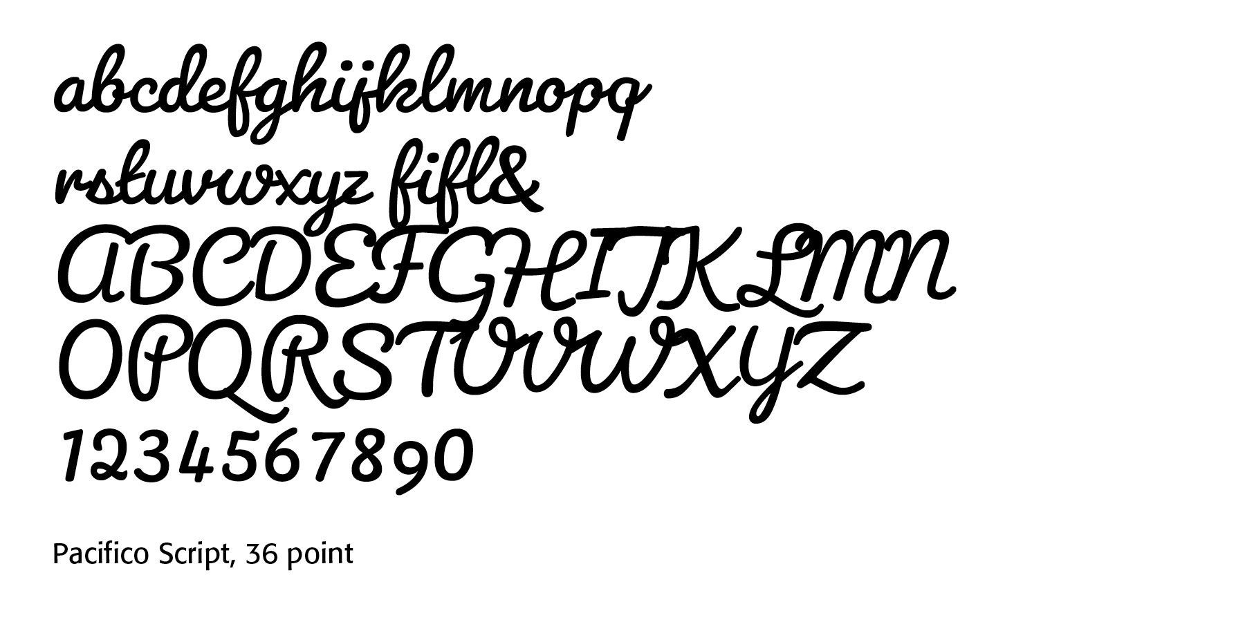
Casual scripts include faces like Mistral, Freestyle Script, Kaufmann, Segoe Script, Comic Sans Script, and Pacifico.
Characteristically they have irregular letterforms, moderate connections, natural handwritten appearance, and a friendly and informal tone.
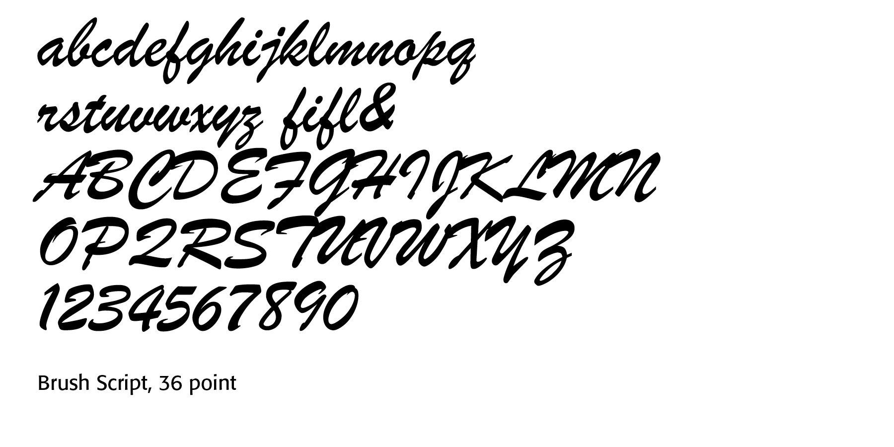
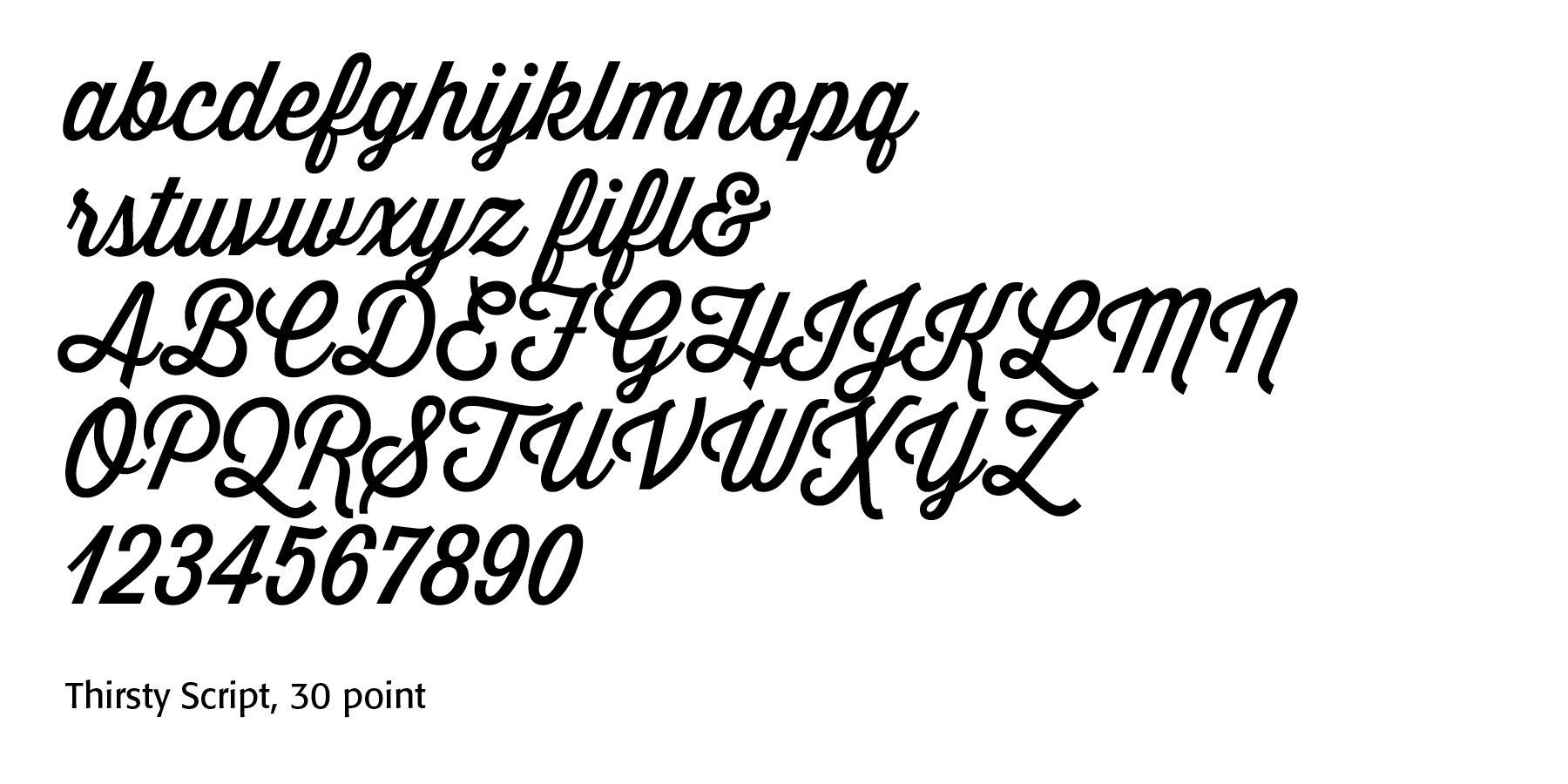
Brush scripts, populat between 1940-1960s, include Brush Script MT, SignPainter, Ballpark Weiner, Thirsty Script, Playlist Script, and Brusher.
They offer variable brush strokes, bold movement, visible texture or dry-brush effects, and dynamic, energetic appearance.
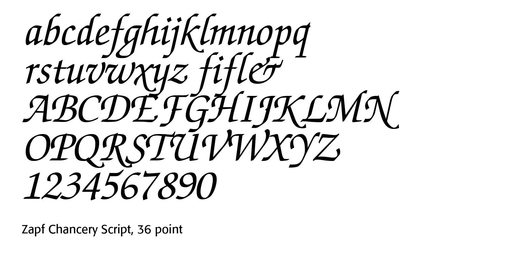
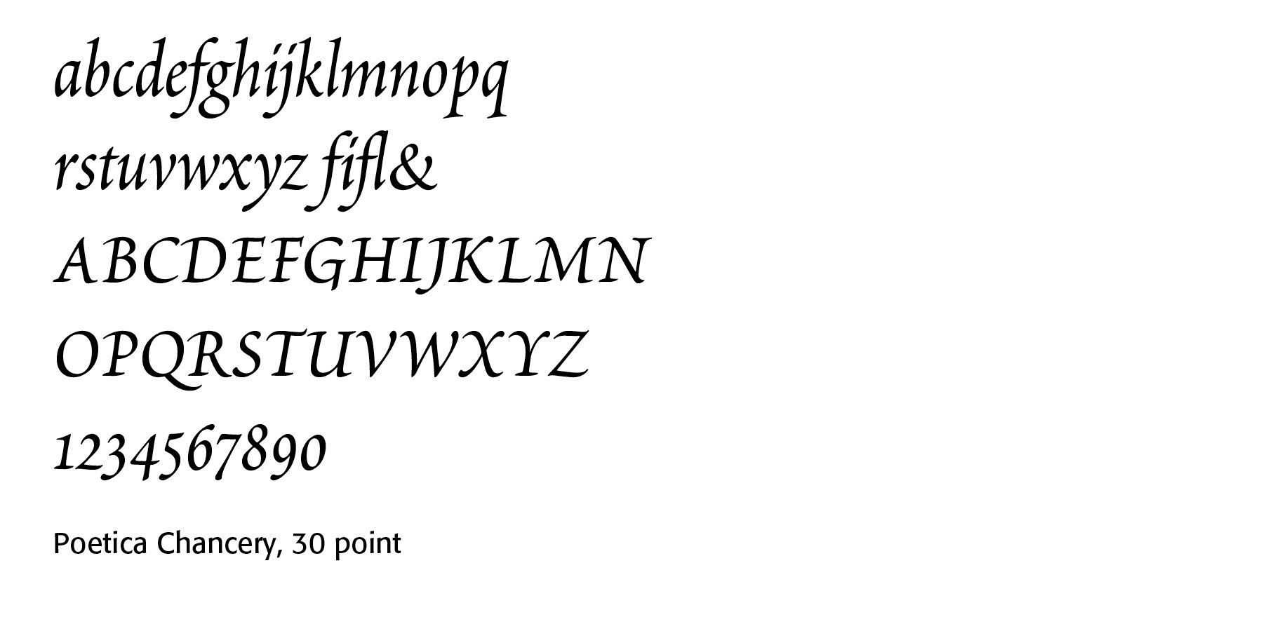
Calligraphic scripts include faces like Zapf Chancery, Lucida Calligraphy, Poetica, Cantoni, and Linoscript.
They are based on historical penmanship, authentic pen stroke modulation, elegant capitals, and often include alternate characters and ligatures.
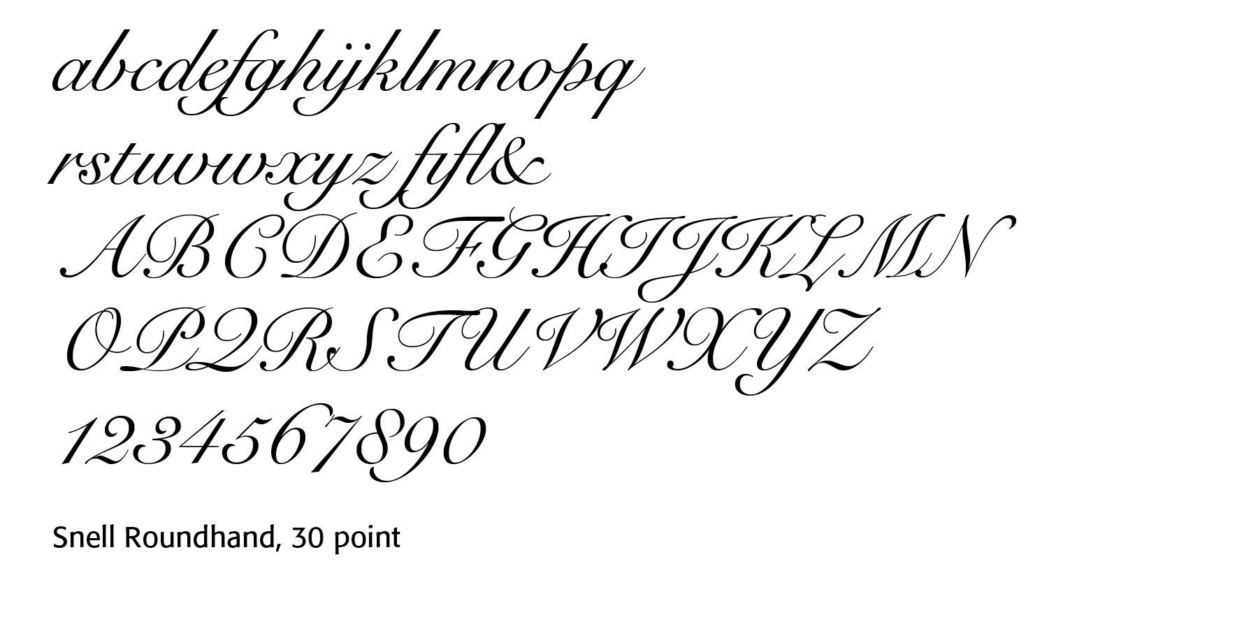
Copperplate-inspired scripts are based on the engraved English Round Hand style popularized in the eighteenth century. Examples include Snell Roundhand, Bickham Script Pro, English 157, Shelley Script, Adorn Garland.
They offer high contrast between thick and thin strokes, oval letterforms, precise engraving style, and elaborate capitals and flourishes.
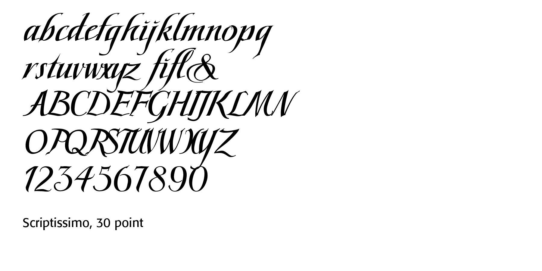
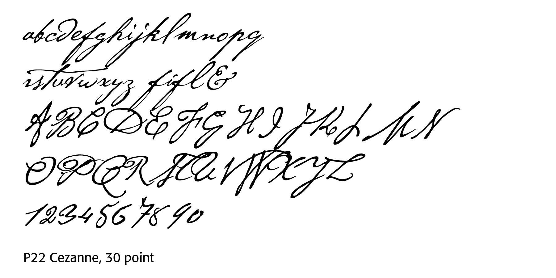
Spencerian-inspired scripts derive from the nineteenth-century American business handwriting developed by Platt Rogers Spencer. They emphasize graceful movement and rhythmic curves. Examples here include
Spencerian Script, Young Baroque, P22 Cezanne, Palmer Script, Spencerian Palmer Penmanship, and Scriptissimo Forte Middle.
Characteristics are light, flowing rhythm, delicate hairlines, long ascending and descending loops, less rigidity than Copperplate, and they are designed for rapid, beautiful handwriting.
Not every script is cursive. Many display scripts have disconnected letters while still looking handwritten. Formal scripts are often used on invitations and diplomas. Casual scripts are used on greeting cards. Brush scripts are found on posters and advertising packaging. Calligraphic scripts can be used for religious or artistic certificates. Copperplate-inspired scripts can be found on luxury branding and wedding stationery. Spencerian-inspired scripts are used on logos, certificates and for historical reproductions.
Successful Layout & Design