French Typography History (Part 2)
Art Nouveau and Paris
Between 1500 and 1900 typography evolved from Renaissance humanist forms to industrial mass production and artistic revival. Old style typefaces (like Garamond) moved to Transitional faces (like Baskerville) to Modern/Didone faces (like Didot and Bodoni) to Industrial display types (fat faces, slab serifs, sans serifs) to the Arts & Crafts revivals. Art Nouveau was a reaction against the academicism, eclecticism and historicism of nineteenth century architecture and decorative art. The new art movement had its roots in Britain, in the floral designs of William Morris, and in the Arts and Crafts movement founded by the pupils of Morris.
Art Nouveau fonts (REFERENCE) grew out of the late nineteenth century Art Nouveau movement (c. 1890–1910). The style flourished across Europe and America in architecture, furniture, illustration, and typography. In lettering, Art Nouveau embraced organic forms, flowing curves, floral motifs, and asymmetry, reflecting the movement’s fascination with natural growth and hand-drawn ornament.
Art Nouveau took its name from the Maison de l'Art Nouveau, a Parisian gallery that exhibited the works of artists and designers who were associated with the movement. The style was characterized by flowing, curvilinear forms inspired by natural shapes and motifs such as flowers, vines, and insects. It also incorporated elements from other artistic traditions, such as Japanese art and the Arts and Crafts movement.
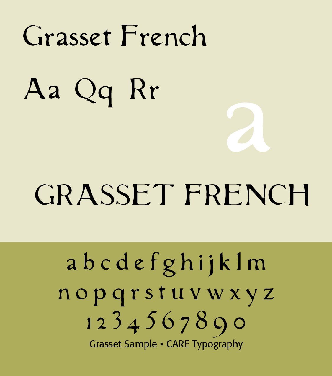
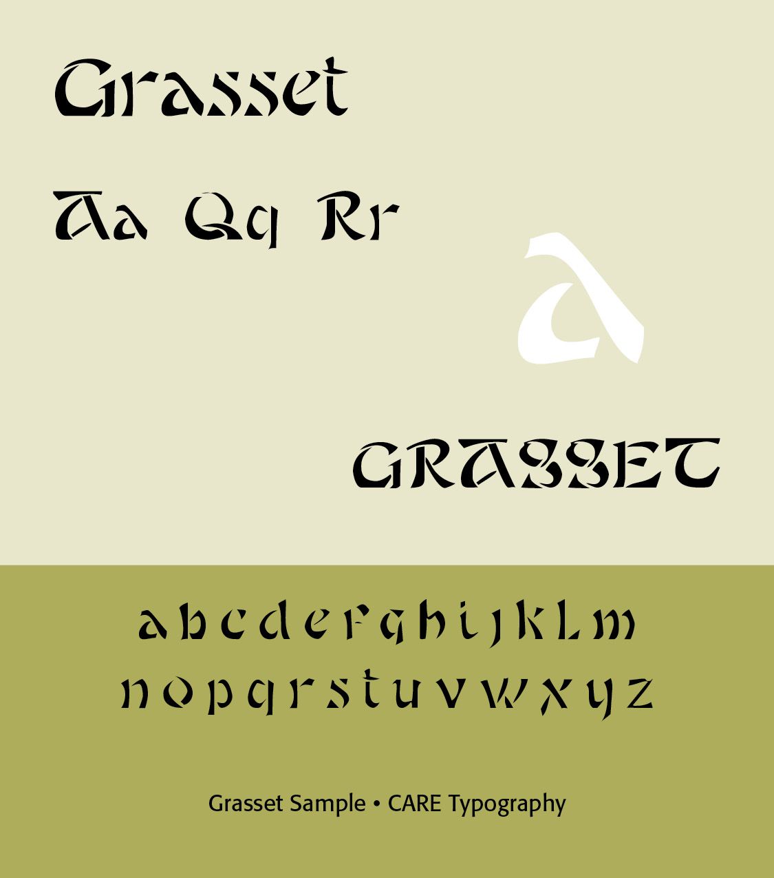
The work of Alphonse Mucha and the type of Eugene Smauel Grasset (1845–1917) are particularly important to understanding this period. (ILLS) Grasset taught design at the École Guérin from 1890 to 1903, at the École d’Art graphique in the rue Madame from 1903 to 1904, at theAcadémie de la Grande Chaumiere from 1904 to 1913, and at the École Estienne in Paris. Grasset had freely adapted the alphabet of Nicolas Jenson (1471) with the intention of using it to print a book on his own method for ornamental composition, inspired by the courses he gave to the Guérin school. (Wikipedia)
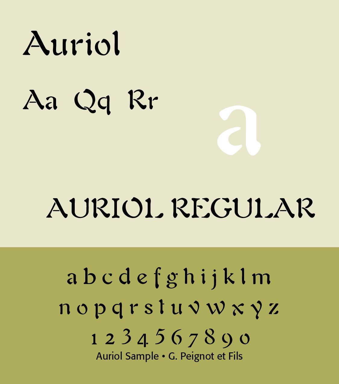
The Grasset Typeface (ILLS) from Lewis F. Day's Alphabets Old and New, London, 1910, shows that art nouveau flair for which these men were famous. The font has been digitized by CARE Typography and is offered with a number of other historic fonts for a modest fee. Contact cshanktype@gmail.com for details. Auriol (1901, George Auriol, France). Produced by G. Peignot et Fils foundry, was one of the most widely used Art Nouveau fonts in Paris. It was inspired by Japanese calligraphy. Japanese calligraphy, called Shodo or Shuji, heavily influenced Art Nouveau type.
Art Nouveau was particularly popular in Europe, where it influenced a wide range of artistic disciplines, including architecture, interior design, furniture, jewelry, and graphic design. Some of the most notable Art Nouveau architects included Hector Guimard, Antoni Gaudí, and Victor Horta, while artists such as Alphonse Mucha, Aubrey Beardsley, and Gustav Klimt were celebrated for their decorative and ornamental works.
By 1910, Art Nouveau was fading. It was seen as overly decorative and was replaced by Art Deco, Plakatstil (poster style), and modernist sans-serifs (e.g., Futura, 1927). Still, Art Nouveau typefaces remained popular in advertising for certain luxury goods. In the 1960s–70s counterculture revival, fonts like Arnold Böcklin were rediscovered and associated with psychedelic posters, bringing Art Nouveau back into fashion.
In short, Art Nouveau fonts were display-oriented, highly decorative, and tied to the broader artistic revolt against rigid academic styles. Fonts like Eckmann, Auriol, Bradley, and Arnold Böcklin remain the most recognizable products of the period.
Art Deco and 1920s Paris
Paris became a major center of Art Deco during the 1920s and 1930s.Typography became more geometric, symmetrical, streamlined, architectural, and modern. Designers used geometric sans serifs, condensed capitals, high-contrast Romans, and stylized lettering. Typography was closely connected to the worlds of fashion, architecture, transportation, cinema, and advertising, as well as department stores.
Parisian graphic design during this period helped establish the visual language of modern luxury. Dramatic, bold and stylish typefaces in the Art Deco period mirrored the golden age of cinema. From the 1920s to the early 1940s, after World War One, this type and art style embraced elegance, ornamentation and stylization. Known initially as “le style moderne” or “Jazz Moderne,” the style received its current name in 1968. Art Deco originated in a time of intense aesthetic experimentation. Art movements such as the Bauhaus, Constructivism, Cubism, De Stijl, Futurism, Orphism, and Surrealism helped define the style’s inherent modernism.
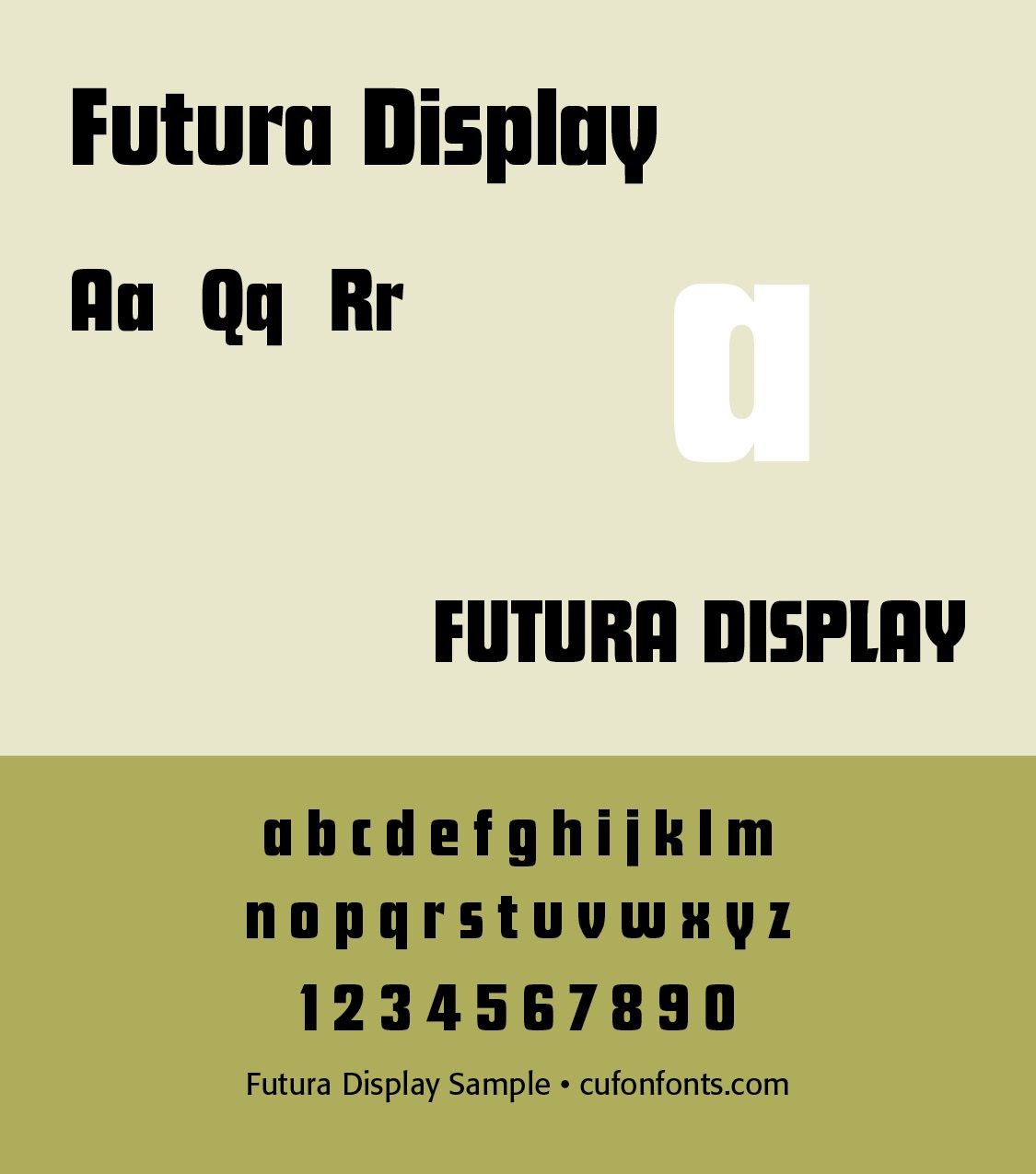
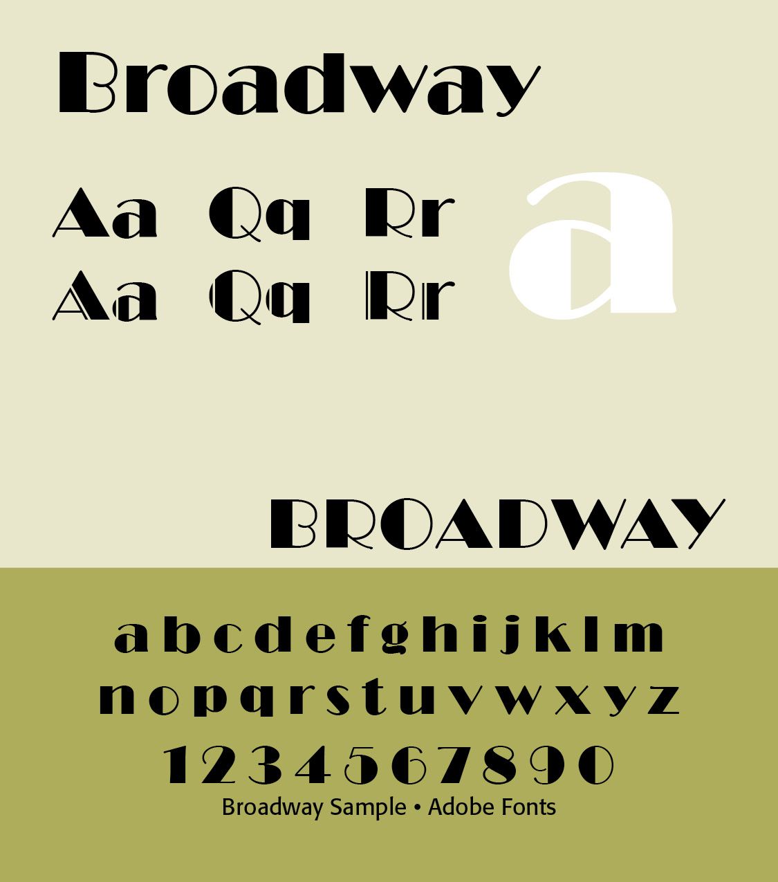
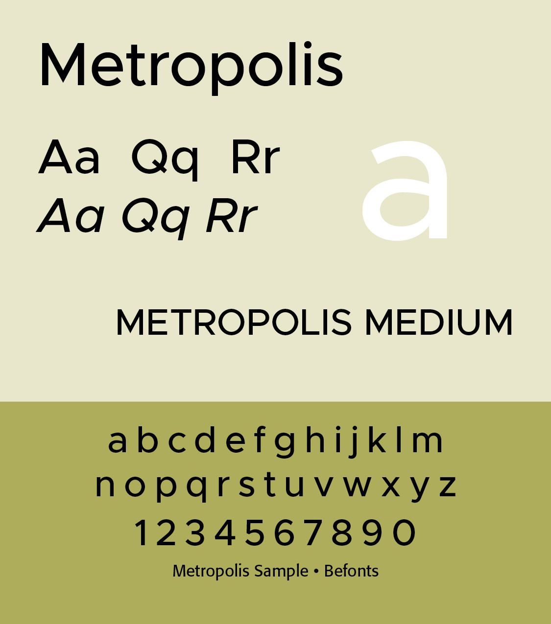
Many Art Deco typefaces were based on simple shapes, such as triangles, circles and rectangles, but combined into elegant, futuristic forms. It was the machine age gone glamorous. The of chrome, glass, neon and metallics in architecture and product design carried over into the look of display type, appearing sleek and shiny in print and signage.
Art Deco marked the rise of display type — typefaces intended for large headings, signage, and advertising. Art Deco fonts like Broadway, Futura Display and Metropolis became iconic of the period. Note that the letterforms were stylized with angular, elongated lines, sharp corners, stepped forms and symmetrical embellishments. They were visually heavy, strong and yet, like the font Broadway, conveyed sophistication and style. Movie posters and theater marquees featured such typefaces.
Typography in the Art Deco period was ornamental, geometric and celebratory. It reflected the optimism, luxury and modernity of the interwar years, combining traditional craftsmanship with industrial precision. Art Deco was meant to dazzle — perfect for the jazz age, cinema, and the dawn of mass consumerism. (ChatGPT)
What about beauty in Art Deco? Did Art Deco reflect Christian ideals and God-centered beauty principles? One article from the New York Public Library gives suggestive context to this discussion when it states that “Art Deco design exemplified opulent consumption, crass commercialism, and the acceleration of contemporary life summed up in the Futurist credo ‘Speed is beauty.’” (https://www.nypl.org/node/171023.)
Art Deco was a reaction to the shattered utopian dreams from World War One. People went on a binge of sorts against regimentation and sacrifice with Art Deco. Art was now combined with the machine age with designs that incorporated chic elegance, eclectic historical and national imagery with the Machine Age into decorative effervescence. Beauty’s revelation of the presence of God is rebuffed in Art Deco.
Art Deco demands to be noticed. Its use of geometric forms gives a unified expression but rejects ancient artistic differences. It clearly crosses international boundaries and breaks through the borders of traditional art. It is “fitting” in the sense that it reflects the opulence and commercialism and looseness of the times, energizing it with the benefits of Machine Age advancements. Its purpose was to dazzle, and it did that with impunity.
Paris and modernist typography: Cubism
Paris also played an important role in the development of modernist graphic design.
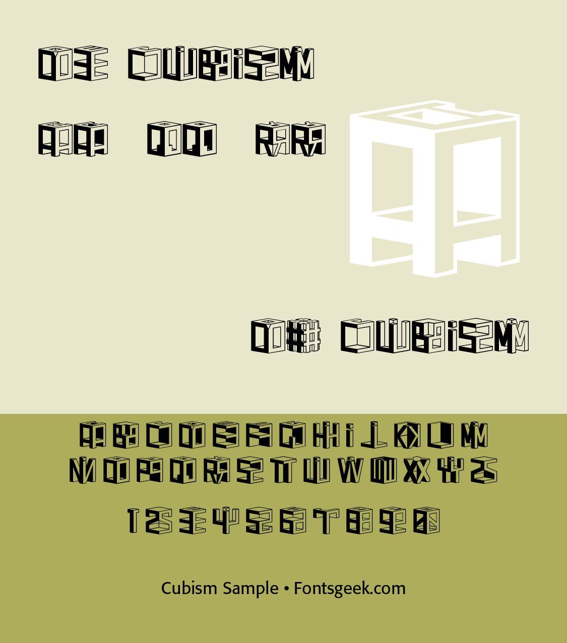
Cubism was primarily an avant-garde art movement that developed in Paris around 1907–1914, associated especially with Pablo Picasso and Georges Braque. Although Cubism did not produce a single “Cubist typeface,” its ideas profoundly influenced graphic design, typography, advertising, posters, book design, and visual communication, particularly during the 1910s–1930s.
Cubist design encouraged designers to think of the page as a visual composition in which words, letters, shapes, textures, and images could occupy different planes simultaneously. Several important design principles followed — fragmentation, where forms are broken into geometric pieces, multiple viewpoints, where an object may be suggested from several perspectives at once, geometric construction, where rectangles, diagonals, planes, and angular forms become important, overlapping, where elements occupy several visual layers. Additionally, collage was used, where printed words, newspaper fragments, labels, and other materials become design elements. Nonlinear composition was a design feature where the eye does not necessarily follow a conventional left-to-right reading order. Typography as image became foremost, where letters can function as shapes rather than merely carriers of language.
One of Cubism's most important contributions to graphic design was the collage.
Picasso and Braque began incorporating actual pieces of printed material into their compositions. Newspaper typography, labels, sheet music, wallpaper, and lettering could become part of the artwork. This changed the designer's understanding of printed language. A newspaper fragment could simultaneously be read as text, recognized as an image, used as texture, or used as a geometric shape. That idea became enormously important to twentieth-century graphic design.
Cubist thinking encouraged designers to consider the individual letter as a graphic form. For example, a large A might function simultaneously as a letter, a triangle, a structural element, a directional device, or part of a geometric pattern. This helped move typography toward the modern idea of typography as visual architecture. The letter no longer had to remain subordinate to the sentence. Cubism supplied much of the fragmentation and spatial experimentation; Futurism added movement and dynamism. (ILLS font)
Paris and modernist typography: Dada
Cubism also helped prepare the way for Dada typography.(REFERENCE) Dada designers and artists pushed fragmentation even further, producing pages in which: type ran vertically and diagonally, letters were enlarged or reduced dramatically, different typefaces appeared together, photographs collided with text, words were deliberately fragmented, and conventional reading order was disrupted.
In Futurism designers increasingly experimented with asymmetrical layouts, sans-serif typography, unconventional scale, diagonal composition, photomontage, and typography as image. The traditional French concern for typographic refinement therefore began interacting with international modernism.
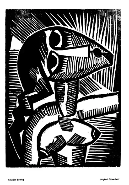
Then came World War 1 (1914–1918) and with it a devasting blow to societal hopes and standards. The utopianism of pre-war gave way to the skepticism of post war and the rise of German totalitarianism under Hitler. Culture here again invaded typography and typographic designs. World War 2 would further affect typographic design with the modernist move toward individualism and anti-Christian historic thought and standards.
This break with historic type formulations can be seen in the Dadaism movement. Disdain for convention marks the Dada period of typography, if we can rightly call it typography. Dadaists were influenced by Futurist typography, which celebrated energy and disorder. Whereas Futurists glorified progress, Dada questioned meaning itself.(ILLS Picture)
This avant-garde movement rejected order and logic, which it regarded as having failed to prevent the catastrophic First World War. This frightfully horrific war trashed former utopian dreams of a wonderful, orderly and helpful society. Dada was nihilistic and used dynamic, non-linear text to express anger and emotion. The term “Dada” has no actual meaning. It is a childlike word used to describe lack of reason or logic in artwork and typography. (REFERENCE).
Mid-20th-century Paris
After World War II, Paris remained an important center for graphic design and typography. French designers explored the relationship between type plus photography plus architecture plus information. One important development was the growth of Swiss-influenced modernist typography, particularly in corporate and institutional design. Consequently, French designers retained a strong interest in classical typography for book design, literary publishing, calligraphy, and refined page composition. This produced an interesting tension between modernist functionalism and traditional French book typography.
Roger Excoffon (1910–1983) was one of the most distinctive French type designers of the postwar period. His work is strongly associated with the visual culture of 1950s–1970s France, particularly advertising, posters, packaging, signage, and commercial display typography. Unlike designers who pursued systematic geometric modernism, Excoffon favored expressive, hand-drawn, organic forms. His typefaces often look as though they were painted, brushed, or written rather than constructed from rigid geometric principles.
His work belongs to a particularly interesting moment when French graphic design was negotiating between traditional French lettering, Art Deco, modernist typography, American advertising, expressive commercial lettering, and the emerging Swiss-style rationalism. Designers such as Max Miedinger and Adrian Frutiger were developing typefaces intended to achieve clarity, consistency, and international applicability. Excoffon went in another direction. His letters frequently retain the gesture of the hand.
This distinction is particularly important because postwar French typography cannot simply be treated as a secondary version of Swiss typography. Excoffon represents a distinctly French alternative. His designs therefore emphasize gesture to rhythm to personality to communication, rather than geometry to system to neutrality to standardization. This made his typefaces particularly effective in advertising.
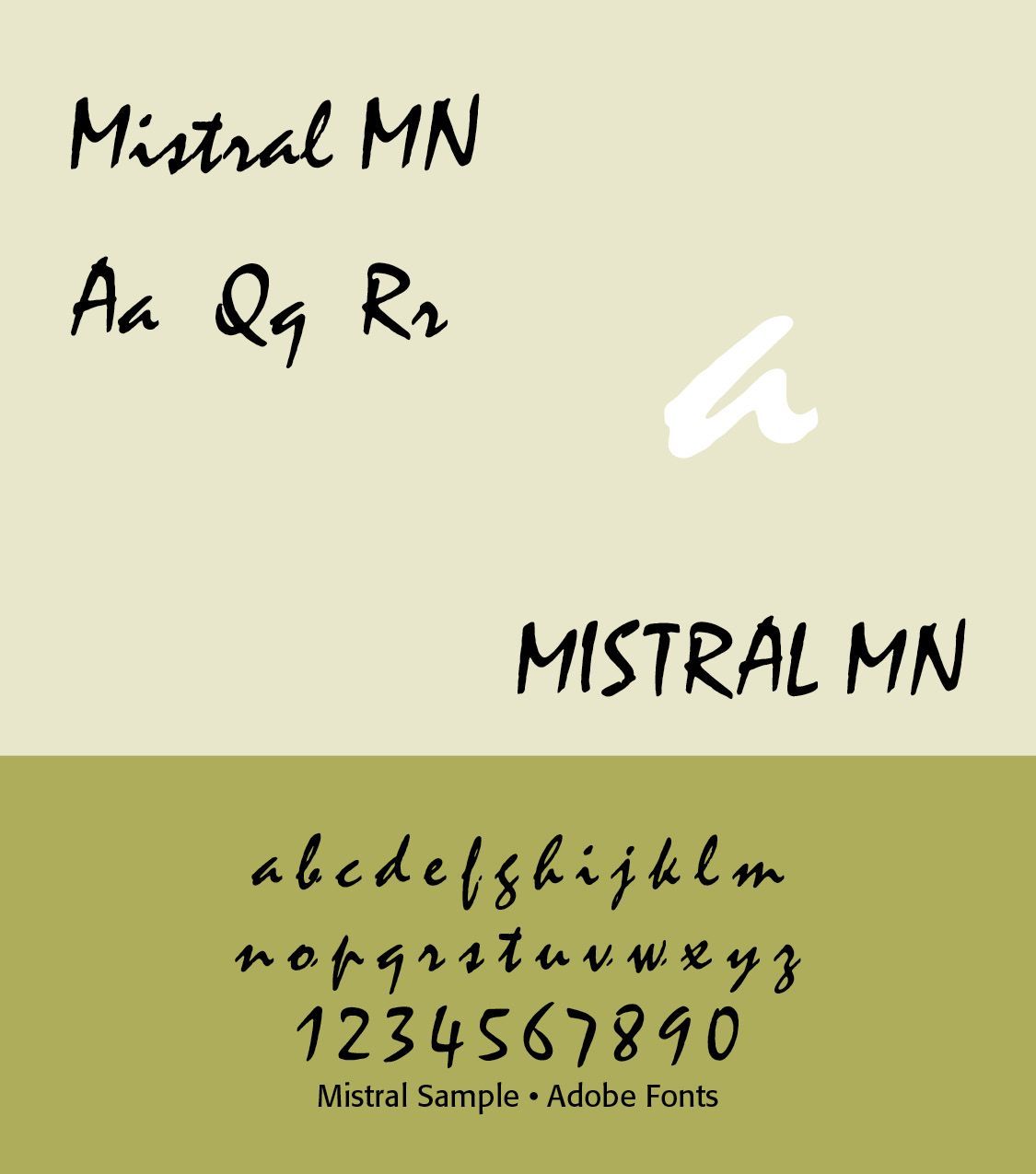
Mistral is probably Excoffon's best-known typeface. It imitates the appearance of rapid handwritten brush lettering. The letters have a strong rhythm and often connect visually, producing the impression of handwriting executed quickly with a broad instrument. Characteristics include flowing strokes, irregular letterforms, strong horizontal movement, brush-like terminals, dramatic changes in stroke weight, and an informal, energetic personality. The name refers to the Mistral wind of southern France, an appropriate association for a typeface characterized by movement. Mistral became enormously influential in advertising and popular culture. It represents the opposite of the cool, mechanical appearance of geometric sans serifs such as Futura. (ILLS)
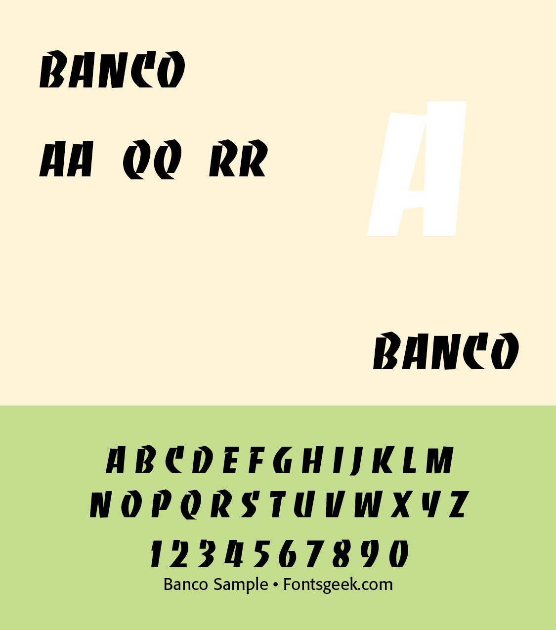
Banco is another highly recognizable Excoffon design. Its forms are bold, irregular, and highly stylized. Banco has an almost sign-painter or hand-lettered quality. It is particularly useful for understanding Excoffon's philosophy — letters don't have to look mechanically constructed to function as typography. Banco was widely used for posters, packaging, restaurant signs, advertising, entertainment graphics, and headlines.(ILLS)
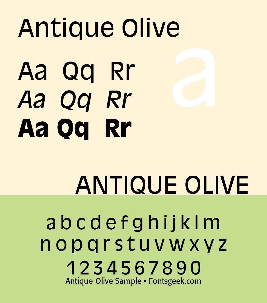
Antique Olive is perhaps his most important contribution to text and corporate typography. At first glance it is a sans serif, but it does not behave like a conventional geometric sans. Its proportions and letter construction are highly individual. Important characteristics include a large x-height, compact proportions, unusual letter shapes, relatively low contrast, organic curves, distinctive terminals, and a strong visual personality. (ILLS)
Excoffon's importance extends beyond type specimens. His typefaces became part of the visual vocabulary of postwar French commercial culture. They appeared in automobile advertising, food and beverage packaging, posters, storefronts, magazines, restaurants, cinema and entertainment, corporate identities, and transportation graphics. His designs therefore helped establish what might be called the vernacular face of French modernity. Instead of presenting modern France exclusively through minimalist geometric design, Excoffon's typography presented it through movement, wit, sensuality, and visual exuberance. If Didot represents the refinement of French typographic classicism, and Romain du Roi represents French rationalism, Excoffon represents a later French vernacular and expressive modernism.
21st Century French Type
French typography in the 21st century is characterized by a strong dialogue between historical tradition and contemporary digital design. France remains particularly influential in type design because of its long history—from Garamond and the Didot dynasty through Art Deco, phototypesetting, and modern graphic design—combined with a vibrant contemporary type-design culture.
One of the most important developments since about 2000 has been the growth of independent type foundries and designer-led studios. French type design increasingly operates internationally. Designers create families intended for books and editorial design, corporate identities, websites and apps, signage, cultural institutions, packaging, government and public information, and multilingual publications.
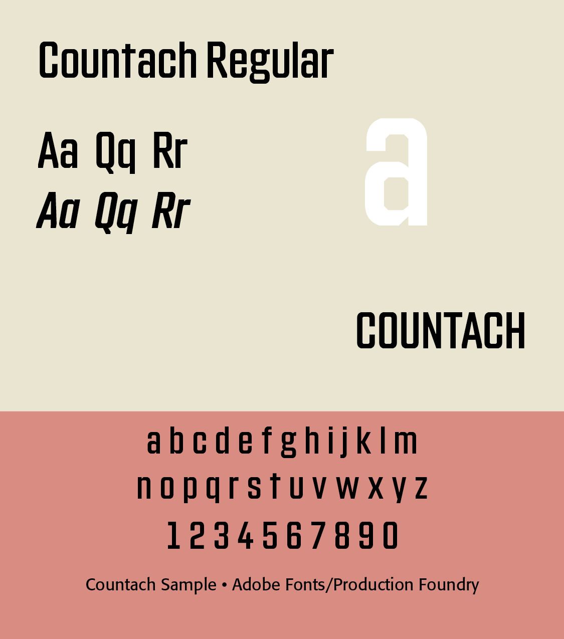
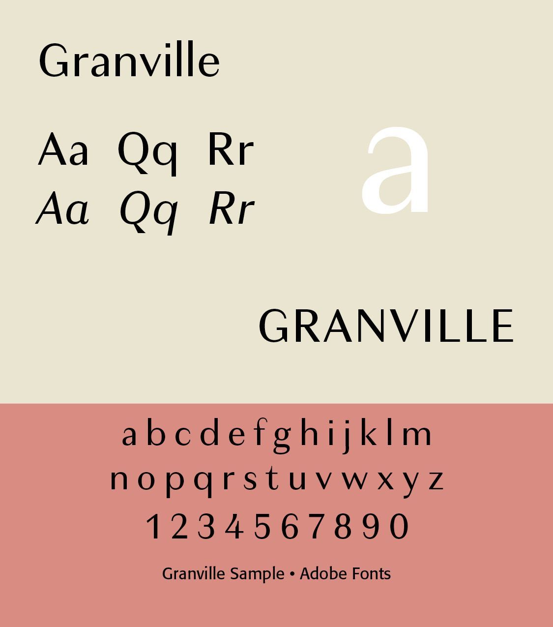
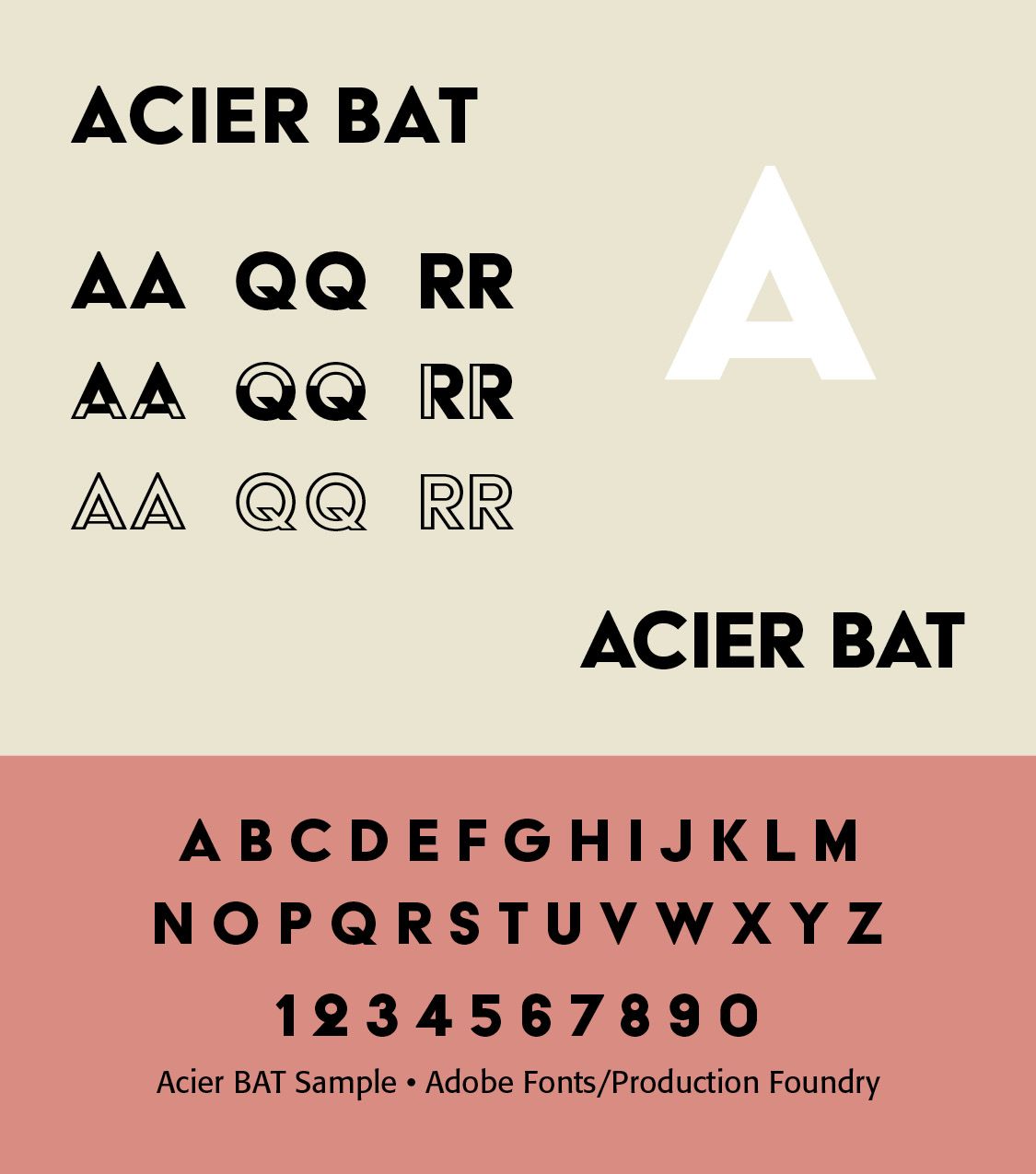
Jean-Baptiste Levée is one of the important figures in contemporary French type design. His work represents the intersection of historical scholarship, professional typography, and digital type production. He has designed and contributed to numerous typefaces and has also been deeply involved in the French typographic community. His career illustrates an important characteristic of contemporary French typography: the designer is often simultaneously a type designer, typographic researcher, educator, and practitioner. Granville, Countach, Acier BAT (from Adobe/Production Type Samples)(ILLS fonts)
Production Type, founded in Paris, is one of the most internationally prominent contemporary French type foundries. Its work demonstrates the broad range of contemporary French type design—from sophisticated editorial faces to highly experimental display typography. Production Type's designers have worked on typefaces for major cultural and commercial organizations, demonstrating how contemporary French typography operates at an international level.
A major change in the twenty-first century is the increasing use of bespoke typefaces for corporate identities. Large French institutions and companies increasingly commission typefaces rather than relying entirely upon established commercial fonts. Such typefaces can express French cultural identity, technological sophistication, institutional authority, luxury, accessibility, modernity, and national identity.
Historical French typefaces are frequently reconstructed or reinterpreted digitally. Rather than producing simple copies, contemporary designers may ask: What would this historical typeface look like if it had originally been designed for today's screens? This has resulted in new interpretations of Renaissance French romans, Garamond-style type, Didones, eighteenth-century transitional types, nineteenth-century display faces, French grotesques, and Art Deco lettering This approach connects typographic history with contemporary technology.
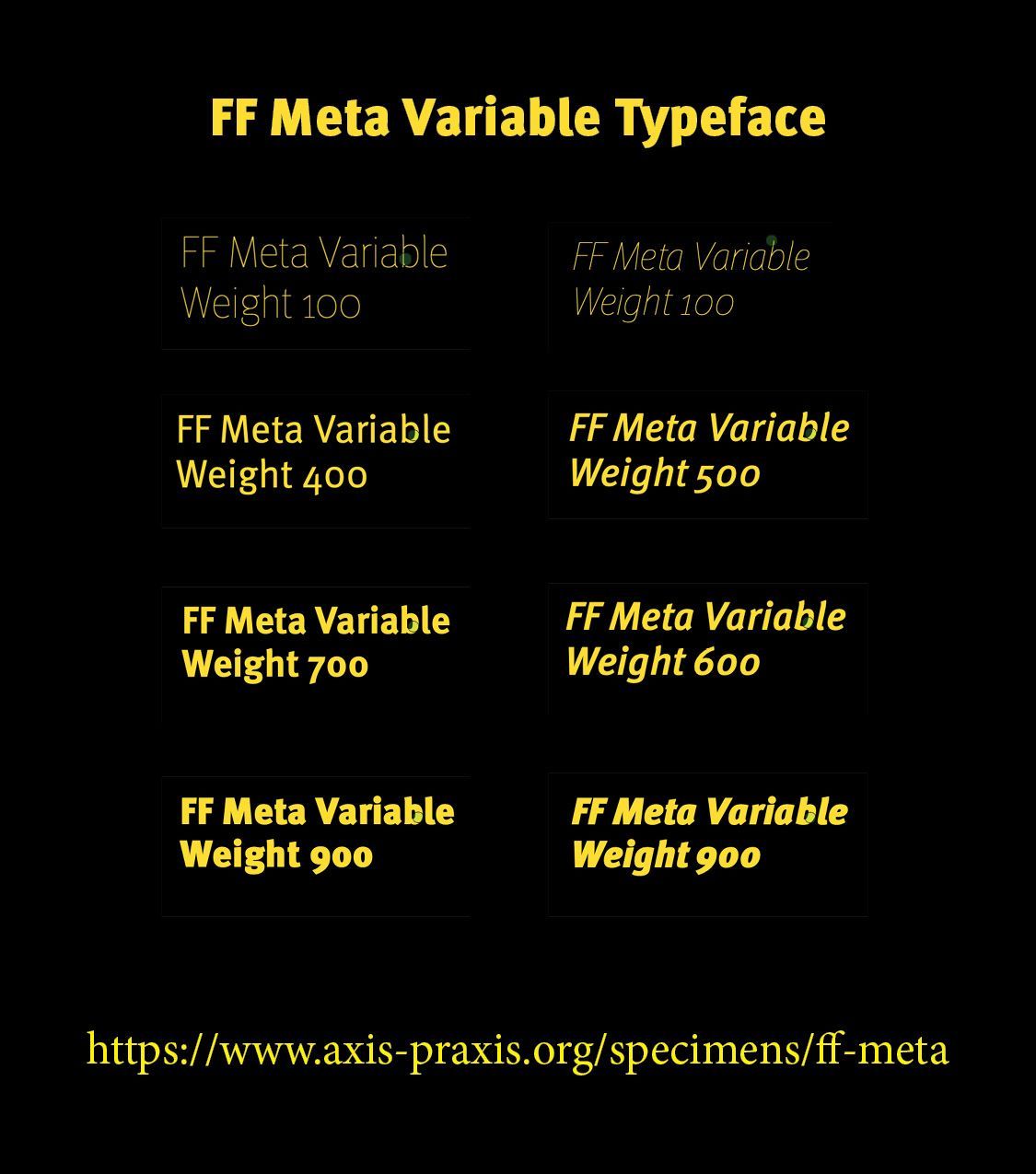
Experimental typography. Twenty-first-century French graphic design has also embraced experimentation. Designers use typography as a visual form rather than merely as a vehicle for language. This can involve extreme contrast, distorted letterforms, variable fonts, animated typography, unconventional spacing, oversized display type, fragmented text, multilingual typography, and a continuing interaction between typography and photography. This connects contemporary French typography with the experimental traditions of Dada, Surrealism, Lettrism, and the French avant-garde.
Modern French typefaces may include extensive character sets for Latin Extended, Central and Eastern European languages, Vietnamese, Greek, Cyrillic, and occasionally Arabic and other scripts. The contemporary French type designer therefore works in a genuinely multilingual and global typographic environment.
The larger historical picture is the development viewed as a long sequence — Garamond → Fournier → Didot → Art Nouveau/Art Deco → Excoffon → phototype → digital type → variable fonts
The distinctive feature of twenty-first century French typography is therefore not a single recognizable “French style.” Instead, it is the ability to combine historical French typographic forms with contemporary technology and international graphic design. In that sense, contemporary French typography is both deeply historical and technologically forward-looking. It preserves the prestige of the French typographic tradition while treating the typeface as a flexible digital design instrument. (ChatGPT)
Successful Layout & Design