More Fournier

Carl Shank • August 20, 2025

(UPDATE FROM POST DECEMBER 23, 2024) Pierre-Simon Fournier  — In our history of typography series, Pierre-Simon Fournier (1712–1768) was a French typographer and type designer, renowned for his contributions to the field of typography in the 18th century. He is best known for his work in creating typefaces that reflected the elegance and sophistication of the time.


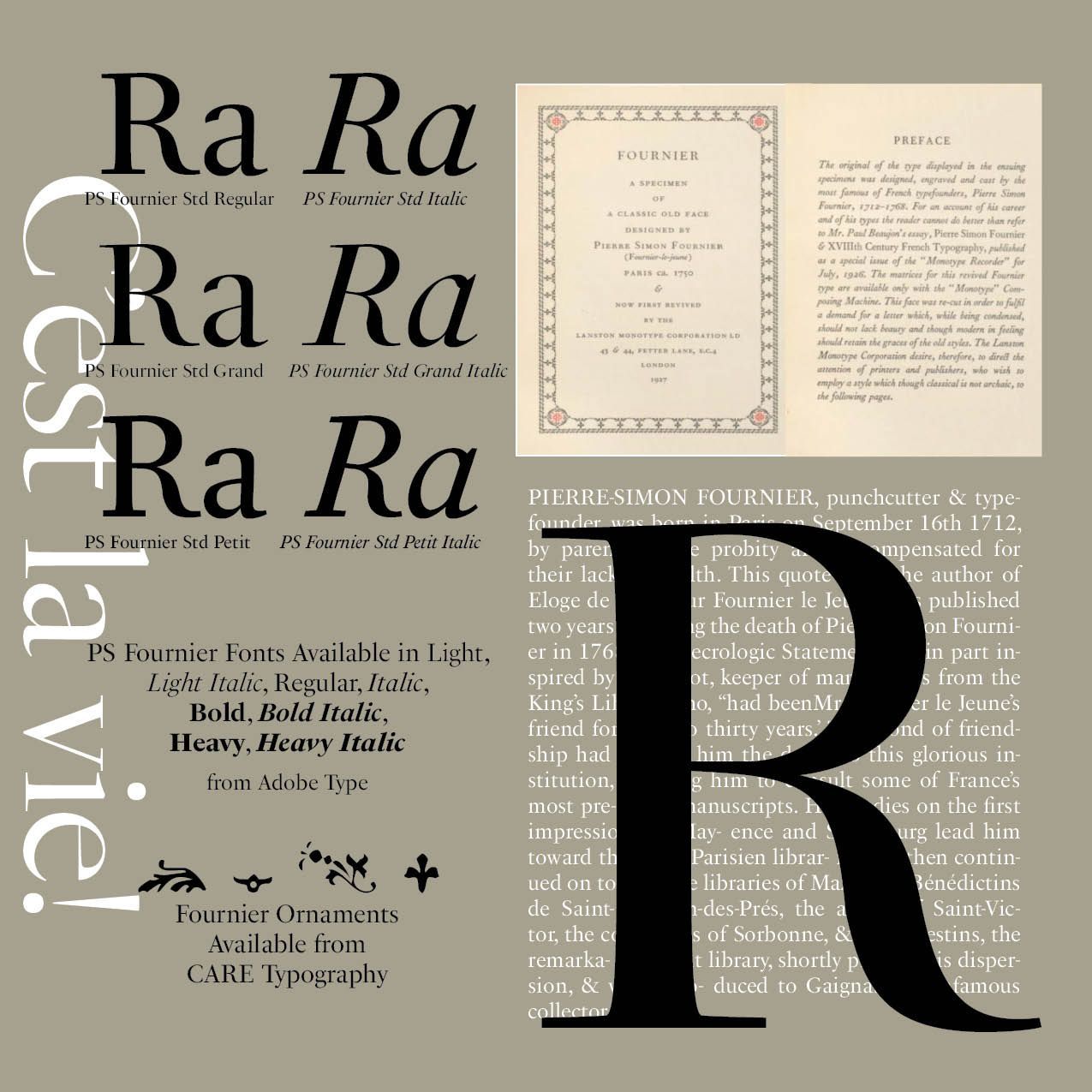
Fournier's work in type design focused on creating typefaces that were both visually appealing and functional. His types were characterized by their clarity, beauty, and legibility. The typeface Fournier is an aristocratic roman typeface. It is transitional, almost modern, in character, with a distinct French flavor, but with more grace and style than traditional French oldstyle designs. This modern character influenced the later work of Bodoni.(See Sample)


One of Fournier's significant contributions to typography was his establishment of a typographic point system. He invented a system that standardized measurements for type, which provided consistency and made it easier for printers to produce high-quality texts. This innovation helped printers achieve consistency in their work.


Fournier published a seminal work in the history of typography titled Manuel de la Typographie (Manual of Typography, two volumes published in 1764 and 1766), which included detailed descriptions of his typefaces along with examples. This work served as a reference for printers and typographers. The Introduction gives an overview of the principles of typography. In his Classification of typefaces, Fournier emphasizes the distinction between different styles, such as Roman, Italic, and Gothic types. The manual includes practical tips for setting type, including spacing, alignment, and layout, aimed at improving the quality of printed materials. Fournier includes numerous type specimens, showcasing his designs and providing examples of how different types can be used effectively in printing. Throughout the text, Fournier discusses the historical development of typography and its evolution, reflecting on the influence of various cultures and periods on the art of type.


Other contemporaries elsewhere, such as J.M. Fleischman and J. Enschedé, started imitating Fournier's style. In the 1750s, his career was at its peak. He advised royalty in Sweden and Sradinia on types, and set up a printing shop for Madame de Pompadour. He developed musical types in cooperation with J.G.I. Breitkopf in 1756. Fournier's designs influenced future generations of typographers and established a foundation for modern type design. His methods and styles contributed to the evolution of typography, leading to the development of various typefaces we see today.


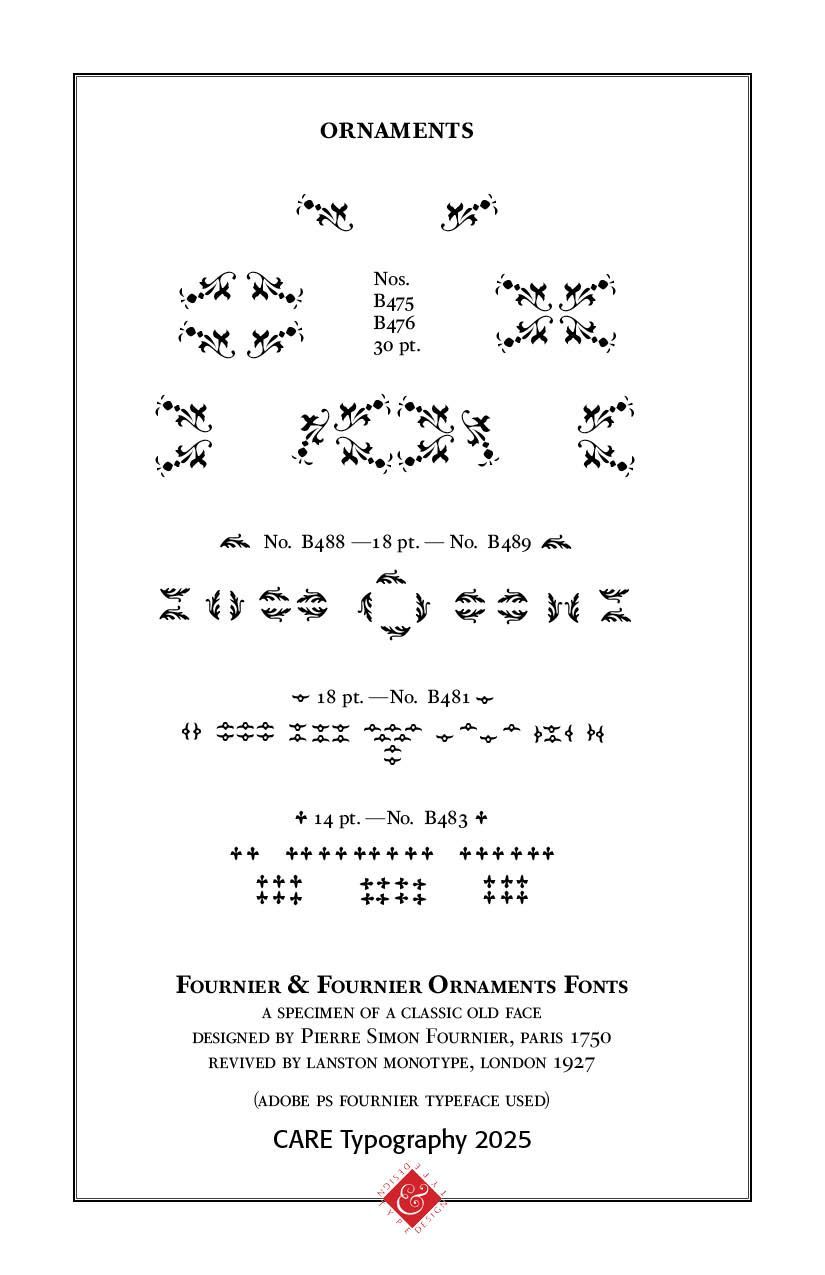
The ORNAMENTS display is a careful digitized reproduction by CARE Typography of Fournier's original ad as seen in the "Fournier Specimen Book" by Lanston Monotype, 1927, in London.


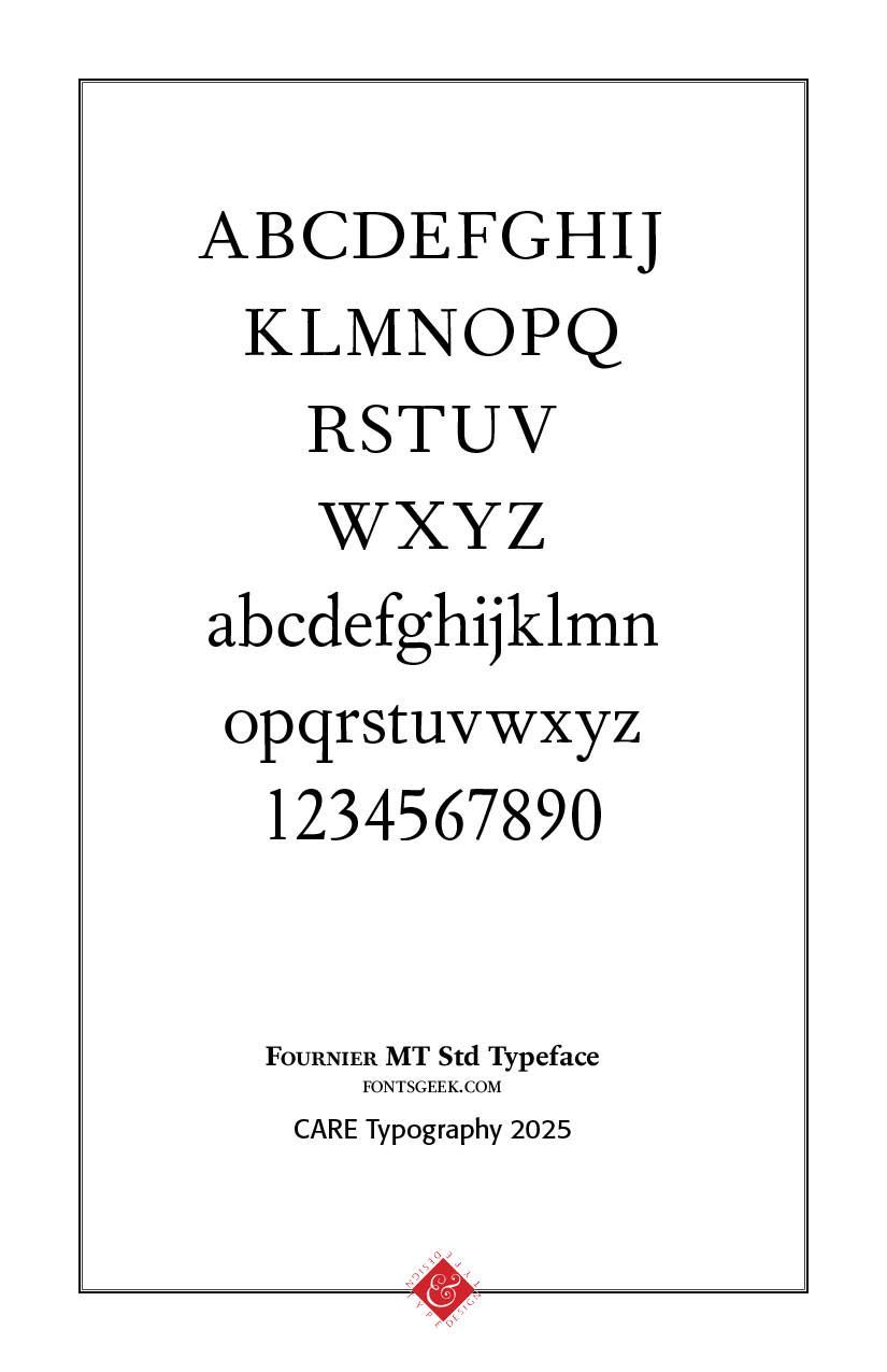
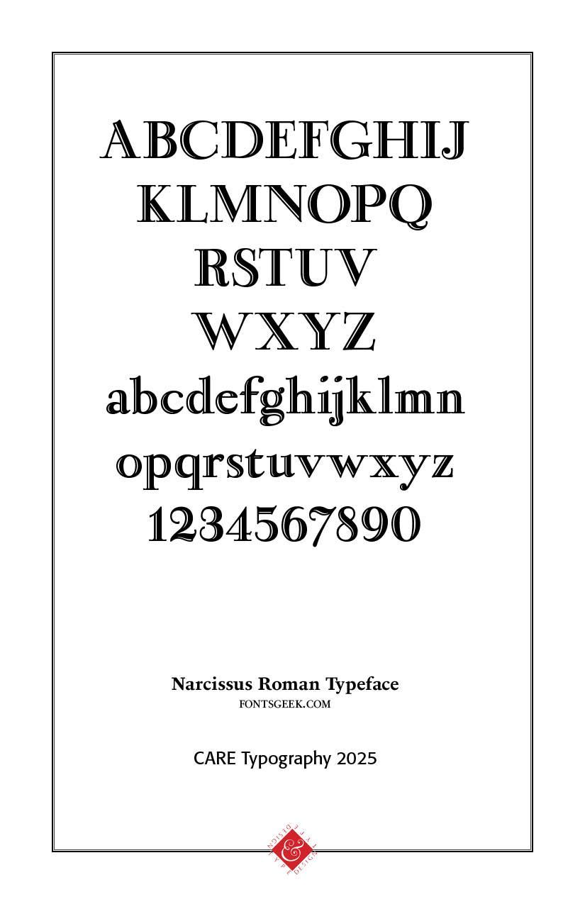
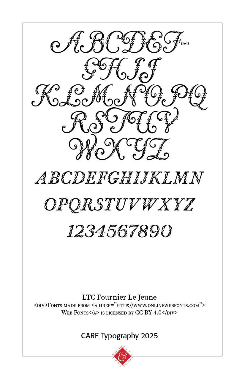
Legacy: The Fournier MT family by Monotype (1924-1925) was based on the types cut by Pierre-Simon Fournier (ca. 1742) and was called St Augustin Ordinaire in Fournier's Manuel Typographique. Narcissus-Roman (1995, Font Bureau) is based on a 1745 design of Simon Pierre Fournier, and a 1921 version of it called Narcissus by Walter Tiemann for Klingspor, and was digitized by Brian Lucid in 1995. Jim Spiece's version is called Narcissus SG. In 1768, he designed an ornamental all caps face, which Peignot produced as Fournier le Jeune. More elaborate caps were added by ATF in the 1920s, and the current digital version by P22/Lanston, also called Fournier le Jeune, is based on that [see LTC Fournier Le Jeune]. Based on the decorated letters designed by P.S. Fournier c. 1746 and reproduced by Peignot.” [JBJ]

“Fournier or Fournier Le Jeune, with the exception of the figures, is a reproduction of Le Fournier Le Jeune originally cut in France in 1768 […] and revived in 1913 [by G. Deberny]. ATF secured the American rights in 1926.” [McGrew 1993]


Also offered by the Amsterdam Type Foundry as Gravure verziert.

Digitally revived by Paul D. Hunt for LTC as LTC Fournier Le Jeune, featuring “more elaborate ‘Vogue Initials’ caps which were offered by ATF in 1920s.” [P22] Latter were designed by Clarence Pearson Hornung in 1923. [Reichardt 2011]


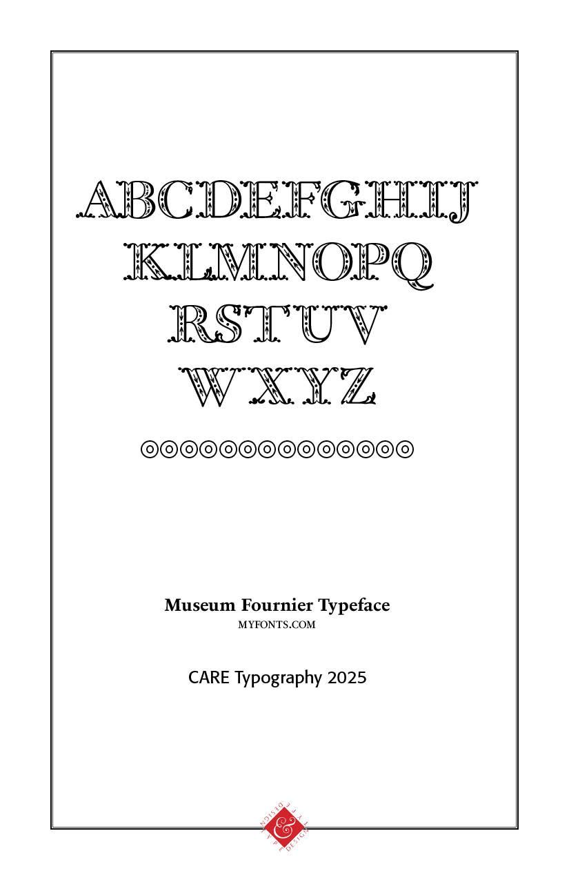
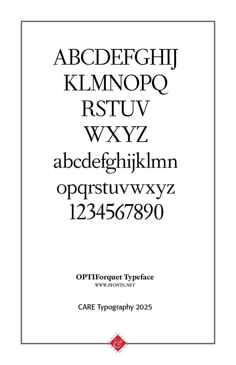
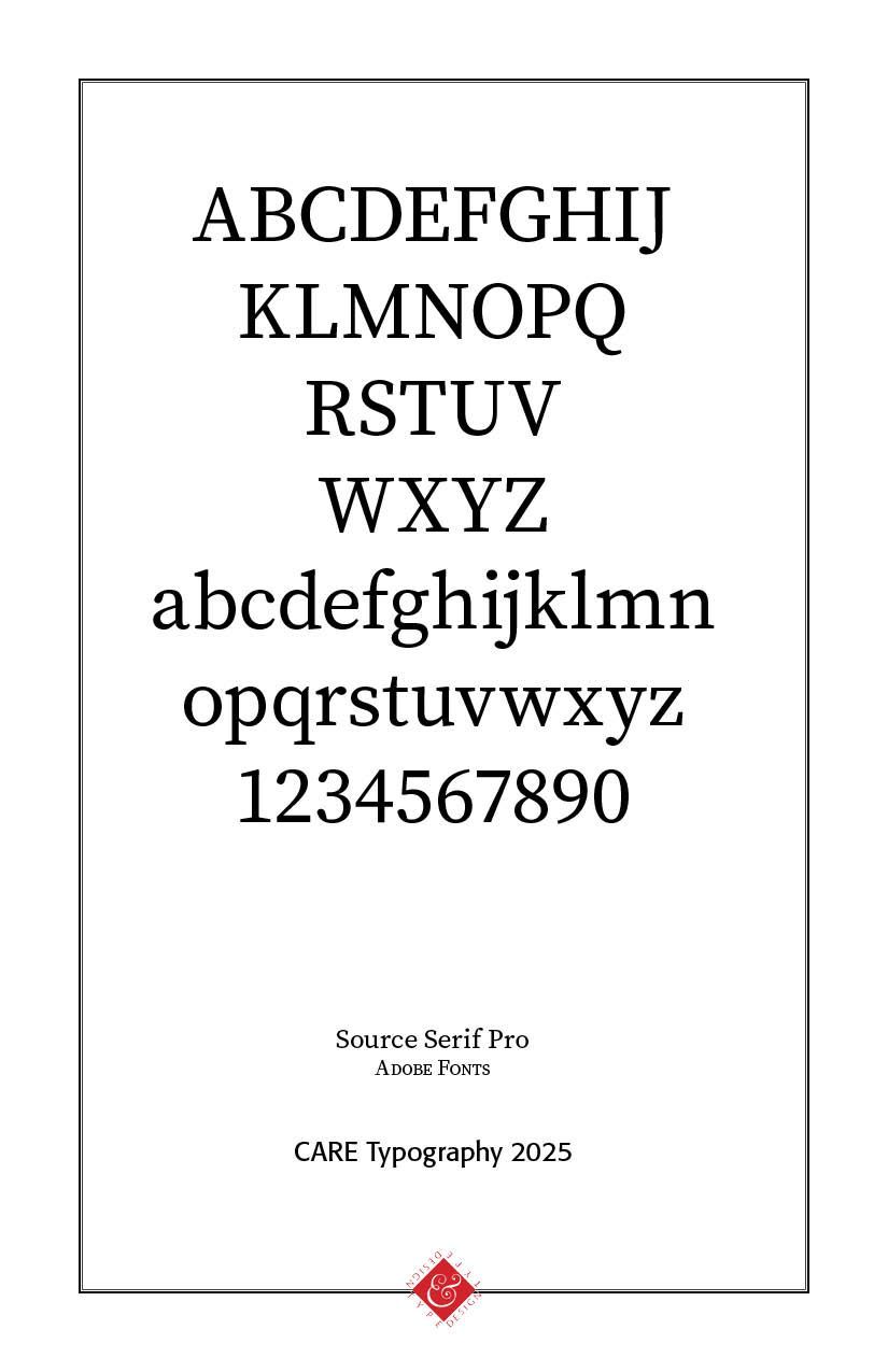
 Alan Jay Prescott created APT New June (1996) based on Fournier le Jeune. In 2007, Tjorbjörn Olsson (T4) created Museum Fournier, inspired by a set of Rococo capitals designed by Pierre Simon Fournier le Jeune, ca. 1760. The Castcraft version of Fournier is called OPTI Fourquet. Joshua Darden's Corundum Text (2006) and typeface Griesshammer's free font Source Serif (2014, Adobe) are also based on Fournier. The ambitious PS Fournier  (2016, Stéphane Elbaz) is perhaps one of the best digital revivals. At B&P Swiss Typefaces, François Rappo published New Fournier (2011) based on the typography of Pierre-Simon Fournier. It comes in 24 styles.


Overall, Pierre-Simon Fournier's impact on typography is significant, as he helped to shape the standards of type design and usage in the 18th century, leaving a lasting mark on the field.


Successful Layout & Design

By Carl Shank February 12, 2026
Free Fonts: A Deal or Trouble? The latest Google estimate of available fonts is over 300,000 and counting. Other estimates have catalogued over 550,000 fonts. There are over 36,000 font families, over 4,000 type designers and over 2,700 professional font foundries, not counting smaller font entrepreneurs like CARE Typography, which provides restored fonts from yesteryear. (Quora source https://www.quora.com/How-many-fonts-are-there-in-existence-Does-any-group-attempt-to-keep-a-record-of-all-the-fonts-that-exist ) There are commercial fonts from sources like Adobe and MyFonts (Monotype) which require payment for their use in various platforms. Both provide a subscription service, which usually requires a substantial monthly or yearly fee to download and use their fonts. When I began using Apple Macintoshes in the 1980s, font manufacturers like Adobe and Monotype would “sell” the right to use a number of their fonts for thousands of dollars. And, by the way, you never really “own” the font. You have paid only for the use of the font for a specific purpose or machine. Moreover, the price varies for print use, or web use, or a digital ad use. Even today, the font Trinité Titling by Bram de Does, used in a number of Bibles and biblical studies, costs over $4,000 for the use on a single computer and much more for a number of computer users. Individual users of such fonts are mostly priced out of their budget. Why the seemingly extravagant cost? We had a valve on one of our household plumbing lines go bad. I called the plumber, and he replaced the valve — at a cost of several hundred dollars, while the valve itself cost only a few dollars. Was that fair? Yes, because I was paying for the time and training and effort going into replacing that valve in my house. The same holds true for professional font designers. They spend hundreds, sometimes thousands, of hours in font development. We are paying for their livelihood. Font licenses cover four basic parameters around font usage — “The What: The weight and style of the typeface; The Where: Literally where you’ll use the font – a website, digital ad, or in print; The Who: The number times a font can be installed on a computer (aka the number of people who can use it); The How many: For example, web font licenses describe the number of allotted page views, and app and digital marketing licenses set similar parameters.” (Monotype Report) Companies like Monotype are rarely concerning with an individual using a font for a home, individualized project, but rather an entire design company or printer using that font for commercial gain and advertising dollars. There are fonts available “for personal use only,” prohibiting their use for commercial or money-making projects. There are what have been called “shareware” fonts, fonts with a minimal cost which require attribution of the type designer or provider on projects. Most fonts provide a EULA, or font license, which outlines and determines the legal restrictions and ramifications for their use. What about free fonts? Monotype warns against using unlicensed or what are called “free” fonts for several valid reasons, but, in my opinion, this is an obvious ploy to get the user to buy or subscribe to their font services. One Monotype report cites six issues associated with what are deemed “free” fonts. Free fonts may pop up in similar ads or designs to industry competition, perhaps prompting a lawsuit or cease-and-desist actions. Free fonts often have the inability to scale, add special characters, or even different alphabets. Free fonts have limited creative scope. They may be saddled with malware or software viruses. Poor font design can be a problem with such fonts. A sixth problem with so-called free fonts is that they can be actually “pirated” fonts, copied from legitimately designed fonts. “Aside from branding issues, free fonts also suffer from a whole host of performance issues. Fonts are software files that interact with applications and the operating system on which it’s installed; without the guidance of a skilled font engineer, rendering issues may arise from crashing glyphs, or a lack of proper kerning (the space between glyphs) text in certain scenarios. A free font downloaded from a random website might not support a broad range of languages and or complex scripts (e.g., Japanese or Arabic), or basic diatrics to cover commonly used Latin languages.” (Monotype Report) Monotype maintains that free fonts won’t give a company the individual style it deserves to help it stand out in the marketplace. They also point to the legal ramifications involved with font licensing, not a glamorous subject but one in which company attorneys are hired to examine for possible litigation. Types of Free Fonts There are four sources of free fonts — Open Source fonts with an SIL Open Font License (SEE https://openfontlicense.org ); OS fonts, fonts that come with your operating system and hardware; Subscription add-on fonts that come as an add-on to a subscription service; and, advertised free fonts by independent font designers, such as CARE Typography. Many or most of such free fonts come from freeware, shareware, public domain or demo fonts downloaded or reconstructed from an archive or library, like Internet Archive. Companies such as Website Planet offer free “commercial” fonts, fonts that can be used in business and corporate applications. See https://www.websiteplanet.com/blog/best-free-fonts/. Several cautions, however, are still in order here. First, a font that “looks like” a standard, business font is not the same thing as its “older brother.” An example is Website Planet’s Playfair Display font, both a variable and static font designed by Claus Eggers Sørensen licensed under the SIL Open Font License agreement. Yet, this font looks a lot like the standard Bodoni font, created by Giambattista Bodoni in 1767 and revived by Morris Fuller Benton in 1911 under Linotype’s commercial license.
By Carl Shank December 23, 2025
More on the Greek font. In a previous post ( It's Greek To Me! March 18, 2023) we noted that Cursive Greek type appeared as a chancery script by Francesco Griffo in 1502 and lasted two hundred years. Robert Bringhurst notes that "chancery Greeks were cut by many artists from Garamond to Cason, but Neoclassical and Romantic designers . . . all returned to simpler cursive forms . . . in the English speaking world the cursive Greek most often seen is the one designed in 1806 by Richard Porson." This face has been the "standard Greek face for the Oxford Classical Texts for over a century." ( Robert Bringhurst, The Elements of Typographic Style, Hartley & Marks, Version 3.1, 2005 , pp. 274, 278) In fact, asking Google for the best Greek face to use, it points us to Porson Greek. Porson is a beautiful Unicode Font for Greek. It's not stiff, like many of the cleaner fonts, which are usually san serif. It is bold and easy to read and seems to more closely match the orthography in newer textbooks. (Jan 8, 2004) 
Show More