Linotype's Party Emblems in 1920
Linotype's Party Emblems in 1920. Type follows and often mimics cultural fashions and ideas. Consequently, Victorian type flowed with the ornamentation of that period. Punk and Grunge type traced with a rebellious period in American culture. The political landscape of the 1920s was shaped by the aftermath of World War I, economic prosperity, social change, and debates over the role of government. While the specific parties differed by country, the decade is most often discussed in terms of the United States, where the Republican Party dominated national politics. Being a major typesetter for the period, Linotype issued characters that reflected the political parties and feelings of the times. Such type emblems showed up in their 1920 publication of One Line Specimens.
The Republican Party, under Warren Harding (1921–23), Calvin Coolidge (1923–29) and Herbert Hoover (elected 1928) was the dominant political force of the period. Their Eagle Symbol stood for American business ingenuity and less governmental interference. This philosophy became known as "laissez-faire" economics. Tarnished by several scandals during the Harding administration, this party oversaw a period of rapid industrial growth and rising consumer culture, with expanded infrastructure and technological development.
Suffering from internal divisions during the 1920s, the Democratic Party favored greater assistance for farmers, more state and local control and some opposition to big business policies. The Party divided over urban versus rural interests, the Prohibition Movement, immigration policy and even religious differences between Protestants and Catholics.
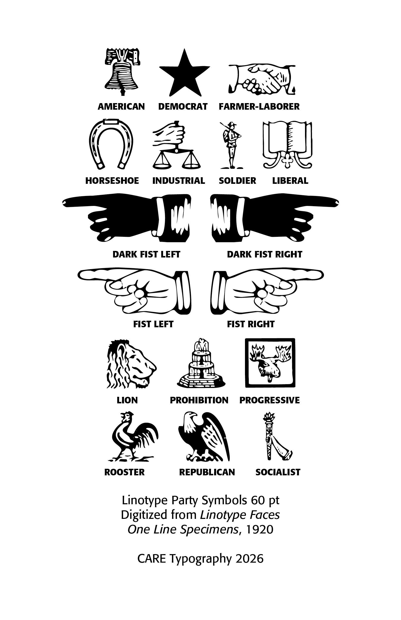
The Progressive Party, under Robert LaFollette, stood for government regulation of monopolies
labor rights, public ownership of some utilities, direct democracy reforms, and protection of civil liberties.
The Socialist Party, which had been much stronger before World War I, had declined considerably during the 1920s, mostly due to ant-radical sentiment following the First Read Scare (1919–1920) and general widespread prosperity during much of the decade. They held to public ownership of major industries, workers' rights, expanded social welfare programs, and
economic equality.
The first modern Farmer–Labor Party in the United States emerged in Minnesota in 1918 but dissolved in 1936 on a federal level with the Minnesota Farmer-Labor Party surviving on the state level until merging with the Democratic Party in 1944.
The League for Industrial Democracy (LID) was founded as a successor to the Intercollegiate Socialist Society in 1921. In its early years, the LID addressed societal problems such as poverty, child labor, work conditions, and poor housing conditions, under the leadership of notable activists, including Robert Lovett, Charles Steinmetz, Florence Kelley and Stuart Chase. It became the base for leftwing intellectuals, otherwise known as Muckrakers. During the Great Depression of the 1930s, the LID organized radio stations and broadcasts centered around the New Deal. Throughout its history, the LID has called itself a proponent of the labor movement. The group saw this movement as a progressive force that is misunderstood by intellectuals.
The Progressive Movement reached its peak between 1890 and 1920, but it remained an important force throughout the 1920s, even though its influence declined after World War I. Progressives believed that government should actively solve social and economic problems created by industrialization. They wanted to eliminate political corruption, regulate large corporations and monopolies, protect workers, improve public education, expand public health initiatives, reform the electoral process, and promote conservation of natural resources. Many Progressive Reforms resulted in women's suffrage (19th Amendment), Federal income tax (16th Amendment), direct election of senators (17th Amendment), child labor reform efforts, food and drug regulation, and conservation programs.Fear of radicalism and economic prosperity after World War I weakened the movement.
The Liberal Movement. "Liberal" in the 1920s meant something somewhat different from its later twentieth-century usage. It generally referred to individuals who favored civil liberties, political reform, academic freedom, freedom of speech, religious liberty, international cooperation, and moderate government intervention to improve society. One important organization was the American Civil Liberties Union, founded in 1920 to defend constitutional rights. In religion, Many Protestant denominations embraced modern biblical scholarship, the Social Gospel, cooperation between science and religion, and ecumenical efforts. This often brought them into conflict with Christian fundamentalists, as witnessed in the Scopes Trial in 1925.
The
Prohibition Movement grew from the 19th century Temperance Movement. Its supporters believed alcohol caused poverty, domestic violence, crime, workplace accidents, family breakdown, and political corruption. Prohibition became law through the 18th Amendment (1919), and the Volstead Act, which enforced the amendment.Beginning in January 1920 manufacture of alcoholic beverages was illegal, transportation was illegal, and sale was illegal. Consumption itself was not prohibited, though obtaining alcohol legally became very difficult. However, bootlegging and organized crime grew in this period. The amendment was repealed by the 20th Amendment in 1933.
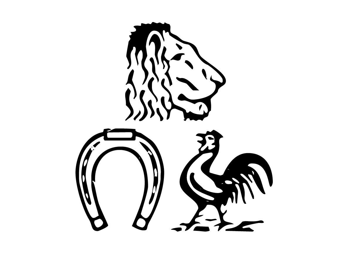
The horseshoe was one of America's most popular symbols of good luck. It was believed to bring good fortune, to ward off evil and to represent prosperity and success. It was also adopted as an emblem by some vocational and agricultural organizations during the late 1920s because of its association with farming.
The rooster had a long history as a Democratic Party symbol. Before the donkey became dominant, the rooster was on Democratic campaign ribbons, posters, buttons and parade decorations. Although by the 1920s the donkey had become the better-known Democratic emblem, the rooster still appeared in campaign materials, especially in southern states and local elections. It also symbolized wakefulness, honesty, readiness and rural values.
The Lion's Head, Horseshoe, and Rooster were widely recognized symbols in the United States during the 1920s, but they were generally not a single, unified set of symbols. Their meanings depended on the context—politics, business, fraternal organizations, advertising, or good-luck traditions.
The lion's head symbol commonly represented strength, courage, and authority—a traditional heraldic emblem used by many businesses and organizations. It was used as manufacturers' trademarks, especially for tools, hardware, paper goods, clothing, and printing equipment.Fraternal organizations employed the head, where the lion symbolized vigilance and leadership. In the printing and publishing industries, lion-head trademarks were used by several type foundries and paper manufacturers.
As one of the major typesetting and printing establishments of the period, Linotype produced these symbols along with baseball scoreboard fonts, tariff fonts, and telephone directory typefaces.
Successful Layout & Design