Calligraphy & Typography
Calligraphy & Typography. Calligraphy, the art of beautiful handwriting, has a long and rich history that spans cultures, religions, and centuries. It developed not only as a means of communication but also as a form of artistic expression, religious devotion, and cultural preservation. While typography is not calligraphy, with much of type carefully structured, straight-backed and neatly drawn and focused on lettering for printing readability, both art forms involve visual expression of language. Both focus on the shape, proportion and beauty of letters. Both reflect religious, historical and cultural influences on writing styles. Both are used for artistic and decorative purposes in design, and much of type has been greatly influenced by calligraphic styles. Yet, they differ significantly in their methods, purposes and tools.
Calligraphy is the art of hand drawn, beautiful writing, while typography focuses on the design and arrangement of type letters for print or digital use. Calligraphy is created manually with pens, brushes, or quills, while type is created digitally or mechanically using typefaces. Traditional tools used in calligraphy include dip pens, brushes and ink, while type is formed with digital or physical lettering. Calligraphy is highly expressive and free flowing, while type is usually uniform and consistent across all characters. Calligraphy is usually done for decorative and personal use, while typography is often constructed and used for mass communication in books, websites and signage. Mediums for calligraphy include paper, parchment, walls, while typography focuses on print and digital media. Yet, the roots of much of type comes from the wealth of history and styling offered by calligraphy. CARE Typography has been able with Font Lab's tools like Fontographer, to translate fine calligraphy into usable typefaces, even for the modern market tastes.
The fine art of calligraphy is highlighted in the background to this post in the 2018 calligraphic rendering of the Scripture, "Well done, good and faithful servant" (Matthew 25:25a) by Calligraphy for Christ (https://www.calligraphyforchrist.com/). Such beautiful religious typographic pieces actually begin not with the Gutenberg era in 1450 but with the ancient Chinese.
Chinese Beginnings. Long before Gutenberg in 1450, printing from moveable type was invented in China in the 1040s by the scholarly engineer Bi Sheng. Fêng Tao, who a century or more after the beginning of block printing improved the art and applied it to new uses, is usually regarded by Chinese as the inventor of printing, and holds much the same place in Chinese history that Gutenberg holds in that of Europe. From his day printing became a fine art.
Chinese calligraphy is among the oldest and most continuously practiced forms of calligraphy, from the second millennium BC. The precise origins of Chinese printing remain obscure. Religious seals had been used since long before the Han period (202 BC–220 AD), and the Chinese had later used large seals carved from hardwood to reduplicate Taoist religious charms in large numbers. Small wooden stamps similar to those employed in printing textile patterns were used for the replication of images of the Buddha. (Twitchett, 13)*
In Chinese calligraphy and typography, each character is considered to occupy a square space of equal size, the characters being arranged in vertical columns, usually separated in traditional printing by a fine line. The Chinese compositor was thus faced with none of the complexities of spacing and layout that confront the Western typographer. This "block printing" method lasted and remained standard even into modern times.
The blocks for fine printing were made from a hard close-grained wood, usually pear or jujube. The surface was prepared with a sort of size. The copy for the page to be printed was written by a copyist on a very thin paper, and this was laid face down on the surface of the block while the size was still wet. The engraver then cut the block around the characters. A page printed in this way could thus reproduce any style of calligraphy, or any mixture of styles, any size or variety of sizes of character, and could equally easily accommodate both text and illustrations. The blocks could be corrected by recutting, by inserting plugs into the block and recutting over them, and by minor trimming.(Twitchett, 70)
Chinese calligraphy developed as both a visual and spiritual art form. Writing was done with brush and ink on paper or silk. Notable calligraphers included Ouyang Xun (557–641 BC), a Tang Dynasty master of what is called "regular script." During the Tang Dynasty, he was a censor and scholar at the Hongwen Academy, where he taught calligraphy. He later became the Imperial Calligrapher and inscribed several major imperial steles.
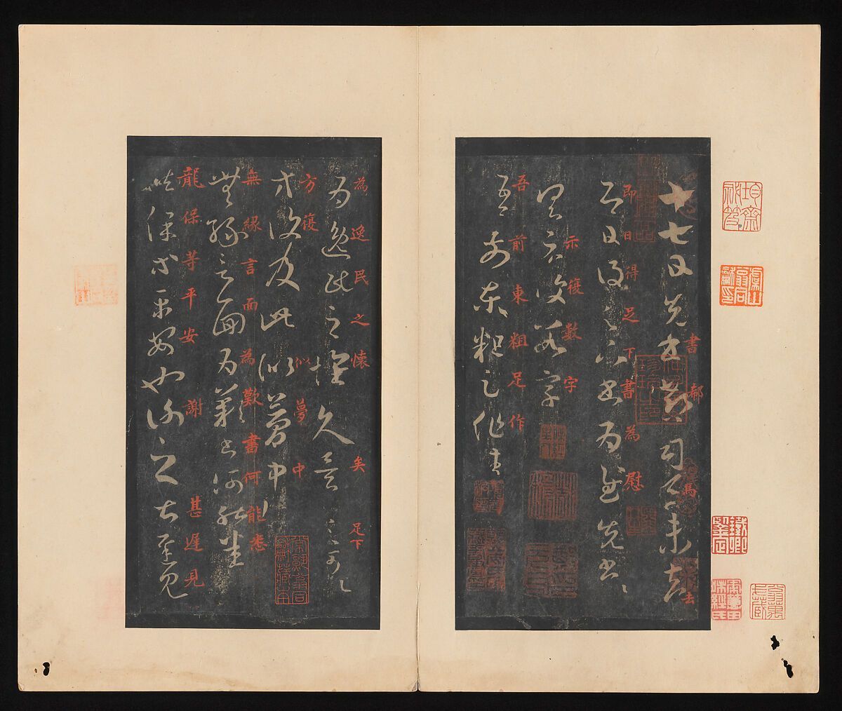
Wang Xizhi (303–361 BC), known as the "Sage of Calligraphy," produced "On the Seventeenth Day," a selection of twenty-nine letters under the sponsorship of the Tang emperor Taizong. (Print above from Wikipedia) (www.metmuseum.org/art/collection/search/39899)
Yan Zhenqing (709–785) was known for his bold and dynamic style. Su Shi (1037–1101), a scholar and poet, practiced expressive cursive calligraphy. Wikipedia notes that approximately 2,700 poems and 800 letters penned by Su Shi have been preserved to date. His mastery spanned across various forms, including the shi, ci and fu styles of poetry, as well as prose, calligraphy, and painting. While a significant portion of his poetry is in the shi format, it is his 350 ci style poems that largely cemented his poetic legacy.
It should be noted that Chinese calligraphy involves a graphic language of a very small number of simple
stroke shapes combined into more complex glyphs. There is a particular way to make dots, horizontal lines, vertical lines, lines angled left, lines angled right, corners and endings of lines. (Judith Sutcliffe) In fact, there are five styles of script in Chinese calligraphy, the seal script, clerical script, regular script, running script and cursive. Characters are written top to bottom, left to right, and horizontal to vertical. There are eight different types of strokes, and each has a specific way they should be drawn.
"It is an art of turning square Chinese characters into expressive images by varying the speed and pressure of a pointed Chinese brush. By controlling the concentration of ink, the thickness and adsorptivity of the paper, and the flexibility of the brush, the artist is free to produce an infinite variety of styles and forms. In contrast to western calligraphy, diffusing ink blots and dry brush strokes are viewed as a natural expression rather than a fault. While western calligraphy often pursues font-like uniformity, Chinese calligraphy emphasizes more on expressing one’s emotions." (www.chinaonlinemuseum.com/ calligraphy.php)
Japanese & Korean Calligraphy. Both Japanese and Korean calligraphy developed from Chinese roots. As in all early calligraphic forms and writings, such calligraphy was heavily influenced by Buddhism. Kukai (774–835) was a monk who brought Chinese calligraphy to Japan. His importance in Japanese Buddhism has developed stories and legends, one of them which attributes the kana syllabary to him, with which the Japanese language is written to this day. Ono no Michikaze (894–966) took a first step in Japanizing the art of calligraphy from China, with strong influence from Wang Xizhi and Wang Xianzhi.Fujiwara no Kozei (1100s) popularized calligraphic styles imported from China. He was called the master of the "way of writing." Kim Jeong-hui (1786–1856) in Korea developed the Chusa style, merging Chinese and Korean aesthetics.
Early Christian Calligraphy/Typography. Greek classical and Byzantine scripts, along with the Roman script, were important in developing western calligraphy and later typography. The development of uncial and half-uncial scripts has been covered in detail in my Typography Through the Years (Lulu Press, 2024) in the chapters on "The Alphabet" and "Pre-Gutenberg Printing." Monks in that period preserved ancient knowledge through scriptoria in monasteries, with lavishly decorated religious texts like the Book of Kells and Lindisfarne Gospels. Carolingian Minuscule was developed under Charlemagne, with uniform and legible script that influenced later Latin typefaces.
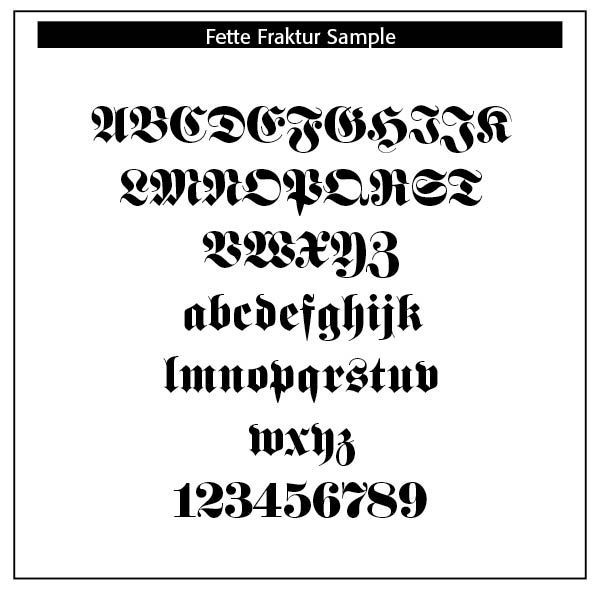
Blackletter or Gothic script was derived from medieval European calligraphy (12th–17th centuries). Typefaces that developed from such calligraphy included Fraktur, Old English Text and Gothic typefaces. These strong, angular, dense forms have been used in formal documents, diplomas and even newspaper mastheads today, like the New York Times.
Italic Script. Derived from Italian Renaissance calligraphy (15th century), scribes in Rome and Florence began using what we call italics , or slanted letters for faster writing. The Renaissance, beginning in Italy in the fourteenth century, marked a revival of classical antiquity and a move toward humanism. This brought a renewed interest in the legible, flowing scripts of Roman and Greek antiquity, which were more readable and aesthetically simple compared to Gothic lettering. The development of the printing press (ca. 1440) by Johannes Gutenberg created a need for more versatile and legible typefaces. The emerging humanist values aligned with a preference for typefaces that resembled the clear, round, and graceful writing of ancient Roman scripts.
The Italic typeface was introduced by Aldus Manutius in Venice around 1501. Manutius, a prominent printer and publisher, sought to create more compact and elegant typefaces that could fit more text on a page, catering to the rising demand for smaller, portable books. Italic was based on the handwriting of Niccolò de’ Niccoli, a Renaissance scholar and calligrapher. Italic typefaces are defined by their slanted, cursive-like appearance, with letters that have a flowing, dynamic quality. It allowed for more text to be fitted on the page and mimicked the handwriting style of humanist scholars.
Italic type was not only more elegant than the Gothic but also more efficient in terms of space. It became the preferred choice for printed texts that emphasized classical learning, philosophy, poetry, and humanist literature. Italic was initially used for entire texts but later became more common for emphasis (such as book titles, headings, or foreign phrases) alongside Roman type.
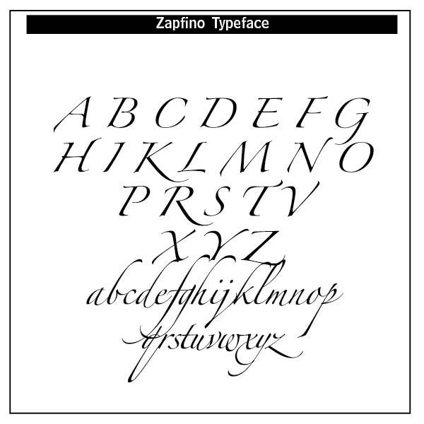
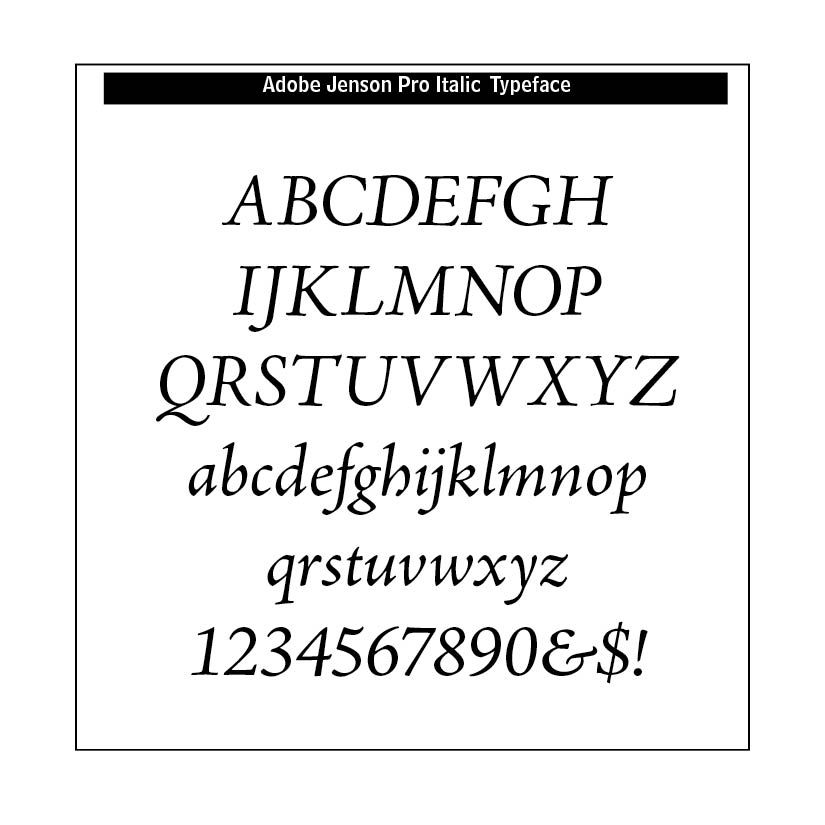
Typefaces developed from this italics period include Zapfino, Palatino Italic, Adobe Jenson Italic.
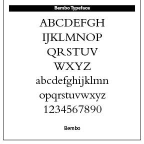
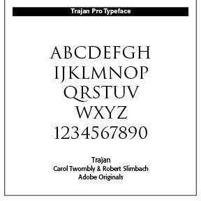
Roman Capitals/Humanist Script. Ancient Roman inscriptions and Renaissance humanist writing inspired calligraphy that later translated to typefaces such as Trajan, Garamond and Bembo. Roman square capitals seen on monuments, like Trajan's Column, started to appear in book titles as well as classical or academic branding.
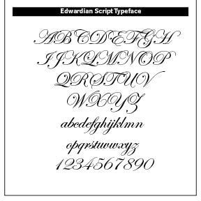
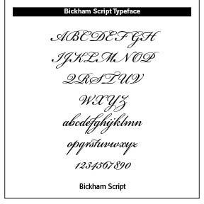
Copperplate Script. Derived from English Roundhand calligraphy in the 18th century, copperplate script was created with a pointed pen and pressure sensitive strokes and widely used in formal writing. Such script is often found in wedding invitations, certificates and branding for luxury items. Typefaces emerging from such script include Bickham Script, Edwardian Script and Snell Roundhand.
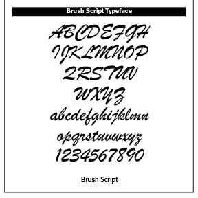
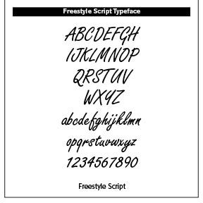
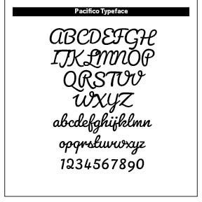
Brush Script. Brush Script calligraphy derives from modern brush calligraphy. Popular in the mid-twentieth century America for retro posters, signage and casual branding, its typefaces include Brush Script MT, Pacifico and Freestyle Script.
A concluding note. It is significant that early calligraphy along with typography had strong religious roots, whether that be Christian European roots or Chinese Buddhist roots or Islamic Koran rootings. Many of these calligraphers, along with their typography counterparts, believed and lived from a worldview filled with the Divine. While modern calligraphy has perhaps deviated from these religious roots, there are still calligraphers and typographers that operate out of a viewpoint of creativity that goes back to their faith in God. That is certainly true of this typographer!
Successful Layout & Design


