Pen-Lettering History
Pen-drawn lettering lies at the heart of Western typographic tradition. From Roman capitals to digital script fonts, its influence persists in the balance, rhythm, and grace of letterforms—whether carved in stone, printed in books, or drawn by hand on a modern tablet.
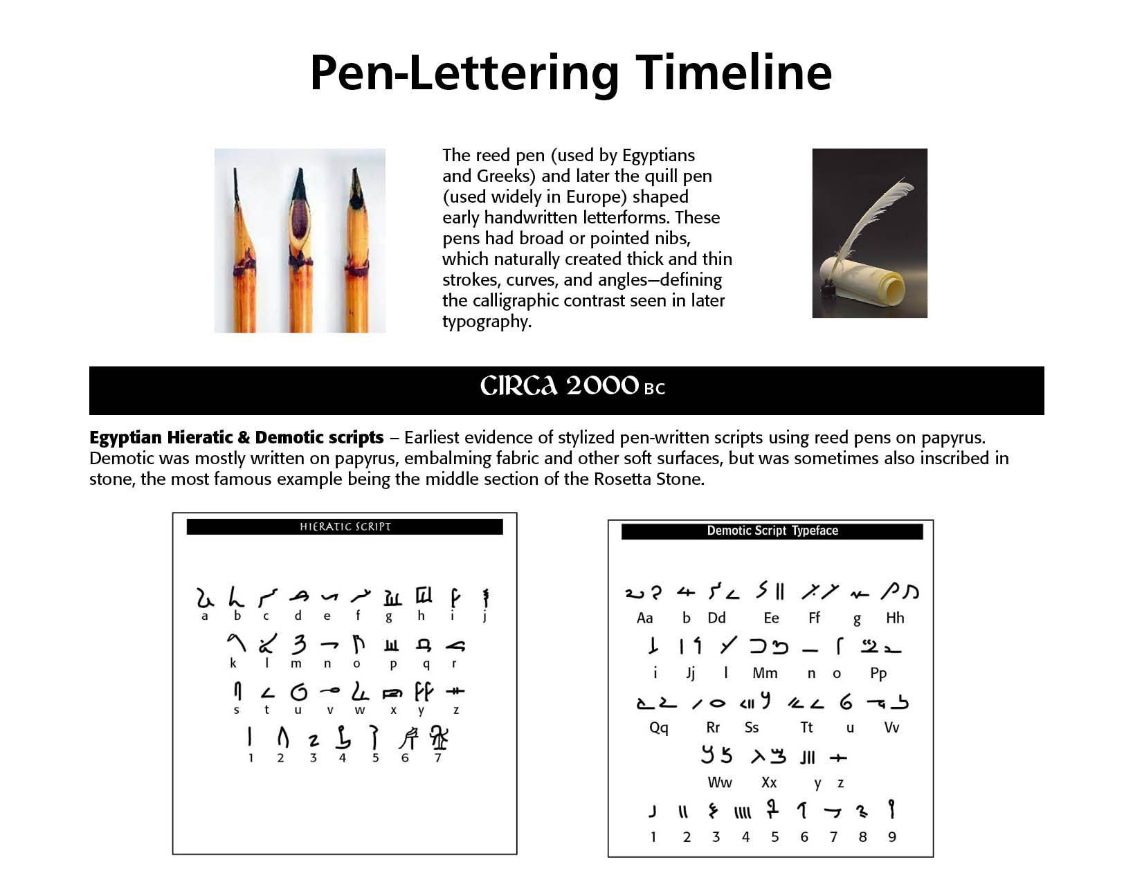
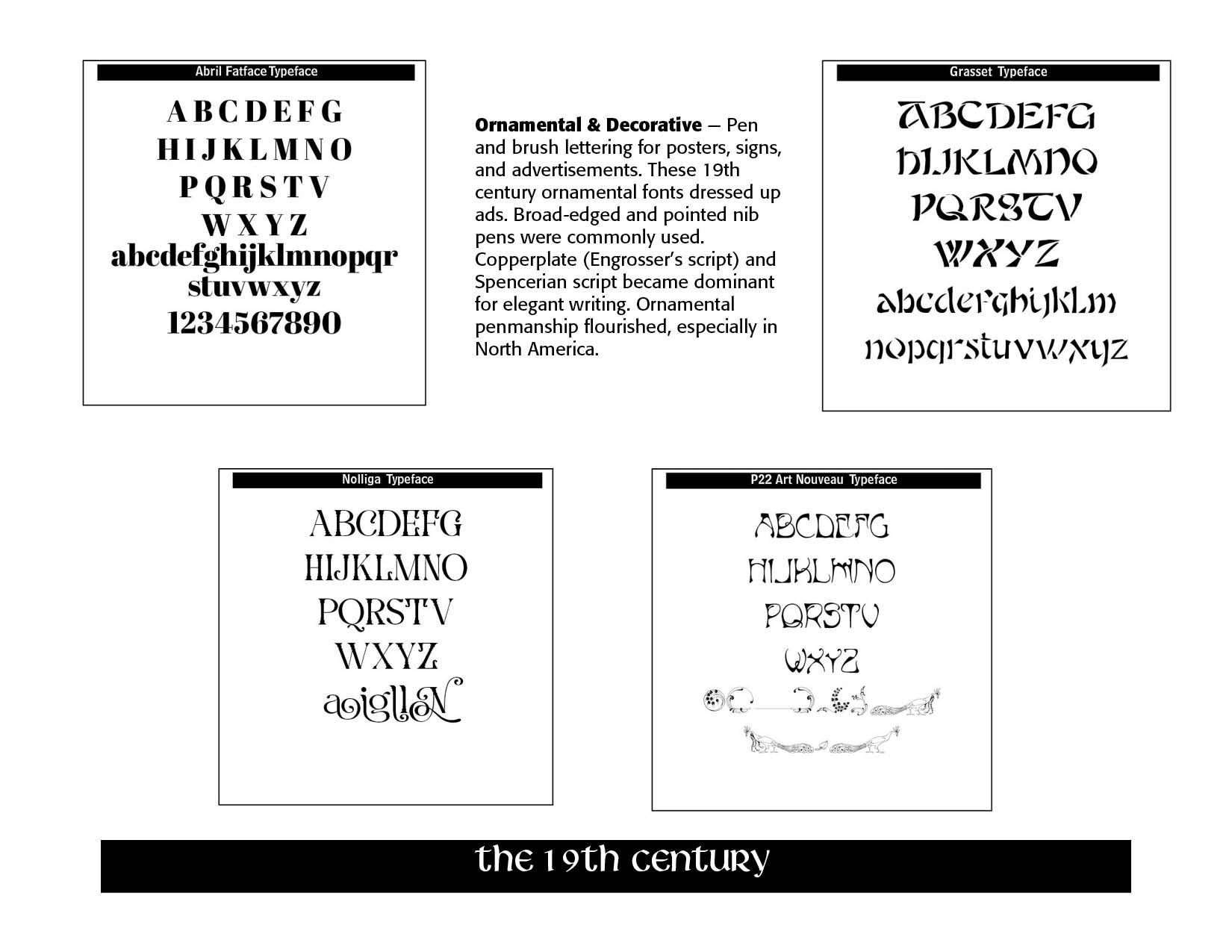
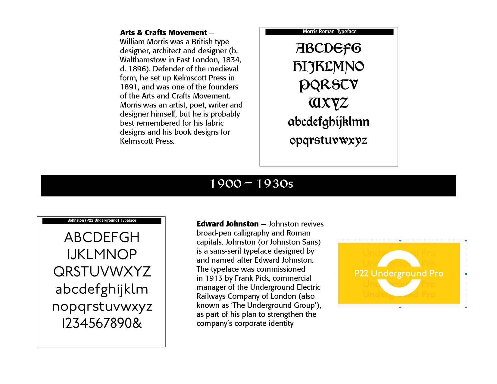
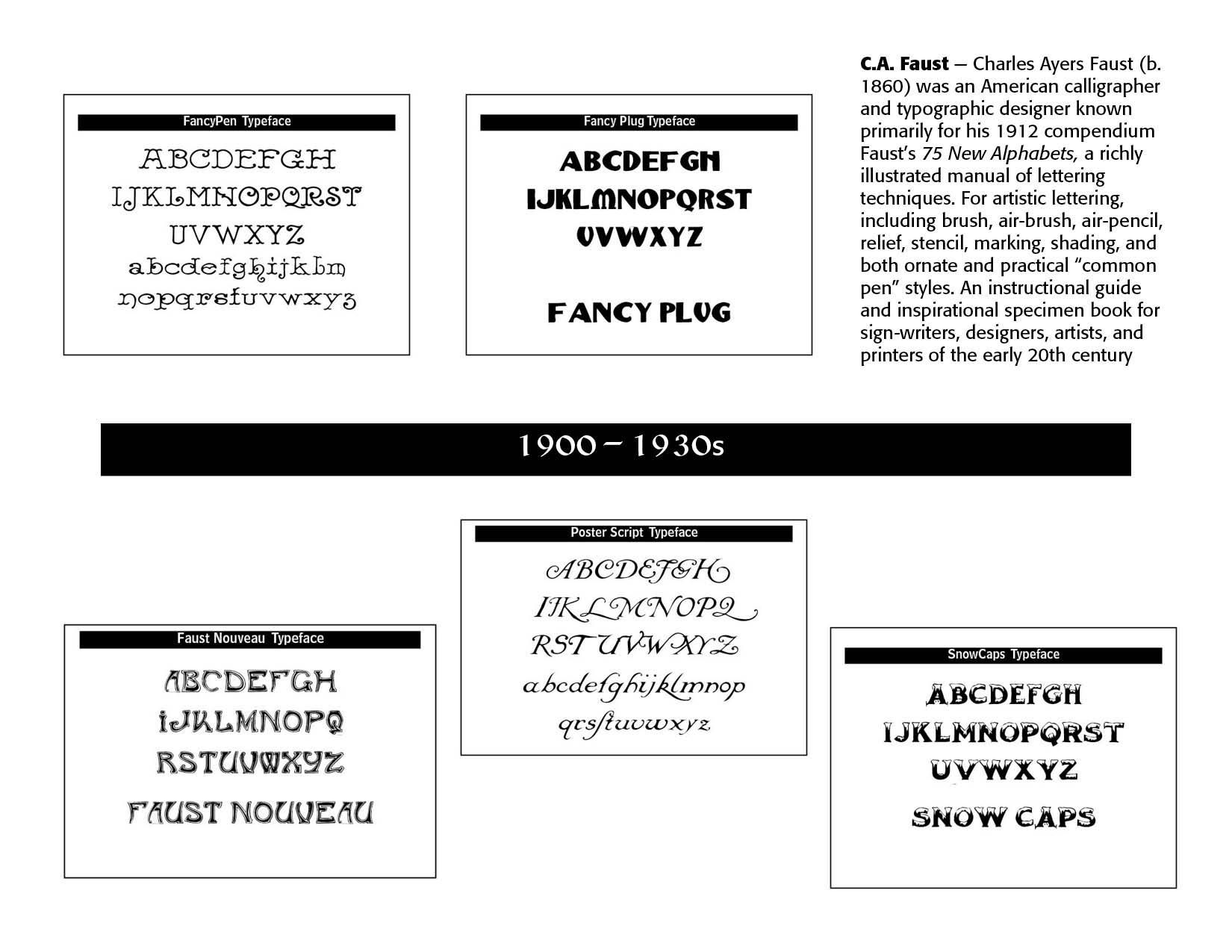
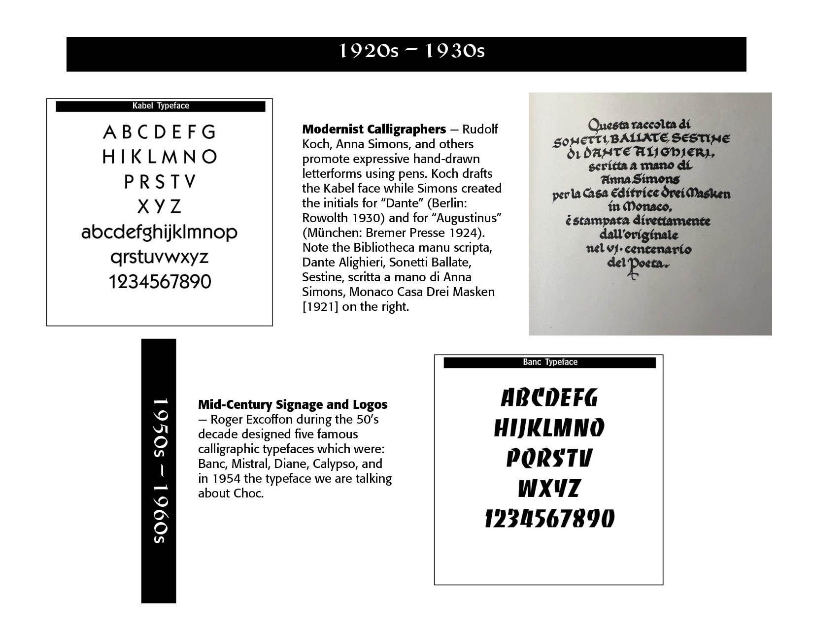
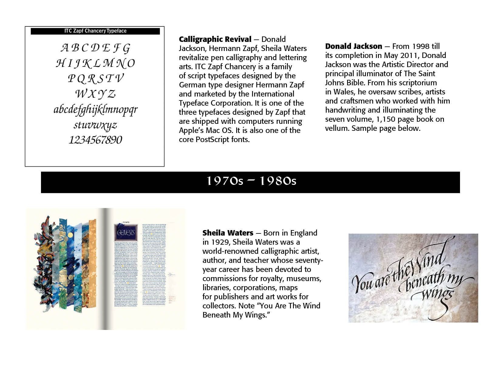
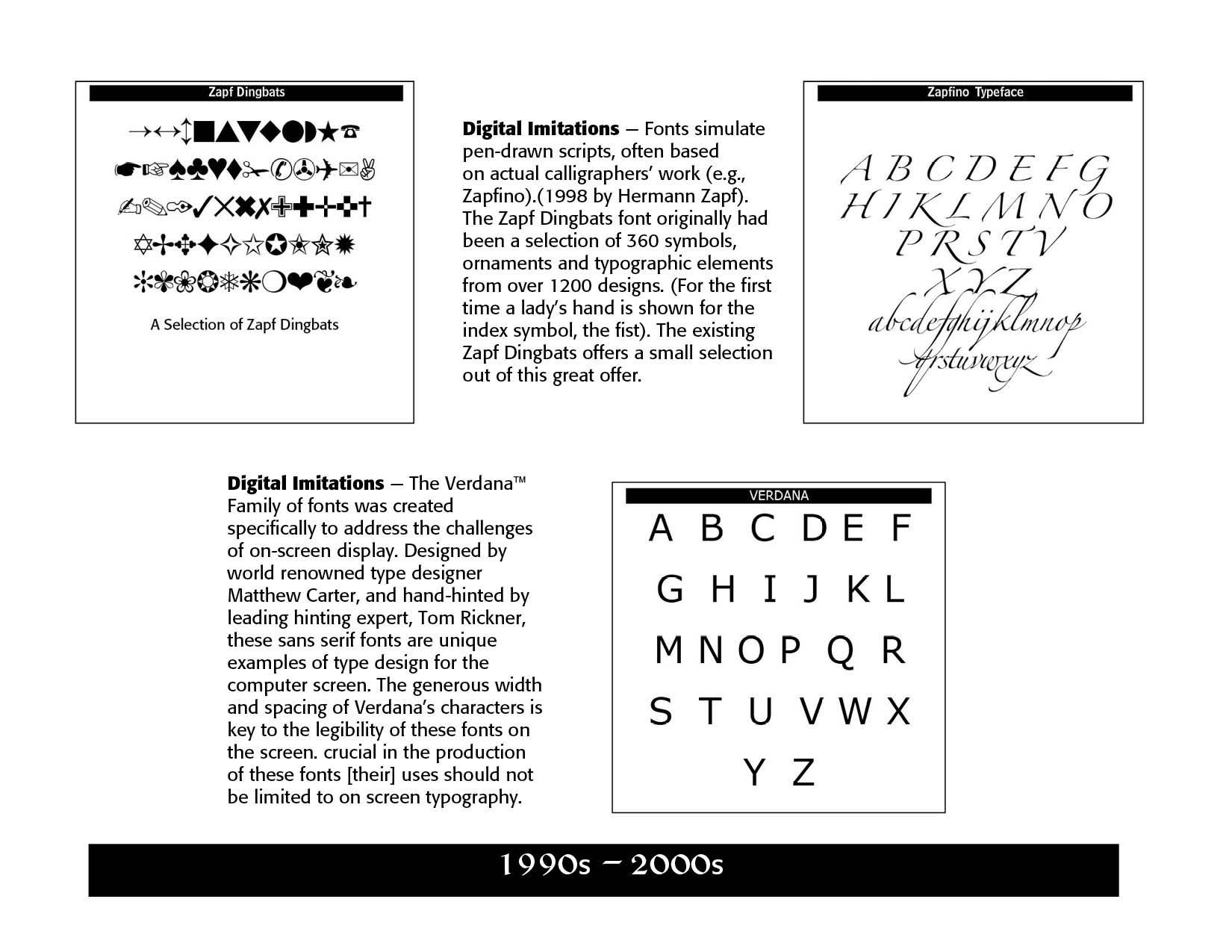
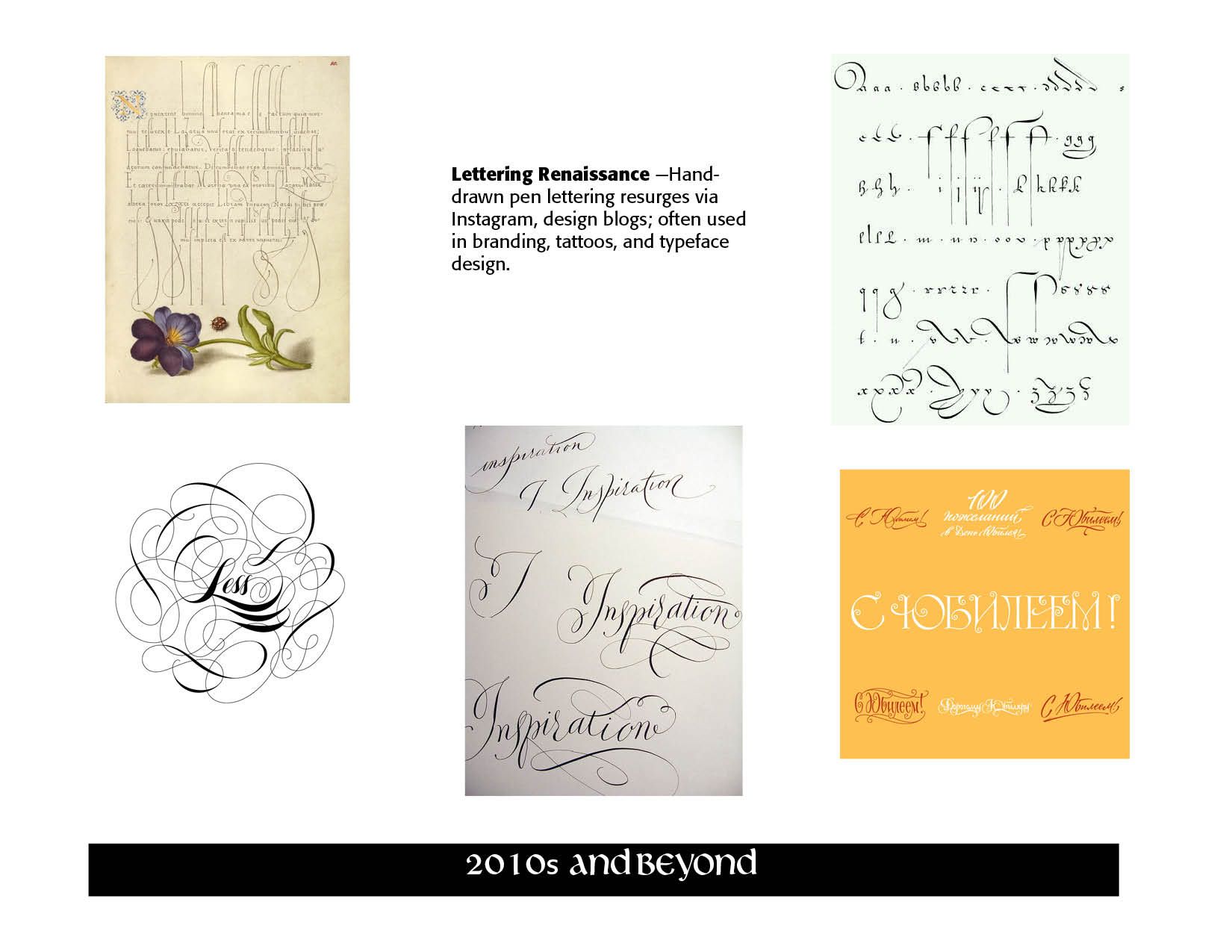
The history of pen-drawn lettering in typography is deeply intertwined with the broader evolution of writing, calligraphy, and type design. It represents a key bridge between handwritten traditions and mechanical or digital type. Key characteristics of Pen-Drawn Lettering include stroke contrast, from broad-nib or pointed-pen techniques, fluid cures and terminals, which are naturally shaped by hand movement, and the human touch of imperfections, variation and expression.
Although allied with Calligraphy, pen-lettering has distinct differences. Calligraphy illustrates the art of writing with specific strokes, while pen-lettering focuses on the art of drawing letters. Calligraphy shows writing in one continuous flow while in pen-lettering letters are stylized individually. Calligraphy relies on pressure for thick/thin strokes while pen-lettering is drawn and shaded manually. It is harder to fix mistakes in calligraphy. Thus, the word "typography" in calligraphy is written in one flowing motion, using a brush pen, adjusting pressure to get thick and thin lines. In pen-lettering the word "typography" is done by drawing each letter as a mini-illustration, perhaps outlining it and adding embellishments. However, both calligraphy and pen-lettering share similar histories and are at least partners in typography.
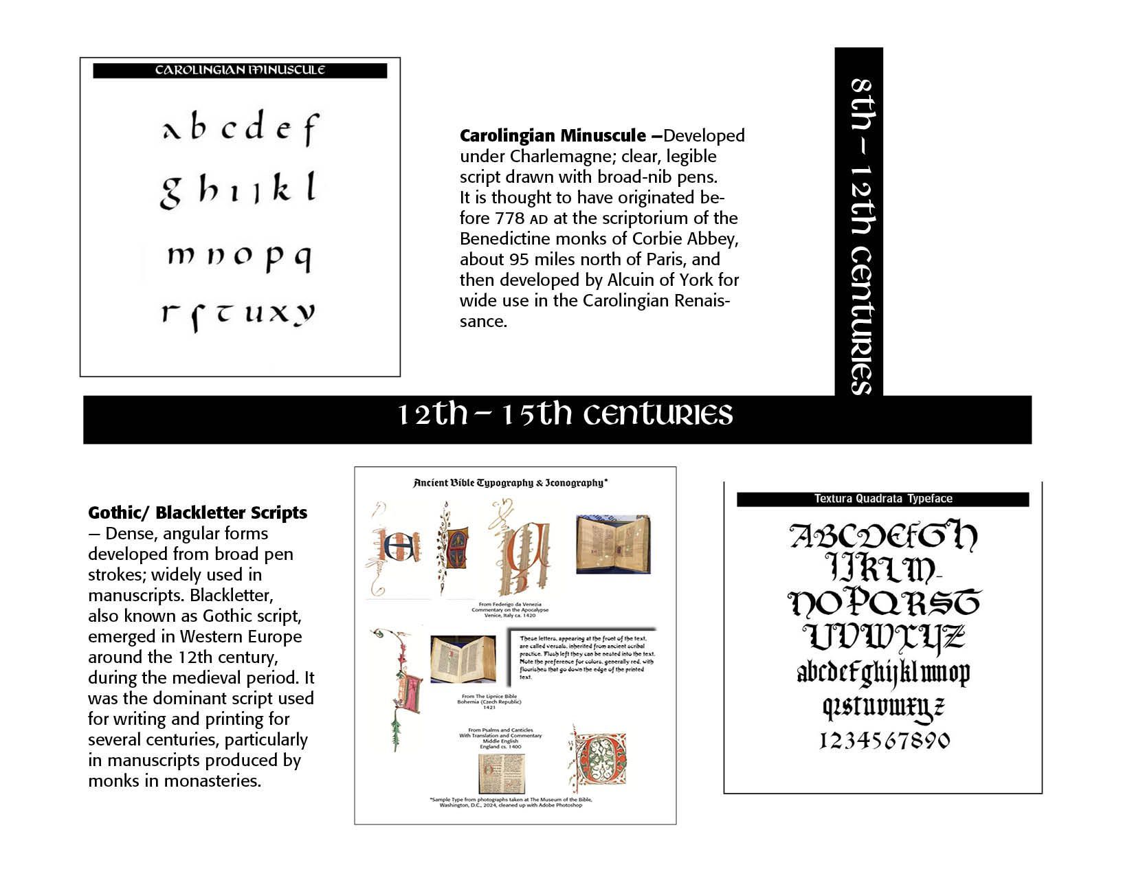
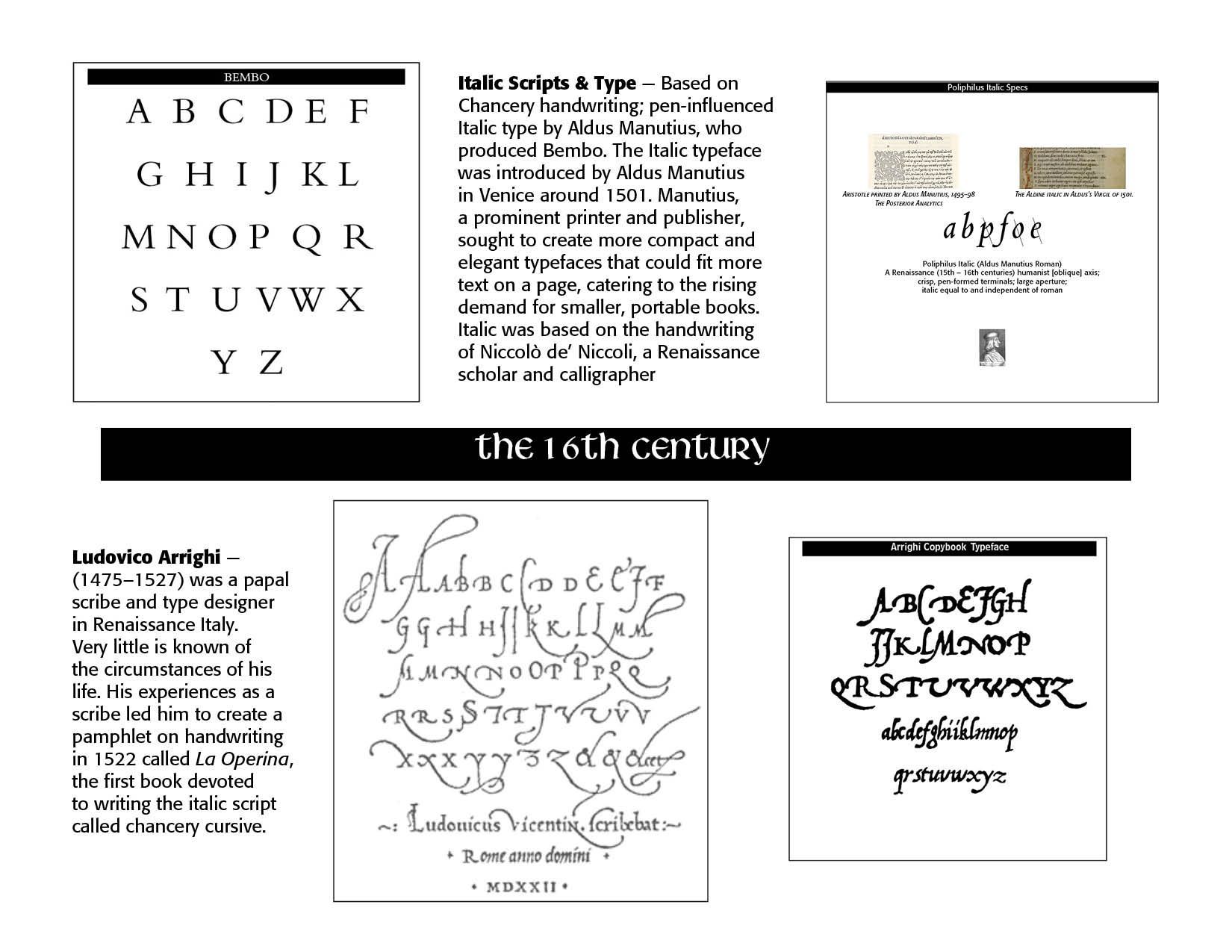
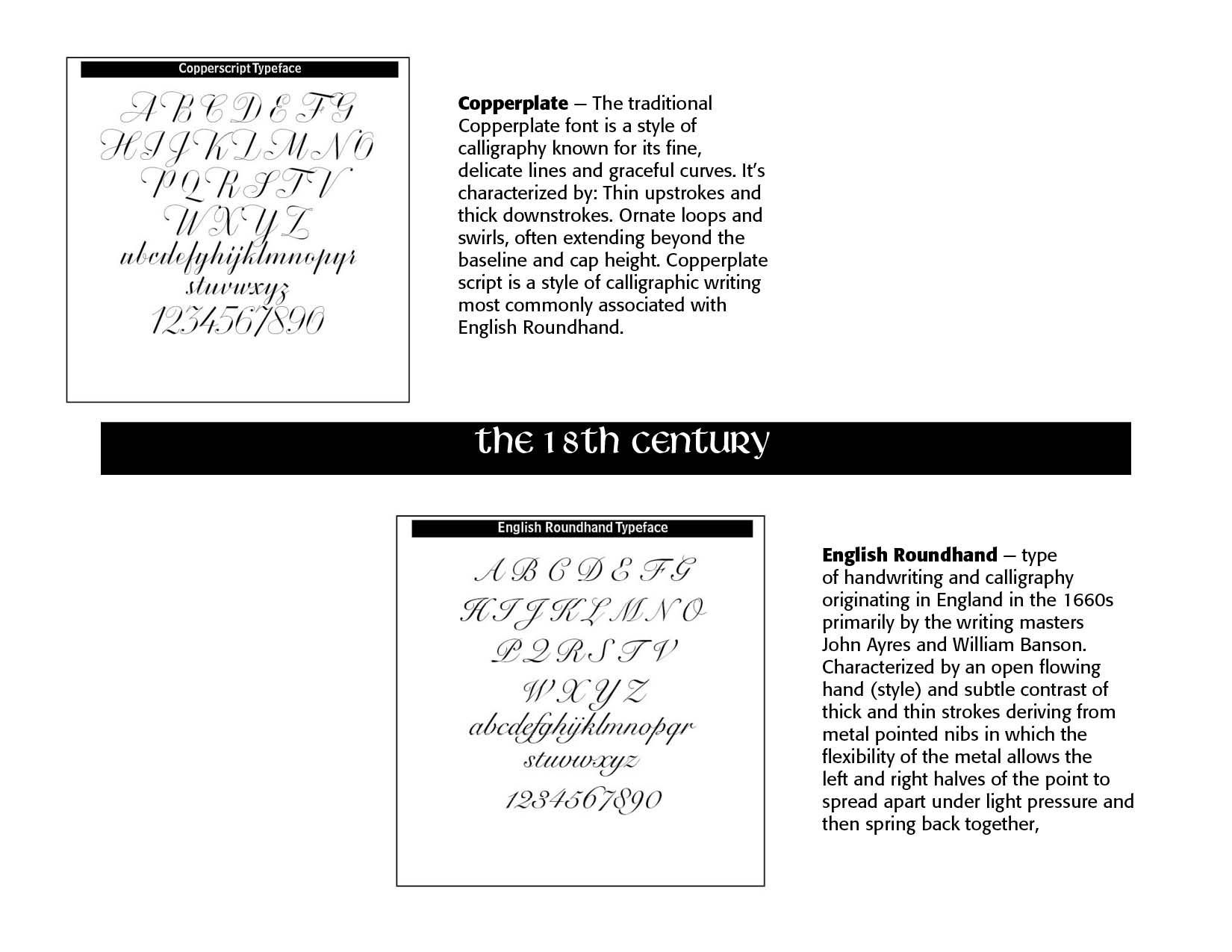
The plates below give an overall history of pen-lettering. Enjoy!


SOURCES
ChatGPT on "calligraphy" and "pen lettering"
https://luc.devroye.org/fonts-32497.html
https://en.wikipedia.org/wiki/Johnston_(typeface))
P22 Type Foundry and MyFonts.com for typeface descriptions
https://www.calligraphersguild.org/sheila-waters
Настина Сказка - мир макраме мастера vk.com/nastinaskazka on Pinterest
https://www.pinterest.com/pin/3588874697522020/visual-search/?cropSource=5&surfaceType=flashlight&rs=deep_linking lettering on Pinterest
http://www.lettercult.com/archives/2853 featuring David Croy on Pinterest
H. Carl Shank, Typography Through the Years, Lulu Press, 2024
Lewis F. Day, Alphabets Old and New, London, 1910.
Maggie Patton, “The Printer’s Mark: That Curious Penguin on the Spine of Your Favorite Paperback Isn’t There Just for Decoration,” Openbook, Autumn 2022.
William Roberts, The Project Gutenberg Ebook of Printers’ Marks, June 1, 2008, Ebook #25663, from inages made available by The Internet Archive.
Charles Ayers Faust, Faust's 75 New Alphabets, C.W. Braithewait Co., 1912
Successful Layout & Design


