English Penman Calligraphic Fonts
George Bickham the Elder (b. 1684) was one of the most influential English engravers, calligraphers, and writing masters of the eighteenth century. Although he was a capable print engraver, his lasting significance lies in his role in preserving and popularizing English Round Hand (later known as Copperplate script) through beautifully engraved writing manuals. His work shaped business handwriting, penmanship education, typography, and ornamental lettering for generations.
He trained as both a writing master and an engraver, two professions that were closely linked before the advent of modern printing. Rather than merely copying handwriting, he engraved elaborate penmanship examples onto copper plates, allowing thousands of identical, highly detailed specimens to be printed. He became renowned for his extraordinary ability to translate handwritten originals directly onto copper plates with exceptional fidelity, a skill admired by his contemporaries.
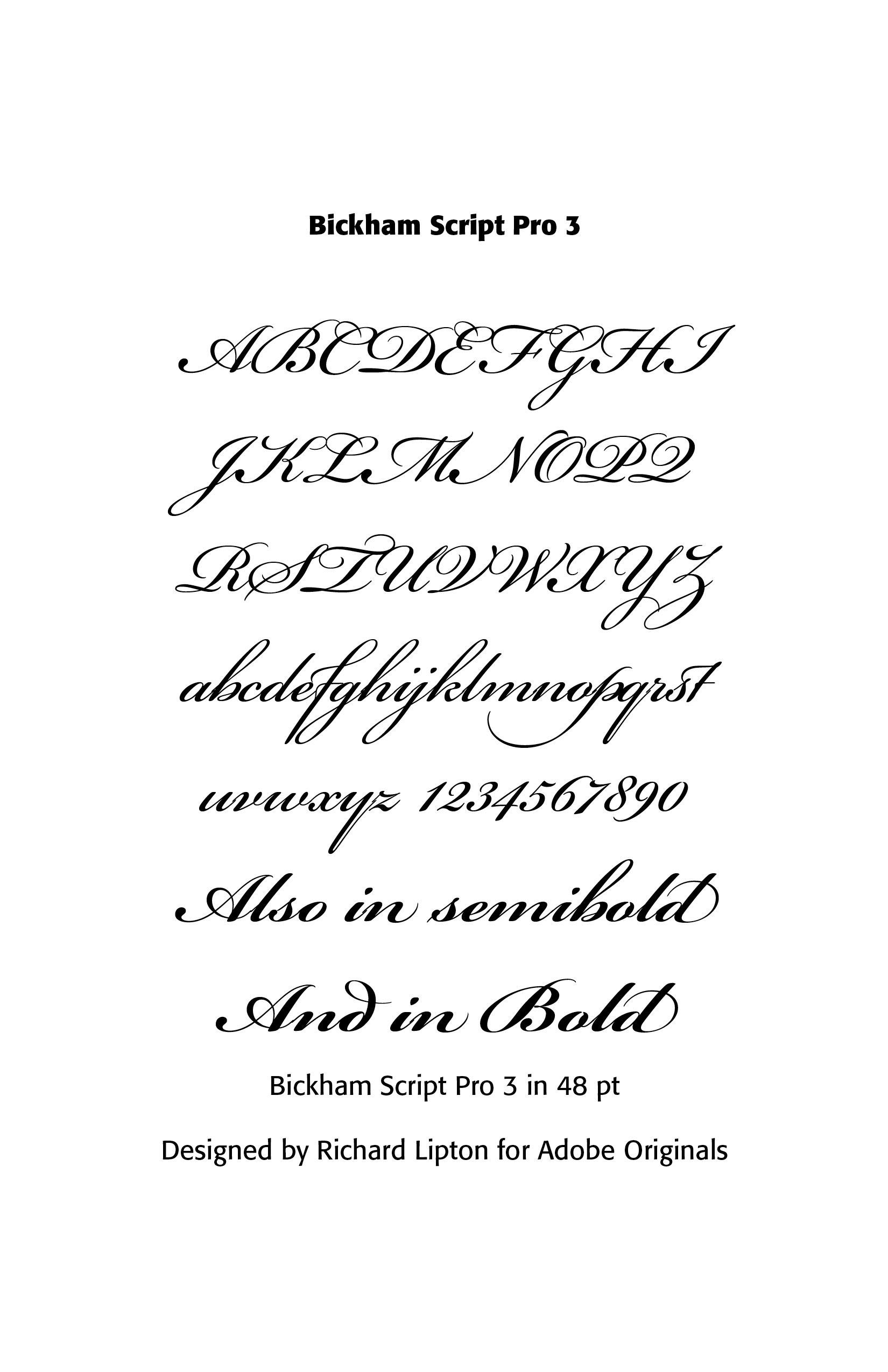
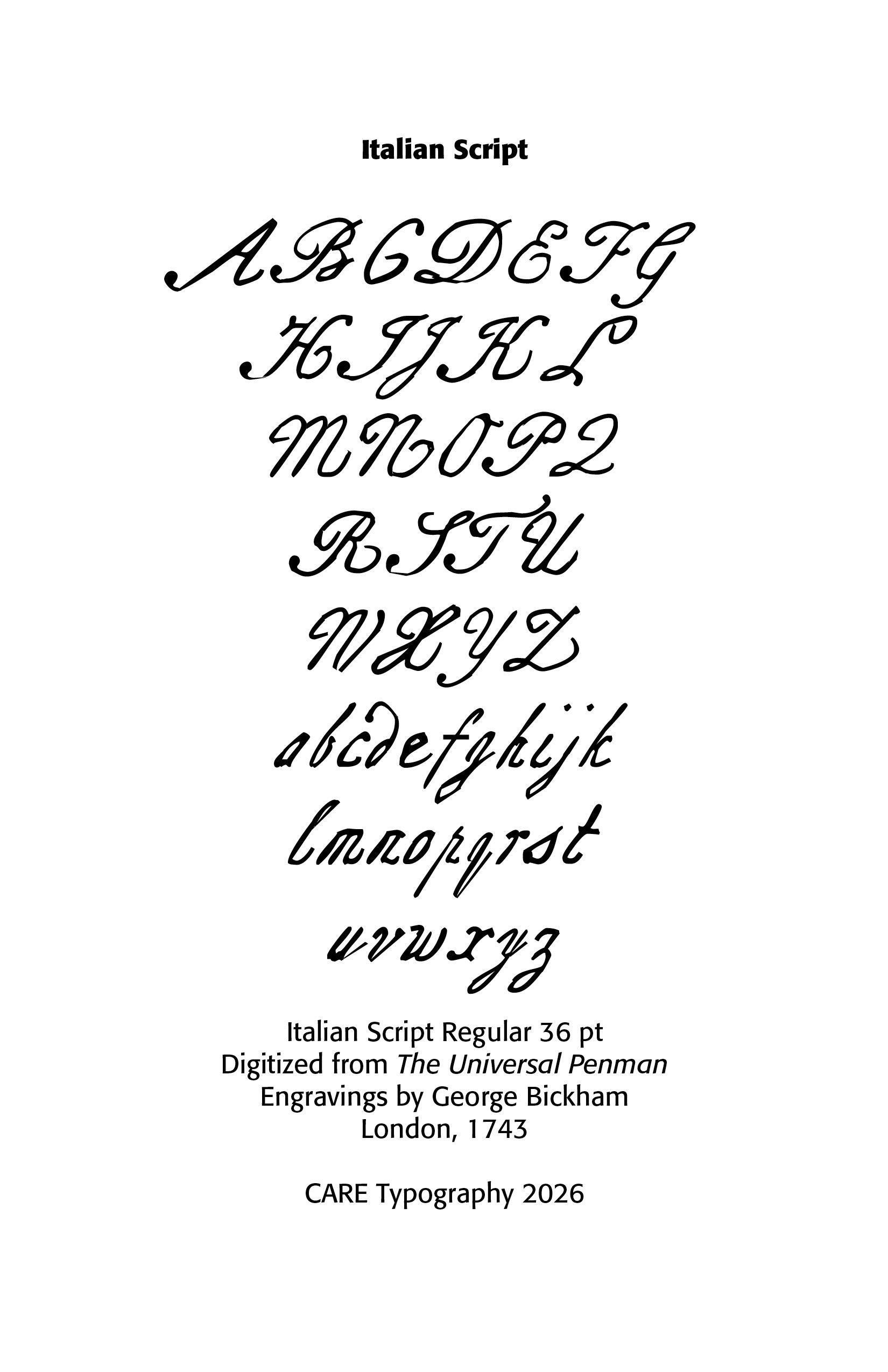
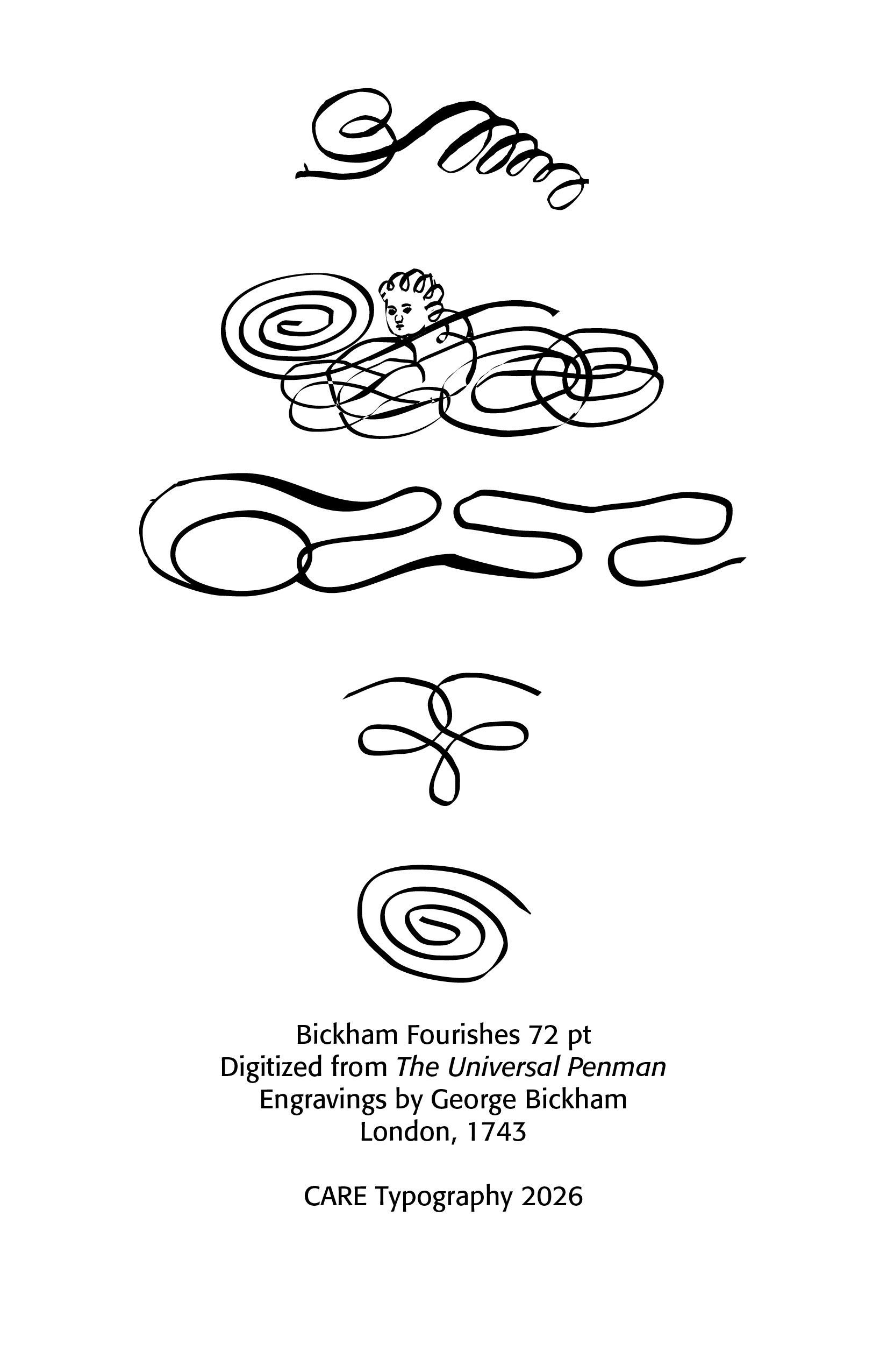
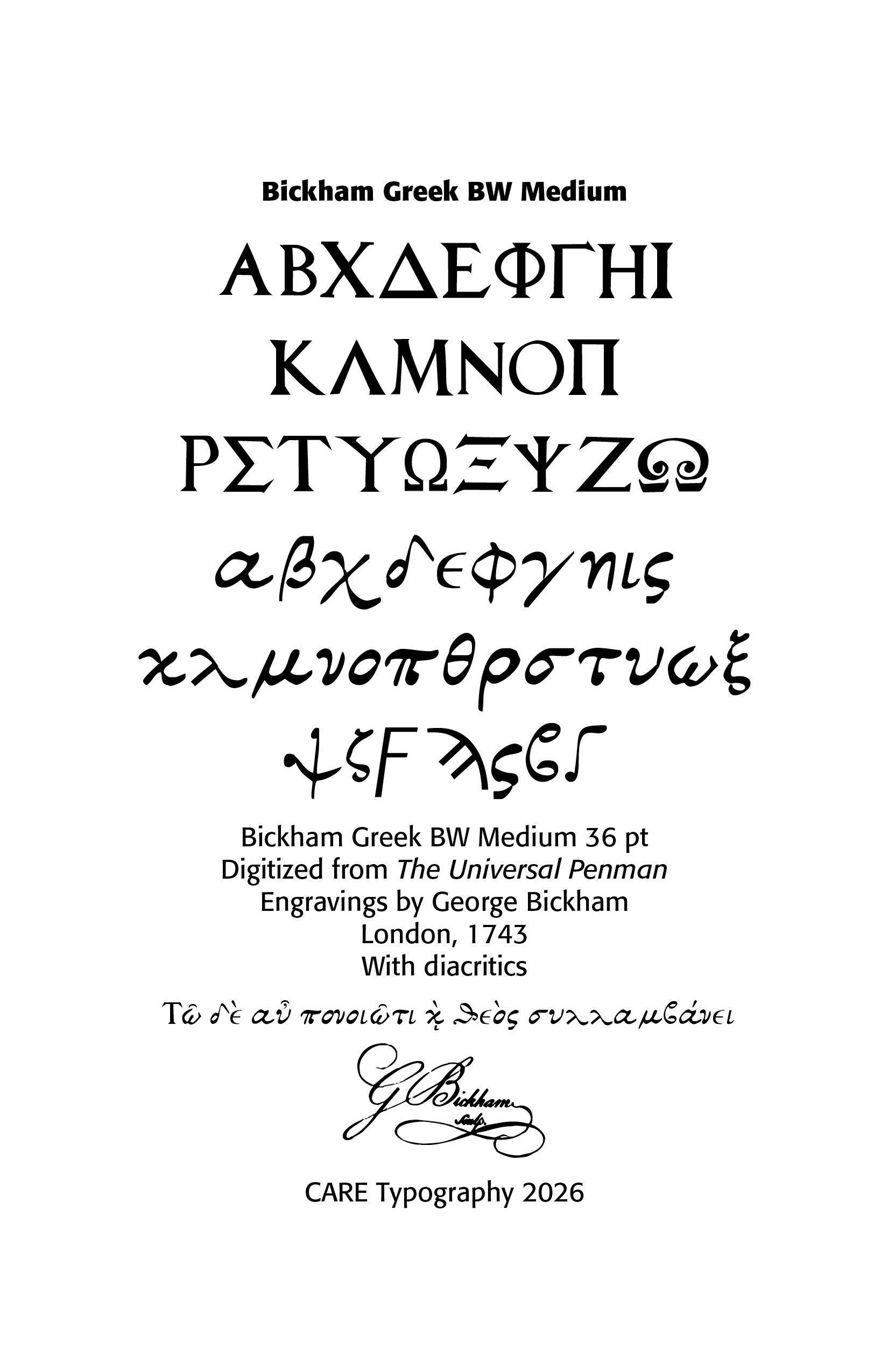
Philip Hofer, former Curator, Department of Printing and Graphic Arts, Harvard College Library, wrote an introductory piece on Bickham's masterpiece, The Universal Penman, republished by Paul Struck, New York, 1941. The original 1743 work was published in 52 installments between 1733 and 1741. Rather than being solely his own work, the publication collected exemplary handwriting from approximately twenty-five of London's finest writing masters, which Bickham engraved and embellished with ornamental borders, allegorical scenes, landscapes, animals, and decorative flourishes. The finished work contains over 200 engraved plates and became the definitive model for elegant handwriting throughout Britain and its colonies. The book served several audiences including merchants learning business correspondence, government clerks, accountants, students, professional writing masters, and artists interested in ornamental design.
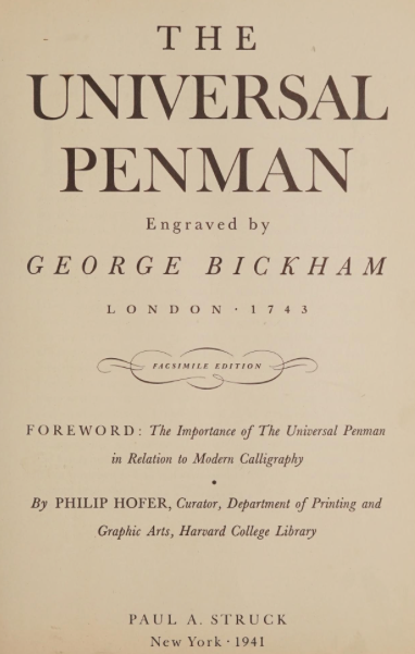
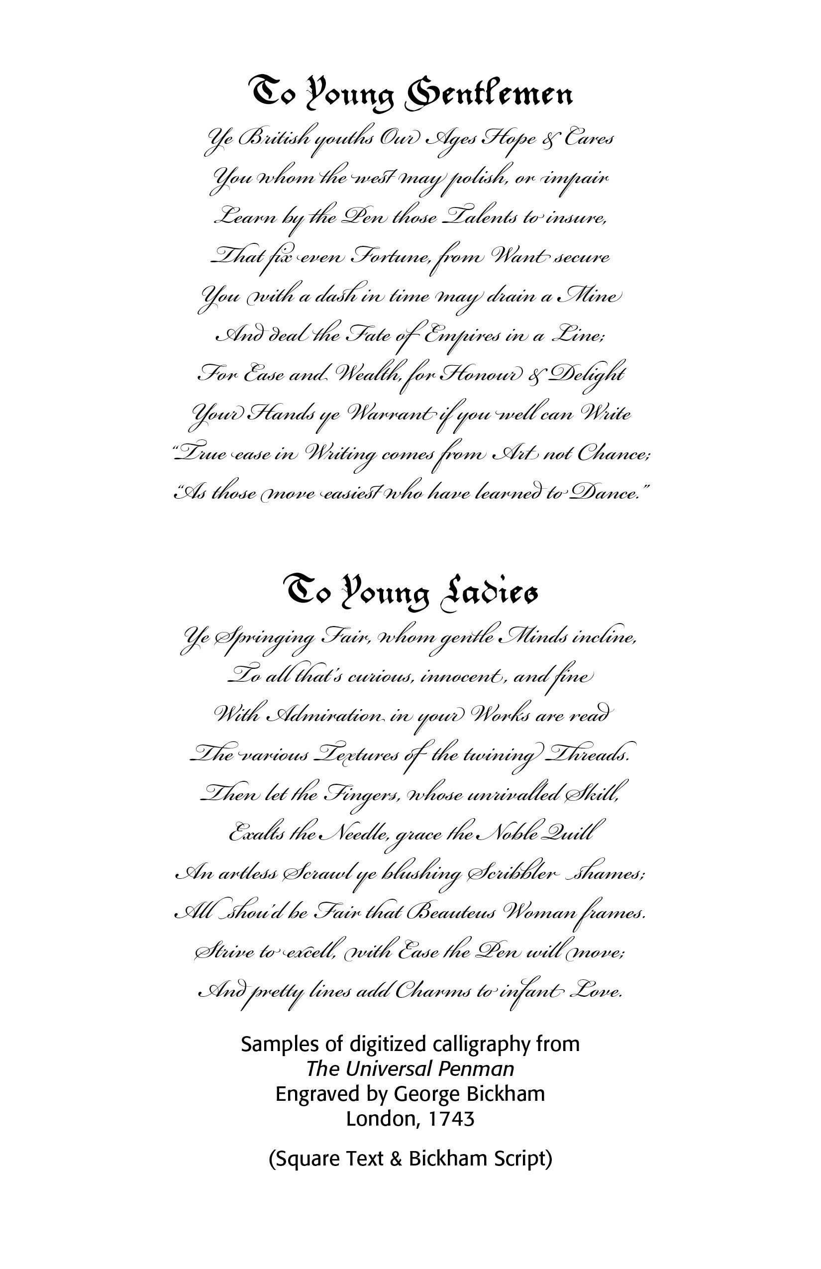
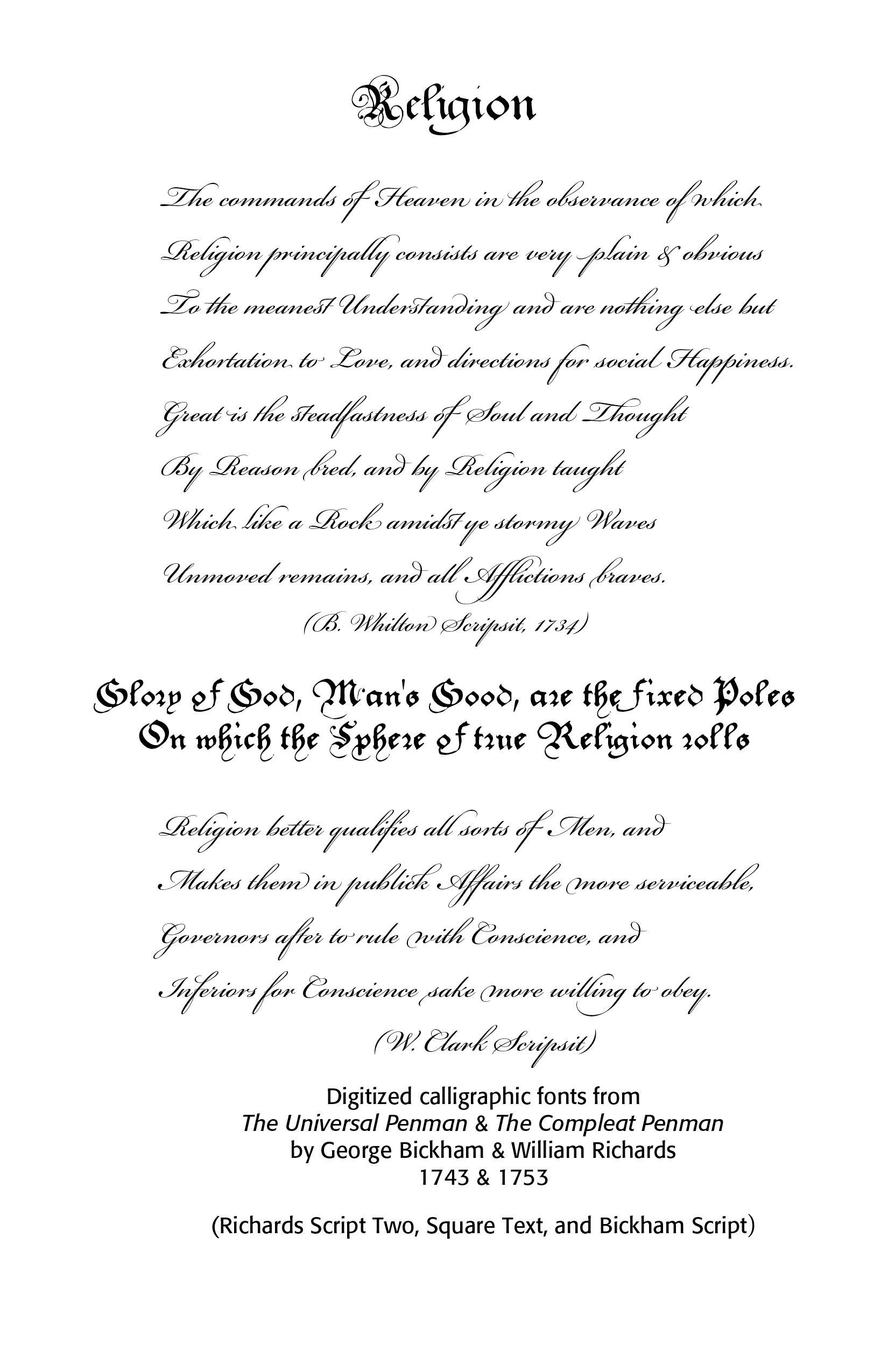
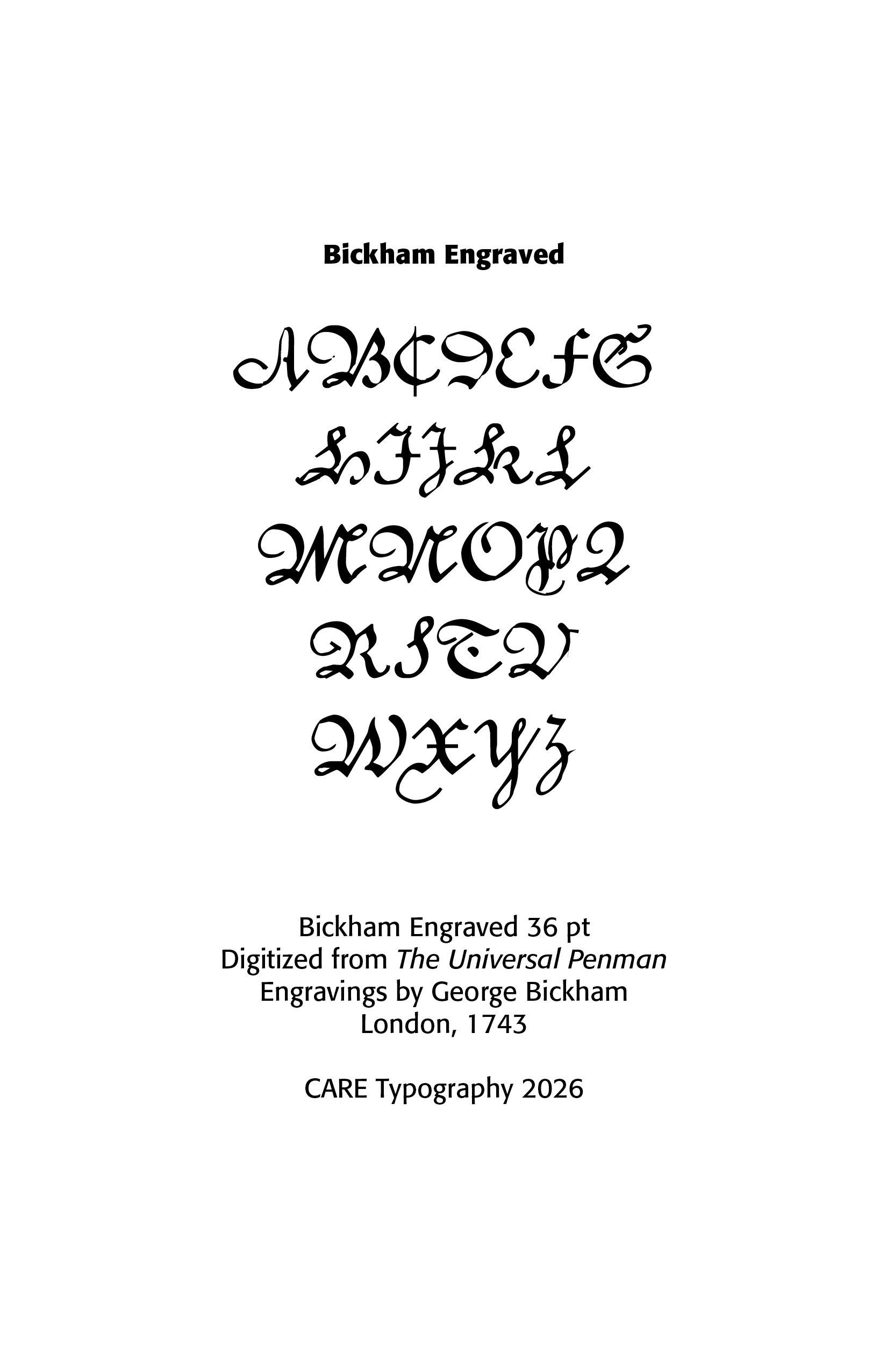
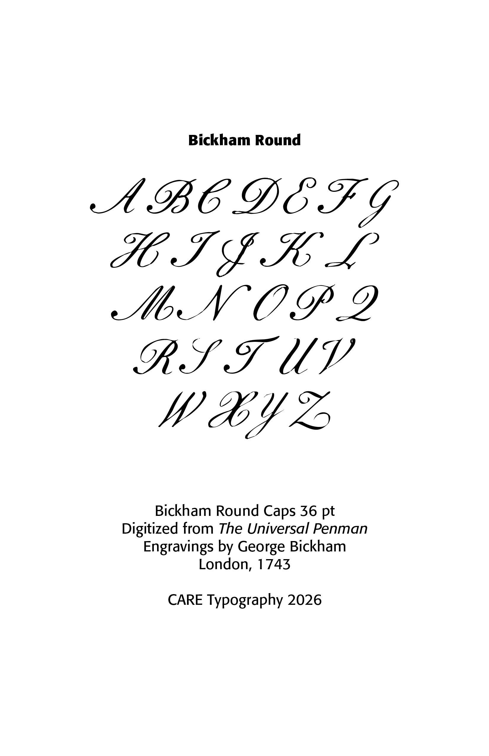
Hofer traces the history of English calligraphic writing, noting that the famous William Caxton, who introduced printing into England in 1476 –1477, provided only a local, rather “crabbed hand” for writing. In the later seventeenth century, men like Cocker, Ayres, More, Smith, Seddon and Snell inspired an even larger group of professional scribes in the first quarter of the eighteenth century. Edward Cocker’s engraved letterforms became models for later script typefaces. He helped bridge handwritten calligraphy and printed lettering. John Ayres promoted practical business writing alongside ornamental scripts. His instructional approach made quality handwriting accessible to merchants and students. Thomas More’s engraved examples served as references for decorative lettering and script typography. He demonstrated the artistic possibilities of pen lettering beyond purely functional writing. William Smith emphasized clarity, proportion, and consistency in handwriting. He helped spread standardized commercial writing styles, and reinforced letterforms that later informed English book and business typography. Thomas Seddon’s work reflected the transition from ornate seventeenth-century styles to the more restrained eighteenth-century English Round Hand. He helped popularize the forms that inspired many engraved script fonts, and influenced commercial writing styles used in business printing. Charles Snell, one of the most respected English writing teachers of the eighteenth century strongly influenced the development of English Round Hand typefaces. He helped establish a disciplined, readable script that later inspired engraved and digital script fonts.
Together, these writing masters preserved and refined England's major script traditions through engraved copybooks. They standardized handwriting used in commerce, education, and government. They created engraved letterforms that served as prototypes for script typefaces, Bridging the worlds of calligraphy, engraving, and typography during a period before script could be easily reproduced with movable type. They laid the aesthetic foundation for many eighteenth- and nineteenth-century script fonts, especially those based on Round Hand and Copperplate traditions.
Two English events prompted such an explosion in calligraphic script—the rising importance of English commercial enterprise and the development of “a round, even, flowing hand for business correspondence, which proved to be a well-nigh perfect technique when used by well-trained clerks. It was legible, neat in appearance, and, above all, swifter in execution than any of the hands practiced at that time elsewhere in Europe. Thus, one is not surprised to find that even such practical men of affairs as Samuel Pepys became interested in good writing, and collected copy books and specimens of the period.”
Such a script movement may have had its origin in the Morris revival period. William Morris (1834 –1896) was an Arts & Crafts designer who founded the Kelmscott Press (1891), reviving hand craftsmanship in printing. His work influenced the twentieth century private press and type revival movements. Lettering became a vehicle for breaking convention. Led by figures such as Morris, there was a decided reaction against industrialization, seeing machine-made goods as dehumanizing and ugly. Handcraftmanship, honesty in materials and utility fused with beauty made up much of what was called the Arts & Crafts Movement. That movement was rooted in medieval guild ideals and morality in design. (See more on https://www.caretypography.com/advances-in-typography-a-historical-sketch-part-2)
Hofer, however, believes the Bickham typographic script movement can be “more clearly traced to the lectures of Edward Johnson and Graily Hewitt in England and Germany, about 1905-6. In this country it can be credited to William A. Dwiggins as much as to anyone.” Edward Johnston and Graily Hewitt were the two most influential figures in the revival of calligraphy and hand-based typography during the Arts and Crafts movement in Britain. Together they helped reestablish lettering as both a practical craft and an artistic discipline, profoundly shaping twentieth-century typography, book design, and type design.
Edward Johnston is widely regarded as the father of modern calligraphy. At a time when industrial printing had largely separated typography from handwriting, Johnston argued that all good letterforms should be rooted in the movement of the broad-edged pen. His work restored the connection between handwriting, typography, and design. Johnston studied medieval manuscripts in the British Museum and rediscovered techniques that had largely disappeared since the Renaissance. His teaching emphasized broad-edged pen construction, Roman capitals, Carolingian and half-uncial scripts, careful spacing and proportion, and harmony between text and page. His methods became the foundation of modern calligraphy instruction. His book, Writing, Illuminating & Lettering (1906), became one of the most influential lettering manuals ever published.
Graily Hewitt was Johnston's most important disciple and collaborator. While Johnston revived calligraphy itself, Hewitt expanded its application to illumination, gilding, book decoration, and type theory. Hewitt became the leading authority on medieval-style manuscript decoration. He revived techniques including raised gesso, gold leaf gilding, illuminated initials, decorative borders, and vellum manuscript production. Many twentieth-century illuminators learned these methods through his teaching in Lettering for Students & Craftsmen (1930).
William Addison Dwiggins was one of the most influential American typographers, book designers, calligraphers, and graphic designers of the twentieth century. He helped transform American typography from the revivalist styles of the nineteenth century into a modern discipline emphasizing clarity, craftsmanship, and functional beauty. He is also widely credited with introducing the term "graphic design" in a 1922 essay, helping define the profession as it is known today.
Bickham’s influence can be still seen in the “We The People Font” by Keith Bates (www.k-type.com) cited below.
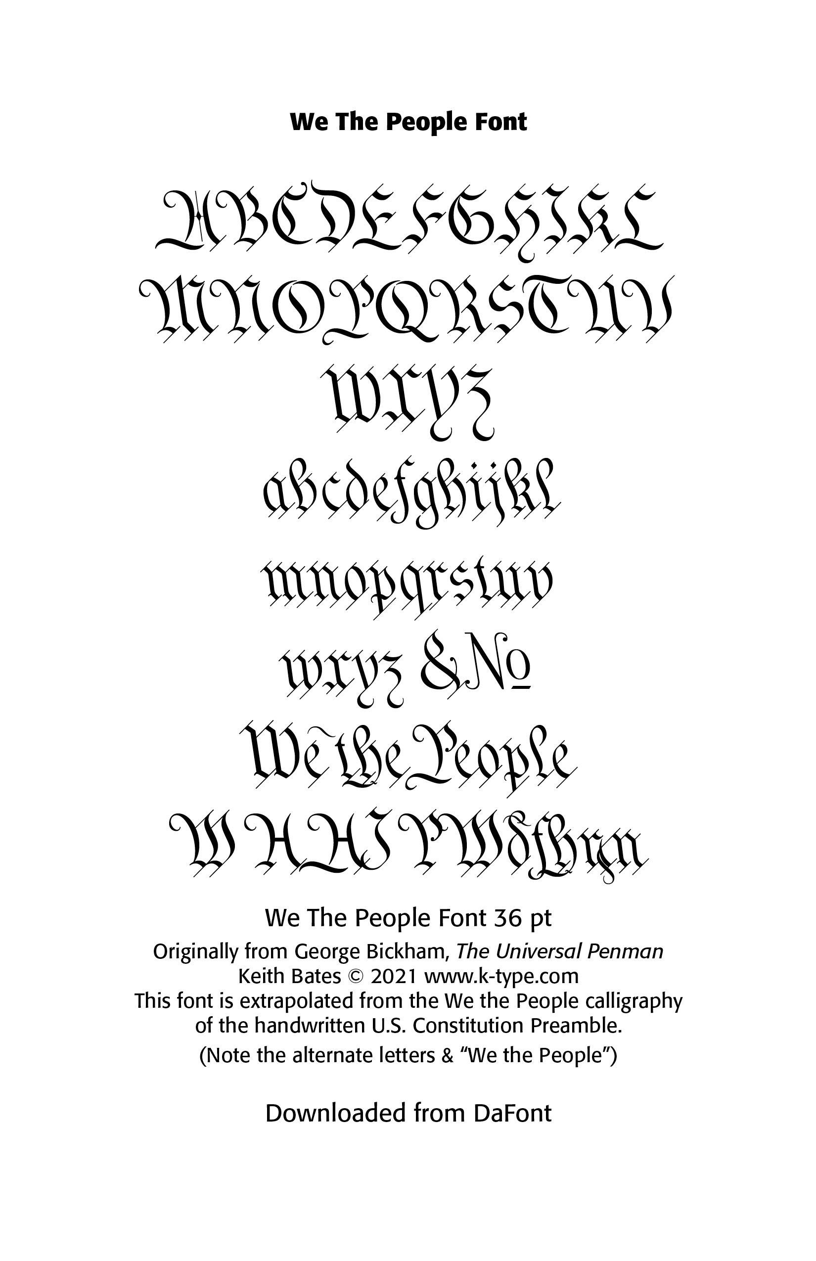
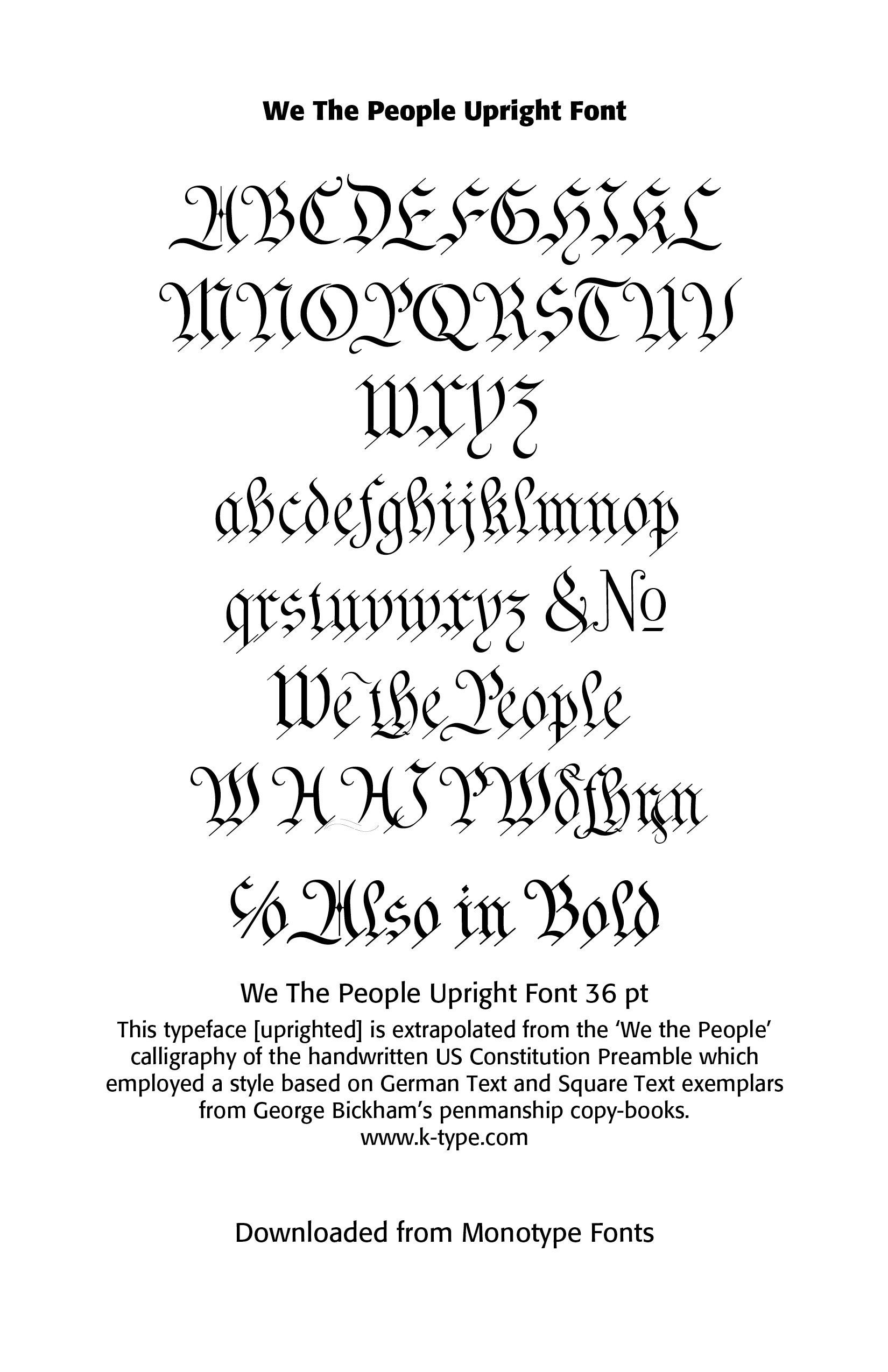
We The People Font
This typeface is extrapolated from the ‘We the People’ calligraphy of the handwritten US Constitution Preamble which employed a style based on German Text and Square Text exemplars from George Bickham’s penmanship copy-books, the most celebrated being
The Universal Penman
published in 1743.
The original Constitution document was transcribed onto parchment by Jacob Shallus, a Pennsylvania Assistant Clerk, over a weekend in 1787. Shallus’s biographer, Arthur Plotnik ('The Man Behind the Quill', 1987), notes that he was paid $30, a modest monthly wage at the time. He also suggests that the calligraphic headings, ‘We the People’ and ‘Article’, may have been inserted by Shallus’s 14 year old trainee son, Francis,
“The manner in which the ‘Article’ headings are squeezed into the space Shallus allowed for them suggests a second hand—and perhaps not a very experienced one.”
The unconventional backslant of the headings would seem to support this contention, and at the end of the document there is perhaps a novice’s inconsistency in the structure of the letter n between that used for ‘done’ and those used for ‘In Witness’. However, one has to admire the elegant swagger of the wavy t, h and l which the K-Type font extends to the b, f and k. Also, the simpler, Schwabacher-style W, an enlarged version of the lowercase w, is a little less flamboyant than the capital W from the German and Square texts in Bickham’s manuals.
For designers using OpenType-aware applications, the typeface includes some Alternates, including a Bickham-style W, the letters t, h and n with added flourishes, two simpler forms of the A, and a few roman numerals for numbering articles. Also some ornamental flourishes and a round middle dot/decimal point. Punctuation marks are drawn in square, calligraphic style, but an alternative round period/full stop, for use with currency and numerals, is available at the period centered position (though placed on the baseline), accessed by Shift Option 9 on a Mac, or Alt 0183 on Windows. The full phrase, ‘We the People’, has been placed at the trademark keystroke and can be accessed by Shift Option 2 on a Mac, or Alt 0153 on Windows.
For designers who find the backslant awkward or unpleasant, the licensed typeface is available from k-type.com and includes two additional fonts which have a vertical aspect that may be more conducive to graphic design layouts. ‘We The People Upright’ and ‘We The People Upright Bold’ both retain the distinctive style, and the heavier weight is only slightly emboldened, just enough to add some punch. (Article courtesy dafont, Feb 11, 2021)
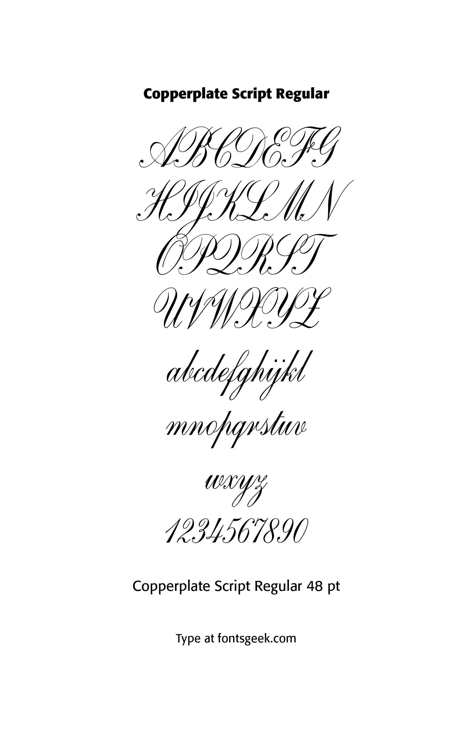
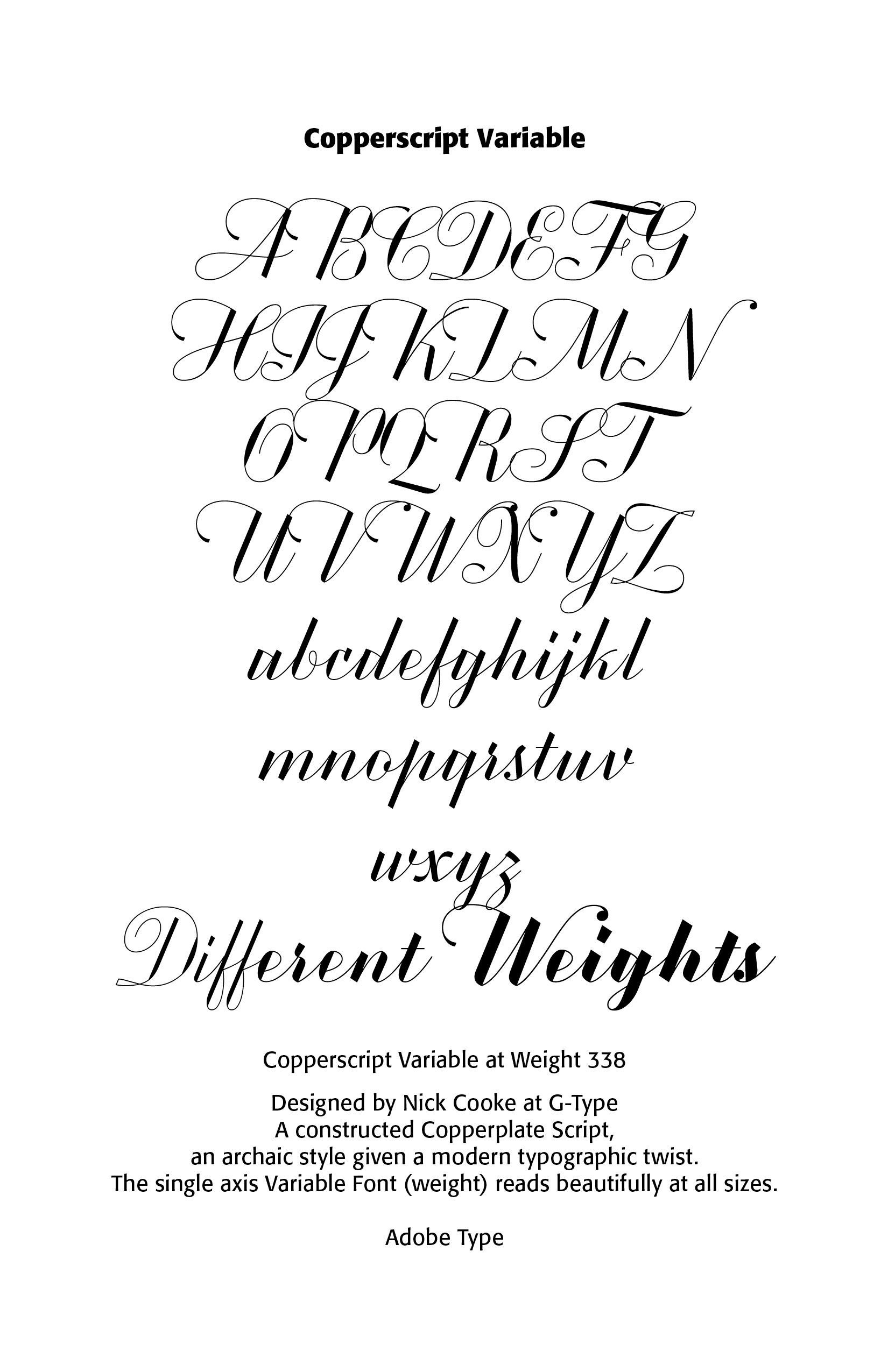
Bingham’s work helped standardize English Round Hand, copperplate script, commercial penmanship, and script typefaces developed during the nineteenth and twentieth centuries. Many modern digital fonts marketed as "Copperplate Script," "English Roundhand," or "Bickham Script" ultimately trace their visual ancestry to his engraved specimens.
William Richards & Typography
William Richards was associated with the traditions of printing, writing, and letterforms that flourished during the late eighteenth and early nineteenth centuries. His work reflects a period when typography was moving from the restrained neoclassical styles of Baskerville and Bodoni toward the more expressive display types of the nineteenth century.
Although a minor figure in typographic history, Richards provided the typographic world with the promotion of quality printing, emphasizing legibility and orderly page design.He continued the tradition of handwriting on printed type and educationally helped preserve standards of good lettering and printing practice through instructional and publishing activities.
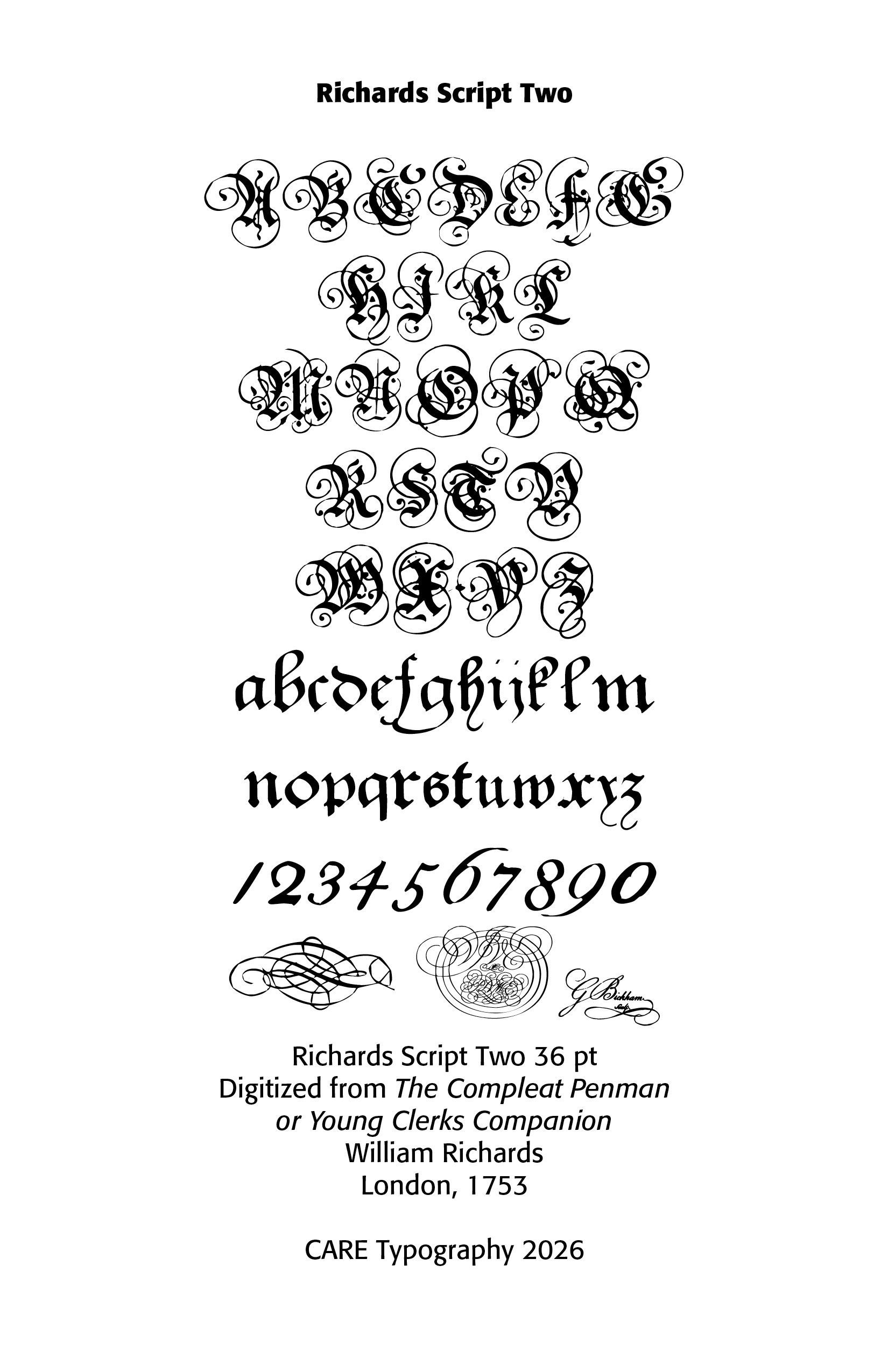
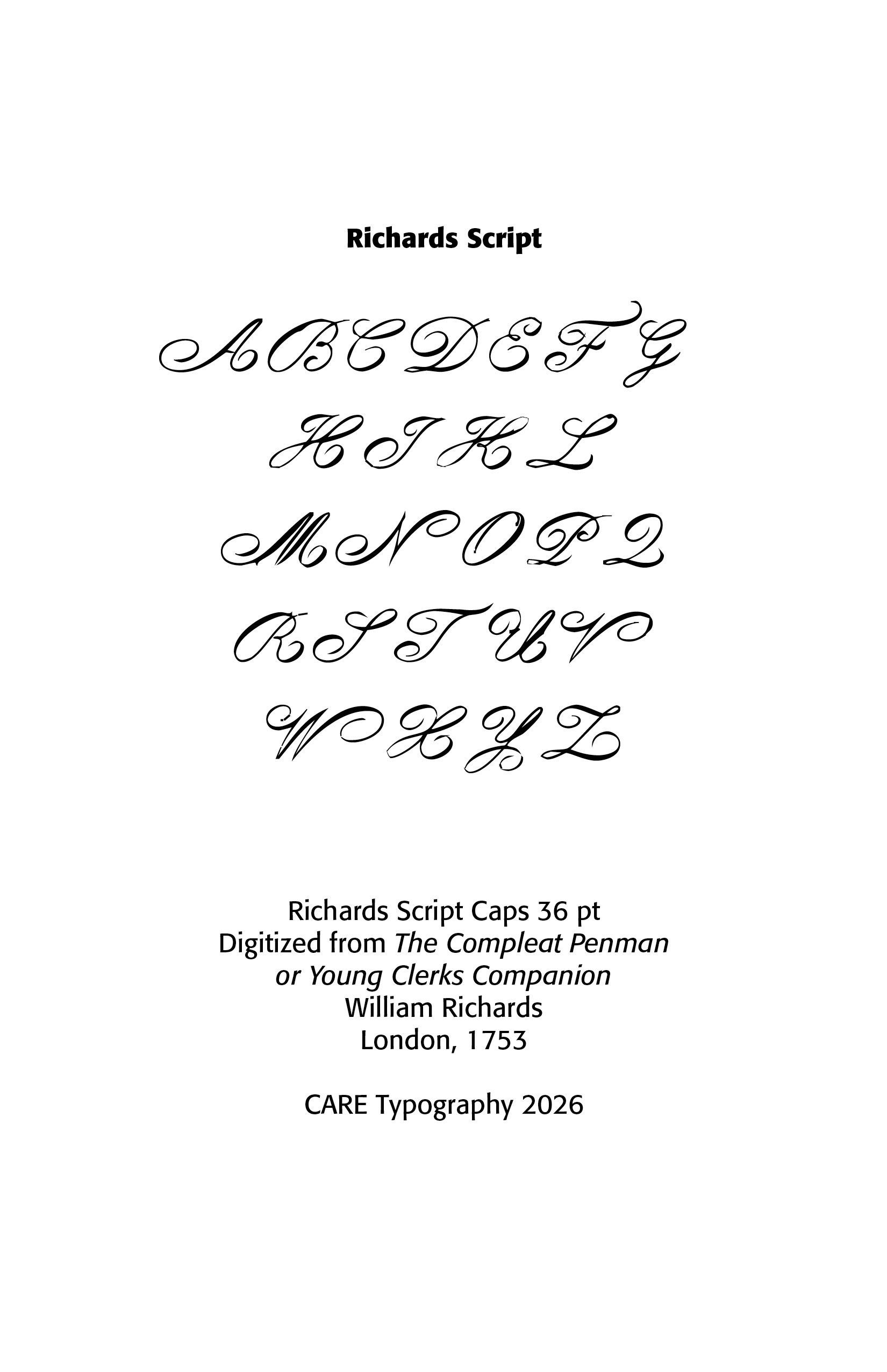
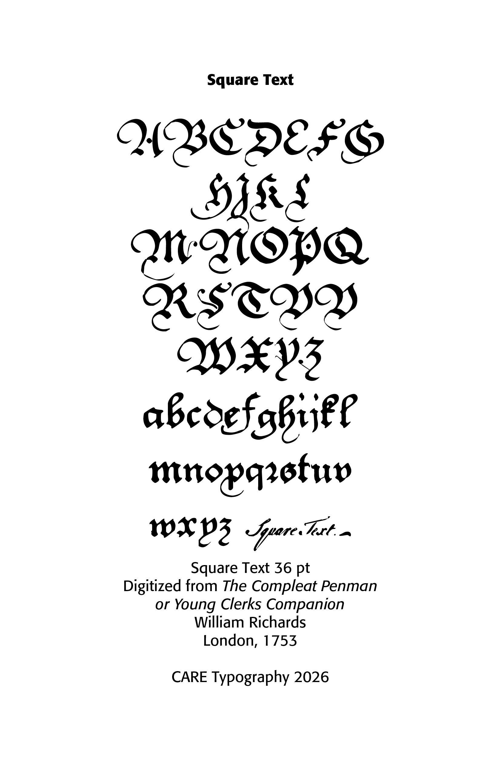
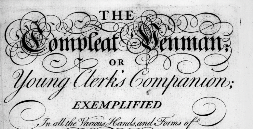
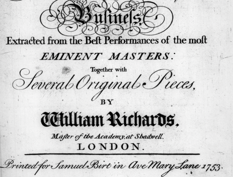
His importance lies in representing the skilled printers and lettering practitioners who maintained high standards of book production during a transitional period in printing history. While he did not introduce a new typographic style or typeface, his work reflects the craftsmanship that connected eighteenth-century printing traditions with the rapidly changing typography of the Victorian era. The typeface samples below are from his book, The Compleat Penman or Young Clerks Companion, published in London in 1753, a decade after Bingham.
Successful Layout & Design