Scripts & Cursives (2)
In typographic terminology, script refers to a class of typefaces designed to emulate handwriting or calligraphy, regardless of whether letters are connected. Cursive, by contrast, refers to a style of handwriting characterized by connected, flowing letterforms developed for efficient writing. Consequently, cursive writing is one important source of script typefaces, but script typography also includes many designs that are not truly cursive.
While a script typeface may connect every letter, or only certain combinations, or even none at all, cursive faces are characterized by connected letters. Thus, English Roundhand, Spencerian writing, the Palmer method, and modern school writing are all cursives. Cursive writing evolved because ancient scribes needed to write quickly.
Roman cursive (or Latin cursive) is a form of handwriting (or script) used in ancient Rome and to some extent into the Middle Ages. It is divided into old (or ancient) cursive, and new cursive. [The following text is adapted from Wikipedia and Luc Devroye.org)
Old Roman cursive, also called majuscule cursive and capitalis cursive, was the everyday form of handwriting used for writing letters, by merchants writing business accounts, by schoolchildren learning the Latin alphabet, and even by emperors issuing commands. A more formal style of writing was based on Roman square capitals, but cursive was used for quicker, informal writing. It was most commonly used from about the 1st century BC to the 3rd century AD. Old Roman cursive is very difficult to read for people today.
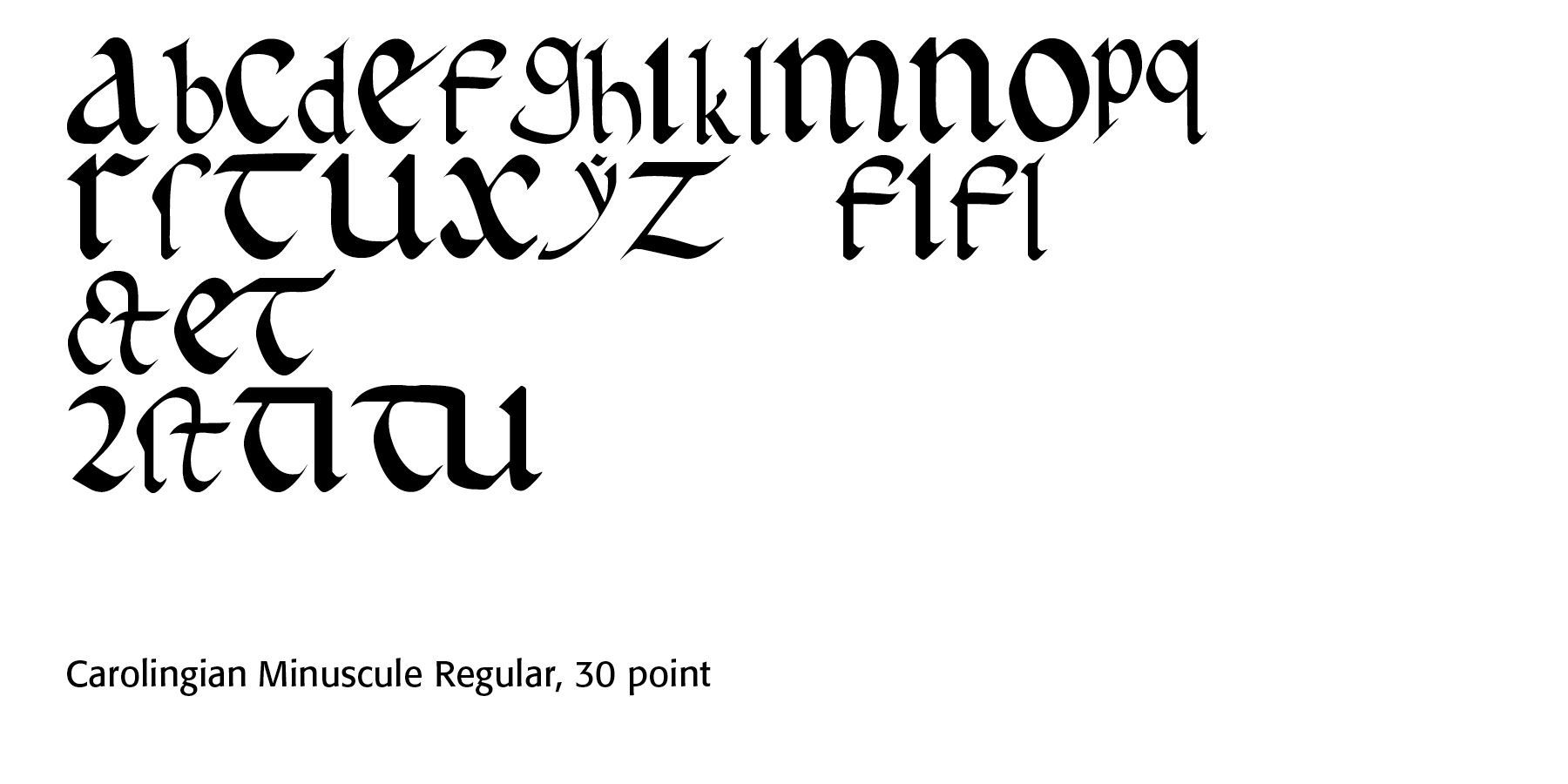
New Roman cursive, also called minuscule cursive or later Roman cursive, developed from old Roman cursive. It was used from approximately the 3rd century to the 7th century, and uses letter forms that are more recognizable. This evolved into the medieval script known as Carolingian minuscule, which was used in nineth century France and Germany in the imperial chancery, and whose revival in the Renaissance forms the basis of our modern lowercase letters.
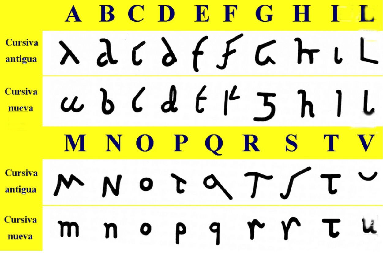
Developed from Wikipedia
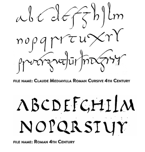
https://luc.devroye.org/fonts-66269.html
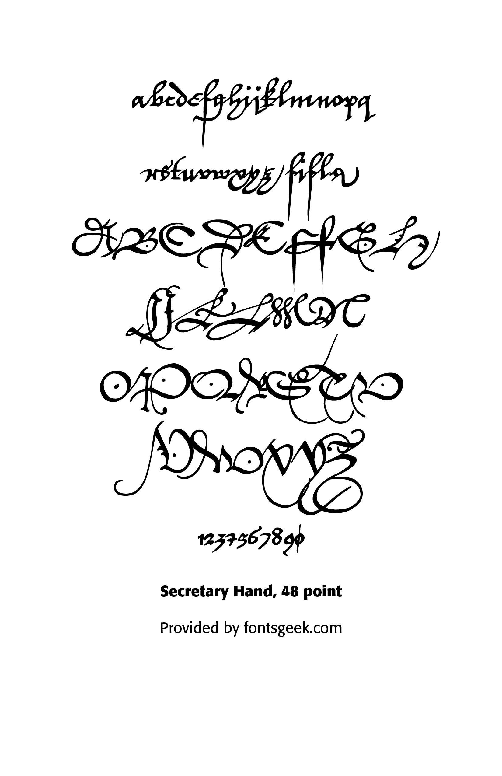
Secretary hand was a form of cursive in the 14th–17th centuries. It had an angular appearance with numerous loops and flourishes and highly abbreviated. It was used for efficiency in legal and governmental writing for, example, court records, will, and land deeds.
William Shakespeare frequently wrote in Secretary Hand. This typeface dominated English administration before italic handwriting replaced it.
Running hand cursives populated the 17th–19th centuries. They offered flowing, connected writing, were faster than formal round hand, had moderate slant, and few pen lifts.
Examples included personal letters, merchant account books, business correspondence, and
educational copybooks.
This was the everyday handwriting of Britain and America and offered a transitional style leading toward nineteenth-century business penmanship.
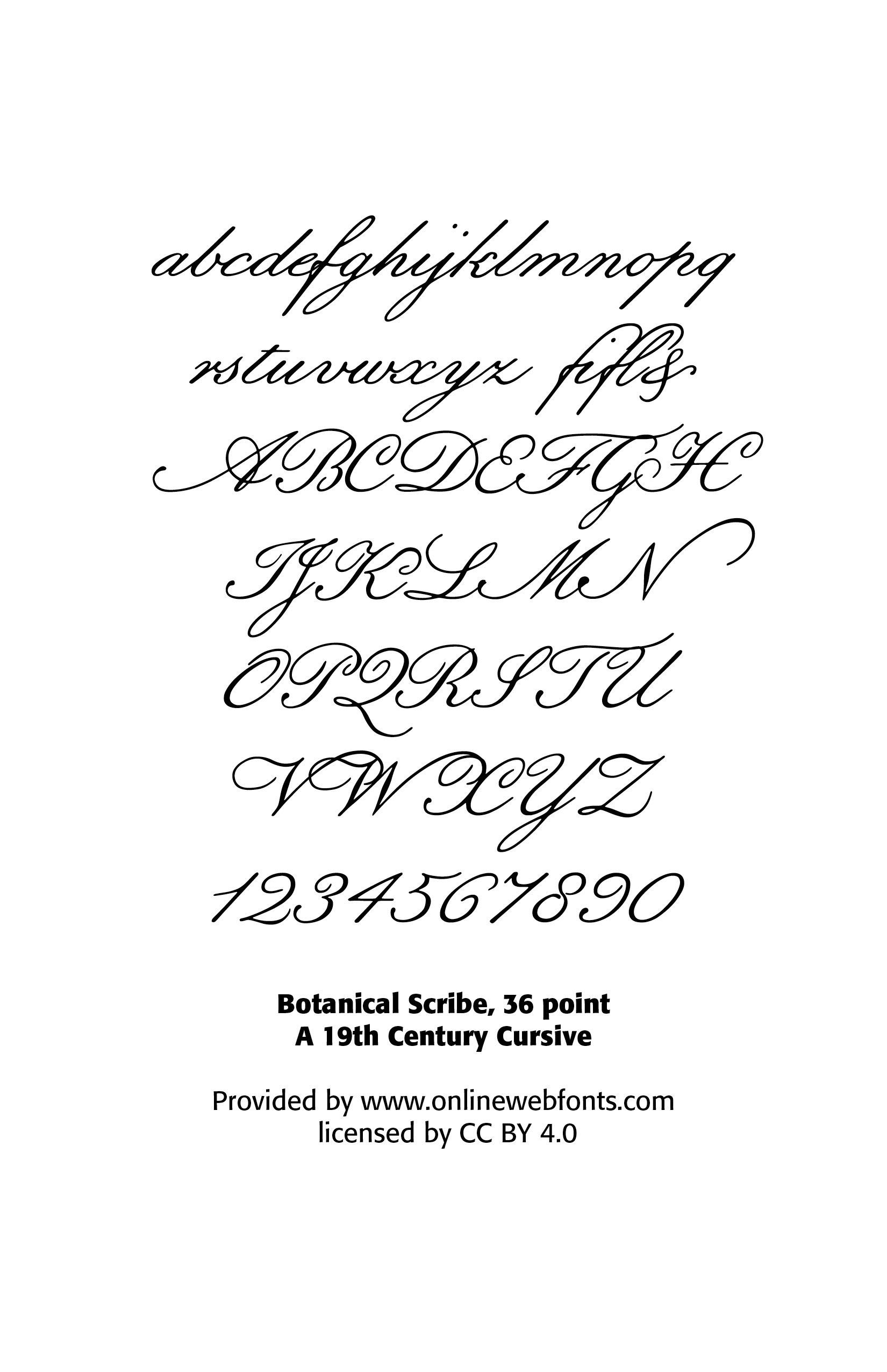
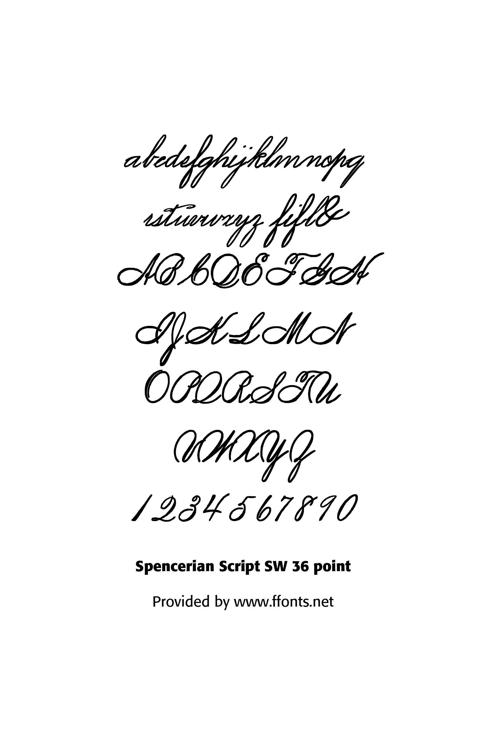
Spencerian script (1840–1925) is a handwriting script style based on copperplate script that was used in the United States from approximately 1850 to 1925 and was considered the American de facto standard writing style for business correspondence prior to the widespread adoption of the typewriter. The Coca-Cola Company logo was inspired by Spencerian penmanship.
Spencerian script, a form of cursive handwriting, was also widely integrated into the school system as an instructional method until the "simpler" Palmer Method replaced it. President James A. Garfield called the Spencerian script "the pride of our country and the model of our schools." Spencer, inspired by the forms that he saw of smooth pebbles in a stream, aimed to create a graceful script to resemble those shapes. While likely originally writing and developing the script with a quill pen, Spencerian script's evolution is tied to the availability and development of higher-quality steel pens. (wikipedia)
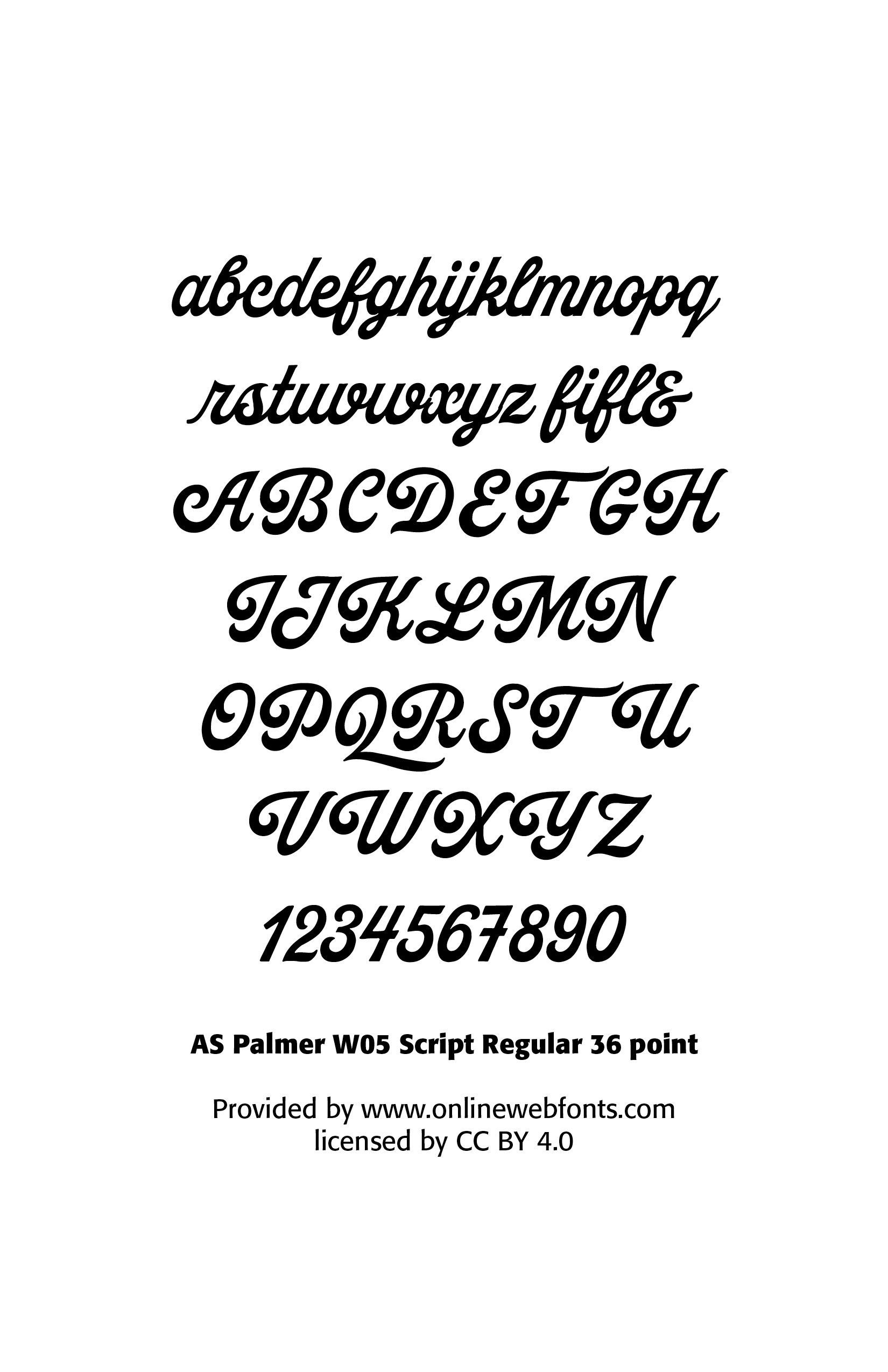
The Palmer Method of penmanship (1890–1950s) instruction was developed and promoted by Austin Palmer in the late 19th and early 20th centuries. It was intended to simplify the earlier Spencerian method, which had been the main handwriting learning method since the 1840s.
The Palmer Method soon became the most popular handwriting system in the United States. Palmer's method involved "muscle motion" in which the more proximal muscles of the arm were used for movement, rather than allowing the fingers to move in writing. In spite of opposition from the major publishers, this textbook enjoyed great success: in 1912, one million copies were sold throughout the United States.
Under the method, students were taught to adopt a uniform system of cursive writing with rhythmic elliptical motions. (wikipedia)
Successful Layout & Design