Dutch Typography: Historical Beginnings
Dutch Typography: Historical Beginnings
Dutch typography has had an influence far beyond the relatively small geographic size of the Netherlands. From the early printing centers of the Low Countries to the international reputation of Dutch type designers in the twentieth and twenty-first centuries, Dutch typography is characterized by craftsmanship, readability, experimentation, and a strong relationship between type and graphic design.
The larger historical pattern
Early Printing in the Low Countries (c. 1470–1500). The Netherlands and Belgium were important centers of European printing almost immediately after Gutenberg. Major early centers included Utrecht, Haarlem, Leuven, Bruges, Ghent, Antwerp, and Amsterdam. Dutch and Flemish printers initially used forms derived from Gothic textura, but Roman types increasingly appeared in humanist books. A particularly important early figure was Gerard Leeu, who printed in Gouda and later Antwerp. His books demonstrate the transition from manuscript traditions toward increasingly sophisticated typographic production.
Gerard or Gheraert Leeu, Leew, (between 1445 and 1450 to1492) printed what is called “incunable.” An incunable or incunabulum (pl.: incunables or incunabula, respectively) is a book or pamphlet printed in the earliest stages of European printing up to about 1500. They are distinct from manuscripts, which are documents written by hand. Some authorities on the history of printing include block books from the same time period as incunabula, whereas others limit the term to works printed using movable type. Famous incunabula include two from Mainz, the Gutenberg Bible of 1455 and the Peregrinatio in terram sanctam of 1486, printed and illustrated by Erhard Reuwich, the Nuremberg Chronicle written by Hartmann Schedel and printed by Anton Koberger in 1493, and the Hypnerotomachia Poliphiliprinted by Aldus Manutius with important illustrations by an unknown artist.
Leeu printed his first (liturgical) book in May 1477 in his shop in Gouda, where between 1477 and 1484 he produced a total of about 69 books. Besides printing works in Latin and Dutch, he reprinted some of William Caxton’s editions for the English market. (REFERENCE) The Low Countries also developed a strong tradition of illustrated books, woodcut initials, borders, and ornamental typography.
The sixteenth century was a special age for Flemish printing, particularly in Antwerp. The central figure was Christophe Plantin (1520–1589), whose printing house became one of Europe's great publishing establishments.
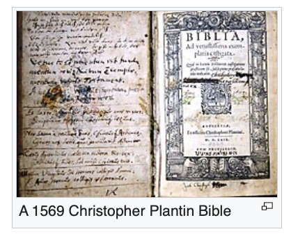
Christophe Plantin was a French Renaissance humanist and book printer and publisher who resided and worked in Antwerp. He established in Antwerp one of the most prominent publishing houses of his time, the Plantin Press. It played a significant role in making Antwerp a leading center of book publishing in Europe. The publishing house was continued by his successors until 1867. His most important work is considered to be the Biblia Regia (King's Bible), also known as the Plantin Polyglot. There were eight volumes in folio format, meaning only two pages could be printed at one time. The Polyglot Bible has parallel texts in Latin, Greek, Syriac, Aramaic, and Hebrew. This work earned Plantin little profit, but resulted in Philip's granting him the privilege of printing all Roman Catholic liturgical books. Plantin was concerned over being accused of heresy and being a Protestant sympathizer.
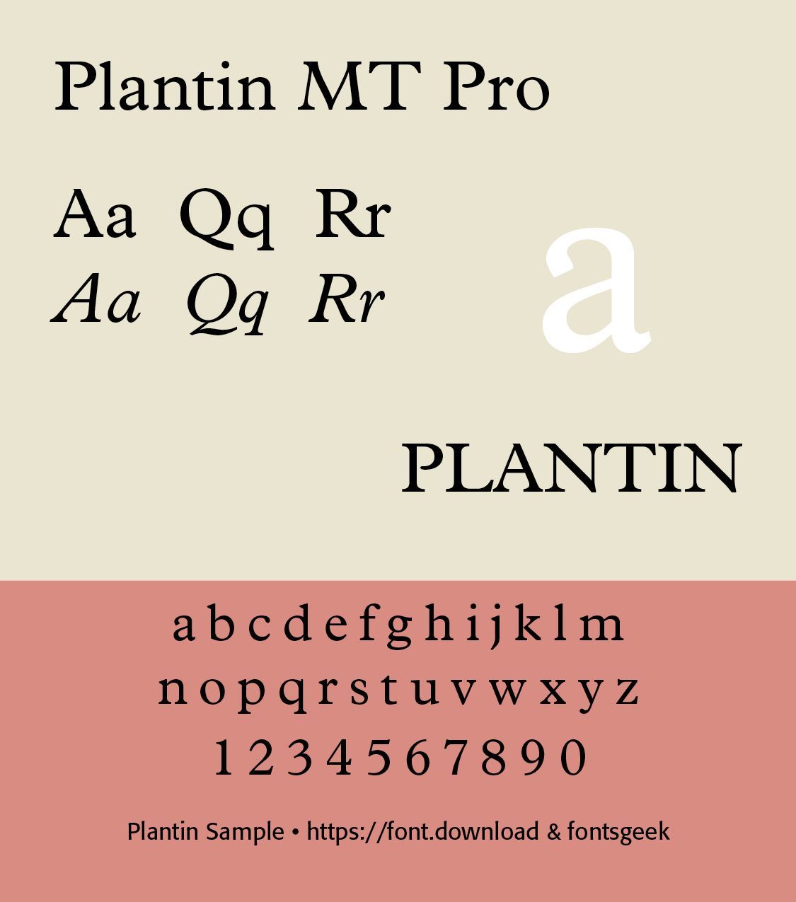
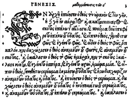
Plantin's books established a model of typographic refinement that influenced European printing for centuries. Important characteristics included carefully proportioned Roman type, refined italic type, excellent typography and composition, elaborate title pages, woodcut and engraved illustrations, mathematical and scientific books, multilingual printing, and high-quality paper and production. Plantin worked with type designers and punchcutters including Robert Granjon and Claude Garamond's circle of influence, while developing a distinctive Flemish typographic tradition.(ILLS)
Plantin Greek Sample
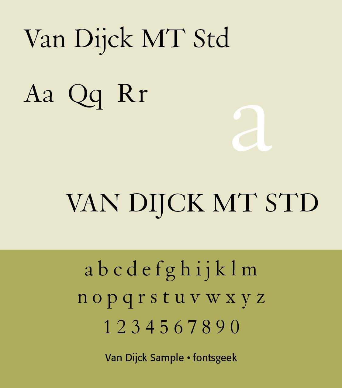
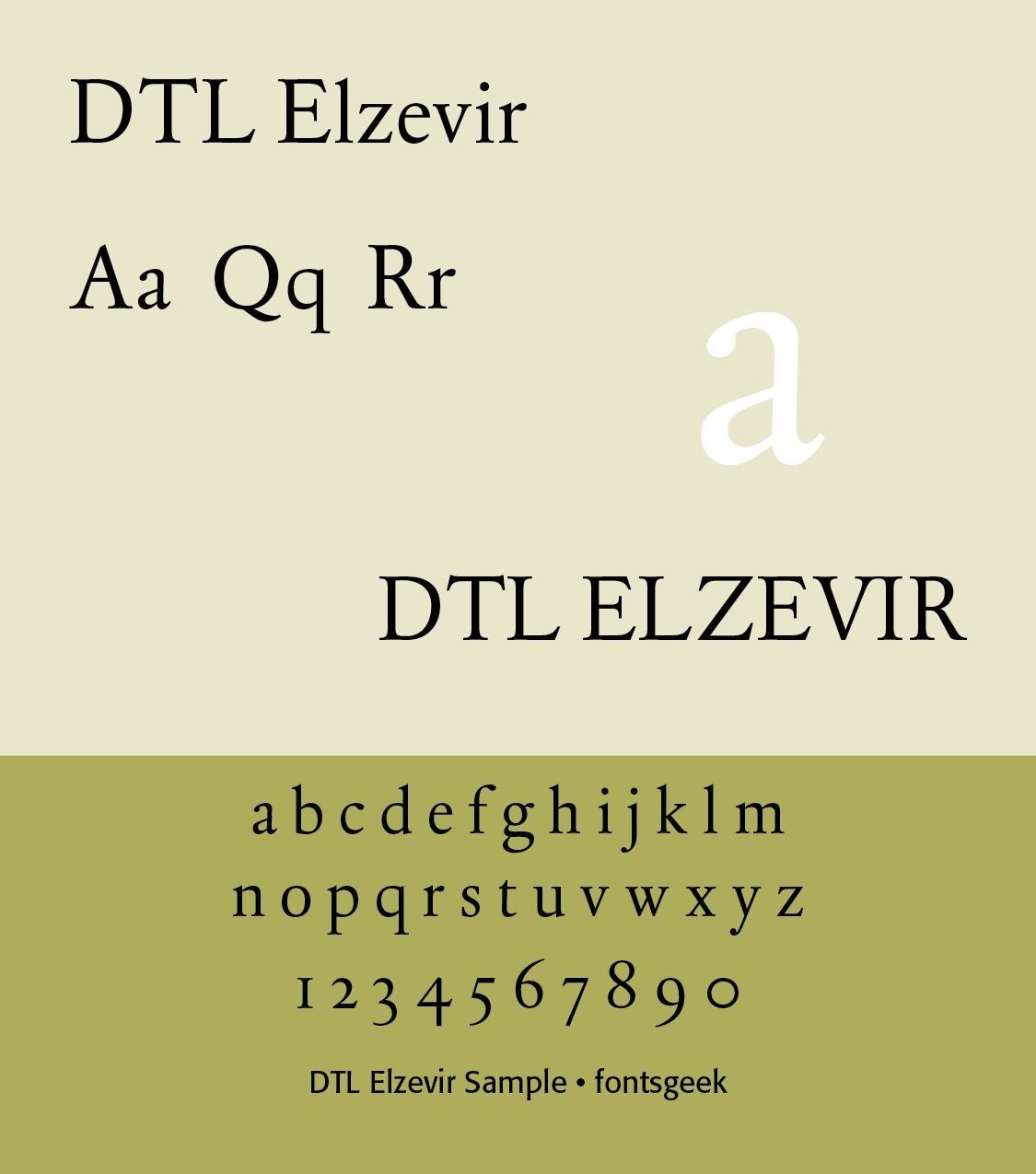
The Dutch Golden Age — 1600s. The seventeenth century transformed Dutch typography. The Dutch Republic became an international center of commerce, publishing, cartography, scientific printing, Bible printing, political pamphlets, newspapers, and book production. Amsterdam in particular became a major publishing center. Christoffel van Dyck (1601–1669) was a major Amsterdam punchcutter whose types became associated with Dutch book printing.(REFERENCE) Digital recreations include DTL Elzevir (1992) and Custodia (2002–06). DTL Elzevir (Gerard Daniels) is based on a study of several cuttings from Christoffel Van Dijck. His designs were characterized by relatively compact proportions, strong readability, moderate contrast, sturdy serifs, and economical use of space. Van Dyck's types were particularly influential in Bible and scholarly printing. (ILLS 2 Fonts)
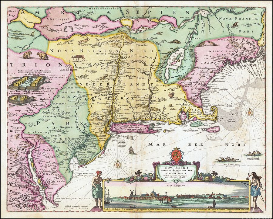
Seventeenth-century Dutch typography developed alongside the visual culture of Dutch Baroque art. The typography was generally more restrained than French ornamental typography, but Dutch books could be extremely elaborate. Typical features included copperplate engraving, elaborate title pages, decorated initials, ornaments and fleurons, mathematical diagrams, maps, scientific illustrations, and dense but carefully organized pages. Dutch publishers were also major producers of atlas and cartographic books. The typography of Dutch maps and atlases became an important part of the country's international visual identity.(ILLS Map)
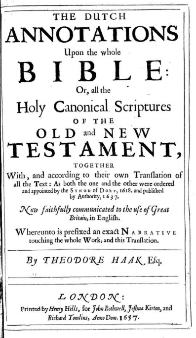
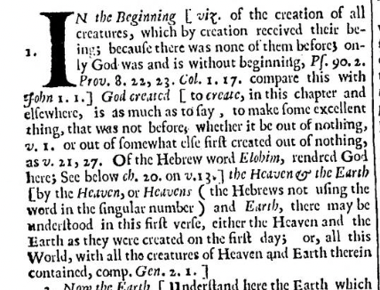
The Dutch Bible — Statenbijbel.
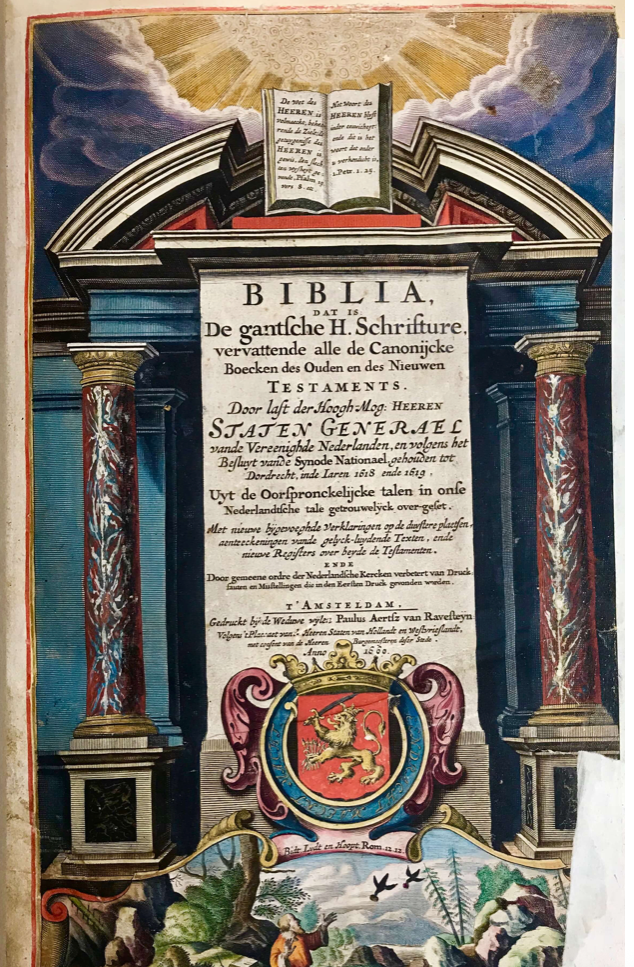
One of the most important typographic projects in Dutch history was the Statenbijbel, or States Bible, commissioned by the States General. It was first published in 1637. The Bible Notes were written with specific guidelines for translation established by the Synod of Dort during its eighth session on 20 November 1618.
The four main instructions to the translators were (1) That they always carefully adhere to the original text, and that the manner of writing of the original languages be preserved, as much as the clarity and properties of Dutch speech permit. But in case where the Hebrew or Greek manner of speech was harder than could remain in the text, that they note this in the margin; (2) That they add as few words as possible to complete the meaning of a sentence if it is not expressed fully, and that these words be distinguished from the text with a different font and placed between brackets; (3) That they formulate a short and clear summary for each book and chapter and write this in the margin at the respective locations in the Holy Scriptures; and, (4)That they add a brief explanation providing insight to the translation of unclear passages; but the addition of lessons learned is neither necessary nor advisable.
The Apocryphal books, evident in Catholic editions, were not included in the main text of the Bible because of their lack of biblical canonicity. The Synod was heavily influenced by Calvinistic orthodoxy and writing against Arminian theological concepts.† The Name of God was particularly important. It was noted in the twelfth session that “After the completion of the works of creation/ here for the first time God is given the name IEHOVAH / meaning the independent/ self being/ being the same from eternity to eternity/ and the origin or cause of existence of all things; that is why this name only belongs to God. Remember for all time; wherever you from now on see the word LORD written in capital letters/ that there in Hebrew the word IEHOVAH, or shorter/ IAH is stated.” (Wikipedia) (ILLS Picture)
“New Dutch Bibles (published in 2004 and 2010) have recently replaced the Statenvertaling as the primary Dutch Bibles in use. Even these translations, written centuries later, use the seventeenth century Statenvertaling as their starting point—attesting to the lasting quality and continuing influence of the work of the Synod of Dordt and the translators.” (https://calvin.edu/centers-institutes/meeter-center/about-the-synod-of-dordt/the-statenvertaling-bible)
“The Synod of Dordt met between November 1618 and May 1619. The first issue on the agenda at the Synod was the translation of a new Bible. Johannes Bogerman, the president of the Synod and an expert in biblical languages, brought up the King James Bible as well as Spanish and Italian translations that worked from the original languages, pointing out the framework the Dutch Bible should follow. The delegates unanimously voted to commission the new Bible.
While the commissioning was unanimous, the delegates debated what to do with the apocrypha. Lay people read the apocrypha for centuries before the Reformation, and many Reformed churches accepted the apocryphal texts. But Franciscus Gomarus (the late Arminius’ opponent on the faculty at Leiden), and Jean Diodati, (Beza’s student and an Italian biblical translator), were against it. The apocrypha, they argued, conflicted with scriptures and was dogmatically wrong. After debate, the Synod of Dordt decided that the translators should place the apocrypha at the back of the Bible with a preface warning the reader. After its initial 1637 publication by Paulus Aertsz van Ravesteyn in Leiden, the Statenvertaling was reprinted twenty-two times before the turn of the eighteenth century. For the next two centuries, the Statenbijbel was the most-owned book in the Netherlands.”
Was there an association with the Westminster Assembly in England? Not directly. However, in a Preface to the Notes on the Statenvertaling, in Gothic typeface of the period, we have this statement — “Whereas we are sufficiently assured by the Testimony of many of the Divines of both kingdoms, sitting in the Assembly at Westminster, that the Compleat Translation of the Large Annotations on the Dutch Bible, set forth 1637, will be of great Use and Benefit to these Realms, for the promotion of Piety; And the pains in finishing such a Work exceeding great, Be it Ordered and Ordained by the Lords and Commissioners Assemble in Parliament, for the encouragement of the Undertaker thereof, Theodore Haak. . . . shall have the privilege of printing the said Annotations for the space of fourteen years . . .” (Henry Elsyng, Clerk, 30 March 1648)
During the eighteenth century, Dutch typography continued to be important, although France and England increasingly became dominant in type design. Dutch typefounders nevertheless maintained a strong tradition of type production. One important figure was Johann Michael Fleischmann (1701–1768). Although German-born, Fleischmann became an important Amsterdam typefounder and punchcutter.
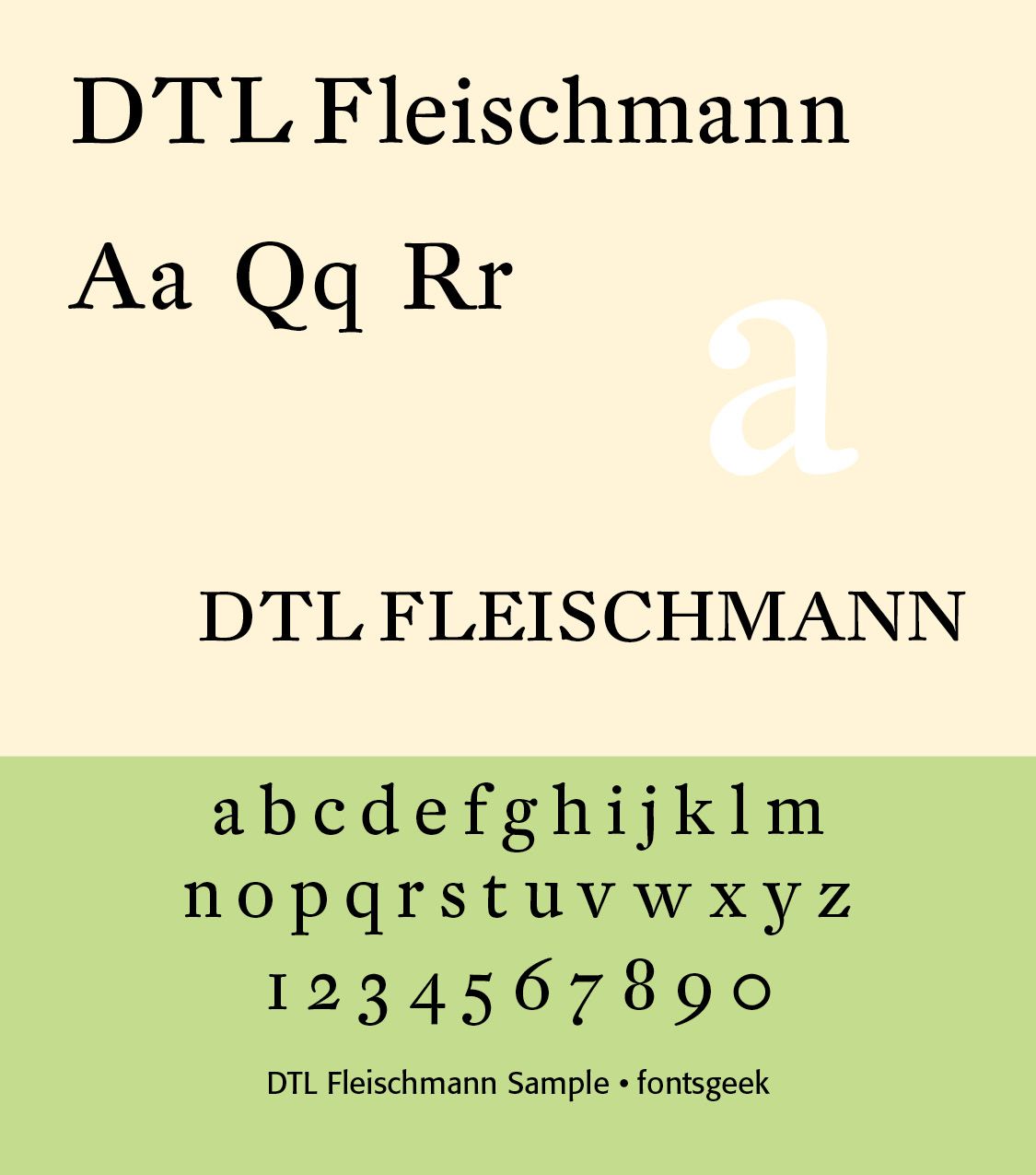
Fleischman worked in the Baroque period of design and his roman typefaces have been described as “transitional” in style, more stylized and sharply cut than was common before. Perhaps his most notable design was his complex music font, that was later used to decorate the edges of documents, including the first bank note of the Netherlands called the "roodborstje" or robin. DTL Fleischmann, published by. Dutch Type Library, is a particularly faithful digital revival of his work with optical sizes. (ILLS)
The nineteenth century brought industrialization and new forms of typography. Dutch printing increasingly incorporated advertising typography, newspapers, posters, commercial printing, lithography, wood type, display type, condensed typefaces, and bold ornamented faces. Typography became increasingly connected with commercial communication rather than exclusively with books. Amsterdam, Rotterdam, and other industrial cities developed substantial printing industries.
SOURCES & NOTES
†For those interested in the theological work of the Synod, the author has published a book, The Five Points Revisited: Calvinism for Today, 2011, which outlines the major points of the Synod. You may contact him at cshanktype@gmail.com for more information.
Successful Layout & Design