Art Nouveau Typography
Art Nouveau fonts grew out of the late 19th-century Art Nouveau movement (c. 1890–1910), which sought to break away from academic, historicist styles and create a new art for the modern age. The style flourished across Europe and America in architecture, furniture, illustration, and typography. In lettering, Art Nouveau embraced organic forms, flowing curves, floral motifs, and asymmetry, reflecting the movement’s fascination with natural growth and hand-drawn ornament.
Art Nouveau took its name from the Maison de l'Art Nouveau, a Parisian gallery that exhibited the works of artists and designers who were associated with the movement. The style was characterized by flowing, curvilinear forms inspired by natural shapes and motifs such as flowers, vines, and insects. It also incorporated elements from other artistic traditions, such as Japanese art and the Arts and Crafts movement.
Art Nouveau was particularly popular in Europe, where it influenced a wide range of artistic disciplines, including architecture, interior design, furniture, jewelry, and graphic design. Some of the most notable Art Nouveau architects included Hector Guimard, Antoni Gaudí, and Victor Horta, while artists such as Alphonse Mucha, Aubrey Beardsley, and Gustav Klimt were celebrated for their decorative and ornamental works.
Art Nouveau declined in popularity after World War I, as artists and designers began to embrace new, more modernist styles. However, its influence can still be seen in many aspects of contemporary design, and it remains an important and influential movement in the history of art and design.
Origins & Background. By the 1880s, the heavy blackletter of Germany and the strict Didone and transitional serifs dominating print (Bodoni, Didot) felt outdated for avant-garde artists. Lettering became a vehicle for breaking convention. Led by figures such as William Morris (1834–1896), there was a decided reaction against industrialization, seeing machine-made goods as dehumanizing and ugly. Handcraftmanship, honesty in materials and utility fused with beauty made up much of what was called the Arts & Crafts Movement. That movement was rooted in medieval guild ideals and morality in design.
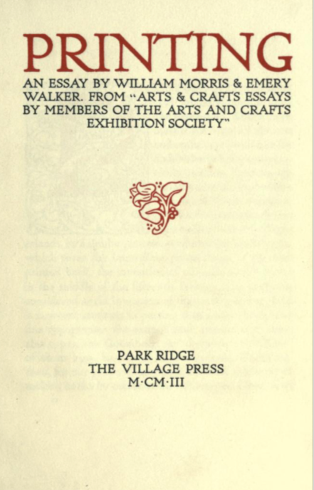
Morris in his essay on "Printing" emphasized these new points. He says that "It is discouraging to note that the improvement of the last fifty years is almost wholly confined to Great Britain. Here and there a book is printed in France or Germany with some pretension to good taste, but the general revival of the old forms has made no way in those countries. Italy is contentedly stagnant. America has produced a good many showy books, the typography, paper, and illustrations of which are, however, all wrong, oddity rather than rational beauty & meaning being apparently the thing sought for both in the letters and the illustrations."
On Typography he notes that "it is obvious that legibility is the firSt thing to be aimed at in the forms of the letters; this is best furthered by the avoidance of irrational swellings & spiky projections, and by the using of careful purity of line. Even the Caslon type when enlarged shows great short- comings in this respect: the ends of many of the letters such as the t and e are hooked up in a vulgar and meaningless way."
Even the use of the paper on which the type was printed did not escape his criticism — "The paper that is used for ordinary books is exceedingly bad even in this country [Britain], but is beaten in the race for vileness by that made in America, which is the worst conceivable. There seems to be no reason why ordinary paper should not be better made, even allowing the necessity for a very low price ; but any improvement must be based on showing openly that the cheap article is cheap, e.g. the cheap paper should not sacrifice toughness and durability to a smooth & white surface, which should be indications of a delicacy of material and manufacture which would of necessity increase its cost."
"Therefore, granted well-designed type, due spacing of the lines and words, and proper position of the page on the paper, all books might be at least comely and well looking : and if to these good qualities were added really beautiful ornament & pictures, printed books might once again illustrate to the full the position of our Society that a work of utility might be also a work of art, if we cared to make it so."
Devoting himself to the socialist cause, he regularly lectured at meetings across Britain, hoping to gain more converts, although was regularly criticized for doing so by the mainstream press. Politically, Morris was a staunch revolutionary socialist and anti-imperialist, and although raised a Christian he came to be an atheist.
The Movement stressed simple, functional, and durable forms. with inspiration from nature but rendered in stylized, often geometric patterns (floral or foliate motifs). Heavy emphasis was placed on natural materials—wood, stone, textiles. Earthy colors and solid craftsmanship were key characteristics. Morris's ethos was that one should "have nothing in your houses that you do not know to be useful or believe to be beautiful."
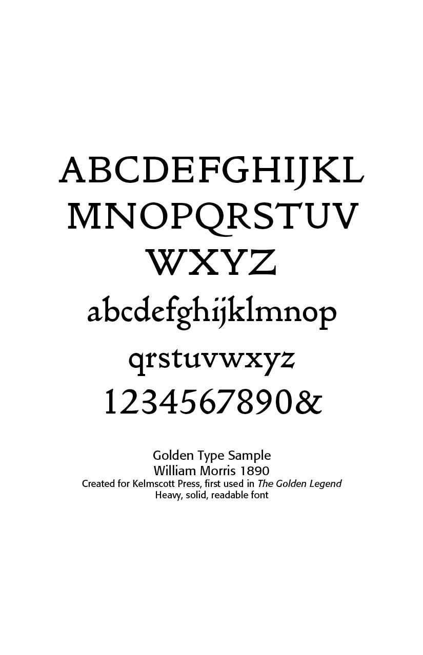
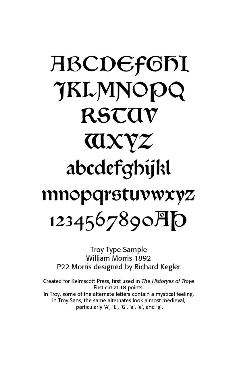
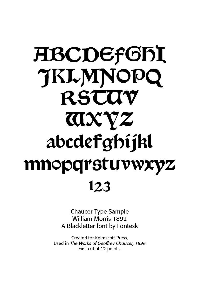
Morris created three main typefaces for the Kelmscott Press —Golden Type (roman), Troy Type (blackletter), and Chaucer Type (smaller blackletter). These remain his lasting contributions to typography.
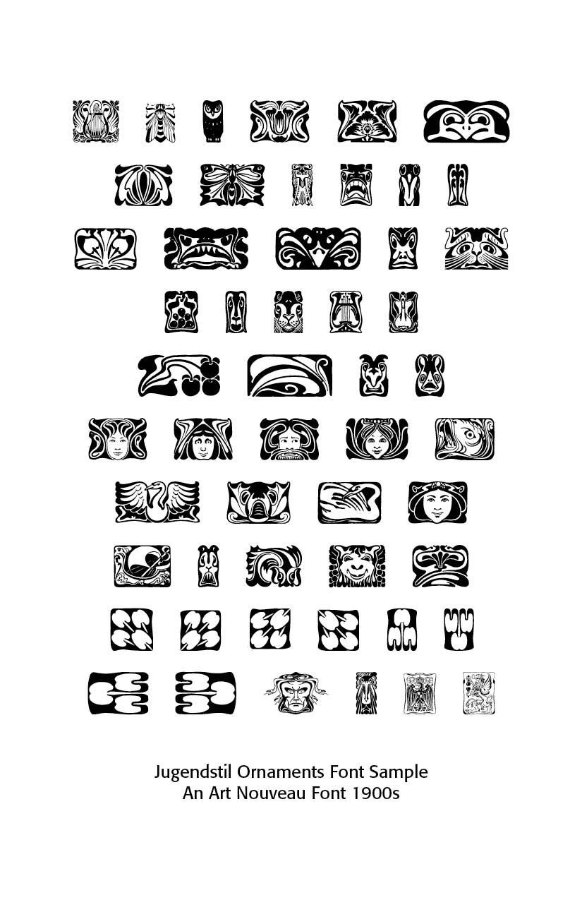
Art Nouveau Type. (1890-1914) While The Arts and Crafts Movement was about honest, handcrafted simplicity rooted in morality and tradition, Art Nouveau embraced ornament, sensuality, and new modern aesthetics, often using industrial methods for decorative ends. This new art movement had its roots in Britain, in the floral designs of William Morris, and in the Arts and Crafts movement founded by the pupils of Morris. It rejected imitation of past styles, but embraced modernity and innovation. It celebrated the idea that art should unify with life—“total art” (Gesamtkunstwerk). Art Nouveau was open to new technologies (iron, glass, print posters). Ornament as beauty, unifying art and life was the key idea.
Characteristics of Art Nouveau Lettering
- Curvilinear strokes (“whiplash” lines).
- Organic ornament: vines, flowers, tendrils.
- Highly stylized serifs and terminals (sometimes melting into plant-like extensions).
- Heavy contrast between thick and thin strokes.
- Asymmetry and playful letter proportions.
- Often uppercase-dominant, designed for display.
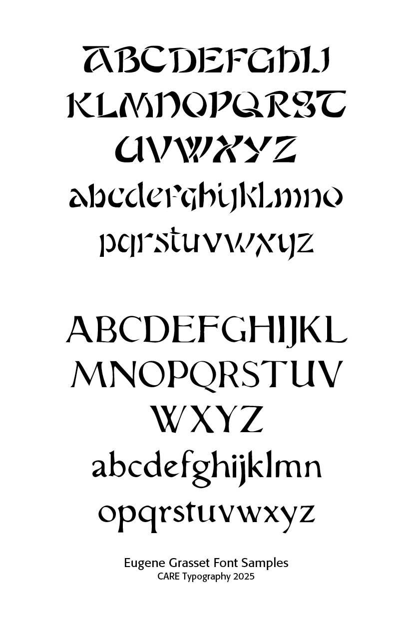
Eugène Grasset created hand-lettered alphabets (1890s) for posters and books. He was influential in developing curvilinear, decorative forms. Grasset taught design at the École Guérin from 1890 to 1903, at the École d’Art graphique in the rue Madame from 1903 to 1904, at the Académie de la Grande Chaumière from 1904 to 1913, and at the École Estienne in Paris. Grasset had freely adapted the alphabet of Nicolas Jenson (1471) with the intention of using it to print a book on his own method for ornamental composition, inspired by the courses he gave to the Guérin school.
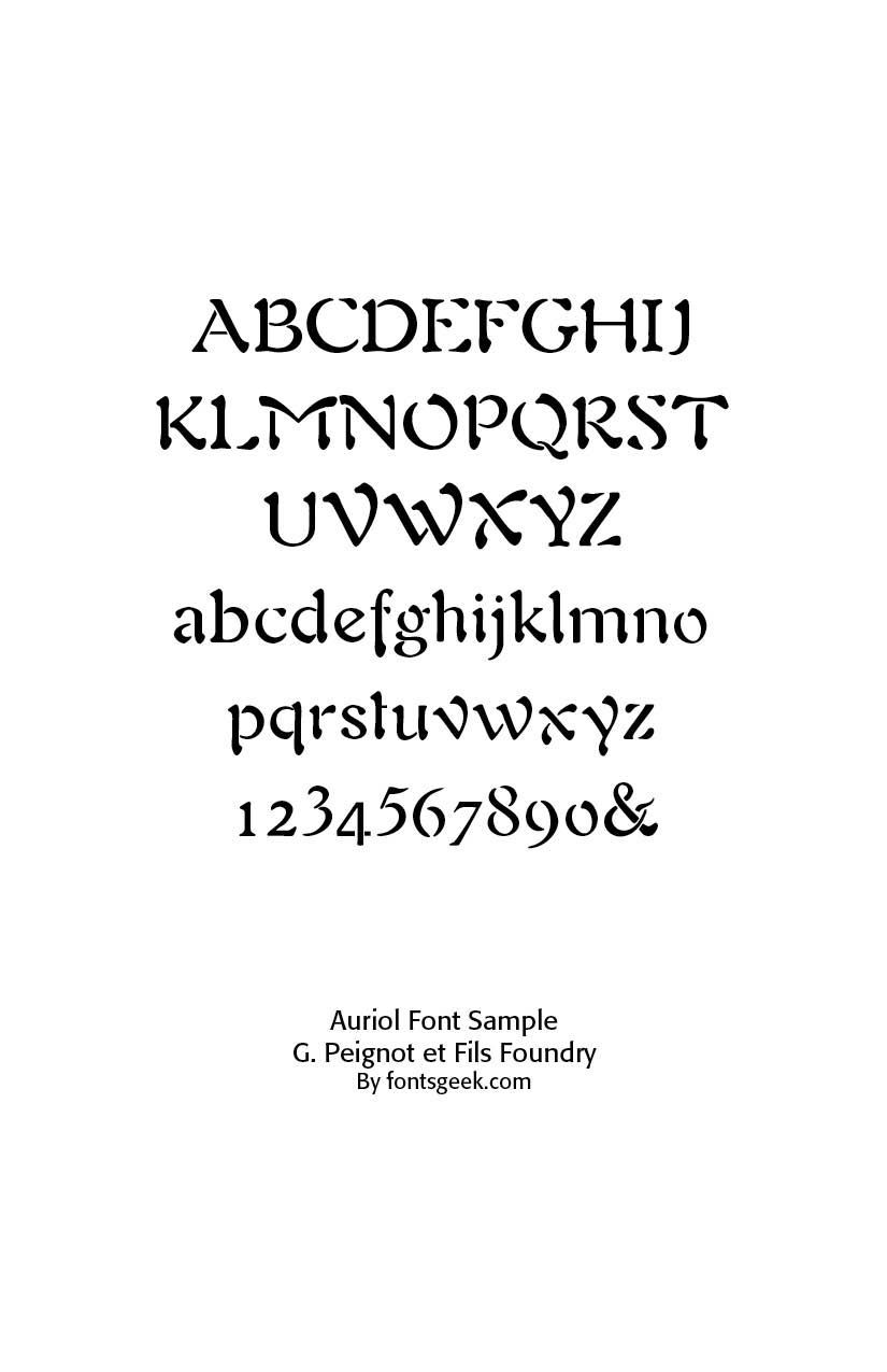
Auriol (1901, George Auriol, France). Produced by G. Peignot et Fils foundry, was one of the most widely used Art Nouveau fonts in Paris. It was inspired by Japanese calligraphy. Japanese calligraphy, called Shodo or Shuji, heavily influenced Art Nouveau type.
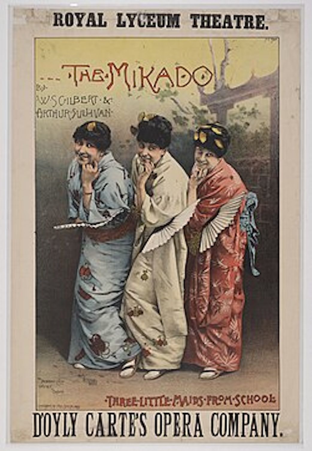
Japanese woodblock prints (Japonisme) introduced flowing lines, asymmetry, and decorative motifs. Japonisme is a French term coined in the late nineteenth century and refers to the popularity and influence of Japanese art and design among a number of Western European artists in the nineteenth century following the forced reopening of foreign trade with Japan in 1858. Japonisme was first described by French art critic and collector Philippe Burty in 1872.
While the effects of the trend were likely most pronounced in the visual arts, they extended to architecture, landscaping and gardening, and clothing. Even the performing arts were affected; Gilbert and Sullivan's The Mikado is perhaps the best example.
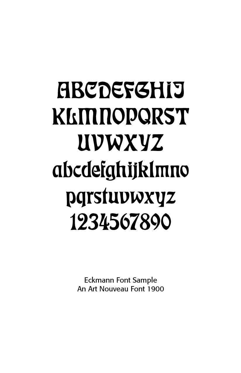
Otto Eckmann (1900) created Eckmannschrift, one of the first typefaces specifically associated with Art Nouveau. Influenced by Japanese art and medieval calligraphy. Eckmann used woodblock print for his work on Jugend magazine similar to Japanese prints and later-adapted French styles. Eckmann's work differed from others in the Art Nouveau movement in that he used dimensionality in his designs, where most designers used a flat look Eckmann's work shows a clear background, middle-ground and foreground. From 1900 to 1902, he designed the fonts Eckmann (in 1900) and Fette Eckmann (in 1902), probably the most common Jugendstil fonts still in use. Eckmann was also proficient in tile design and furniture design.
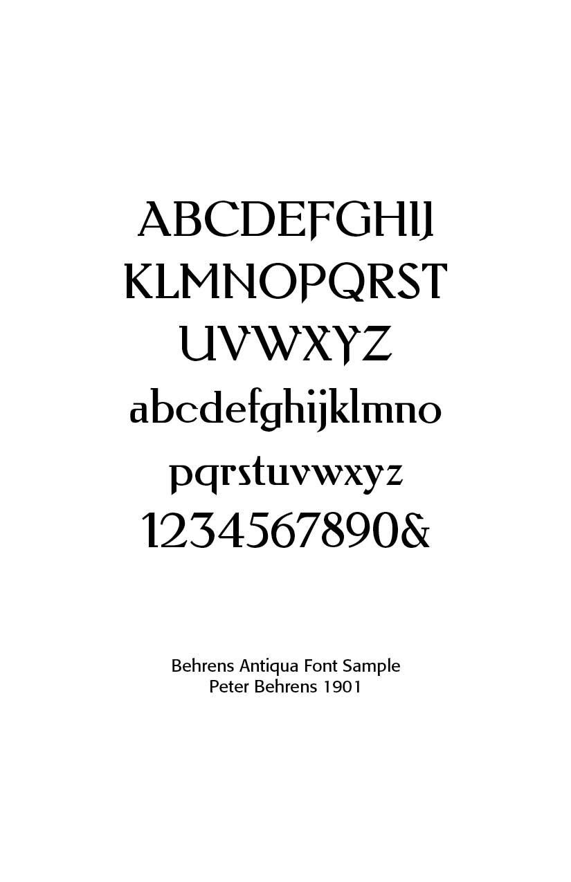
Peter Behrens (1901) designed Behrens Antiqua and other lettering styles—bridging Art Nouveau to modernism. Peter Behrens (1868 – 1940) was a leading German architect, graphic and industrial designer, best known for his early pioneering AEG Turbine Hall in Berlin in 1909. He had a long career, designing objects, typefaces, and important buildings in a range of styles from the 1900s to the 1930s. He was a founding member of the German Werkbund in 1907, when he also began designing for AEG, pioneered corporate design, graphic design, producing typefaces, objects, and buildings for the company.
Rudolf Koch (slightly later, 1900s) blended Jugendstil (German Art Nouveau) with medieval forms.
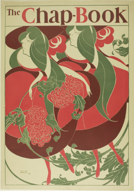
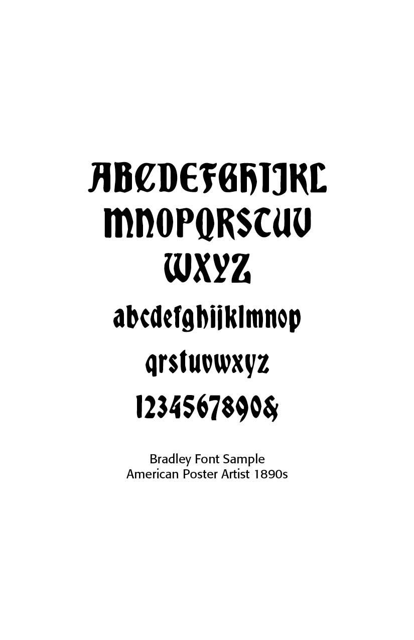
In the United States, Will Bradley (b. 1895) was largely self-taught as an artist. Bradley executed a number of designs to promote The Chap-Book, a short-lived but important publication based in Chicago. His 1894 design for Chap-Book, titled "The Twins," has been called the first American Art Nouveau poster. This and other posters for the magazine brought him widespread recognition and popularity. Bradley was well acquainted with the stylistic innovations of his European counterparts. Like many French artists, he borrowed stylistic elements from Japanese prints, working in flat, broad color planes and cropped forms. He appropriated the whiplash curves of the Art Nouveau movement so dominant in Europe at the turn of the century and was influenced by the work of the English illustrator Aubrey Beardsley.
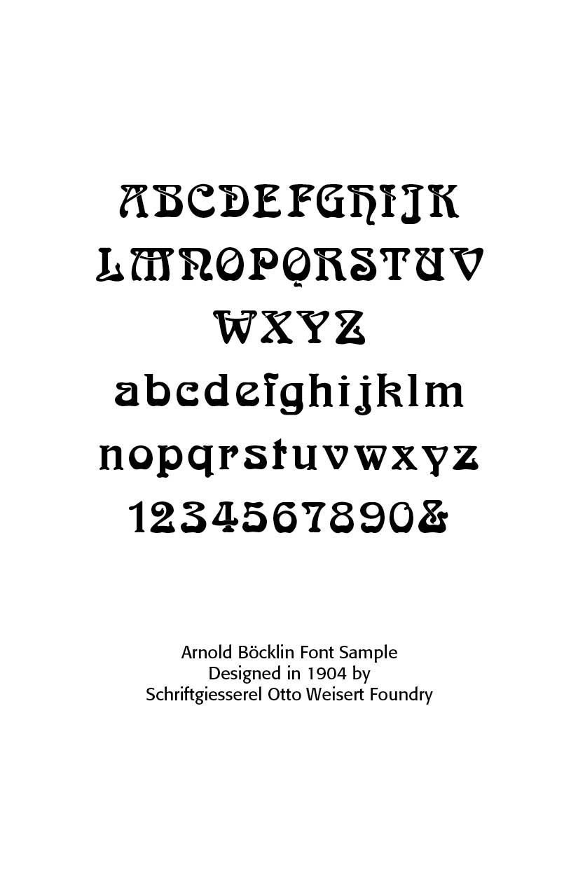
Arnold Böcklin (1904, Germany, still popular in the 1970s hippie revival) – eccentric, ornamental, and perhaps the most widely recognized Art Nouveau revival type. Arnold Böcklin (1827 – 1901) was a Swiss Symbolist painter. He is associated with the Düsseldorf school of painting. Schirmer, who recognized in him a student of exceptional promise, sent him to Antwerp and Brussels, where he copied the works of Flemish and Dutch masters. Böcklin then went to Paris, worked at the Louvre, and painted several landscapes.
Arnold 3556 is a typeface for display use that was designed in 1904 by Schriftgiesserei Otto Weisert foundry. Probably the best-known Art Nouveau typeface, the font had a renaissance in the 1960s and 1970s as part of the general Art Nouveau revival in popular design. Its influence can be seen in the work of illustrators such as Roger Dean and the Stuckist artist Paul Harvey, and on Donovan's 1960's album cover.
Arnold Böcklin is highly stylized, following Art Nouveau aesthetic principles in vogue at the time of its design. Many letters feature an unorthodox bottom-heavy contrast, and are adorned with swooping, botanical ornaments. The underlying skeletons of the letterforms are primarily based on classical Roman forms, but occasionally borrow from Uncial and Blackletter, as seen in letters like “H”, “N”, “M”, as well as the single-story “g” and the looped “k”. Due to its highly ornamental nature, Arnold Böcklin is primarily suitable for typesetting at large display sizes.
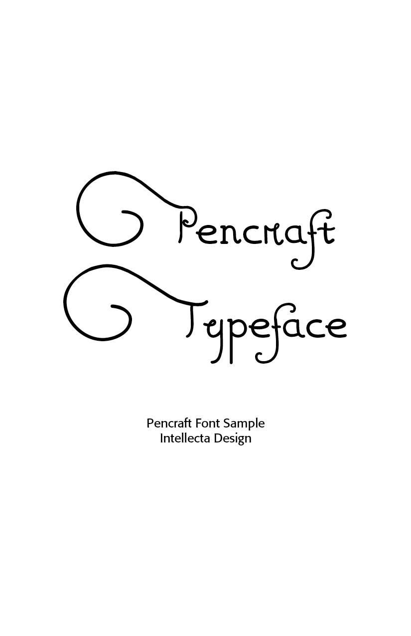
Pencraft and other display alphabets (ATF, Barnhart Bros. & Spindler), U.S. foundries issued ornamental Art Nouveau types for advertising. Pencraft, from Intellecta Design has a mixed source. The capitals were inspired in “Swagger Capitals”, an original design from Carl Stephen Junge, at Barnhart Brothers & Spindler. Carl was an illustrator and poster designer in Chicago in the 1920s and 1930s, who lived from 1880.
Pencraft has a long history in the North-American typography. It was first designed by Hermann Ihlenburg, born in Germany in 1843, where he studied art and worked for several German type foundries. He emigrated to the USA in 1866 and worked for the L. Johnson & Co. foundry, later MacKellar, Smiths & Jordan. Ihlenburg died July 31, 1905 in Philadelphia. Sidney Gaunt, working as a type designer for Barnhart Brothers & Spindler foundry, in Chicago, added in 1914 the Pencraft Oldstyle series (BB&S later ATF). Pencraft, from Intellecta, is a free-interpretation from Pencraft Specials, an ornamental variation (with few lowercase, an incomplete alphabete) from Pencraft Oldstyle series, as displayed in the BBS catalog from 1922. The research and development of this font is work by Chyrllene K, a new, and welcome designer at Intellecta,
By 1910, Art Nouveau was fading. It was seen as overly decorative and was replaced by Art Deco, Plakatstil (poster style), and modernist sans-serifs (e.g., Futura, 1927). Still, Art Nouveau typefaces remained popular in advertising for certain luxury goods. In the 1960s–70s counterculture revival, fonts like Arnold Böcklin were rediscovered and associated with psychedelic posters, bringing Art Nouveau back into fashion.
In short: Art Nouveau fonts were display-oriented, highly decorative, and tied to the broader artistic revolt against rigid academic styles. Fonts like Eckmann, Auriol, Bradley, and Arnold Böcklin remain the most recognizable products of the period.
Successful Layout & Design


