More on Variable Fonts (2)
Google’s variable font selection includes IBM Plex Sans, Inter, Newsreader, Open Sans, Playfair Display, Express Fraunces and Roboto. FF Meta Variable is now a licensed font from Monotype (myFonts.com). Formata Variable is a demonstration only font from CARE Typography. We consider two Google Variable typefaces here — Playfair Display and Express Fraunces.
Playfair Display
Playfair Display is a high-contrast transitional/display serif typeface designed by Claus Eggers Sørensen and released through Google Fonts in 2011. It was designed primarily for large display sizes, especially headlines, titles, and editorial typography.
Its appearance draws inspiration from the late eighteenth-century transition from traditional broad-nib writing toward pointed steel pens, as well as from the elegant typefaces associated with the European Enlightenment and neoclassical period.
Playfair Display is a contemporary high-contrast serif designed primarily for display typography. Its visual ancestry lies in the 18th-century transitional period, particularly the movement from broad-nib calligraphic forms toward the sharper, more vertical forms that ultimately produced Didot and Bodoni.
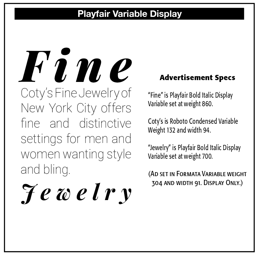
Playfair Display can be classified as a twenty-first-century digital reinterpretation of late-eighteenth-century transitional and early modern serif typography, particularly notable for bringing an elegant, high-contrast editorial style into contemporary web and graphic design.
Playfair Display is immediately recognizable by its very high thick–thin contrast, fine hairline serifs, elegant, vertical stress, relatively narrow proportions, graceful curved strokes, delicate appearance at large sizes, and strong fashion editorial personality. It is considerably more dramatic than a conventional reading serif.
It looks toward the period around the late 1700s, when printing and writing were undergoing significant changes. Earlier typefaces such as Caslon were strongly influenced by the forms produced by broad-edged writing instruments. By the late 18th century, increasingly pointed writing instruments permitted much sharper contrasts between thick and thin strokes.
This development can be seen in typefaces associated with designers such as John Baskerville, Giambattista Bodoni, and Firmin Didot. Playfair Display does not simply reproduce any of these typefaces. Instead, it creates a modern interpretation of this historical transition. While Baskerville is transitional, has moderate contrast, is relatively sturdy, designed for continuous reading, and of 18th-century origin, Playfair Display has much higher contrast, is more delicate, more vertical, a 21st century typeface designed primarily for digital type. Playfair Display can be understood as taking some of the transitional qualities of Baskerville and pushing them toward the high-contrast elegance associated with Didot and Bodoni.
Playfair Display is particularly effective when used at larger sizes for magazine headlines, book titles, posters, invitations, fashion publications, restaurant menus, branding, website hero headings, and editorial titles. It can be used for body text, but this is generally not where its strongest qualities appear. At small sizes, its extremely thin strokes can become less comfortable and less robust.
Playfair Display Italic introduces more flowing forms, greater calligraphic movement, dramatic curves, elegant capitals, strong contrast and is especially effective for subtitles, pull quotes, invitations, literary titles and fashion/editorial applications.
Playfair Display can be paired with Source Sans, Montserrat, Open Sans, Lato and Roboto. Playfair Display tends to communicate elegance, luxury, sophistication, fashion, classicism, literary refinement, romance and European editorial style. Because of these associations, it is common in designs connected with fashion, beauty, hospitality, weddings, lifestyle publishing, and upscale branding.
However, this also means that it can become somewhat predictable if used in the same contexts without a distinctive typographic strategy. While aware of its strengths, weaknesses include high contrast which can be fragile at small sizes, overly fashionable when overused, less appropriate for long passages of body copy. Thin strokes can reproduce poorly at low resolution or poor printing quality. Its strong personality can dominate a design.
Playfair Display Variable
There are 12 static type instances in Playfair Display — Black, Black Italic, Bold, Bold Italic, Extra Bold, Extra Bold Italic, Medium, Medium Italic, Regular, Italic, Semibold and Semi Bold Italic.
Playfair Variable offers the Weight axis from Google.
This Font Software is licensed under the SIL Open Font License, Version 1.1.
Express Fraunces
Fraunces is a contemporary serif typeface designed by Phaedra Charles and Flavia Zimbardi of Undercase Type. It was conceived as a deliberately expressive reinterpretation of the early-twentieth-century “Old Style” display tradition and became particularly notable as an early, ambitious example of a variable font.
Fraunces (2018–2020) is a contemporary “Old Style” display serif that transforms the quirky, organic character of Windsor, Souvenir, Cooper, and the Arts & Crafts tradition into an unusually expressive four-axis variable font.
We could place Fraunces alongside Cooper Black, Windsor, Souvenir, and William Morris's Golden Type as a particularly good example of how historical type characteristics can be revived, reinterpreted, and technologically transformed rather than simply copied.
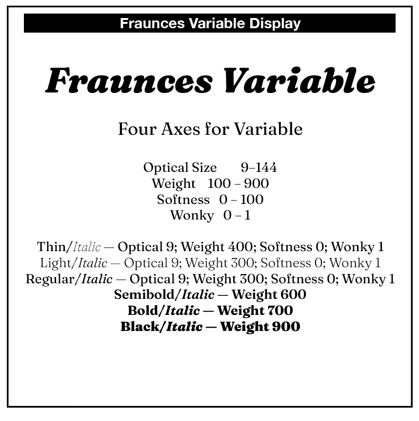
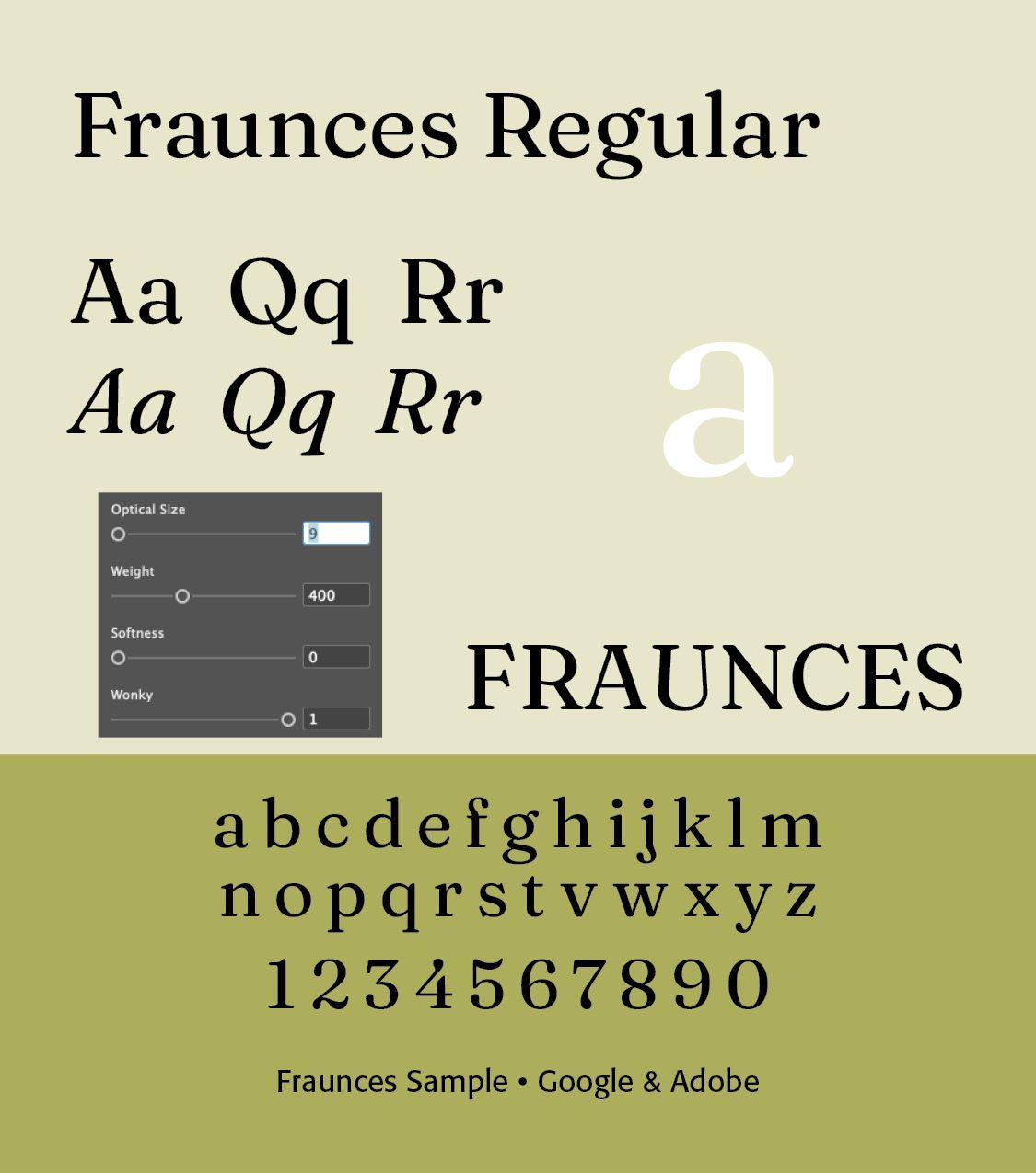
Fraunces began in 2018, when Google Fonts commissioned Charles and Zimbardi to create a display typeface that would demonstrate the possibilities of variable-font technology while retaining a sense of humor and personality.
The designers noticed a gap in contemporary type libraries: the eccentric, heavy, hand-drawn-looking display serifs associated with Cooper, Windsor, and Souvenir were influential historically but were not being represented in a contemporary variable typeface. They referred to this aesthetic informally as “wonky” typography. Fraunces grew out of that idea.
Its more immediate ancestors are early-20th-century display faces like Windsor — particularly its irregular, leaning forms, Souvenir — soft, friendly, organic shapes, Cooper series — rounded, heavy, highly personable forms, and Cooper Black — especially its exuberant, ink-rich appearance.
The designers trace this broader aesthetic back to the Arts and Crafts movement of the late nineteenth and early twentieth centuries, including William Morris's Golden Type and the lettering associated with the Roycroft movement.
Fraunces can range from relatively restrained to deliberately exuberant. Its characteristic qualities include soft, rounded serifs, organic rather than geometric construction, high personality, strong contrast between light and heavy versions, occasional tilted or eccentric letterforms, ink-like, bulbous terminals, a distinctly retro/early-20th-century feeling, and a playful relationship between regularity and irregularity.
This makes it particularly effective for headlines, packaging, editorial design, posters, branding, book jackets, and other display applications. The lighter and smaller optical-size versions can also function effectively for text.
Fraunces Variable
Instead of producing only a fixed set of styles, its design space allows several characteristics to change continuously — Weight goes from Thin to Black; Optical size adjusts the design for different point sizes; Softness goes from sharp to increasingly soft and “inky” forms; Wonky introduces deliberate eccentric alternate characters.
The Softness axis is particularly unusual. It changes the apparent “wetness” or inkiness of the letterforms, allowing the designer to move from relatively crisp forms toward much softer, more exuberant forms. The WONK axis is even more distinctive. It can introduce irregular forms such as the characteristic leaning h, n, and min the Roman and bulbous or flagged terminals in the Italic.
Fraunces was released as an open-source typeface through Google Fonts in September 2020, under the SIL Open Font License. The finished family contains Roman and Italic, multiple weights and optical sizes, and more than 100 predefined combinations of its variable axes.
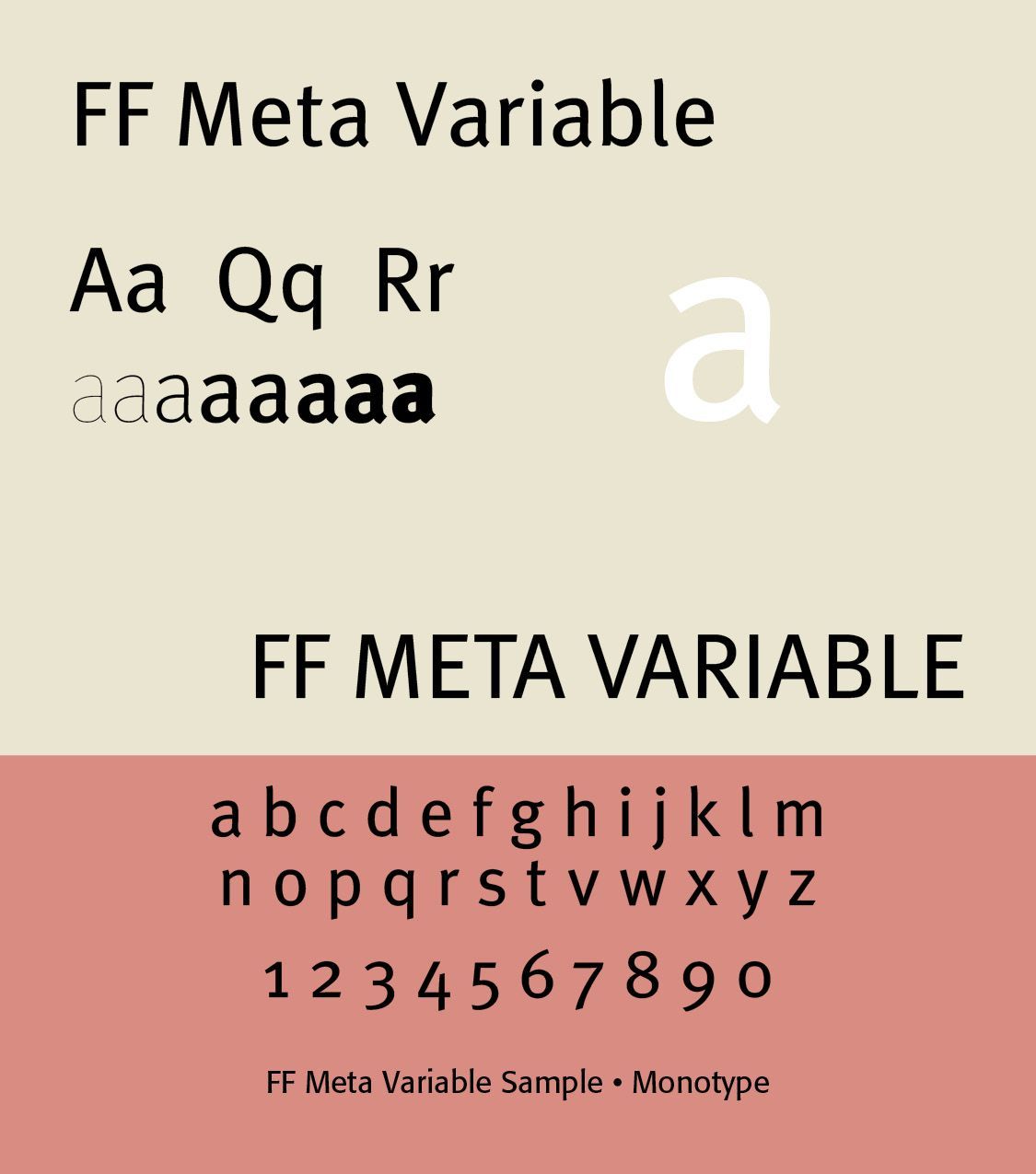
FF Meta Variable
(Not a Google Font; Purchased from Monotype at myFonts.com)
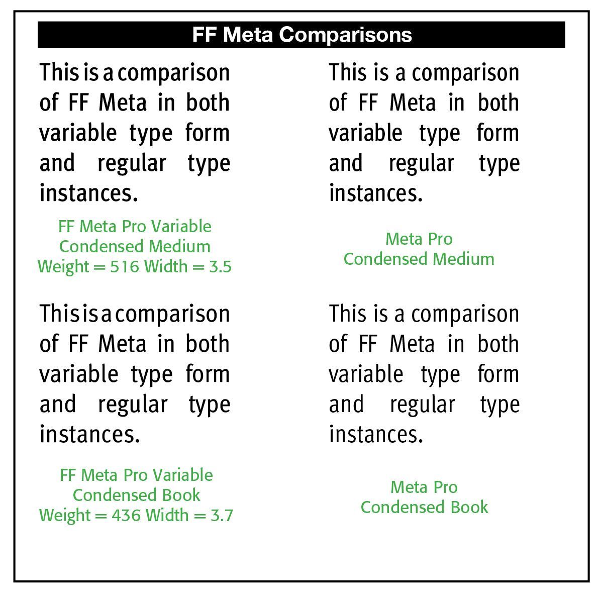
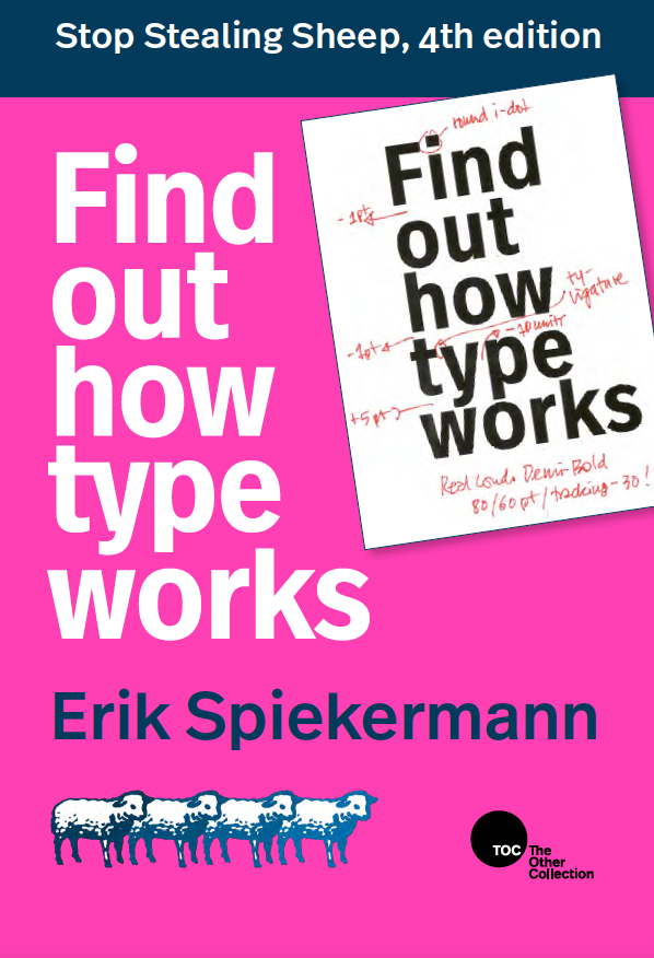
FF Meta Variable Roman. Internationally renowned graphic designer, typographer and type designer Eric Spiekermann. He founded the multidisciplinary design consultancy MetaDesign in Berlin, 1979, opening a major San Francisco office in 1992, and another in Zurich. In 1989/90 he co-founded FontShop International with Joan Spiekermann and Neville Brody. Their own brand of fonts is called FontFont. Spiekermann’s best known, very influential typeface is FF Meta.(Myfonts.com)
The historical background to this font can be found on our Blog at REFERENCE. FF Meta was part of Germany’s typographic history. According to Spiekermann, FF Meta was intended to be a "complete antithesis of Helvetica ", which he found "boring and bland.” It originated from an unused commission for the German Federal Post Office. Throughout the 1990s, FF Meta was embraced by the international design community with Spiekermann and E. M. Ginger writing that it had been dubiously praised as the Helvetica of the 1990s.
Visual characteristics include in the upper case angled letter “M,” resembling Futura or an upturned “W” than Helvetica or Gill Sans. The upper case also has slanted upper terminal on the top right of E, F and T. “E” and “T” are asymmetrical. In the lower case, there is a round dot over the letter i and j. The ends of the letter s are nearly horizontal. There is a curved bottom of l, making it clearly different from a 1 or upper-case I. “a” is double-storey with a very open aperture at the top. The bottom loop in binocular g is not fully closed. There is a bend to the left at the top of the letters b, h, k, l, and a bend to the right at the top of the letter d. A very distinctive y where the two strokes do not join smoothly is also noted. A general feature of FF Meta is relatively open apertures, in contrast to the more folded-up appearance of Helvetica. Note in the variable sample that the very small lettering sample has an optically spaced and enhanced fashion, making it easier to read at that small level.(Wikipedia)
Formata Variable
(Demonstration Only)
Formata is my preferred font instead of Helvetica or FF Meta. Formata is a humanistic sans-serif typeface designed by Bernd Möllenstädt for the German type foundry H. Berthold AG. It was released in 1984 and is notable for offering a warmer, more calligraphic alternative to the highly geometric or mechanically constructed sans serifs common in the postwar period.
Formata is a 1984 humanistic sans serif by Bernd Möllenstädt for Berthold. Its importance lies in the way it combines modern sans-serif construction with subtle calligraphic qualities. Large x-height, open counters, flowing forms, angled stroke endings, and a broad range of weights make it suitable for both text and display.
Formata is an important example of the 1980s humanist reaction to the dominance of Helvetica-style neutral sans serifs—a typeface that demonstrates how the written hand could be brought back into modern sans-serif design without sacrificing functionality.
By the 1960s and 1970s, typefaces such as Helvetica, Univers, and Akzidenz-Grotesk had established a powerful tradition of relatively neutral, rational sans-serif typography. Formata belongs to a different strand of development: the humanist sans serif. Rather than eliminating calligraphic influence, Möllenstädt incorporated it into a contemporary sans-serif structure. The result is a typeface that feels humanistic, warm, approachable, functional, and slightly calligraphic. It is less mechanically geometric than Helvetica. Its design is particularly notable for curved and slightly sheared strokes, rather than the completely uniform, mechanically cut strokes associated with some grotesque sans serifs.
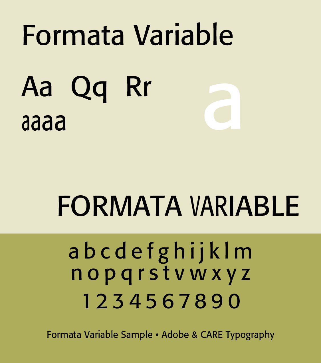
Distinctive letter forms in Formata include a two-story "a." The lowercase a has the conventional double-story structure, giving it a familiar text-type appearance.The two-story "g" reinforces its suitability for serious text setting. Open apertures in forms such as e and c retain generous openings, helping readability. The angled/sheared verticals terminate at subtle angles, creating one of Formata's most distinctive calligraphic characteristics. There is a straight-tailed "y" which is distinctive. These details become more noticeable as the type is enlarged.
Formata can function nicely as a text face, unlike many of the sans serifs of the 1980s. Its relatively large lowercase and open counters allow it to perform well in books, reports, magazines, brochures, corporate documents, long blocks of text, and digital text. The design has also been described as suitable for both text and display, with its more distinctive characteristics becoming apparent at larger sizes.
Formata demonstrates that a sans serif can be modern while retaining rhythm, gesture, calligraphic influence, warmth, and individuality. Formata fits particularly well into the history of humanist sans-serif development moving from Gill Sans in 1928, to Frutiger in 1976, to Formata in 1984, to Myriad in 1992 and FF Meta in 1991/93. It therefore represents an important 1980s response to the dominance of neutral grotesque typography.
The Formata Variable font here is introduced by CARE Typography as a demonstration sample only of what can be accomplished in FontLab’s FontLab 8 edition. It has two axes — weight and width.
Successful Layout & Design