Dutch Typography: Modern History
The early twentieth century produced an important Dutch visual culture. One of the most distinctive movements was the Amsterdam School, an expressionist architectural and decorative movement. Typography associated with the period often emphasized geometric forms, expressive lettering, unusual compositions. decorative initials, hand lettering, and architectural integration. Typography became increasingly understood as part of a larger graphic and architectural composition. Perhaps the most internationally famous Dutch contribution to modern graphic design was De Stijl. (REFERENCE) De Stijl was not just an art style, but a comprehensive aesthetic philosophy. It sought universal beauty, as abstracted from individual beauty, and a visual language and typography based on simplicity, geometry and primary colors, namely red, blue and yellow. Its core characteristics were the use of straight horizonal and vertical lines, the use of rectangles and squares, an emphasis on asymmetry, and the favoring of pure abstraction.
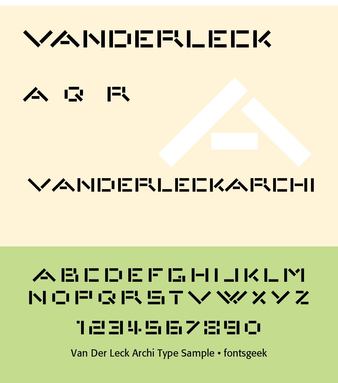
Although Jan Tschichold was German, Dutch modernist design was closely connected to the international New Typography movement. Dutch designers adopted principles such as asymmetrical composition, sans-serif type, standardized layouts, grids, strong hierarchy, functional typography, and reduction of ornament. This helped prepare the way for the highly influential Dutch graphic design culture of the postwar period.
Postwar Dutch Typography — 1945–1970. After World War II, Dutch graphic design became internationally important. A central institution was the Amsterdam-based Type and Media tradition, along with Dutch printing and design schools.Designers increasingly emphasized clarity + structure + experimentation. The Netherlands became particularly influential in the development of systematic graphic design.
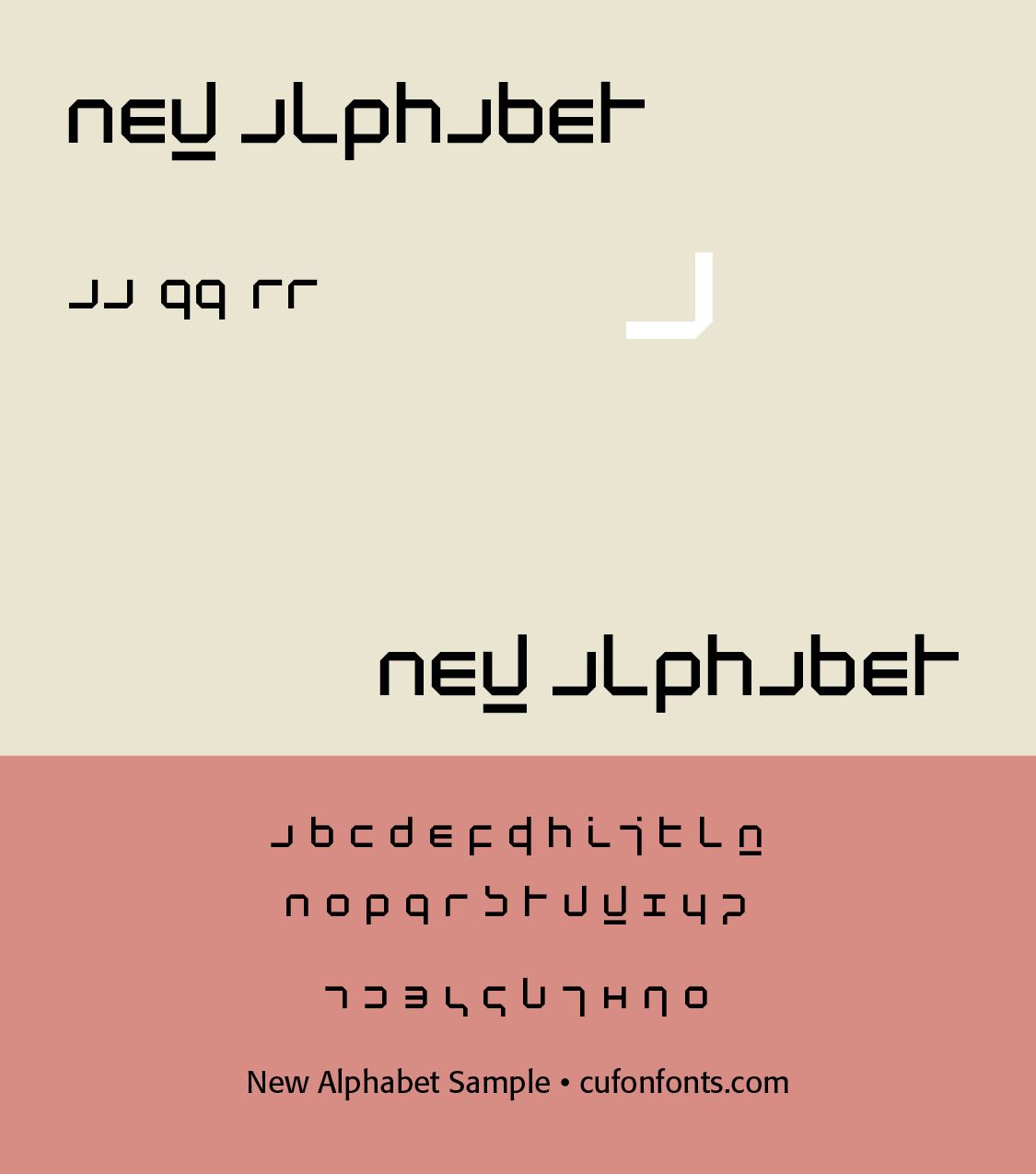
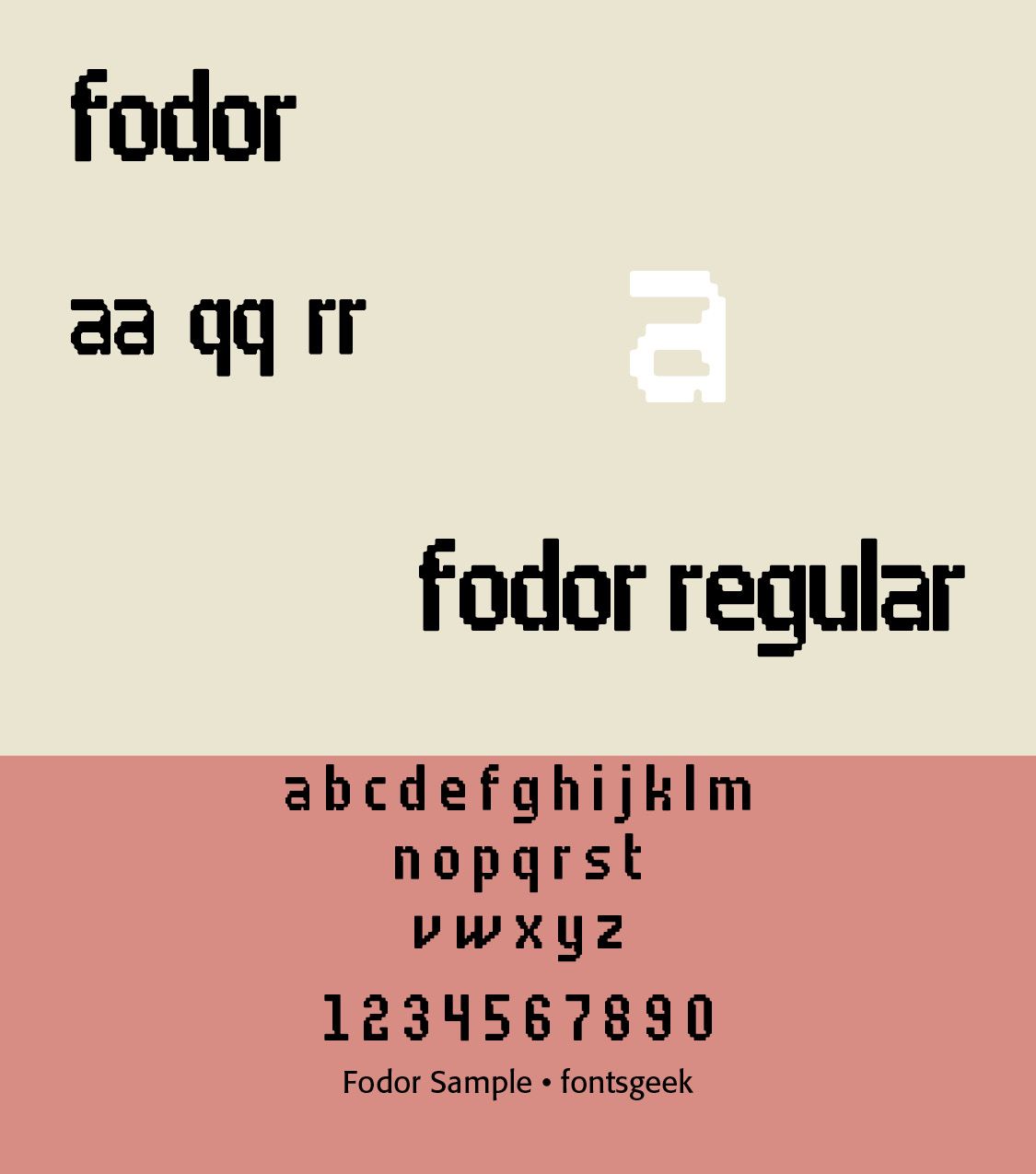
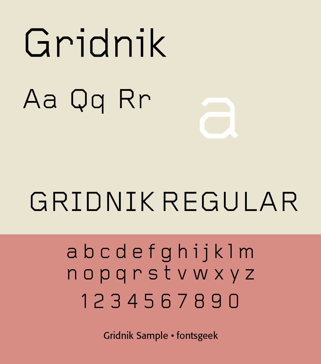
Wim Crouwel (1928–2019) became one of the most important Dutch graphic designers of the twentieth century. In 1963, he was one of the founders of the design studio Total Design (currently named Total Identity). From 1964 onwards, Crouwel was responsible for the design of the posters, catalogues and exhibitions of the Stedelijk Museum in Amsterdam. In 1967 he designed the typeface New Alphabet, a design that embraces the limitations of the cathode-ray tube technology used by early data display screens and phototypesetting equipment, thus only containing horizontal and vertical strokes. Other typefaces from his hand are Fodor and Gridnik.
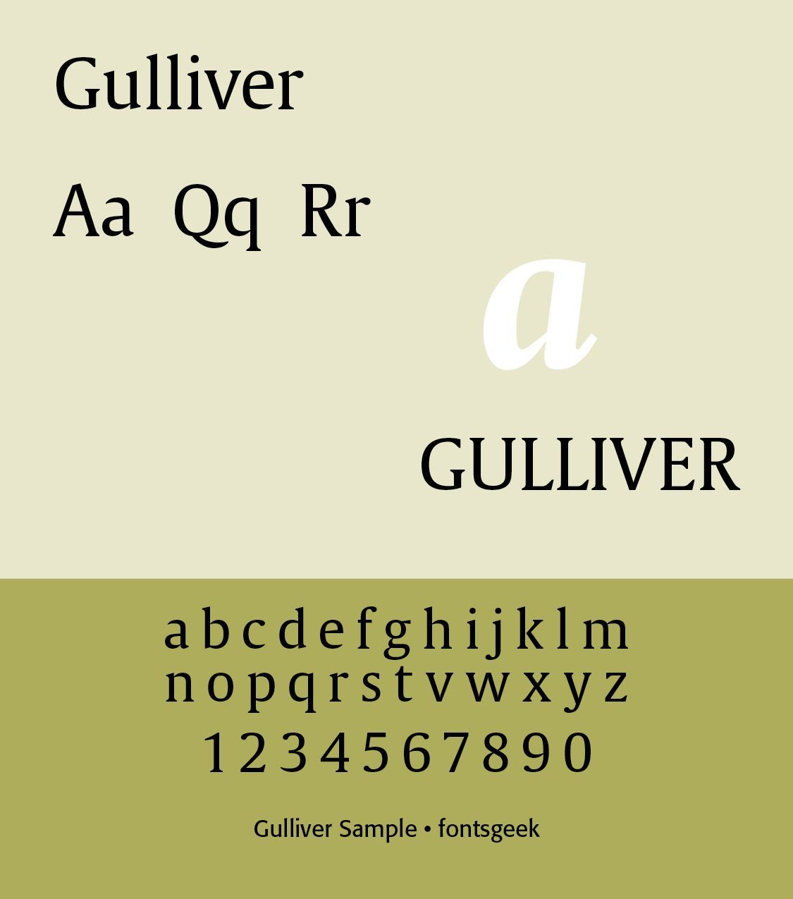
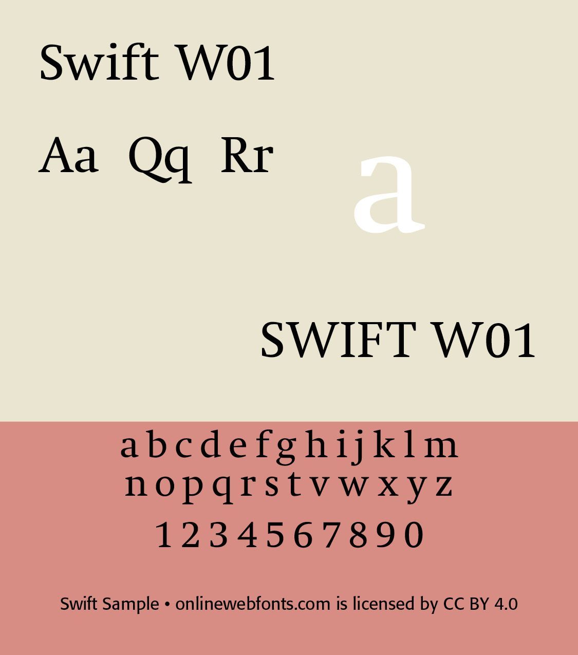
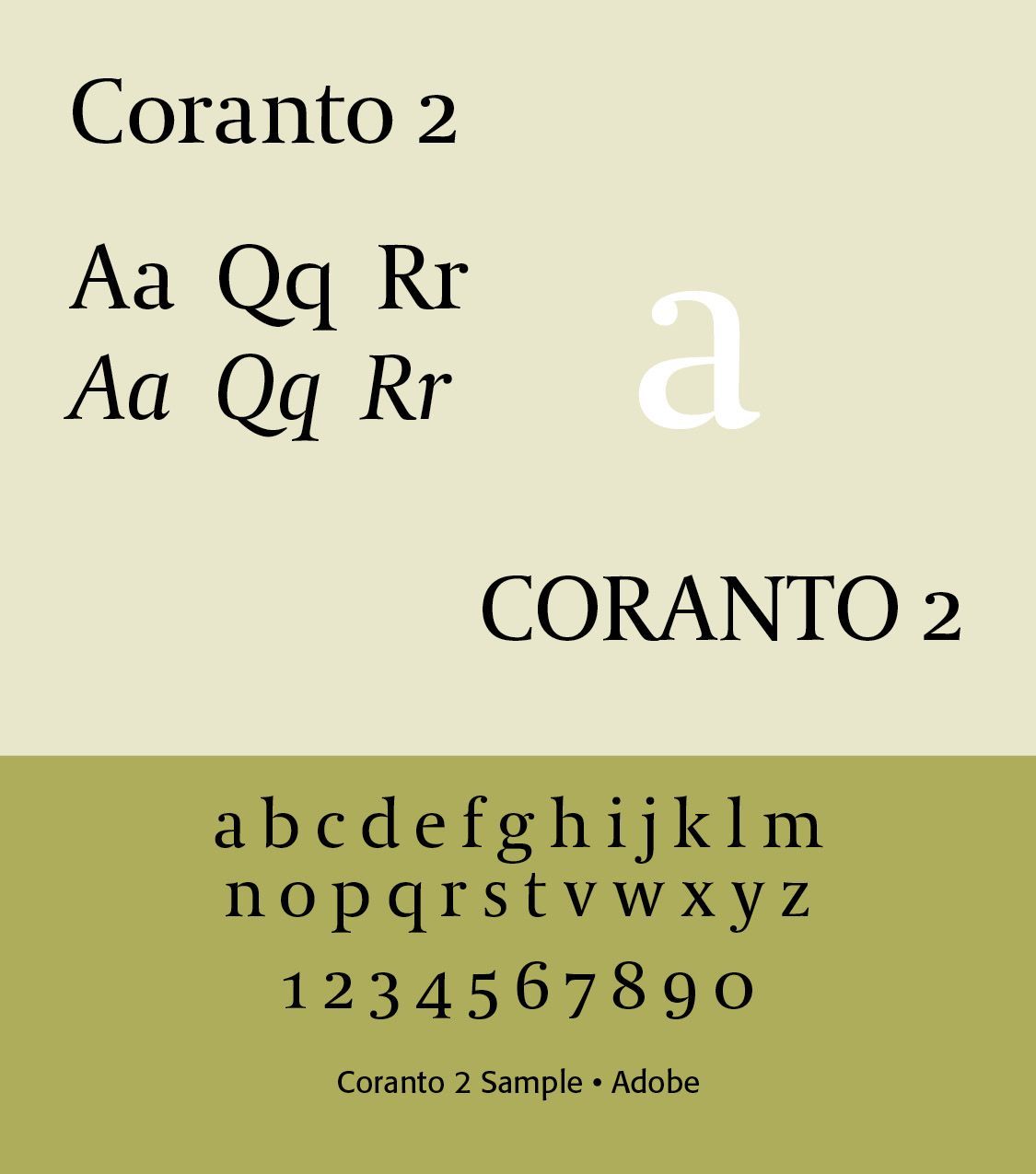
Gerard Unger (1942–2018) was one of the Netherlands' most important type designer. He studied in Amsterdam from 1963 to 1967, and subsequently worked at Total Design, Prad and Joh. Enchedé. In 1975, he established himself as an independent developer. A long-time guest lecturer at the University of Reading, he mentored many modern typeface designers. Unger developed many typefaces over the years, of which several were specially developed for newspapers (usually typefaces with a large x-height and large inner counters), such as Swift, Gulliver, Coranto and Vesta. He also developed designs for magazines, coins. books, logos and signage systems for both the Dutch highways and the Amsterdam Metro. His work concentrated particularly on functional typography and readability. Unger demonstrated that Dutch type design could combine technical innovation with traditional typographic principles.
His Gulliver, for example, was designed partly to achieve economical yet highly readable newspaper typography.
The Digital Revolution — 1980s–1990s. The Netherlands became one of Europe's major centers of experimental digital typography. The rise of desktop publishing and digital type transformed Dutch type design. A particularly important institution was The Royal Academy of Art, The Hague (KABK), whose Type and Media postgraduate program became internationally renowned. It helped establish the Netherlands as a major center for education in type design. Designers explored bitmap fonts, pixel typography, experimental type, variable letterforms, digital type technologies, type systems, multilingual typography,
The 1990s saw a particularly experimental period. Designers such as Just van Rossum and Erik van Blokland, working together as Letterror, experimented with digital type and programming. Their work helped establish a distinctly Dutch approach to digital typography: type could be programmed, manipulated, randomized, and made responsive. This was an important departure from the traditional idea of the typeface as a fixed collection of metal or digital drawings.
Contemporary Dutch Typography. Today the Netherlands remains one of the world's important centers of type design.Contemporary Dutch typography often combines historical type traditions, modernist grids, experimental typography, digital technology, variable fonts, responsive typography, multilingual type, open-source design, and revived historical typefaces.
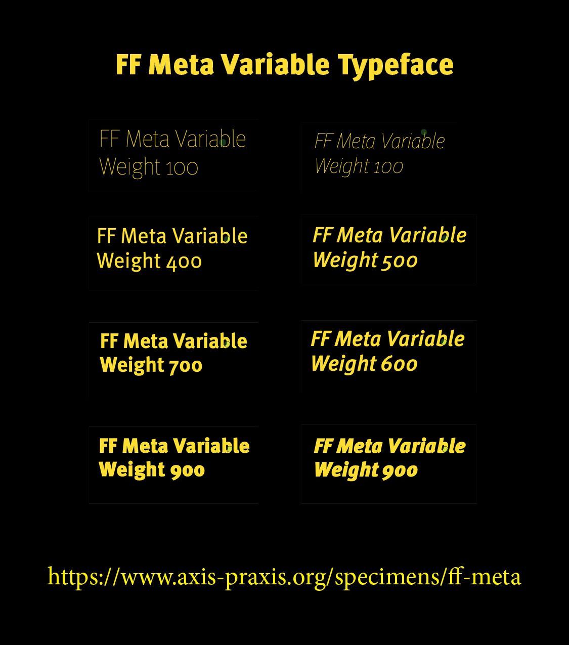
Important contemporary designers include Peter Verheul, Fred Smeijers, Ramiro Espinoza, Underware, David Quay, Laurenz Brunner, Just van Rossum, and Erik van Blokland. Dutch type design is particularly notable for its willingness to combine technical rigor with experimentation.
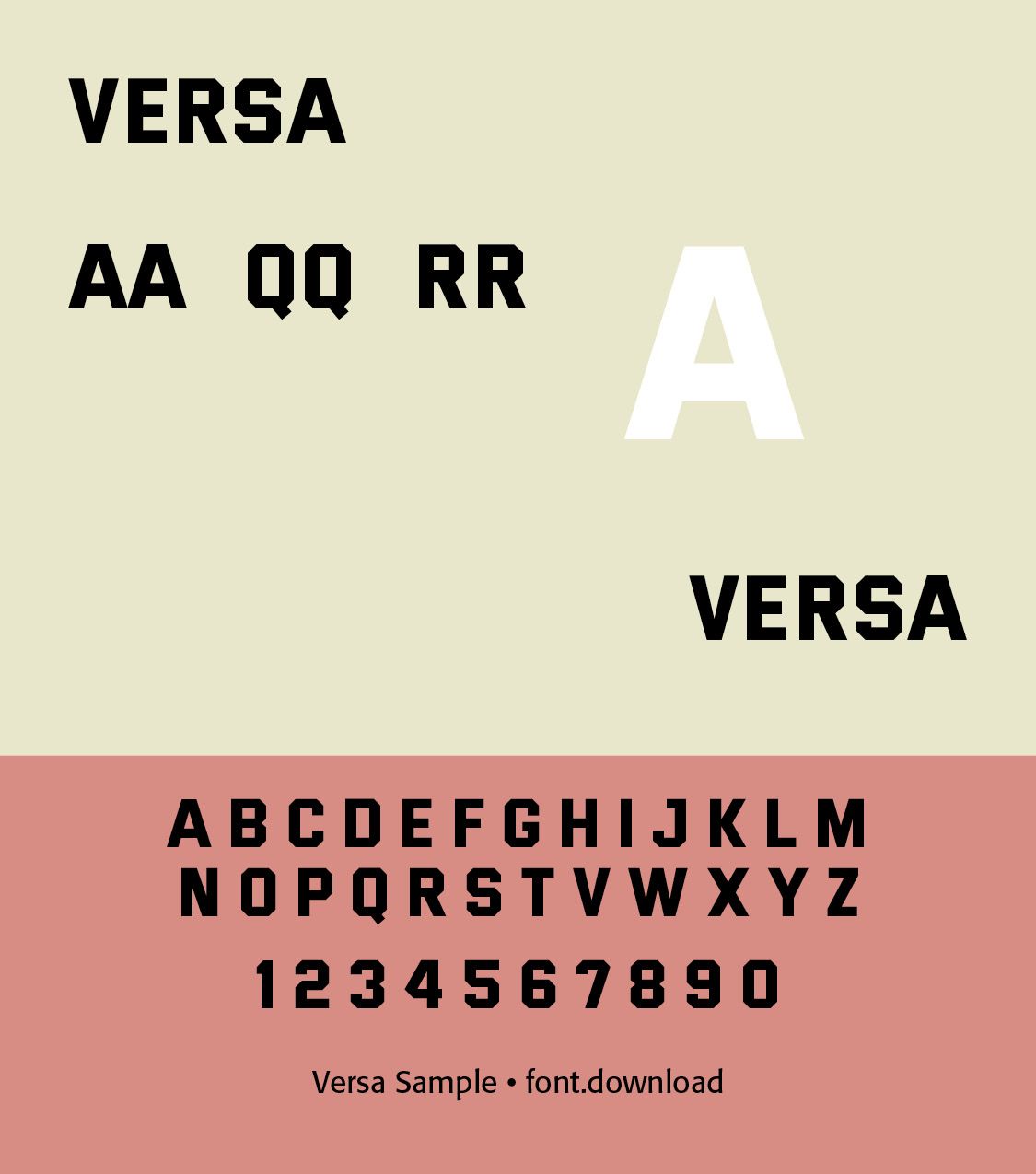
Peter Verheul is a type designer and educator who lives in Den Haag. He has been a professor at the KABK since 1991. Fonts he designed include Haganum, Adetro, Bumper, Illuster, FF New Berlin, FF Sheriff, OT Versa. Kidscript, and Rijksoverheid Serif and Rijksoverheid Sans (2008), created at Studio Dumbar for the new identity of the Dutch Government, among others.
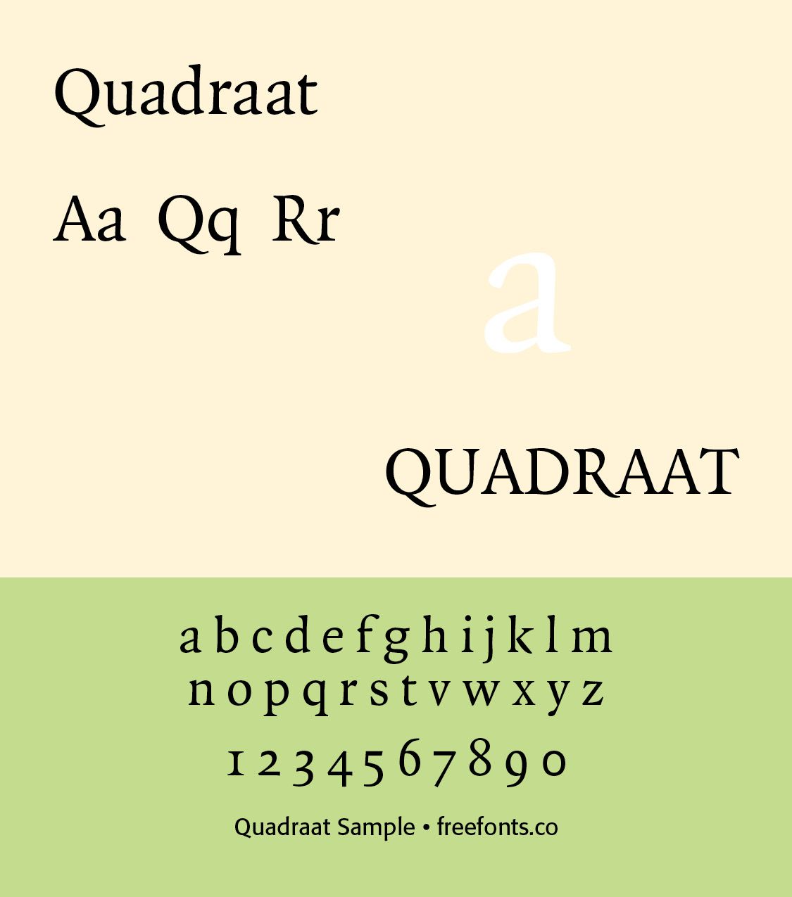
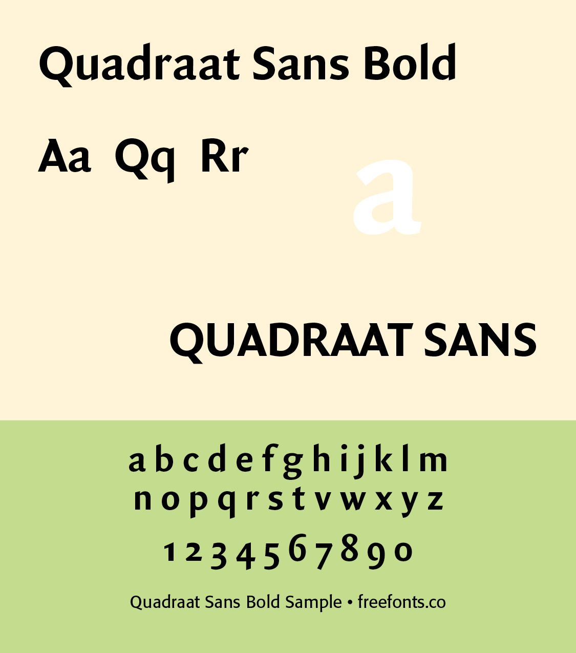
Fred Smeijers (born 1961) is a Dutch type designer, researcher and writer. Smeijers is the creative director and co-founder of the typeface design and publishing company Type By. In 2019 Smeijers was appointed Professor in Typeface Design at the University of Reading in the UK.In the mid-1980s Smeijers started to develop an interest in the early sixteenth century technique of punchcutting.This became first apparent in his typeface FF Quadraat , a classic book typeface with interesting and innovative details. Other Smeijers' retail typefaces are FF Quadraat Sans, FF Quadraar Display, FF Quadraat Headliner, and others.
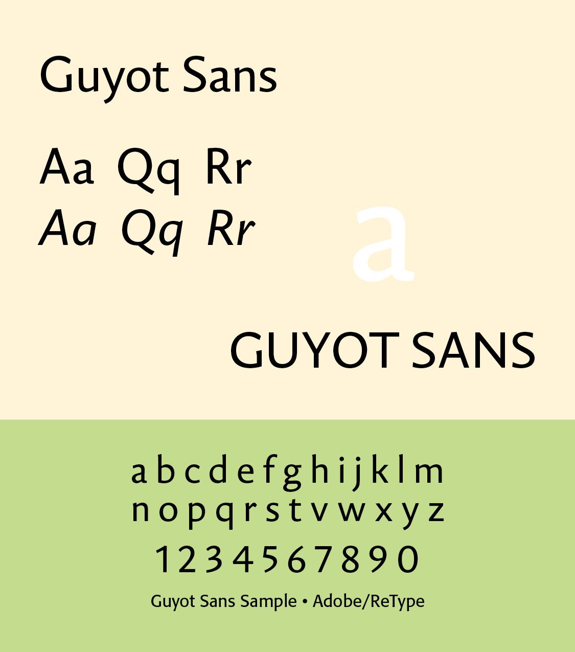
Ramiro Espinoza studied graphic design at the Universidad Nacional del Litoral in Santa Fe, Argentina. After graduation he taught Typography at the Universidad de Buenos Aires. He specialized in type design at the KABK in The Hague and the Plantin Institute for Typography in Antwerp. He has been a contributor to design magazines, researched vernacular Dutch lettering and worked in numerous freelance assignments for FontShop International, Shinn Type and Feliciano Type Foundry. In 2007 he founded the Retype type foundry to market his typefaces.
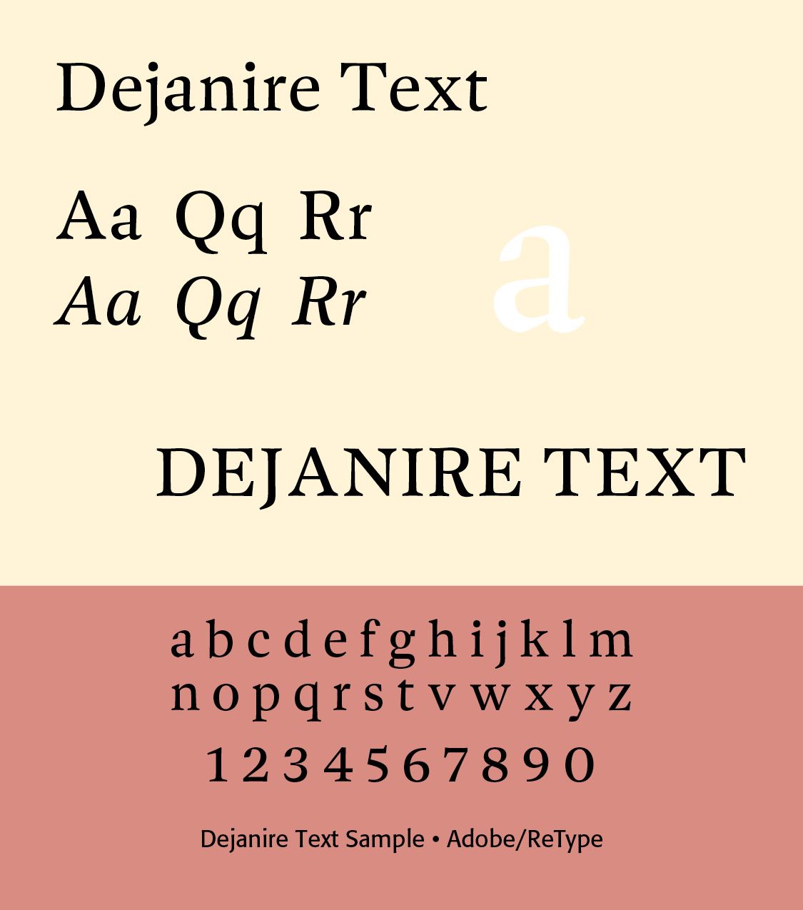
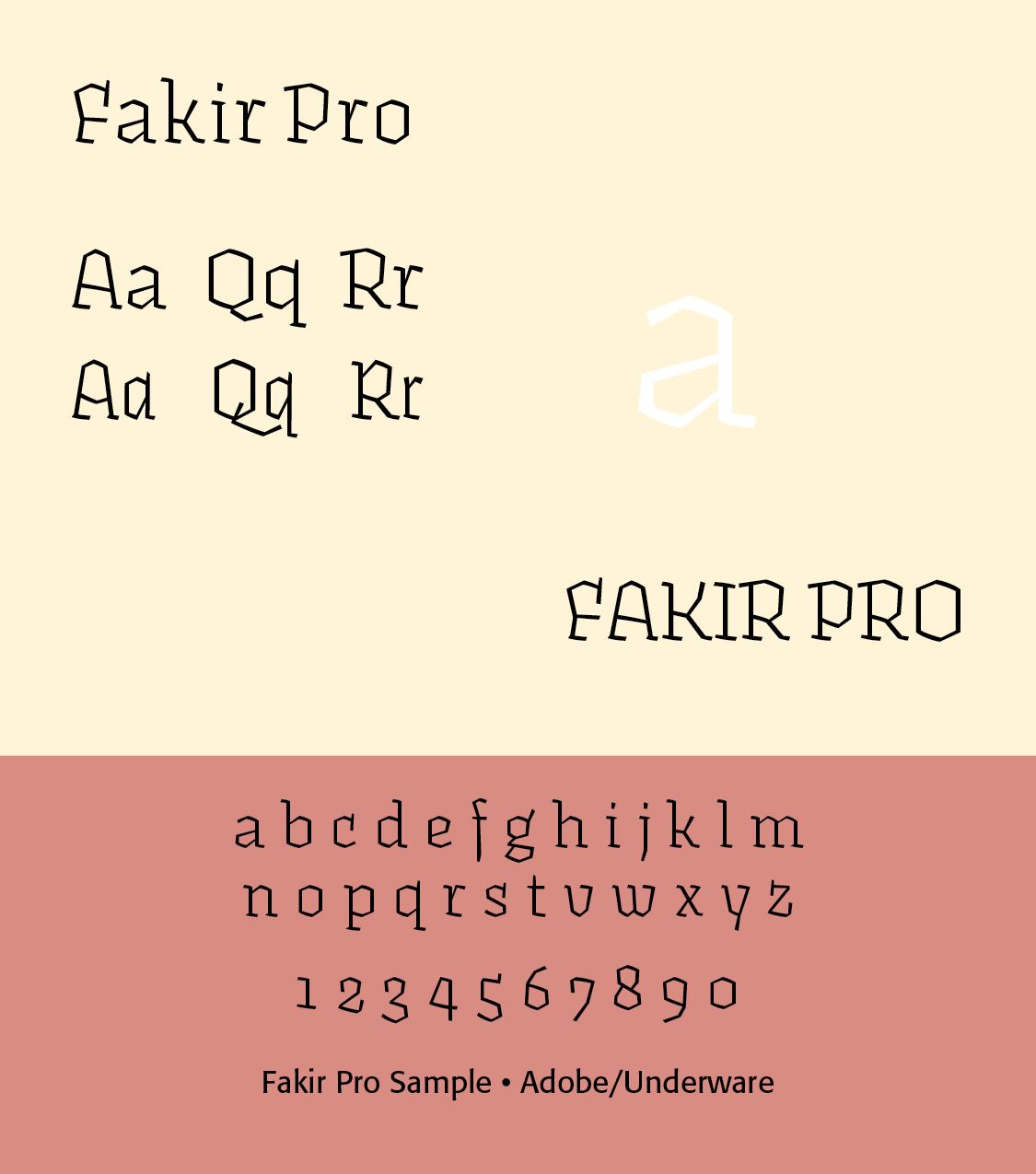
Underware is a rock-hard font foundry with a whole lot of feeling for real type. Stunning retail fonts, exclusive branding, custom type for demanding clients, own freaky design tools, you name it. Sweating & rocking in Den Haag, Helsinki and Amsterdam. Founded by Akiem Helmling, Sami Kortemäki and Bas Jacobs in 1999. You can ask them anything. Fonts would include Liza Pro and Fakir.
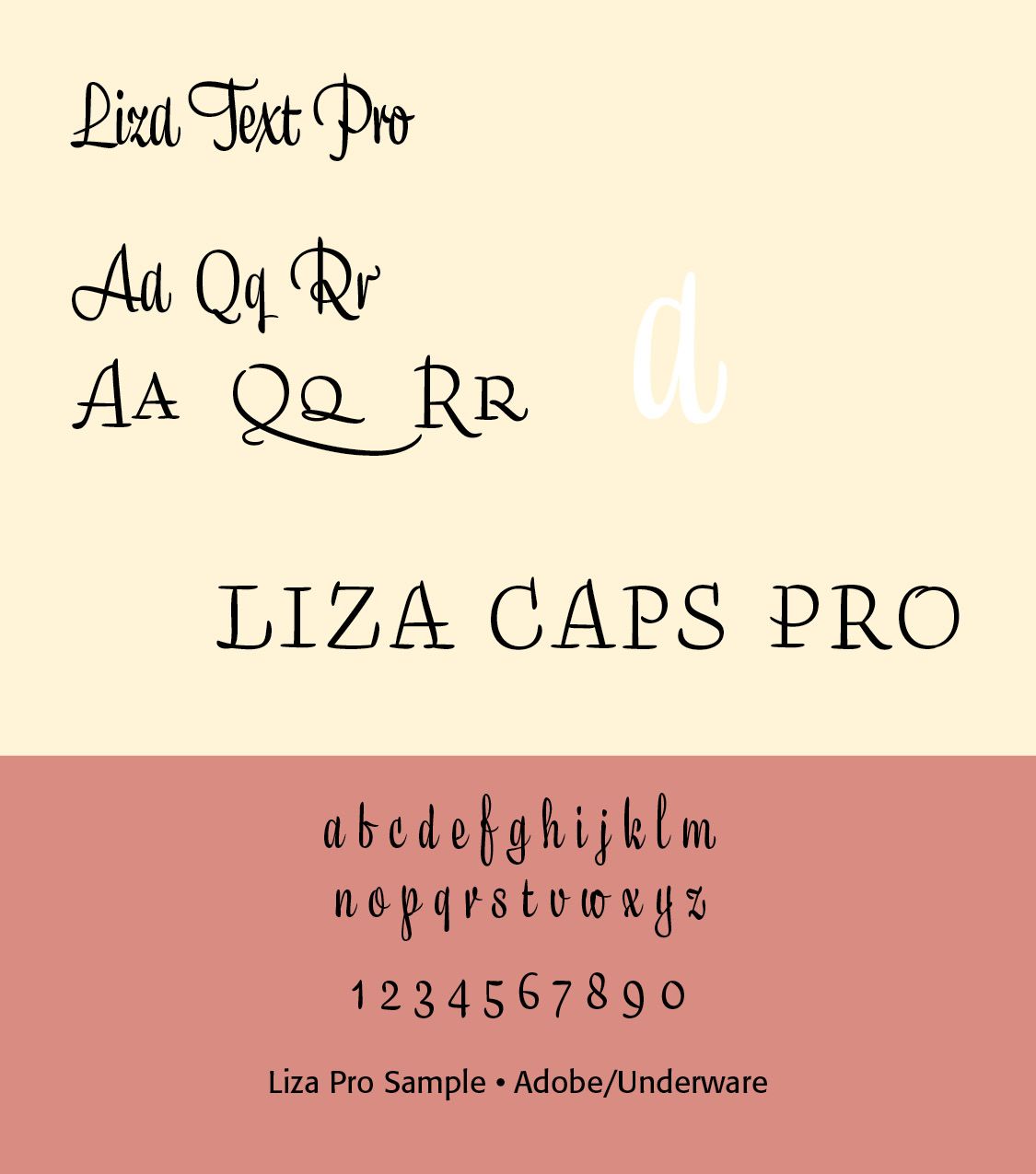
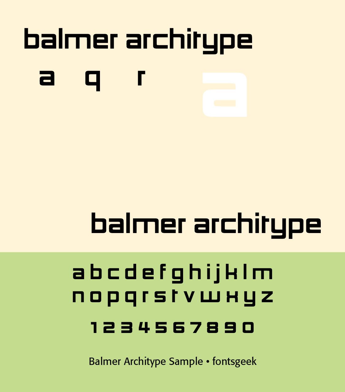
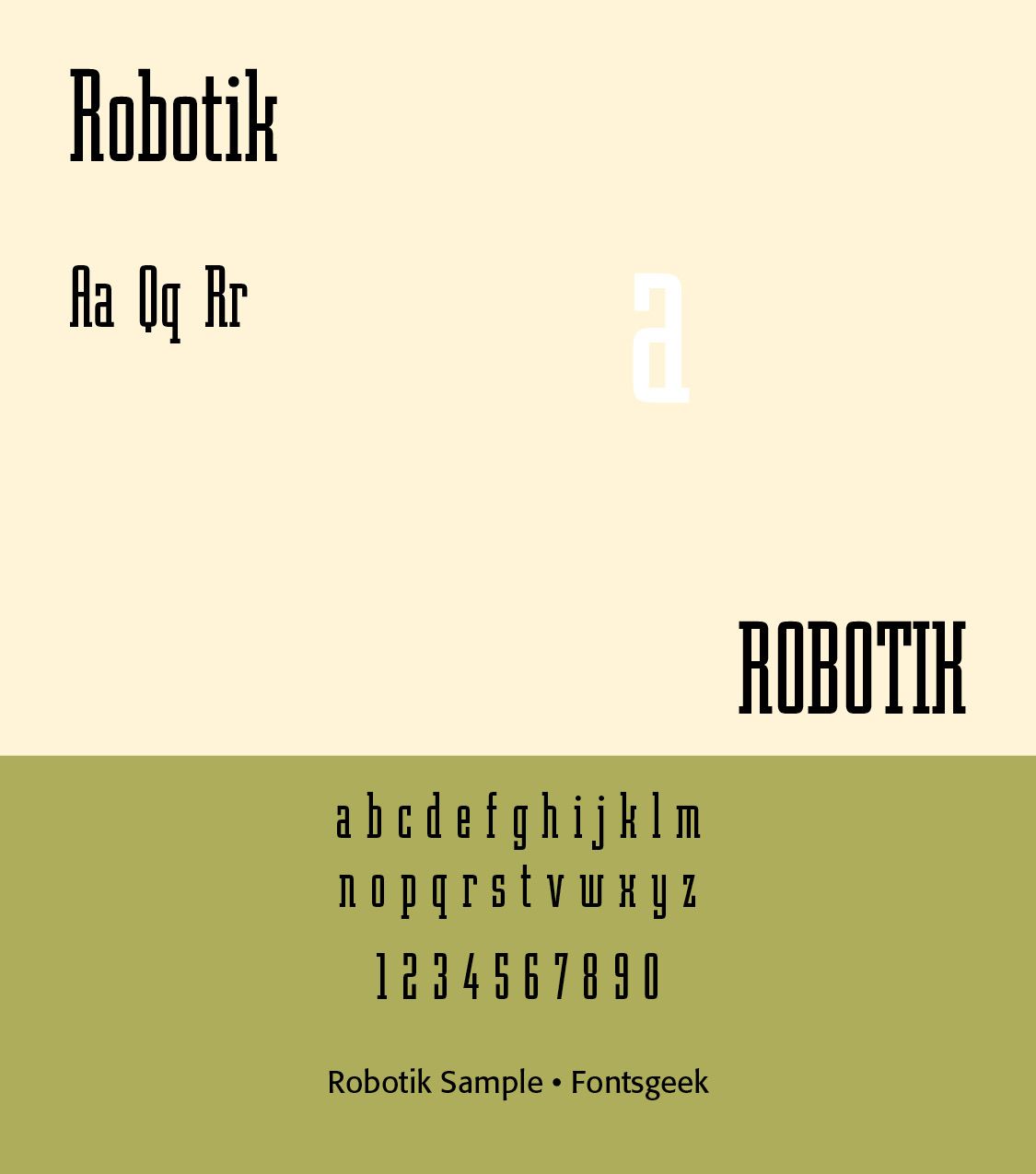
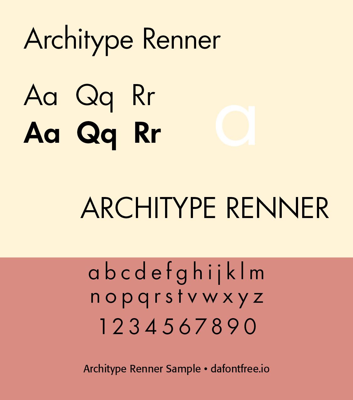
David Quay was born in London, England, and studied graphic design at the Ravensbourne College of Art & Design. After graduation he worked in various London design studios until he became a freelance designer in 1975, specializing in lettering, logotype and graphic design. In 1987 he formed David Quay Design in London. Clients included Monotype, H. Berthold AG, and the International Typeface Corporation (ITC). FONTS include Robotik, architype ballmer, Bordeaux Roman, Foundry Dit Bold, Mekanik, Foundry Sans Bold (and Extra Bold), Architype Renner, Teknik.
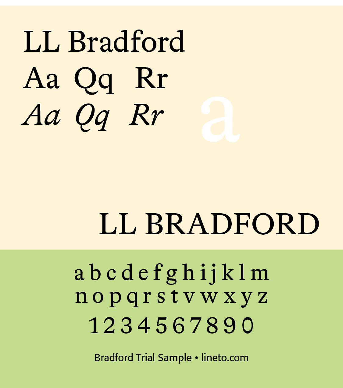
Laurenz Brunner. After an apprenticeship in Switzerland and an internship in London, Laurenz Brunner (1980) worked for Tate Modern under the art director James Goggin (2002/03). While studying at Central Saint Martins, he drew LL Akkurat, which was published in 2004. In the same year, Laurenz started to collaborate with Cornel Windlin on TATE ETC. magazine, and he moved to Amsterdam to finish his BA studies at Gerrit Rietveld Academie (2005). Since 2006, Laurenz has been teaching at Rietveld. In 2007, he debuted LL Bradford (released in 2018) when re-designing Dutch art serial Casco Issues with Julia Born. LL Bradford is an all-purpose serif font family conceived as a versatile tool for high-volume text setting. It was developed and elaborated on over the course of ten years. The primary historical reference point was provided by Römische Antiqua (1884).
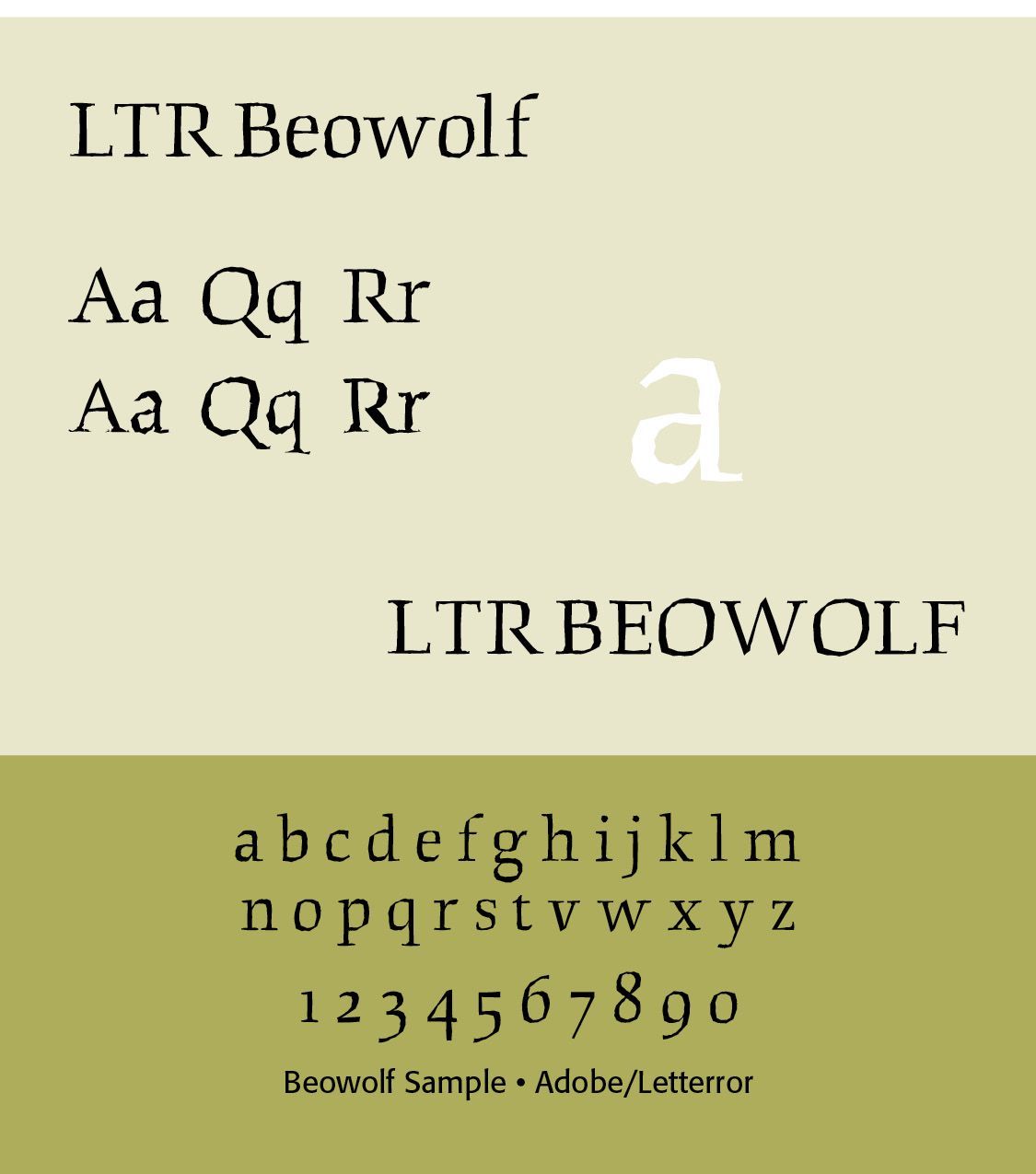
Just van Rossum (born 1966) is a Dutch typeface designer, software developer, and professor. He is the co-founder of design firm, LettError, along with Erik van Blockland. LettError. The magazine primarily consists of editorials denouncing the overreliance on Bézier curves and the lack of innovation by typeface designers using Posscript. LettError published its first typeface in 1990, titled FF Beowolf. It is a serif typeface and the first proof of a "Random Font" as theorized by the duo in 1989. The programming behind the typeface effectively subverts Postscript standard practices by replacing standard commands with an original function written by Just and Erik.
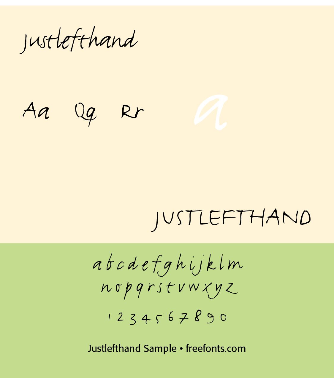
Erik van Blokland (born 1967) is a Dutch typeface designer, educator and computer programmer. He is the head of the Type Media Master of Design program in Typeface Design at the Royal Academy of Art, The Hague in the Netherlands.Letterror is the name of the collaborative efforts of Erik van Blokland and Jus van Rossum. LTR Beowolf is a serif-typeface which had novel programming features. Each time it was printed, code within the typeface files moved the outlines of the letters around slightly, giving it a spiky appearance. Also called "distressed type", this mode of typeface creation became very popular, and a large number of "grunge" typefaces were created. Letterror's Justlefthand and Erikrighthand typefaces were the first digital "handwriting" fonts. Erik's typeface Trixie was the second one, it came out in 1991, a year before RayGun magazine signaled the formal beginning of Grunge Design. It was famously used in the iconic logo for The X-files TV series, Later works include Action Condensed which the NBA used for a redesign of their logo and graphic identity.
Modern Dutch type design is particularly notable for its willingness to combine technical rigor with experimentation.
Successful Layout & Design