The Legibility Group

Carl Shank • July 29, 2026

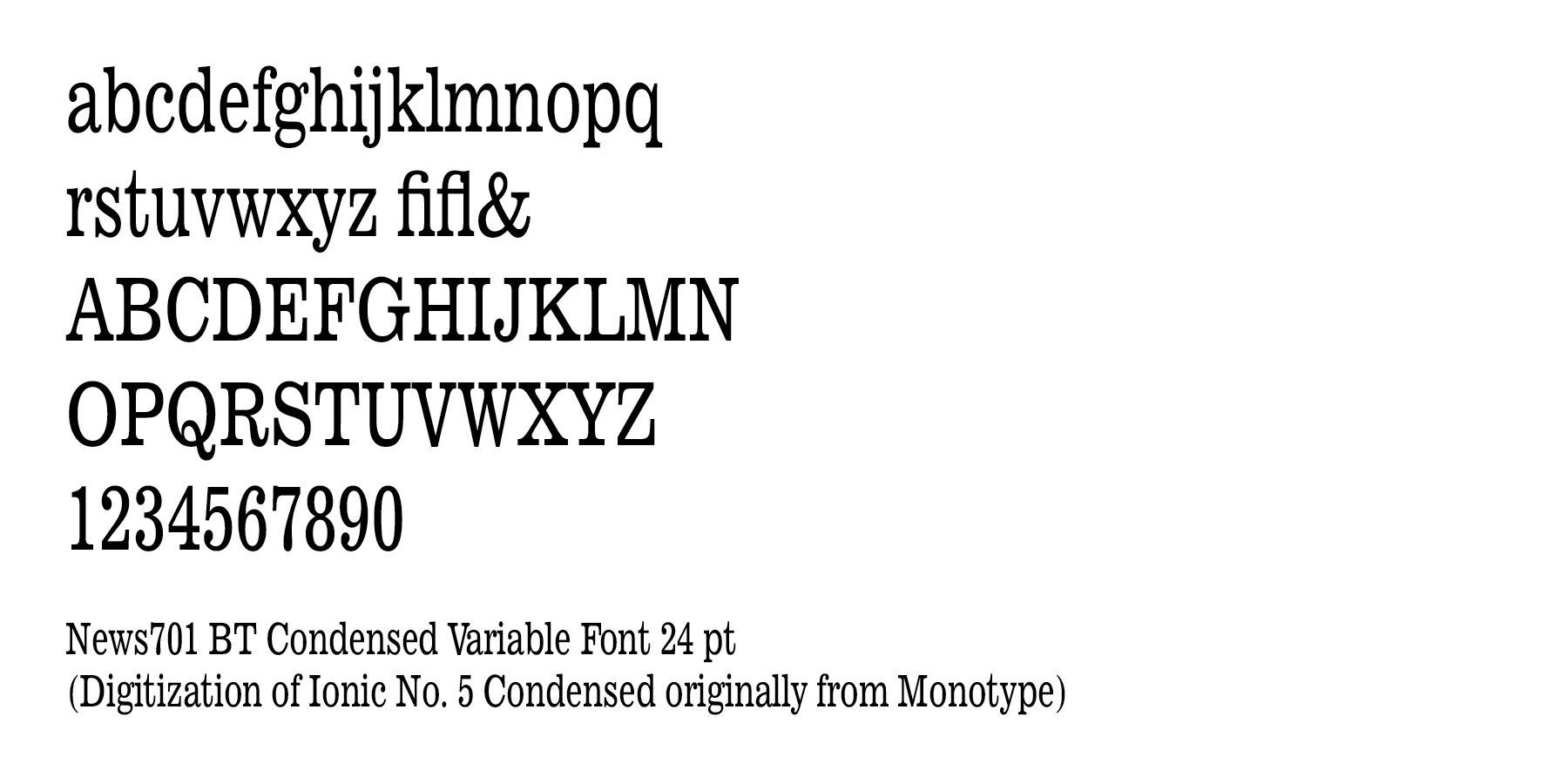
The Legibility Group. This group of typefaces comes from the The Mergenthaler Linotype Company was a company founded in the United States in 1886 to market the Linotype machine, a system to cast metal type in lines (linecaster) invented by Ottmar Mergenthaler. The company became the world's leading manufacturer of newspaper and book typesetting equipment. The Legibility Group is a series of serif typefaces intended for use in newspapers on Linotype's hot metal typesetting  system. They were developed in-house by Linotype's design team, led by Chauncey H. Griffith and released from 1925, when the first member, Ionic No. 5, appeared.


The family became a large group due to the creation of slightly different designs for different printing conditions, such as levels of inking used in different newspaper production processes and versions with different x-heights.[6][b] Linotype carried out a survey of optometrists as part of their research processIt consisted of Ionic No. 5, Textype, Excelsior, Opticon, Paragon and Corona. Although not part of the family, Linotype marketed its sans-serif family Metro and slab serif face Memphis as effective complements for headings.
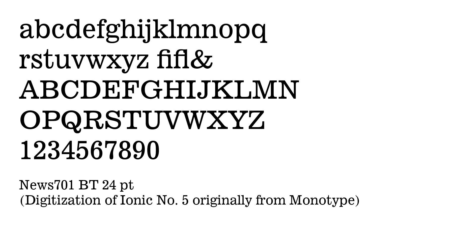
Ionic No. 5 — the first in the family and extremely successful. Sometimes criticized for having too high an x-height  making lower-case letters very wide and reducing the difference between an "n" and an "h". Bitstream’sNews 701 typeface is an unofficial digitization.


It features a large lowercase with short ascenders and descenders, with no fine lines or serifs to break down in stereotyping, and no small openings to fill up with ink. This is one of a few typefaces made in many closely graded sizes: 5-, 51/2-, 6-, 61/2-, 63/4-, 7-, 71/2-, 8-, 9-, 10-, and 12-point.  Ionic Condensed was designed by Griffith in 1927, also for Linotype. It is a refinement of traditional designs, intended for newspaper headings, and has most of the general characteristics of the text face. 

Successful Layout & Design
By Carl Shank July 13, 2026
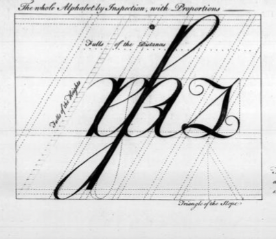
George Bickham the Elder (b. 1684) was one of the most influential English engravers, calligraphers, and writing masters of the eighteenth century. Although he was a capable print engraver, his lasting significance lies in his role in preserving and popularizing English Round Hand (later known as Copperplate script) through beautifully engraved writing manuals. His work shaped business handwriting, penmanship education, typography, and ornamental lettering for generations. He trained as both a writing master and an engraver, two professions that were closely linked before the advent of modern printing. Rather than merely copying handwriting, he engraved elaborate penmanship examples onto copper plates, allowing thousands of identical, highly detailed specimens to be printed. He became renowned for his extraordinary ability to translate handwritten originals directly onto copper plates with exceptional fidelity, a skill admired by his contemporaries.
By Carl Shank June 13, 2026
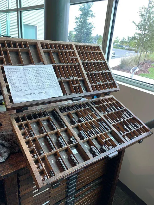
Compositors & Type: Origin and Use of “Uppercase” and “Lowercase” Carl Shank, CARE Typography Most everyone knows what “uppercase” and “lowercase” letters are. They refer, of course, to our “capital” letters and our “regular” small print. But not many know why or how they came to be known by such terminology. The answer is found in the history and development of typography and printing. “Case” here doesn’t refer to “circumstance” or “condition.” It refers to the wooden trays used to store metal letters, the top case for capital letters (“uppercase”) and the lower case for small letters. Each tray was divided into compartments to hold the type. The lower case also held the punctuation marks and other pieces of type, like “spacers.” The type case was a shallow wooden tray divided into compartments of various sizes. There were about thirty styles of type cases, and some of these were made in different sizes.[1] The most common, or standard, size was 32¼ by 16 inches, outside dimensions, and ⅛ inches deep, inside. One of three traditional plans or schemes for such type cases involved (1) all characters in one case; (2) capitals, small capitals and a few other characters in one case; or (3) the small letters, figures, points, spaces and quads in another case. The two latter cases formed a pair and would nearly always be used together.(See Images) Hand compositors (or “swifts”) would take individual letters, spaces and punctuation marks or other characters from the type case and place them in what was called a composing “stick” in such a manner that when the type characters are properly assembled, they form words, sentences and paragraphs. The work of the press room compositor was divided into two fundamental operations — the “setting” of type and the “unsetting” of type. The former was called composition and the latter, distribution. A visual example of such typesetting can be seen in some of the episodes of The Waltons, an American historical dramatelevision series about a family in rural western Virginia in the Appalachian/Blue Ridge mountains chain, during the economic hardships and mass unemployment of the Great Depression in the 1930s and the subsequent United State home front during World War II in the 1940s. The series aired from 1972 to 1981. John-Boy, a leading character of the series, opened a print shop in a shed by the family home with an old-fashioned mechanical printer that required setting cold metal type from a type case. His brother was the compositor while John-Boy ran the printing machine.
Show More