Typography Pictorial History
Typography Pictorial History. Typography has a rich and fascinating history that spans centuries, evolving alongside the development of writing systems, printing technologies, and artistic movements. Throughout this rich history, typography has evolved from a functional necessity to a sophisticated art form, reflecting cultural, technological, and artistic movements. Today, typography continues to play a crucial role in visual communication, shaping the way we perceive and interact with information. Here's an overview of the history of typography.
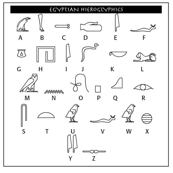
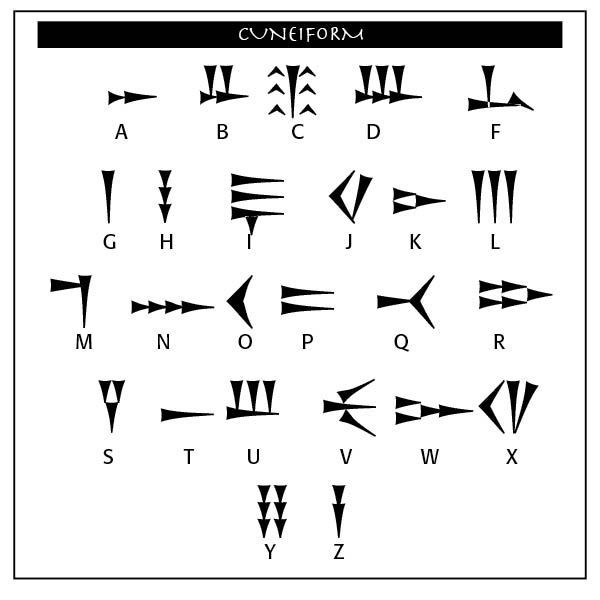
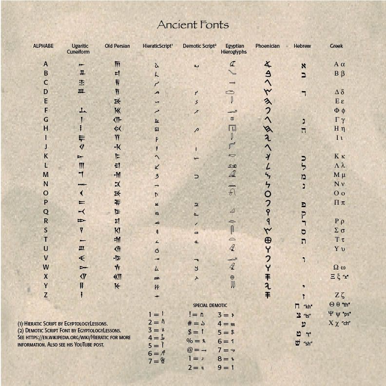
(3500 BC to 600 BC) The alphabet is old. Very old. The origins of our alphabet and writing systems go back to pictograph writing systems like Egyptian hieroglyphs.
*John Coleman Darnell, an Egyptologist from Yale University, in the 1990s made a discovery that rocked the alphabetic world. Looking for Egyptian relics, he discovered two ancient inscriptions at Wadi El-hol in central Egypt, about 30 miles northwest of ancient Thebes. This ancient road had evidence of inscriptions on the walls of the cliffs lining the roadway. The writings show the alphabet's invention from around 2000 B.C. A fascinating study of his report is found in David Sacks, Letter Perfect: The Marvelous History of Our Alphabet From A to Z.
The Egyptians wrote in hieroglyphics (called "sacred carvings"), using pictograms for letters. Pictures of familiar objects were used to convey sounds and words. The ancient Semites borrowed from these pictograms, so that, for example, the picture of a "head" was called resh, and since the word began with the sound of an "r," they selected that image for the sound. Thus, "R" is the sketch of a head. (*From Blog, "What's In A Name?" Oct 12, 2023)
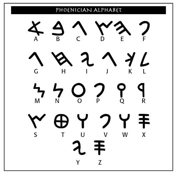
From these backgrounds, the Phoenicians, descendants of people who lived in ancient Canaan, began writing their language in a 22-letter alphabet, sometime before 1000 B.C. They had inherited these letters from other tribes before them, but had the skill and knowledge to formally write them down. By 900 B.C. the Jews and other Near Eastern peoples copied the letters for their own use. The Greeks then followed about 800 B.C., adapting the letters for their own use.
The Phoenician alphabet begat the Greek which begat the Etruscan, a people who lived in northern Italy. From there, the Roman alphabet and writing were developed. The original Phoenician alphabet had 22 letters, while the Greek alphabet had 26. Interestingly, the Hebrews, another Semitic tribe which populated the Canaanite region under the influence of Joshua's campaign (in the Bible), only khet (j), qof (q), resh (r) andshin (v) resemble their Phoenician counterparts. The Hebrew writing from right-to-left derives from the Phoenicians.
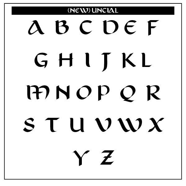
This New Uncial Display typeface takes inspiration from Uncial Writing. It is an iconic medieval system found in religious manuscripts from 800 BC. The letter designs served as a basis for the development of the Roman alphabet in force in the Western world. New Uncial was born from careful calligraphy, resulting in an opentype display font with clean glyphs, upper and lower case characters, easy to apply and capable of bringing impact to graphic pieces that seek aesthetic appeal. Thanks to Lucas Riedi for sharing this awesome typeface
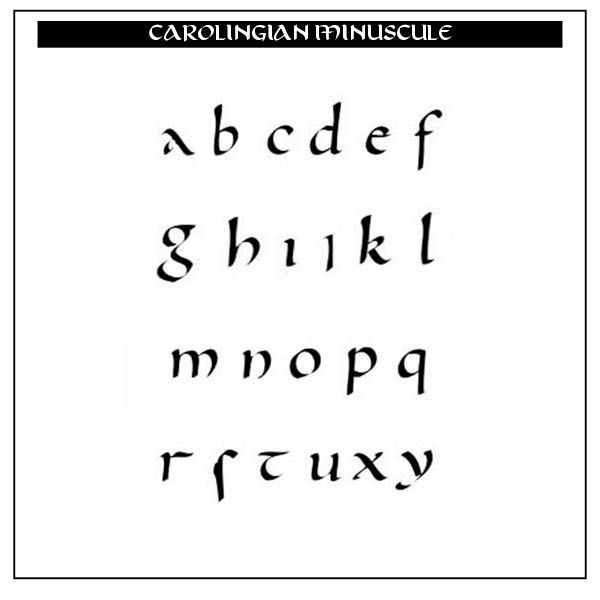
(600 BC – 1450 AD) The Manuscript Era saw scribes meticulously handwriting manuscripts, using calligraphic scripts like Uncial. In the sixth through tenth centuries, lower case letters (called minuscules) were formed, with modern lettering evolving from the Carolingian scripts. The Emperor Charlemagne used these letters as an educational standard.
**"Early uncial script most likely developed from late rustic capitals. Early forms are characterized by broad single-stroke letters using simple round forms taking advantage of the new parchment and vellum surfaces, as opposed to the angular, multiple-stroke letters, which are more suited for rougher surfaces, such as papyrus. In the oldest examples of uncial, such as the fragment of De bellis macedonicis in the British Library, of the late 1st–early 2nd centuries, all of the letters are disconnected from one another, and word separation is typically not used. Word separation, however, is characteristic of later uncial usage.
As the script evolved over the centuries, the characters became more complex. Specifically, around AD 600, flourishes and exaggerations of the basic strokes began to appear in more manuscripts. Ascenders and descenders were the first major alterations, followed by twists of the tool in the basic stroke and overlapping. By the time the more compact minuscule scripts arose circa AD 800, some of the evolved uncial styles formed the basis for these simplified, smaller scripts." (**From https://en.wikipedia.org/wiki/Uncial_script)
The Carolingian Minuscule on the right, thanks to J. Pemery (https://commons.wikimedia.org/w/index.php?curid=19018724) develops from strictly capital letters to small lettering.
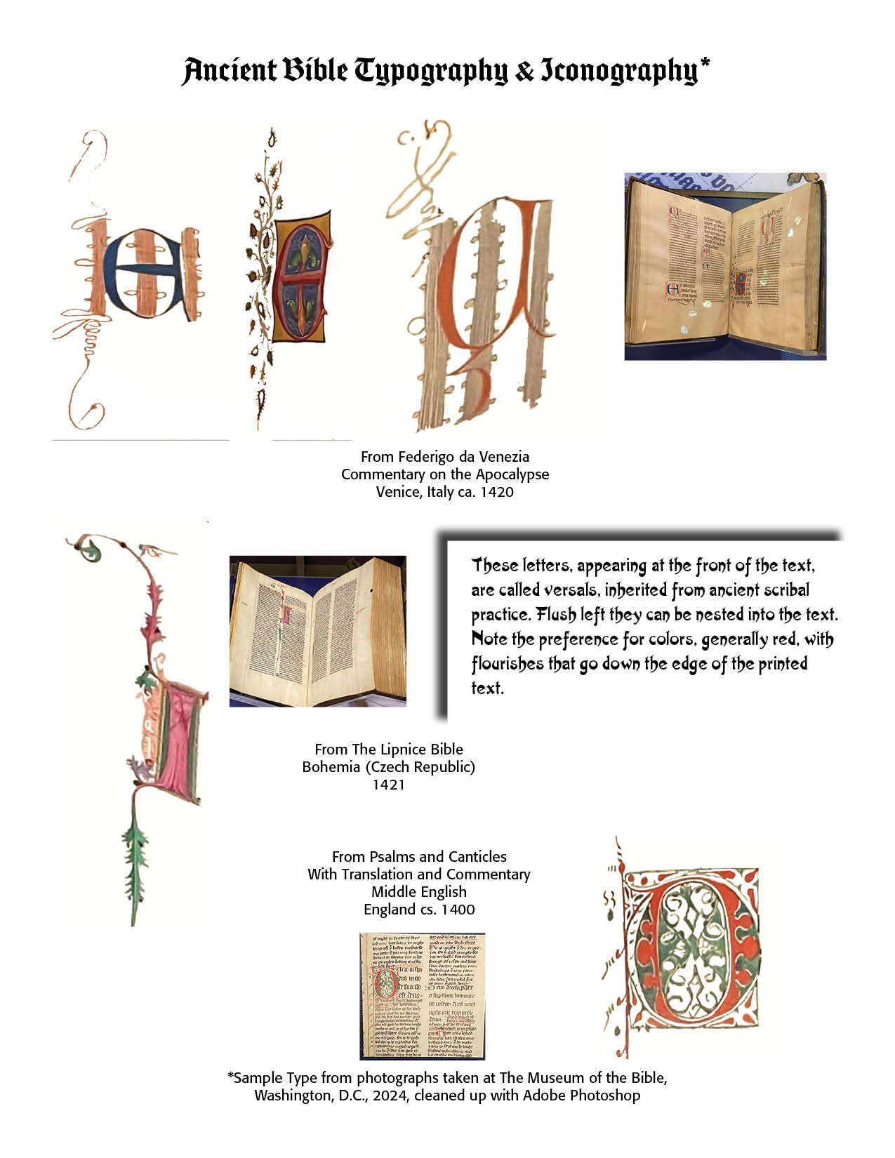
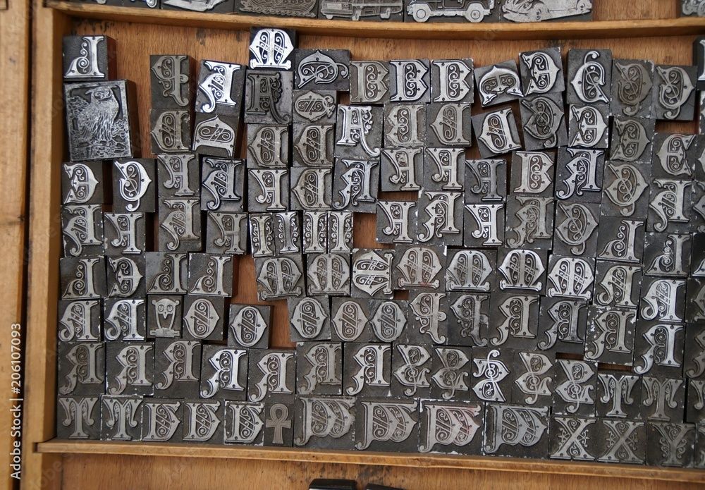
Illuminated manuscripts, decorated with ornate initials, illustrations and borders were created by gifted and skilled scribes and artists, as samples below illustrate. (See Blog, "Old Bible Typography Versals," April 19, 2024)
(1450 – 1800) The Printing Revolution and new typefaces. Johannes Gutenberg's invention of moveable type printing in the mid-15th century revolutionized book production and typography. Renaissance typefaces by Claude Garamond and Aldus Manutius enhanced typographic principles.
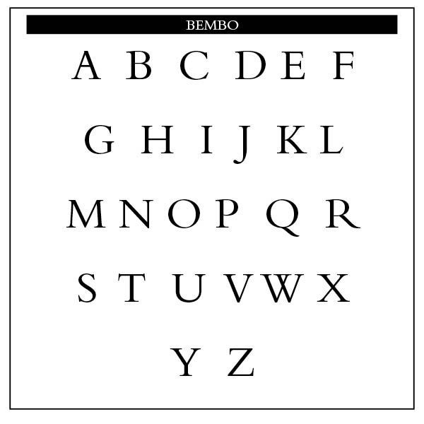
Aldus Manutius was a Venetian scholar, who became a publisher and printer when he founded the Aldine Press in 1495. He introduced personal or pocket editions of the classics in Latin and Greek that all could own, as well as works by contemporaries Pietro Bembo and Erasmus. His typefaces were all designed and cut by the brilliant Francesco Griffo, a punchcutter who created the first roman type cut from study of classical Roman capitals. Type designs based on work used by Aldus Manutius include Bembo and Poliphilus.
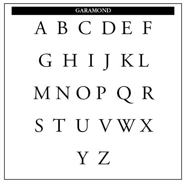
The typefaces Garamond produced between 1530 and 1545 are considered the typographical highlight of the 16th century. His fonts have been widely copied and are still produced and in use today. Publications include: "Essai d’un nouveau caractère de fonte pour l’impression de la musique", Paris 1756; "Manuel typographique" (2 vols.), Paris 1764–66. (From TYPOGRAPHY – An Encyclopedic Survey of Type Design and Techniques Throughout History by Friedrich Friedl, Nicolaus Ott (Editor), Bernard Stein, published by Könemann Verlagsgesellschaft mbH.)
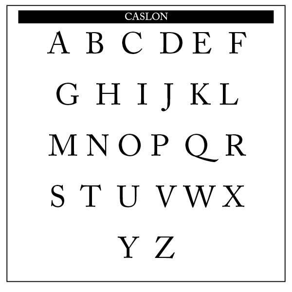
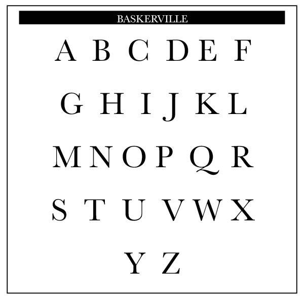
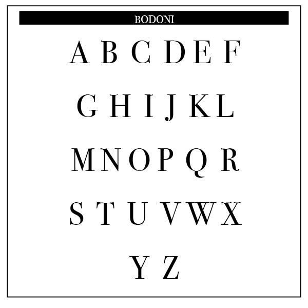
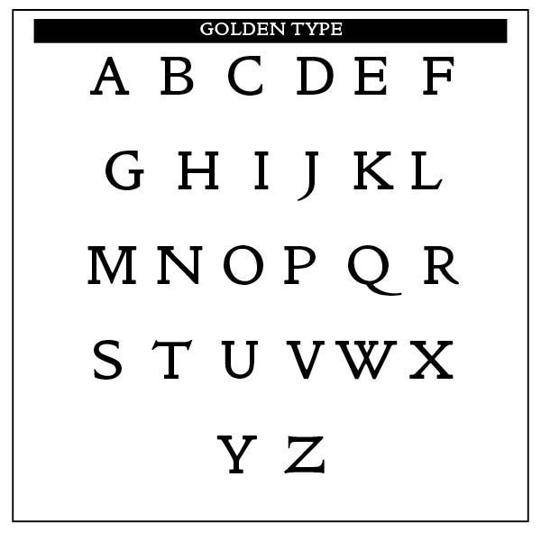
(1700 – 1900) The Age of Enlightenment and the Industrial Revolution highlighted William Caslon (1692–1766), who produced one of the most influential and popular typefaces of the 18th century. New printing technologies, such as the Baskerville type and the Stanhope Press improved print quality. Mechanization of printing processes and the development of new typefaces by Giambattista Bodoni (1740–1813) gave us a typeface characterized by its distinctive contrast between thick and thin strokes. William Morris (1834–1896), who led the Arts and Crafts Movement, promoted a return to craftsmanship (See "Golden Type" below) and traditional printing methods through his Kelmscott Press.
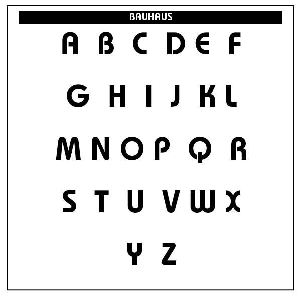
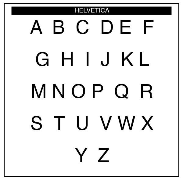
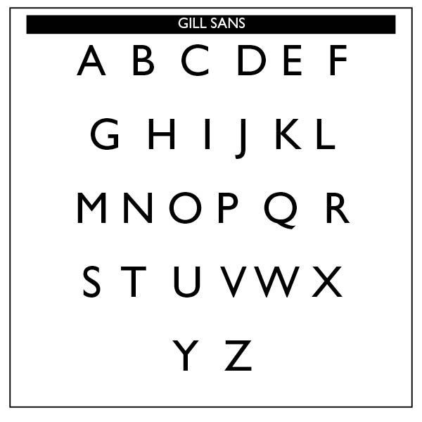
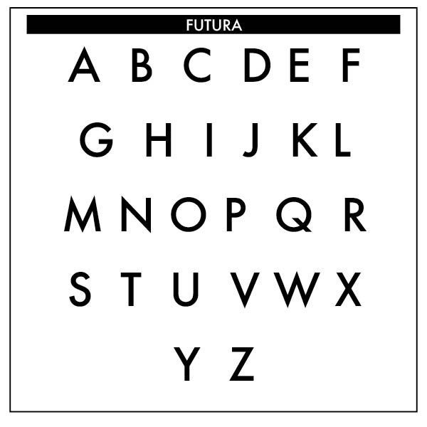
(1900 – 1960) The Modernist Era. The Bauhaus school in Germany produced a functional, minimalist approach to typography and design. Key tenets of Bauhaus design include form follows function and less is more. The style is characterized by a lack of ornament and a focus on clean lines that reduce forms to their essential elements. Bauhaus design, art, and architecture often features simple geometric forms such as circles, squares, and triangles. Jan Tschichold (1902–1974), a German typographer and book designer, played a significant role in the modernist movement and the development of functional typography. Eric Gill (1882–1940) was an English sculptor and typeface designer, known for his typefaces of Gill Sans and Perpetua. Sans-serif ("without feet") typefaces like Futura and Helvetica became popular, reflecting the modern aesthetic. Paul Renner (1878–1956) became known for the highly influential face, Futura, in 1927.
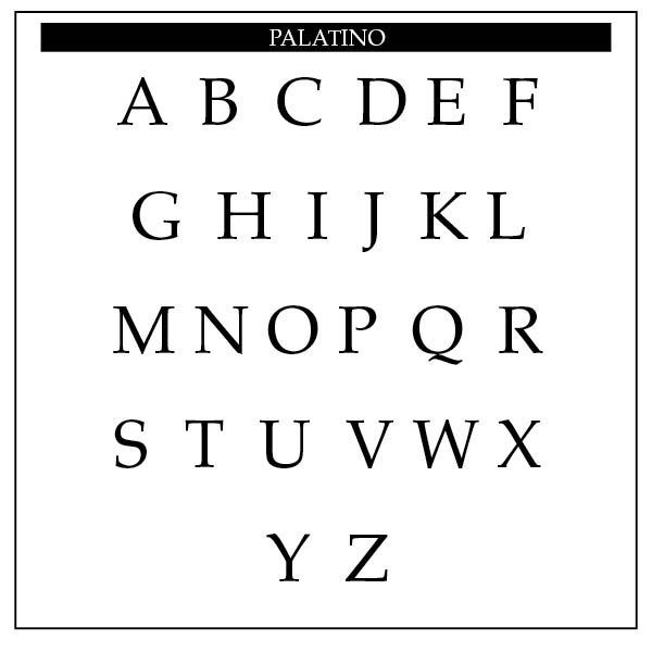
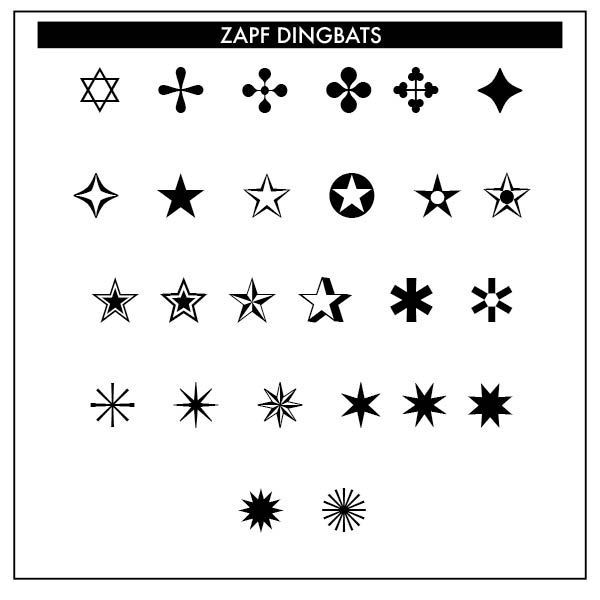
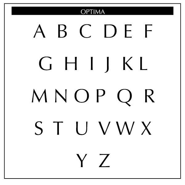
(1960–present) The Modern Age saw the development of digital typography and desktop publishing software, like PageMaker (now defunct & replaced by Adobe's InDesign) and QuarkXPress, which transformed the design process and allowed an entirely new cadré of typeface designers into the mix. Hermann Zapf (1918–2015), a German calligrapher, typographer and type designer, became known for typefaces such as Palatino, Optima and a pictogram font, Zapf Dingbats.
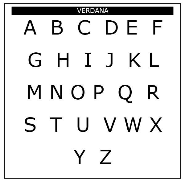
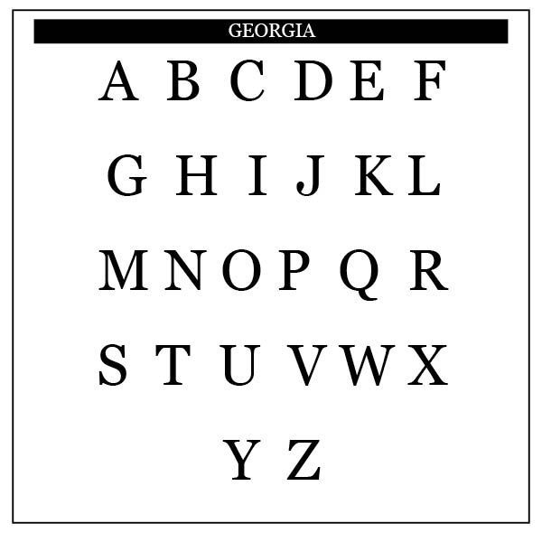
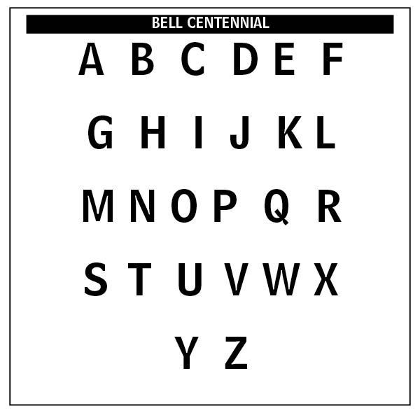
Andrew Carter (1937 – ), an American type designer, designed typefaces like Verdana, Georgia and Bell Centennial, which was commissioned by AT&T for the phone books.
The development of OpenType (SEE "Using OpenType Fonts," Blog Sep. 29, 2023) and TrueType font formats allowed for greater typographic control and cross-platform compatibility. Web typography, with the introduction of web-safe fonts and responsive typography techniques allowed expressive and experimental typeface designs.
These typographers and type designers have left an indelible mark on the history of typography, shaping the way we perceive and interact with text through their groundbreaking work and innovative designs.

Successful Layout & Design