A Cross Inspired Typeface
A Cross Inspired Typeface. CARE Typography has been able to craft a typeface of Christian crosses from the history of the Christian Church throughout the world. We named it CrossesTwo to simply distinguish it from other writings. It is a FREE font, available to all who ask. Christian crosses are used widely in churches, on top of church buildings, on bibles, in heraldry, in personal jewelry, on hilltops, and elsewhere as an attestation or other symbol of Christianity. Crosses are a prominent feature of Christian cemeteries, either carved on gravestones or as sculpted stelae. Because of this, planting small crosses is sometimes used in countries of Christian culture to mark the site of fatal accidents. Not far from where we are, there is a huge Christian cross built by a Virginia church marking not merely the site of the church building, but announcing the central message of the Bible there.
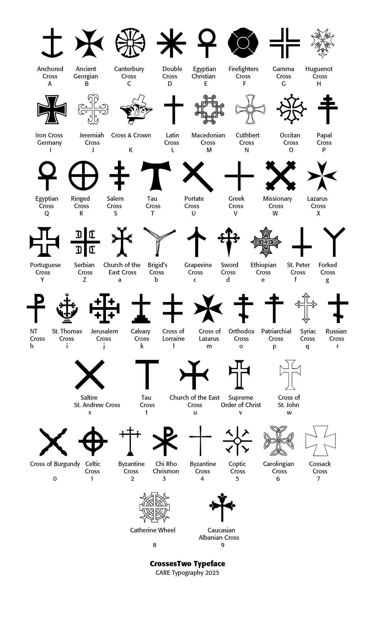
Christian crosses are powerful symbols that convey theological meaning, cultural identity, and historical legacy. Over centuries, many distinct styles of the cross have developed across Christian traditions, regions, and periods. Some of the most prominent crosses are the traditional Latin Cross (Letter "L" in CrossesTwo typeface), where the vertical beam extends beyond the horizontal cross bar, the Greek Cross, a cross with four arms of equal length (Letter "V" in the typeface), the Orthodox (Eastern) Cross (Letter small "o" in typeface), with three horizontal bars — the top for the inscription (INRI), the middle for the hands, and the slanted bottom bar for the footrest, the Celtic Cross (Letter "1" in the typeface), which is a Latin cross with a circular ring connecting the arms. The traditional Latin cross symbolizes the crucifixion of Jesus, with the empty cross signaling that He rose again from the dead, and is used in Western Christianity, Roman Catholic, Protestant, and many global Christian contexts.
The Greek Cross is common in early Christian art and Byzantine Christianity and used in Eastern Orthodox, Byzantine, and early Christian monuments and mosaics. In the Orthodox Eastern Cross the slanted bar represents the two thieves crucified beside Christ — one rose to heaven, the other descended. It is used in Russian, Greek, Serbian, and other Eastern Orthodox Churches. The Celtic Cross had its origins in early medieval Ireland and Britain, associated with Celtic Christianity. It has been used in Irish Christianity, Anglican, some Protestant denominations, and decorative gravestones.
The Coptic Cross (Letter "5" in the typeface and note Letter "e" where the Ethiopian Cross is a close match to the new Coptic Cross) is a a variation with intricate, symmetrical designs — sometimes with equal arms or surrounded by circles. It is used by Christians in Ethiopia and Eritrea. The Jerusalem Cross (Letter "j" in the typeface) has a large central cross surrounded by four smaller Greek crosses, used by the Crusades in the eleventh century, is the Heraldic symbol of the Crusader Kingdom of Jerusalem and used by Franciscans and in modern Jerusalem-related contexts. The Russian Orthodox Cross (Letter "o" in the typeface) Features three horizontal bars — top (INRI), middle (hands), and slanted bottom (feet). The Tau Cross (Letters "T" and "t" in the typeface) is shaped like the Greek letter tau and has been adopted by St. Anthony and Franciscans to symbolize Old Testament sacrifices and God's protection (Ezekiel 9:4).
St. Andrew's Cross (Saltire) (Letter "s" in the typeface) is an X-shaped cross from the tradition that Andrew the Apostle was crucified on a diagonal cross. It is the symbol of Scotland and the Eastern Orthodox Church. The Papal Cross (Letter "P" in the typeface) is a vertical staff with three horizontal bars, decreasing in length, representing the pope’s triple office: bishop of Rome, patriarch of the West, and successor of Peter. The Cross of Lorraine (Letter "l" in the typeface) is a vertical bar crossed by two horizontal bars — the lower one longer, has been used in Western Europe during the Crusades and was a symbol of French resistance in World War 2. The Patriarchal Cross (Letter "p" in the typeface) is similar to the Cross of Lorraine, but primarily associated with ecclesiastical hierarchy, and used by archbishops and patriarchs in Eastern and Western churches.
Each cross reflects regional theological emphases, cultural aesthetics, and historical developments. While the Latin Cross remains the universal Christian emblem, the variety in form reveals Christianity's global and historical richness. Note the CrossesTwo typeface below with the description of these and many other crosses. (Credit for the opening image is given to Matteo Corti - http://en.wikipedia.org/wiki/Image:Muiredach_s_Cross.jpg, CC BY-SA 3.0, https://commons.wikimedia.org/w/index.php?curid=1393567)
Successful Layout & Design


