Theology of Type (3): The Twentieth Century (Part 1)
CONSTRUCTIVISM (1915-1934)
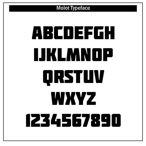
Typography in Constructivism was a rational, disciplined and ideologically charged tool. It served society, especially early Russian forces, and reflected the spirit of the machine age. Constructivism redefined the role of art, design, and typography. Unlike Dadaism’s chaos and anti-art stance, constructivism type, favoring horizontal and vertical axes, creating a clean, mathematical visual language, was highly rational, utilitarian, and politically driven. ChatGPT notes that the movement’s legacy endures in its clarity, structure and purpose-driven design that define much of modern typographic practice. Constructivist movement produced strong, sans-serif (without feet) fonts like the typeface molot. Like Dadaism in some aspect, typography was bold, in-your-face, promoting Suprematism’s geometric abstraction and Futurism’s emphasis on dynamism.[1]
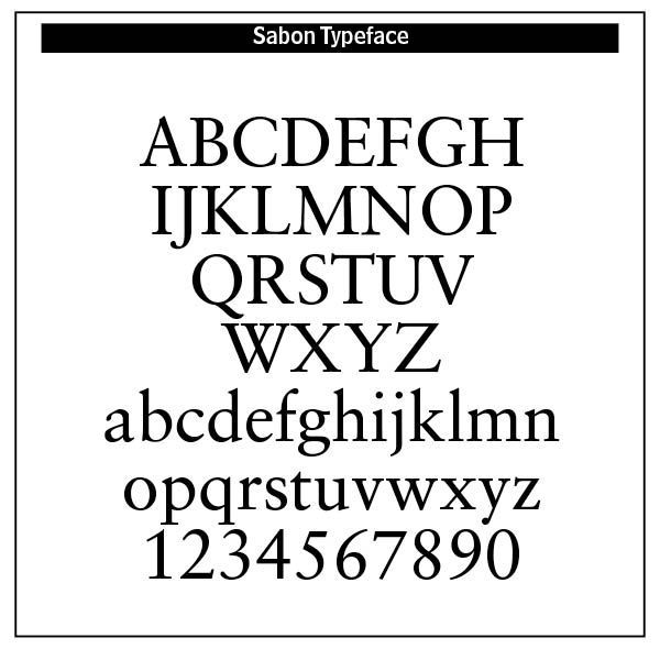
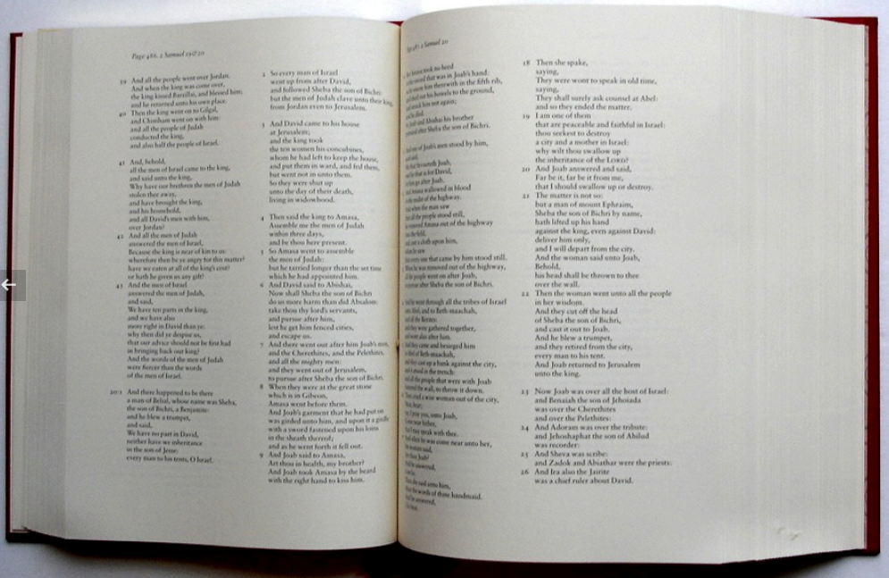
The beauty of Constructivism lies in its purpose driven uniformity and its legacy to the Bauhaus movement. Bold, clean lines of sans-serif type continue to influence poster and movement designers today. Jan Tschichold’s approach to typography was transformed after his first visit to the Bauhaus exhibition at Weimar. He became a leading advocate of Modernist design practices. But he was mostly interested in the practicality of typography. He developed the Sabon typeface, used by Bradbury Thompson in setting the Washburn College Bible.
In early Russia, theology was deeply Orthodox, mystical, and rooted in the lived experience of the Church. God was understood primarily through worship, icons, and ascetic practice, not abstract reasoning. Russian Christianity emphasized the mystery of God, the sanctity of the Church, and the union of divine and human through Christ. Typography was dominated by old-style Cyrillic typefaces rooted in religious and imperial traditions.
However, in the early 1900s a decisive shift toward functionalism and social progress dominated typography and art in Russia. This was a shift away from religious, God centered roots and into more Marxist oriented politics. Beauty in typography in its gratuitous form, reflecting the eternal gratuity and self-giving of the Trinity, was replaced by the State. Diversity was sacrificed for typographical uniformity.
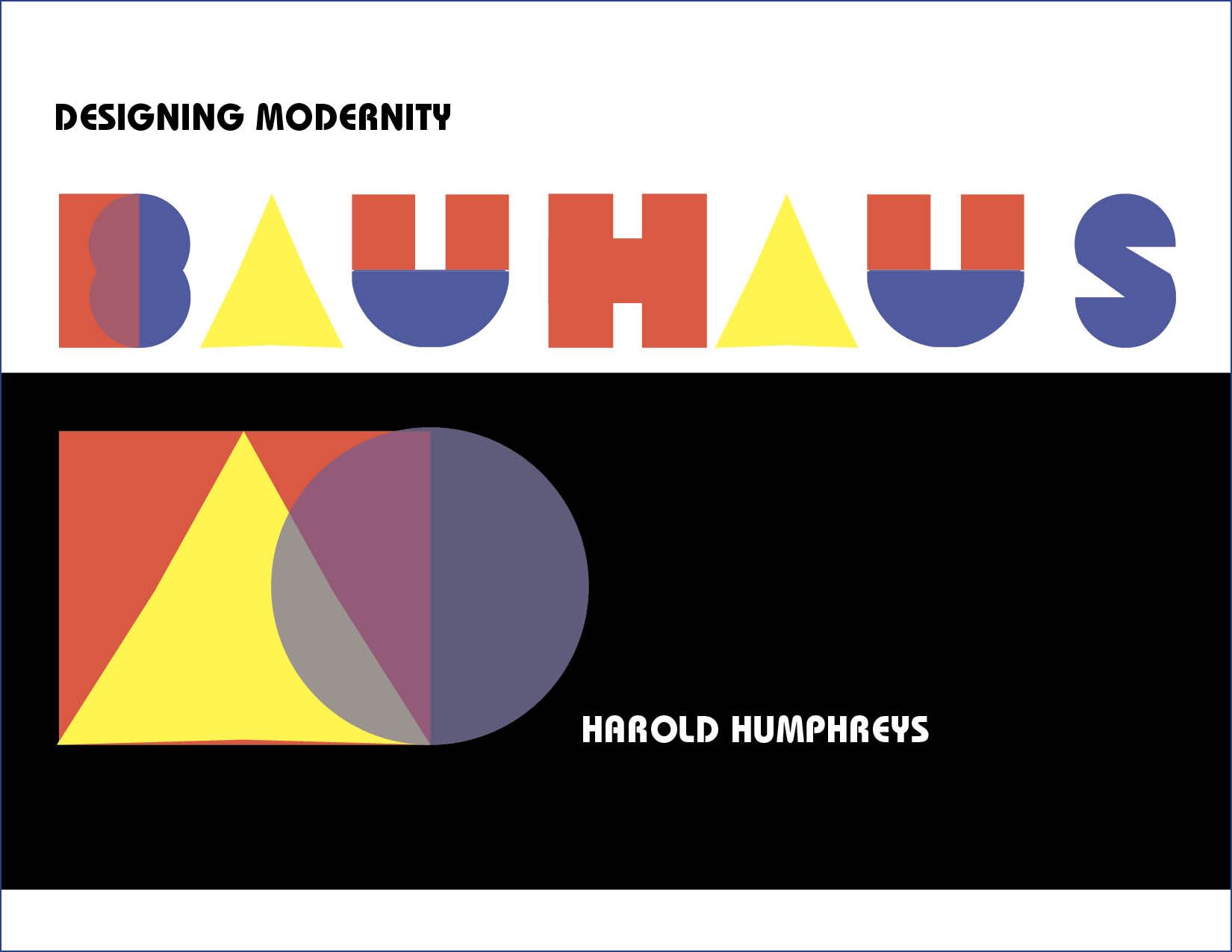
BAUHAUS (1919-1933)
BAUHAUS was one of the most influential design schools of the twentieth century. Founded by Walter Gropius in Weimar, Germany in 1919, many of Europe’s leading artists and designers were on its faculty.
When the Nazis came to power in Germany, many of the staff emigrated to the United States to found the new Bauhaus in Chicago in 1937.
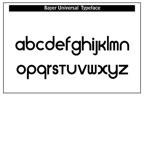
The Bauhaus movement treated type not as a decorative element but as a functional, modern communication tool, closely aligned with industrial progress and rational design principles, where form follows function in sans-serif typefaces. The idea was to make typography visually engaging and informative, while also respecting the economy of space and structure. Sans-serif typefaces became the hallmark of Bauhaus typography. The clean, legible, geometric forms were modern, efficient and aligned with machine aesthetics. A leading typographer and organizer of Bauhaus was Herbert Bayer.
The Bauhaus typographic principles laid the foundation for the International Typographical Style (Swiss Style) and much of modern graphic design. The designer Josef Muller-Brockmann (1914–1996) was a pioneer of the International Typographic Style, with his simple designs and clean use of typography inspiring many graphic designers in the twenty-first century.³ Bauhaus type aesthetics still influence UI/UX design and minimalist information design today.
Is Bauhaus beautiful typographically? Its clean lines, geometrically styled logos and posters, and crisp sans-serif type styles might suggest so. The evidence for a Christian based beauty of this style is as minimal as its minimalistic design standards. While unity and uniformity in type style is at the maximum, diversity is lacking in the type.
We believe as Christians that the sovereign, objective God oversees and reveals creativity to all things so that nothing happens, including Bauhaus, by what is called pure contingency. Otherwise all creativity is lost in the swirl of chance, a place where anything and everything happens “just because,” violating the existence and meaning of everything — "As the absolute and independent existence of God determines the derivative existence of the universe, so the absolute meaning that God has for himself implies that the meaning of every fact in the universe must be related to God."[2]
And this includes The Bauhaus with its many designers and artists.
ART DECO (1919-1939)
DRAMATIC, BOLD AND STYLISH typefaces in the Art Deco period mirrored the golden age of cinema. From the 1920s to the early 1940s, after World War One, this type and art style embraced elegance, ornamentation and stylization. Known initially as “le style moderne” or “Jazz Moderne,” the style received its current name in 1968. Art Deco originated in a time of intense aesthetic experimentation. Art movements such as the Bauhaus, Constructivism, Cubism, De Stijl, Futurism, Orphism, and Surrealism helped define the style’s inherent modernism.
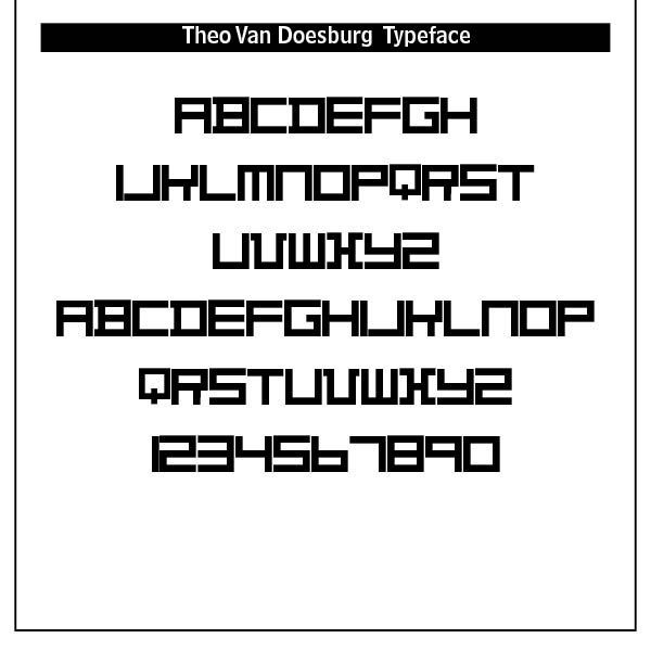
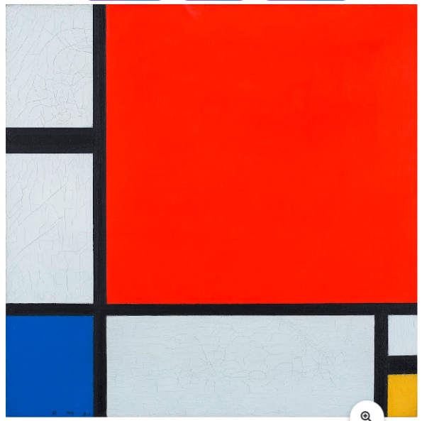
De Stijl (1917-1931) (SEE BLOG Typography and Religion in the De Stijl Movement, July 8, 2025)— It should therefore be no surprise that De Stijl with its ideas of grid systems, sans-serif type and minimalism had its roots in spiritual thought and philosophy. However, unlike early typography and art, De Stijl sought to remove the “particular” (the individual, the emotional, the narrative) and express the “universal” — timeless and absolute truths through plastic means (form, color, and space). Led by a belief system rooted in Eastern religions, occult practices, esoteric traditions, like Gnosticism and Neoplatonism, reincarnation and “secret” teachings, this syncretistic teaching led Piet Mondrian (1872–1944) to develop Neo-Plasticism, the theoretical backbone of De Stijl.
Typefaces that developed from De Stijl included Architype van der Leck designed by Bart van der Leck for the Dutch magazine Flax, a journal of the De Stijl art movement. Bart van der Leck was a Dutch painter and designer. With Theo van Doesburg and Piet Mondriaan he founded the De Stijl (abstract, geometric) art movement. In 1930, he was commissioned by Jo de Leeuw, owner of the prestigious Dutch department store Metz&Co. to design interiors, window packaging, branding and advertising. For these print materials van der Leck developed a rectilinear geometrically constructed alphabet
The danger of De Stijl in its rejection of nature-based forms or figuration, diagonal lines, curved forms, ornamentation and emotional or symbolic expression was that it laid the groundwork for modernist design principles, particularly in graphic design, furniture, architecture and typography. In divorcing the individual “particular” from the abstract “universal” it dichotomized them, creating a modernistic rift between faith and reason
“Whereas modernity dichotomizes the universal and the particular, with the result that the universal becomes abstract and disembodied and the particular becomes of only local interest and useful only as a means for accessing the universal, the Bible diagonalizes that false dichotomy and brings the particular and the universal into harmony. The calling of Abram [Genesis 12:1–3] is “a particularistic means towards a universalistic end. . . God’s promise is realized not in the movement away from Abram’s particularity to an abstract absolute devoid of all specific traits but in the incorporation of particular Abram in a promise made to all particular people in their particularity. The universal comes down into the local without destroying its particularity.” [3]
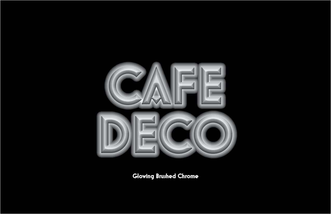
Many Art Deco typefaces were based on simple shapes, such as triangles, circles and rectangles, but combined into elegant, futuristic forms. It was the machine age gone glamorous.
The art deco period celebrated modernity, luxury and progress in bold, geometric and decorative type.
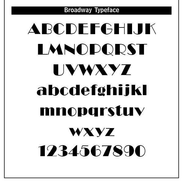
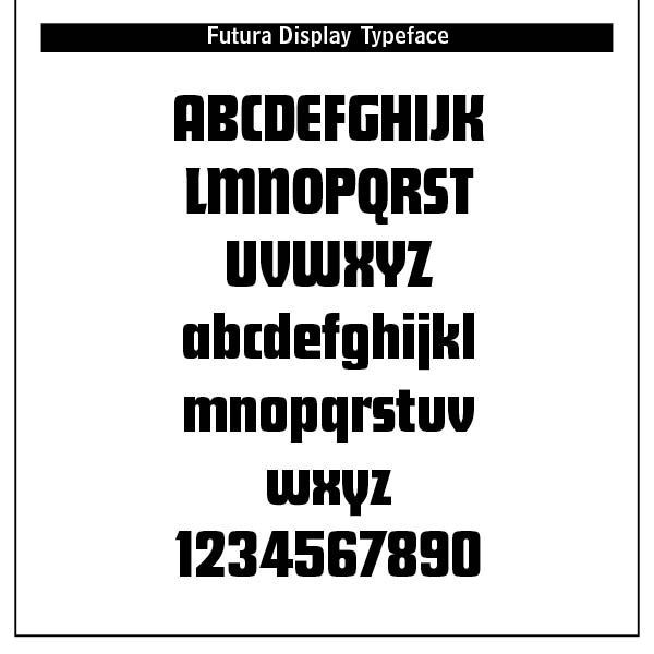
Art Deco marked the rise of display type — typefaces intended for large headings, signage, and advertising. Art Deco fonts like Broadway, Futura Display and Metropolis became iconic of the period. Note that the letterforms were stylized with angular, elongated lines, sharp corners, stepped forms and symmetrical embellishments. They were visually heavy, strong and yet, like the font Broadway, conveyed sophistication and style. Movie posters and theater marquees featured such typefaces.
Typography in the Art Deco period was ornamental, geometric and celebratory. It reflected the optimism, luxury and modernity of the interwar years, combining traditional craftsmanship with industrial precision. Art Deco was meant to dazzle — perfect for the jazz age, cinema, and the dawn of mass consumerism. (ChatGPT)
Psychedelic typography “reflected the spiritual, musical, and drug-influenced culture of the mid to late 1960s —an aesthetic born of rebellion, hallucination, and sensory overload.” (ChartGPT) This was type meant to provoke and overwhelm its readers.
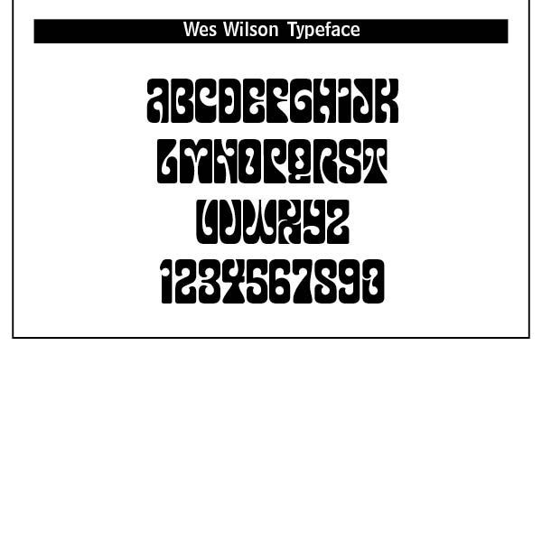
Wrapping words around free flowing areas in order to fill up space is the mark of Wes Wilson’s Psychedelic typeface. This face was in direct and distinct contradiction to the highly legible and clear Swiss type that preceded it.
Wes Wilson disappeared from the San Francisco scene as quickly as he and his contemporaries and their highly individual art form breezed in, heading for the Ozark mountains in Missouri in the early 1970s to live, apparently, a reclusive lifestyle. His legacy though is an incredible art form that forty-five years on is revered as truly classic of its time. Wilson’s style is also known as the Fillmore Poster lettering style.[4]
Psychedelic typography was countercultural, 1960s hippie driven, anti-establishment politics with a fascination for Eastern mysticism, altered consciousness and surrealist art. The San Francisco music scene played a dominant role in popularizing the style. This style was designed to overwhelm, mesmerize and provoke. According to Wilson, “It was a time of enlightenment. In the 60s, we used to think of Utopia as something that was really going to happen.”[5]
Psychedelic art drew from Art Nouveau, notably the ornate lettering of artists like Alphonse Mucha, Surrealism, and Pop Art.
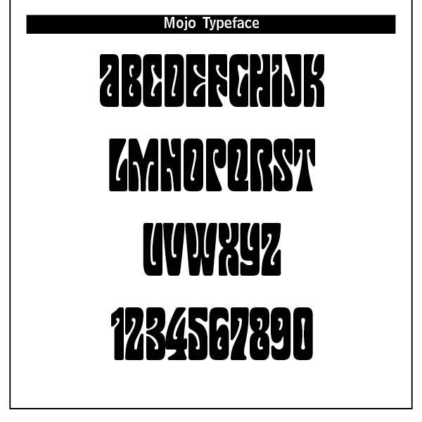
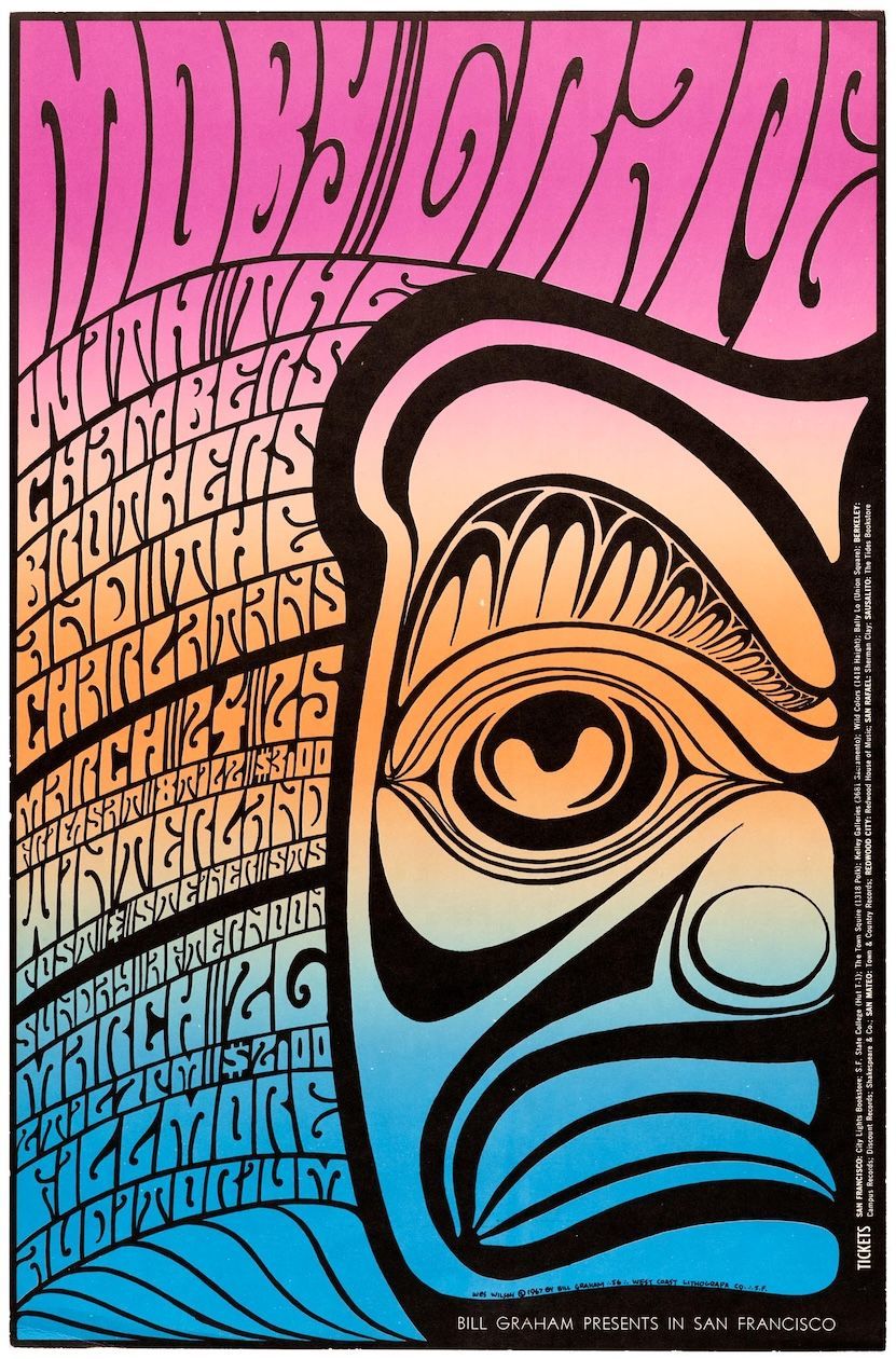
Typography became warped, hand-drawn, dense and illegible by design. Letterforms melted, twisted and expanded to become part of the image chosen. Designers used vibrating contours, contrasting colors and optical illusions to mimic the psychedelic experiences. Other faces that were based on Wilson’s psychedelic lettering were Mojo by Jim Parkinson (1966), Butterfield by David Balle, 1993, Genie and Jonah by Rebecca Alaccari, 2006, Roller Poster by HiH, 2006, and Peace and Love Solid by Leslie Cabarga.[6]
Such type was also featured in underground newspapers, aligning with the counterculture’s anti-mainstream messaging. Typography extended into fashion branding, poster prints, drug culture paraphernalia and festivals. Such type was visual shorthand for rebellion and alternative consciousness. This type was about emotional impact, chaos and fusion of text and image, as ChatGPT says, “a typographical trip in itself!”
Psychedelic type influenced later nontraditional typography and movements like punk, grunge and rave. Today such elements are used to evoke nostalgia, surrealism and emotional intensity.
Interestingly, such a period and its typographical chaos has faded into the background of modern culture. The hippies of the 1960s are the business tycoons and CEOs of today’s wealthiest corporations. The stars of the movie, Field of Dreams, hearken back to their hippie college days as they have settled on an Iowa farm to resurrect a 1920s baseball team. They become outraged at a local school’s possible censure discussion of Catcher In The Rye, a book J.D. Salinger highlighting the struggles of growing up and preserving authenticity in a world that feels phony or shallow.
The question of beauty haunts psychedelic typography. Is cultural revolution fostered by such type a description of beauty that beckons us into the presence of God? While some far Eastern mystics might say and think so, I doubt the connection. The God of order, truth, and right and wrong does not inhabit chaotic alternative consciousness through drug induced trances and flights of fancy. This is why the 1960s did not last, and most of the hippies that I know forsook such a fast and free-loving lifestyle. It is also why psychedelic typography is only seen in limited retro art today.
RUB DOWN, HURRY UP LETRASET type was all the rage in Punk typography and artistry. Popular type faces that were used in Punk typography were the common Courier, Times, Time Bold Italic, Poplar (which is what this versal is in) and Helvetica Condensed, all available on rub down transfer sheets of the 1970s.
Punk type borrowed from Dada, Constructivism and situationist thinking, particularly in its use of cut-up text and ransom-note styling. Rejecting the grid systems of modernist design, Punk embraced disorder, distortion and noise. It was hand-made, urgent and gritty, sometimes illegible and always confrontational. It was fueled by do-it-yourself (DIY)ethics, anti-authoritarianism and the desire for disruption norms.
In an interview of the typographer and designer Sarah Hyndman in London in 2016, she described the DIY sense of Punk typography this way — “There was no style– it’s all the types that were being used in the 1970s, but ripped up and mashed together in a mismatching way, then thrown back down on a page with felt tip scribbles. There was definitely no attention to kerning or leading. The theme that runs through is just this DIY immediacy.”[7]
David Carson became a leading figure in post-modern graphic design. Trained as a sociologist and a professional surfer, Carson drew inspiration from surf culture, skateboarding, and an understanding of texture and movement in composition. He is most famous for his editorial design for magazines like Ray Gun (1992–1995), where layouts and typesetting challenge traditional magazine grid structures and pure functionality.[8]
Such typography also inspired later subcultures like hardcore, riot grrl, and DIY zine culture. Hardcore subcultural operates with a strong “us against the world” feeling, a lifestyle that abstains from alcohol, drugs and sometimes casual sex, and often aligns with ant-fascism, anti-capitalism, environmentalism and social justice campaigns.
I would say that its “ugliness” typographically forces us to see God’s world in its desperate sin-ridden condition and the cross of Christ as its only answer. While this post is not meant as a theological treatise or evangelistic tract, typography like punk causes us not to overlook the depth and weight of the human sinful condition without the presence of God.
SOURCES
- Founded by Kazimir Malevich, suprematism focused on pure abstraction and basic geometric forms and limited colors. Art was reduced to pure feeling and form. The imitation of natural shapes was rejected in suprematism.
- Quote from Cornelius Van Til, philosopher and former professor, at Westminster Theological Seminary, Philadelphia, PA by Pierce Taylor Hibbs, “Beauty Always Beckons.” Westminster Magazine (Vol. 5, Issue 2, Spring 2025), 28.
- Christopher Watkin, Biblical Critical Theory: How the Bible's Unfolding Story Makes Sense of Modern Life and Culture, Zondervan Academic, 2022, 233-234.
- Note by Luc Devroye in https://luc.devroye.org/fonts-51665.html.
- In the Wikipedia article on Robert Wesley Wilson in https://en.wikipedia.org/wiki/Wes_Wilson.
- Luc Devroye.
- From an interview in the UK at https://www.designweek.co.uk/issues/24-30-october-2016/sarah-hyndman-punk-anti-helvetica/.
- From ChatGPT about David Carson.
Successful Layout & Design


