Theology of Type (3): The Twentieth Century (Part 2)
SWISS TYPE BEAUTY
DESIGNERS LIKE JAN TSCHICHOLD were foundational to many of the Swiss design principles. This style evolved from Constructivist, De Stijl and Bauhaus design principles, particularly the ideas of grid systems, sans-serif type and minimalism. Emerging in Switzerland during the 1940s and 1950s, this typography, also known as the International Typographic Style, directly responded to the type chaos of Dada and the stylization of Art Deco.
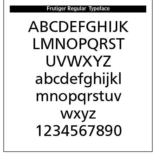
The Swiss style emphasized readability, visual harmony and universality. Clarity, objectivity and functionality were key components. Contributors included Max Miedinger, creator of the Helvetica typeface and Adrian Frutiger, creator of the Univers typeface, both in 1957.
The Journey of Helvetica
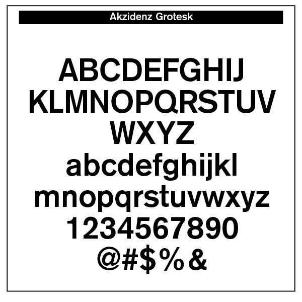
We all use Helvetica. In fact, some say it has been overused through modern years. Helvetica derives its powerful simplicity and display qualities from the 1896 typeface Akzidenz-Grotesk. “The design originates from Royal Grotesk light by Ferdinand Theinhardt who also supplied the regular, medium and bold weights. Throughout the years, Berthold has expanded this extremely popular and versatile family. AG Super was developed in 1968 by Günter Gerhard Lange and is an excellent choice for headlines. In 2001, Günter Gerhard Lange added more weights for Berthold including Super Italic and Extra Bold italic.”[1]
“Helvetica is a twentieth-century Swiss revision of a late nineteenth century German Realist face. The first weights were drawn in 1956 by Max Miedinger, based on the Berthold Foundry’s old Odd-job Sans-serif, or Akzidenz Grotesk, as it is called in German. The heavy, unmodulated line and tiny aperture evoke an image of uncultivated strength, force and persistence. The very light weights issued in recent years have done much to reduce Helvetica’s coarseness but little to increase its readability.”[2]
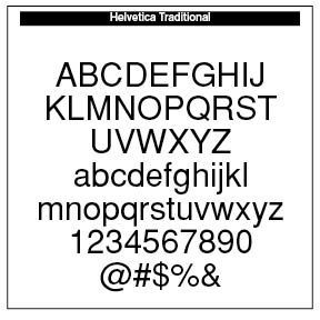
The font comparison chart here indicates the often missed, yet important legibility differences, in variations of Helvetica, and how they compare with traditional Arial and the sans-serif font I like best, Formata. The obvious typeface difference among the fonts is that the Bold Formata font is decidedly bold, contrasting with the bolds of the three Helvetica samples as well as the Arial bold. To correct this, Helvetica in later additions added Helvetica Extra Bold and even Black.
Note the stem of the “G” in all three Helvetica font versions contrasted with the lack of a stem in the Arial “G” and the Formata capital “G.” The Helvetica stems take their cue from the original Akzidenz-Grotesk 1896 font.
The little “tail” on the stem of the capital “R” is noticeable in both the original Helvetica and the Neue Helvetica fonts. However, it has been removed in the newer Helvetica Now edition. The Arial “R” is quite different than the Helvetica models. Note also the tail on the “a” in Helvetica renditions.

The “Q” in all Helvetica versions remain the same, but departs from its original Akzidenz-Grotesk rendering and certainly different than the Formata bold “Q.” Note also the slant on the Arial “t” and the difference between its “1” and the Helvetica numeral “1” as well as the Formata “1.”
The upper “a” stem in the Formata font differs from the other font sample in that it is not as curled as them. The Formata ampersand (“&”) is also constructed differently than the others.
While such differences may seem slight and even uninteresting, to the trained eye they are noticeable and make significant readable differences in overall legibility and appearance.
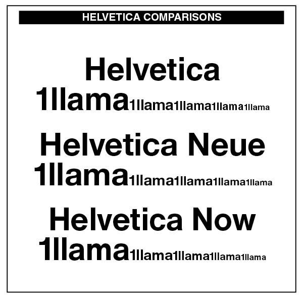
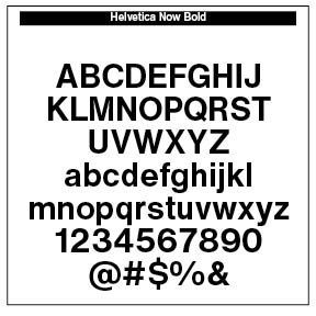
However, Helvetica never goes away. In fact, it has made a comeback in Monotype’s Helvetica Now font and the newest Helvetica Now Variable fonts, crafted by Max Miedinger, Charles Nix, Monotype Studio, Friedrich Althausen, Malou Verlomme, Jan Hendrik Weber, and Emilios Theofanous. Faced with the demand to upgrade the face, these type designers wanted to maintain the original qualities of clarity, simplicity and neutrality while updating it for the demands of contemporary design and branding.
Helvetica Now comprises 96 fonts, consisting of three distinct optical sizes: Micro, Text and Display, all in two widths. Each one has been carefully tailored to the demands of its size
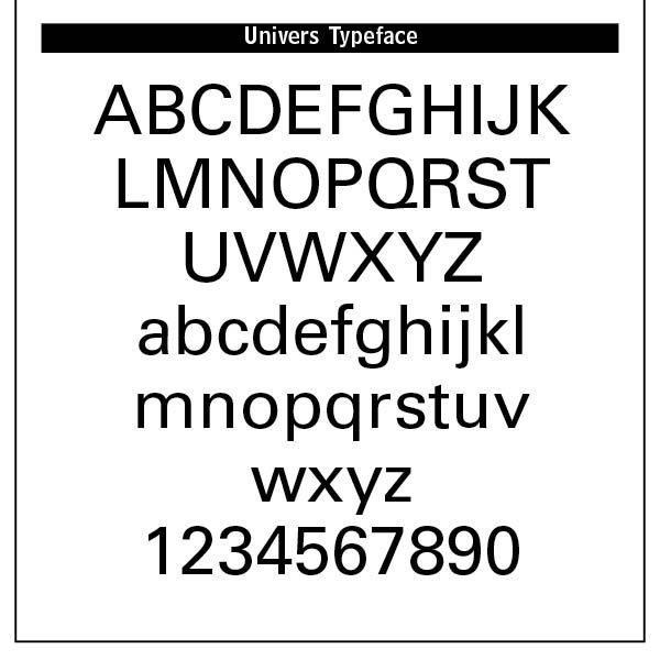
The Univers Typeface
Adrian Frutiger (1928–2015) was Swiss typeface designer whose career spanned hot metal, phototypesetting and digital typesetting eras. Frutiger’s most famous designs, Univers, Frutiger and Avenir, are landmark sans-serif families spanning the three main genres of sans-serif typefaces —neogrotesque, humanist and geometric.
Univers is a clear, objective form suitable for typesetting of longer texts in the sans-serif style. Starting from old sketches from his student days at the School for the Applied Arts in Zurich, he created the Univers type family. Folded into the Linotype collection in the 1980s, Univers has been updated to Univers Next, available with 59 weights. This lasting legible font is suitable for almost any typographic need

As you can well imagine, Swiss typefaces became the standard for corporate design, with Helvetica, in particular, adopted by forms and organizations worldwide for its neutrality and professionalism.
Magazines, journals and brochures have used such type for its legibility and clean structure. Posters composed by Swiss graphic designers use bold sans-serif type, strong alignment and minimalist color palettes. Scientific precision between text and image is the key here.
Helvetica and /or Univers typefaces are used in subway systems, airports and road signage. Advertising adopted Swiss typography for technology, finance and pharmaceuticals to convey credibility, modernity and objectivity.
Swiss type is fantastically beautiful. Far from being cold or rigid, such type sets the standard for modern visual culture. It displays the touch of God the Creator in its gratuitous nature, reflecting the eternal gratuity and self-giving of the Trinity as reflected in his creation.
In fact, Adrian Frutiger was noted to be a Calvinist, following the teachings of John Calvin, the genius behind Reformed theology and philosophy. Swiss type’s God-centered nature and creative order is typographically apparent. Printing was not neutral for Calvin. It was both a moral and spiritual force. It was a vocation, like any other, meant to glorify God by spreading truth and serving the Church.
SOURCES
- From myfonts.com.
- Robert Bringhurst,
The Elements of Typographic Style
(Hartley & Marks, 1992 edition), 93.
Successful Layout & Design


