Theology of Type (1): Printers Marks Expanded
Theology of Type. What does typography have to do with theology? Actually, quite a lot. It is significant that early typography had strong religious roots, especially Christian European roots. Many of these typographers and printers believed and lived from a worldview filled with the Divine. The history of typography operates out of a viewpoint of creativity that goes back to an overriding faith in God.
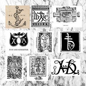
Early Printers' Marks reveal a strong Christian theological stance. Printers’ Marks are symbols or logos that have been used as trademarks by early printers, starting in the fifteenth century. Before the introduction of copyrights, printers’ marks legitimized a printer’s work. Copyright legislation would not be introduced until the eighteenth century.
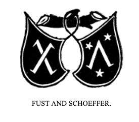
Such marks usually appeared on the last page of a printed work. The first known mark can be found on the Mainz Psalter, produced by Johann Fust and Peter Schoeffer in 1457. This mark depicted two shields bearing a saltire, a diagonal cross and a chevron surrounded by three stars. At the outset these were marks of the printer, but the practice was gradually adopted by publishers.
In early works a statement at the end listed the date of completion and the location. Sometimes the name of the printer or scribe or their initials were included. In printing and typography this is called a colophon, derived from the Greek word κολοφών, meaning summit, or finishing touch. The printer’s mark was added and gradually moved to the title page of the book.
The earliest marks were simple designs produced by using a woodcut stamp. Maggie Patton in her excellent introduction to printers’ marks notes that “the design of a printer’s mark used visual puns, wordplay or sometimes a rebus, a puzzle combining illustrations and letters to depict a motto or printer’s initials. Sacred symbols, the cross and the orb, real and mythical animals, heraldic symbols, and scientific instruments were used in thousands of combinations. The sixteenth century was the highpoint for printers’ marks, when lavish illustrations incorporating a printer’s mark decorated title pages.
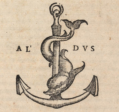
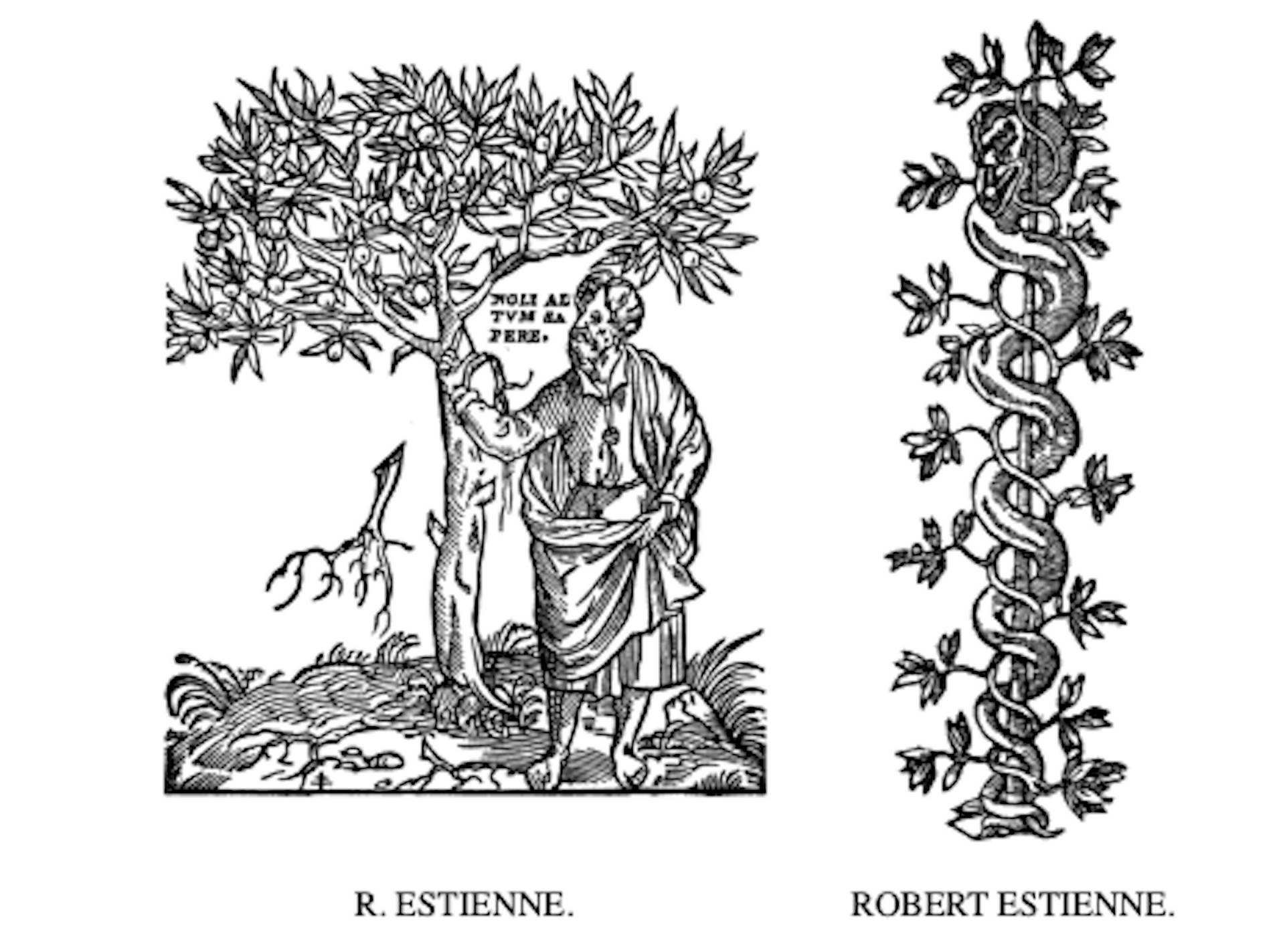
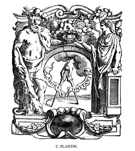
Many famous images and symbols originate from printers’ marks. The design used by Venetian printer Aldus Manutius depicts a dolphin wrapped around an anchor. The printer’s mark used by French printer Robert Estienne shows a man standing by an olive tree, symbolising the tree of knowledge. Christophe Plantin, in Antwerp, used a pair of compasses held by a hand extending from a bank of clouds, the compass points signifying labour and constancy.” [1]
An extensive work on printers’ marks written by William Roberts in 1893 (Printers’ Marks: A Chapter in the History of Typography) showcases a number of printers through the centuries and their trademarks. His work has been reproduced by Project Gutenberg as an eBook.[2]
Roberts grudgingly admits the definite and extensive theological and biblical references made in these early printers and typographers. He reluctantly admits that "it will not be necessary to enter deeply into the motives which induced so many of the old printers and booksellers to select either their devices or the illustrations of their Marks from biblical sources; and it must suffice to say that, if the object is frequently hidden to us to-day, the fact of the extent of their employment cannot be controverted."[3]
Quotations used by these early printers reference the Bible and biblical values. He quotes — "P. de Sartières, Bourges, 'Tout se passe fors dieu' (everthing happens except God) of J. Lambert, 'A espoir en dieu' (to hope in God) of Prigent Calvarin, 'Deum time, pauperes sustine, finem respice' (Fear God, support the poor, look to the end) and several from the Psalms, such as that of C. Nourry, called Le Prince, 'Cor contritum et humiliatum deus non despicies' (A broken and humbled heart, O God, you will not despise) of P. De Saincte-Lucie, also called Le Prince, 'Oculi mei semper ad dominum' (My eyes are always on the Lord).
And of J. Temporal (all three Lyons printers), 'Tangit montes et fumigant,' (It touches mountains and they smoke) in which the design is quite in keeping with the motto; in one case at least, S. Nivelle, one of the commandments is made use of, 'Honora patrem tuum, et matrem tuam, ut sis longævus super terram.' (Honor you father and your mother, that you may live long on the earth) Here, too, we may include the mottoes of B. Rigaud, 'A foy entiere cœur volant' (With whole faith, flying heart) S. De Colines, 'Eripiam et glorificabo eum' (I will rescue and glorify him) and of Benoist Bounyn, Lyons, 'Labores manum tuarum quia manducabis beatus es et bene tibi erit.' (You will work with your hands because you will eat. You will be blessed and it will be well with you).
Among the mottoes of early English printers, the most notable, partly for its dual source, and as one of our earliest examples, is that of William Faques; one sentence, 'Melius est modicum justo super divitias peccatorum multas,' (better is the little of the just than the great riches of sinners) is taken from Psalm xxxvii. verse 16; and the second, 'Melior est patiens viro forti, et qui dominat,' (Better is a patient man than a strong man, and he who rule over) comes from Proverbs xvi., verse 32. The motto of Richard Grafton has already been quoted; that of John Reynes was 'Redemptoris mundi arma' (the arms of the Redeemer of the world) and John Wolfe, 'Vbique floret.' (it blooms everywhere)."[4]
These were not just passing traditions of the period, but whole hearted convictional statements made into Printers Marks and printing devices.
Printers’ Marks: The Crosses
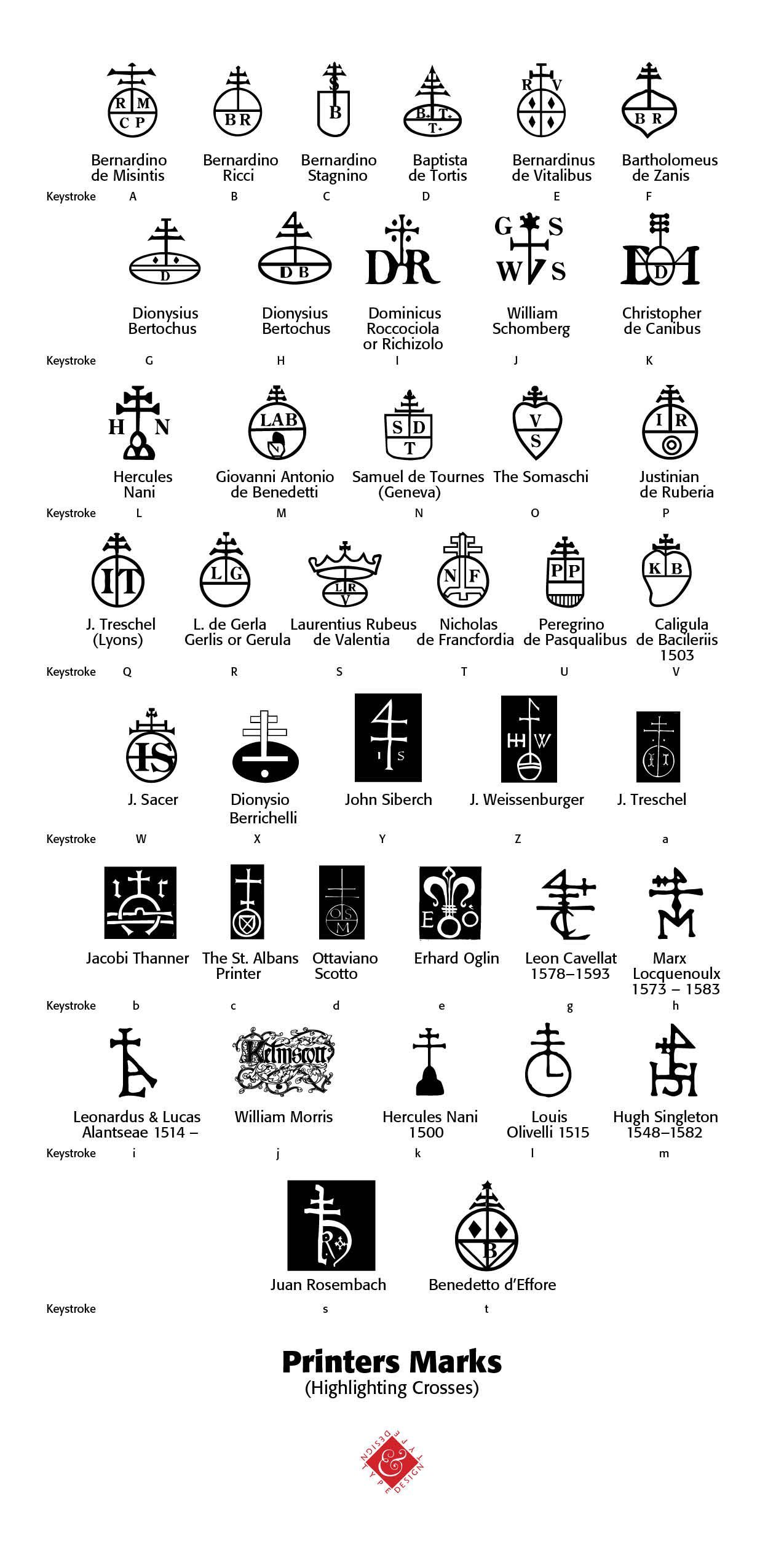
There is an extensive use of the symbol of a cross on many of the earliest printers’ marks. In researching and digitally reproducing these marks, as a typographer and theologian, I find Roberts’ discussion of this phase of printers’ marks unfortunate and demeaning. He says that “there are many points which will forever remain in the region of doubt and obscurity. Tradition is proverbially difficult to eradicate; and all the glamour which surrounds the history of the Cross, and which found expression in, among other popular books, the Legenda Aurea, maintained all its pristine force and attractiveness down to the end of the sixteenth century. The invention of printing and the gradual enlightenment of mankind did much in reducing these legends into their proper place.” [5]
He goes on to question the marks with these words — “Why at the extreme top of the cross is the lateral line formed into a sort of triangular four? Why, without this inexplicable sign, has the cross a number of cyphers, two, or even three, cross-bars? Why should the tail of the cypher 4 itself be traversed by one or sometimes two perpendicular bars which themselves would appear to form another cross of another kind? Why, among the ornamental accessories, do certain species of stars form several crosses, entangled or isolated? Why, at the base of the cross is the V duplicated?" All these are problems which it would be exceedingly difficult to solve with satisfaction.” [6]
In my own study and exploration of these cross marks, what I have found is that the symbolism of the cross at the top with a globe and initials at the bottom indicated a humble submission to the Lordship of Jesus Christ over the earth and its inhabitants, inclusive of the printers themselves. Many of these symbols were crafted by religious men who, instead of capitulating to the times, wanted to express their faith stance for all to see.
Thus, the cross mark, as Roberts has to point out, is “a very striking proof of what M. Delalain calls "la persistance de la croix." It has appeared in all forms and in almost every conceivable shape. Its presence may be taken as indicating a deference and a submission to, as well as a respect for, the Christian religion, and M. Delalain is of the opinion that the sign "eu pour origine l'affliation à une confrérie religieuse." [7]
The earliest printer’s mark by Fust and Schoeffer in 1457 indicated a diagonal cross. It was placed as a colophon at the end of the Psalter printing, the second work of Gutenberg.
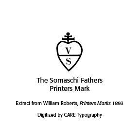
The Somachi Fathers operated a press, being a Catholic Order founded for men in Italy in the sixteenth century. Providing staff for boys’ homes and serving 95 parishes, as well as other ministries, their printer’s mark signaled a devotion to the Cross.
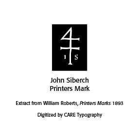
John Siberch (1476–1554) was the first Cambridge printer and an associate of Erasmus. He had links with some of the key figures in North European printing and bookselling and, in turn, formed connections with leading theologians and scholars like Erasmus. Wikipedia notes that Siberch knew “the authors, translators and dedicatees who comprised many of the major contemporary figures of church, state and academia, including bishops John Fisher of Rochester and Nicholas West of Ely, Richard Pace, Secretary of State to Henry VIII, the royal physician Thomas Linacre and, above all, the great humanist scholar Desiderius Erasmus and his circle, while the books touched upon significant issues of the day, such as religious reform and the new humanist learning.” [8]
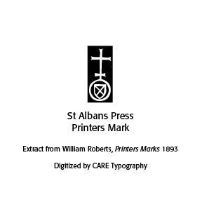
The St Alban’s Press was the third printing press established in England in 1479 as part of the Benedictine Monastery of St Albans, clearly a religious establishment that promoted the Cross as central to their printing. Erhart Oglin was a German printer focusing on printing music. In 1512 he was the first printer in Germany to produce “a printed sheet music, the Deutsche Liederbuch , which contains 43 German sacred and secular songs as well as six Latin songs.” [9]


Juan Rosenbach was a Spanish printer whose printer’s mark can be seen in the Library of Congress today. The evident Cross stands over a sacred “h” perhaps referencing ancient Horus. [10]
Bernardino Giolito de Ferrari, known as Stagnino, used at least three printers’ marks with variations — “The device employed most often is reproduced here from his edition of the Roman missal, printed April 7, 1511: the letter B is enclosed within a heart, surmounted by a cross; the staff of the cross pierces the letter S. While the letters B and S presumably identify the printer, an alternate device shows the figure of St. Bernardino of Siena (1380-1444), an Observant Franciscan friar, with similar initials. Stagnino's mark represented the saint with the IS monogram and three cast-off miters, symbolizing the three bishoprics he rejected in order to continue preaching his popular sermons against Catholic heresy and immorality.” [11] Indeed, a profoundly religious use of the mark.
The mark of Hercules Nani, with the Cross, above three hills or mountains, may imply meditation and heavenly communion — “The Mountains of Myrrh and the Hills of Frankincense, to which the writer of the Song of Solomon says he will retreat, are ideally the same as those ‘silver mountains’ over which, according to Sir Walter Raleigh, ‘My soul, like quiet palmer/ Travelleth towards the land of heaven.’ Among the Jews the three-peaked Mount Olivet was esteemed to be holy, and accounted to be the residence of the Deity.” [10] The point here is that this printer’s mark indicates much more than a mere cultural convenience or capitulation to the period.

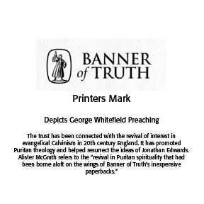
Modern uses of printers’ marks continue, with the examples below of the Banner of Truth Trust and Reformation Heritage Books. Both printers' marks have a deeply religious meaning and message. Often these marks are on the copyright or title page of the book today. They may also adorn the cover of such books.
CARE Typography has meticulously digitized these Cross marks and made them available as a typeface for your use. They are public domain images, free to use with the attribution — Digitized by CARE Typography, 2024.
Sources
[1] Maggie Patton, “The Printer’s Mark: That Curious Penguin on the Spine of Your Favorite Paperback Isn’t There Just for Decoration,” Openbook, Autumn 2022.
[2] William Roberts, The Project Gutenberg Ebook of Printers’ Marks, June 1, 2008, Ebook #25663, from inages made available by The Internet Archive.
[3] Roberts, pp. 24–26
[4] Ibid.
[5] Ibid.
[6] Ibid.
[7] “the persistence of the cross;” “originated from affiliation with a religious brotherhood” quoted by Roberts, 24.
[8] https://en.wikipedia.org/wiki/John_Siberch
[9] https://de.wikipedia.org/wiki/Erhart_Öglin
[10] Harold Bayley, The Lost Language of Symbolism: An Inquiry Into the Origin of Certain Letters. Words, Names, Fairy Tales, Folklore, Etc., 1912, p. 161, from Internet Archive Books.
[11] Library Quarterly Information, Community, Policy, Vol. 83, No 1, pp. 39–41, The University of Chicago, 2023.
[12] Bayley, Lost Language of Symbolism, 35.

Successful Layout & Design


