Mac Mini M1 OR Studio?

Carl Shank • January 13, 2023

Through the modern years, Mac Mini's have kept their shape and design — with a width and depth of 7.7 inches and 1.4 inch height. The newest Mini M1 weighs 2.6 pounds and fits nicely beside my desktop monitor.

The new Mac Studio has either the M1 Max chip or the M1 Ultra chip driving the computing power. The M1 Max chip is a 10-core CPU with 8 performance cores and 2 efficiency cores, with a 24-core GPU and 16-core Neural engine. The M1 Ultra chip has a 20-core CPU, a 48-core GPU and a 32-core Neural engine. What all of this means is that this beast is FAST — especially at video rendering and production.

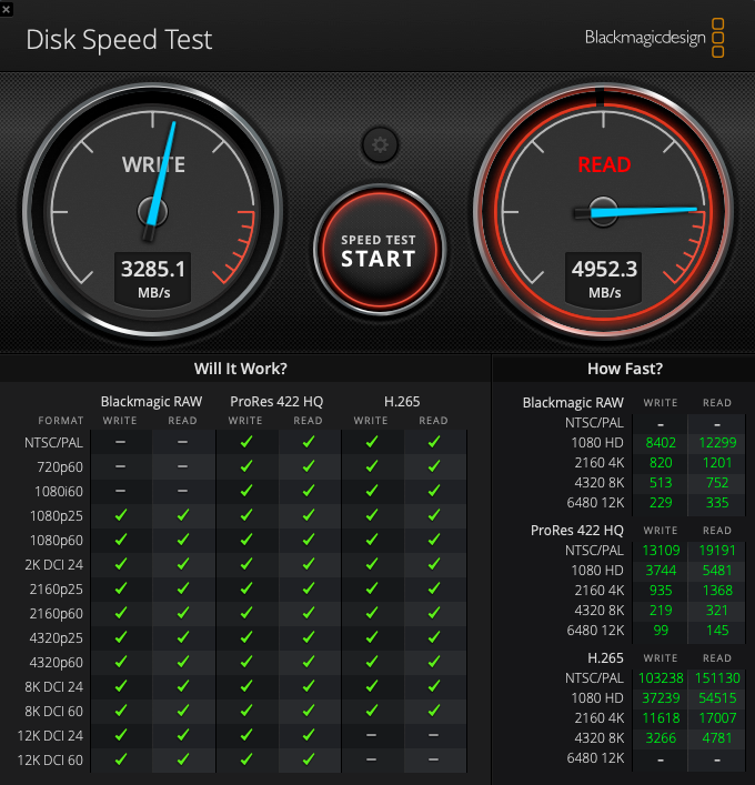
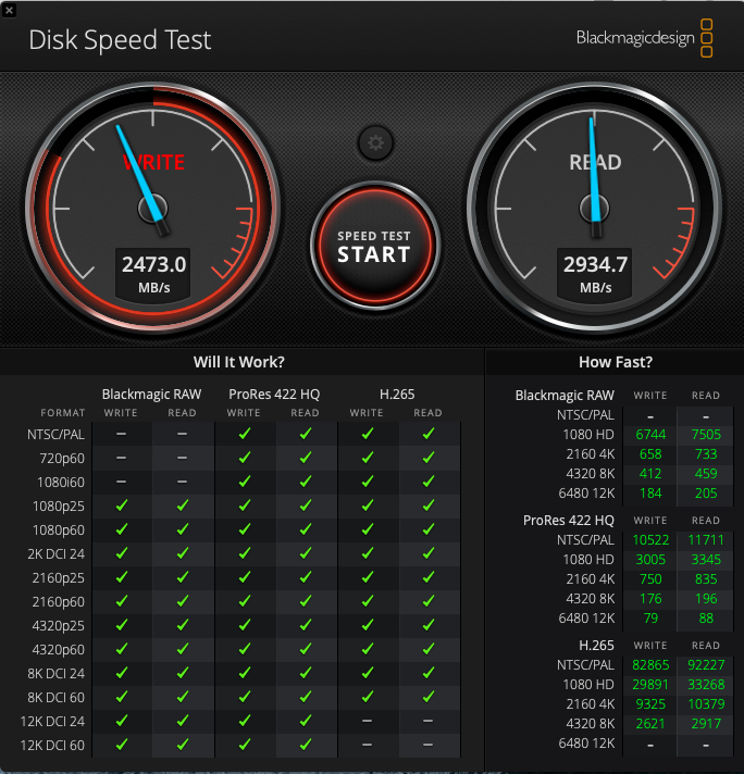
Mac Studio typical speed test.

With the Apple release of the new Mac Studio in 2022, users who have relied on Mac Mini's on their desktop are left with the question of which one to use for them. Both machines use the newer M1 chip in their architecture, giving a notable speed boost to everything from ordinary computer use to layout and design with Adobe products. I have used numerous Mac Mini's through the years, from the humble 2005 PowerPC model through the Intel models in the mid-2000s all the way to the latest Mac mini M1 released in 2020.

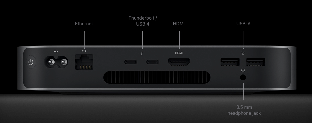
The back of the Mini M1 has two Thunderbolt/USB 4 ports. with two USB-A ports, a HDMI port and a Gigabit Ethernet port (configurable to 10Gb Ethernet). A 3.5 mm headphone jack is included. Of course, Wi-Fi and Bluetooth are built in, along with a built-in speaker. This Mac can support up to two displays, one with up to 6K resolution and another with up to 4K resolution. This is a powerful machine for its size and stature!

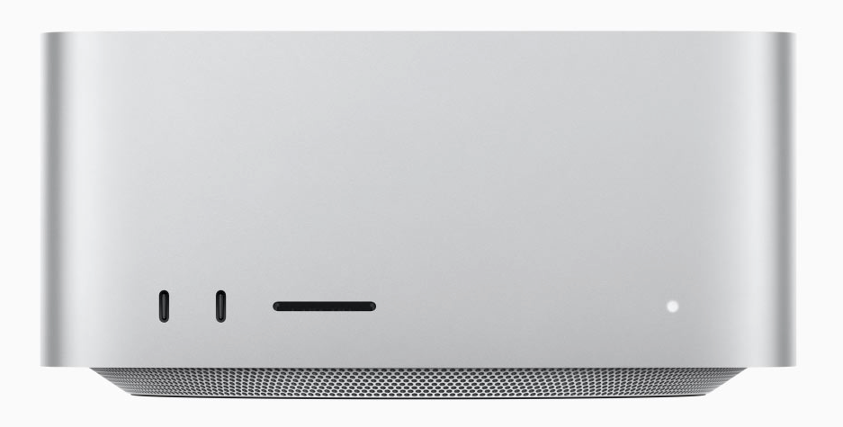
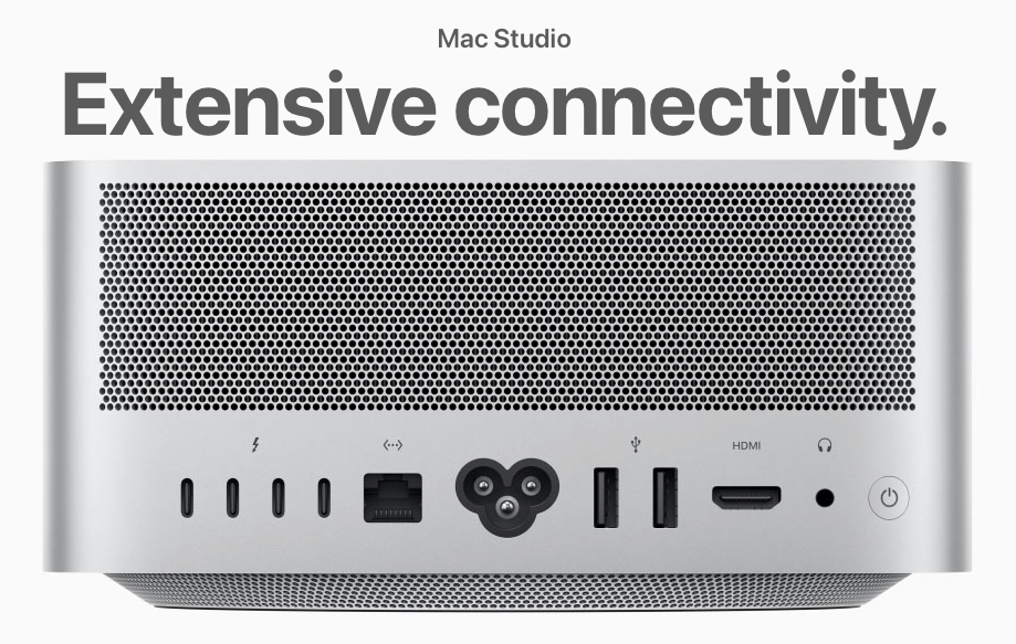
Although it's height is bigger than a Mini (3.7 inches), it is still 7.7 inches by 7.7 inches in width and depth. The biggest seen difference here is in the multitude of ports on the back and front of the Studio. There are four Thunderbolt 4 ports (up to 40 Gb/s), a Display port, two USB-A ports (or USB 4 and USB 3.1) a HDMI port, a 10 Gb Ethernet port and a 3.5 headphone jack port. The front of the M1 Max Studio has two USB-C ports and a SDXC card slot. What the Mini M1 lacks in ports, often needing external help in getting extra ports, the Mac Studio has them all built-in.

Mac Mini M1 typical speed test.

The Mac Studio outpaces the Mac Mini M1, as it should. Of course, others have done more extensive speed tests (find them on YouTube). The speed differential in normal computer work is not that great.


The Mac Mini M1 is a lot cheaper ($699 to $899 retail) than the Mac Studio ($1,999 to $3,999 retail) and its power is quite adequate for most normal computer tasks. The Mac Studio is a pro-sumer computer, less than a professional Mac Pro computer ($5,999 to $6,499 retail), an in-between computer for those wanting multiple displays and faster video editing capabilities or a multitude of high memory use programs simultaneously open. The 8 Gb or even 16 Gb memory option for the Mac Mini pushes the limits of memory use for memory-hogging programs. Notably, a super fitted Mac Mini computer costs about the same as a base line Mac Studio.


Which of these two smaller fitting desktop computers should you buy? It all depends on your use of them and the programming you use on them. I like the faster Mac Studio with its built-in 32 – 64 Gb memory options contrasted to the 8 – 16 Gb memory options on the Mini M1. I also like the multiple ports on the Mac Studio, if you can afford it.

Successful Layout & Design

By Carl Shank October 25, 2025
Theology of Type . What does typography have to do with theology? Actually, quite a lot. It is significant that early typography had strong religious roots, especially Christian European roots. Many of these typographers and printers believed and lived from a worldview filled with the Divine. The history of typography operates out of a viewpoint of creativity that goes back to an overriding faith in God. Early Printers' Marks reveal a strong Christian theological stance. Printers’ Marks are symbols or logos that have been used as trademarks by early printers, starting in the fifteenth century. Before the introduction of copyrights, printers’ marks legitimized a printer’s work. Copyright legislation would not be introduced until the eighteenth century. Such marks usually appeared on the last page of a printed work. The first known mark can be found on the Mainz Psalter, produced by Johann Fust and Peter Schoeffer in 1457. This mark depicted two shields bearing a saltire, a diagonal cross and a chevron surrounded by three stars. At the outset these were marks of the printer, but the practice was gradually adopted by publishers. In early works a statement at the end listed the date of completion and the location. Sometimes the name of the printer or scribe or their initials were included. In printing and typography this is called a colophon, derived from the Greek word κολοφών, meaning summit, or finishing touch. The printer’s mark was added and gradually moved to the title page of the book. The earliest marks were simple designs produced by using a woodcut stamp. Maggie Patton in her excellent introduction to printers’ marks notes that “the design of a printer’s mark used visual puns, wordplay or sometimes a rebus, a puzzle combining illustrations and letters to depict a motto or printer’s initials. Sacred symbols, the cross and the orb, real and mythical animals, heraldic symbols, and scientific instruments were used in thousands of combinations. The sixteenth century was the highpoint for printers’ marks, when lavish illustrations incorporating a printer’s mark decorated title pages. Many famous images and symbols originate from printers’ marks. The design used by Venetian printer Aldus Manutius depicts a dolphin wrapped around an anchor. The printer’s mark used by French printer Robert Estienne shows a man standing by an olive tree, symbolising the tree of knowledge. Christophe Plantin, in Antwerp, used a pair of compasses held by a hand extending from a bank of clouds, the compass points signifying labour and constancy.” [1]
By Carl Shank September 29, 2025
Calligraphy & Typography. Calligraphy, the art of beautiful handwriting, has a long and rich history that spans cultures, religions, and centuries. It developed not only as a means of communication but also as a form of artistic expression, religious devotion, and cultural preservation. While typography is not calligraphy, with much of type carefully structured, straight-backed and neatly drawn and focused on lettering for printing readability, both art forms involve visual expression of language. Both focus on the shape, proportion and beauty of letters. Both reflect religious, historical and cultural influences on writing styles. Both are used for artistic and decorative purposes in design, and much of type has been greatly influenced by calligraphic styles. Yet, they differ significantly in their methods, purposes and tools. Calligraphy is the art of hand drawn, beautiful writing, while typography focuses on the design and arrangement of type letters for print or digital use. Calligraphy is created manually with pens, brushes, or quills, while type is created digitally or mechanically using typefaces. Traditional tools used in calligraphy include dip pens, brushes and ink, while type is formed with digital or physical lettering. Calligraphy is highly expressive and free flowing, while type is usually uniform and consistent across all characters. Calligraphy is usually done for decorative and personal use, while typography is often constructed and used for mass communication in books, websites and signage. Mediums for calligraphy include paper, parchment, walls, while typography focuses on print and digital media. Yet, the roots of much of type comes from the wealth of history and styling offered by calligraphy. CARE Typography has been able with Font Lab's tools like Fontographer, to translate fine calligraphy into usable typefaces, even for the modern market tastes. The fine art of calligraphy is highlighted in the background to this post in the 2018 calligraphic rendering of the Scripture, "Well done, good and faithful servant" (Matthew 25:25a) by Calligraphy for Christ ( https://www.calligraphyforchrist.com/ ). Such beautiful religious typographic pieces actually begin not with the Gutenberg era in 1450 but with the ancient Chinese.
Show More